*A comment added on 04/05/2022: Thanks to a comment by Mr. Maier, I found a major mistake in my visualization. To be concrete, there is a mistake in expressing how to get each colored divided group of tokens by applying linear transformations. That corresponds to the section 3.2.2 in the paper “Attention Is All You Need.” There would be no big differences in the main point of this article, the relations of keys, queries, and values, but please bear that in your mind if you need Transformer at a practical work. Besides checking the implementation by Tensorflow, I will soon prepare a modified version of visualization. For further details, please see comments at the bottom of this article.
This is the third article of my article series named “Instructions on Transformer for people outside NLP field, but with examples of NLP.”
In the last article, I explained how attention mechanism works in simple seq2seq models with RNNs, and it basically calculates correspondences of the hidden state at every time step, with all the outputs of the encoder. However I would say the attention mechanisms of RNN seq2seq models use only one standard for comparing them. Using only one standard is not enough for understanding languages, especially when you learn a foreign language. You would sometimes find it difficult to explain how to translate a word in your language to another language. Even if a pair of languages are very similar to each other, translating them cannot be simple switching of vocabulary. Usually a single token in one language is related to several tokens in the other language, and vice versa. How they correspond to each other depends on several criteria, for example “what”, “who”, “when”, “where”, “why”, and “how”. It is easy to imagine that you should compare tokens with several criteria.
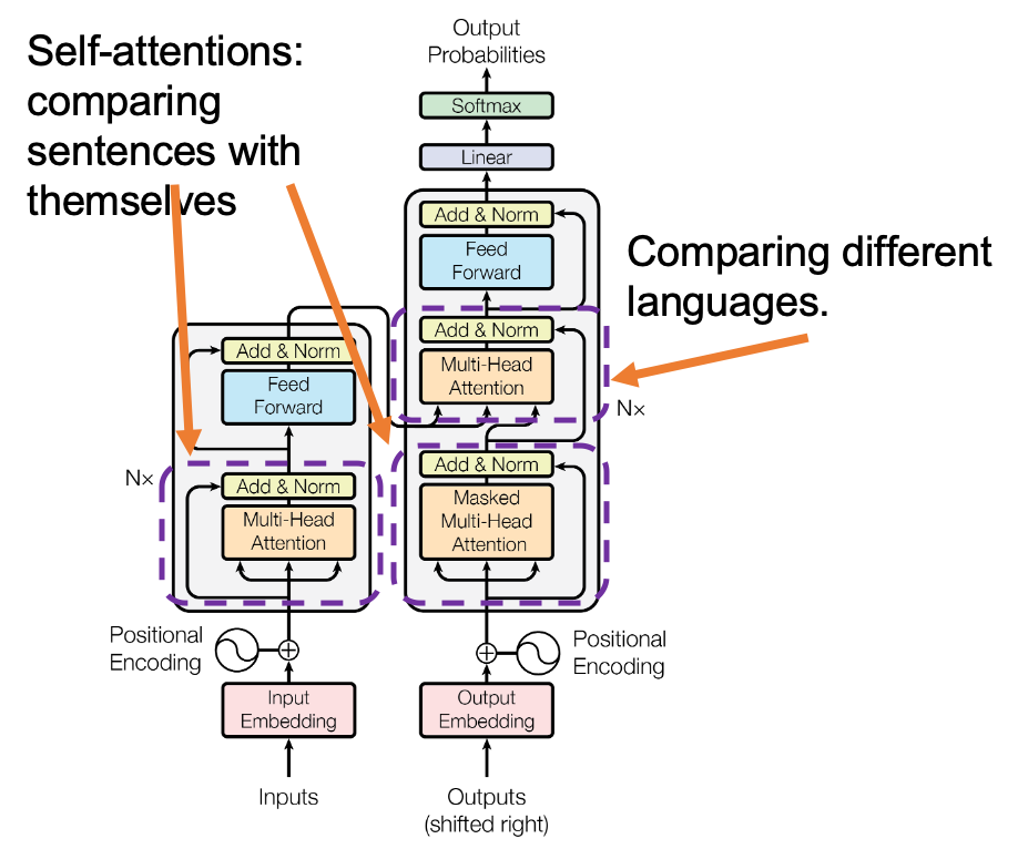
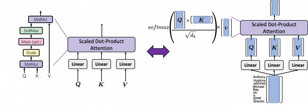
Transformer model was first introduced in the original paper named “Attention Is All You Need,” and from the title you can easily see that attention mechanism plays important roles in this model. When you learn about Transformer model, you will see the figure below, which is used in the original paper on Transformer. This is the simplified overall structure of one layer of Transformer model, and you stack this layer N times. In one layer of Transformer, there are three multi-head attention, which are displayed as boxes in orange. These are the very parts which compare the tokens on several standards. I made the head article of this article series inspired by this multi-head attention mechanism. 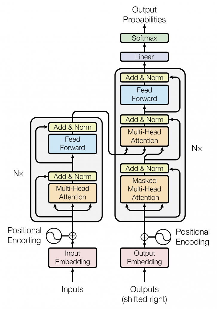
The figure below is also from the original paper on Transfromer. If you can understand how multi-head attention mechanism works with the explanations in the paper, and if you have no troubles understanding the codes in the official Tensorflow tutorial, I have to say this article is not for you. However I bet that is not true of majority of people, and at least I need one article to clearly explain how multi-head attention works. Please keep it in mind that this article covers only the architectures of the two figures below. However multi-head attention mechanisms are crucial components of Transformer model, and throughout this article, you would not only see how they work but also get a little control over it at an implementation level.
1 Multi-head attention mechanism
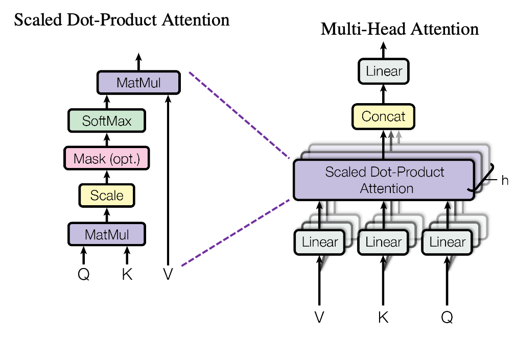
When you learn Transformer model, I recommend you first to pay attention to multi-head attention. And when you learn multi-head attentions, before seeing what scaled dot-product attention is, you should understand the whole structure of multi-head attention, which is at the right side of the figure above. In order to calculate attentions with a “query”, as I said in the last article, “you compare the ‘query’ with the ‘keys’ and get scores/weights for the ‘values.’ Each score/weight is in short the relevance between the ‘query’ and each ‘key’. And you reweight the ‘values’ with the scores/weights, and take the summation of the reweighted ‘values’.” Sooner or later, you will notice I would be just repeating these phrases over and over again throughout this article, in several ways.
*Even if you are not sure what “reweighting” means in this context, please keep reading. I think you would little by little see what it means especially in the next section.
The overall process of calculating multi-head attention, displayed in the figure above, is as follows (Please just keep reading. Please do not think too much.): first you split the V: “values”, K: “keys”, and Q: “queries”, and second you transform those divided “values”, “keys”, and “queries” with densely connected layers (“Linear” in the figure). Next you calculate attention weights and reweight the “values” and take the summation of the reiweighted “values”, and you concatenate the resulting summations. At the end you pass the concatenated “values” through another densely connected layers. The mechanism of scaled dot-product attention is just a matter of how to concretely calculate those attentions and reweight the “values”.
*In the last article I briefly mentioned that “keys” and “queries” can be in the same language. They can even be the same sentence in the same language, and in this case the resulting attentions are called self-attentions, which we are mainly going to see. I think most people calculate “self-attentions” unconsciously when they speak. You constantly care about what “she”, “it” , “the”, or “that” refers to in you own sentence, and we can say self-attention is how these everyday processes is implemented.
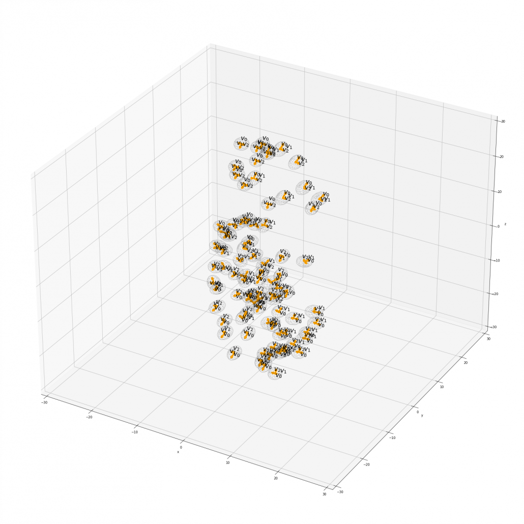
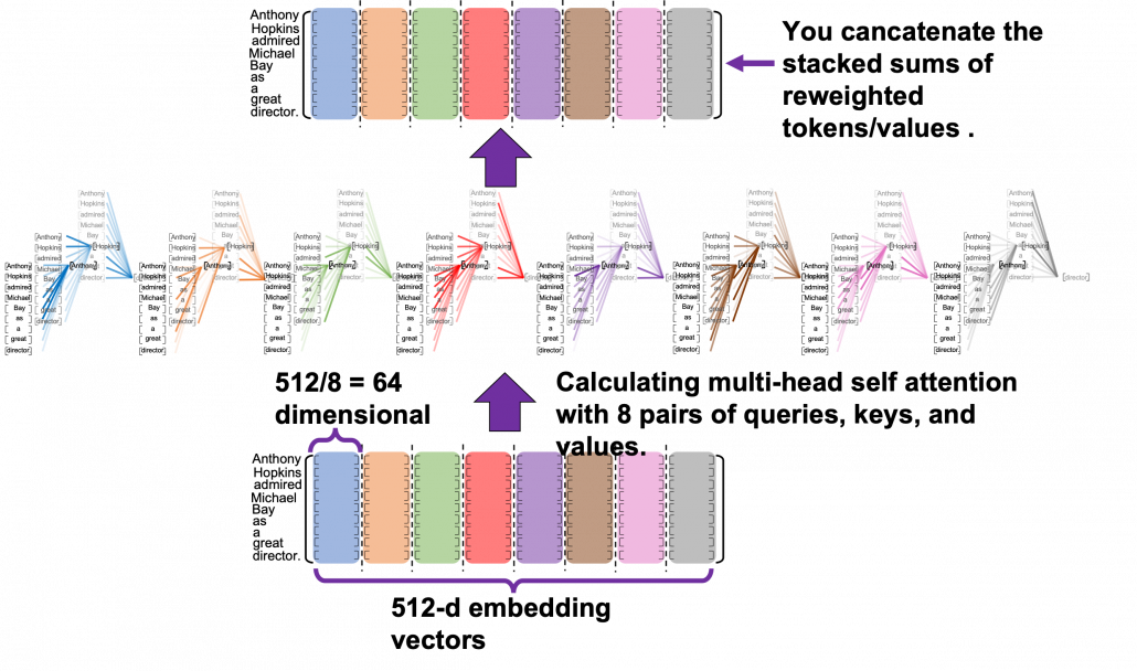
Let’s see the whole process of calculating multi-head attention at a little abstract level. From now on, we consider an example of calculating multi-head self-attentions, where the input is a sentence “Anthony Hopkins admired Michael Bay as a great director.” In this example, the number of tokens is 9, and each token is encoded as a 512-dimensional embedding vector. And the number of heads is 8. In this case, as you can see in the figure below, the input sentence “Anthony Hopkins admired Michael Bay as a great director.” is implemented as a  matrix. You first split each token into
  dimensional, 8 vectors in total, as I colored in the figure below. In other words, the input matrix is divided into 8 colored chunks, which are all
  matrices, but each colored matrix expresses the same sentence. And you calculate self-attentions of the input sentence independently in the 8 heads, and you reweight the “values” according to the attentions/weights. After this, you stack the sum of the reweighted “values” in each colored head, and you concatenate the stacked tokens of each colored head. The size of each colored chunk does not change even after reweighting the tokens. According to Ashish Vaswani, who invented Transformer model, each head compare “queries” and “keys” on each standard. If the a Transformer model has 4 layers with 8-head multi-head attention , at least its encoder has
  heads, so the encoder learn the relations of tokens of the input on 32 different standards.
I think you now have rough insight into how you calculate multi-head attentions. In the next section I am going to explain the process of reweighting the tokens, that is, I am finally going to explain what those colorful lines in the head image of this article series are.
*Each head is randomly initialized, so they learn to compare tokens with different criteria. The standards might be straightforward like “what” or “who”, or maybe much more complicated. In attention mechanisms in deep learning, you do not need feature engineering for setting such standards.
2 Calculating attentions and reweighting “values”
If you have read the last article or if you understand attention mechanism to some extent, you should already know that attention mechanism calculates attentions, or relevance between “queries” and “keys.” In the last article, I showed the idea of weights as a histogram, and in that case the “query” was the hidden state of the decoder at every time step, whereas the “keys” were the outputs of the encoder. In this section, I am going to explain attention mechanism in a more abstract way, and we consider comparing more general “tokens”, rather than concrete outputs of certain networks. In this section each ![[ \cdots ]](https://data-science-blog.com/wp-content/ql-cache/quicklatex.com-a935a6ae352397cdde28cd5115cc275a_l3.png "Rendered by QuickLaTeX.com") denotes a token, which is usually an embedding vector in practice.
denotes a token, which is usually an embedding vector in practice.
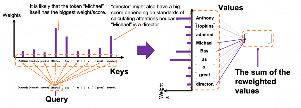
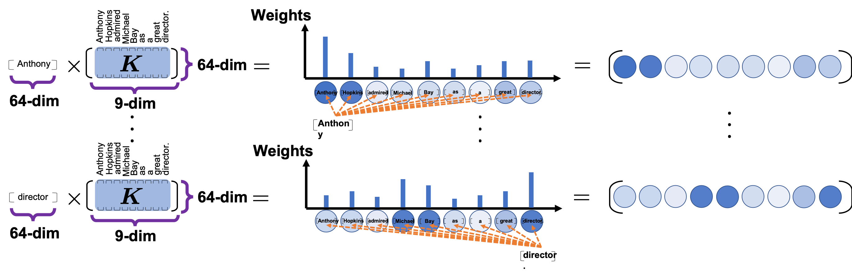
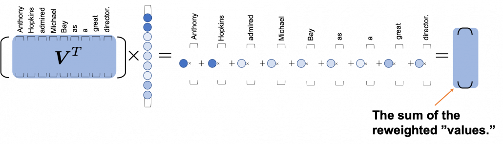
Please remember this mantra of attention mechanism: “you compare the ‘query’ with the ‘keys’ and get scores/weights for the ‘values.’ Each score/weight is in short the relevance between the ‘query’ and each ‘key’. And you reweight the ‘values’ with the scores/weights, and take the summation of the reweighted ‘values’.” The figure below shows an overview of a case where “Michael” is a query. In this case you compare the query with the “keys”, that is, the input sentence “Anthony Hopkins admired Michael Bay as a great director.” and you get the histogram of attentions/weights. Importantly the sum of the weights 1. With the attentions you have just calculated, you can reweight the “values,” which also denote the same input sentence. After that you can finally take a summation of the reweighted values. And you use this summation.
 *I have been repeating the phrase “reweighting ‘values’ with attentions,” but you in practice calculate the sum of those reweighted “values.”
Assume that compared to the “query” token “Michael”, the weights of the “key” tokens “Anthony”, “Hopkins”, “admired”, “Michael”, “Bay”, “as”, “a”, “great”, and “director.” are respectively 0.06, 0.09, 0.05, 0.25, 0.18, 0.06, 0.09, 0.06, 0.15. In this case the sum of the reweighted token is 0.06″Anthony” + 0.09″Hopkins” + 0.05″admired” + 0.25″Michael” + 0.18″Bay” + 0.06″as” + 0.09″a” + 0.06″great” 0.15″director.”, and this sum is the what wee actually use.
*Of course the tokens are embedding vectors in practice. You calculate the reweighted vector in actual implementation.
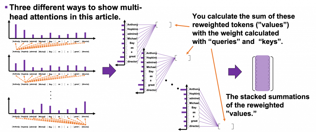
You repeat this process for all the “queries.” As you can see in the figure below, you get summations of 9 pairs of reweighted “values” because you use every token of the input sentence “Anthony Hopkins admired Michael Bay as a great director.” as a “query.” You stack the sum of reweighted “values” like the matrix in purple in the figure below, and this is the output of a one head multi-head attention.
3 Scaled-dot product
This section is a only a matter of linear algebra. Maybe this is not even so sophisticated as linear algebra. You just have to do lots of Excel-like operations. A tutorial on Transformer by Jay Alammar is also a very nice study material to understand this topic with simpler examples. I tried my best so that you can clearly understand multi-head attention at a more mathematical level, and all you need to know in order to read this section is how to calculate products of matrices or vectors, which you would see in the first some pages of textbooks on linear algebra.
We have seen that in order to calculate multi-head attentions, we prepare 8 pairs of “queries”, “keys” , and “values”, which I showed in 8 different colors in the figure in the first section. We calculate attentions and reweight “values” independently in 8 different heads, and in each head the reweighted “values” are calculated with this very simple formula of scaled dot-product: 
 . Let’s take an example of calculating a scaled dot-product in the blue head.
At the left side of the figure below is a figure from the original paper on Transformer, which explains one-head of multi-head attention. If you have read through this article so far, the figure at the right side would be more straightforward to understand. You divide the input sentence into 8 chunks of matrices, and you independently put those chunks into eight head. In one head, you convert the input matrix by three different fully connected layers, which is “Linear” in the figure below, and prepare three matrices  , which are “queries”, “keys”, and “values” respectively.
*Whichever color attention heads are in, the processes are all the same.
*You divide  by
by  in the formula. According to the original paper, it is known that re-scaling
  by is found to be effective. I am not going to discuss why in this article.
As you can see in the figure below, calculating is virtually just multiplying three matrices with the same size (Only K is transposed though). The resulting matrix is the output of the head.
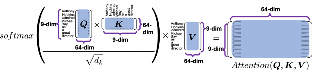
 is calculated like in the figure below. The softmax function regularize each row of the re-scaled product
  , and the resulting
  matrix is a kind a heat map of self-attentions.
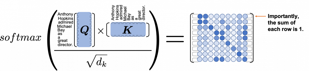
The process of comparing one “query” with “keys” is done with simple multiplication of a vector and a matrix, as you can see in the figure below. You can get a histogram of attentions for each query, and the resulting 9 dimensional vector is a list of attentions/weights, which is a list of blue circles in the figure below. That means, in Transformer model, you can compare a “query” and a “key” only by calculating an inner product. After re-scaling the vectors by dividing them with  and regularizing them with a softmax function, you stack those vectors, and the stacked vectors is the heat map of attentions.
You can reweight “values” with the heat map of self-attentions, with simple multiplication. It would be more straightforward if you consider a transposed scaled dot-product  . This also should be easy to understand if you know basics of linear algebra.
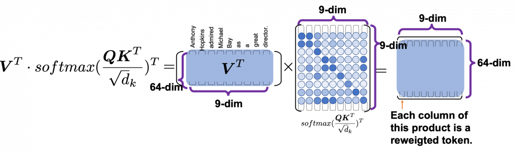
One column of the resulting matrix () can be calculated with a simple multiplication of a matrix and a vector, as you can see in the figure below. This corresponds to the process or “taking a summation of reweighted ‘values’,” which I have been repeating. And I would like you to remember that you got those weights (blue) circles by comparing a “query” with “keys.”
Again and again, let’s repeat the mantra of attention mechanism together: “you compare the ‘query’ with the ‘keys’ and get scores/weights for the ‘values.’ Each score/weight is in short the relevance between the ‘query’ and each ‘key’. And you reweight the ‘values’ with the scores/weights, and take the summation of the reweighted ‘values’.” If you have been patient enough to follow my explanations, I bet you have got a clear view on how multi-head attention mechanism works.
We have been seeing the case of the blue head, but you can do exactly the same procedures in every head, at the same time, and this is what enables parallelization of multi-head attention mechanism. You concatenate the outputs of all the heads, and you put the concatenated matrix through a fully connected layers. 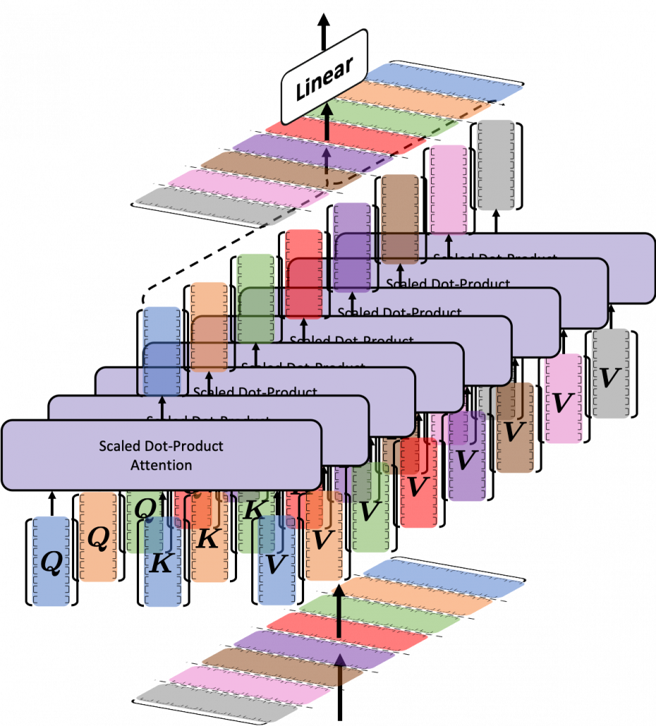
If you are reading this article from the beginning, I think this section is also showing the same idea which I have repeated, and I bet more or less you no have clearer views on how multi-head attention mechanism works. In the next section we are going to see how this is implemented.
4 Tensorflow implementation of multi-head attention
Let’s see how multi-head attention is implemented in the Tensorflow official tutorial. If you have read through this article so far, this should not be so difficult. I also added codes for displaying heat maps of self attentions. With the codes in this Github page, you can display self-attention heat maps for any input sentences in English.
The multi-head attention mechanism is implemented as below. If you understand Python codes and Tensorflow to some extent, I think this part is relatively easy. The multi-head attention part is implemented as a class because you need to train weights of some fully connected layers. Whereas, scaled dot-product is just a function.
*I am going to explain the create_padding_mask() and create_look_ahead_mask() functions in upcoming articles. You do not need them this time.
Let’s see a case of using multi-head attention mechanism on a (1, 9, 512) sized input tensor, just as we have been considering in throughout this article. The first axis of (1, 9, 512) corresponds to the batch size, so this tensor is virtually a (9, 512) sized tensor, and this means the input is composed of 9 512-dimensional vectors. In the results below, you can see how the shape of input tensor changes after each procedure of calculating multi-head attention. Also you can see that the output of the multi-head attention is the same as the input, and you get a matrix of attention heat maps of each attention head.
I guess the most complicated part of this implementation above is the split_head() function, especially if you do not understand tensor arithmetic. This part corresponds to splitting the input tensor to 8 different colored matrices as in one of the figures above. If you cannot understand what is going on in the function, I recommend you to prepare a sample tensor as below.
This is just a simple (1, 9, 512) sized tensor with sequential integer elements. The first row (1, 2, …., 512) corresponds to the first input token, and (4097, 4098, … , 4608) to the last one. You should try converting this sample tensor to see how multi-head attention is implemented. For example you can try the operations below.
These operations correspond to splitting the input into 8 heads, whose sizes are all (9, 64). And the second axis of the resulting (1, 8, 9, 64) tensor corresponds to the index of the heads. Thus sample_sentence[0][0] corresponds to the first head, the blue matrix. Some Tensorflow functions enable linear calculations in each attention head, independently as in the codes below.
Very importantly, we have been only considering the cases of calculating self attentions, where all “queries”, “keys”, and “values” come from the same sentence in the same language. However, as I showed in the last article, usually “queries” are in a different language from “keys” and “values” in translation tasks, and “keys” and “values” are in the same language. And as you can imagine, usualy “queries” have different number of tokens from “keys” or “values.” You also need to understand this case, which is not calculating self-attentions. If you have followed this article so far, this case is not that hard to you. Let’s briefly see an example where the input sentence in the source language is composed 9 tokens, on the other hand the output is composed 12 tokens.
As I mentioned, one of the outputs of each multi-head attention class is matrix of attention heat maps, which I displayed as a matrix composed of blue circles in the last section. The the implementation in the Tensorflow official tutorial, I have added codes to display actual heat maps of any input sentences in English.
*If you want to try displaying them by yourself, download or just copy and paste codes in this Github page. Please maker “datasets” directory in the same directory as the code. Please download “spa-eng.zip” from this page, and unzip it. After that please put “spa.txt” on the “datasets” directory. Also, please download the “checkpoints_en_es” folder from this link, and place the folder in the same directory as the file in the Github page. In the upcoming articles, you would need similar processes to run my codes.
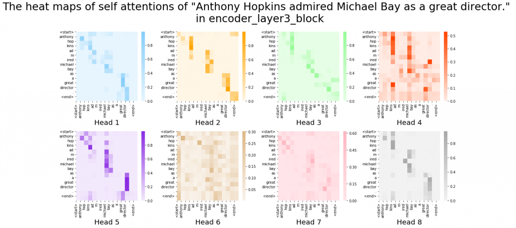
After running codes in the Github page, you can display heat maps of self attentions. Let’s input the sentence “Anthony Hopkins admired Michael Bay as a great director.” You would get a heat maps like this.
In fact, my toy implementation cannot handle proper nouns such as “Anthony” or “Michael.” Then let’s consider a simple input sentence “He admired her as a great director.” In each layer, you respectively get 8 self-attention heat maps.
I think we can see some tendencies in those heat maps. The heat maps in the early layers, which are close to the input, are blurry. And the distributions of the heat maps come to concentrate more or less diagonally. At the end, presumably they learn to pay attention to the start and the end of sentences.
You have finally finished reading this article. Congratulations.
You should be proud of having been patient, and you passed the most tiresome part of learning Transformer model. You must be ready for making a toy English-German translator in the upcoming articles. Also I am sure you have understood that Michael Bay is a great director, no matter what people say.
[References]
[1] Ashish Vaswani, Noam Shazeer, Niki Parmar, Jakob Uszkoreit, Llion Jones, Aidan N. Gomez, Lukasz Kaiser, Illia Polosukhin, “Attention Is All You Need” (2017)
[2] “Transformer model for language understanding,” Tensorflow Core
https://www.tensorflow.org/overview
[3] “Neural machine translation with attention,” Tensorflow Core
https://www.tensorflow.org/tutorials/text/nmt_with_attention
[4] Jay Alammar, “The Illustrated Transformer,”
http://jalammar.github.io/illustrated-transformer/
[5] “Stanford CS224N: NLP with Deep Learning | Winter 2019 | Lecture 14 – Transformers and Self-Attention,” stanfordonline, (2019)
https://www.youtube.com/watch?v=5vcj8kSwBCY
[6]Tsuboi Yuuta, Unno Yuuya, Suzuki Jun, “Machine Learning Professional Series: Natural Language Processing with Deep Learning,” (2017), pp. 91-94
坪井祐太、海野裕也、鈴木潤 著, 「機械学習プロフェッショナルシリーズ 深層学習による自然言語処理」, (2017), pp. 191-193
[7]”Stanford CS224N: NLP with Deep Learning | Winter 2019 | Lecture 8 – Translation, Seq2Seq, Attention”, stanfordonline, (2019)
https://www.youtube.com/watch?v=XXtpJxZBa2c
[8]Rosemary Rossi, “Anthony Hopkins Compares ‘Genius’ Michael Bay to Spielberg, Scorsese,” yahoo! entertainment, (2017)
https://www.yahoo.com/entertainment/anthony-hopkins-transformers-director-michael-bay-guy-genius-010058439.html
* I make study materials on machine learning, sponsored by DATANOMIQ. I do my best to make my content as straightforward but as precise as possible. I include all of my reference sources. If you notice any mistakes in my materials, including grammatical errors, please let me know (email: yasuto.tamura@datanomiq.de). And if you have any advice for making my materials more understandable to learners, I would appreciate hearing it.


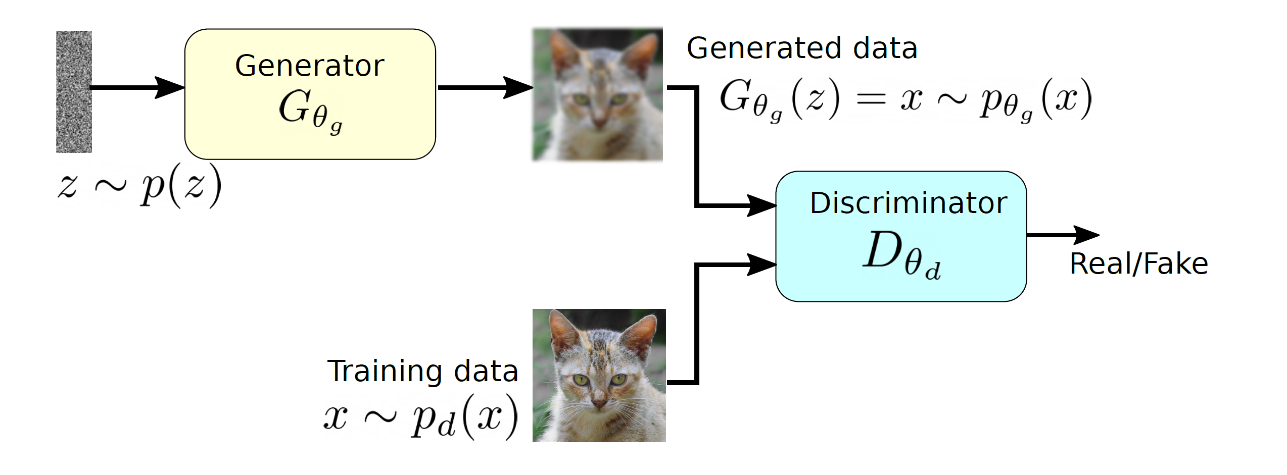
 and produces a sample that has a similar distribution as
  . To train this network efficiently, there is the other network that is utilized as the second player and known as the discriminator. The generator network (player one) tries to fool the discriminator by generating real looking images. Moreover, the discriminator network tries to distinguish between real (training data
  ) and fake images effectively. Our main aim is to have an efficiently trained discriminator to be able to distinguish between real and fake images (the generator’s output) and on the other hand, we would like to have a generator, which can easily fool the discriminator by generating real-looking images.
![\begin{equation*} \min_{p_{\theta_g}}\: \max_{D_{\theta_d}\in F} \: \mathbb{E}_{x\sim p_d}[D_{\theta_d}(x)] - \mathbb{E}_{x\sim p_{\theta_g}} [D_{\theta_d}(G_{\theta_g}(x))], \end{equation*}](https://data-science-blog.com/wp-content/ql-cache/quicklatex.com-7980edcee550a3814c1f817f58e1bfb3_l3.png "Rendered by QuickLaTeX.com")
 and
and  is a set of functions. The \textit{max} part is computing the discrepancies between two distribution using a function
  and this part is very similar to the term
  (discrepancy measure) from our
  . The above mentioned objective function does not use any likelihood function and utilizing two different data samples from training and generated data respectively.
![\mathbb{E}_{x\sim p_d}[D_{\theta_d}(x)]](https://data-science-blog.com/wp-content/ql-cache/quicklatex.com-1c4b4cb35296fdd7dc76bf9166842c48_l3.png "Rendered by QuickLaTeX.com") corresponds to the discriminator, which has direct access to the training data and the second term
corresponds to the discriminator, which has direct access to the training data and the second term ![\mathbb{E}_{x\sim p_{\theta_g}}[D_{\theta_d}(G_{\theta_g}(x))]](https://data-science-blog.com/wp-content/ql-cache/quicklatex.com-9271a567a190dfafd06b4f7d53f5ffa8_l3.png "Rendered by QuickLaTeX.com") represents the generator part as it relies only on the latent space and produces synthetic data. Therefore, Equation
represents the generator part as it relies only on the latent space and produces synthetic data. Therefore, Equation ![\begin{equation*} \min_{p_{\theta_g}}\: \max_{D_{\theta_d}\in F} \: \mathbb{E}_{x\sim p_d}[D_{\theta_d}(x)] - \mathbb{E}_{z\sim p_z}[D_{\theta_d}(G_{\theta_g}(z))], \end{equation*}](https://data-science-blog.com/wp-content/ql-cache/quicklatex.com-768b9dece98731bd7d56aaa85d15a3d9_l3.png "Rendered by QuickLaTeX.com")
![\begin{equation*} \min_{\theta_g}\: \max_{\theta_d} \: (\mathbb{E}_{x\sim p_d} [log \: D_{\theta_d} (x)] + \mathbb{E}_{z\sim p_z}[log(1 - D_{\theta_d}(G_{\theta_g}(z))]), \end{equation*}](https://data-science-blog.com/wp-content/ql-cache/quicklatex.com-bac04040928a64b0805eb863ec4e2864_l3.png "Rendered by QuickLaTeX.com")
 to
to  and
and  respectively as we would like to approximate the network parameters, which are represented by
  , which indicates that the outcome is close to the real data. Furthermore,
  should be close to zero as it is fake data, therefore, the maximization of the above objective function for
  . If the minimization of the objective function happens effectively for
  is a random input vector to the generator to produce a synthetic outcome
  (green curve). The generated data distribution is not close to the original data distribution
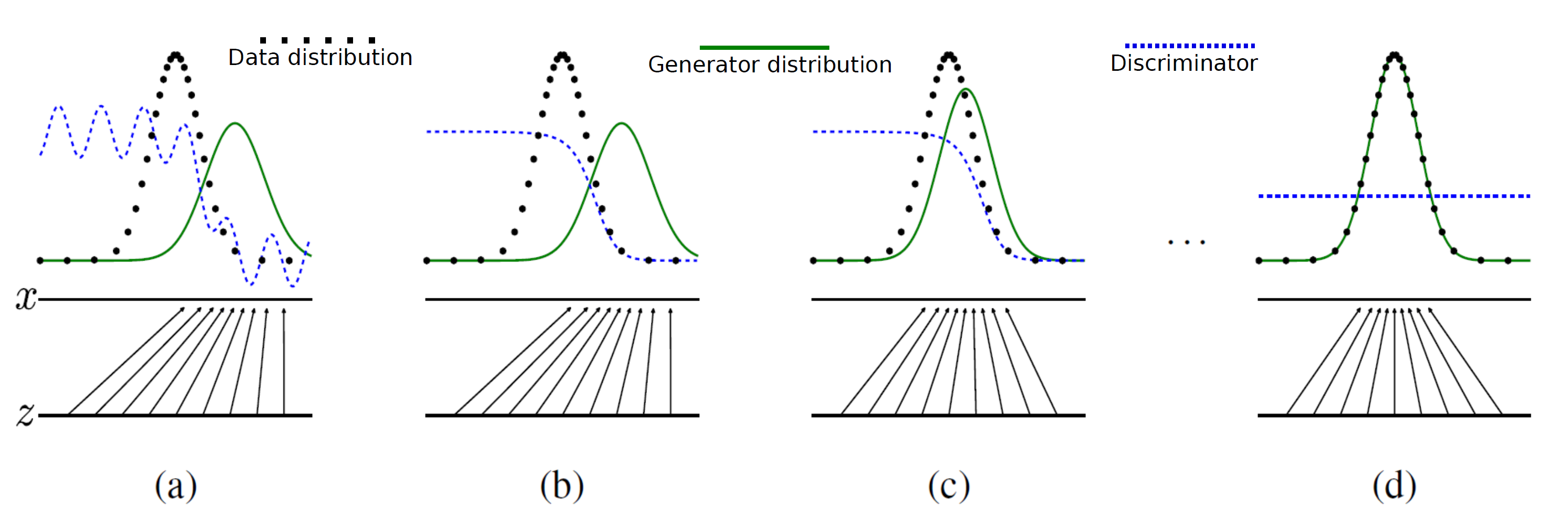
![\begin{equation*} \max_{\theta_d} \: (\mathbb{E}_{x\sim p_d} [log \: D_{\theta_d}(x)] + \mathbb{E}_{z\sim p_z}[log(1 - D_{\theta_d}(G_{\theta_g}(z))]) \end{equation*}](https://data-science-blog.com/wp-content/ql-cache/quicklatex.com-79cc0abf65c2730d44630b9e9078c251_l3.png "Rendered by QuickLaTeX.com")
![\begin{equation*} \min_{\theta_g} \: ( \mathbb{E}_{z\sim p_z}[log(1 - D_{\theta_d}(G_{\theta_g}(z))]) \end{equation*}](https://data-science-blog.com/wp-content/ql-cache/quicklatex.com-1a5f55cfe2aa160fc40a567edc93237d_l3.png "Rendered by QuickLaTeX.com")
 then the term
  has the dominant gradient and vice versa.
 , the generator is not well trained and producing low quality outputs therefore, it requires a dominant gradient for an efficient training. To fix this problem, the gradient ascent method is applied to maximize the modified generator’s objective:
![\begin{equation*} \max_{\theta_g} \: \mathbb{E}_{z\sim p_z}[log \: (D_{\theta_d}(G_{\theta_g}(z))] \end{equation*}](https://data-science-blog.com/wp-content/ql-cache/quicklatex.com-20421f265a98722e9835849d78d80269_l3.png "Rendered by QuickLaTeX.com")

 , where


 .
. .
. is a real symmetric matrix, there exist a rotation matrix
  such that
  , where
  and
and  .
.  are eigenvectors corresponding to
  respectively.
 .
. are positive semidefinite and real symmetric, which means you can always diagonalize
  , based on
  , such that

 , where
  . I also explained that PCA is a case where
  . Assume that you have got an orthonormal rotation matrix
  which diagonalizes
  which are in red in the figure below. Projecting a point
  on the new orthonormal basis is simple: you just have to multiply
  with
with  . Let
. Let  be
be  , and then
  . You can see
  are
are  respectively, and the left side of the figure below shows the idea. When you replace the orginal orthonormal basis
  with
with  to
to  by a rotation matrix
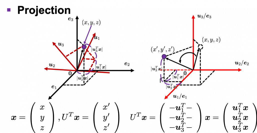
 , with one corner of the cube located at the origin point of those axes. The purple dot denotes the corner of the cube directly opposite the origin corner. The cube is rotated in three dimensions, with the origin corner staying fixed in place. After the rotation with a pivot at the origin, the edges of the cube are now aligned with a new set of orthogonal axes
  , shown in red. You might understand that more clearly with an equation:
 . In short this rotation means you keep relative position of
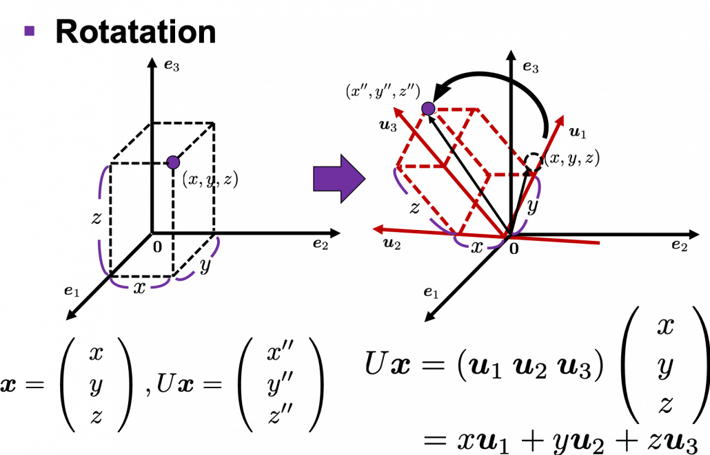
 is an orthonormal matrix and a vector
  , you can project
  or rotate it to
  , where
  and
and  . In other words
  , which means you can rotate back
  to the original point
  , where
  is a real symmetric matrix. The distribution of
  is quadratic curves whose center point covers the origin, and it is known that you can express this distribution in a much simpler way using eigenvectors. When you project this function on eigenvectors of
  for
for 


 . You can always diagonalize real symmetric matrices, so the formula implies that the shapes of quadratic curves largely depend on eigenvectors. We are going to see this in detail in the next section.
 denotes an inner product of
  .
.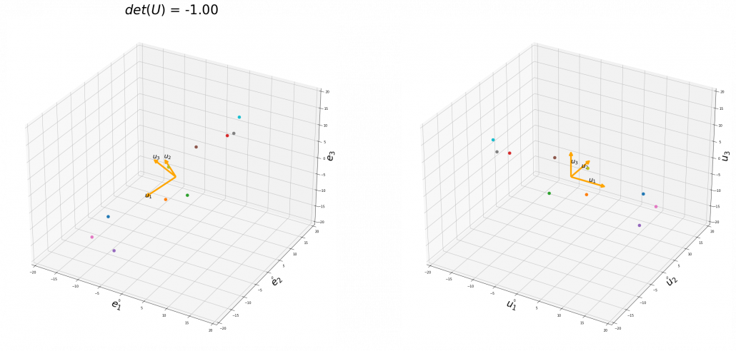
 , and in the case above
  was
was  , and you needed to flip one axis to make the determinant
  . In the example in the figure below, you can match the basis. This also can be generalized to higher dimensions, but that is also beyond the scope of this article series. If you are really interested, you should prepare some coffee and snacks and textbooks on linear algebra, and some weekends.
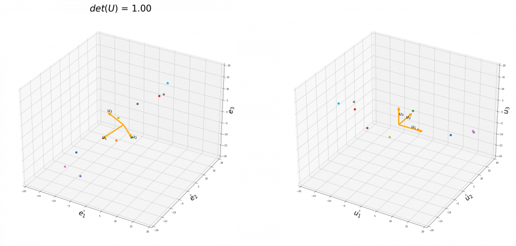
 , you can rotate the original ellipsoid so that it fits the data well.
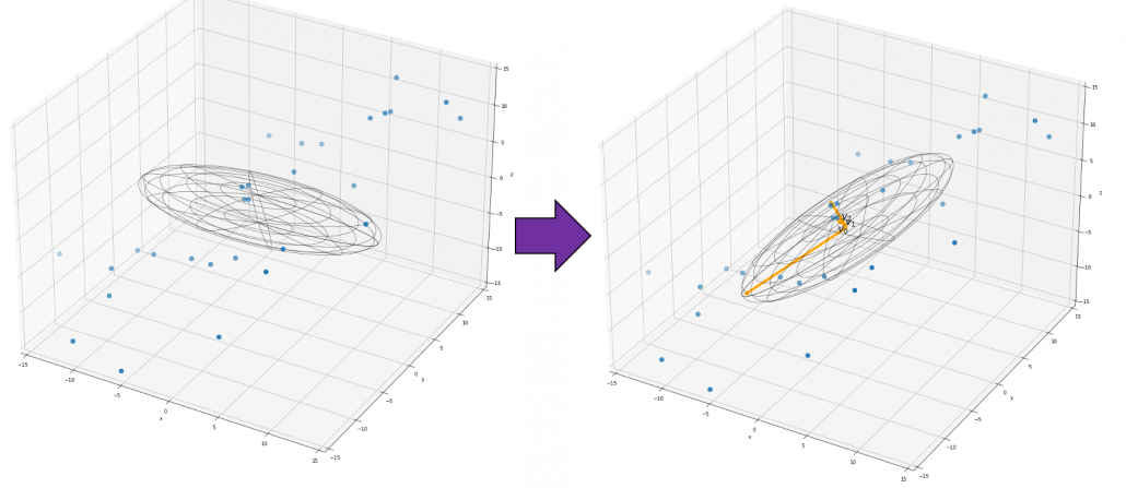
 , where
  , not
, not  .
. , where at least one of
  is not
  . Let
. Let  , then the quadratic curves can be simply denoted with a
  matrix
  as follows:
  ,
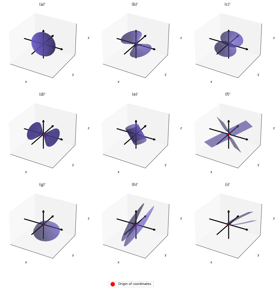
,  . General quadratic curves are roughly classified into the 9 types below.
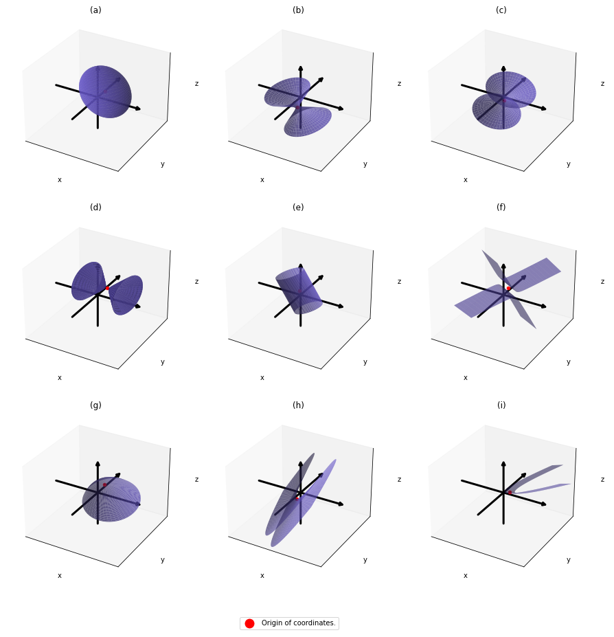
 .
.
 symmetric matrix
  , there exist orthogonal/orthonormal matrices
  , where
 . After you apply rotation by
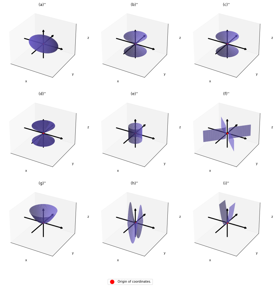


 .
. , those points
  . That means the rotation of the original quadratic curve with
  . Also it is known that when
  , with proper translations and rotations, the quadratic curve
  in a very simple way by projecting
  in two ways. One is a normal “functions”
  , and the others are “curves”
  . “Functions” get an input
  or
or  . However if you replace
  , you can interpret the “curves” as “functions” which are denoted as
  . This might sounds too obvious to you, and my point is you can visualize how values of “functions” change only when the inputs are 2 dimensional.
 real matrices
  have two eigenvalues
  , the distribution of quadratic curves can be roughly classified to the following three types.
 and
and  are positive or negative.
 , and thier curves look like the three graphs below.
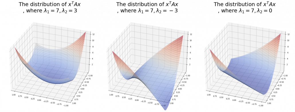
 ,
,  is the gradient of the direction. You can see that more clearly when you restrict the distribution of
  , which is classified to (g), the distribution looks like the left side, and if you restrict the distribution in the unit circle, the distribution looks like a bowl like the middle and the right side. When you move in the direction of
  , you can climb the bowl as as high as
  as high as
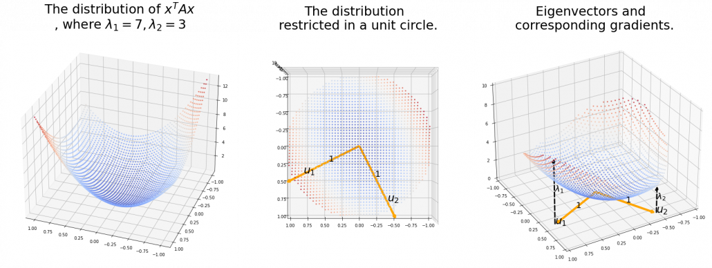
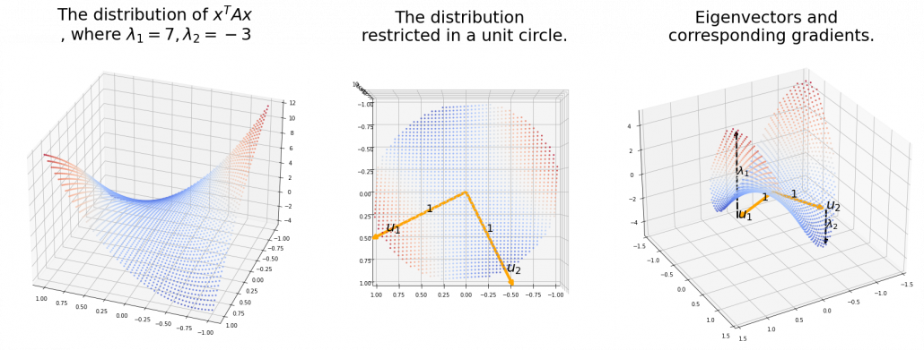
 . Hence, if you project
  , quadratic curves formed by a covariance matrix
 . This shows that you can re-weight
  , the coordinates of data projected projected on eigenvectors of
  , as I have visualized in the case of (g) type curve in the figure above.

 .
. the resulting cross section does not fit the original data well because the equation of the cross section is
  The figure below is an example of slicing the same
  , and the resulting cross section.
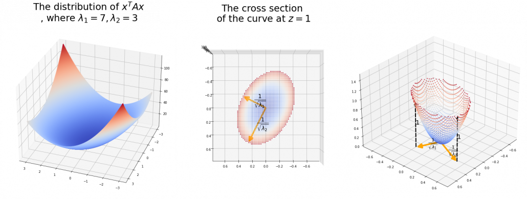
 is the radius of the ellipsoid corresponding to
  , where
  .
.  means you multiply each eigenvalue to each element of
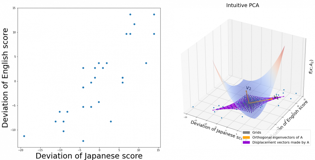
 , the ellipsoid which fits the distribution the best is
  . You might have seen the part
 somewhere else. It is the exponent of general Gaussian distributions:
 . It is known that the eigenvalues of
  are
are  , and eigenvectors corresponding to each eigenvalue are also
  respectively. Hence just as well as what we have seen, if you project
  on each eigenvector of
  be
be  be
be  , where
  . Just as we have seen,


 . Hence
 .
.