Interview – Knowledge Graphs and Semantic Technologies

“It’s incredibly empowering when data that is clear and understood – what we call ‘beautiful data’ – is available to the data workforce.”

Juan F. Sequeda is co-founder of Capsenta, a spin-off from his research, and Senior Director of Capsenta Labs. He is an expert on knowledge graphs, semantic web, semantic & graph data management and (ontology-based) data integration. In this interview Juan lets us know how SMEs can create value from data, what makes the Knowledge Graph so important and why CDOs and CIOs should use semantic technologies.

Data Science Blog: If you had to name five things that apply to SMEs as well as enterprises as they are on their journey through digital transformation: What are the most important steps to take in order to create value from data?

I would state four things:

  1. Focus on the business problem that needs to be solved instead of the technology.
  2. Getting value out of your data is a social-technical problem. Not everything can be solved by technology and automation. It is crucial to understand the social/human aspect of the problems.
  3. Avoid boiling the ocean. Be agile and iterate.
  4. Recall that it’s a marathon, not a sprint. Hence why you shouldn’t focus on boiling the ocean.

Data Science Blog: You help companies to make their company data meaningfully and thus increase their value. The magic word is the knowledge graph. What exactly is a Knowledge Graph?

Let’s recall that the term “knowledge graph”, that is being actively used today, was coined by Google in a 2012 blogpost. From an industry point of view, it’s a term that represents data integration, where not just entities but also relationships are first class citizens. In other words, it’s data integration based on graphs. That is why you see graph database companies use the term knowledge graph instead of data integration.

In the academic circle, there is a “debate” on what the term “knowledge graph” means. As academics, it’s clear that we should always strive to have well defined terms. Nevertheless, I find it ironic that academics are spending time debating on the definition of a term that appeared in a (marketing) blog post 7 years ago! I agree with Simeon Warner on this: “I care about putting more knowledge in my graph, instead of defining what is a knowledge graph”.

Whatever definition prevails, it should be open and inclusive.

On a final note, it is paramount that we remember our history in order to avoid reinventing the wheel. There is over half a century of research results that has led us to what we are calling Knowledge Graphs today. If you are interested, please check out our upcoming ISWC 2019 tutorial “Knowledge Graphs: How did we get here? A Half Day Tutorial on the History of Knowledge Graph’s Main Ideas“.

Data Science Blog: Speaking of Knowledge Graphs: According to SEMANTiCS 2019 Research and Innovation Chair Philippe Cudre-Mauroux the next generation of knowledge graphs will capture more detailed information. Towards which directions are you steering with gra.fo?

Gra.fo is a knowledge graph schema (i.e ontology) collaborative modeling tool combined with google doc style features such as real-time collaboration, comments, history and search.

Designing a knowledge graph schema is just the first step. You have to do something with it! The next step is to map the knowledge graph schema to underlying data sources in order to integrate data.

We are driving Gra.fo to also be a mapping management system. We recently released our first mapping features. You now have the ability to import existing R2RML mapping. The next step will be to create the mappings between relational databases and the schema all within Gra.fo. Furthermore, we will extend to support mappings from different types of sources.

Finally, there are so many features that our users are requesting. We are working on those and will also offer an API in order to empower users to develop their own apps and features.

Data Science Blog: At Capsenta, you are changing the way enterprises model, govern and integrate data. Put in brief, how can you explain the benefits of using semantic technologies and knowledge technologies to a CDO or CIO? Which clients could you serve and how did you help them?

Business users need to answer critical business questions quickly and accurately. However, the frequent bottleneck is the lack of understanding of the large and complex enterprise databases. Additionally, the IT experts who do understand are not always available. The ultimate goal is to empower business users to access the data in the way they think of their domain.

This is where Knowledge Graphs come into play.

At Capsenta, we use our Knowledge Graph technology to bridge this conceptualization gap between the complex and inscrutable data sources and the business intelligence and data analytic tools that domain experts use to answer critical business questions. Our goal is to deliver beautiful data so the business users and data scientist can run with the data.

We are helping large scale enterprises in e-commerce, oil & gas and life science industries to generate beautiful data.

Data Science Blog: What are reasons for which Knowledge Graphs should be part of any corporate strategy?

Graphs are very easy for people to understand and express the complex relationships between concepts. Bubbles and lines between them (i.e. a graph!) is what domain experts draw on the whiteboard all the time. We have even had C-level executives look at a Knowledge Graph and immediately see how it expresses a portion of their business and even offer suggestions for additional richness. Imagine that, C-level executives participating in an ontology engineering session because they understand the graph.

This is in sharp contrast to the data itself, which is almost always very difficult to understand and overwhelming in scope. Critical business value is available in a subset of this data. A Knowledge Graph bridges the conceptual gap between a critical portion of the inscrutable data itself and the business user’s view of their world.

It’s incredibly empowering when data that is clear and understood – what we call “beautiful data” – is available to the data workforce.

Data Science Blog: Data-driven process analyzes require interdisciplinary knowledge. What advice would you give to a process manager who wants to familiarize her-/himself with the topic?

Domain experts/business users frequently use multiple words/phrases to mean the same thing and also a specific phrase can mean different things to different people. Also, the domain experts/business users speak a very different language than the IT database owners.

How can the business have clear, accurate answers when there’s inconsistency in what people mean and are thinking?

This is the social problem of getting everyone on the same page. We’ve seen Knowledge Graphs dramatically help with this problem. The exercise of getting people to agree upon what they mean and encoding it in an intuitive Knowledge Graph is very powerful.

The Knowledge Graph also brings the IT stakeholders into the process by clarifying exactly what data or, typically, complex calculations of data is the actual, accurate value for each and every business concept and relationship expressed in the Knowledge Graph.

It is crucial to avoid boiling the ocean. That is why we have designed a pay-as-you-go methodology to start small and provide value as quickly and accurately as possible. Ideally, the team has available what we call a “Knowledge Engineer”. This is someone who can effectively speak with the business users/domain experts and also nerd out with the database folks.

About SEMANTiCS Conference

SEMANTiCS is an established knowledge hub where technology professionals, industry experts, researchers and decision makers can learn about new technologies, innovations and enterprise implementations in the fields of Linked Data and Semantic AI. Founded in 2005 the SEMANTiCS is the only European conference at the intersection of research and industry.

This year’s event is hosted by the Semantic Web Company, FIZ Karlsruhe – Leibniz Institute for Information Infrastructure GmbH, Fachhochschule St. Pölten Forschungs GmbH, KILT Competence Center am Institut für Angewandte Informatik e.V. and Vrije Universiteit Amsterdam.
Understanding Dropout and implementing it on MNIST dataset

Over-fitting is a major problem in deep learning and a plethora of techniques have been introduced to prevent it. One of the most effective one is called “dropout”.  Let’s use the analogy of a person going to gym for understanding this. Let’s say the person going to gym mostly uses his dominant arm, say his right arm to pick up weights. After some time, he notices that his dominant arm is developing a large muscle, but not the other arm. So, what can he do? Obviously, he needs to involve both his arms while training. Sometimes he should stop using his right arm, and use the left arm to lift weights and vice versa.

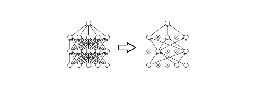
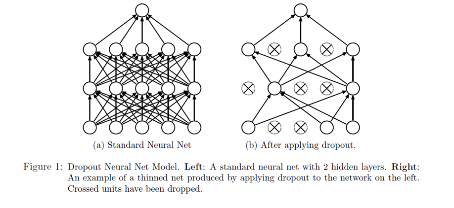
Something like this happens commonly in neural networks. Sometime one part of the network has very large weights and ends up dominating the training. While other part of the network remains weak and does not really play a role in the training. So, what dropout does to solve this problem, is it randomly shuts off some nodes and stop the gradients flowing through it. So, our forward and back propagation happen without those nodes. In that case the rest of the nodes need to pick up the slack and be more active in the training. We define a probability of the nodes getting dropped. For example, P=0.5 means there is a 50% chance a node will be dropped.

Figure 1 demonstrates the dropout technique, taken from the original research paper.

Dropout in a neuronal Net

Our network can never rely on any given node because it can be squashed at any given time. Hence the network is forced to learn redundant representation for everything to make sure at least some of the information remains. Redundant representation leads our network to be more robust. It also acts as ensemble of many networks, since at every epoch random nodes are dropped, each time our network will be different. Ensemble of different networks perform better than a single network since they capture more randomness. Please note, only non-output nodes are dropped.

Let’s, look at the python code to implement dropout in a neural network:


Interview: Does Business Intelligence benefit from Cloud Data Warehousing?

Interview with Ross Perez, Senior Director, Marketing EMEA at Snowflake

Read this article in German:
“Profitiert Business Intelligence vom Data Warehouse in der Cloud?”

Does Business Intelligence benefit from Cloud Data Warehousing?

Ross Perez is the Senior Director, Marketing EMEA at Snowflake. He leads the Snowflake marketing team in EMEA and is charged with starting the discussion about analytics, data, and cloud data warehousing across EMEA. Before Snowflake, Ross was a product marketer at Tableau Software where he founded the Iron Viz Championship, the world’s largest and longest running data visualization competition.
Data Science Blog: Ross, Business Intelligence (BI) is not really a new trend. In 2019/2020, making data available for the whole company should not be a big thing anymore. Would you agree?

BI is definitely an old trend, reporting has been around for 50 years. People are accustomed to seeing statistics and data for the company at large, and even their business units. However, using BI to deliver analytics to everyone in the organization and encouraging them to make decisions based on data for their specific area is relatively new. In a lot of the companies Snowflake works with, there is a huge new group of people who have recently received access to self-service BI and visualization tools like Tableau, Looker and Sigma, and they are just starting to find answers to their questions.

Data Science Blog: Up until today, BI was just about delivering dashboards for reporting to the business. The data warehouse (DWH) was something like the backend. Today we have increased demand for data transparency. How should companies deal with this demand?

Because more people in more departments are wanting access to data more frequently, the demand on backend systems like the data warehouse is skyrocketing. In many cases, companies have data warehouses that weren’t built to cope with this concurrent demand and that means that the experience is slow. End users have to wait a long time for their reports. That is where Snowflake comes in: since we can use the power of the cloud to spin up resources on demand, we can serve any number of concurrent users. Snowflake can also house unlimited amounts of data, of both structured and semi-structured formats.

Data Science Blog: Would you say the DWH is the key driver for becoming a data-driven organization? What else should be considered here?

Absolutely. Without having all of your data in a single, highly elastic, and flexible data warehouse, it can be a huge challenge to actually deliver insight to people in the organization.

Data Science Blog: So much for the theory, now let’s talk about specific use cases. In general, it matters a lot whether you are storing and analyzing e.g. financial data or machine data. What do we have to consider for both purposes?

Financial data and machine data do look very different, and often come in different formats. For instance, financial data is often in a standard relational format. Data like this needs to be able to be easily queried with standard SQL, something that many Hadoop and noSQL tools were unable to provide. Luckily, Snowflake is an ansi-standard SQL data warehouse so it can be used with this type of data quite seamlessly.

On the other hand, machine data is often semi-structured or even completely unstructured. This type of data is becoming significantly more common with the rise of IoT, but traditional data warehouses were very bad at dealing with it since they were optimized for relational data. Semi-structured data like JSON, Avro, XML, Orc and Parquet can be loaded into Snowflake for analysis quite seamlessly in its native format. This is important, because you don’t want to have to flatten the data to get any use from it.

Both types of data are important, and Snowflake is really the first data warehouse that can work with them both seamlessly.

Data Science Blog: Back to the common business use case: Creating sales or purchase reports for the business managers, based on data from ERP-systems such as Microsoft or SAP. Which architecture for the DWH could be the right one? How many and which database layers do you see as necessary?

The type of report largely does not matter, because in all cases you want a data warehouse that can support all of your data and serve all of your users. Ideally, you also want to be able to turn it off and on depending on demand. That means that you need a cloud-based architecture… and specifically Snowflake’s innovative architecture that separates storage and compute, making it possible to pay for exactly what you use.

Data Science Blog: Where would you implement the main part of the business logic for the report? In the DWH or in the reporting tool? Does it matter which reporting tool we choose?

The great thing is that you can choose either. Snowflake, as an ansi-Standard SQL data warehouse, can support a high degree of data modeling and business logic. But you can also utilize partners like Looker and Sigma who specialize in data modeling for BI. We think it’s best that the customer chooses what is right for them.

Data Science Blog: Snowflake enables organizations to store and manage their data in the cloud. Does it mean companies lose control over their storage and data management?

Customers have complete control over their data, and in fact Snowflake cannot see, alter or change any aspect of their data. The benefit of a cloud solution is that customers don’t have to manage the infrastructure or the tuning – they decide how they want to store and analyze their data and Snowflake takes care of the rest.

Data Science Blog: How big is the effort for smaller and medium sized companies to set up a DWH in the cloud? Does this have to be an expensive long-term project in every case?

The nice thing about Snowflake is that you can get started with a free trial in a few minutes. Now, moving from a traditional data warehouse to Snowflake can take some time, depending on the legacy technology that you are using. But Snowflake itself is quite easy to set up and very much compatible with historical tools making it relatively easy to move over.

Allgemeines über Geodaten

Dieser Artikel ist der Auftakt in einer Artikelserie zum Thema “Geodatenanalyse”.

Von den vielen Arten an Datensätzen, die öffentlich im Internet verfügbar sind, bin ich in letzter Zeit vermehrt über eine besonders interessante Gruppe gestolpert, die sich gleich für mehrere Zwecke nutzen lassen: Geodaten.

Gerade in wirtschaftlicher Hinsicht bieten sich eine ganze Reihe von Anwendungsfällen, bei denen Geodaten helfen können, Einblicke in Tatsachen zu erlangen, die ohne nicht möglich wären. Der wohl bekannteste Fall hierfür ist vermutlich die einfache Navigation zwischen zwei Punkten, die jeder kennt, der bereits ein Navigationssystem genutzt oder sich eine Route von Google Maps berechnen lassen hat.
Hiermit können nicht nur Fragen nach dem schnellsten oder Energie einsparensten (und damit gleichermaßen auch witschaftlichsten) Weg z. B. von Berlin nach Hamburg beantwortet werden, sondern auch die bestmögliche Lösung für Ausnahmesituationen wie Stau oder Vollsperrungen berechnet werden (ja, Stau ist, zumindest in der Theorie immer noch eine “Ausnahmesituation” ;-)).
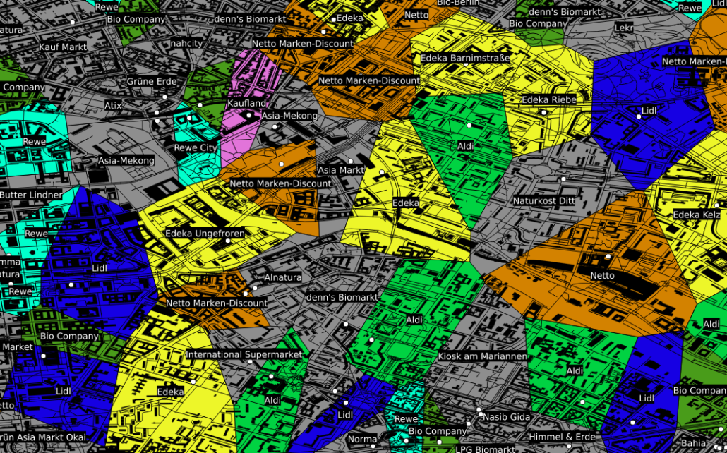
Neben dieser beliebten Art Geodaten zu nutzen, gibt es eine ganze Reihe weiterer Situationen in denen deren Nutzung hilfreich bis essentiell sein kann. Als Beispiel sei hier der Einzugsbereich von in Konkurrenz stehenden Einheiten, wie z. B. Supermärkten genannt. Ohne an dieser Stelle statistische Nachweise vorlegen zu können, kaufen (zumindest meiner persönlichen Beobachtung nach) die meisten Menschen fast immer bei dem Supermarkt ein, der am bequemsten zu erreichen ist und dies ist in der Regel der am nächsten gelegene. Besitzt man nun eine Datenbank mit der Information, wo welcher Supermarkt bzw. welche Supermarktkette liegt, kann man mit so genannten Voronidiagrammen recht einfach den jeweiligen Einzugsbereich der jeweiligen Supermärkte berechnen.
Entsprechende Karten können auch von beliebigen anderen Entitäten mit fester geographischer Position gezeichnet werden: Geldautomaten, Funkmasten, öffentlicher Nahverkehr, …

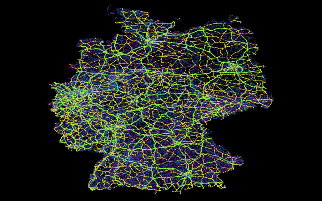
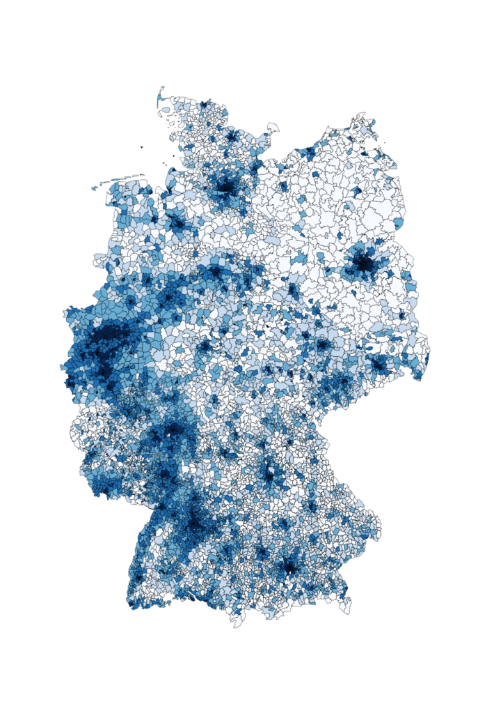
Ein anderes Beispiel, das für die Datenauswertung interessant ist, ist die kartographische Auswertung von Postleitzahlen. Diese sind in fast jedem Datensatz zu Kunden, Lieferanten, ect. vorhanden, bilden jedoch weder eine ordinale, noch eine sinnvolle kategorische Größe, da es viele tausend verschiedene gibt. Zudem ist auch eine einfache Gruppierung in gröbere Kategorien wie beispielsweise Postleitzahlen des Schemas 1xxxx oft kaum sinnvoll, da diese in aller Regel kein sinnvolles Mapping auf z. B. politische Gebiete – wie beispielsweise Bundesländer – zulassen. Ein Ausweg aus diesem Dilemma ist eine einfache kartographische Übersicht, welche die einzelnen Postleitzahlengebiete in einer Farbskala zeigt.

Im gezeigten Beispiel ist die Bevölkerungsdichte Deutschlands als Karte zu sehen. Hiermit wird schnell und übersichtlich deutlich, wo in Deutschland die Bevölkerung lokalisiert ist. Ähnliche Karten können beispielsweise erstellt werden, um Fragen wie “Wie ist meine Kundschaft verteilt?” oder “Wo hat die Werbekampange XYZ besonders gut funktioniert?” zu beantworten. Bezieht man weitere Daten wie die absolute Bevölkerung oder die Bevölkerungsdichte mit ein, können auch Antworten auf Fragen wie “Welchen Anteil der Bevölkerung habe ich bereits erreicht und wo ist noch nicht genutztes Potential?” oder “Ist mein Produkt eher in städtischen oder ländlichen Gebieten gefragt?” einfach und schnell gefunden werden.
Ohne die entsprechende geographische Zusatzinformation bleiben insbesondere Postleitzahlen leider oft als “nicht sinnvoll auswertbar” bei der Datenauswertung links liegen.
Eine ganz andere Art von Vorteil der Geodaten ist der educational point of view:
  • Wer erst anfängt, sich mit Datenbanken zu beschäftigen, findet mit Straßen, Postleitzahlen und Ländern einen deutlich einfacheren und vor allem besser verständlichen Zugang zu SQL als mit abstrakten Größen und Nummern wie ProductID, CustomerID und AdressID. Zudem lassen sich Geodaten nebenbei bemerkt mittels so genannter GeoInformationSystems (*gis-Programme), erstaunlich einfach und ansprechend plotten.
  • Wer sich mit SQL bereits ein wenig auskennt, kann mit den (beispielsweise von Spatialite oder PostGIS) bereitgestellten SQL-Funktionen eine ganze Menge über Datenbanken sowie deren Möglichkeiten – aber auch über deren Grenzen – erfahren.
  • Für wen relationale Datenbanken sowie deren Funktionen schon lange nichts Neues mehr darstellen, kann sich hier (selbst mit dem eigenen Notebook) erstaunlich einfach in das Thema “Bug Data” einarbeiten, da die Menge an öffentlich vorhandenen Geodaten z.B. des OpenStreetMaps-Projektes selbst in optimal gepackten Format vielen Dutzend GB entsprechen. Gerade die Möglichkeit, die viele *gis-Programme wie beispielsweise QGIS bieten, nämlich Straßen-, Schienen- und Stromnetze “on-the-fly” zu plotten, macht die Bedeutung von richtig oder falsch gesetzten Indices in verschiedenen Datenbanken allein anhand der Geschwindigkeit mit der sich die Plots aufbauen sehr eindrucksvoll deutlich.
Um an Datensätze zu kommen, reicht es in der Regel Google mit den entsprechenden Schlagworten zu versorgen.
Neben – um einen Vergleich zu nutzen – dem Brockhaus der Karten GoogleMaps gibt es beispielsweise mit dem OpenStreetMaps-Projekt einen freien Geodatensatz, welcher in diesem Kontext etwa als das Wikipedia der Karten zu verstehen ist.
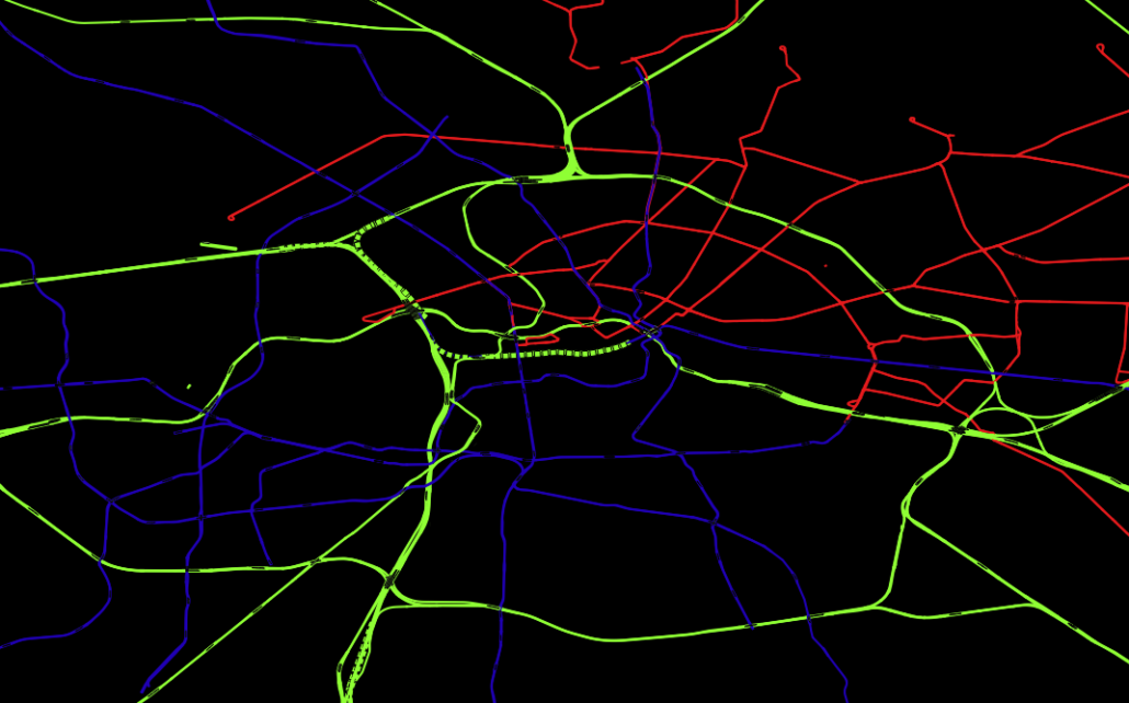
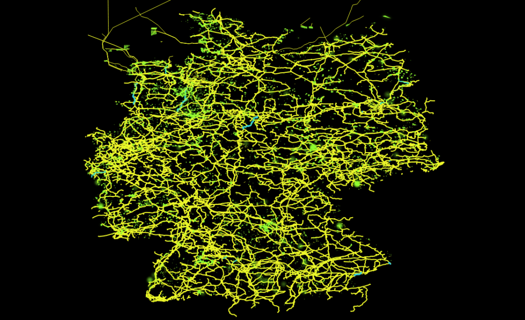
Hier findet man zum Beispiel Daten wie Straßen-, Schienen- oder dem Stromnetz, aber auch die im obigen Voronidiagramm eingezeichneten Gebäude und Supermärkte stammen aus diesem Datensatz. Hiermit lassen sich recht einfach just for fun interessante Dinge herausfinden, wie z. B., dass es in Deutschland ca. 28 Mio Gebäude gibt (ein SQL-Einzeiler), dass der Berliner Osten auch ca. 30 Jahre nach der Wende noch immer vorwiegend von der Tram versorgt wird, während im Westen hauptsächlich die U-Bahn fährt. Oder über welche Trassen der in der Nordsee von Windkraftanlagen erzeugte Strom auf das Festland kommt und von da aus weiter verteilt wird.
Eher grundlegende aber deswegen nicht weniger nützliche Datensätze lassen sich unter dem Stichwort “natural earth” finden. Hier sind Daten wie globale Küstenlinien, mittels Echolot ausgemessene Meerestiefen, aber auch von Menschen geschaffene Dinge wie Landesgrenzen und Städte sehr übersichtlich zu finden.
Im Grunde sind der Vorstellung aber keinerlei Grenzen gesetzt und fast alle denkbaren geographischen Fakten können, manchmal sogar live via Sattelit, mitverfolgt werden. So kann man sich beispielsweise neben aktueller Wolkenbedekung, Regenradar und globaler Oberflächentemperatur des Planeten auch das Abschmelzen der Polkappen seit 1970 ansehen (NSIDC) oder sich live die Blitzeinschläge auf dem gesamten Planeten anschauen – mit Vorhersage darüber, wann und wo der Donner zu hören ist (das funktioniert wirklich! Beispielsweise auf lightningmaps).
Kurzum Geodaten sind neben ihrer wirtschaftlichen Relevanz – vor allem für die Logistik – auch für angehende Data Scientists sehr aufschlussreich und ein wunderbares Spielzeug, mit dem man sich lange beschäftigen und eine Menge interessanter Dinge herausfinden kann.