The algorithm known as PCA and my taxonomy of linear dimension reductions
In one of my previous articles, I explained the importance of reducing dimensions. Principal Component Analysis (PCA) and Linear Discriminant Analysis (LDA) are the simplest types of dimension reduction algorithms. In upcoming articles of mine, you are going to see what these algorithms do. In conclusion, diagonalization, which I mentioned in the last article, is what these algorithms are all about, but still in this article I can mainly cover only PCA.
This article is largely based on the explanations in Pattern Recognition and Machine Learning by C. M. Bishop (which is often called “PRML”), and when you search “PCA” on the Internet, you will find more or less similar explanations. However I hope I can go some steps ahead throughout this article series. I mean, I am planning to also cover more generalized versions of PCA, meanings of diagonalization, the idea of subspace. I believe this article series is also effective for refreshing your insight into linear algebra.
*This is the third article of my article series “Illustrative introductions on dimension reduction.”
1. My taxonomy on linear dimension reduction
*If you soon want to know what the algorithm called “PCA” is, you should skip this section for now to avoid confusion.
Out of the two algorithms I mentioned, PCA is especially important and you would see the same or similar ideas in various fields such as signal processing, psychology, and structural mechanics. However in most cases, the word “PCA” refers to one certain algorithm of linear dimension reduction. Most articles or study materials only mention the “PCA,” and this article is also going to cover only the algorithm which most poeple call “PCA.” However I found that PCA is only one branch of linear dimension reduction algorithms.
*From now on all the terms “PCA” in this article means the algorithm known as PCA unless I clearly mention the generalized KL transform.

*This chart might be confusing to you. According to PRML, PCA and KL transform is identical. PCA has two formulations, maximum variance formulation and minimum error formulation, and they can give the same result. However according to a Japanese textbook, which is very precise about this topic, KL transform has two formulations, and what we call PCA is based on maximum variance formulation. I am still not sure about correct terminology, but in this article I am going to call the most general algorithm “generalized KL transform,” I mean the root of the chart above.
*Most materials just explain the most major PCA, but if you consider this generalized KL transform, I can introduce an intriguing classification algorithm called subspace method. This algorithm was invented in Japan, and this is not so popular in machine learning textbooks in general, but learning this method would give you better insight into the idea of multidimensional space in machine learning. In the future, I am planning to cover this topic in this article series.
2. PCA
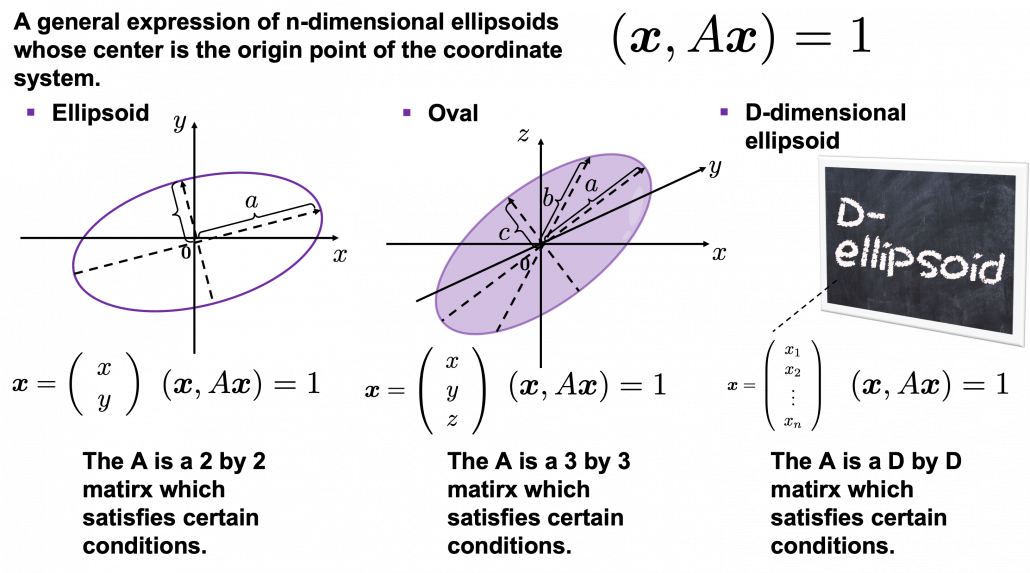
When someones mention “PCA,” I am sure for the most part that means the algorithm I am going to explain in the rest of this article. The most intuitive and straightforward way to explain PCA is that, PCA (Principal Component Analysis) of two or three dimensional data is fitting an oval to two dimensional data or fitting an ellipsoid to three dimensional data. You can actually try to plot some random dots on a piece of paper, and draw an oval which fits the dots the best. Assume that you have these 2 or 3 dimensional data below, and please try to put an oval or an ellipsoid to the data.

I think this is nothing difficult, but I have a question: what was the logic behind your choice?
Some might have roughly drawn its outline. Formulas of “the surface” of general ellipsoids can be explained in several ways, but in this article you only have to consider ellipsoids whose center is the origin point of the coordinate system. In PCA you virtually shift data so that the mean of the data comes to the origin point of the coordinate system. When  is a certain type of
  matrix, the formula of a D-dimensional ellipsoid whose center is identical to the origin point is as follows:
  , where
  . As is always the case with formulas in data science, you can visualize such ellipsoids if you are talking about 1, 2, or 3 dimensional data like in the figure below, but in general D-dimensional space, it is theoretical/imaginary stuff on blackboards.
*In order to explain the conditions which the matrix has to hold, I need another article, so for now please just assume that the is a kind of magical matrix.
You might have seen equations of 2 or 3 dimensional ellipsoids in the following way:  , where
  or
or  , where
  . These are special cases of the equation , where
  . In this case the axes of ellipsoids the same as those of the coordinate system. Thus in this simple case,
  or
or  .
.
I am going explain these equations in detail in the upcoming articles. But thre is one problem: how would you fit an ellipsoid when a data distribution does not look like an ellipsoid?
In fact we have to focus more on another feature of ellipsoids: all the axes of an ellipsoid are orthogonal. In conclusion the axes of the ellipsoids are more important in PCA, so I do want you to forget about the surface of ellipsoids for the time being. You might get confused if you also think about the surface of ellipsoid now. I am planning to cover this topic in the next article. I hope this article, combined with the last one and the next one, would help you have better insight into the ideas which frequently appear in data science or machine learning context.
3. Fitting orthogonal axes on data
*If you have no trouble reading the chapter 12.1 of PRML, you do not need to this section or maybe even this article, but I hope at least some charts or codes of mine would enhance your understanding on this topic.
*I must admit I wrote only the essence of PCA formulations. If that seems too abstract to you, you should just breifly read through this section and go to the next section with a more concrete example. If you are confused, there should be other good explanations on PCA on the internet, and you should also check them. But at least the visualization of PCA in the next section would be helpful.
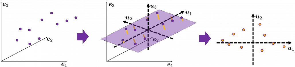
As I implied above, all the axes of ellipsoids are orthogonal, and selecting the orthogonal axes which match data is what PCA is all about. And when you choose those orthogonal axes, it is ideal if the data look like an ellipsoid. Simply putting we want the data to “swell” along the axes.
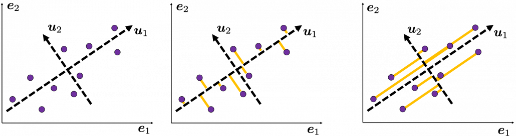
Then let’s see how to let them “swell,” more mathematically. Assume that you have 2 dimensional data plotted on a coordinate system  as below (The samples are plotted in purple). Intuitively, the data “swell” the most along the vector
  . Also it is clear that
  is the only vector orthogonal to . We can expect that the new coordinate system
  expresses the data in a better way, and you you can get new coordinate points of the samples by projecting them on new axes as done with yellow lines below.
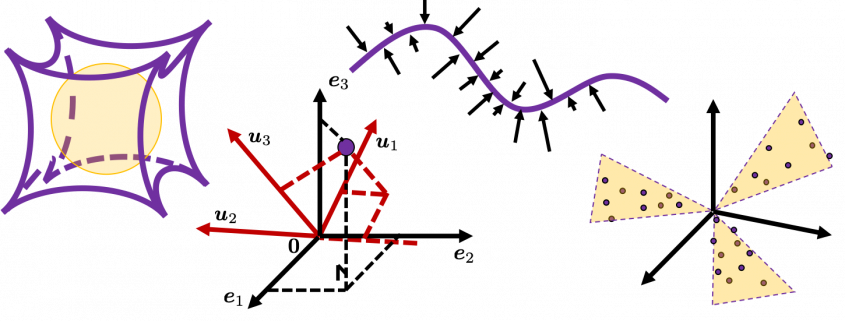
Next, let’s think about a case in 3 dimensional data. When you have 3 dimensional data in a coordinate system  as below, the data “swell” the most also along . And the data swells the second most along . The two axes, or vectors span the plain in purple. If you project all the samples on the plain, you will get 2 dimensional data at the right side. It is important that we did not consider the third axis. That implies you might be able to display the data well with only 2 dimensional sapce, which is spanned by the two axes
  .
.
Thus the problem is how to calculate such axis . We want the variance of data projected on to be the biggest. The coordinate of  on the axis . The coordinate of a data point on the axis is calculated by projecting on . In data science context, such projection is synonym to taking an inner product of and , that is calculating
  .
.
*Each element of is the coordinate of the data point in the original coordinate system. And the projected data on whose coordinates are 1-dimensional correspond to only one element of transformed data.
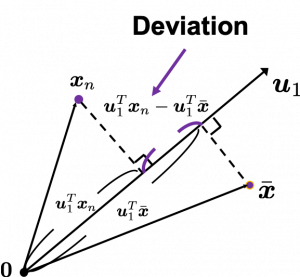
To calculate the variance of projected data on , we just have to calculate the mean of variances of 1-dimensional data projected on . Assume that  is the mean of data in the original coordinate, then the deviation of
  on the axis is calculated as
  , as shown in the figure. Hence the variance, I mean the mean of the deviation on is
  , where
  is the total number of data points. After some deformations, you get the next equation
  , where
  .
.  is known as a covariance matrix.
We are now interested in maximizing the variance of projected data on  , and for mathematical derivation we need some college level calculus, so if that is too much for you, you can skip reading this part till the next section.
We now want to calculate with which is its maximum value. General  including are just coordinate axes after PCA, so we are just interested in their directions. Thus we can set one constraint
  . Introducing a Lagrange multiplier, we have only to optimize next problem:
  . In conclusion
  satisfies
  . If you have read my last article on eigenvectors, you wold soon realize that this is an equation for calculating eigenvectors, and that means is one of eigenvectors of the covariance matrix S. Given the equation of eigenvector the next equation holds
  . We have seen that
  is a the variance of data when projected on a vector , thus the eigenvalue
  is the biggest variance possible when the data are projected on a vector.
Just in the same way you can calculate the next biggest eigenvalue  , and it it the second biggest variance possible, and in this case the date are projected on , which is orthogonal to . As well you can calculate orthogonal 3rd 4th …. Dth eigenvectors.
*To be exact I have to explain the cases where we can get such D orthogonal eigenvectors, but that is going to be long. I hope I can to that in the next article.
4. Practical three dimensional example of PCA
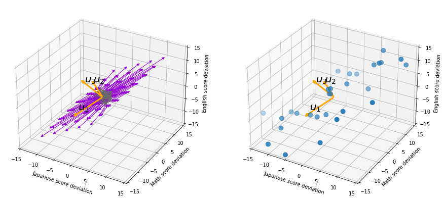
We have seen that PCA is sequentially choosing orthogonal axes along which data points swell the most. Also we have seen that it is equal to calculating eigenvalues of the covariance matrix of the data from the largest to smallest one. From now on let’s work on a practical example of data. Assume that we have 30 students’ scores of Japanese, math, and English tests as below.
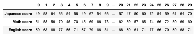
* I think the subject “Japanese” is equivalent to “English” or “language art” in English speaking countries, and maybe “Deutsch” in Germany. This example and the explanation are largely based on a Japanese textbook named 「これなら分かる応用数学教室 最小二乗法からウェーブレットまで」. This is a famous textbook with cool and precise explanations on mathematics for engineering. Partly sharing this is one of purposes of this article.
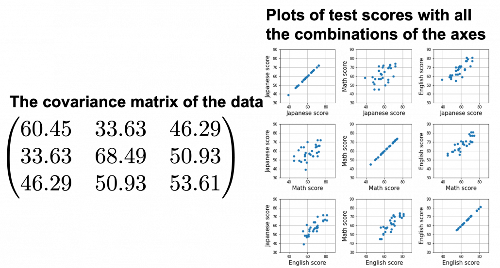
At the right side of the figure below is plots of the scores with all the combinations of coordinate axes. In total 9 inverse graphs are symmetrically arranged in the figure, and it is easy to see that English & Japanese or English and math have relatively high correlation. The more two axes have linear correlations, the bigger the covariance between them is.
In the last article, I visualized the eigenvectors of a  matrix
  , and in fact the matrix is just a constant multiplication of this covariance matrix. I think now you understand that PCA is calculating the orthogonal eigenvectors of covariance matrix of data, that is diagonalizing covariance matrix with orthonormal eigenvectors. Hence we can guess that covariance matrix enables a type of linear transformation of rotation and expansion and contraction of vectors. And data points swell along eigenvectors of such matrix.
Then why PCA is useful? In order to see that at first, for simplicity assume that  denote Japanese, Math, English scores respectively. The mean of the data is
  , and the covariance matrix of data in the original coordinate system is
  . The eigenvalues of
  are
are  , and
, and  , and their corresponding unit eigenvectors are
  respectively.
  is an orthonormal matrix, where
  . As I explained in the last article, you can diagonalize with
  :
:  .
.
In order to see how PCA is useful, assume that  .
.
Let’s take a brief look at what a linear transformation by  means. Each element of
  denotes coordinate of the data point in the original coordinate system (In this case the original coordinate system is composed of
  , and
, and  ).
).  enables a rotation of a rigid body, which means the shape or arrangement of data will not change after the rotation, and enables a reverse rotation of the rigid body.
*Roughly putting, if you hold a bold object such as a metal ball and rotate your arm, that is a rotation of a rigid body, and your shoulder is the origin point. On the other hand, if you hold something soft like a marshmallow, it would be squashed in your hand, and that is not a not a rotation of a rigid body.
![]()
You can rotate with like  , and
, and  is the coordinate of projected on the axis .
Let’s see this more visually. Assume that the data point is a purple dot and its position is expressed in the original coordinate system spanned by black arrows . By multiplying with , the purple point is projected on the red axes respectively, and the product  denotes the coordinate point of the purple point in the red coordinate system. is rotated this way, but for now I think it is better to think that the data are projected on new coordinate axes rather than the data themselves are rotating.
Now that we have seen what rotation by means, you should have clearer image on what means.  denotes the coordinates of data projected on new axes
  , which are unit eigenvectors of . In the coordinate system spanned by the eigenvectors, the data distribute like below.
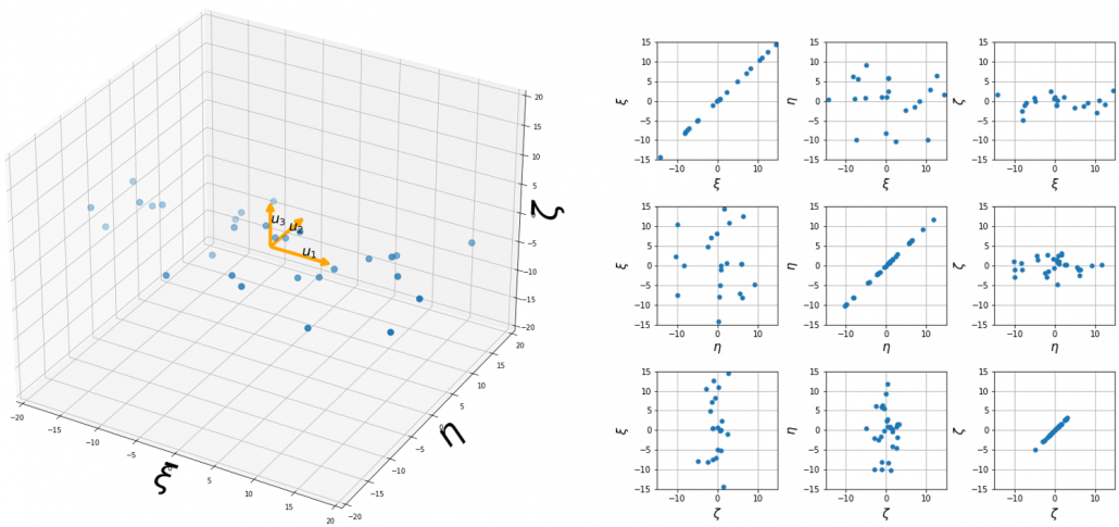
By multiplying from both sides of the equation above, we get  , which means you can express deviations of the original data as linear combinations of the three factors
  , and
, and  . We expect that those three factors contain keys for understanding the original data more efficiently. If you concretely write down all the equations for the factors:
  ,
,  , and
, and  . If you examine the coefficients of the deviations
  , and
, and  , we can observe that
  almost equally reflects the deviation of the scores of all the subjects, thus we can say is a factor indicating one’s general academic level. When it comes to Japanese and Math scores are important, so we can guess that this factor indicates whether the student is at more of “scientific side” or “liberal art side.” In the same way relatively makes much of one’s English score, so it should show one’s “internationality.” However the covariance of the data
  is
is  . You can see does not vary from students to students, which means it is relatively not important to describe the tendency of data. Therefore for dimension reduction you can cut off the factor .
*Assume that you can apply PCA on D-dimensional data and that you get  , where
  . The variance of data projected on new D-dimensional coordinate system is


 . This means that in the new coordinate system after PCA, covariances between any pair of variants are all zero.
*As I mentioned is a rotation of a rigid body, and is the reverse rotation, hence  .
.
Hence you can approximate the original 3 dimensional data on the coordinate system  from the reduced two dimensional coordinate system with the following equation:
  . Then it mathematically clearer that we can express the data with two factors: “how smart the student is” and “whether he is at scientific side or liberal art side.”
We can observe that eigenvalue  is a statistic which indicates how much the corresponding can express the data,
  is called the contribution ratio of eigenvector . In the example above, the contribution ratios of
  and
and  are respectively
  ,
,  ,
,  . You can decide how many degrees of dimensions you reduce based on this information.
Appendix: Playing with my toy PCA on MNIST dataset
Applying “so called” PCA on MNIST dataset is a super typical topic that many other tutorial on PCA also introduce, but I still recommend you to actually implement, or at least trace PCA implementation with MNIST dataset without using libraries like scikit-learn. While reading this article I recommend you to actually run the first and the second code below. I think you can just copy and paste them on your tool to run Python, installing necessary libraries. I wrote them on Jupyter Notebook.
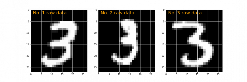
In my implementation, in the simple configuration part you can set the USE_ALL_NUMBERS as True or False boolean. If you set it as True, you apply PCA on all the data of numbers from 0 to 9. If you set it as True, you can specify which digit to apply PCA on. In this article, I show the results results of PCA on the data of digit ‘3.’ The first three images of ‘3’ are as below.
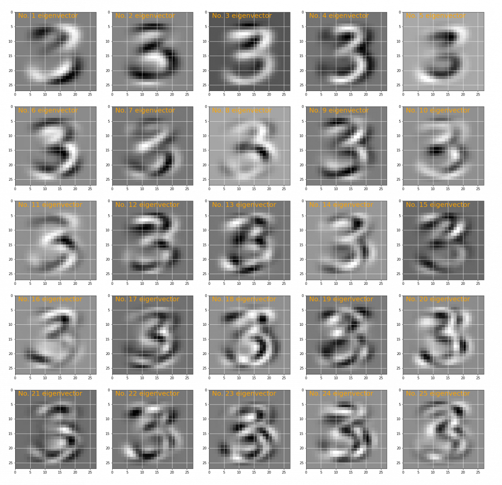
You have to keep it in mind that the data are all shown as 28 by 28 pixel grayscale images, but in the process of PCA, they are all processed as 28 * 28 = 784 dimensional vectors. After applying PCA on the 784 dimensional vectors of images of ‘3,’ the first 25 eigenvectors are as below. You can see that at the beginning the eigenvectors partly retain the shapes of ‘3,’ but they are distorted as the eigenvalues get smaller. We can guess that the latter eigenvalues are not that helpful in reconstructing the shape of ‘3.’
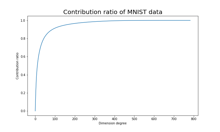
Just as we saw in the last section, you you can cut off axes of eigenvectors with small eigenvalues and reduce the dimension of MNIST data. The figure below shows how contribution ratio of MNIST data grows. You can see that around 200 dimension degree, the contribution ratio reaches around 0.95. Then we can guess that even if we reduce the dimension of MNIST from 784 to 200 we can retain the most of the structure of original data.
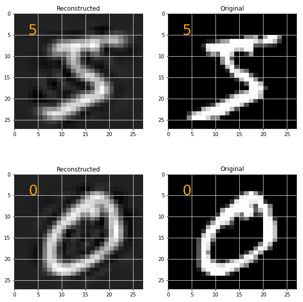
Some results of reconstruction of data from 200 dimensional space are as below. You can set how many images to display by adjusting NUMBER_OF_RESULTS in the code. And if you set LATENT_DIMENSION as 784, you can completely reconstruct the data.
* I make study materials on machine learning, sponsored by DATANOMIQ. I do my best to make my content as straightforward but as precise as possible. I include all of my reference sources. If you notice any mistakes in my materials, including grammatical errors, please let me know (email: yasuto.tamura@datanomiq.de). And if you have any advice for making my materials more understandable to learners, I would appreciate hearing it.
*I attatched the codes I used to make the figures in this article. You can just copy, paste, and run, sometimes installing necessary libraries.
|
1 2 3 4 5 6 7 8 9 10 11 12 13 14 15 16 17 18 19 20 21 22 23 24 25 26 27 28 29 30 31 32 33 34 35 36 37 38 39 40 41 42 43 44 45 46 47 48 49 50 51 52 53 54 55 56 57 58 59 60 61 62 63 64 65 |
import numpy as np import keras # There should be some other simpler ways to download MNIST dataset, # but at least on my laptop, this was the easiest. import matplotlib.pyplot as plt # Configuration part USE_ALL_NUMBERS = False WHICH_NUMBER = 3 W_RAW_DATA = 3 H_RAW_DATA = 1 # 1<= W_RAW_DATA*H_RAW_DATA <= 28*28 H_EIGENVECTORS = 5 W_EIGENVECTORS = 5 # 1<= H_EIGENVECTORS*W_EIGENVECTORS <= 28*28 # Preparing data mnist = keras.datasets.mnist (data, labels), (_, _) = mnist.load_data() data = data.reshape([-1, 28*28]) if USE_ALL_NUMBERS: data_to_use = data labels_to_use = labels else: data_to_use = data[labels==WHICH_NUMBER] labels_to_use = labels[labels==WHICH_NUMBER] # Applying PCA to the data to use ave = np.mean(data_to_use, axis=0) covariance_matrix = np.dot((data_to_use - ave).T, (data_to_use - ave)) eigen_values, eigen_vectors = np.linalg.eig(covariance_matrix) sorted_index = eigen_values.argsort()[::-1] eigen_values=eigen_values[sorted_index] eigen_vectors=eigen_vectors[:, sorted_index].real plt.figure(1, figsize=(5*W_RAW_DATA, 5*H_RAW_DATA)) plt.gray() for id in range(1*3): plt.subplot(1, 3, id + 1) img = data_to_use[id, :].reshape(28, 28) plt.pcolor(img) plt.text(1, 2, "No. %d raw data" % (id+1), color='orange', fontsize=20) plt.xlim(0, 27) plt.ylim(27, 0) plt.grid('on', color='white') plt.savefig("MNIST_raw_data_3.png") plt.show() plt.figure(1, figsize=(W_EIGENVECTORS*5, H_EIGENVECTORS*5)) plt.gray() for id in range(H_EIGENVECTORS*W_EIGENVECTORS): plt.subplot(H_EIGENVECTORS, W_EIGENVECTORS, id + 1) img = eigen_vectors.T[id, :].reshape(28, 28) plt.pcolor(img) plt.text(1, 2, "No. %d eigenvector" % (id+1), color='orange', fontsize=20) plt.xlim(0, 27) plt.ylim(27, 0) plt.grid('on', color='white') plt.savefig("MNIST_PCA_eigenvectors.png") plt.show() |
|
1 2 3 4 5 6 7 8 9 10 11 12 13 14 15 16 17 18 19 20 21 22 23 24 25 26 27 28 29 30 31 32 33 34 35 36 37 38 39 40 41 42 43 44 45 46 47 48 49 50 51 52 53 54 55 56 57 58 59 60 61 62 63 64 65 66 67 |
import numpy as np import keras import matplotlib.pyplot as plt # Configuration part USE_ALL_NUMBERS = True NUMBER_OF_RESULTS = 10 LATENT_DIMENSION = 95 # From 1 to 28*28=784 # Preparing data mnist = keras.datasets.mnist (data, labels), (_, _) = mnist.load_data() data = data.reshape([-1, 28*28]) if USE_ALL_NUMBERS: data_to_use = data labels_to_use = labels else: data_to_use = data[labels==WHICH_NUMBER] labels_to_use = labels[labels==WHICH_NUMBER] # Applying PCA to the data to use ave = np.mean(data_to_use, axis=0) covariance_matrix = np.dot((data_to_use - ave).T, (data_to_use - ave)) eigen_values, eigen_vectors = np.linalg.eig(covariance_matrix) sorted_index = eigen_values.argsort()[::-1] eigen_values=eigen_values[sorted_index] eigen_vectors=eigen_vectors[:, sorted_index].real contribution_ratio = np.array([eigen_values[:i].sum()/eigen_values.sum() for i in range(len(eigen_values))]) plt.figure(1, figsize=(10, 6)) plt.title("Contribution ratio of MNIST data", fontsize=20) plt.plot(np.arange(len(eigen_values)), contribution_ratio) plt.xlabel('Dimension degree') plt.ylabel('Contribution ratio') plt.show() U_reduced = eigen_vectors[:, :LATENT_DIMENSION] data_transformed = np.dot(eigen_vectors.T, data_to_use.T).T data_transformed_and_reduced = data_transformed[:, :LATENT_DIMENSION] x_recomposed = np.dot(U_reduced, data_transformed_and_reduced.T).T plt.figure(1, figsize=(2*5, NUMBER_OF_RESULTS*5)) plt.subplots_adjust(hspace=0.4) plt.gray() for id in range(NUMBER_OF_RESULTS*2): plt.subplot(NUMBER_OF_RESULTS, 2, id + 1) if(id % 2 == 0): img = x_recomposed[id//2, :].reshape(28, 28) plt.title("Reconstructed") else: img = data_to_use[id//2, :].reshape(28, 28) plt.title("Original") plt.pcolor(img) plt.text(3, 5, "%d" % (labels_to_use[id//2]), color='orange', fontsize=28) plt.xlim(0, 27) plt.ylim(27, 0) plt.grid('on', color='white') plt.show() |
|
1 2 3 4 5 6 7 8 9 10 11 12 13 14 15 16 17 18 19 20 21 22 23 24 25 26 27 28 29 30 31 32 33 34 35 36 37 38 39 40 41 42 43 44 45 46 47 48 49 50 51 52 53 54 55 56 57 58 59 60 61 62 63 64 65 66 67 68 69 70 71 72 73 74 75 76 77 78 79 80 81 82 83 84 85 86 87 88 89 90 91 92 93 94 95 96 97 98 99 100 101 102 103 104 105 106 107 108 109 110 111 112 113 114 115 116 117 118 119 120 121 122 123 124 125 126 127 128 129 130 131 132 133 134 135 136 137 138 139 140 141 142 143 144 145 146 147 148 149 150 151 152 153 154 155 156 157 |
import numpy as np import matplotlib.pyplot as plt from mpl_toolkits.mplot3d.proj3d import proj_transform from mpl_toolkits.mplot3d.axes3d import Axes3D from matplotlib.text import Annotation from matplotlib.patches import FancyArrowPatch import matplotlib.patches as mpatches class Annotation3D(Annotation): def __init__(self, text, xyz, *args, **kwargs): super().__init__(text, xy=(0,0), *args, **kwargs) self._xyz = xyz def draw(self, renderer): x2, y2, z2 = proj_transform(*self._xyz, renderer.M) self.xy=(x2,y2) super().draw(renderer) def _annotate3D(ax,text, xyz, *args, **kwargs): '''Add anotation `text` to an `Axes3d` instance.''' annotation= Annotation3D(text, xyz, *args, **kwargs) ax.add_artist(annotation) setattr(Axes3D,'annotate3D',_annotate3D) class Arrow3D(FancyArrowPatch): def __init__(self, x, y, z, dx, dy, dz, *args, **kwargs): super().__init__((0,0), (0,0), *args, **kwargs) self._xyz = (x,y,z) self._dxdydz = (dx,dy,dz) def draw(self, renderer): x1,y1,z1 = self._xyz dx,dy,dz = self._dxdydz x2,y2,z2 = (x1+dx,y1+dy,z1+dz) xs, ys, zs = proj_transform((x1,x2),(y1,y2),(z1,z2), renderer.M) self.set_positions((xs[0],ys[0]),(xs[1],ys[1])) super().draw(renderer) def _arrow3D(ax, x, y, z, dx, dy, dz, *args, **kwargs): '''Add an 3d arrow to an `Axes3D` instance.''' arrow = Arrow3D(x, y, z, dx, dy, dz, *args, **kwargs) ax.add_artist(arrow) setattr(Axes3D,'arrow3D',_arrow3D) jp_score = np.array([49, 58, 64, 65, 54, 58, 49, 67, 54, 66, 72, 66, 54, 64, 39, 56, 54, 56, 48, 57, 57, 47, 50, 60, 72, 54, 59, 61, 64, 70]) math_score = np.array([51, 58, 56, 70, 45, 70, 45, 69, 66, 73, 71, 72, 57, 53, 58, 57, 71, 63, 53, 62, 62, 59, 57, 65, 74, 66, 72, 50, 69, 60]) en_score = np.array([59, 63, 68, 77, 55, 71, 57, 79, 66, 81, 81, 77, 62, 67, 56, 62, 70, 67, 61, 70, 68, 59, 61, 71, 77, 66, 70, 59, 68, 71]) mean_vector = np.array([jp_score.mean(), math_score.mean(), en_score.mean()]) data_matrix = np.c_[jp_score, math_score, en_score] data_mean_reduced = data_matrix - mean_vector covariance_matrix = np.dot(data_mean_reduced.T, data_mean_reduced) / len(jp_score) eigen_values, eigen_vectors = np.linalg.eig(covariance_matrix) sorted_index = eigen_values.argsort()[::-1] eigen_values=eigen_values[sorted_index] eigen_vectors=eigen_vectors[:, sorted_index] eigen_values, eigen_vectors = np.linalg.eig(covariance_matrix) sorted_idx = eigen_values.argsort()[::-1] eigen_values = eigen_values[sorted_idx] eigen_vectors = eigen_vectors[:,sorted_idx] eigen_vectors = eigen_vectors.astype(float) subject_labels = ['Japanese score deviation', 'Math score deviation', 'English score deviation'] const_range = 2 X = np.arange(-const_range, const_range + 1, 1) Y = np.arange(-const_range, const_range + 1, 1) Z = np.arange(-const_range, const_range + 1, 1) U_x, U_y, U_z = np.meshgrid(X, Y, Z) V_x = np.zeros((len(U_x), len(U_y), len(U_z))) V_y = np.zeros((len(U_x), len(U_y), len(U_z))) V_z = np.zeros((len(U_x), len(U_y), len(U_z))) temp_vec = np.zeros((1, 3)) W_x = np.zeros((len(U_x), len(U_y), len(U_z))) W_y = np.zeros((len(U_x), len(U_y), len(U_z))) W_z = np.zeros((len(U_x), len(U_y), len(U_z))) fig = plt.figure(figsize=(15, 15)) grid_range = 15 for idx in range(2): if idx ==0: ax = fig.add_subplot(1, 2, idx + 1, projection='3d') for i in range(len(U_x)): for j in range(len(U_x)): for k in range(len(U_x)): temp_vec[0][0] = U_x[i][j][k] temp_vec[0][1] = U_y[i][j][k] temp_vec[0][2] = U_z[i][j][k] temp_vec[0] = np.dot(covariance_matrix, temp_vec[0]) V_x[i][j][k] = temp_vec[0][0] V_y[i][j][k] = temp_vec[0][1] V_z[i][j][k] = temp_vec[0][2] W_x[i][j][k] = (V_x[i][j][k] - U_x[i][j][k]) / (2*grid_range) W_y[i][j][k] = (V_y[i][j][k] - U_y[i][j][k]) / (2*grid_range) W_z[i][j][k] = (V_z[i][j][k] - U_z[i][j][k]) / (2*grid_range) ax.arrow3D(0, 0, 0, U_x[i][j][k], U_y[i][j][k], U_z[i][j][k], mutation_scale=10, arrowstyle="-|>", fc='dimgrey', ec='dimgrey') #ax.arrow3D(0, 0, 0, # V_x[i][j][k], V_y[i][j][k], V_z[i][j][k], # mutation_scale=10, arrowstyle="-|>", fc='red', ec='red') ax.arrow3D(U_x[i][j][k], U_y[i][j][k], U_z[i][j][k], W_x[i][j][k], W_y[i][j][k], W_z[i][j][k], mutation_scale=10, arrowstyle="-|>", fc='darkviolet', ec='darkviolet') if idx==1: ax = fig.add_subplot(1, 2, idx + 1, projection='3d') ax.scatter(data_mean_reduced[:, 0], data_mean_reduced[:, 1], data_mean_reduced[:, 2], marker='o', s=80) ax.arrow3D(0, 0, 0, eigen_vectors.T[0][0]*10, eigen_vectors.T[0][1]*10, eigen_vectors.T[0][2]*10, mutation_scale=10, arrowstyle="-|>", fc='orange', ec='orange', lw = 3) ax.arrow3D(0, 0, 0, eigen_vectors.T[1][0]*10, eigen_vectors.T[1][1]*10, eigen_vectors.T[1][2]*10, mutation_scale=10, arrowstyle="-|>", fc='orange', ec='orange', lw = 3) ax.arrow3D(0, 0, 0, eigen_vectors.T[2][0]*10, eigen_vectors.T[2][1]*10, eigen_vectors.T[2][2]*10, mutation_scale=10, arrowstyle="-|>", fc='orange', ec='orange', lw = 3) ax.text(eigen_vectors.T[0][0]*8 , eigen_vectors.T[0][1]*8, eigen_vectors.T[0][2]*8+1, r'$u_1$', fontsize=20) ax.text(eigen_vectors.T[1][0]*8 , eigen_vectors.T[1][1]*8, eigen_vectors.T[1][2]*8, r'$u_2$', fontsize=20) ax.text(eigen_vectors.T[2][0]*8 , eigen_vectors.T[2][1]*8, eigen_vectors.T[2][2]*8, r'$u_3$', fontsize=20) ax.set_xlim(-grid_range, grid_range) ax.set_ylim(-grid_range, grid_range) ax.set_zlim(-grid_range, grid_range) #ax.set_xlabel(r'$x_1$', fontsize=25) #ax.set_ylabel(r'$x_2$', fontsize=25) #ax.set_zlabel(r'$x_3$', fontsize=25) ax.set_xlabel(subject_labels[0], fontsize=10) ax.set_ylabel(subject_labels[1], fontsize=10) ax.set_zlabel(subject_labels[2], fontsize=10) #lt.savefig("visualizing_covariance_matrix.png") plt.show() |