Die lineare Regressionsanalyse ist ein häufiger Einstieg ins maschinelle Lernen um stetige Werte vorherzusagen (Prediction bzw. Prädiktion). Hinter der Regression steht oftmals die Methode der kleinsten Fehlerquadrate und die hat mehr als eine mathematische Methode zur Lösungsfindung (Gradientenverfahren und Normalengleichung). Alternativ kann auch die Maximum Likelihood-Methode zur Regression verwendet werden. Wir wollen uns in diesem Artikel nicht auf die Mathematik konzentrieren, sondern uns direkt an die Anwendung mit Python Scikit-Learn machen:
Haupt-Lernziele:
- Einführung in Machine Learning mit Scikit-Learn
- Lineare Regression mit Scikit-Learn
Neben-Lernziele:
- Datenvorbereitung (Data Preparation) mit Pandas und Scikit-Learn
- Datenvisualisierung mit der Matplotlib direkt und indirekt (über Pandas)
Was wir inhaltlich tun:
Der Versuch einer Vorhersage eines Fahrzeugpreises auf Basis einer quantitativ-messbaren Eigenschaft eines Fahrzeuges.
Die Daten als Download
Für dieses Beispiel verwende ich die Datei “Automobil_data.txt” von Kaggle.com. Die Daten lassen sich über folgenden Link downloaden, nur leider wird ein (kostenloser) Account benötigt:
https://www.kaggle.com/toramky/automobile-dataset/downloads/automobile-dataset.zip
Sollte der Download-Link unerwartet mal nicht mehr funktionieren, freue ich mich über einen Hinweis als Kommentar 🙂
Die Entwicklungsumgebung
Ich verwende hier die Python-Distribution Anaconda 3 und als Entwicklungs-Umgebung Spyder (in Anaconda enthalten). Genauso gut funktionieren jedoch auch Jupyter Notebook, Eclipse mit PyDev oder direkt die IPython QT-Console.
Zuerst einmal müssen wir die Daten in unsere Python-Session laden und werden einige Transformationen durchführen müssen. Wir starten zunächst mit dem Importieren von drei Bibliotheken NumPy und Pandas, deren Bedeutung ich nicht weiter erläutern werde, somit voraussetze.
|
|
import matplotlib.pyplot as plt # Die Nr.1 der Bibliotheken zur Datenvisualisierung import numpy as np # Bibliothek "Nummerisches Python" import pandas as pd # Bibliothek "Panel Data" |
Wir nutzen die Pandas-Bibliothek, um die “Automobile_data.txt” in ein pd.DataFrame zu laden.
|
|
dataSet = pd.read_csv("Automobile_data.txt", # Hier liegt die Datei im selben Verzeichnis wie das Python-Skript! delimiter = ',', thousands = None, decimal = '.') |
Schauen wir uns dann die ersten fünf Zeilen in IPython via dataSet.head().
1 2 3 4 5 6 7 8 9 10 11 12 13 14 15 16 17 18 19 20 21 22 23 24 25 26 27 28 29 30 31 |
In : dataSet.head() Out: symboling normalized-losses make fuel-type aspiration num-of-doors \ 0 3 ? alfa-romero gas std two 1 3 ? alfa-romero gas std two 2 1 ? alfa-romero gas std two 3 2 164 audi gas std four 4 2 164 audi gas std four body-style drive-wheels engine-location wheel-base ... engine-size \ 0 convertible rwd front 88.6 ... 130 1 convertible rwd front 88.6 ... 130 2 hatchback rwd front 94.5 ... 152 3 sedan fwd front 99.8 ... 109 4 sedan 4wd front 99.4 ... 136 fuel-system bore stroke compression-ratio horsepower peak-rpm city-mpg \ 0 mpfi 3.47 2.68 9.0 111 5000 21 1 mpfi 3.47 2.68 9.0 111 5000 21 2 mpfi 2.68 3.47 9.0 154 5000 19 3 mpfi 3.19 3.4 10.0 102 5500 24 4 mpfi 3.19 3.4 8.0 115 5500 18 highway-mpg price 0 27 13495 1 27 16500 2 26 16500 3 30 13950 4 22 17450 [5 rows x 26 columns] |
Hinweis: Der Datensatz hat viele Spalten, so dass diese in der Darstellung mit einem Backslash \ umgebrochen werden.
Gleich noch eine weitere Ausgabe dataSet.info(), die uns etwas über die Beschaffenheit der importierten Daten verrät:
1 2 3 4 5 6 7 8 9 10 11 12 13 14 15 16 17 18 19 20 21 22 23 24 25 26 27 28 29 30 31 32 33 |
In : dataSet.info() <class 'pandas.core.frame.DataFrame'> RangeIndex: 205 entries, 0 to 204 Data columns (total 26 columns): symboling 205 non-null int64 normalized-losses 205 non-null object make 205 non-null object fuel-type 205 non-null object aspiration 205 non-null object num-of-doors 205 non-null object body-style 205 non-null object drive-wheels 205 non-null object engine-location 205 non-null object wheel-base 205 non-null float64 length 205 non-null float64 width 205 non-null float64 height 205 non-null float64 curb-weight 205 non-null int64 engine-type 205 non-null object num-of-cylinders 205 non-null object engine-size 205 non-null int64 fuel-system 205 non-null object bore 205 non-null object stroke 205 non-null object compression-ratio 205 non-null float64 horsepower 205 non-null object peak-rpm 205 non-null object city-mpg 205 non-null int64 highway-mpg 205 non-null int64 price 205 non-null object dtypes: float64(5), int64(5), object(16) memory usage: 41.7+ KB |
Einige Spalten entsprechen hinsichtlich des Datentypes nicht der Erwartung. Für die Spalten ‘horsepower’ und ‘peak-rpm’ würde ich eine Ganzzahl (Integer) erwarten, für ‘price’ hingegen eine Fließkommazahl (Float), allerdings sind die drei Spalten als Object deklariert. Mit Trick 17 im Data Science, der Anzeige der Minimum- und Maximum-Werte einer zu untersuchenden Datenreihe, kommen wir dem Übeltäter schnell auf die Schliche:
|
|
dataSet['horsepower'].min() Out: '100' dataSet['horsepower'].max() Out: '?' |
Datenbereinigung
Für eine Regressionsanalyse benötigen wir nummerische Werte (intervall- oder ratioskaliert), diese möchten wir auch durch richtige Datentypen-Deklaration herstellen. Nun wird eine Konvertierung in den gewünschten Datentyp jedoch an den (mit ‘?’ aufgefüllten) Datenlücken scheitern.
Schauen wir uns doch einmal die Datenreihen an, in denen in der Spalte ‘peak-rpm’ Fragezeichen stehen:
|
|
dataSet[dataSet['peak-rpm'] == '?'][['engine-type', 'num-of-cylinders']] Out: engine-type num-of-cylinders 130 ohc four 131 ohc four |
Zwei Datenreihen sind vorhanden, bei denen ‘peak-rpm’ mit einem ‘?’ aufgefüllt wurde. Nun könnten wir diese Datenreihen einfach rauslöschen. Oder mit sinnvollen (im Sinne von wahrscheinlichen) Werten auffüllen. Vermutlichen haben beide Einträge – beide sind OHC-Motoren mit 4 Zylindern – eine ähnliche Drehzahl-Angabe wie vergleichbare Motoren. Mit folgendem Quellcode, gruppieren wir die Spalten ‘engine-type’ und ‘num-of-cylinders’ und bilden für diese Klassen den arithmetischen Mittelwert (.mean()) für die ‘peak-rpm’.
|
|
dataSet_rpm = dataSet[dataSet['peak-rpm'] != '?'][['engine-type', 'num-of-cylinders','peak-rpm']] dataSet_rpm['peak-rpm'] = dataSet_rpm['peak-rpm'].astype(float) dataSet_rpm_grouped = dataSet_rpm.groupby(['engine-type', 'num-of-cylinders']) dataSet_rpm_grouped['peak-rpm'].mean() |
Und schauen wir uns das Ergebnis an:
1 2 3 4 5 6 7 8 9 10 11 12 13 14 15 16 17 18 19 |
dataSet_rpm_grouped['peak-rpm'].mean() Out: engine-type num-of-cylinders dohc four 5700.000000 -- six 5050.000000 dohcv eight 5750.000000 l four 4668.181818 three 5100.000000 ohc five 5081.818182 four 5155.468750 six 4821.428571 ohcf four 4775.000000 six 5900.000000 ohcv eight 4625.000000 six 5212.500000 twelve 5000.000000 rotor two 6000.000000 Name: peak-rpm, dtype: float64 |
Ein Vier-Zylinder-OHC-Motor hat demnach durchschnittlich einen Drehzahl-Peak von 5155 Umdrehungen pro Minute. Ohne nun (fahrlässigerweise) auf die Verteilung in dieser Klasse zu achten, nehmen wir einfach diesen Schätzwert, um die zwei fehlende Datenpunkte zu ersetzen.
Wir möchten jedoch die Original-Daten erhalten und legen ein neues DataSet (dataSet_c) an, in welches wir die Korrekturen vornehmen:
|
|
dataSet_c = dataSet.copy() # das "c"-Anhängsel steht für "corrected" |
Nun können wir die fehlenden Peak-RPM-Einträge mit unserem Schätzwert ersetzen:
|
|
dataSet_c.loc[dataSet_c['peak-rpm'] == '?', 'peak-rpm'] = 5155 |
Was bei einer Drehzahl-Angabe noch funktionieren mag, ist für anderen Spalten bereits etwas schwieriger: Die beiden Spalten ‘price’ und ‘horsepower’ sind ebenfalls vom Typ Object, da sie ‘?’ enthalten. Verzichten wir einfach auf die betroffenen Zeilen:
|
|
dataSet_c = dataSet_c[dataSet_c['price'] != '?'] # entsprechende Zeilen herausfiltern dataSet_c['price'] = dataSet_c['price'].astype(float) # Typ-Konvertierung zu Float dataSet_c = dataSet_c[dataSet_c.horsepower != '?'] # entsprechende Zeilen herausfiltern dataSet_c['horsepower'] = dataSet_c['horsepower'].astype(float) # Typ-Konvertierung in Int |
Datenvisualisierung mit Pandas
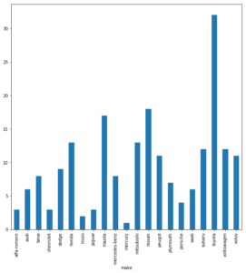
Wir wollen uns nicht lange vom eigentlichen Ziel ablenken, dennoch nutzen wir die Visualisierungsfähigkeiten der Pandas-Library (welche die Matplotlib inkludiert), um uns dann die Anzahlen an Einträgen nach Hersteller der Fahrzeuge (Spalte ‘make’) anzeigen zu lassen:
|
|
dataSet_grouped_make = dataSet_c.groupby('make') dataSet_grouped_make['make'].count().plot(kind = 'bar', figsize = (10, 10)) plt.show() # Besser jedes Plot abschließen! Auch wenn es in Pandas entstanden ist. |
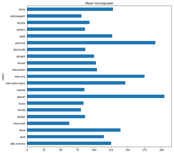
Oder die durchschnittliche PS-Zahl nach Hersteller:
|
|
(dataSet_c.groupby('make'))['horsepower'].mean().plot(kind = 'barh', title = 'Mean Horsepower', figsize = (10, 10)) plt.show() |

Vorbereitung der Regressionsanalyse
Nun kommen wir endlich zur Regressionsanalyse, die wir mit Scikit-Learn umsetzen möchten. Die Regressionsanalyse können wir nur mit intervall- oder ratioskalierten Datenspalten betreiben, daher beschränken wir uns auf diese. Die “price”-Spalte nehmen wir jedoch heraus und setzen sie als unsere Zielgröße fest.
|
|
""" ----- Vorbereitung für die Regressionsanalyse ----- """ cols_ratio = ['horsepower', 'wheel-base', 'length', 'width', 'height', 'curb-weight', 'engine-size', 'compression-ratio', 'city-mpg', 'highway-mpg'] cols_target = ['price'] dataSet_ratio = dataSet_c.loc[:, cols_ratio] dataSet_target = dataSet_c[cols_target] |
Interessant ist zudem die Betrachtung vorab, wie die einzelnen nummerischen Attribute untereinander korrelieren. Dafür nehmen wir auch die ‘price’-Spalte wieder in die Betrachtung hinein und hinterlegen auch eine Farbskala mit dem Preis (höhere Preise, hellere Farben).
|
|
grr = pd.plotting.scatter_matrix(dataSet_c[cols_target + cols_ratio] ,c = dataSet_target ,figsize=(15, 15) ,marker = 'o' ,hist_kwds={'bins' : 20} ,s = 60 ,alpha = 0.8) plt.show() |
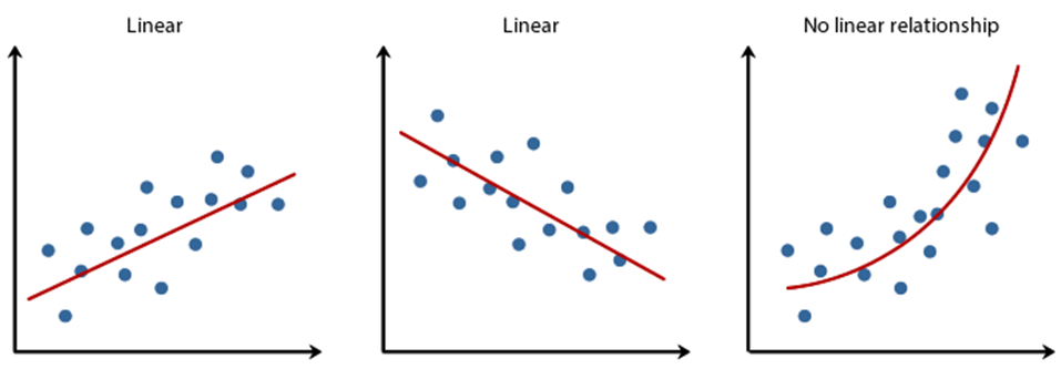
Die lineare Korrelation ist hier sehr interessant, da wir auch nur eine lineare Regression beabsichtigen.
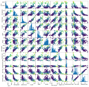
Wie man in dieser Scatter-Matrix recht gut erkennen kann, scheinen einige Größen-Paare nahezu perfekt zu korrelieren, andere nicht.
Korrelation…
- …nahezu perfekt linear: highway-mpg vs city-mpg (mpg = Miles per Gallon)
- … eher nicht gegeben: highway-mpg vs height
- … nicht linear, dafür aber nicht-linear: highway-mpg vs price
Nun, wir wollen den Preis eines Fahrzeuges vorhersagen, wenn wir eine andere quantitative Größe gegeben haben. Auf den Preis bezogen, erscheint mir die Motorleistung (Horsepower) einigermaßen linear zu korrelieren. Versuchen wir hier die lineare Regression und setzen somit die Spalte ‘horsepower’ als X und ‘price’ als y fest.
|
|
X = dataSet_ratio[['horsepower']] # doppelte [], da eine Liste von Spalten zu übergeben ist y = dataSet_c[cols_target] |
Die gängige Konvention ist übrigens, X groß zu schreiben, weil hier auch mehrere x-Dimensionen enthalten sein dürfen (multivariate Regression). y hingegen, ist stets nur eine Zielgröße (eine Dimension).
Die lineare Regression ist ein überwachtes Verfahren des maschinellen Lernens, somit müssen wir unsere Prädiktionsergebnisse mit Test-Daten testen, die nicht für das Training verwendet werden dürfen. Scitkit-Learn (oder kurz: sklearn) bietet hierfür eine Funktion an, die uns das Aufteilen der Daten abnimmt:
|
|
from sklearn.model_selection import train_test_split X_train, X_test, y_train, y_test = train_test_split(X, y, test_size = 0.3, # 70% der Daten für das Training random_state = None) # bei Bedarf kann hier "dem Zufall auf die Sprünge geholfen" werden |
Zu beachten ist dabei, dass die Daten vor dem Aufteilen in Trainings- und Testdaten gut zu durchmischen sind. Auch dies übernimmt die train_test_split-Funktion für uns, nur sollte man im Hinterkopf behalten, dass die Ergebnisse (auf Grund der Zufallsauswahl) nach jedem Durchlauf immer wieder etwas anders aussehen.
Lineare Regression mit Scikit-Learn
Nun kommen wir zur Durchführung der linearen Regression mit Scitkit-Learn, die sich in drei Zeilen trainieren lässt:
|
|
""" ----- Lineare Regressionsanalyse ------- """ from sklearn.linear_model import LinearRegression # importieren der Klasse lr = LinearRegression() # instanziieren der Klasse lr.fit(X_train, y_train) # trainieren |
Aber Vorsicht! Bevor wir eine Prädiktion durchführen, wollen wir festlegen, wie wir die Güte der Prädiktion bewerten wollen. Die gängigsten Messungen für eine lineare Regression sind der MSE und R².

Ein großer MSE ist schlecht, ein kleiner gut.

Ein kleines R² ist schlecht, ein großes R² gut. Ein R² = 1.0 wäre theoretisch perfekt (da der Fehler = 0.00 wäre), jedoch in der Praxis unmöglich, da dieser nur bei absolut perfekter Korrelation auftreten würde. Die Klasse LinearRegression hat eine R²-Messmethode implementiert (score(x, y)).
|
|
print('------ Lineare Regression -----') print('Funktion via sklearn: y = %.3f * x + %.3f' % (lr.coef_[0], lr.intercept_)) print("Alpha: {}".format(lr.intercept_)) print("Beta: {}".format(lr.coef_[0])) print("Training Set R² Score: {:.2f}".format(lr.score(X_train, y_train))) print("Test Set R² Score: {:.2f}".format(lr.score(X_test, y_test))) print("\n") |
Die Ausgabe (ein Beispiel!):
|
|
------ Lineare Regression ----- Funktion via sklearn: y = 170.919 * x + -4254.701 # Die Funktion ist als y = 171 * x - 4254.7 Alpha: [-4254.70114803] # y-Achsenschnitt bei x = 0 Beta: [ 170.91919086] # Steigung der Gerade Training Set R² Score: 0.62 Test Set R² Score: 0.73 |
Nach jedem Durchlauf ändert sich mit der Datenaufteilung (train_test_split()) das Modell etwas und auch R² schwankt um eine gewisse Bandbreite. Berauschend sind die Ergebnisse dabei nicht, und wenn wir uns die Regressionsgerade einmal ansehen, wird auch klar, warum:
|
|
plt.figure(figsize=(10,10)) plt.scatter(X_train, y_train, color = 'blue') # Blaue Punkte sind Trainingsdaten plt.scatter(X_test, y_test, color = 'green') # Grüne Punkte sind Testdaten plt.plot(X_train, lr.predict(X_train), color = 'red') # Hier ensteht die Gerade (x, y) = (x, lr.predict(x) plt.xlabel(X_train.columns[0]) plt.ylabel(cols_target[0]) plt.show() |
Bei kleineren Leistungsbereichen, etwa bis 100 PS, ist die Preis-Varianz noch annehmbar gering, doch bei höheren Leistungsbereichen ist die Spannweite deutlich größer. (Nachträgliche Anmerkung vom 06.05.2018: relativ betrachtet, bleibt der Fehler über alle Wertebereiche ungefähr gleich [relativer Fehler]. Die absoluten Fehlerwerte haben jedoch bei größeren x-Werten so eine Varianz der möglichen y-Werte, dass keine befriedigenden Prädiktionen zu erwarten sind.)
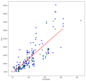
Egal wie wir eine Gerade in diese Punktwolke legen, wir werden keine befriedigende Fehlergröße erhalten.
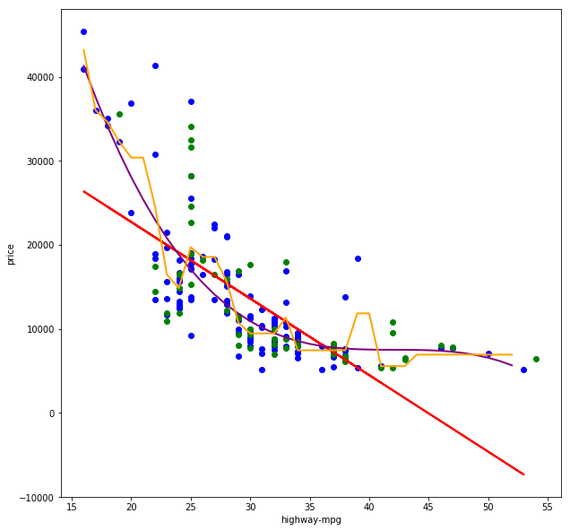
Nehmen wir einmal eine andere Spalte für X, bei der wir vor allem eine nicht-lineare Korrelation erkannt haben: “highway-mpg”
|
|
X = dataSet_ratio[['highway-mpg']] y = dataSet_c[cols_target] |
Wenn wir dann das Training wiederholen:
|
|
------ Lineare Regression ----- Funktion via sklearn: y = -868.787 * x + 40575.036 Alpha: [ 40575.03556055] Beta: [-868.7869183] Training Set R² Score: 0.49 Test Set R² Score: 0.40 |
Die R²-Werte sind nicht gerade berauschend, und das erklärt sich auch leicht, wenn wir die Trainings- und Testdaten sowie die gelernte Funktionsgerade visualisieren:
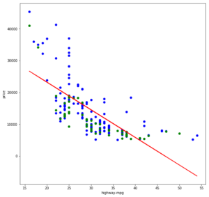 Die Gerade lässt sich nicht wirklich gut durch diese Punktwolke legen, da letztere eher eine Kurve als eine Gerade bildet. Im Grunde könnte eine Gerade noch einigermaßen gut in den Bereich von 22 bis 43 mpg passen und vermutlich annehmbare Ergebnisse liefern. Die Wertebereiche darunter und darüber jedoch verzerren zu sehr und sorgen zudem dafür, dass die Gerade auch innerhalb des mittleren Bereiches zu weit nach oben verschoben ist (ggf. könnte hier eine Ridge-/Lasso-Regression helfen).
Richtig gute Vorhersagen über nicht-lineare Verhältnisse können jedoch nur mit einer nicht-linearen Regression erreicht werden.
Nicht-lineare Regression mit Scikit-Learn
Nicht-lineare Regressionsanalysen erlauben es uns, nicht-lineare korrelierende Werte-Paare als Funktion zu erlernen. Im folgenden Scatter-Plot sehen wir zum einen die gewohnte lineare Regressionsgerade (y = a * x + b) in rot, eine polinominale Regressionskurve dritten Grades (y = a * x³ + b * x² + c * x + d) in violet sowie einen Entscheidungsweg einer Entscheidungsbaum-Regression in gelb.
 Nicht-lineare Regressionsanalysen passen sich dem Verlauf der Punktwolke sehr viel besser an und können somit in der Regel auch sehr gute Vorhersageergebnisse liefern. Ich ziehe hier nun jedoch einen Gedankenstrich, liefere aber den Quellcode für die lineare Regression als auch für die beiden nicht-linearen Regressionen mit:

Python Script Regression via Scikit-Learn
Weitere Anmerkungen
- Bibliotheken wie Scitkit-Learn erlauben es, machinelle Lernverfahren schnell und unkompliziert anwenden zu können. Allerdings sollte man auch verstehen, wei diese Verfahren im Hintergrund mathematisch arbeiten. Diese Bibliotheken befreien uns also nicht gänzlich von der grauen Theorie.
- Statt der “reinen” lineare Regression (LinearRegression()) können auch eine Ridge-Regression (Ridge()), Lasso-Regression (Lasso()) oder eine Kombination aus beiden als sogenannte ElasticNet-Regression (ElasticNet()). Bei diesen kann über Parametern gesteuert werden, wie stark Ausreißer in den Daten berücksichtigt werden sollen.
- Vor einer Regression sollten die Werte skaliert werden, idealerweise durch Standardisierung der Werte (sklearn.preprocessing.StandardScaler()) oder durch Normierung (sklearn.preprocessing.Normalizer()).
- Wir haben hier nur zwei-dimensional betrachtet. In der Praxis ist das jedoch selten ausreichend, auch der Fahrzeug-Preis ist weder von der Motor-Leistung, noch von dem Kraftstoffverbrauch alleine abhängig – Es nehmen viele Größen auf den Preis Einfluss, somit benötigen wir multivariate Regressionsanalysen.


 dependent variable.


 ,
,  , …
, …  of size
  and compute the ordinary (arithmetic) sample mean
  and a sample standard deviation
  from it. Now if (and only if) the (true) population mean µ (first moment) and population variance (second moment) obtained from the actual underlying PDF are finite, the numbers
  , thus neither the first nor the second moment exist whereby the first exists and vanishes at least in the sense of a principal value due to symmetry.
 (pseudo) standard Cauchy random numbers in R* to analyze the behavior of their sample mean and standard deviation
  .
.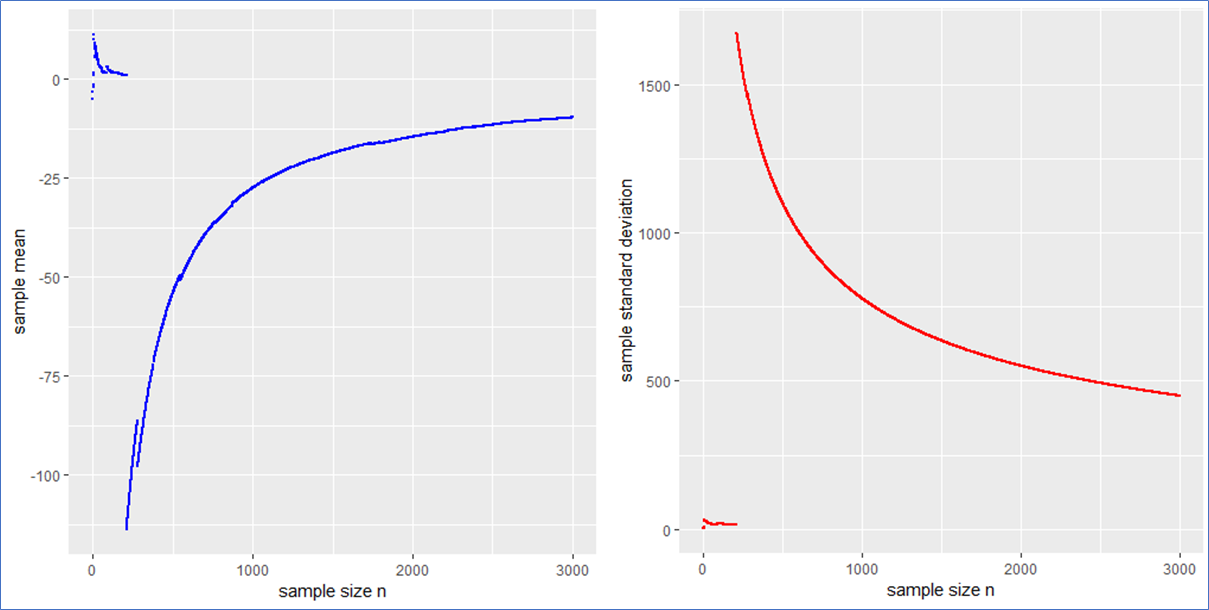
 . This means that the sample mean is also standard Cauchy distributed implying that with a different Cauchy sample one could have easily observed different sample means far of the presented values in blue.
 in such a case? What to do?
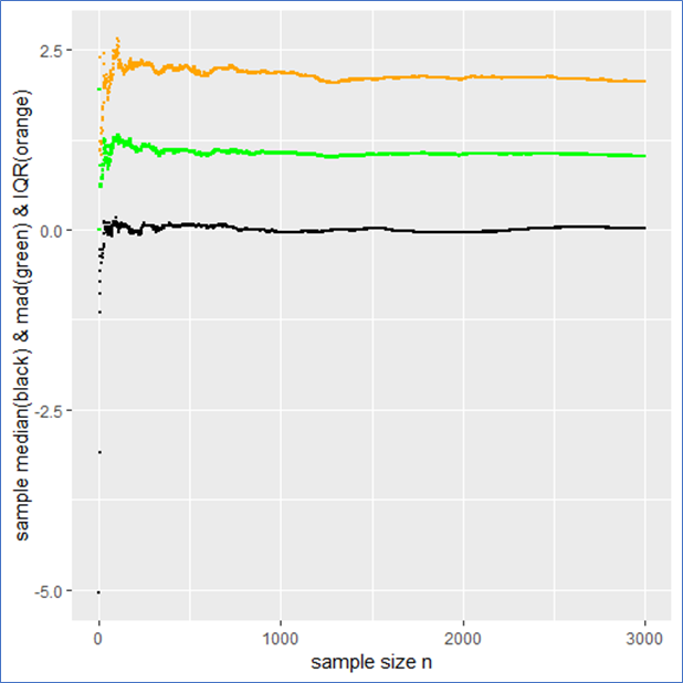
 mad meaning that the IQR is twice the mad.
 from it to present the usual stochastic confidence intervals for the sample mean.