Multi-head attention mechanism: “queries”, “keys”, and “values,” over and over again

*A comment added on 04/05/2022: Thanks to a comment by Mr. Maier, I found a major mistake in my visualization. To be concrete, there is a mistake in expressing how to get each colored divided group of tokens by applying linear transformations. That corresponds to the section 3.2.2 in the paper “Attention Is All You Need.” There would be no big differences in the main point of this article, the relations of keys, queries, and values, but please bear that in your mind if you need Transformer at a practical work. Besides checking the implementation by Tensorflow, I will soon prepare a modified version of visualization. For further details, please see comments at the bottom of this article.

This is the third article of my article series named “Instructions on Transformer for people outside NLP field, but with examples of NLP.”

In the last article, I explained how attention mechanism works in simple seq2seq models with RNNs, and it basically calculates correspondences of the hidden state at every time step, with all the outputs of the encoder. However I would say the attention mechanisms of RNN seq2seq models use only one standard for comparing them. Using only one standard is not enough for understanding languages, especially when you learn a foreign language. You would sometimes find it difficult to explain how to translate a word in your language to another language. Even if a pair of languages are very similar to each other, translating them cannot be simple switching of vocabulary. Usually a single token in one language is related to several tokens in the other language, and vice versa. How they correspond to each other depends on several criteria, for example “what”, “who”, “when”, “where”, “why”, and “how”. It is easy to imagine that you should compare tokens with several criteria.

Transformer model was first introduced in the original paper named “Attention Is All You Need,” and from the title you can easily see that attention mechanism plays important roles in this model. When you learn about Transformer model, you will see the figure below, which is used in the original paper on Transformer.  This is the simplified overall structure of one layer of Transformer model, and you stack this layer N times. In one layer of Transformer, there are three multi-head attention, which are displayed as boxes in orange. These are the very parts which compare the tokens on several standards. I made the head article of this article series inspired by this multi-head attention mechanism.
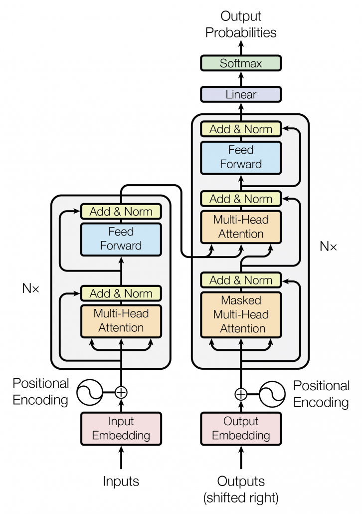
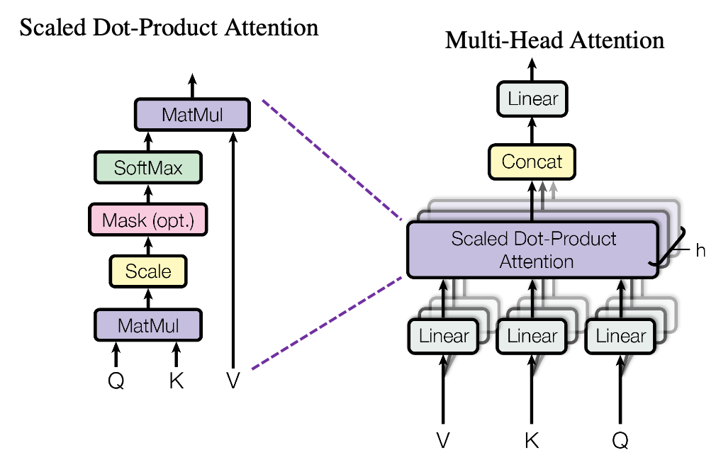
The figure below is also from the original paper on Transfromer. If you can understand how multi-head attention mechanism works with the explanations in the paper, and if you have no troubles understanding the codes in the official Tensorflow tutorial, I have to say this article is not for you. However I bet that is not true of majority of people, and at least I need one article to clearly explain how multi-head attention works. Please keep it in mind that this article covers only the architectures of the two figures below. However multi-head attention mechanisms are crucial components of Transformer model, and throughout this article, you would not only see how they work but also get a little control over it at an implementation level.
1 Multi-head attention mechanism

When you learn Transformer model, I recommend you first to pay attention to multi-head attention. And when you learn multi-head attentions, before seeing what scaled dot-product attention is, you should understand the whole structure of multi-head attention, which is at the right side of the figure above. In order to calculate attentions with a “query”, as I said in the last article, “you compare the ‘query’ with the ‘keys’ and get scores/weights for the ‘values.’ Each score/weight is in short the relevance between the ‘query’ and each ‘key’. And you reweight the ‘values’ with the scores/weights, and take the summation of the reweighted ‘values’.” Sooner or later, you will notice I would be just repeating these phrases over and over again throughout this article, in several ways.

*Even if you are not sure what “reweighting” means in this context, please keep reading. I think you would little by little see what it means especially in the next section.

The overall process of calculating multi-head attention, displayed in the figure above, is as follows (Please just keep reading. Please do not think too much.): first you split the V: “values”, K: “keys”, and Q: “queries”, and second you transform those divided “values”, “keys”, and “queries” with densely connected layers (“Linear” in the figure). Next you calculate attention weights and reweight the “values” and take the summation of the reiweighted “values”, and you concatenate the resulting summations. At the end you pass the concatenated “values” through another densely connected layers. The mechanism of scaled dot-product attention is just a matter of how to concretely calculate those attentions and reweight the “values”.
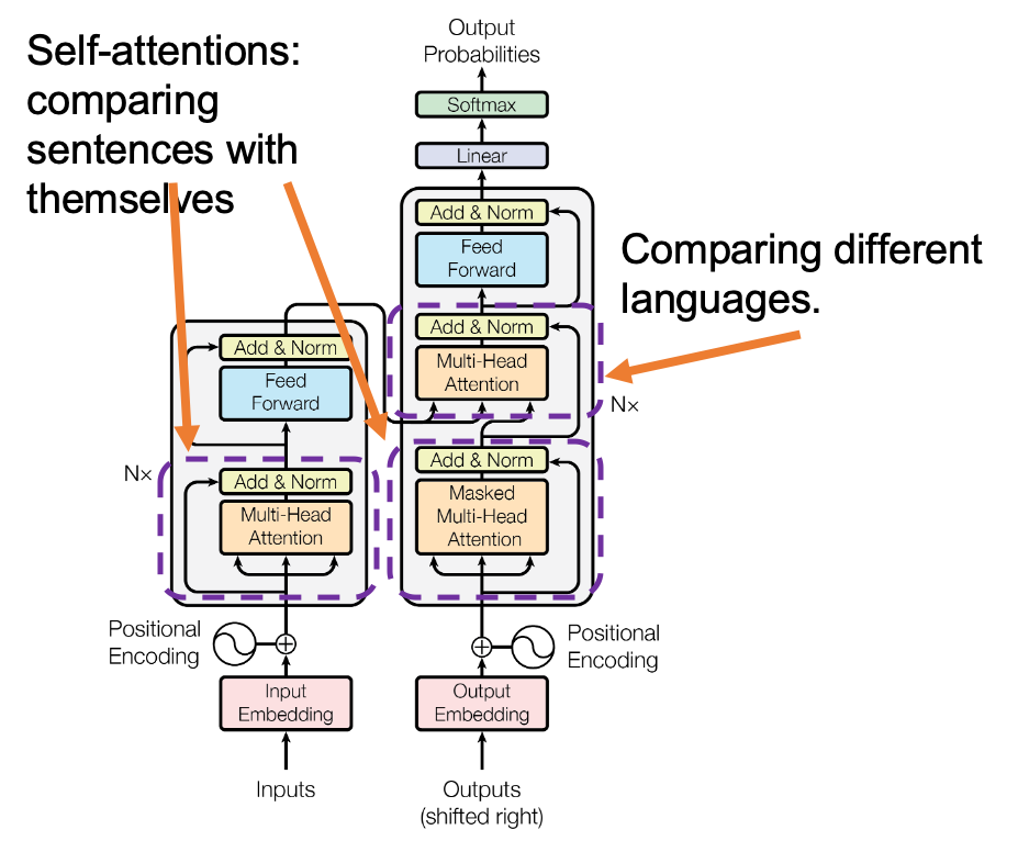
*In the last article I briefly mentioned that “keys” and “queries” can be in the same language. They can even be the same sentence in the same language, and in this case the resulting attentions are called self-attentions, which we are mainly going to see. I think most people calculate “self-attentions” unconsciously when they speak. You constantly care about what “she”, “it” , “the”, or “that” refers to in you own sentence, and we can say self-attention is how these everyday processes is implemented.

Let’s see the whole process of calculating multi-head attention at a little abstract level. From now on, we consider an example of calculating multi-head self-attentions, where the input is a sentence “Anthony Hopkins admired Michael Bay as a great director.” In this example, the number of tokens is 9, and each token is encoded as a 512-dimensional embedding vector. And the number of heads is 8. In this case, as you can see in the figure below, the input sentence “Anthony Hopkins admired Michael Bay as a great director.” is implemented as a 9\times 512 matrix. You first split each token into 512/8=64 dimensional, 8 vectors in total, as I colored in the figure below. In other words, the input matrix is divided into 8 colored chunks, which are all 9\times 64 matrices, but each colored matrix expresses the same sentence. And you calculate self-attentions of the input sentence independently in the 8 heads, and you reweight the “values” according to the attentions/weights. After this, you stack the sum of the reweighted “values”  in each colored head, and you concatenate the stacked tokens of each colored head. The size of each colored chunk does not change even after reweighting the tokens. According to Ashish Vaswani, who invented Transformer model, each head compare “queries” and “keys” on each standard. If the a Transformer model has 4 layers with 8-head multi-head attention , at least its encoder has 4\times 8 = 32 heads, so the encoder learn the relations of tokens of the input on 32 different standards.
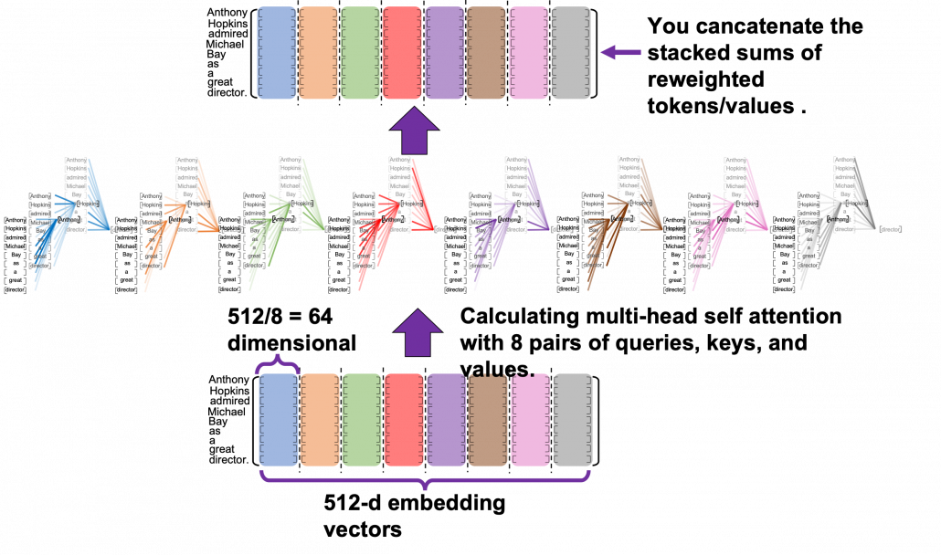
I think you now have rough insight into how you calculate multi-head attentions. In the next section I am going to explain the process of reweighting the tokens, that is, I am finally going to explain what those colorful lines in the head image of this article series are.

*Each head is randomly initialized, so they learn to compare tokens with different criteria. The standards might be straightforward like “what” or “who”, or maybe much more complicated. In attention mechanisms in deep learning, you do not need feature engineering for setting such standards.

2 Calculating attentions and reweighting “values”

If you have read the last article or if you understand attention mechanism to some extent, you should already know that attention mechanism calculates attentions, or relevance between “queries” and “keys.” In the last article, I showed the idea of weights as a histogram, and in that case the “query” was the hidden state of the decoder at every time step, whereas the “keys” were the outputs of the encoder. In this section, I am going to explain attention mechanism in a more abstract way, and we consider comparing more general “tokens”, rather than concrete outputs of certain networks. In this section each [ \cdots ] denotes a token, which is usually an embedding vector in practice.

Please remember this mantra of attention mechanism: “you compare the ‘query’ with the ‘keys’ and get scores/weights for the ‘values.’ Each score/weight is in short the relevance between the ‘query’ and each ‘key’. And you reweight the ‘values’ with the scores/weights, and take the summation of the reweighted ‘values’.” The figure below shows an overview of a case where “Michael” is a query. In this case you compare the query with the “keys”, that is, the input sentence “Anthony Hopkins admired Michael Bay as a great director.” and you get the histogram of attentions/weights. Importantly the sum of the weights 1. With the attentions you have just calculated, you can reweight the “values,” which also denote the same input sentence. After that you can finally take a summation of the reweighted values. And you use this summation.
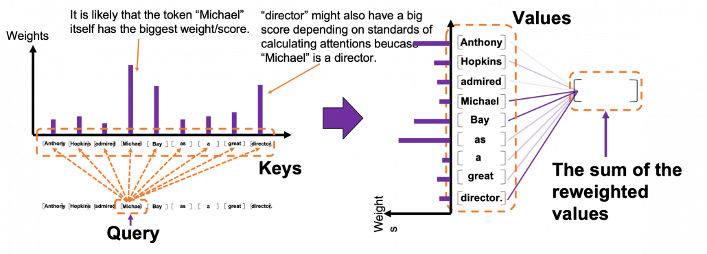
*I have been repeating the phrase “reweighting ‘values’  with attentions,”  but you in practice calculate the sum of those reweighted “values.”

Assume that compared to the “query”  token “Michael”, the weights of the “key” tokens “Anthony”, “Hopkins”, “admired”, “Michael”, “Bay”, “as”, “a”, “great”, and “director.” are respectively 0.06, 0.09, 0.05, 0.25, 0.18, 0.06, 0.09, 0.06, 0.15. In this case the sum of the reweighted token is 0.06″Anthony” + 0.09″Hopkins” + 0.05″admired” + 0.25″Michael” + 0.18″Bay” + 0.06″as” + 0.09″a” + 0.06″great” 0.15″director.”, and this sum is the what wee actually use.

*Of course the tokens are embedding vectors in practice. You calculate the reweighted vector in actual implementation.

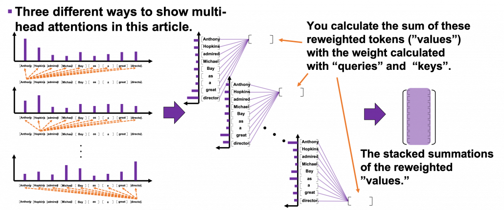
You repeat this process for all the “queries.”  As you can see in the figure below, you get summations of 9 pairs of reweighted “values” because you use every token of the input sentence “Anthony Hopkins admired Michael Bay as a great director.” as a “query.” You stack the sum of reweighted “values” like the matrix in purple in the figure below, and this is the output of a one head multi-head attention.
3 Scaled-dot product

This section is a only a matter of linear algebra. Maybe this is not even so sophisticated as linear algebra. You just have to do lots of Excel-like operations. A tutorial on Transformer by Jay Alammar is also a very nice study material to understand this topic with simpler examples. I tried my best so that you can clearly understand multi-head attention at a more mathematical level, and all you need to know in order to read this section is how to calculate products of matrices or vectors, which you would see in the first some pages of textbooks on linear algebra.

We have seen that in order to calculate multi-head attentions, we prepare 8 pairs of “queries”, “keys” , and “values”, which I showed in 8 different colors in the figure in the first section. We calculate attentions and reweight “values” independently in 8 different heads, and in each head the reweighted “values” are calculated with this very simple formula of scaled dot-product: Attention(\boldsymbol{Q}, \boldsymbol{K}, \boldsymbol{V}) =softmax(\frac{\boldsymbol{Q} \boldsymbol{K} ^T}{\sqrt{d}_k})\boldsymbol{V}. Let’s take an example of calculating a scaled dot-product in the blue head.

At the left side of the figure below is a figure from the original paper on Transformer, which explains one-head of multi-head attention. If you have read through this article so far, the figure at the right side would be more straightforward to understand. You divide the input sentence into 8 chunks of matrices, and you independently put those chunks into eight head. In one head, you convert the input matrix by three different fully connected layers, which is “Linear” in the figure below, and prepare three matrices Q, K, V, which are “queries”, “keys”, and “values” respectively.

*Whichever color attention heads are in, the processes are all the same.

*You divide \frac{\boldsymbol{Q}} {\boldsymbol{K}^T} by \sqrt{d}_k in the formula. According to the original paper, it is known that re-scaling \frac{\boldsymbol{Q} }{\boldsymbol{K}^T} by \sqrt{d}_k is found to be effective. I am not going to discuss why in this article.
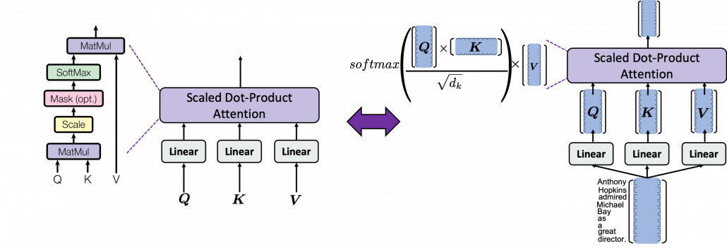
As you can see in the figure below, calculating Attention(\boldsymbol{Q}, \boldsymbol{K}, \boldsymbol{V}) is virtually just multiplying three matrices with the same size (Only K is transposed though). The resulting 9\times 64 matrix is the output of the head.

softmax(\frac{\boldsymbol{Q} \boldsymbol{K} ^T}{\sqrt{d}_k}) is calculated like in the figure below. The softmax function regularize each row of the re-scaled product \frac{\boldsymbol{Q} \boldsymbol{K} ^T}{\sqrt{d}_k}, and the resulting 9\times 9 matrix is a kind a heat map of self-attentions.

The process of comparing one “query” with “keys” is done with simple multiplication of a vector and a matrix, as you can see in the figure below. You can get a histogram of attentions for each query, and the resulting 9 dimensional vector is a list of attentions/weights, which is a list of blue circles in the figure below. That means, in Transformer model, you can compare a “query” and a “key” only by calculating an inner product. After re-scaling the vectors by dividing them with \sqrt{d_k} and regularizing them with a softmax function, you stack those vectors, and the stacked vectors is the heat map of attentions.

You can reweight “values” with the heat map of self-attentions, with simple multiplication. It would be more straightforward if you consider a transposed scaled dot-product \boldsymbol{V}^T \cdot softmax(\frac{\boldsymbol{Q} \boldsymbol{K} ^T}{\sqrt{d}_k})^T. This also should be easy to understand if you know basics of linear algebra.

One column of the resulting matrix (\boldsymbol{V}^T \cdot softmax(\frac{\boldsymbol{Q} \boldsymbol{K} ^T}{\sqrt{d}_k})^T) can be calculated with a simple multiplication of a matrix and a vector, as you can see in the figure below. This corresponds to the process or “taking a summation of reweighted ‘values’,” which I have been repeating. And I would like you to remember that you got those weights (blue) circles by comparing a “query” with “keys.”

Again and again, let’s repeat the mantra of attention mechanism together: “you compare the ‘query’ with the ‘keys’ and get scores/weights for the ‘values.’ Each score/weight is in short the relevance between the ‘query’ and each ‘key’. And you reweight the ‘values’ with the scores/weights, and take the summation of the reweighted ‘values’.” If you have been patient enough to follow my explanations, I bet you have got a clear view on how multi-head attention mechanism works.

We have been seeing the case of the blue head, but you can do exactly the same procedures in every head, at the same time, and this is what enables parallelization of multi-head attention mechanism. You concatenate the outputs of all the heads, and you put the concatenated matrix through a fully connected layers.
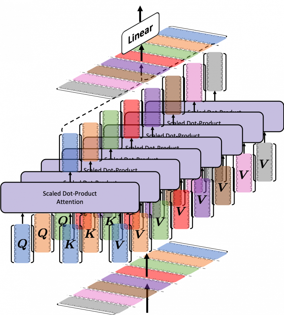
If you are reading this article from the beginning, I think this section is also showing the same idea which I have repeated, and I bet more or less you no have clearer views on how multi-head attention mechanism works. In the next section we are going to see how this is implemented.

4 Tensorflow implementation of multi-head attention

Let’s see how multi-head attention is implemented in the Tensorflow official tutorial. If you have read through this article so far, this should not be so difficult. I also added codes for displaying heat maps of self attentions. With the codes in this Github page, you can display self-attention heat maps for any input sentences in English.

The multi-head attention mechanism is implemented as below. If you understand Python codes and Tensorflow to some extent, I think this part is relatively easy.  The multi-head attention part is implemented as a class because you need to train weights of some fully connected layers. Whereas, scaled dot-product is just a function.

*I am going to explain the create_padding_mask() and create_look_ahead_mask() functions in upcoming articles. You do not need them this time.

Let’s see a case of using multi-head attention mechanism on a (1, 9, 512) sized input tensor, just as we have been considering in throughout this article. The first axis of (1, 9, 512) corresponds to the batch size, so this tensor is virtually a (9, 512) sized tensor, and this means the input is composed of 9 512-dimensional vectors. In the results below, you can see how the shape of input tensor changes after each procedure of calculating multi-head attention. Also you can see that the output of the multi-head attention is the same as the input, and you get a 9\times 9 matrix of attention heat maps of each attention head.

I guess the most complicated part of this implementation above is the split_head() function, especially if you do not understand tensor arithmetic. This part corresponds to splitting the input tensor to 8 different colored matrices as in one of the figures above. If you cannot understand what is going on in the function, I recommend you to prepare a sample tensor as below.

This is just a simple (1, 9, 512) sized tensor with sequential integer elements. The first row (1, 2, …., 512) corresponds to the first input token, and (4097, 4098, … , 4608) to the last one. You should try converting this sample tensor to see how multi-head attention is implemented. For example you can try the operations below.

These operations correspond to splitting the input into 8 heads, whose sizes are all (9, 64). And the second axis of the resulting (1, 8, 9, 64) tensor corresponds to the index of the heads. Thus sample_sentence[0][0] corresponds to the first head, the blue 9\times 64 matrix. Some Tensorflow functions enable linear calculations in each attention head, independently as in the codes below.

Very importantly, we have been only considering the cases of calculating self attentions, where all “queries”, “keys”, and “values” come from the same sentence in the same language. However, as I showed in the last article, usually “queries” are in a different language from “keys” and “values” in translation tasks, and “keys” and “values” are in the same language. And as you can imagine, usualy “queries” have different number of tokens from “keys” or “values.” You also need to understand this case, which is not calculating self-attentions. If you have followed this article so far, this case is not that hard to you. Let’s briefly see an example where the input sentence in the source language is composed 9 tokens, on the other hand the output is composed 12 tokens.

As I mentioned, one of the outputs of each multi-head attention class is 9\times 9 matrix of attention heat maps, which I displayed as a matrix composed of blue circles in the last section. The the implementation in the Tensorflow official tutorial, I have added codes to display actual heat maps of any input sentences in English.

*If you want to try displaying them by yourself, download or just copy and paste codes in this Github page. Please maker “datasets” directory in the same directory as the code. Please download “spa-eng.zip” from this page, and unzip it. After that please put “spa.txt” on the “datasets” directory. Also, please download the “checkpoints_en_es” folder from this link, and place the folder in the same directory as the file in the Github page. In the upcoming articles, you would need similar processes to run my codes.

After running codes in the Github page, you can display heat maps of self attentions. Let’s input the sentence “Anthony Hopkins admired Michael Bay as a great director.” You would get a heat maps like this.
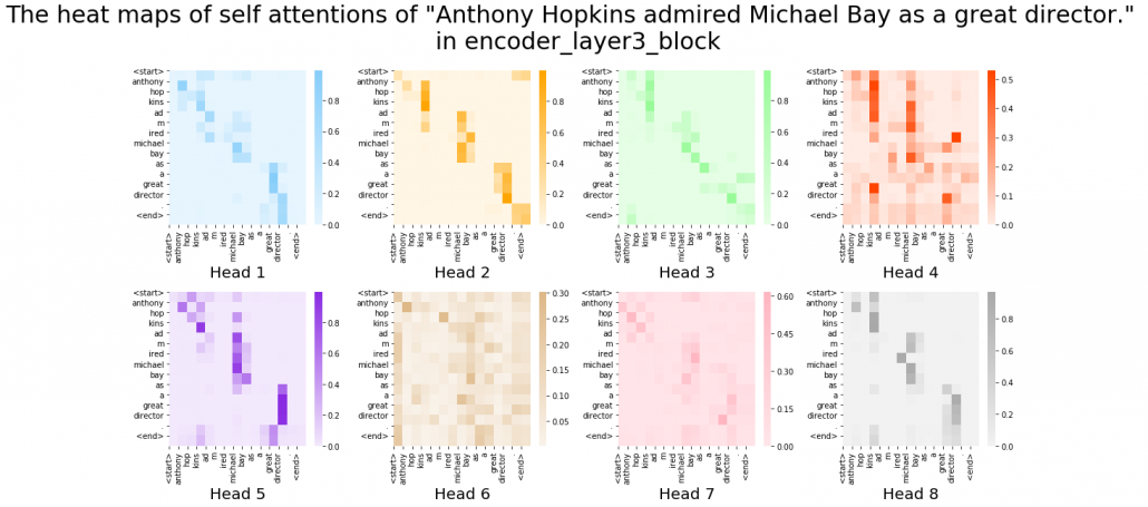
In fact, my toy implementation cannot handle proper nouns such as “Anthony” or “Michael.” Then let’s consider a simple input sentence “He admired her as a great director.” In each layer, you respectively get 8 self-attention heat maps.

I think we can see some tendencies in those heat maps. The heat maps in the early layers, which are close to the input, are blurry. And the distributions of the heat maps come to concentrate more or less diagonally. At the end, presumably they learn to pay attention to the start and the end of sentences.

You have finally finished reading this article. Congratulations.

You should be proud of having been patient, and you passed the most tiresome part of learning Transformer model. You must be ready for making a toy English-German translator in the upcoming articles. Also I am sure you have understood that Michael Bay is a great director, no matter what people say.

[References]

[1] Ashish Vaswani, Noam Shazeer, Niki Parmar, Jakob Uszkoreit, Llion Jones, Aidan N. Gomez, Lukasz Kaiser, Illia Polosukhin, “Attention Is All You Need” (2017)

[2] “Transformer model for language understanding,” Tensorflow Core
https://www.tensorflow.org/overview

[3] “Neural machine translation with attention,” Tensorflow Core
https://www.tensorflow.org/tutorials/text/nmt_with_attention

[4] Jay Alammar, “The Illustrated Transformer,”
http://jalammar.github.io/illustrated-transformer/

[5] “Stanford CS224N: NLP with Deep Learning | Winter 2019 | Lecture 14 – Transformers and Self-Attention,” stanfordonline, (2019)
https://www.youtube.com/watch?v=5vcj8kSwBCY

[6]Tsuboi Yuuta, Unno Yuuya, Suzuki Jun, “Machine Learning Professional Series: Natural Language Processing with Deep Learning,” (2017), pp. 91-94
坪井祐太、海野裕也、鈴木潤 著, 「機械学習プロフェッショナルシリーズ 深層学習による自然言語処理」, (2017), pp. 191-193

[7]”Stanford CS224N: NLP with Deep Learning | Winter 2019 | Lecture 8 – Translation, Seq2Seq, Attention”, stanfordonline, (2019)
https://www.youtube.com/watch?v=XXtpJxZBa2c

[8]Rosemary Rossi, “Anthony Hopkins Compares ‘Genius’ Michael Bay to Spielberg, Scorsese,” yahoo! entertainment, (2017)
https://www.yahoo.com/entertainment/anthony-hopkins-transformers-director-michael-bay-guy-genius-010058439.html

* I make study materials on machine learning, sponsored by DATANOMIQ. I do my best to make my content as straightforward but as precise as possible. I include all of my reference sources. If you notice any mistakes in my materials, including grammatical errors, please let me know (email: yasuto.tamura@datanomiq.de). And if you have any advice for making my materials more understandable to learners, I would appreciate hearing it.
Support Vector Machines for Text Recognition

Hand Written Alphabet recognition Using Support Vector Machine

We have used image classification as an task in many cases, more often this has been done using an module like openCV in python or using pre-trained models like in case of MNIST data sets. The idea of using Support Vector Machines for carrying out the same task is to give a simpler approach for a complicated process. There are some pro’s and con’s in every algorithm. Support vector machine for data with very high dimension may prove counter productive. But in case of image data we are actually using a array. If its a mono chrome then its just a 2 dimensional array, if grey scale or color image stack then we may have a 3 dimensional array processing to be considered. You can get more clarity on the array part if you go through this article on Machine learning using only numpy array. While there are certainly advantages of using OCR packages like Tesseract or OpenCV or GPTs, I am putting forth this approach of using a simple SVM model for hand written text classification. As a student while doing linear regression, I learn’t a principle “Occam’s Razor”, Basically means, keep things simple if they can explain what you want to. In short, the law of parsimony, simplify and not complicate. Applying the same principle on Hand written Alphabet recognition is an attempt to simplify using a classic algorithm, the Support Vector Machine. We break the  problem of hand written alphabet recognition into a simple process rather avoiding usage of heavy packages. This is an attempt to create the data and then build a model using Support Vector Machines for Classification.

Data Preparation

Manually edit the data instead of downloading it from the web. This will help you understand your data from the beginning. Manually write some letters on white paper and get the photo from your mobile phone. Then store it on your hard drive. As we are doing a trial we don’t want to waste a lot of time in data creation at this stage, so it’s a good idea to create two or three different characters for your dry run. You may need to change the code as you add more instances of classes, but this is where the learning phase begins. We are now at the training level.

Data Structure

You can create the data yourself by taking standard pictures of hand written text in a 200 x 200 pixel dimension. Alternatively you can use a pen tab to manually write these alphabets and save them as files. If you know and photo editing tools you can use them as well. For ease of use, I have already created a sample data and saved it in the structure as below.

Image Source : From Author

You can download the data which I have used, right click on this download data link and open in new tab or window. Then unzip the folders and you should be able to see the same structure and data as above in your downloads folder. I would suggest, you should create your own data and repeat the  process. This would help you understand the complete flow.

Install the Dependency Packages for RStudio

We will be using the jpeg package in R for Image handling and the SVM implementation from the kernlab package.  Also we need to make sure that the image data has dimension’s of 200 x 200 pixels, with a horizontal and vertical resolution of 120dpi. You can vary the dimension’s like move it to 300 x 300 or reduce it to 100 x 100. The higher the dimension, you will need more compute power. Experiment around the color channels and resolution later once you have implemented it in the current form.


Load the training data set

Feature Transformation

Since we don’t intend to use the typical CNN, we are going to use the white, grey and black pixel values for new feature creation. We will use the summation of all the pixel values of a image  and save it as a new feature called as “sum”, the count of all pixels adding up to zero as “zero”, the count of all pixels adding up to “ones” and the sum of all pixels between zero’s and one’s as “in_between”. The “label” feature names are extracted from the names of the folder

Support Vector Machine model

Evaluate the Model on the Testing Data Set

I would recommend you to learn concepts of SVM which couldn’t be explained completely in this article by going through my free Data Science and Machine Learning video courses. We have created the classifier using the Kerlab package in R, but I would advise you to study the mathematics involved in Support vector machines to get a clear understanding.

Data Mining Process flow – Easy Understanding

1 Overview

Development of computer processing power, network and automated software completely change and give new concept of each business. And data mining play the vital part to solve, finding the hidden patterns and relationship from large dataset with business by using sophisticated data analysis tools like methodology, method, process flow etc.

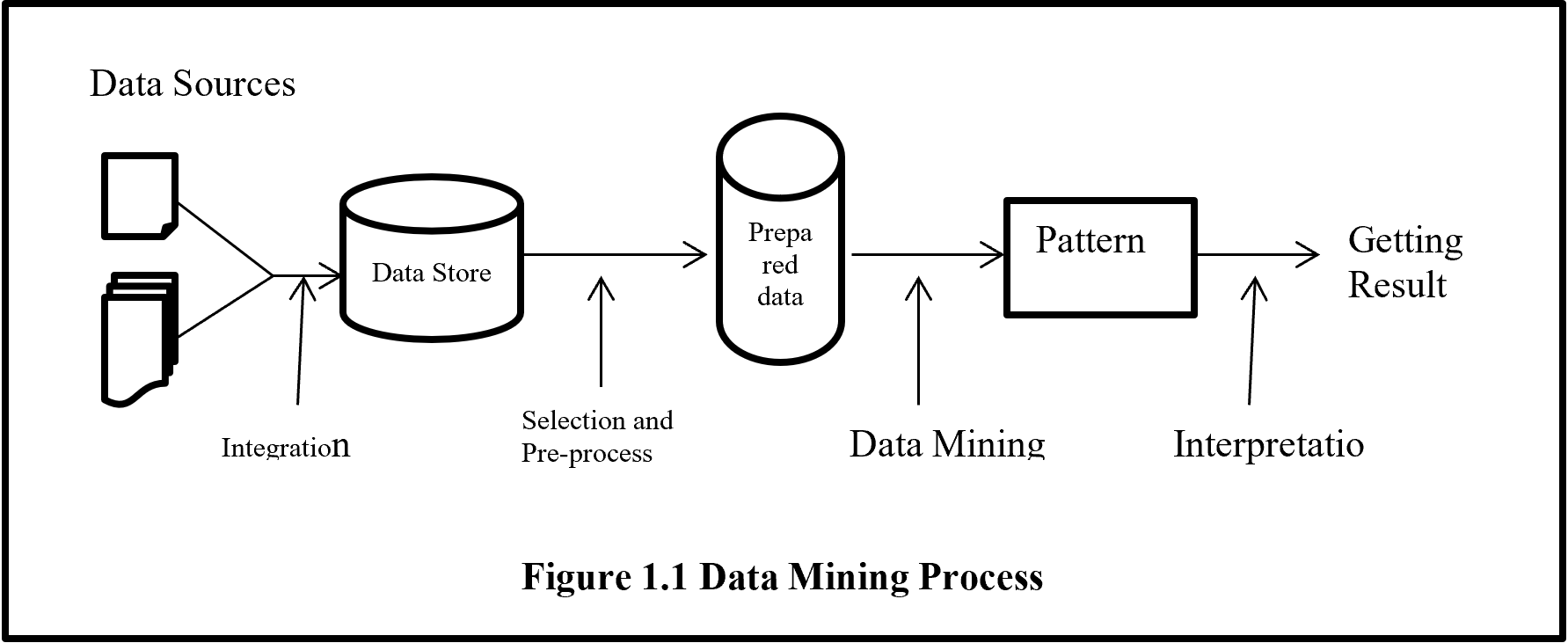
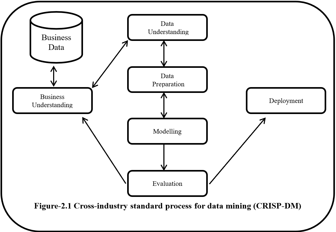
On this paper, proposed a process flow followed CRISP-DM methodology and has six steps where data understanding does not considered.

Phase of new process flow given below:-

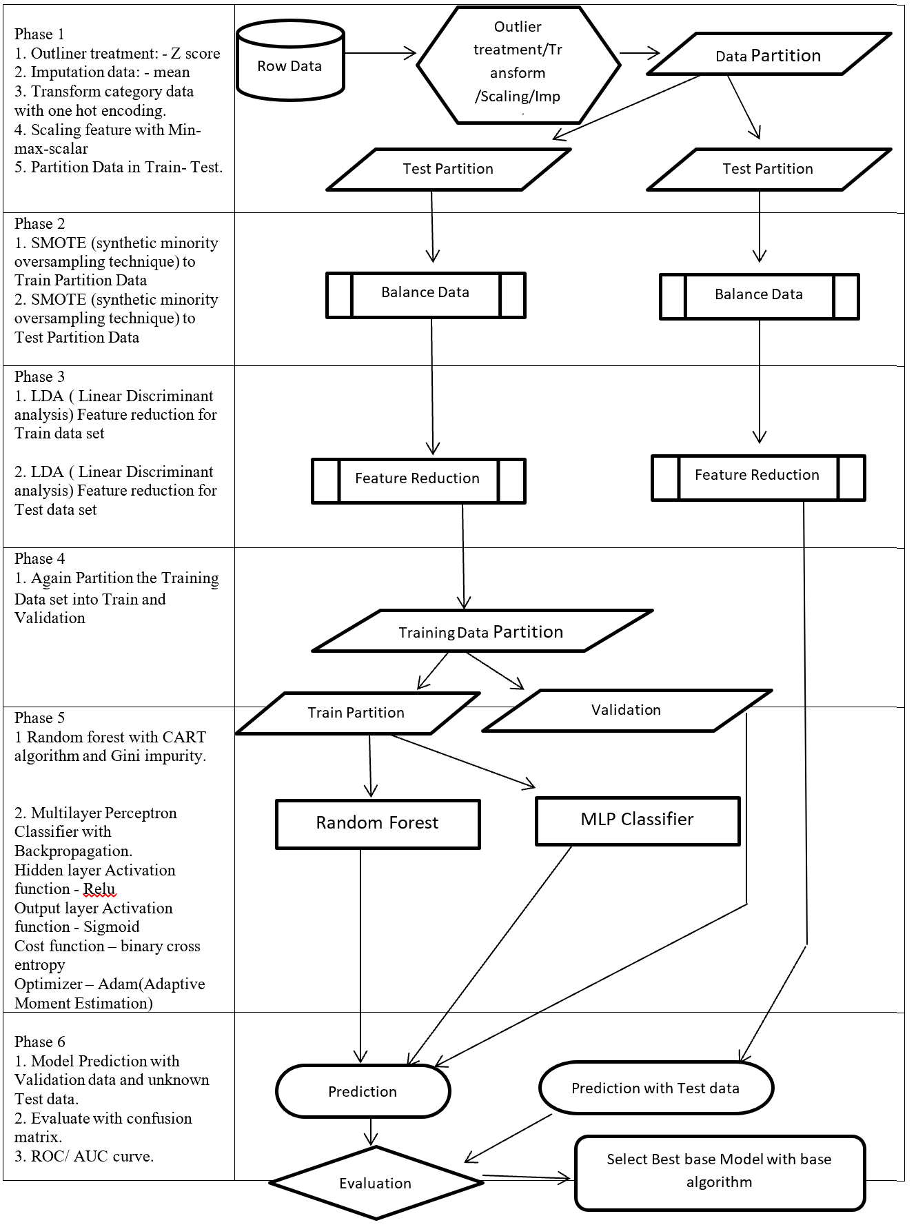
Phase 1: Involved with collection, outliner treatment, imputation, transformation, scaling, and partition dataset in to two sub-frames (Training and Testing). Here as an example for outliner treatment, imputation, transformation, scaling consider accordingly Z score, mean, One hot encoding and Min Max Scaler.

Phase 2: On this Phase training and testing data balance with same balancing algorithm but separately. As an example here SMOTE (synthetic minority oversampling technique) is considered.

Phase 3: This phase involved with reduction, selection, aggregation, extraction. But here for an example considering same feature reduction algorithm (LDA -Linear Discriminant analysis) on training and testing data set separately.

Phase 4: On this Phase Training data set again partition into two more set (Training and Validation).

Phase 5: This Phase considering several base algorithms as a base model like CNN, RNN, Random forest, MLP, Regression, Ensemble method. This phase also involve to find out best hyper parameter and sub-algorithm for each base algorithm. As an example on this paper consider two class classification problems and also consider Random forest (Included CART – Classification and Regression Tree and GINI index impurity) and MLP classifier (Included (Relu, Sigmoid, binary cross entropy, Adam – Adaptive Moment Estimation) as base algorithms.

Phase 6: First, Prediction with validation data then evaluates with Test dataset which is fully unknown for these (Random forest, MLP classifier) two base algorithms. Then calculate the confusion matrix, ROC, AUC to find the best base algorithm.

New method from phase 1 to phase 4 followed CRISP-DM methodology steps such as data collection, data preparation then phase 5 followed modelling and phase 6 followed evaluation and implementation steps.

Structure of proposed process flow for two class problem combined with algorithm and sub-algorithm display on figure – 1.

These articles mainly focus to describe all algorithms which are going to implementation for better understanding.


Data Mining Process Flow

Figure 1 – Data Mining Process Flow

2 Phase 1: Outlier treatment, Transform, Scaling, Imputation

This phase involved with outlier treatment, imputation, scaling, and transform data.

2.1 Outliner treatment: – Z score

Outlier is a data point which lies far from all other data point in a data set. Outlier need to treat because it may bias the entire result. Outlier treatment with Z score is a common technique.  Z score is a standard score in statistics.  Z score provides information about data value is smaller or grater then mean that means how many standard deviations away from the mean value. Z score equation display below:

Z = \frac{(x - \mu)}{\sigma}

Here x = data point
σ = Standard deviation
μ = mean value

Equation- 1 Z-Score

In a normal distribution Z score represent 68% data lies on +/- 1, 95% data point lies on +/- 2, 99.7% data point lies on +/- 3 standard deviation.

2.2 Imputation data: – mean

Imputation is a way to handle missing data by replacing substituted value. There are many imputation technique represent like mean, median, mode, k-nearest neighbours. Mean imputation is the technique to replacing missing information with mean value. On the mean imputation first calculate the particular features mean value and then replace the missing value with mean value. The next equation displays the mean calculation:

\mu = \frac{(\sum x)}{n}

Here x = value of each point
n = number of values
μ = mean value

Equation- 2 Mean

2.3 Transform: – One hot encoding

Encoding is a pre-processing technique which represents data in such a way that computer can understand.  For understanding of machine learning algorithm categorical columns convert to numerical columns, this process called categorical encoding. There are multiple way to handle categorical variable but most widely used techniques are label encoding and one host encoding. On label encoding give a numeric (integer number) for each category. Suppose there are 3 categories of foods like apples, orange, banana. When label encoding is used then 3 categories will get a numerical value like apples = 1, banana = 2 and orange = 3. But there is very high probability that machine learning model can capture the relationship in between categories such as apple < banana < orange or calculate average across categories like 1 +3 = 4 / 2 = 2 that means model can understand average of apple and orange together is banana which is not acceptable because model correlation calculation is wrong. For solving this problem one hot encoding appear. The following table displays the label encoding is transformed into one hot encoding.

Label Encoding and One-Hot-Encoding

Table- 1 Encoding example

On hot encoding categorical value split into columns and each column contains 0 or 1 according to columns placement.

2.4 Scaling data: – Min Max Scaler

Feature scaling method is standardized or normalization the independent variable that means it is used to scale the data in a particular range like -1 to +1 or depending on algorithm. Generally normalization used where data distribution does not follow Gaussian distribution and standardization used where data distribution follow Gaussian distribution. On standardization techniques transform data values are cantered around the mean and unit is standard deviation. Formula for standardization given below:

Standardization X = \frac{(X - \mu)}{\sigma}

Equation-3 Equations for Standardization

X represent the feature value, µ represent mean of the feature value and σ represent standard deviation of the feature value. Standardized data value does not restrict to a particular range.

Normalization techniques shifted and rescaled data value range between 0 and 1. Normalization techniques also called Min-Max scaling. Formula for normalization given below:

Normalization X = \frac{(X - X_{min})}{X_{max} - X_{min}}

Equation – 4 Equations for Normalization

Above X, Xmin, Xmax are accordingly feature values, feature minimum value and feature maximum value. On above formula when X is minimums then numerator will be 0 (  is 0) or if X is maximums then the numerator is equal to the denominator (  is 1). But when X data value between minimum and maximum then  is between 0 and 1. If ranges value of data does not normalized then bigger range can influence the result.

3 Phase 2: – Balance Data

3.1 SMOTE

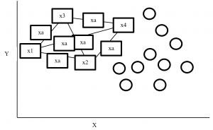
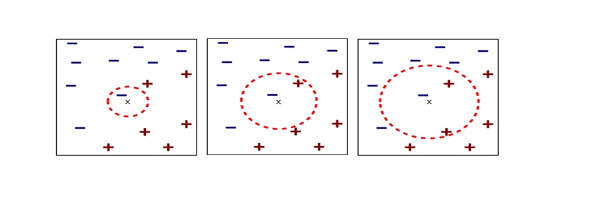
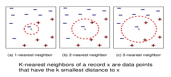
SMOTE (synthetic minority oversampling technique) is an oversampling technique where synthetic observations are created based on existing minority observations. This technique operates in feature space instead of data space. Under SMOTE each minority class observation calculates k nearest neighbours and randomly chose the neighbours depending on over-sampling requirements. Suppose there are 4 data point on minority class and 10 data point on majority class. For this imbalance data set, balance by increasing minority class with synthetic data point.   SMOTE creating synthetic data point but it is necessary to consider k nearest neighbours first. If k = 3 then SMOTE consider 3 nearest neighbours. Figure-2 display SMOTE with k = 3 and x = x1, x2, x3, x4 data point denote minority class. And all circles represent majority class.

SMOTE Example

Figure- 2 SMOTE example


4 Phase 3: – Feature Reduction

4.1 LDA

LDA stands for Linear Discriminant analysis supervised technique are commonly used for classification problem.  On this feature reduction account continuous independent variable and output categorical variable. It is multivariate analysis technique. LDA analyse by comparing mean of the variables.  Main goal of LDA is differentiate classes in low dimension space. LDA is similar to PCA (Principal component analysis) but in addition LDA maximize the separation between multiple classes. LDA is a dimensionality reduction technique where creating synthetic feature from linear combination of original data set then discard less important feature. LDA calculate class variance, it maximize between class variance and minimize within class variance. Table-2 display the process steps of LDA.

LDA Process

Table- 2 LDA process

5 Phase 5: – Base Model

Here we consider two base model ensemble random forest and MLP classifier.

5.1 Random Forest

Random forest is an ensemble (Bagging) method where group of weak learner (decision tree) come together to form a strong leaner. Random forest is a supervised algorithm which is used for regression and classification problem. Random forests create several decisions tree for predictions and provide solution by voting (classification) or mean (regression) value. Working process of Random forest given below (Table -3).

Random Forest

Table-3 Random Forest process

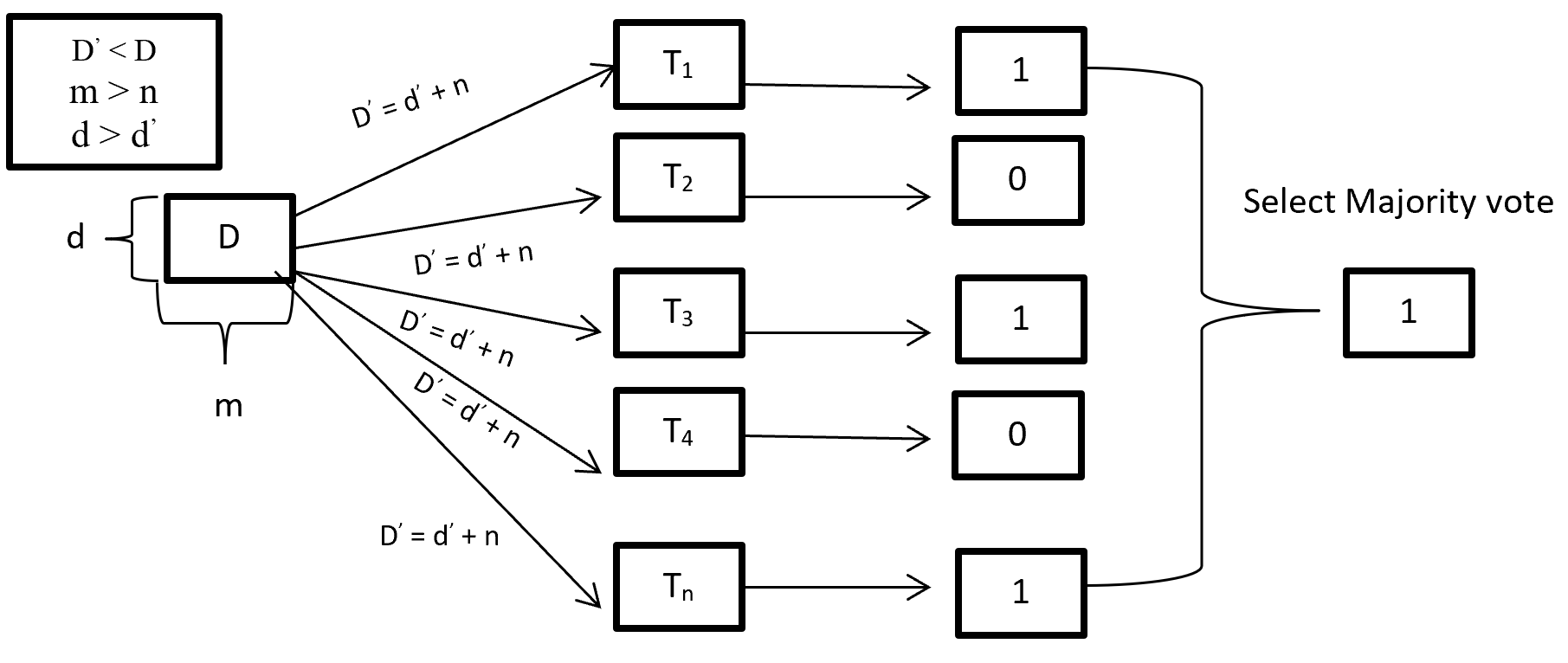
When training a Random forest root node contains a sample of bootstrap dataset and the feature is as same as original dataset. Suppose the dataset is D and contain d record and m number of columns. From the dataset D random forest first randomly select sample of rows (d) with replacement and sample of features (n) and give it to the decision tree. Suppose Random forest created several decision trees like T1, T2, T3, T4 . . . Tn. Then randomly selected dataset D = d + n is given to the decision tree T1, T2, T3, T4 . . . Tn where D < D, m > n and d > d.  After taking the dataset decision tree give the prediction for binary classification 1 or 0 then aggregating the decision and select the majority voted result. Figure-3 describes the structure of random forest process.

Random Forest Process

Figure- 3 Random Forest process

On Random forest base learner Decision Tree grows complete depth where bias (properly train on training dataset) is low and variance is high (when implementing test data give big error) called overfitting. On Random forest using multiple decision trees where each Decision tree is high variance but when combining all decision trees with the respect of majority vote then high variance converted into low variance because using row and feature sampling with replacement and taking the majority vote where decision is not depend on one decision tree.

CART (Classification and Regression Tree) is binary segmentation technique. CART is a Gini’s impurity index based classical algorithm to split a dataset and build a decision tree. By splitting a selected dataset CART created two child nodes repeatedly and builds a tree until the data no longer be split. There are three steps CART algorithm follow:

  1. Find best split for each features. For each feature in binary split make two groups of the ordered classes. That means possibility of split for k classes is k-1. Find which split is maximized and contain best splits (one for each feature) result.
  2. Find the best split for nodes. From step 1 find the best one split (from all features) which maximized the splitting criterion.
  3. Split the best node from step 2 and repeat from step 1 until fulfil the stopping criterion.


For splitting criteria CART use GINI index impurity algorithm to calculate the purity of split in a decision tree. Gini impurity randomly classified the labels with the same distribution in the dataset. A Gini impurity of 0 (lowest) is the best possible impurity and it is achieve when everything is in a same class. Gini index varies from 0 to 1. 0 indicate the purity of class where only one class exits or all element under a specific class. 1 indicates that elements are randomly distributed across various classes. And 0.5 indicate equal elements distributed over classes. Gini index (GI) described by mathematically that sum of squared of probabilities of each class (pi) deducted from one (Equation-5).

Gini Impurities

Equation – 5 Gini impurities

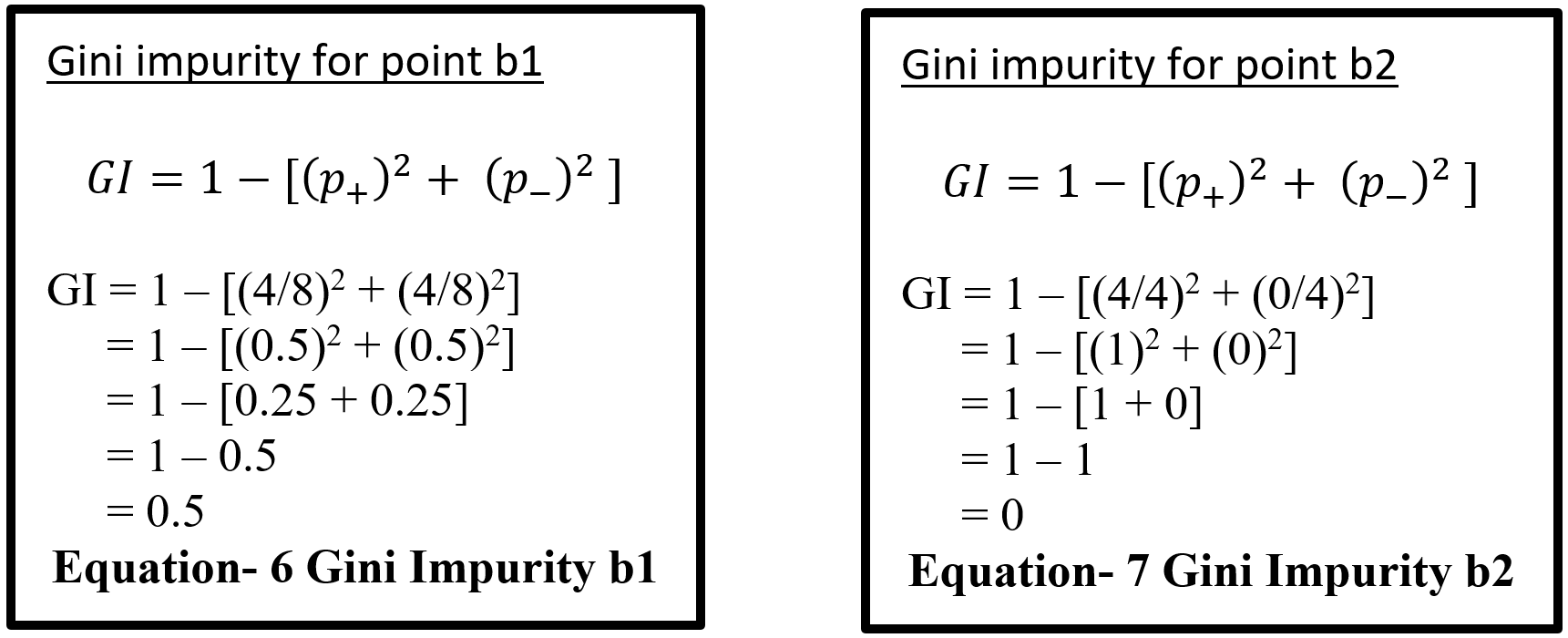
Here (Equation-5) pi represent the probability (probability of p+ or yes and probability of p- or no) of distinct class with classified element. Suppose randomly selected feature (a1) which has 8 yes and 4 no. After the split right had side (b1 on equation-6) has 4 yes and 4 no and left had side (b2 on equation – 7) has 4 yes and 0 no. here b2 is a pure split (leaf node) because only one class yes is present. By using the GI (Gini index) formula for b1 and b2:-

Equation- 6 & 7 – Gini Impurity b1 & Gini Impurity b2

Here for b1 value 0.5 indicates that equal element (yes and no) distribute over classes which is not pure split. And b2 value 0 indicates pure split. On GINI impurity indicates that when probability (yes or no) increases GINI value also increases. Here 0 indicate pure split and .5 indicate equal split that means worst situation. After calculating the GINI index for b1 and b2 now calculate the reduction of impurity for data point a1. Here total yes 8 (b1 and b2 on Equation – 8) and total no 4 (b1) so total data is 12 on a1. Below display the weighted GINI index for feature a1:

Total data point on b1 with Gini index (m) = 8/12 * 0.5 = 0.3333

Total data point on b2 with Gini index (n) = 4/12 * 0 = 0

Weighted Gini index for feature a1 = m + n = 0.3333

Equation- 8 Gini Impurity b1 & b2

After computing the weighted Gini value for every feature on a dataset taking the highest value feature as first node and split accordingly in a decision tree. Gini is less costly to compute.

5.2 Multilayer Perceptron Classifier (MLP Classifier)

Multilayer perceptron classifier is a feedforward neural network utilizes supervised learning technique (backpropagation) for training. MLP Classifier combines with multiple perceptron (hidden) layers. For feedforward taking input send combining with weight bias and then activation function from one hidden layer output goes to other hidden and this process continuing until reached the output. Then output calculates the error with error algorithm. These errors send back with backpropagation for weight adjustment by decreasing the total error and process is repeated, this process is call epoch. Number of epoch is determined with the hyper-parameter and reduction rate of total error.

5.2.1 Back-Propagation

Backpropagation is supervised learning algorithm that is used to train neural network. A neural network consists of input layer, hidden layer and output layer and each layer consists of neuron. So a neural network is a circuit of neurons. Backpropagation is a method to train multilayer neural network the updating of the weights of neural network and is done in such a way so that the error observed can be reduced here, error is only observed in the output layer and that error is back propagated to the previous layers and previous layer is proportionally updated weight. Backpropagation maintain chain rule to update weight. Mainly three steps on backpropagation are (Table-4):

Step Process
Step 1 Forward Pass
Step 2 Backward Pass
Step 3 Sum of all values and calculate updated weight value with Chain – rules.

Table-4 Back-Propagation process

5.2.2 Forward pass/ Forward propagation

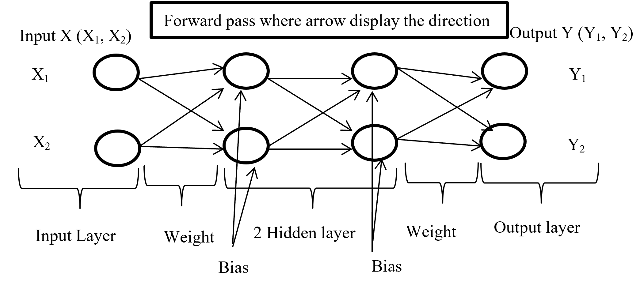
Forward propagation is the process where input layer send the input value with randomly selected weight and bias to connected neuron and inside neuron selected activation function combine them and forward to other connected neuron layer after layer then give an output with the help of output layer. Below (Figure-4) display the forward propagation.

Foreward Pass

Figure-4 Forward passes

Input layer take the input of X (X1, X2) combine with randomly selected weight for each connection and with fixed bias (different hidden layer has different bias) send it to first hidden layer where first multiply the input with corresponding weight and added all input with single bias then selected activation function (may different form other layer) combine all input and give output according to function and this process is going on until reach in output layer. Output layer give the output like Y (Y1, Y2) (here output is binary classification as an example) according to selected activation function.

5.2.3 Backward Pass

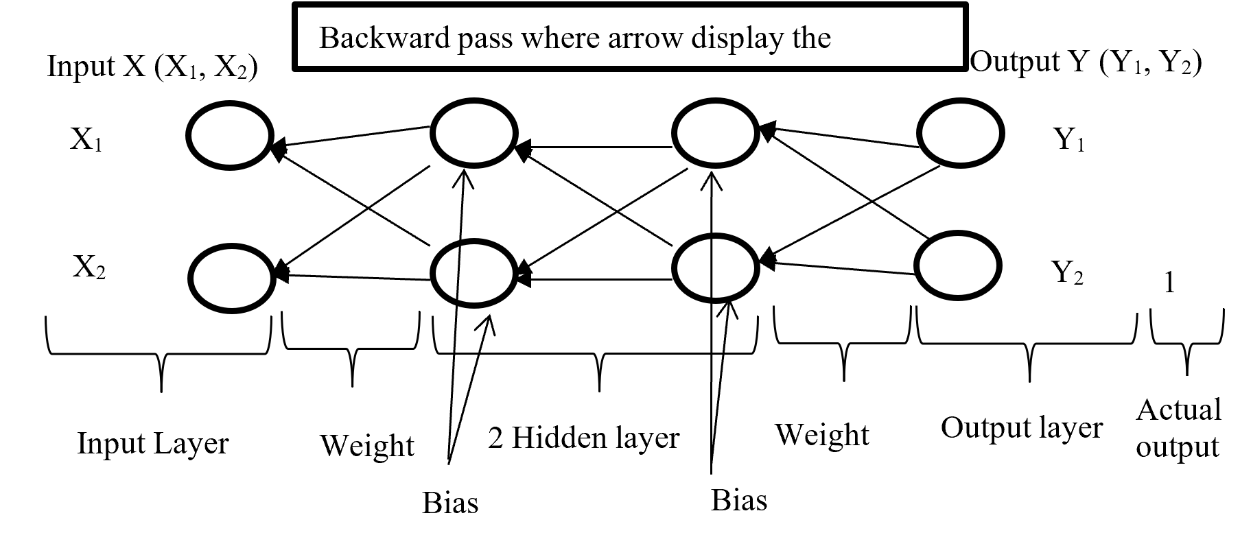
After calculating error (difference between Forward pass output and actual output) backward pass try to minimize the error with optimisation function by sending backward with proportionally distribution and maintain a chain rule. Backward pass distribution the error in such a way where weighted value is taking under consideration. Below (Figure-5) diagram display the Backward pass process.

Backward Pass

Figure-5 Backward passes

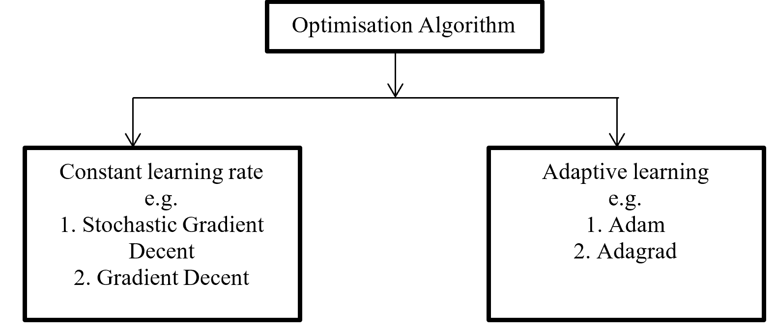
Backpropagation push back the error which is calculated with error function or loss function for update proportional distribution with the help of optimisation algorithm. Division of Optimisation algorithm given below on Figure – 6

Optimisation Algorithms

Figure -6 Division of Optimisation algorithms

Gradient decent calculate gradient and update value by increases or decreases opposite direction of gradients unit and try to find the minimal value. Gradient decent update just one time for whole dataset but stochastic gradient decent update on each training sample and it is faster than normal gradient decent. Gradient decent can be improve by tuning parameter like learning rate (0 to 1 mostly use 0.5). Adagrad use time step based parameter to compute learning rate for every parameter. Adam is Adaptive Moment Estimation. It calculates different parameter with different learning rate. It is faster and performance rate is higher than other optimization algorithm. On the other way Adam algorithm is squares the calculated exponential weighted moving average of gradient.

5.2.4 Chain – rules

Backpropagation maintain chain-rules to update weighted value. On chain-rules backpropagation find the derivative of error respect to any weight. Suppose E is output error. w is weight for input a and bias b and ac neuron output respect of activation function and summation of bias with weighted input (w*a) input to neuron is net. So partial derivative for error respect to weight is ∂E / ∂w display the process on figure-7.

Figure- 7 Partial derivative for error respect to weight

On the chain rules for backward pass to find (error respect to weight) ∂E / ∂w = ∂E / ∂ac * ∂ac / ∂net * ∂net / ∂w. here find to error respect to weight are error respect to output of activation function multiply by activation function output respect to input in a neuron multiply by input in a neuron respect to weight.

5.2.5 Activation function

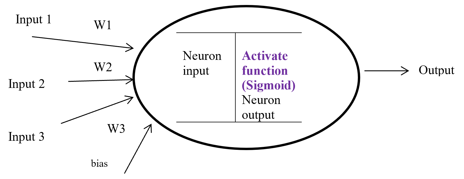
Activation function is a function which takes the decision about neuron to activate or deactivate. If the activate function activate the neuron then it will give an output on the basis of input. Input in a activation function is sum of input multiply with corresponding weight and adding the layered bias.  The main function of a activate function is non-linearity output of a neuron.

Activation Function

Figure-8 Activation function

Figure – 8 display a neuron in a hidden layer. Here several input (1, 2, 3) with corresponding weight (w1, w2, w3) putting in a neuron input layer where layer bias add with summation of multiplication with input and weight. Equation-9 display the output of an activate function.

Output from activate function y = Activate function (Ʃ (weight * input) + bias)

y = f (Ʃ (w*x) +b)

Equation- 9 Activate function

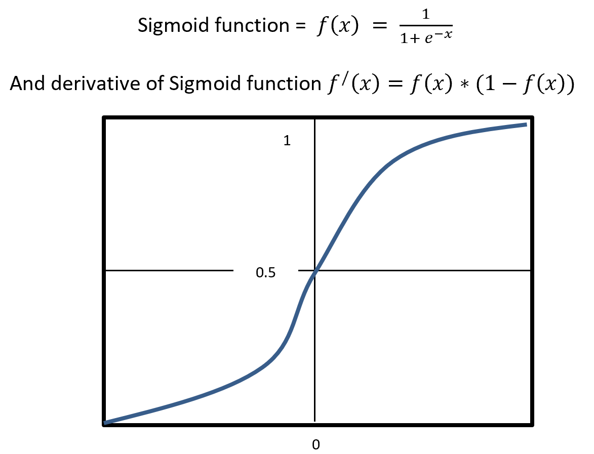
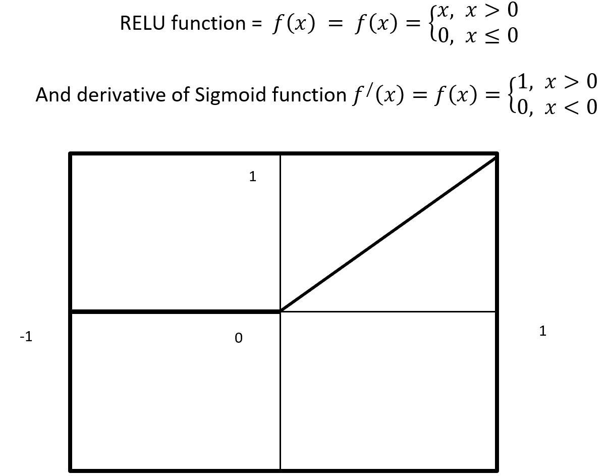
There are many activation functions like linear function for regression problem, sigmoid function for binary classification problem where result either 0 or 1, Tanh function which is based on sigmoid function but mathematically shifted version and values line -1 to 1. RELU function is Rectified linear unit. RELU is less expensive to compute.

5.2.6 Sigmoid

Sigmoid is a squashing activate function where output range between 0 and 1. Sigmoidal name comes from Greek letter sigma which looks like letter S when graphed. Sigmoid function is a logistic type function, it mainly use in output layer in neural network. Sigmoid is non-linear, fixed output range (between 0 and 1), monotonic (never decrees or never increases) and continuously differentiated function. Sigmoid function is good at classification and output from sigmoid is nonlinear. But Sigmoid has a vanishing gradient problem because output variable is very less to change in input variable. Figure- 9 displays the output of a Sigmoid and derivative of Sigmoid. Here x is any number (positive or negative). On sigmoid function 1 is divided by exponential negative input with adding 1.

Sigmoid

Figure – 9 Sigmoid Functions

4.5.2.7 RELU

RELU stands for Rectified Linear Units it is simple, less expensive in computation and rectifies the gradient vanishing problem. RELU is nonlinear activation function. It gives output either positive (infinity) or 0. RELU has a dying problem because if neurons stop for responding to variation because of gradient is 0 or nothing has to change. Figure- 10 displays the output of an RELU and derivative of RELU. Here x is any positive input and if x is grater then 0 give the output as x or give output 0. RELU function gives the output maximum value of input, here max (0, x).

Relu Activation Function

Figure – 10 RELU Function

4.5.2.8 Cost / loss function (Binary Cross-Entropy)

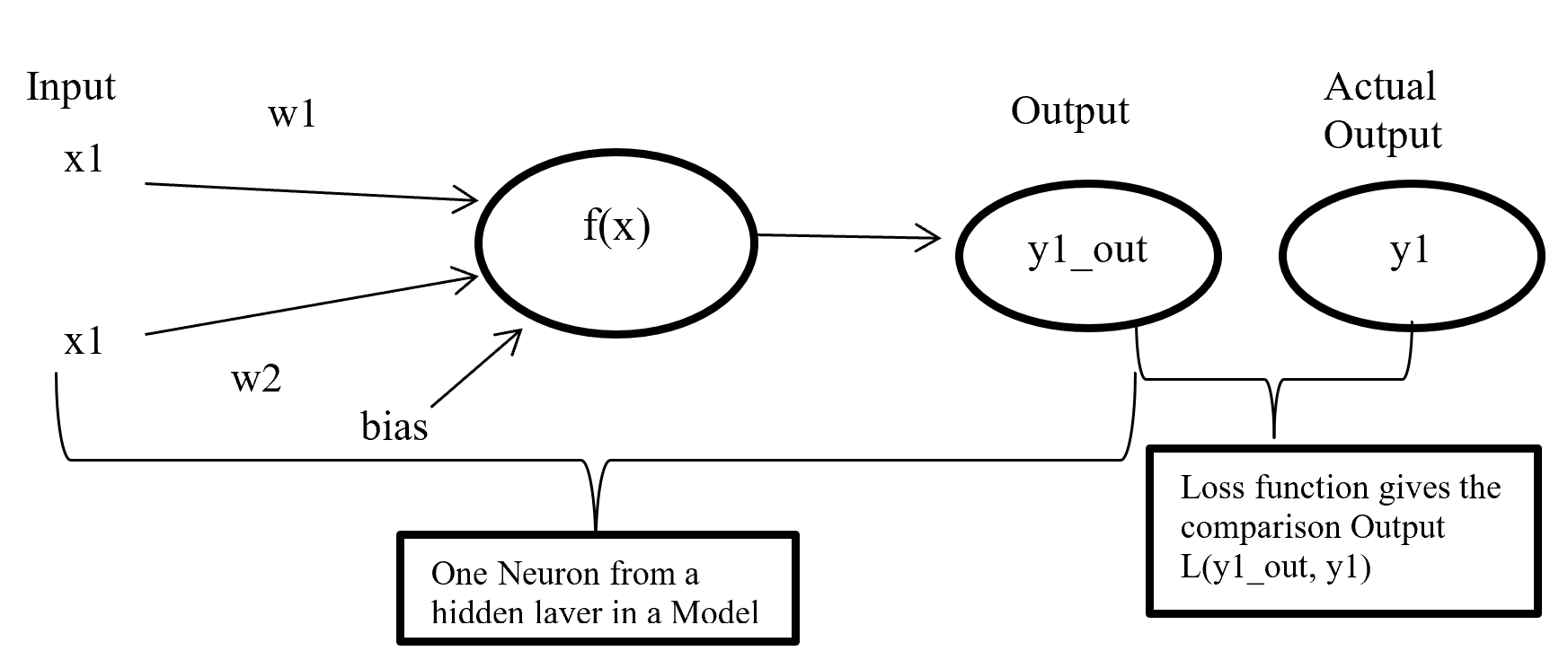
Cost or loss function compare the predictive value (model outcome) with actual value and give a quantitative value which give the indication about how much good or bad the prediction is.

Cost Function

Figure- 11 Cost function work process

Figure-11 x1 and x2 are input in a activate function f(x) and output y1_out which is sum of weighted input added with bias going through activate function. After model output activate function compare the output with actual output and give a quantitative value which indicate how good or bad the prediction is.

There are many type of loss function but choosing of optimal loss function depends on the problem going to be solved such as regression or classification. For binary classification problem binary cross entropy is used to calculate cost. Equation-10 displays the binary cross entropy where y is actual binary value and yp predictive outcome range 0 and 1. And i is scalar vale range between 1 to model output size (N).

Binary Crossentropy

Equation-10 displays the binary cross entropy

6 Phase 6: – Evaluation

6.1 Confusion matrix

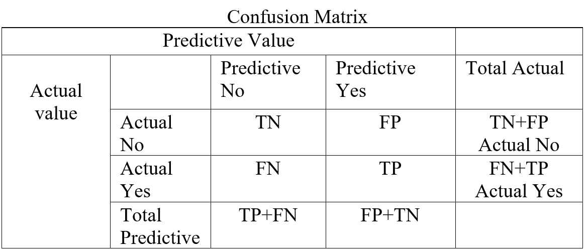
In a classification confusion matrix describe the performance of actual value against predictive value. Confusion Matrix does the performance measurement. So confusion matrix classifies and display predicted and actual value (Visa, S., Ramsay 2011).

Confusion Matrix

Table- 5 Confusion Matrix

Confusion Matrix (Table-5) combines with True Positive (TP), True Negative (TN), False Positive (FP), and False Negative (FN). True Positive is prediction positive and true. True Negative is prediction negative and that is true. False positive is prediction positive and it’s false. False negative is prediction negative and that is false. False positive is known as Type1 error and false negative is known as Type 2 error. Confusion matrix can able to calculate several list of rates which are given below on Table- 6.

Here    N = Total number of observation, TP = True Positive, TN = True Negative

FP = False Positive, FN = False Negative, Total Actual No (AN) = TN + FP,

Total Predictive Yes (PY) = FP + TP. Total Actual Yes (AY) = FN + TP

Rate


Description Mathematical Description
Accuracy Classifier, overall how often correctly identified  (TP+TN) / N
Misclassification Rate Classifier, overall how often wrongly identified (FP + FN) / N
True Positive Rate

(Sensitivity / Recall)

Classifier, how often predict correctly yes when it is actually yes.  TP / AY
False Positive Rate Classifier, how often predict wrongly yes when it is actually no.  FP / AN
True Negative Rate

(Specificity)

Classifier, how often predict correctly no when it is actually no.  TN / AN
Precision Classifier how often predict yes when it is correct.  TP / PY
Prevalence Yes conditions how often occur in a sample. AY / N

Table – 6 Confusion matrixes Calculation

From confusion matrix F1 score can be calculated because F1 score related to precision and recall. Higher F1 score is better. If precision or recall any one goes down F1 score also go down.

F1 = \frac{2 * Precision * Recall}{Precision + Recall}

4.6.2 ROC (Receiver Operating Characteristic) curve

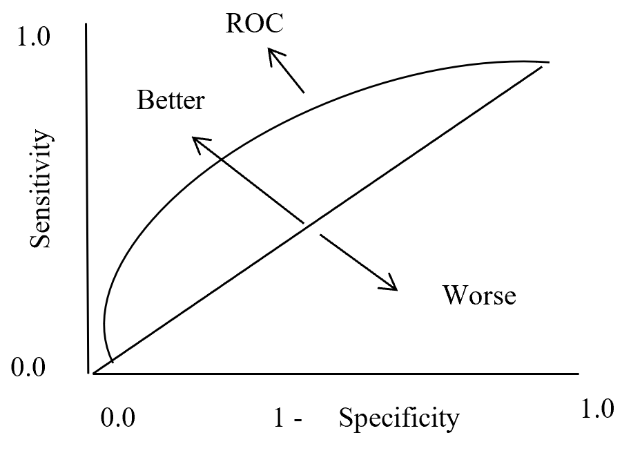
In statistics ROC is represent in a graph with plotting a curve which describe a binary classifiers performance as its differentiation threshold is varied. ROC (Equation-11) curve created true positive rate (TPR) against false positive rate (FPR). True positive rate also called as Sensitivity and False positive rate also known as Probability of false alarm. False positive rate also called as a probability of false alarm and it is calculated as 1 – Specificity.

True Positive Rate = \frac{True Positive}{True Positive + False Negative} = Recall or Sensivity

False Positive Rate = \frac{True Negative}{True Negative + False Positive} = 1 - Specificity

Equation- 11 ROC

So ROC (Receiver Operation Characteristic) curve allows visual representation between sensitivity and specificity associated with different values of the test result (Grzybowski, M. and Younger, J.G., 1997)

On ROC curve each point has different Threshold level. Below (Figure – 12) display the ROC curve. Higher the area curve covers is better that means high sensitivity and high specificity represent more accuracy. ROC curve also represent that if classifier predict more often true than it has more true positive and also more false positive. If classifier predict true less often then fewer false positive and also fewer true positive.

ROC Curve

ROC Curve

Figure – 12 ROC curve description

4.6.3 AUC (Area under Curve)

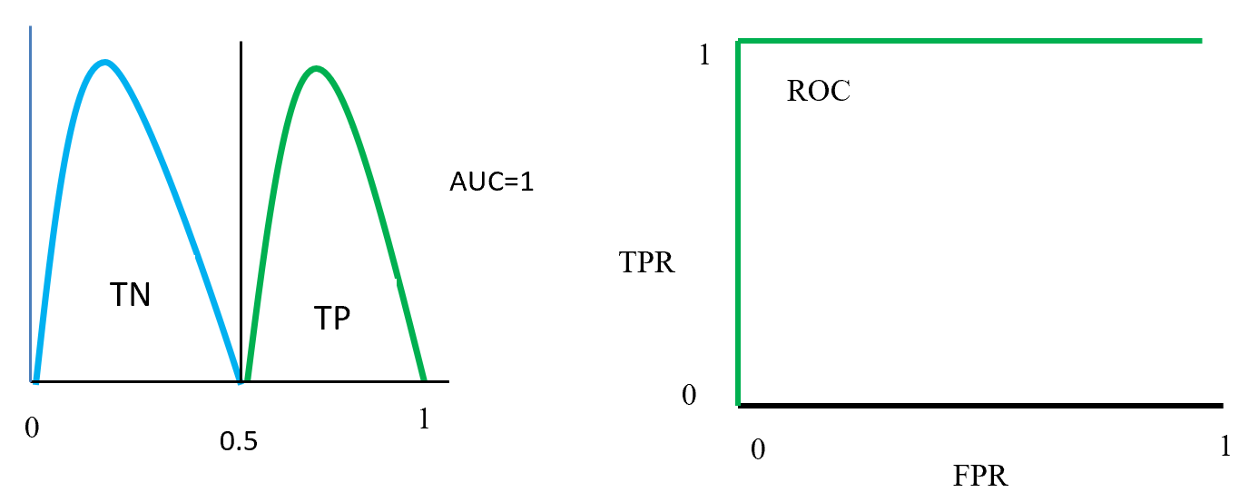
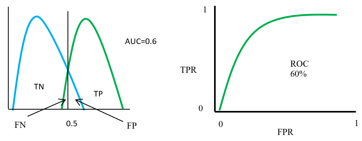
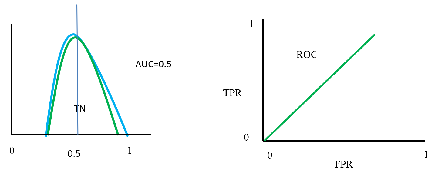
Area under curve (AUC) is the area surrounded by the ROC curve and AUC also represent the degree of separability that means how good the model to distinguished between classes. Higher the AUC value represents better the model performance to separate classes. AUC = 1 for perfect classifier, AUC = 0 represent worst classifier, and AUC = 0.5 means has no class separation capacity. Suppose AUC value is 0.6 that means 60% chance that model can classify positive and negative class.

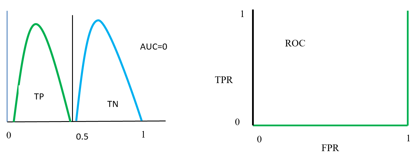
Figure- 13 to Figure – 16 displays an example of AUC where green distribution curve for positive class and blue distribution curve for negative class. Here threshold or cut-off value is 0.5 and range between ‘0’ to ‘1’. True negative = TN, True Positive = TP, False Negative = FN, False Positive = FP, True positive rate = TPR (range 0 to 1), False positive rate = FPR (range 0 to 1).

On Figure – 13 left distribution curve where two class curves does not overlap that means both class are perfectly distinguished. So this is ideal position and AUC value is 1.  On the left side ROC also display that TPR for positive class is 100% occupied.

ROC distributions (perfectly distinguished

ROC distributions (perfectly distinguished

Figure – 14 two class overlap each other and raise false positive (Type 1), false negative (Type 2) errors. Here error could be minimize or maximize according to threshold. Suppose here AUC = 0.6, that means chance of a model to distinguish two classes is 60%. On ROC curve also display the curve occupied for positive class is 60%.

ROC distributions (class partly overlap distinguished)

ROC distributions (class partly overlap distinguished)

Figure- 15 displayed that positive and negative overlap each other. Here AUC value is 0.5 or near to 0.5. On this position classifier model does not able distinguish positive and negative classes. On left side ROC curve become straight that means TPR and FPR are equal.

ROC distributions (class fully overlap distinguished)

ROC distributions (class fully overlap distinguished)

Figure- 16 positive and negative class swap position and on this position AUC = 0. That means classified model predict positive as a negative and negative as a positive. On the left ROC curve display that curve on FPR side fully fitted.

ROC distributions (class swap position distinguished)

ROC distributions (class swap position distinguished)

7 Summaries

This paper describes a data mining process flow and related model and its algorithm with textual representation. One hot encoding create dummy variable for class features and min-max scaling scale the data in a single format. Balancing by SMOTE data where Euclidian distance calculates the distance in-between nearest neighbour to produce synthetic data under minority class. LDA reduce the distance inside class and maximise distance in-between class and for two class problem give a single dimension features which is less costly to calculate accuracy by base algorithm (random forest and MLP classifier).  Confusion matrix gives the accuracy, precision, sensitivity, specificity which is help to take a decision about base algorithm. AUC and ROC curve also represent true positive rate against false positive rate which indicate base algorithm performance.

Base algorithm Random forest using CART with GINI impurity for feature selection to spread the tree. Here CART is selected because of less costly to run. Random forest algorithm is using bootstrap dataset to grow trees, and aggregation using majority vote to select accuracy.

MLP classifier is a neural network algorithm using backpropagation chain-rule to reducing error. Here inside layers using RLU activation function. Output layers using Sigmoid activation function and binary cross entropy loss function calculate the loss which is back propagate with Adam optimizer to optimize weight and reduce loss.

References:

  1. Visa, S., Ramsay, B., Ralescu, A.L. and Van Der Knaap, E., 2011. Confusion Matrix-based Feature Selection. MAICS, 710, pp.120-127.
  2. Grzybowski, M. and Younger, J.G., 1997. Statistical methodology: III. Receiver operating characteristic (ROC) curves. Academic Emergency Medicine, 4(8), pp.818-826.

On the difficulty of language: prerequisites for NLP with deep learning

This is the first article of my article series “Instructions on Transformer for people outside NLP field, but with examples of NLP.”

1 Preface

This section is virtually just my essay on language. You can skip this if you want to get down on more technical topic.

As I do not study in natural language processing (NLP) field, I would not be able to provide that deep insight into this fast changing deep leaning field throughout my article series. However at least I do understand language is a difficult and profound field, not only in engineering but also in many other study fields. Some people might be feeling that technologies are eliminating languages, or one’s motivations to understand other cultures. First of all, I would like you to keep it in mind that I am not a geek who is trying to turn this multilingual world into a homogeneous one and rebuild Tower of Babel, with deep learning. I would say I am more keen on social or anthropological sides of language.

I think you would think more about languages if you have mastered at least one foreign language. As my mother tongue is Japanese, which is totally different from many other Western languages in terms of characters and ambiguity, I understand translating is not what learning a language is all about. Each language has unique characteristics, and I believe they more or less influence one’s personalities. For example, many Western languages make the verb, I mean the conclusion, of sentences clear in the beginning part of the sentences. That is also true of Chinese, I heard. However in Japanese, the conclusion comes at the end, so that is likely to give an impression that Japanese people are being obscure or indecisive. Also, Japanese sentences usually omit their subjects. In German as well, the conclusion of a sentences tend to come at the end, but I am almost 100% sure that no Japanese people would feel German people make things unclear. I think that comes from the structures of German language, which tends to make the number, verb, relations of words crystal clear.

Source: https://twitter.com/nakamurakihiro

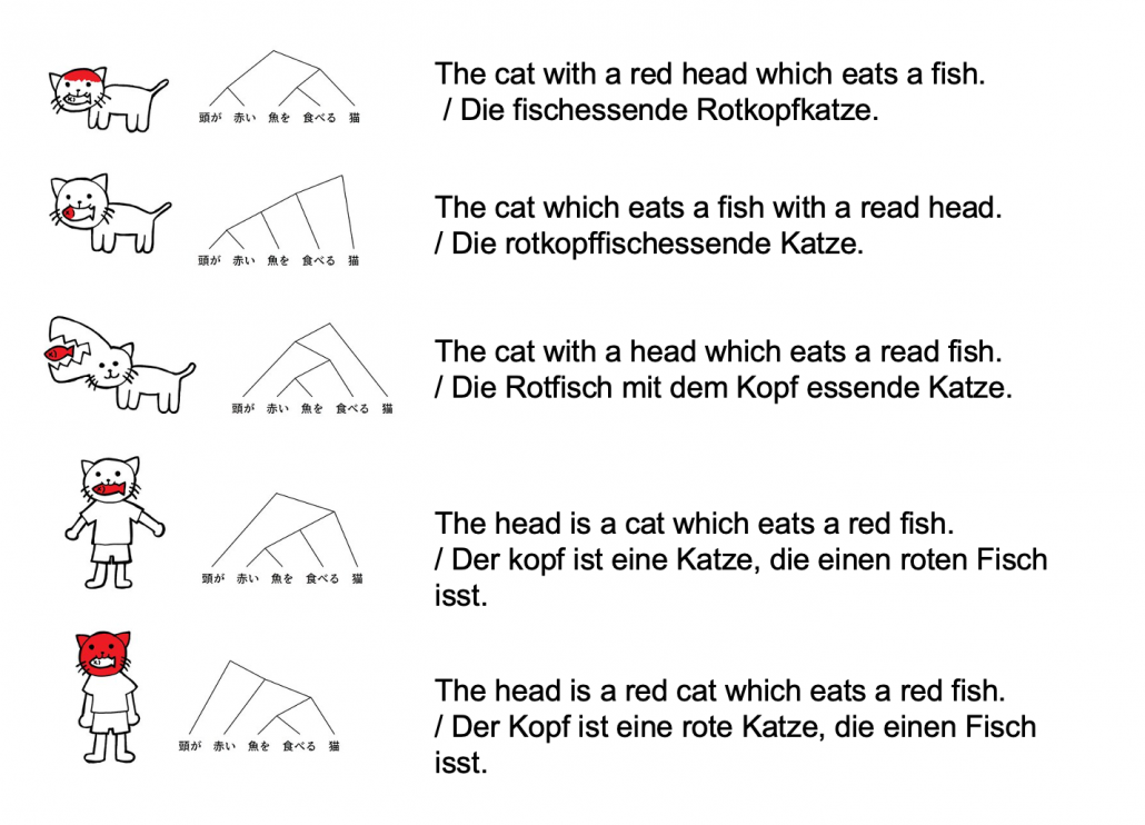
Let’s take an example to see how obscure Japanese is. A Japanese sentence 「頭が赤い魚を食べる猫」can be interpreted in five ways, depending on where you put emphases on.

Common sense tells you that the sentence is likely to mean the first two cases, but I am sure they can mean those five possibilities. There might be similarly obscure sentences in other languages, but I bet few languages can be as obscure as Japanese. Also as you can see from the last two sentences, you can omit subjects in Japanese. This rule is nothing exceptional. Japanese people usually don’t use subjects in normal conversations. And when you read classical Japanese, which Japanese high school students have to do just like Western students learn some of classical Latin, the writings omit subjects much more frequently.

*However interestingly we have rich vocabulary of subjects. The subject “I” can be translated to 「私」、「僕」、「俺」、「自分」、「うち」etc, depending on your personality, who you are talking to, and the time when it is written in.

I believe one can see the world only in the framework of their language, and it seems one’s personality changes depending on the language they use. I am not sure whether the language originally determines how they think, or how they think forms the language. But at least I would like you to keep it in mind that if you translate a conversation, for example a random conversation at a bar in Berlin, into Japanese, that would linguistically sound Japanese, but not anthropologically. Imagine that such kind of random conversation in Berlin or something is like playing a catch, I mean throwing a ball named “your opinion.” On the other hand,  normal conversations of Japanese people are in stead more of, I would say,  “resonance” of several tuning forks. They do their bests to show that they are listening to each other, by excessively nodding or just repeating “Really?”, but usually it seems hardly any constructive dialogues have been made.

*I sometimes feel you do not even need deep learning to simulate most of such Japanese conversations. Several-line Python codes would be enough.

My point is, this article series is mainly going to cover only a few techniques of NLP in deep learning field: sequence to sequence model (seq2seq model) , and especially Transformer. They are, at least for now, just mathematical models and mappings of a small part of this profound field of language (as far as I can cover in this article series). But still, examples of language would definitely help you understand Transformer model in the long run.

2 Tokens and word embedding

*Throughout my article series, “words” just means the normal words you use in daily life. “Tokens” means more general unit of NLP tasks. For example the word “Transformer” might be denoted as a single token “Transformer,” or maybe as a combination of two tokens “Trans” and “former.”

One challenging part of handling language data is its encodings. If you started learning programming in a language other than English, you would have encountered some troubles of using keyboards with different arrangements or with characters. Some comments on your codes in your native languages are sometimes not readable on some software. You can easily get away with that by using only English, but when it comes to NLP you have to deal with this difficulty seriously. How to encode characters in each language should be a first obstacle of NLP. In this article we are going to rely on a library named BPEmb, which provides word embedding in various languages, and you do not have to care so much about encodings in languages all over the world with this library.

In the first section, you might have noticed that Japanese sentence is not separated with spaces like Western languages. This is also true of Chinese language, and that means we need additional tasks of separating those sentences at least into proper chunks of words. This is not only a matter of engineering, but also of some linguistic fields. Also I think many people are not so conscious of how sentences in their native languages are grammatically separated.

The next point is, unlike other scientific data, such as temperature, velocity, voltage, or air pressure, language itself is not measured as numerical data. Thus in order to process language, including English, you first have to map language to certain numerical data, and after some processes you need to conversely map the output numerical data into language data. This section is going to be mainly about one-hot encoding and word embedding, the ways to convert word/token into numerical data. You might already have heard about this

You might have learnt about word embedding to some extent, but I hope you could get richer insight into this topic through this article.

2.1 One-hot encoding

One-hot encoding would be the most straightforward way to encode words/tokens. Assume that you have a dictionary whose size is |\mathcal{V}|, and it includes words from “a”, “ablation”, “actually” to “zombie”, “?”, “!”

In a mathematical manner, in order to choose a word out of those |\mathcal{V}| words, all you need is a |\mathcal{V}| dimensional vector, one of whose elements is 1, and the others are 0. When you want to choose the No. i word, which is “indeed” in the example below, its corresponding one-hot vector is \boldsymbol{v} = (0, \dots, 1, \dots, 0 ), where only the No. i element is 1. One-hot encoding is also easy to understand, and that’s all. It is easy to imagine that people have already come up with more complicated and better way to encoder words. And one major way to do that is word embedding.

2.2 Word embedding

Source: Francois Chollet, Deep Learning with Python,(2018), Manning

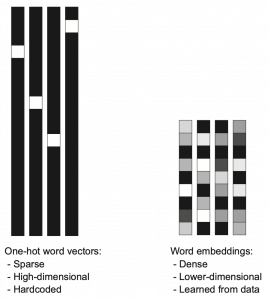
Actually word embedding is related to one-hot encoding, and if you understand how to train a simple neural network, for example densely connected layers, you would understand word embedding easily. The key idea of word embedding is denoting each token with a D dimensional vector, whose dimension is fewer than the vocabulary size |\mathcal{V}|. The elements of the resulting word embedding vector are real values, I mean not only 0 or 1. Obviously you can encode much richer variety of tokens with such vectors. The figure at the left side is from “Deep Learning with Python” by François Chollet, and I think this is an almost perfect and simple explanation of the comparison of one-hot encoding and word embedding. But the problem is how to get such convenient vectors. The answer is very simple: you have only to train a network whose inputs are one-hot vector of the vocabulary.

The figure below is a simplified model of word embedding of a certain word. When the word is input into a neural network, only the corresponding element of the one-hot vector is 1, and that virtually means the very first input layer is composed of one neuron whose value is 1. And the only one neuron propagates to the next D dimensional embedding layer. These weights are the very values which most other study materials call “an embedding vector.”

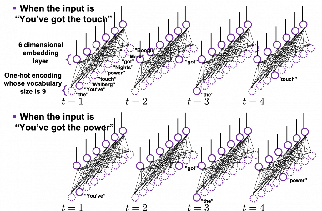
When you input each word into a certain network, for example RNN or Transformer, you map the input one-hot vector into the embedding layer/vector. The examples in the figure are how inputs are made when the input sentences are “You’ve got the touch” and “You’ve got the power.”   Assume that you have a dictionary of one-hot encoding, whose vocabulary is {“the”, “You’ve”, “Walberg”, “touch”, “power”, “Nights”, “got”, “Mark”, “Boogie”}, and the dimension of word embeding is 6. In this case |\mathcal{V}| = 9, D=6. When the inputs are “You’ve got the touch” or “You’ve got the power” , you put the one-hot vector corresponding to “You’ve”, “got”, “the”, “touch” or “You’ve”, “got”, “the”, “power” sequentially every time step t.

In order to get word embedding of certain vocabulary, you just need to train the network. We know that the words “actually” and “indeed” are used in similar ways in writings. Thus when we propagate those words into the embedding layer, we can expect that those embedding layers are similar. This is how we can mathematically get effective word embedding of certain vocabulary.

More interestingly, if word embedding is properly trained, you can mathematically “calculate” words. For example, \boldsymbol{v}_{king} - \boldsymbol{v}_{man} + \boldsymbol{v}_{woman} \approx \boldsymbol{v}_{queen}, \boldsymbol{v}_{Japan} - \boldsymbol{v}_{Tokyo} + \boldsymbol{v}_{Vietnam} \approx \boldsymbol{v}_{Hanoi}.

*I have tried to demonstrate this type of calculation on several word embedding, but none of them seem to work well. At least you should keep it in mind that word embedding learns complicated linear relations between words.

I should explain word embedding techniques such as word2vec in detail, but the main focus of this article is not NLP, so the points I have mentioned are enough to understand Transformer model with NLP examples in the upcoming articles.


3 Language model

Language models is one of the most straightforward, but crucial ideas in NLP. This is also a big topic, so this article is going to cover only basic points. Language model is a mathematical model of the probabilities of which words to come next, given a context. For example if you have a sentence “In the lecture, he opened a _.”, a language model predicts what comes at the part “_.” It is obvious that this is contextual. If you are talking about general university students, “_” would be “textbook,” but if you are talking about Japanese universities, especially in liberal art department, “_” would be more likely to be “smartphone. I think most of you use this language model everyday. When you type in something on your computer or smartphone, you would constantly see text predictions, or they might even correct your spelling or grammatical errors. This is language modelling. You can make language models in several ways, such as n-gram and neural language models, but in this article I can explain only general formulations for such models.

*I am not sure which algorithm is used in which services. That must be too fast changing and competitive for me to catch up.

As I mentioned in the first article series on RNN, a sentence is usually processed as sequence data in NLP. One single sentence is denoted as \boldsymbol{X} = (\boldsymbol{x}^{(1)}, \dots, \boldsymbol{x}^{(\tau)}), a list of vectors. The vectors are usually embedding vectors, and the (t) is the index of the order of tokens. For example the sentence “You’ve go the power.” can be expressed as \boldsymbol{X} = (\boldsymbol{x}^{(1)}, \boldsymbol{x}^{(2)}, \boldsymbol{x}^{(3)}, \boldsymbol{x}^{(4)}), where \boldsymbol{x}^{(1)}, \boldsymbol{x}^{(2)}, \boldsymbol{x}^{(3)}, \boldsymbol{x}^{(4)} denote “You’ve”, “got”, “the”, “power”, “.” respectively. In this case \tau = 4.

In practice a sentence \boldsymbol{X} usually includes two tokens BOS and EOS at the beginning and the end of the sentence. They mean “Beginning Of Sentence” and “End Of Sentence” respectively. Thus in many cases \boldsymbol{X} = (\boldsymbol{BOS} , \boldsymbol{x}^{(1)}, \dots, \boldsymbol{x}^{(\tau)}, \boldsymbol{EOS} ). \boldsymbol{BOS} and \boldsymbol{EOS} are also both vectors, at least in the Tensorflow tutorial.

P(\boldsymbol{X} = (\boldsymbol{BOS}, \boldsymbol{x}^{(1)}, \dots, \boldsymbol{x}^{(\tau)}, \boldsymbol{EOS}) is the probability of incidence of the sentence. But it is easy to imagine that it would be very hard to directly calculate how likely the sentence \boldsymbol{X} appears out of all possible sentences. I would rather say it is impossible. Thus instead in NLP we calculate the probability P(\boldsymbol{X}) as a product of the probability of incidence or a certain word, given all the words so far. When you’ve got the words (\boldsymbol{x}^{(1)}, \dots, \boldsymbol{x}^{(t-1}) so far, the probability of the incidence of \boldsymbol{x}^{(t)}, given the context is  P(\boldsymbol{x}^{(t)}|\boldsymbol{x}^{(1)}, \dots, \boldsymbol{x}^{(t-1)}). P(\boldsymbol{BOS}) is a probability of the the sentence \boldsymbol{X} being (\boldsymbol{BOS}), and the probability of \boldsymbol{X} being (\boldsymbol{BOS}, \boldsymbol{x}^{(1)}) can be decomposed this way: P(\boldsymbol{BOS}, \boldsymbol{x}^{(1)}) = P(\boldsymbol{x}^{(1)}|\boldsymbol{BOS})P(\boldsymbol{BOS}).

Just as well P(\boldsymbol{BOS}, \boldsymbol{x}^{(1)}, \boldsymbol{x}^{(2)}) = P(\boldsymbol{x}^{(2)}| \boldsymbol{BOS}, \boldsymbol{x}^{(1)}) P( \boldsymbol{BOS}, \boldsymbol{x}^{(1)})= P(\boldsymbol{x}^{(2)}| \boldsymbol{BOS}, \boldsymbol{x}^{(1)}) P(\boldsymbol{x}^{(1)}| \boldsymbol{BOS}) P( \boldsymbol{BOS}).

Hence, the general probability of incidence of a sentence \boldsymbol{X} is P(\boldsymbol{X})=P(\boldsymbol{BOS}, \boldsymbol{x}^{(1)}, \boldsymbol{x}^{(2)}, \dots, \boldsymbol{x}^{(\tau -1)}, \boldsymbol{x}^{(\tau)}, \boldsymbol{EOS}) = P(\boldsymbol{EOS}| \boldsymbol{BOS}, \boldsymbol{x}^{(1)}, \dots, \boldsymbol{x}^{(\tau)}) P(\boldsymbol{x}^{(\tau)}| \boldsymbol{BOS}, \boldsymbol{x}^{(1)}, \dots, \boldsymbol{x}^{(\tau - 1)}) \cdots P(\boldsymbol{x}^{(2)}| \boldsymbol{BOS}, \boldsymbol{x}^{(1)}) P(\boldsymbol{x}^{(1)}| \boldsymbol{BOS}) P(\boldsymbol{BOS}).

Let \boldsymbol{x}^{(0)} be \boldsymbol{BOS} and \boldsymbol{x}^{(\tau + 1)} be \boldsymbol{EOS}. Plus, let P(\boldsymbol{x}^{(t+1)}|\boldsymbol{X}_{[0, t]}) be P(\boldsymbol{x}^{(t+1)}|\boldsymbol{x}^{(0)}, \dots, \boldsymbol{x}^{(t)}), then P(\boldsymbol{X}) = P(\boldsymbol{x}^{(0)})\prod_{t=0}^{\tau}{P(\boldsymbol{x}^{(t+1)}|\boldsymbol{X}_{[0, t]})}. Language models calculate which words to come sequentially in this way.

Here’s a question: how would you evaluate a language model?

I would say the answer is, when the language model generates words, the more confident the language model is, the better the language model is. Given a context, when the distribution of the next word is concentrated on a certain word, we can say the language model is confident about which word to come next, given the context.

*For some people, it would be more understandable to call this “entropy.”

Let’s take the vocabulary {“the”, “You’ve”, “Walberg”, “touch”, “power”, “Nights”, “got”, “Mark”, “Boogie”} as an example. Assume that P(\boldsymbol{X}) = P(\boldsymbol{BOS}, \boldsymbol{You've}, \boldsymbol{got}, \boldsymbol{the}, \boldsymbol{touch}, \boldsymbol{EOS}) = P(\boldsymbol{BOS}, \boldsymbol{x}^{(1)}, \boldsymbol{x}^{(2)}, \boldsymbol{x}^{(3)}, \boldsymbol{x}^{(4)}, \boldsymbol{EOS})= P(\boldsymbol{x}^{(0)})\prod_{t=0}^{4}{P(\boldsymbol{x}^{(t+1)}|\boldsymbol{X}_{[0, t]})}. Given a context (\boldsymbol{BOS}, \boldsymbol{x}^{(1)}), the probability of incidence of \boldsymbol{x}^{(2)} is P(\boldsymbol{x}^{2}|\boldsymbol{BOS}, \boldsymbol{x}^{(1)}). In the figure below, the distribution at the left side is less confident because probabilities do not spread widely, on the other hand the one at the right side is more confident that next word is “got” because the distribution concentrates on “got”.

*You have to keep it in mind that the sum of all possible probability P(\boldsymbol{x}^{(2)} | \boldsymbol{BOS}, \boldsymbol{x}^{(1)}) is 1, that is, P(\boldsymbol{the}| \boldsymbol{BOS}, \boldsymbol{x}^{(1)}) + P(\boldsymbol{You've}| \boldsymbol{BOS}, \boldsymbol{x}^{(1)}) + \cdots + P(\boldsymbol{Boogie}| \boldsymbol{BOS}, \boldsymbol{x}^{(1)}) = 1.

While the language model generating the sentence “BOS You’ve got the touch EOS”, it is better if the language model keeps being confident. If it is confident, P(\boldsymbol{X})= P(\boldsymbol{BOS}) P(\boldsymbol{x}^{(1)}|\boldsymbol{BOS}}P(\boldsymbol{x}^{(3)}|\boldsymbol{BOS}, \boldsymbol{x}^{(1)}, \boldsymbol{x}^{(2)}) P(\boldsymbol{x}^{(4)}|\boldsymbol{BOS}, \boldsymbol{x}^{(1)}, \boldsymbol{x}^{(2)}, \boldsymbol{x}^{(3)}) P(\boldsymbol{EOS}|\boldsymbol{BOS}, \boldsymbol{x}^{(1)}, \boldsymbol{x}^{(2)}, \boldsymbol{x}^{(3)}, \boldsymbol{x}^{(4)})} gets higher. Thus (-1) \{ log_{b}{P(\boldsymbol{BOS})} + log_{b}{P(\boldsymbol{x}^{(1)}|\boldsymbol{BOS}}) + log_{b}{P(\boldsymbol{x}^{(3)}|\boldsymbol{BOS}, \boldsymbol{x}^{(1)}, \boldsymbol{x}^{(2)})} + log_{b}{P(\boldsymbol{x}^{(4)}|\boldsymbol{BOS}, \boldsymbol{x}^{(1)}, \boldsymbol{x}^{(2)}, \boldsymbol{x}^{(3)})} + log_{b}{P(\boldsymbol{EOS}|\boldsymbol{BOS}, \boldsymbol{x}^{(1)}, \boldsymbol{x}^{(2)}, \boldsymbol{x}^{(3)}, \boldsymbol{x}^{(4)})} \} gets lower, where usually b=2 or b=e.

This is how to measure how confident language models are, and the indicator of the confidence is called perplexity. Assume that you have a data set for evaluation \mathcal{D} = (\boldsymbol{X}_1, \dots, \boldsymbol{X}_n, \dots, \boldsymbol{X}_{|\mathcal{D}|}), which is composed of |\mathcal{D}| sentences in total. Each sentence \boldsymbol{X}_n = (\boldsymbol{x}^{(0)})\prod_{t=0}^{\tau ^{(n)}}{P(\boldsymbol{x}_{n}^{(t+1)}|\boldsymbol{X}_{n, [0, t]})} has \tau^{(n)} tokens in total excluding \boldsymbol{BOS}, \boldsymbol{EOS}. And let |\mathcal{V}| be the size of the vocabulary of the language model. Then the perplexity of the language model is b^z, where z = \frac{-1}{|\mathcal{V}|}\sum_{n=1}^{|\mathcal{D}|}{\sum_{t=0}^{\tau ^{(n)}}{log_{b}P(\boldsymbol{x}_{n}^{(t+1)}|\boldsymbol{X}_{n, [0, t]})}. The b is usually 2 or e.

For example, assume that \mathcal{V} is vocabulary {“the”, “You’ve”, “Walberg”, “touch”, “power”, “Nights”, “got”, “Mark”, “Boogie”}. Also assume that the evaluation data set for perplexity of a language model is \mathcal{D} = (\boldsymbol{X}_1, \boldsymbol{X}_2), where \boldsymbol{X_1} =(\boldsymbol{You've}, \boldsymbol{got}, \boldsymbol{the}, \boldsymbol{touch}) \boldsymbol{X_2} = (\boldsymbol{You've}, \boldsymbol{got}, \boldsymbol{the }, \boldsymbol{power}). In this case |\mathcal{V}|=9, |\mathcal{D}|=2. I have already showed you how to calculate the perplexity of the sentence “You’ve got the touch.” above. You just need to do a similar thing on another sentence “You’ve got the power”, and then you can get the perplexity of the language model.

*If the network is not properly trained, it would also be confident of generating wrong outputs. However, such network still would give high perplexity because it is “confident” at any rate. I’m sorry I don’t know how to tackle the problem. Please let me put this aside, and let’s get down on Transformer model soon.

Appendix

Let’s see how word embedding is implemented with a very simple example in the official Tensorflow tutorial. It is a simple binary classification task on IMDb Dataset. The dataset is composed to comments on movies by movie critics, and you have only to classify if the commentary is positive or negative about the movie. For example when you get you get an input “To be honest, Michael Bay is a terrible as an action film maker. You cannot understand what is going on during combat scenes, and his movies rely too much on advertisements. I got a headache when Mark Walberg used a Chinese cridit card in Texas. However he is very competent when it comes to humorous scenes. He is very talented as a comedy director, and I have to admit I laughed a lot.“, the neural netowork has to judge whether the statement is positive or negative.

This networks just takes an average of input embedding vectors and regress it into a one dimensional value from 0 to 1. The shape of embedding layer is (8185, 16). Weights of neural netowrks are usually implemented as matrices, and you can see that each row of the matrix corresponds to emmbedding vector of each token.

*It is easy to imagine that this technique is problematic. This network virtually taking a mean of input embedding vectors. That could mean if the input sentence includes relatively many tokens with negative meanings, it is inclined to be classified as negative. But for example, if the sentence is “This masterpiece is a dark comedy by Charlie Chaplin which depicted stupidity of the evil tyrant gaining power in the time. It thoroughly mocked Germany in the time as an absurd group of fanatics, but such propaganda could have never been made until ‘Casablanca.'” , this can be classified as negative, because only the part “masterpiece” is positive as a token, and there are much more words with negative meanings themselves.

The official Tensorflow tutorial provides visualization of word embedding with Embedding Projector, but I would like you to take more control over the data by yourself. Please just copy and paste the codes below, installing necessary libraries. You would get a map of vocabulary used in the text classification task. It seems you cannot find clear tendency of the clusters of the tokens. You can try other dimension reduction methods to get maps of the vocabulary by for example using Scikit Learn.

[References]

[1] “Word embeddings” Tensorflow Core
https://www.tensorflow.org/tutorials/text/word_embeddings

[2]Tsuboi Yuuta, Unno Yuuya, Suzuki Jun, “Machine Learning Professional Series: Natural Language Processing with Deep Learning,” (2017), pp. 43-64, 72-85, 91-94
坪井祐太、海野裕也、鈴木潤 著, 「機械学習プロフェッショナルシリーズ 深層学習による自然言語処理」, (2017), pp. 43-64, 72-85, 191-193

[3]”Stanford CS224N: NLP with Deep Learning | Winter 2019 | Lecture 8 – Translation, Seq2Seq, Attention”, stanfordonline, (2019)
https://www.youtube.com/watch?v=XXtpJxZBa2c

[4] Francois Chollet, Deep Learning with Python,(2018), Manning , pp. 178-185

[5]”2.2. Manifold learning,” scikit-learn
https://scikit-learn.org/stable/modules/manifold.html

* I make study materials on machine learning, sponsored by DATANOMIQ. I do my best to make my content as straightforward but as precise as possible. I include all of my reference sources. If you notice any mistakes in my materials, including grammatical errors, please let me know (email: yasuto.tamura@datanomiq.de). And if you have any advice for making my materials more understandable to learners, I would appreciate hearing it.

CRISP-DM methodology in technical view

On this paper discuss about CRISP-DM (Cross Industry Standard Process for data mining) methodology and its steps including selecting technique to successful the data mining process. Before going to CRISP-DM it is better to understand what data mining is? So, here first I introduce the data mining and then discuss about CRISP-DM and its steps for any beginner (data scientist) need to know.

1 Data Mining

Data mining is an exploratory analysis where has no idea about interesting outcome (Kantardzic, 2003). So data mining is a process to explore by analysis a large set of data to discover meaningful information which help the business to take a proper decision. For better business decision data mining is a way to select feature, correlation, and interesting patterns from large dataset (Fu, 1997; SPSS White Paper, 1999).

Data mining is a step by step process to discover knowledge from data. Pre-processing data is vital part for a data mining. In pre-process remove noisy data, combining multiple sources of data, retrieve relevant feature and transforming data for analysis. After pre-process mining algorithm applied to extract data pattern so data mining is a step by step process and applied algorithm to find meaning full data pattern. Actually data mining is not only conventional analysis it is more than that (Read, 1999).

Data mining and statistics closely related. Main goal of data mining and statistic is find the structure of data because data mining is a part of statistics (Hand, 1999). However, data mining use tools, techniques, database, machine learning which not part of statistics but data mining use statistics algorithm to find a pattern or discover hidden decision.

Data mining objective could be prediction or description. On prediction data mining considering several features of dataset to predict unidentified future, on the other hand description involve identifying pattern of data to interpreted (Kantardzic, 2003).

From figure 1.1 shows data mining is the only one part of getting unknown information from data but it is the central process of whole process. Before data mining there are several processes need to be done like collecting data from several sources than integrated data and keep in data storage. Stored unprocessed data evaluated and selected with pre-processed activity to give a standard format than data mining algorithm to analysis for hidden pattern.

Data Mining Process

2 CRISP-DM Methodologies

Cross Industry Standard Process for data mining (CRISP-DM) is most popular and widely uses data mining methodology. CRISP-DM breaks down the data mining project life cycle into six phases and each phase consists of many second-level generic tasks. Generic task cover all possible data mining application. CRISP-DM extends KDD (Knowledge Discovery and Data Mining) into six steps which are sequence of data mining application (Martínez-Plumed 2019).

Data science and data mining project extract meaningful information from data. Data science is an art where a lot of time need to spend for understanding the business value and data before applying any algorithm then evaluate and deployed a project. CRISP-DM help any data science and data mining project from start to end by giving step by step process.

Present world every day billions of data are generating. So organisations are struggling with overwhelmed data to process and find a business goal. Comprehensive data mining methodology, CRISP-DM help business to achieve desirable goal by analysing data.

CRISP-DM (Cross Industry Standard Process for Data Mining) is well documented, freely available, data mining methodology. CRISP-DM is developed by more than 200 data mining users and many mining tool and service providers funded by European Union. CRISP-DM encourages organization for best practice and provides a structure of data mining to get better, faster result.

CRISP-DM is a step by step methodology. Figure-2.1 show the phases of CRISP-DM and process of data mining. Here one side arrow indicates the dependency between phases and double side arrow represents repeatable process. Six phases of CRISP-DM are Business understanding, Data understanding, Modelling, Evaluation and Deployment.

CRISP-DM

2.1 Business Understanding

Business Understanding or domain understanding is the first step of CRISP-DM methodology. On this stage identify the area of business which is going to transform into meaningful information by analysing, processing and implementing several algorithms. Business understanding identifies the available resource (human and hardware), problems and set a goal. Identification of business objective should be agreed with project sponsors and other unit of business which will be affected. This step also focuses about details business success criteria, requirements, constraints, risk, project plan and timeline.

2.2 Data Understanding

Data understanding is the second and closely related with the business understanding phase. This phase mainly focus on data collection and proceeds to get familiar with the data and also detect interesting subset from data. Data understanding has four subsets these are:-

2.2.1 Initial data collection

On this subset considering the data collection sources which is mainly divided into two categories like outsource data or internal source data.  If data is from outsource then it may costly, time consuming and may be low quality but if data is collected form internal source it is an easy and less costly, but it may be contain irrelevant data. If internal source data does not fulfil the interest of analysis than it is necessary to move outsource data. Data collection also give an assumption that the data is quantitative (continuous, count) or qualitative (categorical).  It also gives information about balance or imbalanced dataset.  On data collection should avoid random error, systematic error, exclusion errors, and errors of choosing.

2.2.2 Data Description

Data description performs initial analysis about data. On this stage it is going to determine about the source of data like RDBMS, SQL, NoSQL, Big data etc. then analysis and describe the data about size (large data set give more accurate result but time consuming), number of records, tables, database, variables, and data types (numeric, categorical or Boolean). On this phase examine the accessibility and availability of attributes.

2.2.3 Exploratory data analysis (EDA)

On exploratory data analysis describe the inferential statistics, descriptive statistics and graphical representation of data. Inferential statistics summarize the entire population from the sample data to perform sampling and hypothesis testing. On Parametric hypothesis testing  (Null or alternate – ANOVA, t-test, chi square test) perform for known distribution (based on population) like mean, variance, standard deviation, proportion and Non-parametric hypothesis testing perform when distribution is unknown or sample size is small. On sample dataset, random sampling implement when dataset is balance but for imbalance dataset should be follow random resampling (under  and over sampling), k fold cross validation, SMOTE (synthetic minority oversampling technique), cluster base sampling, ensemble techniques (bagging and boosting – Add boost, Gradient Tree Boosting, XG Boost) to form a balance dataset.

On descriptive statistics analysis describe about the mean, median, mode for measures of central tendency on first moment business decision. On second moment business decision describe the measure of dispersion about the variance, standard deviation and range of data.  On third and fourth moment business decision describe accordingly skewness (Positive skewness – heavier tail to the right, negative skewness – heavier tail to the left, Zero skewness – symmetric distribution) and Kurtosis (Leptokurtosis – heavy tail, platykurtosis – light tail, mesokurtic – normal distribution).

Graphical representation is divided into univariate, bivariate and multivariate analysis. Under univariate whisker plot, histogram identify the outliers and shape of distribution of data and Q-Q plot (Quantile – Quantile) plot describe the normality of data that means data is normally distribution or not.  On whisker plot if data present above of Q3 + 1.5 (IQR) and below of Q1 – 1.5 (IQR) is outlier. For Bivariate correlations identify with scatter plot which describe positive, negative or no correlation and also identify the data linearity or non-linearity. Scatter plot also describe the clusters and outliers of data.  For multivariate has no graphical analysis but used to use regression analysis, ANOVA, Hypothesis analysis.

2.2.4 Data Quality analysis

This phase identified and describes the potential errors like outliers, missing data, level of granularity, validation, reliability, bad metadata and inconsistency.  On this phase AAA (attribute agreement analysis) analysed discrete data for data error. Continuous data analysed with Gage repeatability and reproducibility (Gage R & R) which follow SOP (standard operating procedures). Here Gage R & R define the aggregation of variation in the measurement data because of the measurement system.

2.3 Data Preparation

Data Preparation is the time consuming stage for every data science project. Overall on every data science project 60% to 70% time spend on data preparation stage. Data preparation stapes are described below.

2.3.1 Data integration

Data integration involved to integrate or merged multiple dataset. Integration integrates data from different dataset where same attribute or same columns presents but when there is different attribute then merging the both dataset.

2.3.2 Data Wrangling

On this subset data are going to clean, curate and prepare for next level. Here analysis the outlier and treatment done with 3 R technique (Rectify, Remove, Retain) and for special cases if there are lots of outliner then need to treat outlier separately (upper outliner in an one dataset and lower outliner in another dataset) and alpha (significant value) trim technique use to separate the outliner from the original dataset. If dataset has a missing data then need to use imputation technique like mean, median, mode, regression, KNN etc.

If dataset is not normal or has a collinearity problem or autocorrelation then need to implement transformation techniques like log, exponential, sort, Reciprocal, Box-cox etc. On this subset use the data normalization (data –means/standard deviation) or standardization (min- max scaler) technique to make unitless and scale free data. This step also help if data required converting into categorical then need to use discretization or binning or grouping technique. For factor variable (where has limited set of values), dummy variable creation technique need to apply like one hot encoding.  On this subset also help heterogeneous data to transform into homogenous with clustering technique. Data inconsistencies also handle the inconsistence of data to make data in a single scale.

2.3.3 Feature engineering and selection/reduction

Feature engineering may called as attribute generation or feature extraction. Feature extraction creating new feature by reducing original feature to make simplex model. Feature engineering also do the normalized feature by producing calculative new feature. So feature engineering is a data pre-process technique where improve data quality by cleaning, integration, reduction, transformation and scaling.

Feature selections reduce the multicollinearity or high correlated data and make model simple. Main two type of feature selection technique are supervised and unsupervised. Principal Components Analysis (PCA) is an unsupervised feature reduction/ feature selection technique and LDA is a Linear Discriminant analysis supervised technique mainly use for classification problem. LDA analyse by comparing mean of the variables. Supervised technique is three types filter, wrapper and ensemble method. Filter method is easy to implement but wrapper is costly method and ensemble use inside a model.

2.4 Model

2.4.1 Model Selection Technique

Model selection techniques are influence by accuracy and performance.  Because recommendation need better performance but banking fraud detection needs better accuracy technique.  Model is mainly subdivided into two category supervised learning where predict an output variable according to given an input variable and unsupervised learning where has not output variable.

On supervised learning if an output variable is categorical than it is classification problem like two classes or multiclass classification problem. If an output variable is continuous (numerical) then the problem is called prediction problem. If need to recommending according to relevant information is called recommendation problem or if need to retrieve data according to relevance data is called retrieval problem.

On unsupervised learning where target or output variable is not present. On this technique all variable is treated as an input variable. Unsupervised learning also called clustering problem where clustering the dataset for future decision.

Reinforcement learning agent solves the problem by getting reward for success and penalty for any failure. And semi-supervised learning is a process to solve the problem by combining supervised and unsupervised learning method. On semi-supervised, a problem solved by apply unsupervised clustering technique then for each cluster apply different type of supervised machine learning algorithm like linear algorithm, neural network, K nearest  neighbour etc.

On data mining model selection technique, where output variable is known, then need to implement supervised learning.  Regression is the first choice where interpretation of parameter is important. If response variable is continuous then linear regression or if response variable is discrete with 2 categories value then logistic regression or if response variable is discrete with more than 2 categorical values then multinomial or ordinal regression or if response variable is count then poission where mean is equal to variance or negative binomial regression where variance is grater then mean or if response variable contain excessive zero values then need to choose Zero inflated poission (ZIP) or Zero inflated negative binomial (ZINB).

On supervised technique except regression technique all other technique can be used for both continuous or categorical response variable like KNN (K-Nearest Neighbour),  Naïve Bays, Black box techniques (Neural network, Support vector machine), Ensemble Techniques (Stacking, Bagging like random forest, Boosting like Decision tree, Gradient boosting, XGB, Adaboost).

When response variable is unknown then need to implement unsupervised learning. Unsupervised learning for row reduction is K-Means, Hierarchical etc., for columns reduction or dimension reduction PCA (principal component analysis), LDA (Linear Discriminant analysis), SVD (singular value decomposition) etc. On market basket analysis or association rules where measure are support and confidence then lift ration to determine which rules is important. There are recommendation systems, text analysis and NLP (Natural language processing) also unsupervised learning technique.

For time series need to select forecasting technique. Where forecasting may model based or data based. For Trend under model based need to use linear, exponential, quadratic techniques. And for seasonality need to use additive, multiplicative techniques. On data base approaches used auto regressive, moving average, last sample, exponential smoothing (e.g. SES – simple exponential smoothing, double exponential smoothing, and winters method).

2.4.2 Model building

After selection model according to model criterion model is need to be build. On model building provided data is subdivided with training, validation and testing.  But sometime data is subdivided just training and testing where information may leak from testing data to training data and cause an overfitting problem. So training dataset should be divided into training and validation whereas training model is tested with validation data and if need any tuning to do according to feedback from validation dataset. If accuracy is acceptable and error is reasonable then combine the training and validation data and build the model and test it on unknown testing dataset. If the training error and testing error is minimal or reasonable then the model is right fit or if the training error is low and testing error is high then model is over fitted (Variance) or if training error is high and testing error is also high then model is under fitted (bias). When model is over fitted then need to implement regularization technique (e.g. linear – lasso, ridge regression, Decision tree – pre-pruning, post-pruning, Knn – K value, Naïve Bays – Laplace, Neural network – dropout, drop connect, batch normalization, SVM –  kernel trick)

When data is balance then split the data training, validation and testing and here training is larger dataset then validation and testing. If data set is imbalance then need to use random resampling (over and under) by artificially increases training dataset. On random resampling by randomly partitioning data and for each partition implement the model and taking the average of accuracy. Under K fold cross validation creating K times cross dataset and creating model for every dataset and validate, after validation taking the average of accuracy of all model. There is more technique for imbalance dataset like SMOTH (synthetic minority oversampling technique), cluster based sampling, ensemble techniques e.g. Bagging, Boosting (Ada Boost, XGBoost).

2.4.3 Model evaluation and Tuning

On this stage model evaluate according to errors and accuracy and tune the error and accuracy for acceptable manner. For continuous outcome variable there are several way to measure the error like mean error, mean absolute deviation, Mean squared error, Root mean squared error, Mean percentage error and Mean absolute percentage error but more acceptable way is Mean absolute percentage error. For this continuous data if error is known then it is easy to find out the accuracy because accuracy and error combining value is one. The error function also called cost function or loss function.

For discrete output variable model, for evaluation and tuning need to use confusion matrix or cross table. From confusion matrix, by measuring accuracy, error, precision, sensitivity, specificity, F1 help to take decision about model fitness. ROC curve (Receiver operating characteristic curve), AUC curve (Area under the ROC curve) also evaluate the discrete output variable. AUC and ROC curve plot of sensitivity (true positive rate) vs 1-specificity (false positive rate).  Here sensitivity is a positive recall and  recall is basically out of all positive samples, how sample classifier able to identify. Specificity is negative recall here recall is out of all negative samples, how many sample classifier able to identify.  On AUC where more the area under the ROC is represent better accuracy. On ROC were step bend it’s indicate the cut off value.

2.4.4 Model Assessment

There is several ways to assess the model. First it is need to verify model performance and success according to desire achievement. It needs to identify the implemented model result according to accuracy where accuracy is repeatable and reproducible. It is also need to identify that the model is scalable, maintainable, robust and easy to deploy. On assessment identify that the model evaluation about satisfactory results (identify the precision, recall, sensitivity are balance) and meet business requirements.

2.5 Evaluation

On evaluation steps, all models which are built with same dataset, given a rank to find out the best model by assessing model quality of result and simplicity of algorithm and also cost of deployment. Evaluation part contains the data sufficiency report according to model result and also contain suggestion, feedback and recommendation from solutions team and SMEs (Subject matter experts) and record all these under OPA (organizational process assets).

2.6 Deployment

Deployment process needs to monitor under PEST (political economical social technological) changes within the organization and outside of the organization. PEST is similar to SWOT (strength weakness opportunity and thread) where SW represents the changes of internal and OT represents external changes.

On this deployment steps model should be seamless (like same environment, same result etc.) from development to production. Deployment plan contain the details of human resources, hardware, software requirements. Deployment plan also contain maintenance and monitoring plan by checking the model result and validity and if required then implement retire, replace and update plan.

3 Summaries

CRISP-DM implementation is costly and time consuming. But CRISP-DM methodology is an umbrella for data mining process. CRISP-DM has six phases, Business understanding, Data understanding, Modelling, Evaluation and Deployment. Every phase has several individual criteria, standard and process. CRISP-DM is Guideline for data mining process so if CRISP-DM is going to implement in any project it is necessary to follow each and every single guideline and maintain standard and criteria to get required result.

4 References

  1. Fu, Y., (1997), “Data Mining: Tasks, Techniques and Applications”, Potentials, IEEE, 16: 4, 18–20.
  2. Hand, D. J., (1999), “Statistics and Data Mining: Intersecting Disciplines”, ACM SIGKDD Explorations Newsletter, 1: 1, 16 – 19.
  3. Kantardzic, M., (2003), “Data Mining: Concepts, Models, Methods, and Algorithms” John Wiley and Sons, Inc., Hoboken, New Jersey
  4. Martínez-Plumed, F., Contreras-Ochando, L., Ferri, C., Orallo, J.H., Kull, M., Lachiche, N., Quintana, M.J.R. and Flach, P.A., 2019. CRISP-DM Twenty Years Later: From Data Mining Processes to Data Science Trajectories. IEEE Transactions on Knowledge and Data Engineering.
  5. Read, B.J., (1999), “Data Mining and Science? Knowledge discovery in science as opposed to business”, 12th ERCIM Workshop on Database Research.

Instructions on Transformer for people outside NLP field, but with examples of NLP

I found it quite difficult to explain mathematical details of long short-term memory (LSTM) in my previous article series. But when I was studying LSTM, a new promising algorithm was already attracting attentions. The algorithm is named Transformer. Its algorithm was a first announced in a paper named “Attention Is All You Need,” and it outperformed conventional translation algorithms with lower computational costs.

In this article series, I am going to provide explanations on minimum prerequisites for understanding deep learning in NLP (natural language process) tasks, but NLP is not the main focus of this article series, and actually I do not study in NLP field. I think Transformer is going to be a new major model of deep learning as well as CNN or RNN, and the model is now being applied in various fields.

Even though Transformer is going to be a very general deep learning model, I still believe it would be an effective way to understand Transformer with some NLP because language is a good topic we have in common. Unlike my previous article series, in which I tried to explain theoretical side of RNN as precisely as possible, in this article I am going to focus on practical stuff with my toy implementations of NLP tasks, largely based on Tensorflow official tutorial. But still I will do my best to make it as straightforward as possible to understand the architecture of Transformer with various original figures.

This series is going to be composed of the articles below.

If you are in the field and can read the codes in the official tutorial with no questions, this article series is not for you, but if you want to see how a Transformer works but do not want to go too much into details of NLP, this article would be for you.

The algorithm known as PCA and my taxonomy of linear dimension reductions

In one of my previous articles, I explained the importance of reducing dimensions. Principal Component Analysis (PCA) and Linear Discriminant Analysis (LDA) are the simplest types of dimension reduction algorithms. In upcoming articles of mine, you are going to see what these algorithms do. In conclusion, diagonalization, which I mentioned in the last article, is what these algorithms are all about, but still in this article I can mainly cover only PCA.

This article is largely based on the explanations in Pattern Recognition and Machine Learning by C. M. Bishop (which is often called “PRML”), and when you search “PCA” on the Internet, you will find more or less similar explanations. However I hope I can go some steps ahead throughout this article series. I mean, I am planning to also cover more generalized versions of PCA, meanings of diagonalization, the idea of subspace. I believe this article series is also effective for refreshing your insight into linear algebra.

*This is the third article of my article series “Illustrative introductions on dimension reduction.”

1. My taxonomy on linear dimension reduction

*If you soon want to know  what the algorithm called “PCA” is, you should skip this section for now to avoid confusion.

Out of the two algorithms I mentioned, PCA is especially important and you would see the same or similar ideas in various fields such as signal processing, psychology, and structural mechanics. However in most cases, the word “PCA” refers to one certain algorithm of linear dimension reduction. Most articles or study materials only mention the “PCA,” and this article is also going to cover only the algorithm which most poeple call “PCA.” However I found that PCA is only one branch of linear dimension reduction algorithms.

*From now on all the terms “PCA” in this article means the algorithm known as PCA unless I clearly mention the generalized KL transform.

*This chart might be confusing to you. According to PRML, PCA and KL transform is identical. PCA has two formulations, maximum variance formulation and minimum error formulation, and they can give the same result. However according to a Japanese textbook, which is very precise about this topic, KL transform has two formulations, and what we call PCA is based on maximum variance formulation. I am still not sure about correct terminology, but in this article I am going to call the most general algorithm “generalized KL transform,” I mean the root of the chart above.

*Most materials just explain the most major PCA, but if you consider this generalized KL transform, I can introduce an intriguing classification algorithm called subspace method. This algorithm was invented in Japan, and this is not so popular in machine learning textbooks in general, but learning this method would give you better insight into the idea of multidimensional space in machine learning. In the future, I am planning to cover this topic in this article series.

2. PCA

When someones mention “PCA,” I am sure for the most part that means the algorithm I am going to explain in the rest of this article. The most intuitive and straightforward way to explain PCA is that, PCA (Principal Component Analysis) of two or three dimensional data is fitting an oval to two dimensional data or fitting an ellipsoid to three dimensional data. You can actually try to plot some random dots on a piece of paper, and draw an oval which fits the dots the best. Assume that you have these 2 or 3 dimensional data below, and please try to put an oval or an ellipsoid to the data.

I think this is nothing difficult, but I have a question: what was the logic behind your choice?

Some might have roughly drawn its outline. Formulas of  “the surface” of general ellipsoids can be explained in several ways, but in this article you only have to consider ellipsoids whose center is the origin point of the coordinate system. In PCA you virtually shift data so that the mean of the data comes to the origin point of the coordinate system. When A is a certain type of D\times D matrix, the formula of a D-dimensional ellipsoid whose center is identical to the origin point is as follows: (\boldsymbol{x}, A\boldsymbol{x}) = 1, where \boldsymbol{x}\in \mathbb{R}. As is always the case with formulas in data science, you can visualize such ellipsoids if you are talking about 1, 2, or 3 dimensional data like in the figure below, but in general D-dimensional space, it is theoretical/imaginary stuff on blackboards.

*In order to explain the conditions which the matrix A has to hold, I need another article, so for now please just assume that the A is a kind of magical matrix.

You might have seen equations of 2 or 3 dimensional ellipsoids in the following way: \frac{x^2}{a^2} + \frac{y^2}{b^2} = 1, where a\neq 0, b\neq 0 or \frac{x^2}{a^2} + \frac{y^2}{b^2} + \frac{z^2}{c^2}= 1, where a\neq 0, b\neq 0, c \neq 0. These are special cases of the equation (\boldsymbol{x}, A\boldsymbol{x}) = 1, where A=diag(a_1^2, \dots, a_D^2). In this case the axes of ellipsoids the same as those of the coordinate system. Thus in this simple case, A=diag(a^2, b^2) or A=diag(a^2,c^2,c^2).

I am going explain these equations in detail in the upcoming articles. But thre is one problem: how would you fit an ellipsoid when a data distribution does not look like an ellipsoid?

In fact we have to focus more on another feature of ellipsoids: all the axes of an ellipsoid are orthogonal. In conclusion the axes of the ellipsoids are more important in PCA, so I do want you to forget about the surface of ellipsoids for the time being. You might get confused if you also think about the surface of ellipsoid now. I am planning to cover this topic in the next article. I hope this article, combined with the last one and the next one, would help you have better insight into the ideas which frequently appear in data science or machine learning context.

3. Fitting orthogonal axes on data

*If you have no trouble reading the chapter 12.1 of PRML, you do not need to this section or maybe even this article, but I hope at least some charts or codes of mine would enhance your understanding on this topic.

*I must admit I wrote only the essence of PCA formulations. If that seems too abstract to you, you should just breifly read through this section and go to the next section with a more concrete example. If you are confused, there should be other good explanations on PCA on the internet, and you should also check them. But at least the visualization of PCA in the next section would be helpful.

As I implied above, all the axes of ellipsoids are orthogonal, and selecting the orthogonal axes which match data is what PCA is all about. And when you choose those orthogonal axes, it is ideal if the data look like an ellipsoid. Simply putting we want the data to “swell” along the axes.

Then let’s see how to let them “swell,” more mathematically. Assume that you have 2 dimensional data plotted on a coordinate system (\boldsymbol{e}_1, \boldsymbol{e}_2) as below (The samples are plotted in purple). Intuitively, the data “swell” the most along the vector \boldsymbol{u}_1. Also  it is clear that \boldsymbol{u}_2 is the only vector orthogonal to \boldsymbol{u}_1. We can expect that the new coordinate system (\boldsymbol{u}_1, \boldsymbol{u}_2) expresses the data in a better way, and you you can get new coordinate points of the samples by projecting them on new axes as done with yellow lines below.

Next, let’s think about a case in 3 dimensional data. When you have 3 dimensional data in a coordinate system (\boldsymbol{e}_1, \boldsymbol{e}_2,\boldsymbol{e}_3) as below,  the data “swell” the most also along \boldsymbol{u}_1. And the data swells the second most along \boldsymbol{u}_2. The two axes, or vectors span the plain in purple. If you project all the samples on the plain, you will get 2 dimensional data at the right side. It is important that we did not consider the third axis. That implies you might be able to display the data well with only 2 dimensional sapce, which is spanned by the two axes \boldsymbol{v}_1, \boldsymbol{v}_2.


Thus the problem is how to calculate such axis \boldsymbol{u}_1. We want the variance of data projected on \boldsymbol{u}_1 to be the biggest. The coordinate of \boldsymbol{x}_n on the axis \boldsymbol{u}_1. The coordinate of a data point \boldsymbol{x}_n on the axis \boldsymbol{u}_1 is calculated by projecting \boldsymbol{x}_n on \boldsymbol{u}_1. In data science context, such projection is synonym to taking an inner  product of \boldsymbol{x}_n and \boldsymbol{u}_1, that is calculating \boldsymbol{u}_1^T \boldsymbol{x}_n.

*Each element of \boldsymbol{x}_n is the coordinate of the data point \boldsymbol{x}_n in the original coordinate system. And the projected data on \boldsymbol{u}_1 whose coordinates are 1-dimensional correspond to only one element of transformed data.

To calculate the variance of projected data on \boldsymbol{u}_1, we just have to calculate the mean of variances of 1-dimensional data projected on \boldsymbol{u}_1. Assume that \bar{\boldsymbol{x}} is the mean of data in the original coordinate, then the deviation of \boldsymbol{x}_1 on the axis \boldsymbol{u}_1 is calculated as \boldsymbol{u}_1^T \boldsymbol{x}_n - \boldsymbol{u}_1^T \bar{\boldsymbol{x}}, as shown in the figure. Hence the variance, I mean the mean of the deviation on is \frac{1}{N} \sum^{N}_{n}{\boldsymbol{u}_1^T \boldsymbol{x}_n - \boldsymbol{u}_1^T \bar{\boldsymbol{x}}}, where N is the total number of data points. After some deformations, you get the next equation \frac{1}{N} \sum^{N}_{n}{\boldsymbol{u}_1^T \boldsymbol{x}_n - \boldsymbol{u}_1^T \bar{\boldsymbol{x}}} = \boldsymbol{u}_1^T S \boldsymbol{u}_1, where S = \frac{1}{N}\sum_{n=1}^{N}{(\boldsymbol{x}_n - \bar{\boldsymbol{x}})(\boldsymbol{x}_n - \bar{\boldsymbol{x}})^T}. S is known as a covariance matrix.

We are now interested in maximizing the variance of projected data on  \boldsymbol{u}_1^T S \boldsymbol{u}_1, and for mathematical derivation we need some college level calculus, so if that is too much for you, you can skip reading this part till the next section.

We now want to calculate \boldsymbol{u}_1 with which \boldsymbol{u}_1^T S \boldsymbol{u}_1 is its maximum value. General \boldsymbol{u}_i including \boldsymbol{u}_1 are just coordinate axes after PCA, so we are just interested in their directions. Thus we can set one constraint \boldsymbol{u}_1^T  \boldsymbol{u}_1 = 1. Introducing a Lagrange multiplier, we have only to optimize next problem: \boldsymbol{u}_1 ^ {*} = \mathop{\rm arg~max}\limits_{\boldsymbol{u}_1} \{ \boldsymbol{u}_1^T S \boldsymbol{u}_1 + \lambda_1 (1 - \boldsymbol{u}_1^T \boldsymbol{u}_1) \}. In conclusion \boldsymbol{u}_1 ^ {*} satisfies S\boldsymbol{u}_1 ^ {*}  = \lamba_1 \boldsymbol{u}_1 ^ {*}. If you have read my last article on eigenvectors, you wold soon realize that this is an equation for calculating eigenvectors, and that means \boldsymbol{u}_1 ^ {*} is one of eigenvectors of the covariance matrix S. Given the equation of eigenvector the next equation holds \boldsymbol{u}_1 ^ {*}^T S \boldsymbol{u}_1 ^ {*} = \lambda_1. We have seen that \boldsymbol{u}_1 ^T S \boldsymbol{u}_1 ^ is a the variance of data when projected on a vector \boldsymbol{u}_1, thus the eigenvalue \lambda_1 is the biggest variance possible when the data are projected on a vector.

Just in the same way you can calculate the next biggest eigenvalue \lambda_2, and it it the second biggest variance possible, and in this case the date are projected on \boldsymbol{u}_2, which is orthogonal to \boldsymbol{u}_1. As well you can calculate orthogonal 3rd 4th …. Dth eigenvectors.

*To be exact I have to explain the cases where we can get such D orthogonal eigenvectors, but that is going to be long. I hope I can to that in the next article.

4. Practical three dimensional example of PCA

We have seen that PCA is sequentially choosing orthogonal axes along which data points swell the most. Also we have seen that it is equal to calculating eigenvalues of the covariance matrix of the data from the largest to smallest one. From now on let’s work on a practical example of data. Assume that we have 30 students’ scores of Japanese, math, and English tests as below.

* I think the subject “Japanese” is equivalent to “English” or “language art” in English speaking countries, and maybe “Deutsch” in Germany. This example and the explanation are largely based on a Japanese textbook named 「これなら分かる応用数学教室 最小二乗法からウェーブレットまで」. This is a famous textbook with cool and precise explanations on mathematics for engineering. Partly sharing this is one of purposes of this article.

At the right side of the figure below is plots of the scores with all the combinations of coordinate axes. In total 9 inverse graphs are symmetrically arranged in the figure, and it is easy to see that English & Japanese or English and math have relatively high correlation. The more two axes have linear correlations, the bigger the covariance between them is.

In the last article, I visualized the eigenvectors of a 3\times 3 matrix A = \frac{1}{50} \begin{pmatrix} 60.45 &  33.63 & 46.29 \\33.63 & 68.49 & 50.93 \\ 46.29 & 50.93 & 53.61 \end{pmatrix}, and in fact the matrix is just a constant multiplication of this covariance matrix. I think now you understand that PCA is calculating the orthogonal eigenvectors of covariance matrix of data, that is diagonalizing covariance matrix with orthonormal eigenvectors. Hence we can guess that covariance matrix enables a type of linear transformation of rotation and expansion and contraction of vectors. And data points swell along eigenvectors of such matrix.

Then why PCA is useful? In order to see that at first, for simplicity assume that x, y, z denote Japanese, Math, English scores respectively. The mean of the data is \left( \begin{array}{c} \bar{x} \\ \bar{y} \\ \bar{z} \end{array} \right) = \left( \begin{array}{c} 58.1 \\ 61.8 \\ 67.3 \end{array} \right), and the covariance matrix of data in the original coordinate system is V_{xyz} = \begin{pmatrix} 60.45 & 33.63 & 46.29 \\33.63 & 68.49 & 50.93 \\ 46.29 & 50.93 & 53.61 \end{pmatrix}. The eigenvalues of  V_{xyz} are \lambda_1=148.34, \lambda_2 = 30.62, and \lambda_3 = 3.60, and their corresponding unit eigenvectors are \boldsymbol{u}_1 =  \left( \begin{array}{c} 0.540 \\ 0.602 \\ 0.589 \end{array} \right) , \boldsymbol{u}_2 =  \left( \begin{array}{c} 0.736 \\ -0.677 \\ 0.0174 \end{array} \right) , \boldsymbol{u}_3 =  \left( \begin{array}{c} -0.408 \\ -0.4.23 \\ 0.809 \end{array} \right) respectively.  U = (\boldsymbol{u}_1 \quad \boldsymbol{u}_2 \quad \boldsymbol{u}_3 )  is an orthonormal matrix, where \boldsymbol{u}_i^T\boldsymbol{u}_j = \begin{cases} 1 & (i=j) \\ 0 & (otherwise) \end{cases}. As I explained in the last article, you can diagonalize V_{xyz} with U: U^T V_{xyz}U = diag(\lambda_1, \dots, \lambda_D).

In order to see how PCA is useful, assume that \left( \begin{array}{c} \xi \\ \eta \\ \zeta \end{array} \right)  = U^T \left( \begin{array}{c} x - \bar{x} \\ y - \bar{y} \\ z - \bar{z} \end{array} \right).

Let’s take a brief look at what a linear transformation by U^T means. Each element of \boldsymbol{x} denotes coordinate of the data point \boldsymbol{x}  in the original coordinate system (In this case the original coordinate system is composed of \boldsymbol{e}_1, \boldsymbol{e}_2, and \boldsymbol{e}_3). U = (\boldsymbol{u}_1, \boldsymbol{u}_2, \boldsymbol{u}_3) enables a rotation of a rigid body, which means the shape or arrangement of data will not change after the rotation, and U^T enables a reverse rotation of the rigid body.

*Roughly putting, if you hold a bold object such as a metal ball and rotate your arm, that is a rotation of a rigid body, and your shoulder is the origin point. On the other hand, if you hold something soft like a marshmallow, it would be squashed in your hand, and that is not a not a rotation of a rigid body.

You can rotate \boldsymbol{x} with U like U^T\boldsymbol{x} = \left( \begin{array}{c} -\boldsymbol{u}_1^{T}- \\ -\boldsymbol{u}_2^{T}- \\ -\boldsymbol{u}_3^{T}- \end{array} \right)\boldsymbol{x}=\left( \begin{array}{c} \boldsymbol{u}_1^{T}\boldsymbol{x} \\ \boldsymbol{u}_2^{T}\boldsymbol{x} \\ \boldsymbol{u}_3^{T}\boldsymbol{x} \end{array} \right), and \boldsymbol{u}_i^{T}\boldsymbol{x} is the coordinate of \boldsymbol{x} projected on the axis \boldsymbol{u}_i.

Let’s see this more visually. Assume that the data point \boldsymbol{x}  is a purple dot and its position is expressed in the original coordinate system spanned by black arrows . By multiplying \boldsymbol{x} with U^T, the purple point \boldsymbol{x} is projected on the red axes respectively, and the product \left( \begin{array}{c} \boldsymbol{u}_1^{T}\boldsymbol{x} \\ \boldsymbol{u}_2^{T}\boldsymbol{x} \\ \boldsymbol{u}_3^{T}\boldsymbol{x} \end{array} \right) denotes the coordinate point of the purple point in the red coordinate system. \boldsymbol{x} is rotated this way, but for now I think it is better to think that the data are projected on new coordinate axes rather than the data themselves are rotating.

Now that we have seen what rotation by U means, you should have clearer image on what \left( \begin{array}{c} \xi \\ \eta \\ \zeta \end{array} \right)  = U^T \left( \begin{array}{c} x - \bar{x} \\ y - \bar{y} \\ z - \bar{z} \end{array} \right) means. \left( \begin{array}{c} \xi \\ \eta \\ \zeta \end{array} \right) denotes the coordinates of data projected on new axes \boldsymbol{u}_1, \boldsymbol{u}_2, \boldsymbol{u}_3, which are unit eigenvectors of V_{xyz}. In the coordinate system spanned by the eigenvectors, the data distribute like below.

By multiplying U from both sides of the equation above, we get \left( \begin{array}{c} x - \bar{x} \\ y - \bar{y} \\ z - \bar{z} \end{array} \right) =U \left( \begin{array}{c} \xi \\ \eta \\ \zeta \end{array} \right), which means you can express deviations of the original data as linear combinations of the three factors \xi, \eta, and \zeta. We expect that those three factors contain keys for understanding the original data more efficiently. If you concretely write down all the equations for the factors: \xi = 0.540 (x - \bar{x}) + 0.602 (y - \bar{y}) + 0.588 (z - \bar{z}), \eta = 0.736(x - \bar{x}) - 0.677 (y - \bar{y}) + 0.0174 (z - \bar{z}), and \zeta = - 0.408 (x - \bar{x}) - 0.423 (y - \bar{y}) + 0.809(z - \bar{z}). If you examine the coefficients of the deviations (x - \bar{x}), (y - \bar{y}), and (z - \bar{z}), we can observe that \eta almost equally reflects the deviation of the scores of all the subjects, thus we can say \eta is a factor indicating one’s general academic level. When it comes to \eta Japanese and Math scores are important, so we can guess that this factor indicates whether the student is at more of “scientific side” or “liberal art side.” In the same way \zeta relatively makes much of one’s English score,  so it should show one’s “internationality.” However the covariance of the data \xi, \eta, \zeta is V_{\xi \eta \zeta} = \begin{pmatrix} 148.34 & 0 & 0 \\ 0 & 30.62 & 0 \\ 0 & 0 & 3.60 \end{pmatrix}. You can see \zeta does not vary from students to students, which means it is relatively not important to describe the tendency of data. Therefore for dimension reduction you can cut off the factor \zeta.

*Assume that you can apply PCA on D-dimensional data and that you get \boldsymbol{x}', where \boldsymbol{x}' = U^T\boldsymbol{x} - \bar{\boldsymbol{x}}. The variance of data projected on new D-dimensional coordinate system is V'=\frac{1}{N}\sum{(\boldsymbol{x}')^T\boldsymbol{x}'} =\frac{1}{N}\sum{(U^T\boldsymbol{x})^T(U^T\boldsymbol{x})} =\frac{1}{N}\sum{U^T\boldsymbol{x}\boldsymbol{x}^TU} =U^T(\frac{1}{N}\sum{\boldsymbol{x}\boldsymbol{x}^T})U =U^TVU =diag(\lambda_1, \dots, \lambda_D). This means that in the new coordinate system after PCA, covariances between any pair of variants are all zero.

*As I mentioned U is a rotation of a rigid body, and U^T is the reverse rotation, hence U^TU = UU^T = I.

Hence you can approximate the original 3 dimensional data on the coordinate system (\boldsymbol{e}_1, \boldsymbol{e}_2, \boldsymbol{e}_3) from the reduced two dimensional coordinate system (\boldsymbol{u}_1, \boldsymbol{u}_2) with the following equation: \left( \begin{array}{c} x - \bar{x} \\ y - \bar{y} \\ z - \bar{z} \end{array} \right) \approx U_{reduced} \left( \begin{array}{c} \xi \\ \eta  \end{array} \right)  = (\boldsymbol{u}_1 \quad \boldsymbol{u}_2) \left( \begin{array}{c} \xi \\ \eta  \end{array} \right). Then it mathematically clearer that we can express the data with two factors: “how smart the student is” and “whether he is at scientific side or liberal art side.”

We can observe that eigenvalue \lambda_i is a statistic which indicates how much the corresponding \boldsymbol{u}_i can express the data, \frac{\lambda_i}{\sum_{j=1}^{D}{\lambda_j}} is called the contribution ratio of eigenvector \boldsymbol{u}_i. In the example above, the contribution ratios of \boldsymbol{u}_1, \boldsymbol{u}_2, and \boldsymbol{u}_3 are respectively \frac{\lambda_1}{\lambda_1 + \lambda_2 + \lambda_3}=0.813, \frac{\lambda_2}{\lambda_1 + \lambda_2 + \lambda_3}=0.168, \frac{\lambda_3}{\lambda_1 + \lambda_2 + \lambda_3}=0.0197. You can decide how many degrees of dimensions you reduce based on this information.

Appendix: Playing with my toy PCA on MNIST dataset

Applying “so called” PCA on MNIST dataset is a super typical topic that many other tutorial on PCA also introduce, but I still recommend you to actually implement, or at least trace PCA implementation with MNIST dataset without using libraries like scikit-learn. While reading this article I recommend you to actually run the first and the second code below. I think you can just copy and paste them on your tool to run Python, installing necessary libraries. I wrote them on Jupyter Notebook.

In my implementation, in the simple configuration part you can set the USE_ALL_NUMBERS as True or False boolean. If you set it as True, you apply PCA on all the data of numbers from 0 to 9. If you set it as True, you can specify which digit to apply PCA on. In this article, I show the results results of PCA on the data of digit ‘3.’ The first three images of ‘3’ are as below.

You have to keep it in mind that the data are all shown as 28 by 28 pixel grayscale images, but in the process of PCA, they are all processed as 28 * 28 = 784 dimensional vectors. After applying PCA on the 784 dimensional vectors of images of ‘3,’ the first 25 eigenvectors are as below. You can see that at the beginning the eigenvectors partly retain the shapes of ‘3,’ but they are distorted as the eigenvalues get smaller. We can guess that the latter eigenvalues are not that helpful in reconstructing the shape of ‘3.’

Just as we saw in the last section, you you can cut off axes of eigenvectors with small eigenvalues and reduce the dimension of MNIST data. The figure below shows how contribution ratio of MNIST data grows. You can see that around 200 dimension degree, the contribution ratio reaches around 0.95. Then we can guess that even if we reduce the dimension of MNIST from 784 to 200 we can retain the most of the structure of original data.

Some results of reconstruction of data from 200 dimensional space are as below. You can set how many images to display by adjusting NUMBER_OF_RESULTS in the code. And if you set LATENT_DIMENSION as 784, you can completely reconstruct the data.

* I make study materials on machine learning, sponsored by DATANOMIQ. I do my best to make my content as straightforward but as precise as possible. I include all of my reference sources. If you notice any mistakes in my materials, including grammatical errors, please let me know (email: yasuto.tamura@datanomiq.de). And if you have any advice for making my materials more understandable to learners, I would appreciate hearing it.
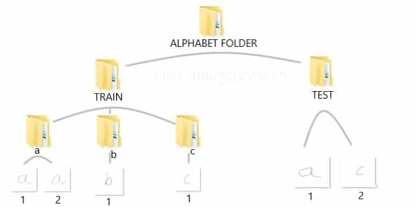
*I attatched the codes I used to make the figures in this article. You can just copy, paste, and run, sometimes installing necessary libraries.


Bias and Variance in Machine Learning

Machine learning continues to be an ever more vital component of our lives and ecosystem, whether we’re applying the techniques to answer research or business problems or in some cases even predicting the future. Machine learning models need to give accurate predictions in order to create real value for a given industry or domain.

While training a model is one of the key steps in the Data Science Project Life Cycle, how the model generalizes on unseen data is an equally important aspect that should be considered in every Data Science Project Life Cycle. We need to know whether it works and, consequently, if we can trust its predictions. Could the model be merely memorizing the data it is fed with, and therefore unable to make good predictions on future samples, or samples that it hasn’t seen before?

Let’s know the importance of evaluation with a simple example, There are two student’s Ramesh and Suresh preparing for the CAT exam to get into top IIMs (Indian Institute of Management). They both are quite good friends and stayed in the room during preparation and put an equal amount of hard work while solving numerical problems.

They both prepared for almost the same number of hours for the entire year and appeared in the final CAT exam. Surprisingly, Ramesh cleared, but Suresh did not. When asked, we got to know that there was one difference in their strategy of preparation between them, Ramesh had joined a Test Series course where he used to test his knowledge and understanding by giving mock exams and then further evaluating on which portions he is lagging and making necessary adjustments to he is preparation cycle in order to do well in those areas. But Suresh was confident, and he just kept training himself without testing on the preparation he had done.

Like the above situation we can train a Machine Learning Algorithm extensively with many parameters and new techniques, but if you are skipping its evaluation step, you cannot trust your model to perform well on the unseen data. In this article, we explain the importance of Bias, Variance and the trade-off between them in order to know how well a machine learning model generalizes to new, previously unseen data.

Training of Supervised Machine Learning

Bias

Bias is the difference between the Predicted Value and the Expected Value or how far are the predicted values from the actual values. During the training process the model makes certain assumptions on the training data provided. After Training, when it is introduced to the testing/validation data or unseen data, these assumptions may not always be correct.

If we use a large number of nearest neighbors in the K-Nearest Neighbors Algorithm, the model can totally decide that some parameters are not important at all for the modelling.  For example, it can just consider that only two predictor variables are enough to classify the data point though we have more than 10 variables.

This type of model will make very strong assumptions about the other parameters not affecting the outcome at all. You can take it as a model predicting or understanding only the simple relationship when the data points clearly indicate a more complex relationship.

When the model has high bias error, it results in a very simplistic model that does not consider the complexity of the data very well leading to Underfitting.

Variance

Variance occurs when the model performs well on the trained dataset but does not do well on an unseen data set, it is when the model considers the fluctuations or i.e. the noise as in the data as well. The model will still consider the variance as something to learn from because it learns too much from the noise inside the trained data set that it fails to perform as expected on the unseen data.

Based on the above example from Bias, if the model learns that all the ten predictor variables are important to classify a given data point then it tends to have high variance. You can take it as the model is trying to understand every minute detail making it more complex and failing to perform well on the unseen data.

When a model has High Bias error, it underfits the data and makes very simplistic assumptions on it. When a model has High Variance error, it overfits the data and learns too much from it. When a model has balanced Bias and Variance errors, it performs well on the unseen data.

Bias-Variance Trade-off

Based on the definitions of bias and variance, there is clear trade-off between bias and variance when it comes to the performance of the model. A model will have a high error if it has very high bias and low variance and have a high error if it has high variance and low bias.

A model that strikes a balance between the bias and variance can minimize the error better than those that live on extreme ends.

We can find whether the model has High Bias using the below steps:

  1. We tend to get high training errors.
  2. The validation error or test error will be similar to the training error.

We can find whether the model has High Bias using the below steps:

  1. We tend to get low training error
  2. The validation error or test error will be very high.

We can fix the High Bias using below steps:

  1. We need to gather more input features or can even try to create few using the feature engineering techniques.
  2. We can even add few polynomial features in order to increase the complexity.
  3. If we are using any regularization terms in our model, we can try to minimize it.

We can fix the High Variance using below steps:

  1. We can gather more training data so that the model can learn more on the patterns rather than the noise.
  2. We can even try to reduce the input features or do feature selection.
  3.  If we are using any regularization terms in our model we can try to maximize it.

Conclusion

In this article, we got to know the importance of the evaluation step in the Data Science Project Life Cycle, definitions of Bias and Variance, the trade-off between them and the steps we can take to fix the Underfitting and Overfitting of a Machine Learning Model.

Rethinking linear algebra: visualizing linear transformations and eigenvectors

In terms of calculation processes of Principal Component Analysis (PCA) or Linear Discriminant Analysis (LDA), which are the dimension reduction techniques I am going to explain in the following articles, diagonalization is what they are all about. Throughout this article, I would like you to have richer insight into diagonalization in order to prepare for understanding those basic dimension reduction techniques.

When our professor started a lecture on the last chapter of our textbook on linear algebra, he said “It is no exaggeration to say that everything we have studied is for this ‘diagonalization.'” Until then we had to write tons of numerical matrices and vectors all over our notebooks, calculating those products, adding their rows or columns to other rows or columns, sometimes transposing the matrices, calculating their determinants.

It was like the scene in “The Karate Kid,” where the protagonist finally understood the profound meaning behind the prolonged and boring “wax on, wax off” training given by Miyagi (or “jacket on, jacket off” training given by Jackie Chan). We had finally understood why we had been doing those seemingly endless calculations.

Source: http://thinkbedoleadership.com/secret-success-wax-wax-off/

But usually you can do those calculations easily with functions in the Numpy library. Unlike Japanese college freshmen, I bet you are too busy to reopen textbooks on linear algebra to refresh your mathematics. Thus I am going to provide less mathematical and more intuitive explanation of diagonalization in this article.

*This is the second article of the article series ” Illustrative introductions on dimension reduction .”

1, The mainstream ways of explaining diagonalization.

*The statements below are very rough for mathematical topics, but I am going to give priority to offering more visual understanding on linear algebra in this article. For further understanding, please refer to textbooks on linear algebra. If you would like to have minimum understandings on linear algebra needed for machine learning, I recommend the Appendix C of Pattern Recognition and Machine Learning by C. M. Bishop.

In most textbooks on linear algebra, the explanations on dioagonalization is like this (if you are not sure what diagonalization is or if you are allergic to mathematics, you do not have to read this seriously):

Let V (dimV = D)be a vector space and let  T_A : V \rightarrow V be a mapping of V into itself,  defined as T_A(v) = A \cdot \boldsymbol{v}, where A is a D\times D matrix and \boldsymbol{v} is D dimensional vector. An element \boldsymbol{v} \in V is called an eigen vector if there exists a number \lambda such that A \cdot \boldsymbol{v}= \lambda \cdot \boldsymbol{v} and \boldsymbol{v} \neq \boldsymbol{0}. In this case \lambda is uniquely determined and is called an eigen value of A belonging to the eigen vector \boldsymbol{v}.

Any matrix A has D eigen values \lambda_{i}, belonging to \boldsymbol{v}_{i} (i=1, 2, …., D). If \boldsymbol{v}_{i} is basis of the vector space V, then A is diagonalizable.

When A is diagonalizable, with D \times D matrices P = (\boldsymbol{v}_{1}, \dots, \boldsymbol{v}_{D}) , whose column vectors are eigen vectors \boldsymbol{v}_{i} (i=1, 2, …., D), the following equation holds: P^{-1}AP = \Lambda, where \Lambda = diag(\lambda_{1}, \dots, \lambda_{D})= \begin{pmatrix} \lambda_{1} & 0& \ldots &0\\ 0 & \lambda_{2} & \ldots & 0 \\ \vdots & \vdots & \ddots & \vdots \\ 0 & 0 & \ldots & \lambda_{D} \end{pmatrix}.

And when A is diagonalizable, you can diagonalize A as below.

Most textbooks keep explaining these type of stuff, but I have to say they lack efforts to make it understandable to readers with low mathematical literacy like me. Especially if you have to apply the idea to data science field, I believe you need more visual understanding of diagonalization. Therefore instead of just explaining the definitions and theorems, I would like to take a different approach. But in order to understand them in more intuitive ways, we first have to rethink waht linear transformation T_A means in more visible ways.

2, Linear transformations

Even though I did my best to make this article understandable to people with little prerequisite knowledge, you at least have to understand linear transformation of numerical vectors and with matrices. Linear transformation is nothing difficult, and in this article I am going to use only 2 or 3 dimensional numerical vectors or square matrices. You can calculate linear transformation of \boldsymbol{v} by A as equations in the figure. In other words, \boldsymbol{u} is a vector transformed by A.

*I am not going to use the term “linear transformation” in a precise way in the context of linear algebra. In this article or in the context of data science or machine learning, “linear transformation” for the most part means products of matrices or vectors. 

*Forward/back propagation of deep learning is mainly composed of this linear transformation. You keep linearly transforming input vectors, frequently transforming them with activation functions, which are for the most part not linear transformation.

As you can see in the equations above, linear transformation with A transforms a vector to another vector. Assume that you have an original vector \boldsymbol{v} in grey and that the vector \boldsymbol{u} in pink is the transformed \boldsymbol{v} by A is. If you subtract \boldsymbol{v} from \boldsymbol{u}, you can get a displacement vector, which I displayed in purple. A displacement vector means the transition from a vector to another vector.

Let’s calculate the displacement vector with more vectors \boldsymbol{v}. Assume that A =\begin{pmatrix} 3 & 1 \\ 1 & 2 \end{pmatrix}, and I prepared several grid vectors \boldsymbol{v} in grey as you can see in the figure below. If you transform those grey grid points with A, they are mapped into the vectors \boldsymbol{u} in pink. With those vectors in grey or pink, you can calculate the their displacement vectors \boldsymbol{u} - \boldsymbol{v}, which are in purple.

The displacement vectors in the figure above have some tendencies. In order to see that more clearly, let’s calculate displacement vectors with several matrices A and more grid points. Assume that you have three 2 \times 2 square matrices A_1 =\begin{pmatrix} 3 & 1 \\ 1 & 2 \end{pmatrix}, A_2 =\begin{pmatrix} 3 & 1 \\ -1 & 1 \end{pmatrix}, A_3 =\begin{pmatrix} 1 & -1 \\ 1 & 1 \end{pmatrix}, and I plotted displace vectors made by the matrices respectively in the figure below.

I think you noticed some characteristics of the displacement vectors made by those linear transformations: the vectors are swirling and many of them seem to be oriented in certain directions. To be exact, some displacement vectors extend in the same directions as some of original vectors in grey. That means  linear transformation by A did not change the direction of the original vector \boldsymbol{v}, and the unchanged vectors are called eigen vectors. Real eigen vectors of each A are displayed as arrows in yellow in the figure above. But when it comes to A_3, the matrix does not have any real eigan values.

In linear algebra, depending on the type matrices A, you have to consider various cases such as whether the matrices have real or imaginary eigen values, whether the matrices are diagonalizable, whether the eigen vectors are orthogonal, or whether they are unit vectors. But those topics are out of the scope of this article series, so please refer to textbooks on linear algebra if you are interested.

Luckily, however, in terms of PCA or LDA, you only have to consider a type of matrices named positive semidefinite matrices, which A_1 is classified to, and I am going to explain positive semidefinite matrices in the fourth section.

3, Eigen vectors as coordinate system

Source: Ian Stewart, “Professor Stewart’s Cabinet of Mathematical Curiosities,” (2008), Basic Books

Let me take Fibonacci numbers as an example to briefly see why diagonalization is useful. Fibonacci is sequence is quite simple and it is often explained using an example of pairs of rabbits increasing generation by generation. Let a_n (n=0, 1, 2, …) be the number of pairs of grown up rabbits in the n^{th} generation. One pair of grown up rabbits produce one pair of young rabbit The concrete values of a_n are a_0 = 0, a_1 = 1, a_2=1, a_3=2, a_4=3, a_5=5, a_6=8, a_7=13, \dots. Assume that A =\begin{pmatrix} 1 & 1 \\ 1 & 0 \end{pmatrix} and that \begin{pmatrix} a_1 \\ a_0  \end{pmatrix} =\begin{pmatrix} 1 \\ 0  \end{pmatrix}, then you can calculate the number of the pairs of grown up rabbits in the next generation with the following recurrence relation. \begin{pmatrix} a_{n+1} \\ a_{n}  \end{pmatrix}=\begin{pmatrix} 1 & 1 \\ 1 & 0 \end{pmatrix} \cdot \begin{pmatrix} a_{n+1} \\ a_{n}  \end{pmatrix}.Let \boldsymbol{a}_n be \begin{pmatrix} a_{n+1} \\ a_{n}  \end{pmatrix}, then the recurrence relation can be written as \boldsymbol{a}_{n+1} = A \boldsymbol{a}_n, and the transition of \boldsymbol{a}_n are like purple arrows in the figure below. It seems that the changes of the purple arrows are irregular if you look at the plots in normal coordinate.

Assume that \lambda _1, \lambda_2 (\lambda _1< \lambda_2) are eigen values of A, and \boldsymbol{v}_1, \boldsymbol{v}_2 are eigen vectors belonging to them respectively. Also let \alpha, \beta scalars such that \begin{pmatrix} a_{1} \\ a_{0}  \end{pmatrix} = \begin{pmatrix} 1 \\ 0  \end{pmatrix} = \alpha \boldsymbol{v}_1 + \beta \boldsymbol{v}_2. According to the definition of eigen values and eigen vectors belonging to them, the following two equations hold: A\boldsymbol{v}_1 = \lambda_1 \boldsymbol{v}_1, A\boldsymbol{v}_2 = \lambda_2 \boldsymbol{v}_2. If you calculate \boldsymbol{a}_1 is, using eigen vectors of A, \boldsymbol{a}_1  = A\boldsymbol{a}_0 = A (\alpha \boldsymbol{v}_1 + \beta \boldsymbol{v}_2) = \alpha\lambda _1 \boldsymbol{v}_1 + \beta \lambda_2 \boldsymbol{v}_2. In the same way, \boldsymbol{a}_2 = A\boldsymbol{a}_1 = A (\alpha\lambda _1 \boldsymbol{v}_1 + \beta \lambda_2 \boldsymbol{v}_2) = \alpha\lambda _{1}^{2} \boldsymbol{v}_1 + \beta \lambda_{2}^{2} \boldsymbol{v}_2, and \boldsymbol{a}_3 = A\boldsymbol{a}_2 = A (\alpha\lambda _{1}^{2} \boldsymbol{v}_1 + \beta \lambda_{2}^{2} \boldsymbol{v}_2) = \alpha\lambda _{1}^{3} \boldsymbol{v}_1 + \beta \lambda_{2}^{3} \boldsymbol{v}_2. These equations show that in coordinate system made by eigen vectors of A, linear transformation by A is easily done by just multiplying eigen values with each eigen vector. Compared to the graph of Fibonacci numbers above, in the figure below you can see that in coordinate system made by eigen vectors the plots changes more systematically generation by generation.


In coordinate system made by eigen vectors of square matrices, the linear transformations by the matrices can be much more straightforward, and this is one powerful strength of eigen vectors.

*I do not major in mathematics, so I am not 100% sure, but vectors in linear algebra have more abstract meanings. Various things in mathematics can be vectors, even though in machine learning or data science we  mainly use numerical vectors with more concrete elements. We can also say that matrices are a kind of maps. That is just like, at least in my impression, even though a real town is composed of various components such as houses, smooth or bumpy roads, you can simplify its structure with simple orthogonal lines, like the map of Manhattan. But if you know what the town actually looks like, you do not have to follow the zigzag path on the map.

4, Eigen vectors of positive semidefinite matrices

In the second section of this article I told you that, even though you have to consider various elements when you discuss general diagonalization, in terms of PCA and LDA we mainly use only a type of matrices named positive semidefinite matrices. Let A be a D \times D square matrix. If \boldsymbol{x}^T A \boldsymbol{x} \geq 0 for all values of the vector \boldsymbol{x}, the A is said to be a positive semidefinite matrix. And also it is known that A being a semidefinite matrix is equivalent to \lambda _{i} \geq 0 for all the eigen values \lambda_i (i=1, \dots , D).

*I think most people first learn a type of matrices called positive definite matrices. Let A be aD \times D square matrix. If \boldsymbol{x}^T A \boldsymbol{x} > 0 for all values of the vector \boldsymbol{x}, the A is said to be a positive definite matrix. You have to keep it in mind that even if all the elements of A are positive, A is not necessarly positive definite/semidefinite.

Just as we did in the second section of this article, let’s visualize displacement vectors made by linear transformation with a 3 \times 3 square positive semidefinite matrix A.

*In fact A_1 =\begin{pmatrix} 3 & 1 \\ 1 & 2 \end{pmatrix}, whose linear transformation I visualized the second section, is also positive semidefinite.

Let’s visualize linear transformations by a positive definite matrix A = \frac{1}{50} \begin{pmatrix} 60.45 &  33.63 & 46.29 \\33.63 & 68.49 & 50.93 \\ 46.29 & 50.93 & 53.61 \end{pmatrix}. I visualized the displacement vectors made by the A just as the same way as in the second section of this article. The result is as below, and you can see that, as well as the displacement vectors made by A_1, the three dimensional displacement vectors below are swirling and extending in three directions, in the directions of the three orthogonal eigen vectors \boldsymbol{v}_1, \boldsymbol{v}_2, and \boldsymbol{v}_3.

*It might seem like a weird choice of a matrix, but you are going to see why I chose it in the next article.

You might have already noticed A_1 =\begin{pmatrix} 3 & 1 \\ 1 & 2 \end{pmatrix} and A = \frac{1}{50} \begin{pmatrix} 60.45 &  33.63 & 46.29 \\33.63 & 68.49 & 50.93 \\ 46.29 & 50.93 & 53.61 \end{pmatrix} are both symmetric matrices and that their elements are all real values, and that their diagonal elements are all positive values. Super importantly, when all the elements of a D \times D symmetric matrix A are real values and its eigen values are \lambda_{i} (i=1, \dots , D), there exist orthonormal matrices U such that U^{-1}AU = \Lambda, where \Lambda = diag(\lambda_{1}, \dots , \lambda_{D}).

*The title of this section might be misleading, but please keep it in mind that positive definite/semidefinite matrices are not necessarily real symmetric matrices. And real symmetric vectors are not necessarily positive definite/semidefinite matrices.

5, Orthonormal matrices and rotation of vectors

In this section I am gong to explain orthonormal matrices, as known as rotation matrices. If a D\times D matrix U is an orthonormal matrix, column vectors of U are orthonormal, which means U = (\boldsymbol{u}_1 \dots \boldsymbol{u}_D), where \begin{cases} \boldsymbol{u}_{i}^{T}\boldsymbol{u}_{j} = 1 \quad (i = j) \\ \boldsymbol{u}_{i}^{T}\boldsymbol{u}_{j} = 0 \quad (i\neq j) \end{cases}. In other words column vectors \boldsymbol{u}_{i} form an orthonormal coordinate system.

Orthonormal matrices U have several important properties, and one of the most important properties is U^{-1} = U^{T}. Combining this fact with what I have told you so far, you we can reach one conclusion: you can orthogonalize a real symmetric matrix A as U^{T}AU = \Lambda. This is known as spectral decomposition or singular value decomposition.

Another important property of U is that U^{T} is also orthonormal. In other words, assume U is orthonormal and that U = (\boldsymbol{u}_1 \dots \boldsymbol{u}_D) = \begin{pmatrix} -\boldsymbol{v_1}^{T}- \\ \vdots \\ -\boldsymbol{v_D}^{T}- \end{pmatrix}, (\boldsymbol{v}_1 \dots \boldsymbol{v}_D) also forms a orthonormal coordinate system.

…It seems things are getting too mathematical and abstract (for me), thus for now I am going to wrap up what I have explained in this article .

We have seen

  • Numerical matrices linearly transform vectors.
  • Certain linear transformations do not change the direction of vectors in certain directions, which are called eigen vectors.
  • Making use of eigen vectors, you can form new coordinate system which can describe the linear transformations in a more straightforward way.
  • You can diagonalize a real symmetric matrix A with an orthonormal matrix U.

Of our current interest is what kind of linear transformation the real symmetric positive definite matrix enables. I am going to explain why the purple vectors in the figure above is swirling in the upcoming articles. Before that, however, we are going to  see one application of what we have seen in this article, on dimension reduction. To be concrete the next article is going to be about principal component analysis (PCA), which is very important in many fields.

*In short, the orthonormal matrix U, which I mentioned above enables rotation of matrix, and the diagonal matrix diag(\lambda_1, \dots, \lambda_D) expands or contracts vectors along each axis. I am going to explain that more precisely in the upcoming articles.

* I make study materials on machine learning, sponsored by DATANOMIQ. I do my best to make my content as straightforward but as precise as possible. I include all of my reference sources. If you notice any mistakes in my materials, including grammatical errors, please let me know (email: yasuto.tamura@datanomiq.de). And if you have any advice for making my materials more understandable to learners, I would appreciate hearing it.
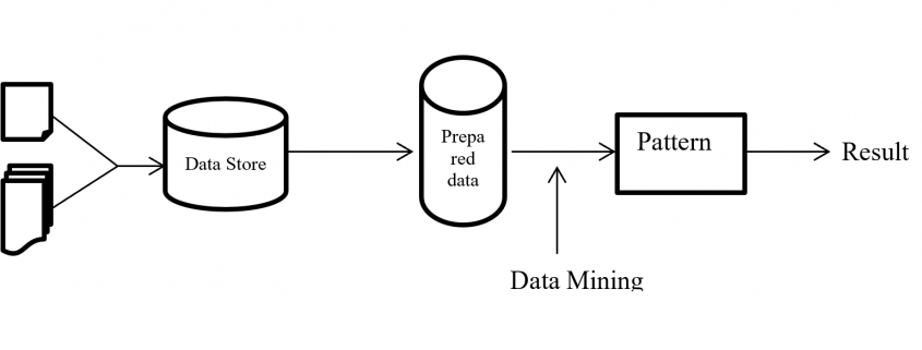
*I attatched the codes I used to make the figures in this article. You can just copy, paste, and run, sometimes installing necessary libraries.
 

K Nearest Neighbour For Supervised Learning

K-Nearest Neighbour (KNN) Algorithms is an easy-to-implement & advanced level supervised machine learning algorithm used for both – classification as well as regression problems. However, you can see a wide of its applications in classification problems across various industries.

If you’ve been shopping a lot in e-commerce sites like Amazon, Flipkart, Myntra, or love watching web series over Netflix and Amazon Prime, one common thing you’ve always noticed, and that is recommendations.

Are you wondering how they recommend you following your choice? They use KNN Supervised Learning to find out what you may need the next when you’re buying and recommend you with a few more products.

Imagine you’re looking for an iPhone to purchase. When you scroll down a little, you see some iPhone cases, tempered glasses – saying, “People who purchased an iPhone have also purchased these items. The same applies to Netflix and Amazon Prime. When you finished a show or a series, they give you recommendations of the same genre. And do it all using KNN supervised learning and classify the items for the best user experience.

Advantages Of KNN

  • Quickest Calculation Time
  • Simple Algorithms
  • High Accuracy
  • Versatile – best use for Regression and Classification.
  • Doesn’t make any assumptions about data.

Where KNN Are Mostly Used

  • Simple Recommendation Models
  • Image Recognition Technology
  • Decision-Making Models
  • Calculating Credit Rating

Choosing The Right Value For K

 To choose the right value of K, you have to run KNN algorithms several times with different values of K and select the value of K, which reduces the number of errors you’ve come across and come out as the most stable value for K.

Your Step-By-Step Guide For Choosing The Value Of K

  • As you decrease the value of K to 1 (K = 1), you’ll reach a query point, where you get to see many elements from class A (-) and class B (+) where (-) is the only nearest neighbor. Reasonably, you would think about the query point to be most likely the red one. As K =1, which has a blue color, KNN incorrectly predicts the wrong color blue.
  • As you increase the value of K to 2 (K=2), you get to see two elements, (-) and (+) are the only nearest neighbor. As you have two values, which are of Class A and Class B, KNN incorrectly predicts the wrong values (Blue and Red).
  • As you increase the value of K to 3 (K=3), you get to see three elements (-) and (+), (+) are the only nearest neighbor. And this time, you got three values, one from blue and two from red. As your assumption is red, KNN correctly predicts the right value (Blue and Red, Red). Your answer is more stable this time compared to previous ones.

Conclusion

KNN works by finding the nearest distance between a query and all the elements in the database. By choosing the value for K, we get the closest to the query. And then, KNN algorithms look for the most frequent labels in classification and averages of labels in regression.