This is the third article of the series My elaborate study notes on reinforcement learning.
1, Some excuses for writing another article on the same topic
In the last article I explained policy iteration and value iteration of dynamic programming (DP) because DP is the foundation of reinforcement learning (RL). And in fact this article is a kind of a duplicate of the last one. Even though I also tried my best on the last article, I would say it was for superficial understanding of how those algorithms are implemented. I think that was not enough for the following two reasons. The first reason is that what I explained in the last article was virtually just about how to follow pseudocode of those algorithms like other study materials. I tried to explain them with a simple example and some diagrams. But in practice it is not realistic to think about such diagrams all the time. Also writing down Bellman equations every time is exhausting. Thus I would like to introduce Bellman operators, powerful tools for denoting Bellman equations briefly. Bellman operators would help you learn RL at an easier and more abstract level.
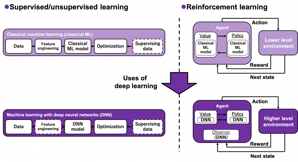
The second reason is that relations of values and policies are important points in many of RL algorithms. And simply, one article is not enough to realize this fact. In the last article I explained that policy iteration of DP separately and interactively updates a value and a policy. These procedures can be seen in many RL algorithms. Especially a family of algorithms named actor critic methods use this structure more explicitly. In the algorithms “actor” is in charge of a policy and a “critic” is in charge of a value. Just as the “critic” gives some feedback to the “actor” and the “actor” update his acting style, the value gives some signals to the policy for updating itself. Some people say RL algorithms are generally about how to design those “actors” and “critics.” In some cases actors can be very influential, but in other cases the other side is more powerful. In order to be more conscious about these interactive relations of policies and values, I have to dig the ideas behind policy iteration and value iteration, but with simpler notations.
Even though this article shares a lot with the last one, without pinning down the points I am going to explain, your study of RL could be just a repetition of following pseudocode of each algorithm. But instead I would rather prefer to make more organic links between the algorithms while studying RL. This article might be tiresome to read since it is mainly theoretical sides of DP or RL. But I would like you to patiently read through this to more effectively learn upcoming RL algorithms, and I did my best to explain them again in graphical ways.
2, RL and plannings as tree structures
Some tree structures have appeared so far in my article, but some readers might be still confused how to look at this. I must admit I lacked enough explanations on them. Thus I am going to review Bellman equation and give overall instructions on how to see my graphs. I am trying to discover effective and intuitive ways of showing DP or RL ideas. If there is something unclear of if you have any suggestions, please feel free to leave a comment or send me an email.
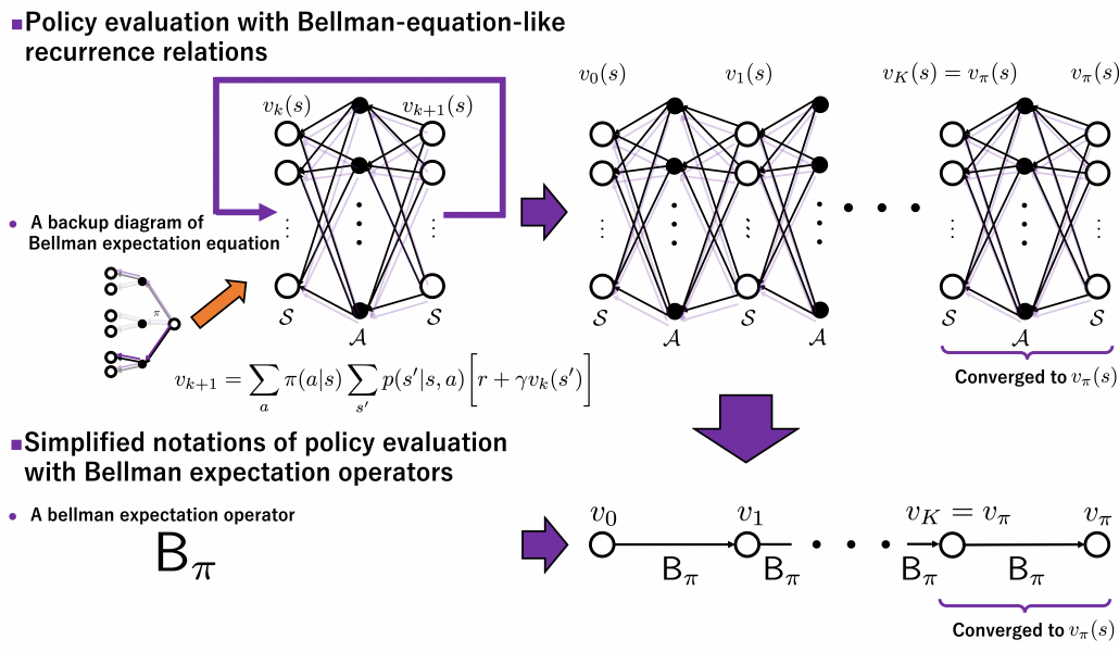
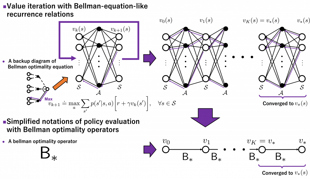
I got inspiration from Backup diagrams of Bellman equations introduced in the book by Barto and Sutton when I started making the graphs in this article series. The back up diagrams are basic units of tree structures in RL, and they are composed of white nodes showing states  and black nodes showing actions
  . And when an agent goes from a node to the next state
  , it gets a corresponding reward
  . As I explained in the second article, a value of a state is calculated by considering all possible actions and corresponding next states , and resulting rewards , starting from . And the backup diagram shows the essence of how a value of is calculated.
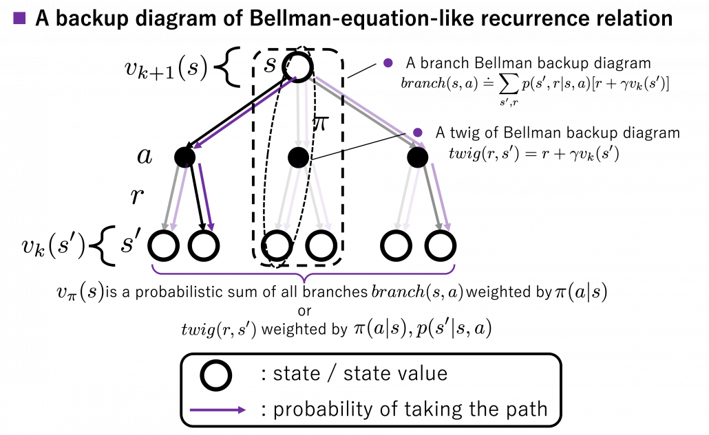
*Please let me call this figure a backup diagram of “Bellman-equation-like recurrence relation,” instead of Bellman equation. Bellman equation holds only when  is known, and is usually calculated from the recurrence relation. We are going to see this fact in the rest part of this article, making uses of Bellman operators.
Let’s again take a look at the definition of , a value of a state for a policy  . is defined as an expectation of a sum of upcoming rewards
  , given that the state at the time step
  is . (Capital letters are random variables and small letters are their realized values.)
![v_{\pi} (s)\doteq \mathbb{E}_{\pi} [ G_t | S_t =s ] =\mathbb{E}_{\pi} [ R_{t+1} + \gamma R_{t+2} + \gamma ^2 R_{t+3} + \cdots + \gamma ^{T-t -1} R_{T} |S_t =s]](https://data-science-blog.com/wp-content/ql-cache/quicklatex.com-10b9dc282a7d98ce7ecaf0316096f9c9_l3.png "Rendered by QuickLaTeX.com")
*To be exact, we need to take the limit of  like
like  . But the number is limited in practical discussions, so please don’t care so much about very exact definitions of value functions in my article series.
But considering all the combinations of actions and corresponding rewards are not realistic, thus Bellman equation is defined recursively as follows.
![v_{\pi} (s)= \mathbb{E}_{\pi} [ R_{t+1} + \gamma v_{\pi}(S_{t+1}) | S_t =s ]](https://data-science-blog.com/wp-content/ql-cache/quicklatex.com-349331e8707784287bb3fd227c4f03af_l3.png "Rendered by QuickLaTeX.com")
But when you want to calculate  at the left side, at the right side is supposed to be unknown, so we use the following recurrence relation.
![v_{k+1} (s)\doteq \mathbb{E}_{\pi} [ R_{t+1} + \gamma v_{k}(S_{t+1}) | S_t =s ]](https://data-science-blog.com/wp-content/ql-cache/quicklatex.com-ba20177dbed44812a6f2ce98154e2c2e_l3.png "Rendered by QuickLaTeX.com")
And the operation of calculating an expectation with  , namely a probabilistic sum of future rewards is defined as follows.
![v_{k+1} (s) = \mathbb{E}_{\pi} [R_{t+1} + \gamma v_k (S_{t+1}) | S_t = s] \doteq \sum_a {\pi(a|s)} \sum_{s', r} {p(s', r|s, a)[r + \gamma v_k(s')]}](https://data-science-blog.com/wp-content/ql-cache/quicklatex.com-1a1aa71a4846a76bd8220751fa988103_l3.png "Rendered by QuickLaTeX.com")
 are policies, and
  are probabilities of transitions. Policies are probabilities of taking an action given an agent being in a state . But agents cannot necessarily move do that based on their policies. Some randomness or uncertainty of movements are taken into consideration, and they are modeled as probabilities of transitions. In my article, I would like you to see the equation above as a sum of
  weighted by or a sum of
  weighted by
  . “Branches” and “twigs” are terms which I coined.
*Even though especially values of are important when you actually implement DP, they are not explicitly defined with certain functions in most study materials on DP.
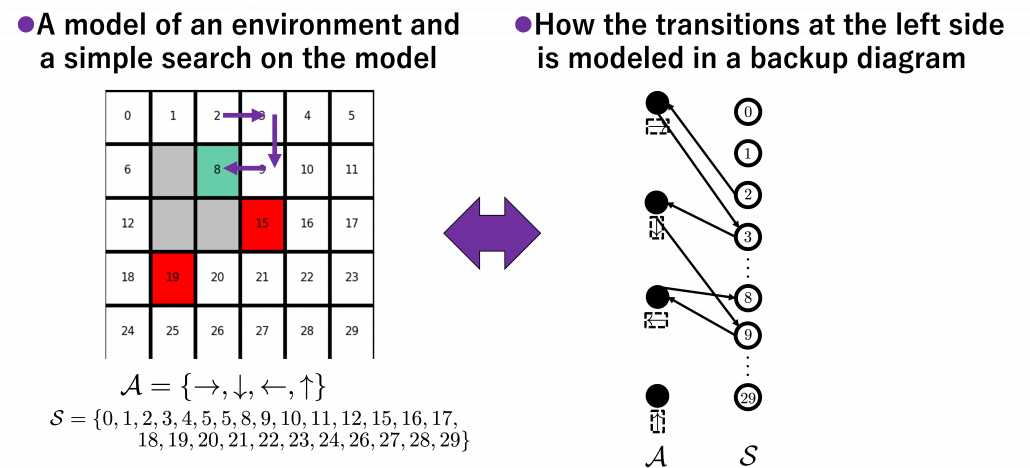
I think what makes the backup diagram confusing at the first glance is that nodes of states in white have two layers, a layer and the one of . But the node is included in the nodes of . Let’s take an example of calculating the Bellman-equation-like recurrence relations with a grid map environment. The transitions on the backup diagram should be first seen as below to avoid confusion. Even though the original backup diagrams have only one root node and have three layers, in actual models of environments transitions of agents are modeled as arows going back and forth between white and black nodes.
But in DP values of states, namely white nodes have to be updated with older values. That is why the original backup diagrams have three layers. For exmple, the value of a value  is calculated like in the figure below, using values of
  . As I explained earlier, the value of the state
  is a sum of , weighted by
  . And I showed the weight as strength of purple color of the arrows.
  are corresponding rewards of each transition. And importantly, the Bellman-equation-like operation, whish is a part of DP, is conducted inside the agent. The agent does not have to actually move, and that is what planning is all about.
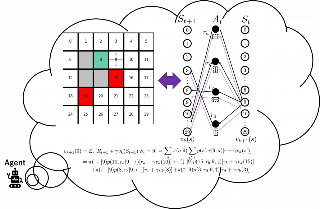
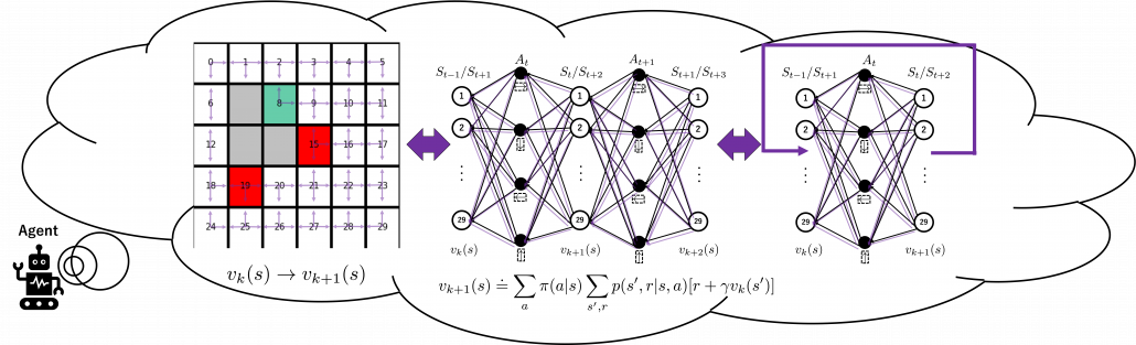
And DP, or more exactly policy evaluation, calculating the expectation over all the states, repeatedly. An important fact is, arrows in the backup diagram are pointing backward compared to the direction of value functions being updated, from  to
to  . I tried to show the idea that values are backed up to calculate . In my article series, with the right side of the figure below, I make it a rule to show the ideas that a model of an environment is known and it is updated recursively.
3, Types of policies
As I said in the first article, the ultimate purpose of DP or RL is finding the optimal policies. With optimal policies agents are the most likely to maximize rewards they get in environments. And policies determine the values of states as value functions . Or policies can be obtained from value functions. This structure of interactively updating values and policies is called general policy iteration (GPI) in the book by Barto and Sutton.
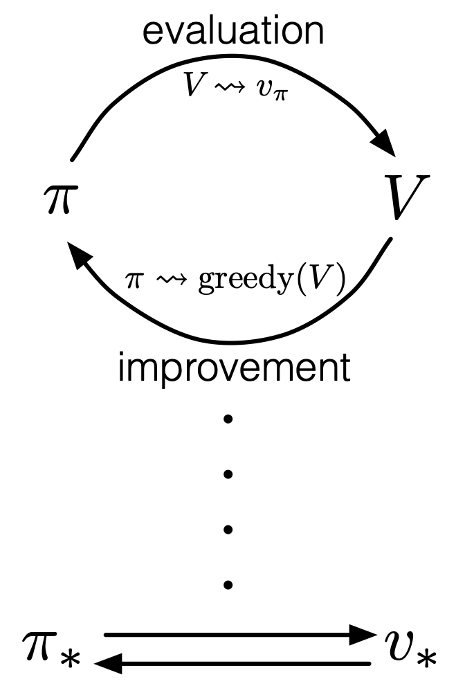
Source: Richard S. Sutton, Andrew G. Barto, “Reinforcement Learning: An Introduction,” MIT Press, (2018)
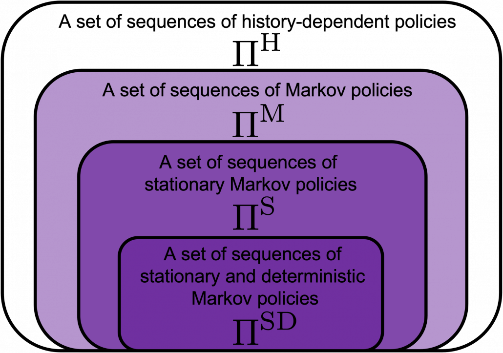
However I have been using the term “a policy” without exactly defining it. There are several types of policies, and distinguishing them is more or less important in the next sections. But I would not like you to think too much about that. In conclusion, only very limited types of policies are mainly discussed in RL. Only  in the figure below are of interest when you learn RL as a beginner. I am going to explain what each set of policies means one by one.
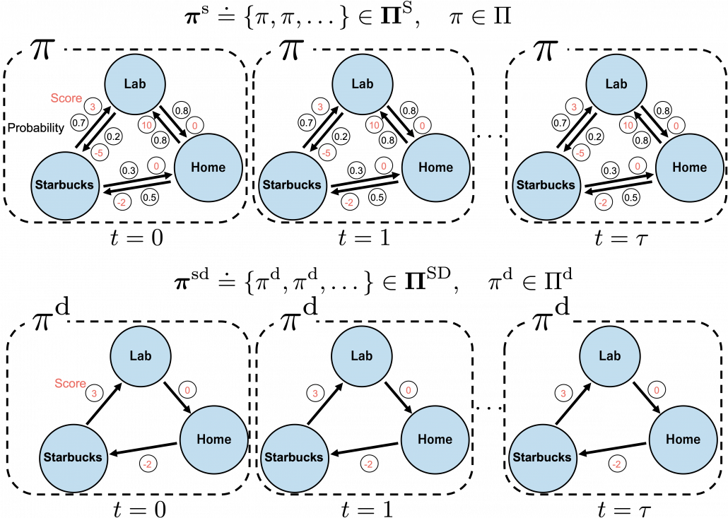
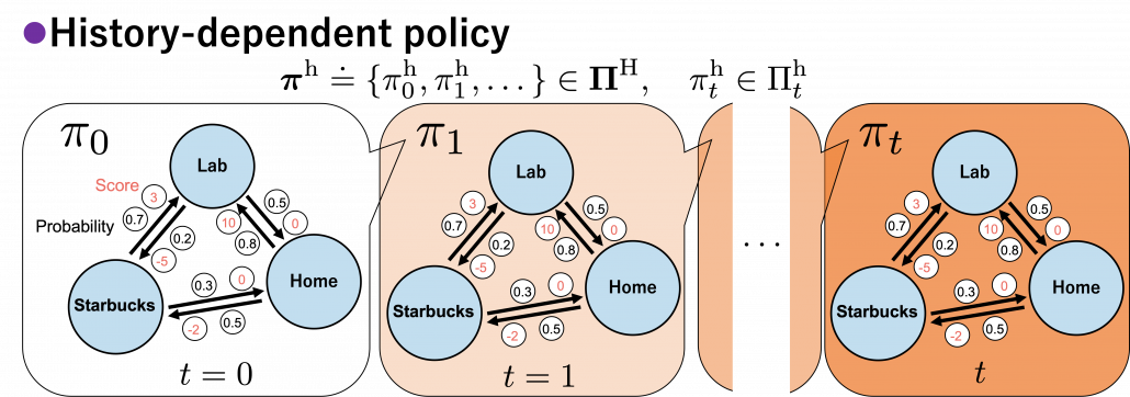
In fact we have been discussing a set of policies  , which mean probabilistic Markov policies. Remember that in the first article I explained Markov decision processes can be described like diagrams of daily routines. For example, the diagrams below are my daily routines. The indexes denote days. In either of states “Home,” “Lab,” and “Starbucks,” I take an action to another state. The numbers in black are probabilities of taking the actions, and those in orange are rewards of taking the actions. I also explained that the ultimate purpose of planning with DP is to find the optimal policy in this state transition diagram.
Before explaining each type of sequences of policies, let me formulate probabilistic Markov policies at first. A set of probabilistic Markov policies is defined as follows.
![\Pi \doteq \biggl\{ \pi : \mathcal{A}\times\mathcal{S} \rightarrow [0, 1]: \sum_{a \in \mathcal{A}}{\pi (a|s) =1, \forall s \in \mathcal{S} } \biggr\}](https://data-science-blog.com/wp-content/ql-cache/quicklatex.com-9a217cc6d5cfd59e564fd2132620f89f_l3.png "Rendered by QuickLaTeX.com")
This means  maps any combinations of an action
  and a state
  to a probability. The diagram above means you choose a policy from the set
  , and you use the policy every time step , I mean every day. A repetitive sequence of the same probabilistic Markov policy is defined as
  . And a set of such stationary Markov policy sequences is denoted as
  .
.
*As I formulated in the last articles, policies are different from probabilities of transitions. Even if you take take an action probabilistically, the action cannot necessarily be finished. Thus probabilities of transitions depend on combinations of policies and the agents or the environments.
But when I just want to focus on works like a robot, I give up living my life. I abandon efforts of giving even the slightest variations to my life, and I just deterministically take next actions every day. In this case, we can say the policies are stationary and deterministic. The set of such policies is defined as below.  are called deterministic policies.
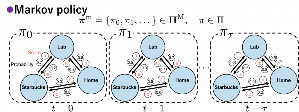
I think it is normal policies change from day to day, even if people also have only options of “Home,” “Lab,” or “Starbucks.” These cases are normal Markov policies, and you choose a policy from every time step.
And the resulting sequences of policies and the set of the sequences are defined as  .
.
In real world, an assumption of Markov decision process is quite unrealistic because your strategies constantly change depending on what you have done or gained so far. Possibilities of going to a Starbucks depend on what you have done in the week so far. You might order a cup of frappucino as a little something for your exhausting working days. There might be some communications on what you order then with clerks. And such experiences would affect your behaviors of going to Starbucks again. Such general and realistic policies are called history-dependent policies.
*Going to Starbucks everyday like a Markov decision process and deterministically ordering a cupt of hot black coffee is supposed to be unrealistic. Even if clerks start heating a mug as soon as I enter the shop.
In history-dependent cases, your policies depend on your states, actions, and rewards so far. In this case you take actions based on history-dependent policies  . However as I said, only are important in my articles. And history-dependent policies are discussed only in partially observable Markov decision process (POMDP), which this article series is not going to cover. Thus you have only to take a brief look at how history-dependent ones are defined.
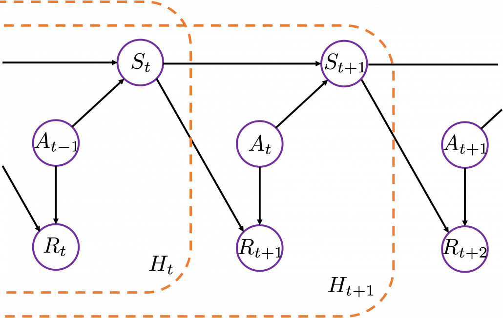
History-dependent policies are the types of the most general policies. In order to formulate history-dependent policies, we first have to formulate histories. Histories  in the context of DP or RL are defined as follows.

Given the histories which I have defined, a history dependent policy is defined as follows.

This means a probability of taking an action given a history  . It might be more understandable with the graphical model below, which I showed also in the first article. In the graphical model,
  is a random variable, and is its realized value.
A set of history-dependent policies is defined as follows.
![\Pi _{t}^{\text{h}} \doteq \biggl\{ \pi _{t}^{h} : \mathcal{A}\times\mathcal{H}_t \rightarrow [0, 1]: \sum_{a \in \mathcal{A}}{\pi_{t}^{\text{h}} (a|h_{t}) =1 } \biggr\}](https://data-science-blog.com/wp-content/ql-cache/quicklatex.com-6414a4a7c3e4041e14077fce7a8c3fa1_l3.png "Rendered by QuickLaTeX.com")
And a set of sequences of history-dependent policies is  .
.
In fact I have not defined the optimal value function  or
or  in my article series yet. I must admit it was not good to discuss DP without even defining the important ideas. But now that we have learnt types of policies, it should be less confusing to introduce their more precise definitions now. The optimal value function
  is defined as the maximum value functions for all states , with respect to any types of sequences of policies
  .
.

And the optimal policy is defined as the policy which satisfies the equation below.

The optimal value function is optimal with respect to all the types of sequences of policies, as you can see from the definition. However in fact, it is known that the optimal policy is a deterministic Markov policy  . That means, in the example graphical models I displayed, you just have to deterministically go back and forth between the lab and the home in order to maximize value function, never stopping by at a Starbucks. Also you do not have to change your plans depending on days.
And when all the values of the states are maximized, you can easily calculate the optimal deterministic policy of your everyday routine. Thus in DP, you first need to maximize the values of the states. I am going to explain this fact of DP more precisely in the next section. Combined with some other important mathematical features of DP, you will have clearer vision on what DP is doing.
*I might have to precisely explain how  is defined. But to make things easier for now, let me skip ore precise formulations. Value functions are defined as expectations of rewards with respect to a single policy or a sequence of policies. You have only to keep it in mind that is a value function resulting from taking actions based on . And , which we have been mainly discussing, is a value function based on only a single policy .
*Please keep it in mind that these diagrams are not anything like exaggeratedly simplified models for explaining RL. That is my life.
3, Key components of DP
*Even though notations on this article series are based on the book by Barto and Sutton, the discussions in this section are, based on a Japanese book named “Machine Learning Professional Series: Reinforcement Learning” by Tetsurou Morimura, which I call “the whale book.” There is a slight difference in how they calculate Bellman equations. In the book by Barto and Sutton, expectations are calculated also with respect to rewards , but not in the whale book. I think discussions in the whale book can be extended to the cases in the book by Barto and Sutton, but just in case please bear that in mind.
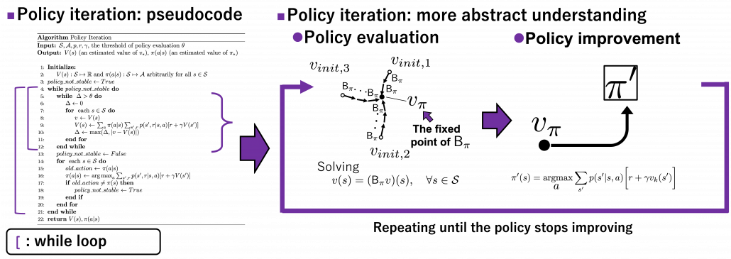
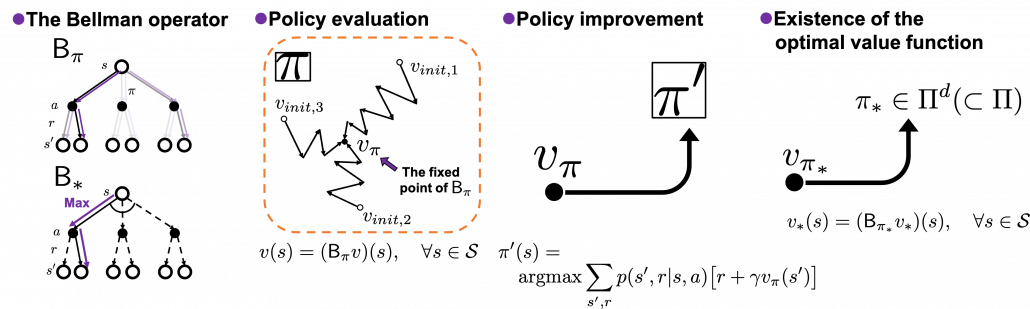
In order to make organic links between the RL algorithms you are going to encounter, I think you should realize DP algorithms you have learned in the last article are composed of some essential ideas about DP. As I stressed in the first article, RL is equal to solving planning problems, including DP, by sampling data through trial-and-error-like behaviors of agents. Thus in other words, you approximate DP-like calculations with batch data or online data. In order to see how to approximate such DP-like calculations, you have to know more about features of those calculations. Those features are derived from some mathematical propositions about DP. But effortlessly introducing them one by one would be just confusing, so I tired extracting some essences. And the figures below demonstrate the ideas.
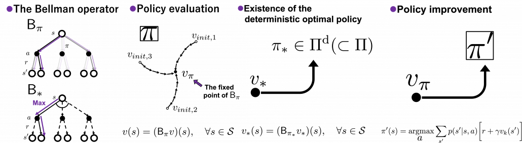
The figures above express the following facts about DP:
- DP is a repetition of Bellman-equation-like operations, and they can be simply denoted with Bellman operators
 or
or  .
.
- The value function for a policy is calculated by solving a Bellman equation, but in practice you approximately solve it by repeatedly using Bellman operators.
- There exists an optimal policy
 , which is deterministic. And it is an optimal policy if and only if it satisfies the Bellman expectation equation
  , with the optimal value function
  .
.
- With a better deterministic policy, you get a better value function. And eventually both the value function and the policy become optimal.
Let’s take a close look at what each of them means.
(1) Bellman operator
In the last article, I explained the Bellman equation and recurrence relations derived from it. And they are the basic ideas leading to various RL algorithms. The Bellman equation itself is not so complicated, and I showed its derivation in the last article. You just have to be careful about variables in calculation of expectations. However writing the equations or recurrence relations every time would be tiresome and confusing. And in practice we need to apply the recurrence relation many times. In order to avoid writing down the Bellman equation every time, let me introduce a powerful notation for simplifying the calculations: I am going to discuss RL making uses of Bellman operators from now on.
First of all, a Bellman expectation operator  , or rather an application of a Bellman expectation operator on any state functions
  is defined as below.
![(\mathsf{B}_{\pi} (v))(s) \doteq \sum_{a}{\pi (a|s)} \sum_{s'}{p(s'| s, a) \biggl[r + \gamma v (s') \biggr]}, \quad \forall s \in \mathcal{S}](https://data-science-blog.com/wp-content/ql-cache/quicklatex.com-35022b46d30c7f99c53089770a9dea7e_l3.png "Rendered by QuickLaTeX.com")
For simplicity, I am going to denote the left side of the equation as  . In the last article I explained that when
  is an arbitrarily initialized value function, a sequence of value functions
  converge to for a fixed probabilistic policy , by repeatedly applying the recurrence relation below.
![v_{k+1} = \sum_{a}{\pi (a|s)} \sum_{s'}{p(s'| s, a) \biggl[r + \gamma v_{k} (s') \biggr]}](https://data-science-blog.com/wp-content/ql-cache/quicklatex.com-792e43affeeb5f73e731a3bbd6469f93_l3.png "Rendered by QuickLaTeX.com")
With the Bellman expectation operator, the recurrence relation above is written as follows.

Thus  is obtained by applying to
 times in total. Such operation is denoted as follows.

As I have just mentioned,  converges to , thus the following equation holds.

I have to admit I am merely talking about how to change notations of the discussions in the last article, but introducing Bellman operators makes it much easier to learn or explain DP or RL as the figure below shows.
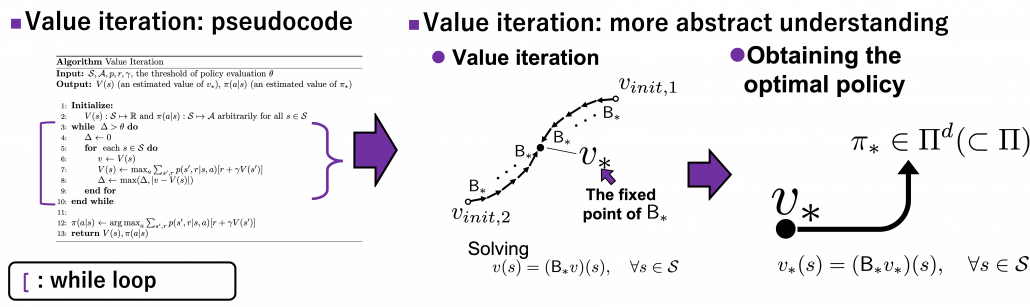
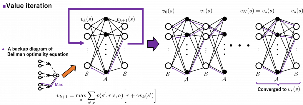
Just as well, a Bellman optimality operator  is defined as follows.
![(\mathsf{B}_{\ast} v)(s) \doteq \max_{a} \sum_{s'}{p(s' | s, a) \biggl[r + \gamma v(s') \biggr]}, \quad \forall s \in \mathcal{S}](https://data-science-blog.com/wp-content/ql-cache/quicklatex.com-1c6fc7233a418b4abdfbde6886da4b58_l3.png "Rendered by QuickLaTeX.com")
Also the notation with a Bellman optimality operators can be simplified as  . With a Bellman optimality operator, you can get a recurrence relation
  . Multiple applications of Bellman optimality operators can be written down as below.

Please keep it in mind that this operator does not depend on policies . And an important fact is that any initial value function  converges to the optimal value function
  .
.

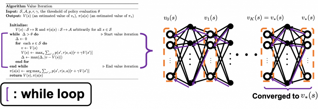
Thus any initial value functions converge to the the optimal value function by repeatedly applying Bellman optimality operators. This is almost equal to value iteration algorithm, which I explained in the last article. And notations of value iteration can be also simplified by introducing the Bellman optimality operator like in the figure below.
Again, I would like you to pay attention to how value iteration works. The optimal value function is supposed to be maximum with respect to any sequences of policies , from its definition. However the optimal value function can be obtained with a single bellman optimality operator , never caring about policies. Obtaining the optimal value function is crucial in DP problems as I explain in the next topic. And at least one way to do that is guaranteed with uses of a .
*We have seen a case of applying the same Bellman expectation operator on a fixed policy , but you can use different Bellman operators on different policies varying from time steps to time steps. To be more concrete, assume that you have a sequence of Markov policies  . If you apply Bellman operators of the policies one by one in an order of
  on a state function
  , the resulting state function is calculated as below.

When  , we can also discuss convergence of
  , but that is just confusing. Please let me know if you are interested.
(2) Policy evaluation
Policy evaluation is in short calculating  , the value function for a policy . And in theory it can be calculated by solving a Bellman expectation equation, which I have already introduced.
![v(s) = \sum_{a}{\pi (a|s)} \sum_{s'}{p(s'| s, a) \biggl[r + \gamma v (s') \biggr]}](https://data-science-blog.com/wp-content/ql-cache/quicklatex.com-d96ea8fd9bc433436f0c1636288df540_l3.png "Rendered by QuickLaTeX.com")
Using a Bellman operator, which I have introduced in the last topic, the equation above can be written  . But whichever the notation is, the equation holds when the value function
  is . You have already seen the major way of how to calculate in (1), or also in the last article. You have only to multiply the same Belman expectation operator to any initial value funtions
  .
.
This process can be seen in this way: any initial value functions little by little converge to as the same Bellman expectation operator is applied. And when a converges to , the value function does not change anymore because the value function already satisfies a Bellman expectation equation . In other words  , and the is called the fixed point of . The figure below is the image of how any initial value functions converge to the fixed point unique to a certain policy . Also Bellman optimality operators also have their fixed points because any initial value functions converge to by repeatedly applying .
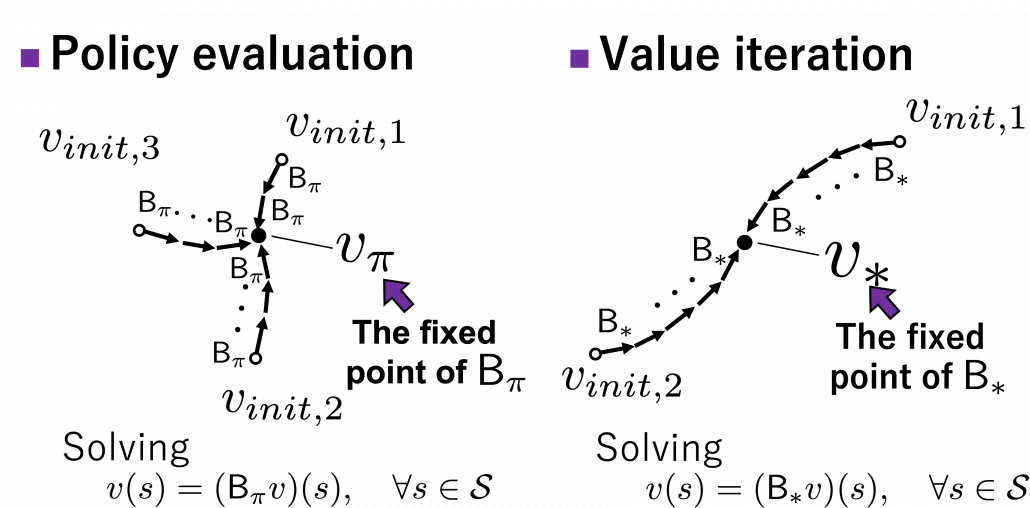
I am actually just saying the same facts as in the topic (1) in another way. But I would like you to keep it in mind that the fixed point of is more of a “local” fixed point. On the other hand the fixed point of is more like “global.” Ultimately the global one is ultimately important, and the fixed point can be directly reached only with the Bellman optimality operator . But you can also start with finding local fixed points, and it is known that the local fixed points also converge to the global one. In fact, the former case of corresponds to policy iteration, and the latter case to value iteration. At any rate, the goal for now is to find the optimal value function . Once the value function is optimal, the optimal policy can be automatically obtained, and I am going to explain why in the next two topics.
(3) Existence of the optimal policy
In the first place, does the optimal policy really exist? The answer is yes, and moreover it is a stationary and deterministic policy  . And also, you can judge whether a policy is optimal by a Bellman expectation equation below.

In other words, the optimal value function has to be already obtained to judge if a policy is optimal. And the resulting optimal policy is calculated as follows.
![\pi^{\text{d}}_{\ast}(s) = \text{argmax}_{a\in \matchal{A}} \sum_{s'}{p(s' | s, a) \biggl[r + \gamma v_{\ast}(s') \biggr]}, \quad \forall s \in \mathcal{S}](https://data-science-blog.com/wp-content/ql-cache/quicklatex.com-f892c961c509bf6562fc0c5cdeabc355_l3.png "Rendered by QuickLaTeX.com")
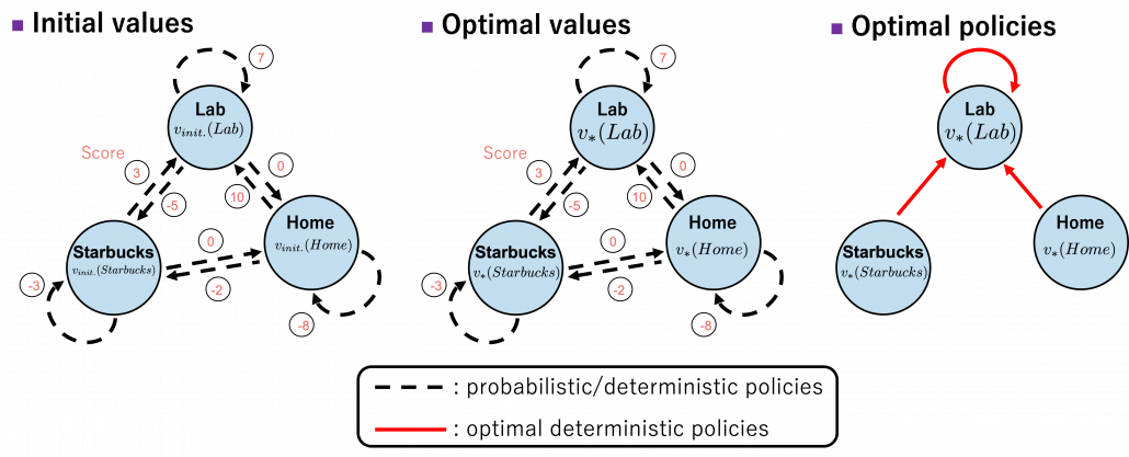
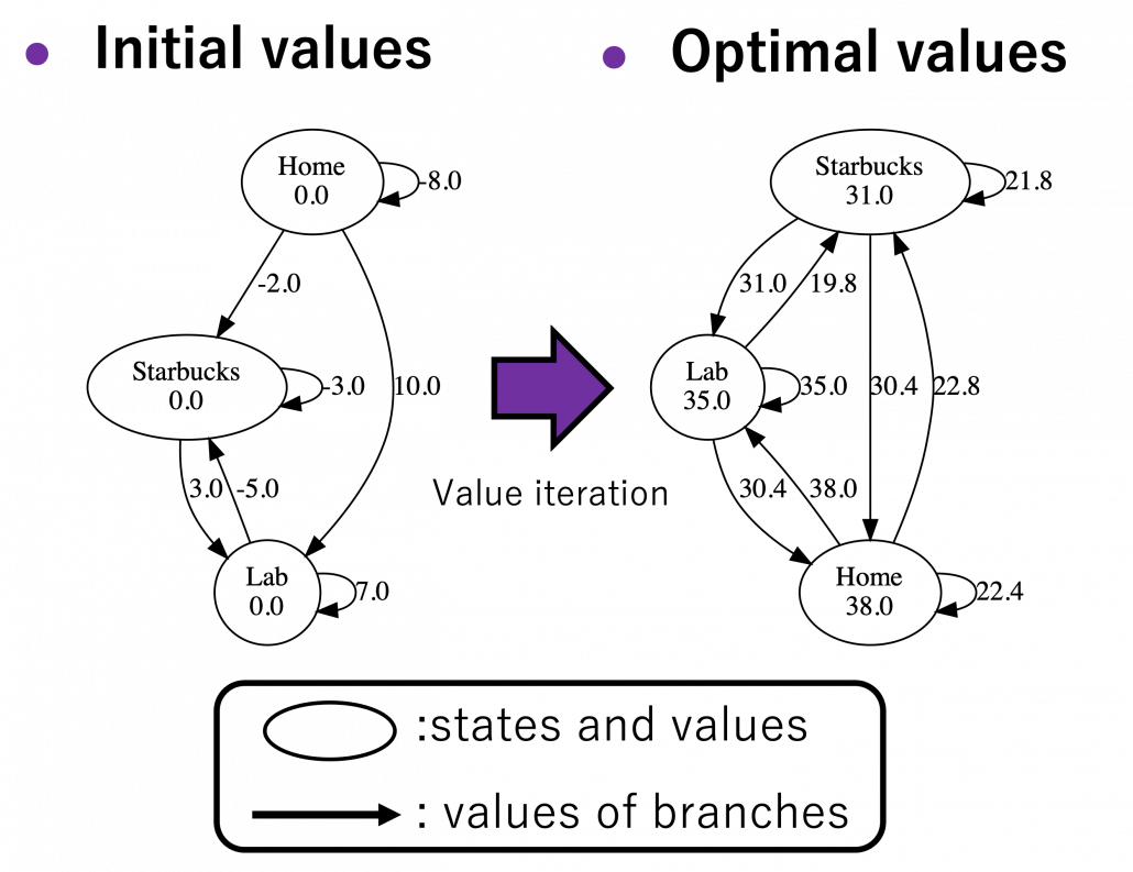
Let’s take an example of the state transition diagram in the last section. I added some transitions from nodes to themselves and corresponding scores. And all values of the states are initialized as  . After some calculations, is optimized to . And finally the optimal policy can be obtained from the equation I have just mentioned. And the conclusion is “Go to the lab wherever you are to maximize score.”
The calculation above is finding an action which maximizes ![b(s, a)\doteq\sum_{s'}{p(s' | s, a) \biggl[r + \gamma v_{\ast}(s') \biggr]} = r + \gamma \sum_{s'}{p(s' | s, a) v_{\ast}(s') }](https://data-science-blog.com/wp-content/ql-cache/quicklatex.com-cb95afc26ed333c0bc782b865d2595f1_l3.png "Rendered by QuickLaTeX.com") . Let me call the part
. Let me call the part  ” a value of a branch,” and finding the optimal deterministic policy is equal to choosing the maximum branch for all . A branch corresponds to a pair of a state
  and all the all the states .
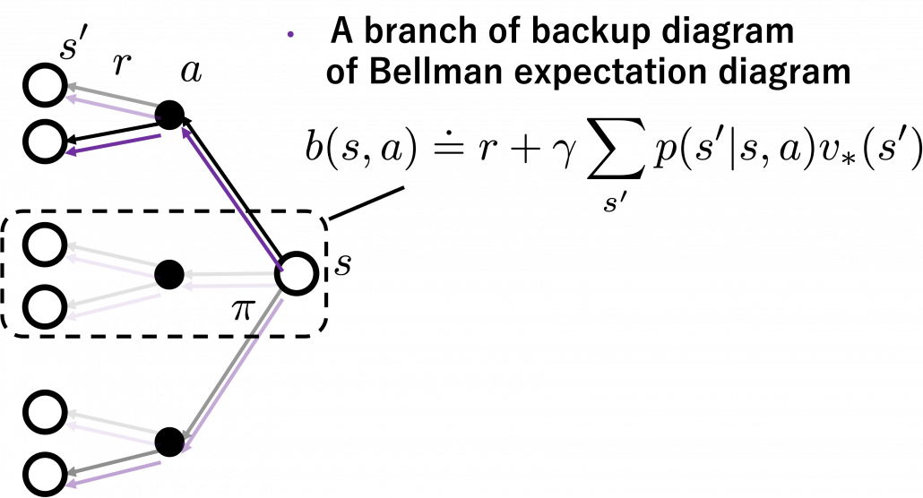
*We can comprehend applications of Bellman expectation operators as probabilistically reweighting branches with policies .
*The states and are basically the same. They are just different in uses of indexes for referring them. That might be a confusing point of understanding Bellman equations.
Let’s see how values actually converge to the optimal values and how branches . I implemented value iteration of the Starbucks-lab-home transition diagram and visuzlied them with Graphviz. I initialized all the states as  , and after some iterations they converged to the optimal values. The numbers in each node are values of the sates. And the numbers next to each edge are corresponding values of branches
  . After you get the optimal value, if you choose the direction with the maximum branch at each state, you get the optimal deterministic policy. And that means “Just go to the lab, not Starbucks.”
*Discussing and visualizing “branches” of Bellman equations are not normal in other study materials. But I just thought it would be better to see how they change.
(4) Policy improvement
Policy improvement means a very simple fact: in policy iteration algorithm, with a better policy, you get a better value function. That is all. In policy iteration, a policy is regarded as optimal as long as it does not updated anymore. But as far as I could see so far, there is one confusing fact. Even after a policy converges, value functions still can be updated. But from the definition, an optimal value function is determined with the optimal value function. Such facts can be seen in some of DP implementation, including grid map implementation I introduced in the last article.
Thus I am not sure if it is legitimate to say whether the policy is optimal even before getting the optimal value function. At any rate, this is my “elaborate study note,” so I conversely ask for some help to more professional someones if they come across with my series. Please forgive me for shifting to the next article, without making things clear.
4, Viewing DP algorithms in a more simple and abstract way
We have covered the four important topics for a better understanding of DP algorithms. Making use of these ideas, pseudocode of DP algorithms which I introduced in the last article can be rewritten in a more simple and abstract way. Rather than following pseudocode of DP algorithms, I would like you to see them this way: policy iteration is a repetation of finding the fixed point of a Bellman operator , which is a local fixed point, and updating the policy. Even if the policy converge, values have not necessarily converged to the optimal values.
When it comes to value iteration: value iteration is finding the fixed point of , which is global, and getting the deterministic and optimal policy.
I have written about DP in as many as two articles. But I would say that was inevitable for laying more or less solid foundation of learning RL. The last article was too superficial and ordinary, but on the other hand this one is too abstract to introduce at first. Now that I have explained essential theoretical parts of DP, I can finally move to topics unique to RL. We have been thinking the case of plannings where the models of the environemnt is known, but they are what agents have to estimate with “trial and errors.” The term “trial and errors” might have been too abstract to you when you read about RL so far. But after reading my articles, you can instead say that is a matter of how to approximate Bellman operators with batch or online data taken by agents, rather than ambiguously saying “trial and erros.” In the next article, I am going to talk about “temporal differences,” which makes RL different from other fields and can be used as data samples to approximate Bellman operators.
* I make study materials on machine learning, sponsored by DATANOMIQ. I do my best to make my content as straightforward but as precise as possible. I include all of my reference sources. If you notice any mistakes in my materials, including grammatical errors, please let me know (email: yasuto.tamura@datanomiq.de). And if you have any advice for making my materials more understandable to learners, I would appreciate hearing it.
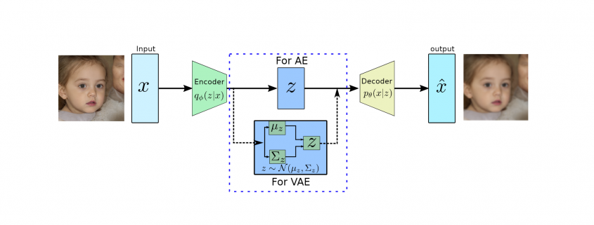

 produces meaningful information of
  .
.
 usually has a much lower dimension than input
  and has the most dominant features of
 to approximate the conditional
  to generate images based on a sample from a true prior,
  are generally of Gaussian distribution.
 as it will be performing probabilistic generation of data. Therefore the encoder and decoder should be probabilistic.
 prior distribution, which is a Gaussian function, therefore, both of them are tractable. However, the integration won’t be tractable because of the high dimensionality of data.
 to approximate the conditional
  . Furthermore, the conditional
  , which is intractable. This additional encoder part will help to derive a lower bound on the data likelihood that will make the likelihood function tractable. In the following we will derive the lower bound of the likelihood function:
![\begin{equation*} \begin{flalign} \begin{aligned} log \: p_\theta (x) = & \mathbf{E}_{z\sim q_\phi(z|x)} \Bigg[log \: \frac{p_\theta (x|z) p_\theta (z)}{p_\theta (z|x)} \: \frac{q_\phi(z|x)}{q_\phi(z|x)}\Bigg] \\ = & \mathbf{E}_{z\sim q_\phi(z|x)} \Bigg[log \: p_\theta (x|z)\Bigg] - \mathbf{E}_{z\sim q_\phi(z|x)} \Bigg[log \: \frac{q_\phi (z|x)} {p_\theta (z)}\Bigg] + \mathbf{E}_{z\sim q_\phi(z|x)} \Bigg[log \: \frac{q_\phi (z|x)}{p_\theta (z|x)}\Bigg] \\ = & \mathbf{E}_{z\sim q_\phi(z|x)} \Big[log \: p_\theta (x|z)\Big] - \mathbf{D}_{KL}(q_\phi (z|x), p_\theta (z)) + \mathbf{D}_{KL}(q_\phi (z|x), p_\theta (z|x)). \end{aligned} \end{flalign} \end{equation*}](https://data-science-blog.com/wp-content/ql-cache/quicklatex.com-94567d6202e7ed5971ce2e83cbc2d369_l3.png "Rendered by QuickLaTeX.com")
 and then it is expanded using Bayes theorem with additional constant
  multiplication. In the next line, it is expanded using the logarithmic rule and then rearranged. Furthermore, the last two terms in the second line are the definition of KL divergence and the third line is expressed in the same.
![\begin{equation*} log \: p_\theta (x)\geq \mathcal{L}(x, \phi, \theta) , \: \text{where} \: \mathcal{L}(x, \phi, \theta) = \mathbf{E}_{z\sim q_\phi(z|x)} \Big[log \: p_\theta (x|z)\Big] - \mathbf{D}_{KL}(q_\phi (z|x), p_\theta (z)). \end{equation*}](https://data-science-blog.com/wp-content/ql-cache/quicklatex.com-959a973388a0ab24ad2464bb87d185e7_l3.png "Rendered by QuickLaTeX.com")
 is presenting the tractable lower bound for the optimization and is also termed as ELBO (Evidence Lower Bound Optimization). During the training process, we maximize ELBO using the following equation:


 and
and  are constants to define the contributions of previous samples
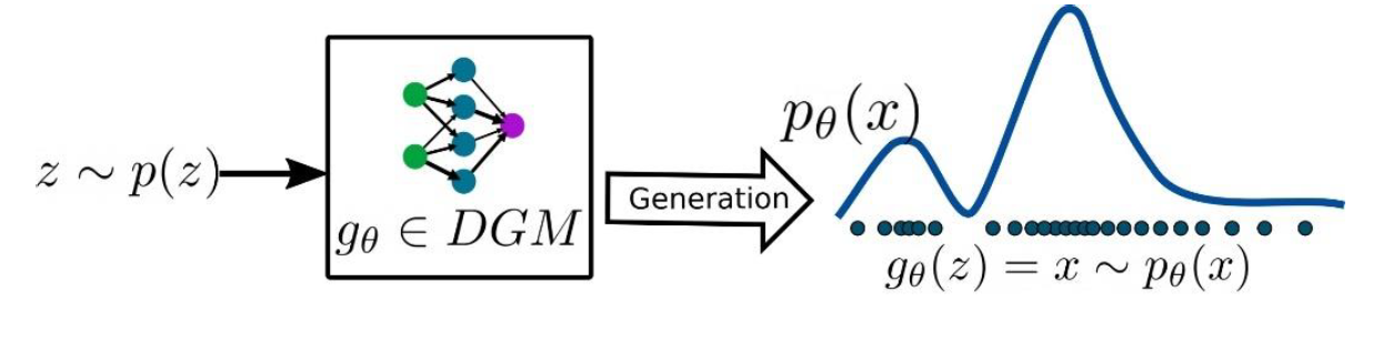
  for the future value prediction. In the other words, autoregressive deep generative models are directed and fully observed models where outcome of the data completely depends on the previous data points as shown in Figure 1.
 , where
  is a set of images and each images is
  dimensional (n pixels). Then the prediction of new data pixel will be depending all the previously predicted pixels (Figure ?? shows the one row of pixels from an image). Referring to our last blog, deep generative models (DGMs) aim to learn the data distribution
  of the given training data and by following the chain rule of the probability, we can express it as:
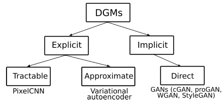
 random variables. On the other hand, these kind of representation can have exponential space complexity. Therefore, in autoregressive generative models (AGM), these conditionals are approximated/parameterized by neural networks.

 does not depend on


 According to a famous Japanese textbook on RL named “Machine Learning Professional Series: Reinforcement Learning,” most study materials on RL lack explanations on mathematical foundations of RL, including the book by Sutton and Barto. That is why many people who have studied machine learning often find it hard to get RL formulations at the beginning. The book also points out that you need to refer to other bulky books on Markov decision process or dynamic programming to really understand the core ideas behind algorithms introduced in RL textbooks. And I got an impression most of study materials on RL get away with the important ideas on DP with only introducing value iteration and policy iteration algorithms. But my opinion is we should pay more attention on policy iteration. And actually important RL algorithms like Q learning, SARSA, or actor critic methods show some analogies to policy iteration. Also the book by Sutton and Barto also briefly mentions “Almost all reinforcement learning methods are well described as GPI (generalized policy iteration). That is, all have identifiable policies and value functions, with the policy always being improved with respect to the value function and the value function always being driven toward the value function for the policy, as suggested by the diagram to the right side.“
 , you need to calculate a value functions
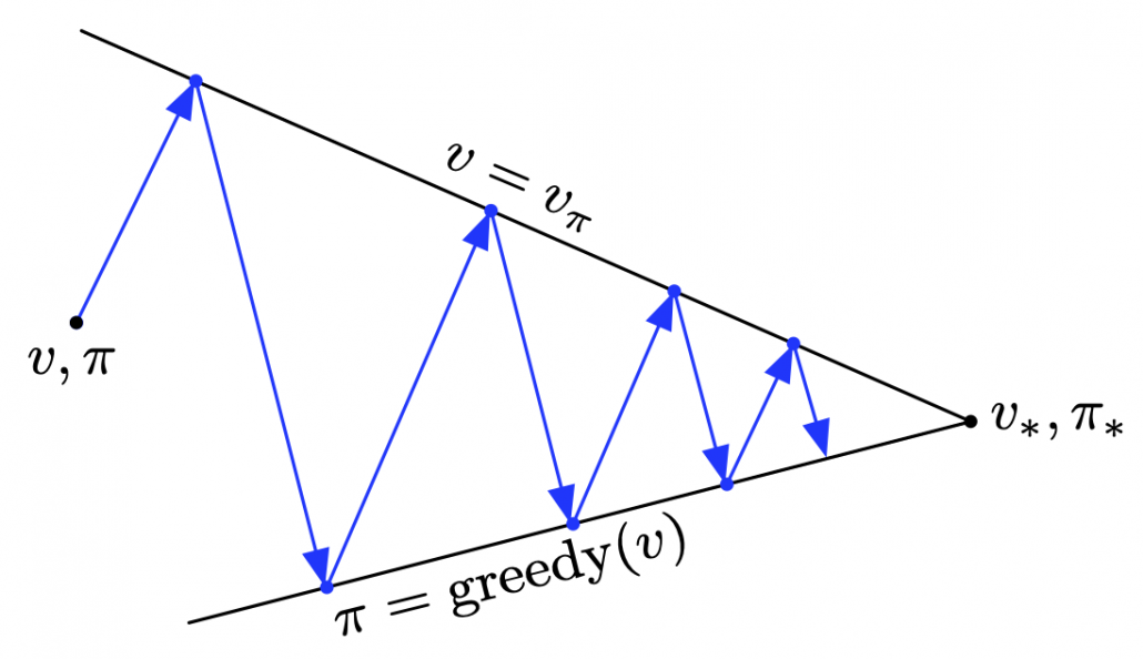
 or
or  . But I would like you take it easy while reading my articles. I will repeatedly mentions differences of notations when that matters.
 grid map which I visualized above. In this case each cell is numbered from
  as the figure below. But the cell 7, 13, 14 are removed from the map. In this case
  , and
, and  . When you pass
  , you get a reward
  , and when you pass the states
  or
or  , you get a reward
  . Also, the agent is encouraged to reach the goal as soon as possible, thus the agent gets a regular reward of
  every time step.
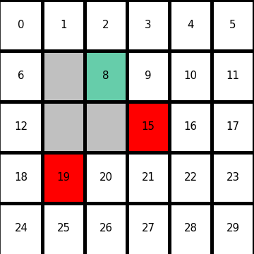

 needs to be considered. And this is the value of the state. Thus the value of a state
 ![\mathbb{E}_{\pi}\bigl[R_{t+1} + R_{t+2} + R_{t+3} + \cdots + R_T | S_t = s \bigr]](https://data-science-blog.com/wp-content/ql-cache/quicklatex.com-1446ab2bd566ff9ae22a26979bc864a2_l3.png "Rendered by QuickLaTeX.com")
 , it can take numerous patterns of actions. For example (a)
  , (b)
, (b)  , (c)
, (c)  . The rewards after each behavior is calculated as follows.
 in total. The probability of taking a course of a) is


 is
is  . The probability of taking the action can be calculated in the same way as
 .
.![\mathbb{E}_{\pi}\bigl[R_{t+1} + R_{t+2} + R_{t+3} + \cdots + R_T | S_t = s \bigr] = r_a \cdot p_a + r_b \cdot p_b](https://data-science-blog.com/wp-content/ql-cache/quicklatex.com-9af1a6e1d05f0e084ca3df7b2cab9ef9_l3.png "Rendered by QuickLaTeX.com")
 ,and it is virtually equal to considering all the possible future cases.A very important formula named the Bellman equation effectively formulate that.
![\gamma \in (0, 1]](https://data-science-blog.com/wp-content/ql-cache/quicklatex.com-914da56af30aaafcc35b558976e8fdca_l3.png "Rendered by QuickLaTeX.com") is a discount rate. (1)As the first point above, the discounted return can be calculated recursively as follows:
is a discount rate. (1)As the first point above, the discounted return can be calculated recursively as follows: 

 . You can postpone calculation of future rewards corresponding to
  this way. This might sound obvious, but this small trick is crucial for defining defining value functions or making update rules of them. (2)The second point might be confusing to some people, but it is the most important in this section. We took a look at a very simplified case of calculating the expectation in the last section, but let’s see how a value function
 ![v_{\pi}(s) \doteq \mathbb{E}_{\pi}\bigl[G_t | S_t = s \bigr]](https://data-science-blog.com/wp-content/ql-cache/quicklatex.com-4a07b7408b4cebfe6e2558ca8d1573cf_l3.png "Rendered by QuickLaTeX.com")
![v_{\pi} (s)= \sum_{a}{\pi(a|s) \sum_{s', r}{p(s', r|s, a)\bigl[r + \gamma v_{\pi}(s')\bigr]}}](https://data-science-blog.com/wp-content/ql-cache/quicklatex.com-9b05fc8f5122733b29e251f8000f7bf2_l3.png "Rendered by QuickLaTeX.com")
![\sum_{s', r, a}{\pi(a|s) p(s', r|s, a)\bigl[r + \gamma v_{\pi}(s')\bigr]}](https://data-science-blog.com/wp-content/ql-cache/quicklatex.com-c9afc3114f14adcf06a184c6656f404b_l3.png "Rendered by QuickLaTeX.com") . It can be comprehended this way: in Bellman equation you calculate a probabilistic sum of
. It can be comprehended this way: in Bellman equation you calculate a probabilistic sum of  , considering all the possible actions of the agent in the time step.
  . Hence the right side of Bellman equation above means the sum of
 ![\pi(a|s) p(s', r|s, a)\bigl[r + \gamma v_{\pi}(s')\bigr]](https://data-science-blog.com/wp-content/ql-cache/quicklatex.com-c68792d33ebf817bf92b2c3122432011_l3.png "Rendered by QuickLaTeX.com") , over all possible combinations of
, over all possible combinations of  . In order to calculate the expectation, you have to consider all the combinations of
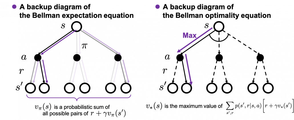
![v_{\ast}(s) \doteq \max_{a} \sum_{s', r}{p(s', r|s, a)\bigl[r + \gamma v_{\ast}(s')\bigr]}](https://data-science-blog.com/wp-content/ql-cache/quicklatex.com-86f7734f497416e3b1922ee15d1688dc_l3.png "Rendered by QuickLaTeX.com")
 are known, a major way of calculating
  converges to
 ![v_{k+1}(s) =\sum_{a}{\pi(a|s)\sum_{s', r}{p(s', r | s, a) [r + \gamma v_k (s')]}}](https://data-science-blog.com/wp-content/ql-cache/quicklatex.com-0d6a73bc17d541f77b43a10e128462ce_l3.png "Rendered by QuickLaTeX.com") .
.![v_{\pi}(s) =\sum_{a}{\pi(a|s)\sum_{s', r}{p(s', r | s, a) [r + \gamma v_{\pi} (s')]}}](https://data-science-blog.com/wp-content/ql-cache/quicklatex.com-afdb0cd8be05e7e79fc3306f8ebc3732_l3.png "Rendered by QuickLaTeX.com") .
. to the converged state at
  . But you have to be careful abut the directions of the arrows in purple. If you correspond the backup diagrams of the Bellman equation with the graphs below, the purple arrows point to the reverse side to the direction where the graphs extend. This process of converging an arbitrarily initialized
  to
to 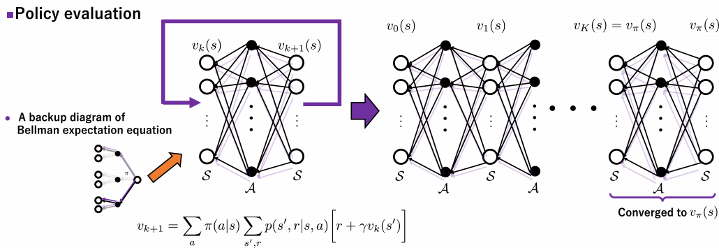
 are a set of states and actions respectively. Thus
  , the size of
  is the number of white nodes in each layer, and
 ![v_{k+1}(s) =\max_a\sum_{s', r}{p(s', r | s, a) [r + \gamma v_k (s')]}](https://data-science-blog.com/wp-content/ql-cache/quicklatex.com-798ecf9bb29b6fcdecb3282f759d07d2_l3.png "Rendered by QuickLaTeX.com")
![\pi(a|s) \gets\text{argmax}_a {r + \sum_{s', r}{p(s', r|s, a)[r + \gamma V(s')]}}, \quad \forall s\in \mathcal{S}](https://data-science-blog.com/wp-content/ql-cache/quicklatex.com-5f4b9305832f16e171d2d5428f5251d8_l3.png "Rendered by QuickLaTeX.com")
![r + \sum_{s', r}{p(s', r|s, a)[r + \gamma V(s')]}](https://data-science-blog.com/wp-content/ql-cache/quicklatex.com-3cb4dfa2cd76474740b41aecacce9d84_l3.png "Rendered by QuickLaTeX.com") is maximized. And when the policy
is maximized. And when the policy 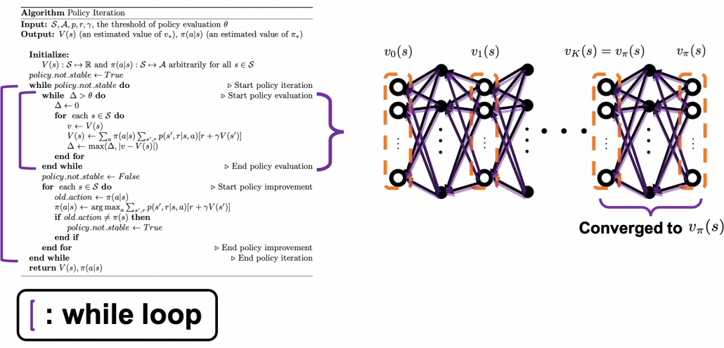
 . And corresponding small letters are realized values of the random variables. For example
  . (*Please do not think too much about the number of
  s on the small letters.)
 . This means the probability of
  are sampled given that
  means a probability of transition, but I am using
  shows the probability that, given an agent being in state
  , and receive reward
  . Thus importantly,
 are discrete random variables, a conditional expectation of
  is calculated as follows:
 ![\mathbb{E}[X|Y=y] = \sum_{x}{p(x|Y=y)}](https://data-science-blog.com/wp-content/ql-cache/quicklatex.com-5bee0d95ebfa141ff0bc520462f4cfa9_l3.png "Rendered by QuickLaTeX.com") .
. and linearity of an expectation, the following equations hold.
![v_{\pi}(s) = \mathbb{E} [G_t | S_t =s] = \mathbb{E} [R_{t+1} + \gamma G_{t+1} | S_t =s]](https://data-science-blog.com/wp-content/ql-cache/quicklatex.com-fbb4801687a26cb911e5675ac25002bd_l3.png "Rendered by QuickLaTeX.com")
![=\mathbb{E} [R_{t+1} | S_t =s] + \gamma \mathbb{E} [G_{t+1} | S_t =s]](https://data-science-blog.com/wp-content/ql-cache/quicklatex.com-f485080bf287c6c9156187adc49b1b4c_l3.png "Rendered by QuickLaTeX.com")
![\mathbb{E} [R_{t+1} | S_t =s]](https://data-science-blog.com/wp-content/ql-cache/quicklatex.com-a585f119409ea2b556c68a0c1378a356_l3.png "Rendered by QuickLaTeX.com") and
and ![\mathbb{E} [G_{t+1} | S_t =s]](https://data-science-blog.com/wp-content/ql-cache/quicklatex.com-7f1e5cf67a9196db4f0aace79e81e322_l3.png "Rendered by QuickLaTeX.com") . As I have explained
. As I have explained  over all the combinations of
  . And according to one of the points above,
  . Thus the following equation holds.
![\mathbb{E} [R_{t+1} | S_t =s] = \sum_{s', a, r}{p(s', a, r|s)r} =](https://data-science-blog.com/wp-content/ql-cache/quicklatex.com-dd202255b6a36417c897509dc2b69655_l3.png "Rendered by QuickLaTeX.com")
 .
.![\mathbb{E} [G_{t+1} | S_t =s]](https://data-science-blog.com/wp-content/ql-cache/quicklatex.com-6bc115f9e71f2fc3a69465acf6a91464_l3.png "Rendered by QuickLaTeX.com")
![= \mathbb{E} [R_{t + 2} + \gamma R_{t + 3} + \gamma ^2 R_{t + 4} + \cdots | S_t =s]](https://data-science-blog.com/wp-content/ql-cache/quicklatex.com-48b09c6d0d7d67902de3191e66a38be2_l3.png "Rendered by QuickLaTeX.com")
![= \mathbb{E} [R_{t + 2} | S_t =s] + \gamma \mathbb{E} [R_{t + 2} | S_t =s] + \gamma ^2\mathbb{E} [ R_{t + 4} | S_t =s] +\cdots](https://data-science-blog.com/wp-content/ql-cache/quicklatex.com-5cdf22993b5055312df2e1f797fd3b26_l3.png "Rendered by QuickLaTeX.com") .
.![\mathbb{E} [R_{t + 2} | S_t =s]](https://data-science-blog.com/wp-content/ql-cache/quicklatex.com-469530b7d89bba0e743a0a3b1015ccd3_l3.png "Rendered by QuickLaTeX.com") . Also
. Also ![\mathbb{E} [R_{t + 3} | S_t =s]](https://data-science-blog.com/wp-content/ql-cache/quicklatex.com-2bb7f6a67696da895bb485861837f1d2_l3.png "Rendered by QuickLaTeX.com") is a sum of
is a sum of  over all the combinations of (s”, a’, r’, s’, a, r).
![\mathbb{E}_{\pi} [R_{t + 2} | S_t =s] =\sum_{s'', a', r', s', a, r}{p(s'', a', r', s', a, r|s)r'}](https://data-science-blog.com/wp-content/ql-cache/quicklatex.com-616b7769fe43ea42b46e5ca3f604ccee_l3.png "Rendered by QuickLaTeX.com")


 and the reward
  and the action
  at the time step.
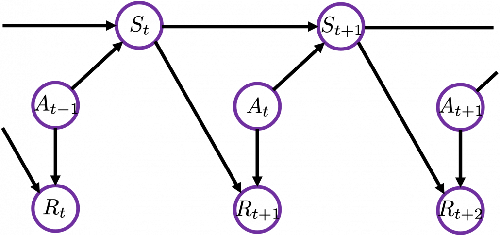
 , only
  . And again
  . Thus the following equations hold.
![\mathbb{E}_{\pi} [R_{t + 2} | S_t =s]=\sum_{ s', a, r}{p(s', a, r|s)} \sum_{s'', a', r'}{p(s'', a', r'| s', a, r', s)r'}](https://data-science-blog.com/wp-content/ql-cache/quicklatex.com-1e4e2cb83f6dd183dce4e2a51990bbc2_l3.png "Rendered by QuickLaTeX.com")

![= \sum_{ s', a, r}{p(s', r|a, s)\pi(a|s)} \mathbb{E}_{\pi} [R_{t+2} | s']](https://data-science-blog.com/wp-content/ql-cache/quicklatex.com-664e5538f363a0ef817dd5f48fbbae6a_l3.png "Rendered by QuickLaTeX.com") .
.![\mathbb{E}_{\pi} [R_{t + 3} | S_t =s]](https://data-science-blog.com/wp-content/ql-cache/quicklatex.com-64827bc08e99d614dc3838a85798c7d8_l3.png "Rendered by QuickLaTeX.com") can be calculated the same way.
can be calculated the same way.![\mathbb{E}_{\pi}[R_{t + 3} | S_t =s] =\sum_{s''', a'', r'', s'', a', r', s', a, r}{p(s''', a'', r'', s'', a', r', s', a, r|s)r''}](https://data-science-blog.com/wp-content/ql-cache/quicklatex.com-421e1a0b214d777abba77463656339f8_l3.png "Rendered by QuickLaTeX.com")


![=\sum_{ s', a, r}{ p(s', r | s, a)p(a|s)} \mathbb{E}_{\pi} [R_{t+3} | s']](https://data-science-blog.com/wp-content/ql-cache/quicklatex.com-6e0ec2657d6aca22c01de6f4b10a136a_l3.png "Rendered by QuickLaTeX.com") .
.![\mathbb{E}_{\pi} [R_{t + 4} | S_t =s]](https://data-science-blog.com/wp-content/ql-cache/quicklatex.com-5370726e4df48fa2beda19166dc02906_l3.png "Rendered by QuickLaTeX.com") ,
, ![\mathbb{E}_{\pi} [R_{t + 5} | S_t =s]\dots](https://data-science-blog.com/wp-content/ql-cache/quicklatex.com-c60185b7e16dd3c9d80041a6d63e4901_l3.png "Rendered by QuickLaTeX.com") . Thus
. Thus![v_{\pi}(s) =\mathbb{E} [R_{t+1} | S_t =s] + \gamma \mathbb{E} [G_{t+1} | S_t =s]](https://data-science-blog.com/wp-content/ql-cache/quicklatex.com-e78cd95d37820f82e6dce3d5c5943815_l3.png "Rendered by QuickLaTeX.com")
![+ \mathbb{E} [R_{t + 2} | S_t =s] + \gamma \mathbb{E} [R_{t + 3} | S_t =s] + \gamma ^2\mathbb{E} [ R_{t + 4} | S_t =s] +\cdots](https://data-science-blog.com/wp-content/ql-cache/quicklatex.com-9d5855daab70bbee7810386c6fc52bc1_l3.png "Rendered by QuickLaTeX.com")

![+\sum_{ s', a, r}{p(s', r|a, s)\pi(a|s)} \mathbb{E}_{\pi} [R_{t+2} |S_{t+1}= s']](https://data-science-blog.com/wp-content/ql-cache/quicklatex.com-028766cd22f5479faa5a4f1ea907da6b_l3.png "Rendered by QuickLaTeX.com")
![+\gamma \sum_{ s', a, r}{ p(s', r | s, a)p(a|s)} \mathbb{E}_{\pi} [R_{t+3} |S_{t+1} = s']](https://data-science-blog.com/wp-content/ql-cache/quicklatex.com-6679a24522d25f8e36d5caf2a7a8ce06_l3.png "Rendered by QuickLaTeX.com")
![+\gamma^2 \sum_{ s', a, r}{ p(s', r | s, a)p(a|s)} \mathbb{E}_{\pi} [ R_{t+4}|S_{t+1} = s'] + \cdots](https://data-science-blog.com/wp-content/ql-cache/quicklatex.com-cb1b0cd6d79e351b146b9b5766c7f5e2_l3.png "Rendered by QuickLaTeX.com")
![=\sum_{ s', a, r}{ p(s', r | s, a)p(a|s)} [r + \mathbb{E}_{\pi} [\gamma R_{t+2}+ \gamma R_{t+3}+\gamma^2R_{t+4} + \cdots |S_{t+1} = s'] ]](https://data-science-blog.com/wp-content/ql-cache/quicklatex.com-641a5ebcd67a76dc3f5367ee009e9b14_l3.png "Rendered by QuickLaTeX.com")
![=\sum_{ s', a, r}{ p(s', r | s, a)p(a|s)} [r + \mathbb{E}_{\pi} [G_{t+1} |S_{t+1} = s'] ]](https://data-science-blog.com/wp-content/ql-cache/quicklatex.com-133e0a40144cd6b8d9d24eb9c62541a3_l3.png "Rendered by QuickLaTeX.com")
![=\sum_{ s', a, r}{ p(s', r | s, a)p(a|s)} [r + v_{\pi}(s') ]](https://data-science-blog.com/wp-content/ql-cache/quicklatex.com-942d98bd0c9d7cc3ed2939137e05df53_l3.png "Rendered by QuickLaTeX.com")