Geschriebene Artikel über Big Data Analytics

Digital und Data braucht Vorantreiber

2020 war das Jahr der Trendwende hin zu mehr Digitalisierung in Unternehmen: Telekommunikation und Tools für Unified Communications & Collaboration (UCC) wie etwa Microsoft Teams oder Skype boomen genauso wie der digitale Posteingang und das digitale Signieren von Dokumenten. Die  Vernetzung und Automatisierung ganz im Sinne der Industrie 4.0 finden nicht nur in der Produktion und Logistik ihren Einzug, sondern beispielsweise auch in Form der Robot Process Automation (RPA) ins Büro – bei vielen Unternehmen ein aktuelles Top-Thema. Und in Zeiten, in denen der öffentliche Verkehr zum unangenehmen Gesundheitsrisiko wird und der Individualverkehr wieder cool ist, boomen digital unterstützte Miet- und Sharing-Angebote für Automobile mehr als je zuvor, gleichwohl autonome Fahrzeuge oder post-ausliefernde Drohnen nach wie vor schmerzlich vermisst werden.

Nahezu jedes Unternehmen muss in der heutigen Zeit nicht nur mit der Digitalisierung der Gesellschaft mithalten, sondern auch sich selbst digital organisieren können und bestenfalls eigene Innovationen vorantreiben. Hierfür ist sollte es mindestens eine verantwortliche Stelle geben, den Chief Digital Officer.

Chief Digital Officer gelten spätestens seit 2020 als Problemlöser in der Krise

Einem Running Gag zufolge haben wir den letzten Digitalisierungsvorschub keinem menschlichen Innovator, sondern der Corona-Pandemie zu verdanken. Und tatsächlich erzwang die Pandemie insbesondere die verstärkte Etablierung von digitalen Alternativen für die Kommunikation und Zusammenarbeit im Unternehmen sowie noch digitalere Shop- und Lieferdiensten oder auch digitale Qualifizierungs- und Event-Angebote. Dennoch scheint die Pandemie bisher noch mit überraschend wenig Innovationskraft verbunden zu sein, denn die meisten Technologien und Konzepte der Digitalisierung waren lange vorher bereits auf dem Erfolgskurs, wenn auch ursprünglich mit dem Ziel der Effizienzsteigerung im Unternehmen statt für die Einhaltung von Abstandsregeln. Die eigentlichen Antreiber dieser Digitalisierungsvorhaben waren bereits lange vorher die Chief Digital Officer (CDO).

Zugegeben ist der Grad an Herausforderung nicht für alle CDOs der gleiche, denn aus unterschiedlichen Branchen ergeben sich unterschiedliche Schwerpunkte. Die Finanzindustrie arbeitet seit jeher im Kern nur mit Daten und betrachtet Digitalisierung eher nur aus der Software-Perspektive. Die produzierende Industrie hat mit der Industrie 4.0 auch das Themenfeld der Vernetzung größere Hürden bei der umfassenden Digitalisierung, aber auch die Logistik- und Tourismusbranchen müssen digitalisieren, um im internationalen Wettbewerb nicht den Boden zu verlieren.

Digitalisierung ist ein alter Hut, aber aktueller denn je

Immer wieder wird behauptet, Digitalisierung sei neu oder – wie zuvor bereits behauptet – im Kern durch Pandemien getrieben. Dabei ist, je nach Perspektive, der Hauptteil der Digitalisierung bereits vor Jahrzehnten mit der Einführung von Tabellenkalkulations- sowie ERP-Software vollzogen. Während in den 1980er noch Briefpapier, Schreibmaschinen, Aktenordner und Karteikarten die Bestellungen auf Kunden- wie auf Lieferantenseite beherrschten, ist jedes Unternehmen mit mehr als hundert Mitarbeiter heute grundsätzlich digital erfasst, wenn nicht gar längst digital gesteuert. Und ERP-Systeme waren nur der Anfang, es folgten – je nach Branche und Funktion – viele weitere Systeme: MES, CRM, SRM, PLM, DMS, ITS und viele mehr.

Zwischenzeitlich kamen um die 2000er Jahre das Web 2.0, eCommerce und Social Media als nächste Evolutionsstufe der Digitalisierung hinzu. Etwa ab 2007 mit der Vorstellung des Apple iPhones, verstärkt jedoch erst um die 2010er Jahre durchdrangen mobile Endgeräte und deren mobile Anwendungen als weitere Befähiger und Game-Changer der Digitalisierung den Markt, womit auch Gaming-Plattformen sich wandelten und digitale Bezahlsysteme etabliert werden konnten. Zeitlich darauf folgten die Trends Big Data, Blockchain, Kryptowährungen, Künstliche Intelligenz, aber auch eher hardware-orientierte Themen wie halb-autonom fahrende, schwimmende oder fliegende Drohnen bis heute als nächste Evolutionsschritte der Digitalisierung.

Dieses Alter der Digitalisierung sowie der anhaltende Trend zur weiteren Durchdringung und neuen Facetten zeigen jedoch auch die Beständigkeit der Digitalisierung als Form des permanenten Wandels und dem Data Driven Thinking. Denn heute bestreben Unternehmen auch Mikroprozesse zu digitalisieren und diese besser mit der Welt interagieren zu lassen. Die Digitalisierung ist demzufolge bereits ein Prozess, der seit Jahrzehnten läuft, bis heute anhält und nur hinsichtlich der Umsetzungsschwerpunkte über die Jahre Verschiebungen erfährt – Daher darf dieser Digitalisierungsprozess keinesfalls aus dem Auge verloren werden. Digitalisierung ist kein Selbstzweck, sondern ein Innovationsprozess zur Erhaltung der Wettbewerbsfähigkeit am Markt.

Digital ist nicht Data, aber Data ist die Konsequenz aus Digital

Trotz der längst erreichten Etablierung des CDOs als wichtige Position im Unternehmen, gilt der Job des CDOs selbst heute noch als recht neu. Zudem hatte die Position des CDOs keinen guten Start, denn hinsichtlich der Zuständigkeit konkurriert der CDO nicht nur sowieso schon mit dem CIO oder CTO, er macht sich sogar selbst Konkurrenz, denn er ist namentlich doppelbesetzt: Neben dem Chief Digital Officer gibt es ebenso auch den noch etwas weniger verbreiteten Chief Data Officer. Doch spielt dieser kleine namentliche Unterschied eine Rolle? Ist beides nicht doch das gemeinsame Gleiche?

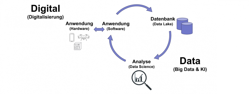
Die Antwort darauf lautet ja und nein. Der CDO befasst sich mit den zuvor bereits genannten Themen der Digitalisierung, wie mobile Anwendungen, Blockchain, Internet of Thing und Cyber Physical Systems bzw. deren Ausprägungen als vernetze Endgeräte entsprechend der Konzepte wie Industrie 4.0, Smart Home, Smart Grid, Smart Car und vielen mehr. Die einzelnen Bausteine dieser Konzepte generieren Daten, sind selbst jedoch Teilnehmer der Digitalisierungsevolution. Diese Teilnehmer aus Hardware und Software generieren über ihren Einsatz Daten, die wiederum in Datenbanken gespeichert werden können, bis hin zu großen Volumen aus heterogenen Datenquellen, die gelegentlich bis nahezu in Echtzeit aktualisiert werden (Big Data). Diese Daten können dann einmalig, wiederholt oder gar in nahezu Echtzeit automatisch analysiert werden (Data Science, KI) und die daraus entstehenden Einblicke und Erkenntnisse wiederum in die Verbesserung der digitalen Prozesse und Produkte fließen.

Folglich befassen sich Chief Digital Officer und Chief Data Officer grundsätzlich im Kern mit unterschiedlichen Themen. Während der Chief Digital Officer sich um die Hardware- und Software im Kontext zeitgemäßer Digitalisierungsvorhaben und deren organisatorische Einordnung befasst, tut dies der Chief Data Officer vor allem im Kontext der Speicherung und Analyse von Daten sowie der Data Governance.

Treffen werden sich Digital und Data jedoch immer wieder im Kreislauf der kontinuierlichen Verbesserung von Produkt und Prozess, insbesondere bei der Gestaltung und Analyse der Digital Journey für Mitarbeiter, Kunden und Partnern und Plattform-Entscheidungen wie etwas Cloud-Systeme.

Oftmals differenzieren Unternehmen jedoch gar nicht so genau und betrachten diese Position als Verantwortliche für sowohl Digital als auch für Data und nennen diese Position entweder nach dem einen oder nach dem anderen – jedoch mit Zuständigkeiten für beides. In der Tat verfügen heute nur sehr wenige Unternehmen über beide Rollen, sondern haben einen einzigen CDO. Für die meisten Anwender klingt das trendige Digital allerdings deutlich ansprechender als das nüchterne Data, so dass die Namensgebung der Position eher zum Chief Digital Officer tendieren mag. Nichtsdestotrotz sind Digital-Themen von den Data-Themen recht gut zu trennen und sind strategisch unterschiedlich einzuordnen. Daher benötigen Unternehmen nicht nur eine Digital-, sondern ebenso eine Datenstrategie – Doch wie bereits angedeutet, können CDOs beide Rollen übernehmen und sich für beide Strategien verantwortlich fühlen.

Die gemeinsame Verantwortung von Digital und Data kann sogar als vorteilhafte Nebenwirkung besonders konsistente Entscheidungen ermöglichen und so typische Digital-Themen wie Blockchain oder RPA mit typischen Data-Themen wie Audit-Datenanalysen oder Process Mining verbinden. Oder der Dokumenten-Digitalisierung und -Verwaltung in der kombinierten Betrachtung mit Visual Computing (Deep Learning zur Bilderkennung).

Vielfältige Kompetenzen und Verantwortlichkeiten eines CDOs

Chief Digital Officer befassen sich mit Innovationsthemen und setzen sie für ihr Unternehmen um. Sie sind folglich auch Change Manager. CDOs dürfen keinesfalls bequeme Schönwetter-Manager sein, sondern müssen den Wandel im Unternehmen vorantreiben, Hemmnissen entgegenstehen und bestehende Prozesse und Produkte hinterfragen. Die Schaffung und Nutzung von digitalen Produkten und Prozessen im eigenen Unternehmen sowie auch bei Kunden und Lieferanten generiert wiederum Daten in Massen. Der Kreislauf zwischen Digital und Data treibt einen permanenten Wandel an, den der CDO für das Unternehmen positiv nutzbar machen muss und dabei immer neue Karriereperspektiven für sich und seine Mitarbeiter schaffen kann.

Zugegeben sind das keine guten Nachrichten für Mitarbeiter, die auf Beständigkeit setzen. Die Iterationen des digitalen Wandels zirkulieren immer schneller und stellen Ingenieure, Software-Entwickler, Data Scientists und andere Technologieverantwortliche vor den Herausforderungen des permanenten und voraussichtlich lebenslangen Lernens. Umso mehr muss ein CDO hier lernbereit und dennoch standhaft bleiben, denn Gründe für den Aufschub von Veränderungen findet im Zweifel jede Belegschaft.

Ein CDO mit umfassender Verantwortung lässt auch das Thema der Datennutzung nicht aus und versteht Architekturen für Business Intelligence und Machine Learning. Um seiner Personalverantwortung gerecht zu werden, muss er sich mit diesen Themen auskennen und mit Experten für Digital und Data auf Augenhöhe sprechen können. Jeder CD sollte wissen, was zum Beispiel ein Data Engineer oder Data Scientist können muss, wie Business-Experten zu verstehen und Vorstände zu überzeugen sind – Denn als Innovator, Antreiber und Wandler fürchten gute CDOs nichts außer den Stillstand.

CRISP-DM methodology in technical view

On this paper discuss about CRISP-DM (Cross Industry Standard Process for data mining) methodology and its steps including selecting technique to successful the data mining process. Before going to CRISP-DM it is better to understand what data mining is? So, here first I introduce the data mining and then discuss about CRISP-DM and its steps for any beginner (data scientist) need to know.

1 Data Mining

Data mining is an exploratory analysis where has no idea about interesting outcome (Kantardzic, 2003). So data mining is a process to explore by analysis a large set of data to discover meaningful information which help the business to take a proper decision. For better business decision data mining is a way to select feature, correlation, and interesting patterns from large dataset (Fu, 1997; SPSS White Paper, 1999).

Data mining is a step by step process to discover knowledge from data. Pre-processing data is vital part for a data mining. In pre-process remove noisy data, combining multiple sources of data, retrieve relevant feature and transforming data for analysis. After pre-process mining algorithm applied to extract data pattern so data mining is a step by step process and applied algorithm to find meaning full data pattern. Actually data mining is not only conventional analysis it is more than that (Read, 1999).

Data mining and statistics closely related. Main goal of data mining and statistic is find the structure of data because data mining is a part of statistics (Hand, 1999). However, data mining use tools, techniques, database, machine learning which not part of statistics but data mining use statistics algorithm to find a pattern or discover hidden decision.

Data mining objective could be prediction or description. On prediction data mining considering several features of dataset to predict unidentified future, on the other hand description involve identifying pattern of data to interpreted (Kantardzic, 2003).

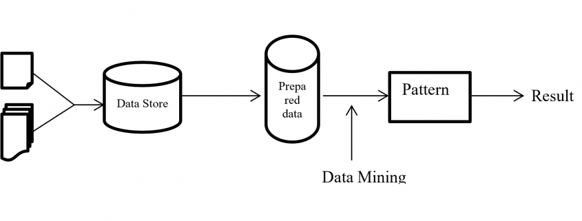
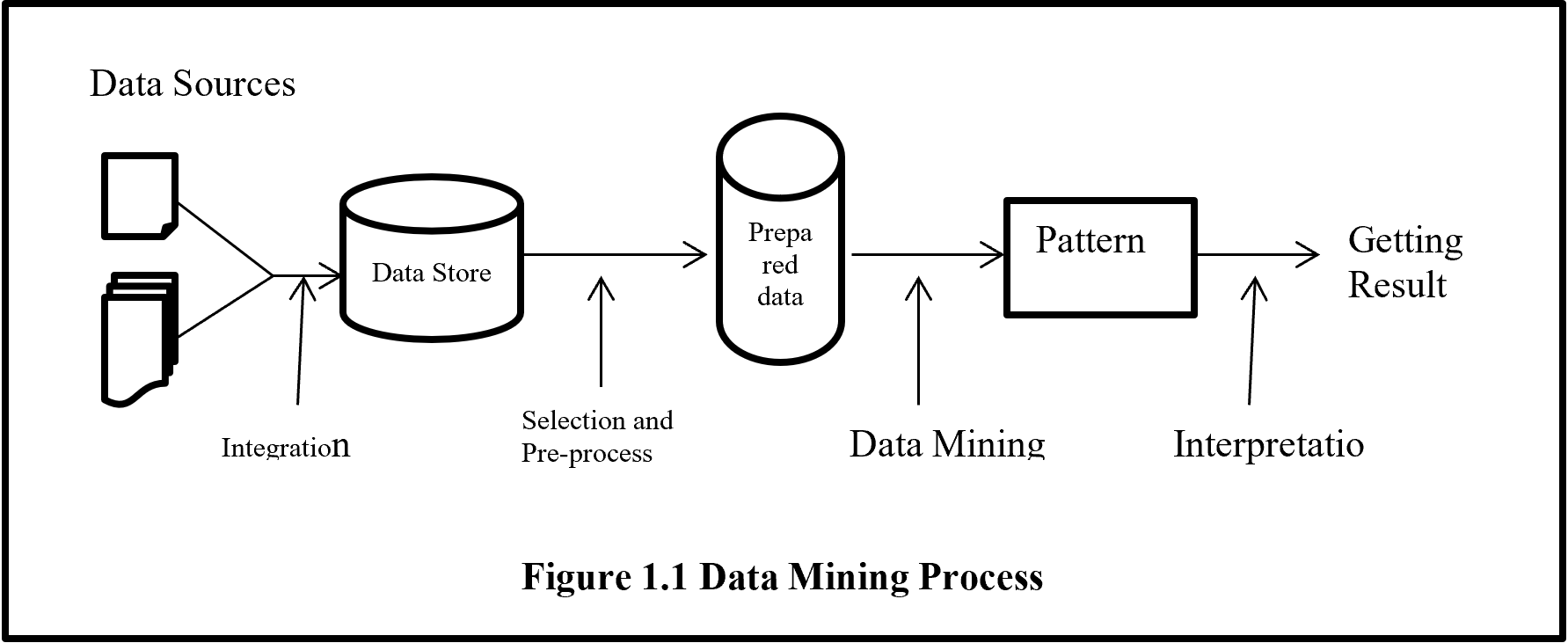
From figure 1.1 shows data mining is the only one part of getting unknown information from data but it is the central process of whole process. Before data mining there are several processes need to be done like collecting data from several sources than integrated data and keep in data storage. Stored unprocessed data evaluated and selected with pre-processed activity to give a standard format than data mining algorithm to analysis for hidden pattern.

Data Mining Process

2 CRISP-DM Methodologies

Cross Industry Standard Process for data mining (CRISP-DM) is most popular and widely uses data mining methodology. CRISP-DM breaks down the data mining project life cycle into six phases and each phase consists of many second-level generic tasks. Generic task cover all possible data mining application. CRISP-DM extends KDD (Knowledge Discovery and Data Mining) into six steps which are sequence of data mining application (Martínez-Plumed 2019).

Data science and data mining project extract meaningful information from data. Data science is an art where a lot of time need to spend for understanding the business value and data before applying any algorithm then evaluate and deployed a project. CRISP-DM help any data science and data mining project from start to end by giving step by step process.

Present world every day billions of data are generating. So organisations are struggling with overwhelmed data to process and find a business goal. Comprehensive data mining methodology, CRISP-DM help business to achieve desirable goal by analysing data.

CRISP-DM (Cross Industry Standard Process for Data Mining) is well documented, freely available, data mining methodology. CRISP-DM is developed by more than 200 data mining users and many mining tool and service providers funded by European Union. CRISP-DM encourages organization for best practice and provides a structure of data mining to get better, faster result.

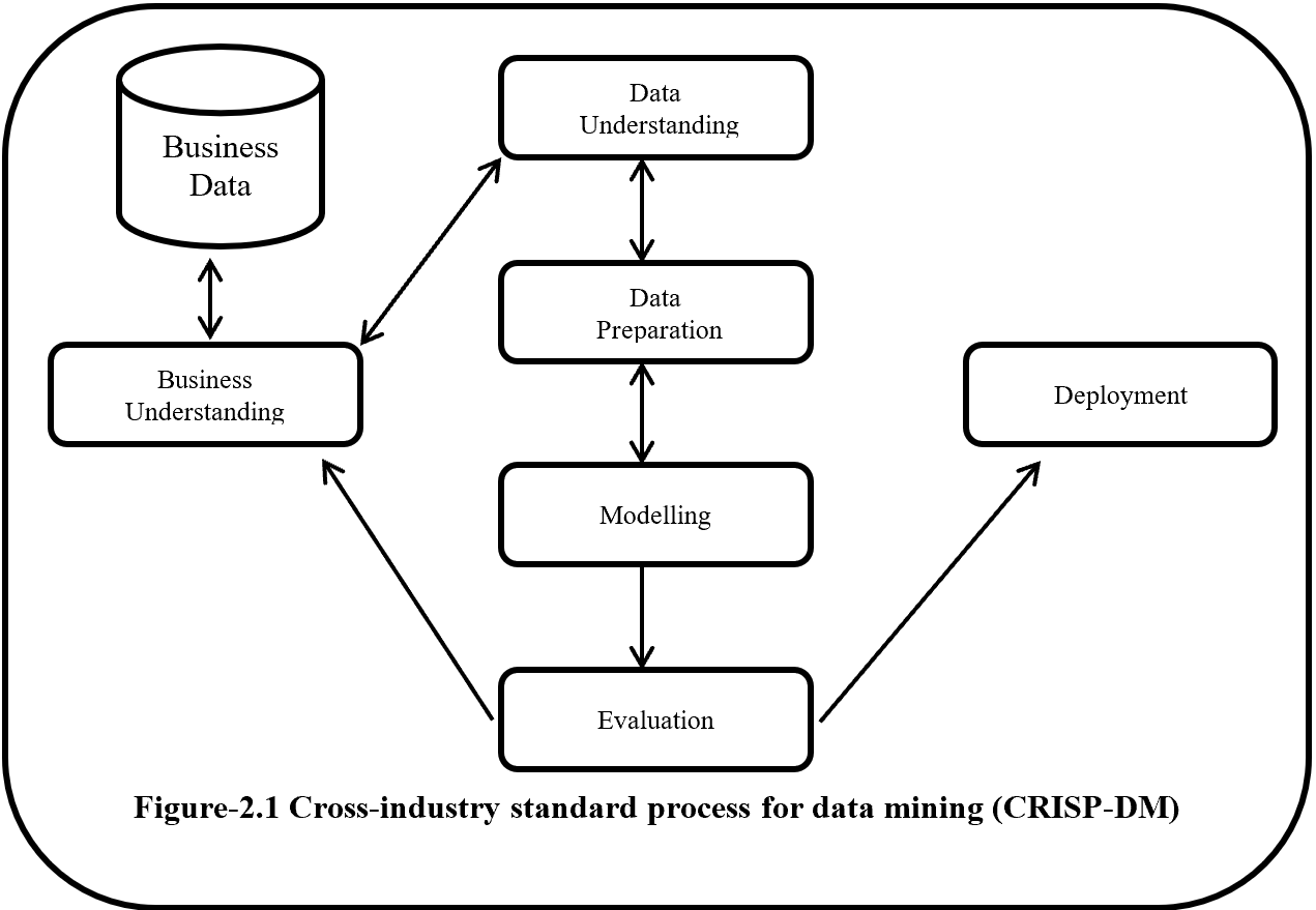
CRISP-DM is a step by step methodology. Figure-2.1 show the phases of CRISP-DM and process of data mining. Here one side arrow indicates the dependency between phases and double side arrow represents repeatable process. Six phases of CRISP-DM are Business understanding, Data understanding, Modelling, Evaluation and Deployment.

CRISP-DM

2.1 Business Understanding

Business Understanding or domain understanding is the first step of CRISP-DM methodology. On this stage identify the area of business which is going to transform into meaningful information by analysing, processing and implementing several algorithms. Business understanding identifies the available resource (human and hardware), problems and set a goal. Identification of business objective should be agreed with project sponsors and other unit of business which will be affected. This step also focuses about details business success criteria, requirements, constraints, risk, project plan and timeline.

2.2 Data Understanding

Data understanding is the second and closely related with the business understanding phase. This phase mainly focus on data collection and proceeds to get familiar with the data and also detect interesting subset from data. Data understanding has four subsets these are:-

2.2.1 Initial data collection

On this subset considering the data collection sources which is mainly divided into two categories like outsource data or internal source data.  If data is from outsource then it may costly, time consuming and may be low quality but if data is collected form internal source it is an easy and less costly, but it may be contain irrelevant data. If internal source data does not fulfil the interest of analysis than it is necessary to move outsource data. Data collection also give an assumption that the data is quantitative (continuous, count) or qualitative (categorical).  It also gives information about balance or imbalanced dataset.  On data collection should avoid random error, systematic error, exclusion errors, and errors of choosing.

2.2.2 Data Description

Data description performs initial analysis about data. On this stage it is going to determine about the source of data like RDBMS, SQL, NoSQL, Big data etc. then analysis and describe the data about size (large data set give more accurate result but time consuming), number of records, tables, database, variables, and data types (numeric, categorical or Boolean). On this phase examine the accessibility and availability of attributes.

2.2.3 Exploratory data analysis (EDA)

On exploratory data analysis describe the inferential statistics, descriptive statistics and graphical representation of data. Inferential statistics summarize the entire population from the sample data to perform sampling and hypothesis testing. On Parametric hypothesis testing  (Null or alternate – ANOVA, t-test, chi square test) perform for known distribution (based on population) like mean, variance, standard deviation, proportion and Non-parametric hypothesis testing perform when distribution is unknown or sample size is small. On sample dataset, random sampling implement when dataset is balance but for imbalance dataset should be follow random resampling (under  and over sampling), k fold cross validation, SMOTE (synthetic minority oversampling technique), cluster base sampling, ensemble techniques (bagging and boosting – Add boost, Gradient Tree Boosting, XG Boost) to form a balance dataset.

On descriptive statistics analysis describe about the mean, median, mode for measures of central tendency on first moment business decision. On second moment business decision describe the measure of dispersion about the variance, standard deviation and range of data.  On third and fourth moment business decision describe accordingly skewness (Positive skewness – heavier tail to the right, negative skewness – heavier tail to the left, Zero skewness – symmetric distribution) and Kurtosis (Leptokurtosis – heavy tail, platykurtosis – light tail, mesokurtic – normal distribution).

Graphical representation is divided into univariate, bivariate and multivariate analysis. Under univariate whisker plot, histogram identify the outliers and shape of distribution of data and Q-Q plot (Quantile – Quantile) plot describe the normality of data that means data is normally distribution or not.  On whisker plot if data present above of Q3 + 1.5 (IQR) and below of Q1 – 1.5 (IQR) is outlier. For Bivariate correlations identify with scatter plot which describe positive, negative or no correlation and also identify the data linearity or non-linearity. Scatter plot also describe the clusters and outliers of data.  For multivariate has no graphical analysis but used to use regression analysis, ANOVA, Hypothesis analysis.

2.2.4 Data Quality analysis

This phase identified and describes the potential errors like outliers, missing data, level of granularity, validation, reliability, bad metadata and inconsistency.  On this phase AAA (attribute agreement analysis) analysed discrete data for data error. Continuous data analysed with Gage repeatability and reproducibility (Gage R & R) which follow SOP (standard operating procedures). Here Gage R & R define the aggregation of variation in the measurement data because of the measurement system.

2.3 Data Preparation

Data Preparation is the time consuming stage for every data science project. Overall on every data science project 60% to 70% time spend on data preparation stage. Data preparation stapes are described below.

2.3.1 Data integration

Data integration involved to integrate or merged multiple dataset. Integration integrates data from different dataset where same attribute or same columns presents but when there is different attribute then merging the both dataset.

2.3.2 Data Wrangling

On this subset data are going to clean, curate and prepare for next level. Here analysis the outlier and treatment done with 3 R technique (Rectify, Remove, Retain) and for special cases if there are lots of outliner then need to treat outlier separately (upper outliner in an one dataset and lower outliner in another dataset) and alpha (significant value) trim technique use to separate the outliner from the original dataset. If dataset has a missing data then need to use imputation technique like mean, median, mode, regression, KNN etc.

If dataset is not normal or has a collinearity problem or autocorrelation then need to implement transformation techniques like log, exponential, sort, Reciprocal, Box-cox etc. On this subset use the data normalization (data –means/standard deviation) or standardization (min- max scaler) technique to make unitless and scale free data. This step also help if data required converting into categorical then need to use discretization or binning or grouping technique. For factor variable (where has limited set of values), dummy variable creation technique need to apply like one hot encoding.  On this subset also help heterogeneous data to transform into homogenous with clustering technique. Data inconsistencies also handle the inconsistence of data to make data in a single scale.

2.3.3 Feature engineering and selection/reduction

Feature engineering may called as attribute generation or feature extraction. Feature extraction creating new feature by reducing original feature to make simplex model. Feature engineering also do the normalized feature by producing calculative new feature. So feature engineering is a data pre-process technique where improve data quality by cleaning, integration, reduction, transformation and scaling.

Feature selections reduce the multicollinearity or high correlated data and make model simple. Main two type of feature selection technique are supervised and unsupervised. Principal Components Analysis (PCA) is an unsupervised feature reduction/ feature selection technique and LDA is a Linear Discriminant analysis supervised technique mainly use for classification problem. LDA analyse by comparing mean of the variables. Supervised technique is three types filter, wrapper and ensemble method. Filter method is easy to implement but wrapper is costly method and ensemble use inside a model.

2.4 Model

2.4.1 Model Selection Technique

Model selection techniques are influence by accuracy and performance.  Because recommendation need better performance but banking fraud detection needs better accuracy technique.  Model is mainly subdivided into two category supervised learning where predict an output variable according to given an input variable and unsupervised learning where has not output variable.

On supervised learning if an output variable is categorical than it is classification problem like two classes or multiclass classification problem. If an output variable is continuous (numerical) then the problem is called prediction problem. If need to recommending according to relevant information is called recommendation problem or if need to retrieve data according to relevance data is called retrieval problem.

On unsupervised learning where target or output variable is not present. On this technique all variable is treated as an input variable. Unsupervised learning also called clustering problem where clustering the dataset for future decision.

Reinforcement learning agent solves the problem by getting reward for success and penalty for any failure. And semi-supervised learning is a process to solve the problem by combining supervised and unsupervised learning method. On semi-supervised, a problem solved by apply unsupervised clustering technique then for each cluster apply different type of supervised machine learning algorithm like linear algorithm, neural network, K nearest  neighbour etc.

On data mining model selection technique, where output variable is known, then need to implement supervised learning.  Regression is the first choice where interpretation of parameter is important. If response variable is continuous then linear regression or if response variable is discrete with 2 categories value then logistic regression or if response variable is discrete with more than 2 categorical values then multinomial or ordinal regression or if response variable is count then poission where mean is equal to variance or negative binomial regression where variance is grater then mean or if response variable contain excessive zero values then need to choose Zero inflated poission (ZIP) or Zero inflated negative binomial (ZINB).

On supervised technique except regression technique all other technique can be used for both continuous or categorical response variable like KNN (K-Nearest Neighbour),  Naïve Bays, Black box techniques (Neural network, Support vector machine), Ensemble Techniques (Stacking, Bagging like random forest, Boosting like Decision tree, Gradient boosting, XGB, Adaboost).

When response variable is unknown then need to implement unsupervised learning. Unsupervised learning for row reduction is K-Means, Hierarchical etc., for columns reduction or dimension reduction PCA (principal component analysis), LDA (Linear Discriminant analysis), SVD (singular value decomposition) etc. On market basket analysis or association rules where measure are support and confidence then lift ration to determine which rules is important. There are recommendation systems, text analysis and NLP (Natural language processing) also unsupervised learning technique.

For time series need to select forecasting technique. Where forecasting may model based or data based. For Trend under model based need to use linear, exponential, quadratic techniques. And for seasonality need to use additive, multiplicative techniques. On data base approaches used auto regressive, moving average, last sample, exponential smoothing (e.g. SES – simple exponential smoothing, double exponential smoothing, and winters method).

2.4.2 Model building

After selection model according to model criterion model is need to be build. On model building provided data is subdivided with training, validation and testing.  But sometime data is subdivided just training and testing where information may leak from testing data to training data and cause an overfitting problem. So training dataset should be divided into training and validation whereas training model is tested with validation data and if need any tuning to do according to feedback from validation dataset. If accuracy is acceptable and error is reasonable then combine the training and validation data and build the model and test it on unknown testing dataset. If the training error and testing error is minimal or reasonable then the model is right fit or if the training error is low and testing error is high then model is over fitted (Variance) or if training error is high and testing error is also high then model is under fitted (bias). When model is over fitted then need to implement regularization technique (e.g. linear – lasso, ridge regression, Decision tree – pre-pruning, post-pruning, Knn – K value, Naïve Bays – Laplace, Neural network – dropout, drop connect, batch normalization, SVM –  kernel trick)

When data is balance then split the data training, validation and testing and here training is larger dataset then validation and testing. If data set is imbalance then need to use random resampling (over and under) by artificially increases training dataset. On random resampling by randomly partitioning data and for each partition implement the model and taking the average of accuracy. Under K fold cross validation creating K times cross dataset and creating model for every dataset and validate, after validation taking the average of accuracy of all model. There is more technique for imbalance dataset like SMOTH (synthetic minority oversampling technique), cluster based sampling, ensemble techniques e.g. Bagging, Boosting (Ada Boost, XGBoost).

2.4.3 Model evaluation and Tuning

On this stage model evaluate according to errors and accuracy and tune the error and accuracy for acceptable manner. For continuous outcome variable there are several way to measure the error like mean error, mean absolute deviation, Mean squared error, Root mean squared error, Mean percentage error and Mean absolute percentage error but more acceptable way is Mean absolute percentage error. For this continuous data if error is known then it is easy to find out the accuracy because accuracy and error combining value is one. The error function also called cost function or loss function.

For discrete output variable model, for evaluation and tuning need to use confusion matrix or cross table. From confusion matrix, by measuring accuracy, error, precision, sensitivity, specificity, F1 help to take decision about model fitness. ROC curve (Receiver operating characteristic curve), AUC curve (Area under the ROC curve) also evaluate the discrete output variable. AUC and ROC curve plot of sensitivity (true positive rate) vs 1-specificity (false positive rate).  Here sensitivity is a positive recall and  recall is basically out of all positive samples, how sample classifier able to identify. Specificity is negative recall here recall is out of all negative samples, how many sample classifier able to identify.  On AUC where more the area under the ROC is represent better accuracy. On ROC were step bend it’s indicate the cut off value.

2.4.4 Model Assessment

There is several ways to assess the model. First it is need to verify model performance and success according to desire achievement. It needs to identify the implemented model result according to accuracy where accuracy is repeatable and reproducible. It is also need to identify that the model is scalable, maintainable, robust and easy to deploy. On assessment identify that the model evaluation about satisfactory results (identify the precision, recall, sensitivity are balance) and meet business requirements.

2.5 Evaluation

On evaluation steps, all models which are built with same dataset, given a rank to find out the best model by assessing model quality of result and simplicity of algorithm and also cost of deployment. Evaluation part contains the data sufficiency report according to model result and also contain suggestion, feedback and recommendation from solutions team and SMEs (Subject matter experts) and record all these under OPA (organizational process assets).

2.6 Deployment

Deployment process needs to monitor under PEST (political economical social technological) changes within the organization and outside of the organization. PEST is similar to SWOT (strength weakness opportunity and thread) where SW represents the changes of internal and OT represents external changes.

On this deployment steps model should be seamless (like same environment, same result etc.) from development to production. Deployment plan contain the details of human resources, hardware, software requirements. Deployment plan also contain maintenance and monitoring plan by checking the model result and validity and if required then implement retire, replace and update plan.

3 Summaries

CRISP-DM implementation is costly and time consuming. But CRISP-DM methodology is an umbrella for data mining process. CRISP-DM has six phases, Business understanding, Data understanding, Modelling, Evaluation and Deployment. Every phase has several individual criteria, standard and process. CRISP-DM is Guideline for data mining process so if CRISP-DM is going to implement in any project it is necessary to follow each and every single guideline and maintain standard and criteria to get required result.

4 References

  1. Fu, Y., (1997), “Data Mining: Tasks, Techniques and Applications”, Potentials, IEEE, 16: 4, 18–20.
  2. Hand, D. J., (1999), “Statistics and Data Mining: Intersecting Disciplines”, ACM SIGKDD Explorations Newsletter, 1: 1, 16 – 19.
  3. Kantardzic, M., (2003), “Data Mining: Concepts, Models, Methods, and Algorithms” John Wiley and Sons, Inc., Hoboken, New Jersey
  4. Martínez-Plumed, F., Contreras-Ochando, L., Ferri, C., Orallo, J.H., Kull, M., Lachiche, N., Quintana, M.J.R. and Flach, P.A., 2019. CRISP-DM Twenty Years Later: From Data Mining Processes to Data Science Trajectories. IEEE Transactions on Knowledge and Data Engineering.
  5. Read, B.J., (1999), “Data Mining and Science? Knowledge discovery in science as opposed to business”, 12th ERCIM Workshop on Database Research.

Instructions on Transformer for people outside NLP field, but with examples of NLP

I found it quite difficult to explain mathematical details of long short-term memory (LSTM) in my previous article series. But when I was studying LSTM, a new promising algorithm was already attracting attentions. The algorithm is named Transformer. Its algorithm was a first announced in a paper named “Attention Is All You Need,” and it outperformed conventional translation algorithms with lower computational costs.

In this article series, I am going to provide explanations on minimum prerequisites for understanding deep learning in NLP (natural language process) tasks, but NLP is not the main focus of this article series, and actually I do not study in NLP field. I think Transformer is going to be a new major model of deep learning as well as CNN or RNN, and the model is now being applied in various fields.

Even though Transformer is going to be a very general deep learning model, I still believe it would be an effective way to understand Transformer with some NLP because language is a good topic we have in common. Unlike my previous article series, in which I tried to explain theoretical side of RNN as precisely as possible, in this article I am going to focus on practical stuff with my toy implementations of NLP tasks, largely based on Tensorflow official tutorial. But still I will do my best to make it as straightforward as possible to understand the architecture of Transformer with various original figures.

This series is going to be composed of the articles below.

If you are in the field and can read the codes in the official tutorial with no questions, this article series is not for you, but if you want to see how a Transformer works but do not want to go too much into details of NLP, this article would be for you.

How Healthcare Is Cracking Down on Data Privacy

The COVID-19 pandemic emerged more than a year ago, and come March, the United States will also pass the one-year anniversary of the novel coronavirus’ arrival in our nation. Hospitals have become overrun with patients, having to adjust for space even when they’re at full capacity. The colder months are bringing on more infections as well.

With such high demands on health care providers, technology has been an area of assistance through it all. Telehealth in particular allows patients to stay at home and receive care without putting themselves at risk. However, security and privacy concerns accompany this reliance on technology.

The digital world can be dangerous. Hacks and breaches can occur at any time. The novel coronavirus pandemic has accelerated these attacks. Through August 2020 alone, 305 healthcare data breaches occurred — which is up from 2019’s 136 breaches in the same time frame. These vulnerabilities cannot continue to occur, since health care facilities hold vital patient information like Social Security numbers, medical records and financial information.

The industry is resilient, though. Adapting to new norms and protocols is part of the healthcare field. With the new focus on technology to connect patients and providers through the ongoing pandemic, practices have been cracking down on keeping data safe and secure.

Health Care Industry Adapts

Data presents itself in the health care industry in several ways. Standard patient data includes personal information about health history, relationships and private matters. Other forms of data may include connections from medical devices that use the internet — something like a digital blood pressure monitor may transmit data. Then, providers must store and send this data at various times.

The Health Insurance Portability and Accountability Act sets forth two main regulations facilities must follow. The security rule mandates that the use of all electronic personal health data must be stable in any form or use. The privacy rule indicates that all medical records, insurance information and private data must have the best protection.

In 2017, 477 breaches affected about 5.6 million patient records, breaching what should have been secure HIPAA data. To uphold HIPAA regulations and prevent breaches like these from happening, health care providers have taken several steps.

First, education is crucial. Bringing all staff in on up-to-date privacy protocols will go a long way. For instance, using encryption on mobile devices, backing up all data, creating strong passwords and consistently patching and updating the systems and firewalls are critical for staff to understand.

Access is another form of protection. Multi-factor authentication, like passwords, keys, PINs and biometrics, will keep systems secure and only give access to those who need it the most. Then, facilities can monitor data at all times — unauthorized access, emails and transfers. If something suspicious happens, IT departments can see it in real time and flag it or stop it.

Last, consistent evaluations are more necessary than ever. Health care facilities will want to make sure they comply with industry and privacy requirements, and that staff members know the protocols to follow. Then, data privacy remains a top priority.

The Lasting Impact

Vaccines are slowly rolling out and becoming more available to residents across the world. However, even with a vaccine, global spread will slow gradually, especially in areas where cases are high and rising. For instance, the United States cases are still rising and breaking records daily.

Data will continue to be a central focus throughout the pandemic and afterward. Right now, specifically, with big tech companies facing scrutiny and investigations for privacy faults, data is at the forefront of Americans’ minds. Health care companies must excel in ways that big tech has not.

One sign of progress is new mental health startups popping up that focus on virtual dynamics. With services like Real Therapy or Two Chairs, you can make a virtual appointment. Since privacy is already an inherent part of therapy, data privacy will be critical to integrate into these business models.

Getting Ahead of the Curve

While the pandemic may seem uncontrollable at times, health care facilities have more agency. They can smooth relationships with patients and operate more efficiently with stricter data privacy protocols in place. In an uncertain time, ensuring data security is one of the best things health care providers can do.

Turbocharge Business Analytics With In-memory Computing

One of the customer traits that’s been gradually diminishing through the years is patience; if a customer-facing website or application doesn’t deliver real-time or near-instant results, it can be a reason for a customer to look elsewhere. This trend has pushed companies to turn to in-memory computing to get the speed needed to address customer demands in real-time. It simplifies access to multiple data sources to provide super-fast performance that’s thousands of times faster than disk-based storage systems. By storing data in RAM and processing in parallel against the full dataset, in-memory computing solutions allow for real-time insights that lead to informed business decisions and improved performance.

The in-memory computing solutions market has been on the rise in recent years because it has been heralded as the platform that will accelerate IT modernization. In-memory data grids, in particular, show great promise because it addresses the main limitation of an in-memory relational database. While the latter is designed to scale up, the former is designed to scale out. This scalability is one of the main draws of an in-memory data grid, since a scale-up architecture is not sustainable in the long term and will always have a breaking point. In-memory data grids on the other hand, benefit from horizontal scalability and computing elasticity. Scaling an in-memory data grid is as simple as adding nodes to a cluster and removing it when it’s no longer needed. This is especially useful for businesses that demand speed in the management of hundreds of terabytes of data across multiple networked computers in geographically distributed data centers.

Since big data is complex and fast-moving, keeping data synchronized across data centers is vital to preserve data integrity. Keeping data in memory removes the bottleneck caused by constant access to disk -based storage and allows applications and their data to collocate in the same memory space. This allows for optimization that allows the amount of data to exceed the amount of available memory. Speed and efficiency is also improved by keeping frequently accessed data in memory and the rest on disk, consequently allowing data to reside both in memory and on disk.

Future-proofing Businesses With In-memory Computing

Data analytics is as much a part of every business as other marketing and business intelligence tools. Because data constantly grows at an exponential rate, in-memory computing serves as the enabler of data analytics because it provides speed, high availability, and straightforward scalability. Speeds more than 100 times faster than other solutions enable in-memory computing solutions to provide real-time insights that are applicable in a host of industries and use cases.

Location-based Marketing

A report from 2019 shows that location-based marketing helped 89% of marketers increase sales, 86% grow their customer base, and 84% improve customer engagement. Location data can be leveraged to identify patterns of behavior by analyzing frequently visited locations. By understanding why certain customers frequent specific locations and knowing when they are there, you can better target your marketing messages and make more strategic customer acquisitions. Location data can also be used as a demographic identifier to help you segment your customers and tailor your offers and messaging accordingly.

Fraud Detection

In-memory computing helps improve operational intelligence by detecting anomalies in transaction data immediately. Through high-speed analysis of large amounts of data, potential risks are detected early on and addressed as soon as possible. Transaction data is fast-moving and changes frequently, and in-memory computing is equipped to handle data as it changes. This is why it’s an ideal platform for payment processing; it helps make comparisons of current transactions with the history of all transactions on record in a matter of seconds. Companies typically have several fraud detection measures in place, and in-memory computing allows running these algorithms concurrently without compromising overall system performance. This ensures responsiveness of systems despite peak volume levels and avoids interruptions to customer service.

Tailored Customer Experiences

The real-time insights delivered by in-memory computing helps personalize experiences based on customer data. Because customer experiences are time-sensitive, processing and analyzing data at super-fast speeds is vital in capturing real-time event data that can be used to craft the best experience possible for each customer. Without in-memory computing, getting real-time data and other necessary information that ensures a seamless customer experience would have been near impossible.

Real-time data analytics helps provide personalized recommendations based on both existing and new customer data. By looking at historical data like previously visited pages and comparing them with newer data from the stream, businesses can craft the proper messaging and plan the next course of action. The anticipation and forecasting of customers’ future actions and behavior is the key to improving conversion rates and customer satisfaction—ultimately leading to higher revenues and more loyal customers.

Conclusion

Big data is the future, and companies that don’t use it to their advantage would find it hard to compete in this ever-connected world that demands results in an instant. Processing and analyzing data can only become more complex and challenging through time, and for this reason, in-memory computing should be a solution that companies should consider. Aside from improving their business from within, it will also help drive customer acquisition and revenue, while also providing a viable low-latency, high throughput platform for high-speed data analytics.

The algorithm known as PCA and my taxonomy of linear dimension reductions

In one of my previous articles, I explained the importance of reducing dimensions. Principal Component Analysis (PCA) and Linear Discriminant Analysis (LDA) are the simplest types of dimension reduction algorithms. In upcoming articles of mine, you are going to see what these algorithms do. In conclusion, diagonalization, which I mentioned in the last article, is what these algorithms are all about, but still in this article I can mainly cover only PCA.

This article is largely based on the explanations in Pattern Recognition and Machine Learning by C. M. Bishop (which is often called “PRML”), and when you search “PCA” on the Internet, you will find more or less similar explanations. However I hope I can go some steps ahead throughout this article series. I mean, I am planning to also cover more generalized versions of PCA, meanings of diagonalization, the idea of subspace. I believe this article series is also effective for refreshing your insight into linear algebra.

*This is the third article of my article series “Illustrative introductions on dimension reduction.”

1. My taxonomy on linear dimension reduction

*If you soon want to know  what the algorithm called “PCA” is, you should skip this section for now to avoid confusion.

Out of the two algorithms I mentioned, PCA is especially important and you would see the same or similar ideas in various fields such as signal processing, psychology, and structural mechanics. However in most cases, the word “PCA” refers to one certain algorithm of linear dimension reduction. Most articles or study materials only mention the “PCA,” and this article is also going to cover only the algorithm which most poeple call “PCA.” However I found that PCA is only one branch of linear dimension reduction algorithms.

*From now on all the terms “PCA” in this article means the algorithm known as PCA unless I clearly mention the generalized KL transform.

*This chart might be confusing to you. According to PRML, PCA and KL transform is identical. PCA has two formulations, maximum variance formulation and minimum error formulation, and they can give the same result. However according to a Japanese textbook, which is very precise about this topic, KL transform has two formulations, and what we call PCA is based on maximum variance formulation. I am still not sure about correct terminology, but in this article I am going to call the most general algorithm “generalized KL transform,” I mean the root of the chart above.

*Most materials just explain the most major PCA, but if you consider this generalized KL transform, I can introduce an intriguing classification algorithm called subspace method. This algorithm was invented in Japan, and this is not so popular in machine learning textbooks in general, but learning this method would give you better insight into the idea of multidimensional space in machine learning. In the future, I am planning to cover this topic in this article series.

2. PCA

When someones mention “PCA,” I am sure for the most part that means the algorithm I am going to explain in the rest of this article. The most intuitive and straightforward way to explain PCA is that, PCA (Principal Component Analysis) of two or three dimensional data is fitting an oval to two dimensional data or fitting an ellipsoid to three dimensional data. You can actually try to plot some random dots on a piece of paper, and draw an oval which fits the dots the best. Assume that you have these 2 or 3 dimensional data below, and please try to put an oval or an ellipsoid to the data.

I think this is nothing difficult, but I have a question: what was the logic behind your choice?

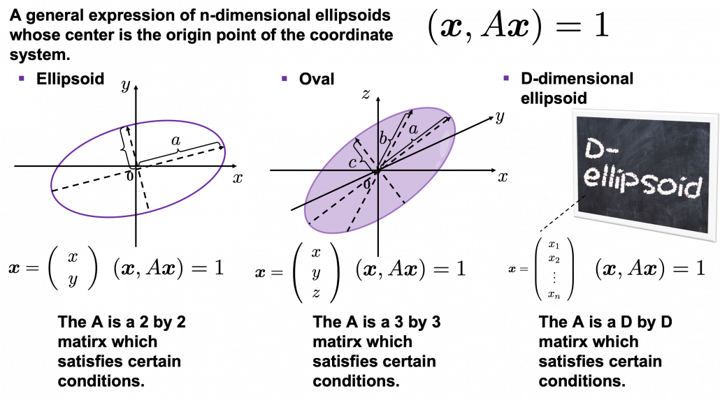
Some might have roughly drawn its outline. Formulas of  “the surface” of general ellipsoids can be explained in several ways, but in this article you only have to consider ellipsoids whose center is the origin point of the coordinate system. In PCA you virtually shift data so that the mean of the data comes to the origin point of the coordinate system. When A is a certain type of D\times D matrix, the formula of a D-dimensional ellipsoid whose center is identical to the origin point is as follows: (\boldsymbol{x}, A\boldsymbol{x}) = 1, where \boldsymbol{x}\in \mathbb{R}. As is always the case with formulas in data science, you can visualize such ellipsoids if you are talking about 1, 2, or 3 dimensional data like in the figure below, but in general D-dimensional space, it is theoretical/imaginary stuff on blackboards.

*In order to explain the conditions which the matrix A has to hold, I need another article, so for now please just assume that the A is a kind of magical matrix.

You might have seen equations of 2 or 3 dimensional ellipsoids in the following way: \frac{x^2}{a^2} + \frac{y^2}{b^2} = 1, where a\neq 0, b\neq 0 or \frac{x^2}{a^2} + \frac{y^2}{b^2} + \frac{z^2}{c^2}= 1, where a\neq 0, b\neq 0, c \neq 0. These are special cases of the equation (\boldsymbol{x}, A\boldsymbol{x}) = 1, where A=diag(a_1^2, \dots, a_D^2). In this case the axes of ellipsoids the same as those of the coordinate system. Thus in this simple case, A=diag(a^2, b^2) or A=diag(a^2,c^2,c^2).

I am going explain these equations in detail in the upcoming articles. But thre is one problem: how would you fit an ellipsoid when a data distribution does not look like an ellipsoid?

In fact we have to focus more on another feature of ellipsoids: all the axes of an ellipsoid are orthogonal. In conclusion the axes of the ellipsoids are more important in PCA, so I do want you to forget about the surface of ellipsoids for the time being. You might get confused if you also think about the surface of ellipsoid now. I am planning to cover this topic in the next article. I hope this article, combined with the last one and the next one, would help you have better insight into the ideas which frequently appear in data science or machine learning context.

3. Fitting orthogonal axes on data

*If you have no trouble reading the chapter 12.1 of PRML, you do not need to this section or maybe even this article, but I hope at least some charts or codes of mine would enhance your understanding on this topic.

*I must admit I wrote only the essence of PCA formulations. If that seems too abstract to you, you should just breifly read through this section and go to the next section with a more concrete example. If you are confused, there should be other good explanations on PCA on the internet, and you should also check them. But at least the visualization of PCA in the next section would be helpful.

As I implied above, all the axes of ellipsoids are orthogonal, and selecting the orthogonal axes which match data is what PCA is all about. And when you choose those orthogonal axes, it is ideal if the data look like an ellipsoid. Simply putting we want the data to “swell” along the axes.

Then let’s see how to let them “swell,” more mathematically. Assume that you have 2 dimensional data plotted on a coordinate system (\boldsymbol{e}_1, \boldsymbol{e}_2) as below (The samples are plotted in purple). Intuitively, the data “swell” the most along the vector \boldsymbol{u}_1. Also  it is clear that \boldsymbol{u}_2 is the only vector orthogonal to \boldsymbol{u}_1. We can expect that the new coordinate system (\boldsymbol{u}_1, \boldsymbol{u}_2) expresses the data in a better way, and you you can get new coordinate points of the samples by projecting them on new axes as done with yellow lines below.

Next, let’s think about a case in 3 dimensional data. When you have 3 dimensional data in a coordinate system (\boldsymbol{e}_1, \boldsymbol{e}_2,\boldsymbol{e}_3) as below,  the data “swell” the most also along \boldsymbol{u}_1. And the data swells the second most along \boldsymbol{u}_2. The two axes, or vectors span the plain in purple. If you project all the samples on the plain, you will get 2 dimensional data at the right side. It is important that we did not consider the third axis. That implies you might be able to display the data well with only 2 dimensional sapce, which is spanned by the two axes \boldsymbol{v}_1, \boldsymbol{v}_2.


Thus the problem is how to calculate such axis \boldsymbol{u}_1. We want the variance of data projected on \boldsymbol{u}_1 to be the biggest. The coordinate of \boldsymbol{x}_n on the axis \boldsymbol{u}_1. The coordinate of a data point \boldsymbol{x}_n on the axis \boldsymbol{u}_1 is calculated by projecting \boldsymbol{x}_n on \boldsymbol{u}_1. In data science context, such projection is synonym to taking an inner  product of \boldsymbol{x}_n and \boldsymbol{u}_1, that is calculating \boldsymbol{u}_1^T \boldsymbol{x}_n.

*Each element of \boldsymbol{x}_n is the coordinate of the data point \boldsymbol{x}_n in the original coordinate system. And the projected data on \boldsymbol{u}_1 whose coordinates are 1-dimensional correspond to only one element of transformed data.

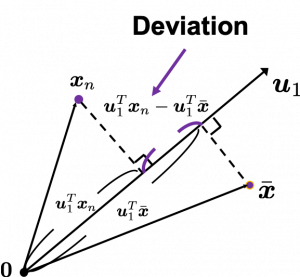
To calculate the variance of projected data on \boldsymbol{u}_1, we just have to calculate the mean of variances of 1-dimensional data projected on \boldsymbol{u}_1. Assume that \bar{\boldsymbol{x}} is the mean of data in the original coordinate, then the deviation of \boldsymbol{x}_1 on the axis \boldsymbol{u}_1 is calculated as \boldsymbol{u}_1^T \boldsymbol{x}_n - \boldsymbol{u}_1^T \bar{\boldsymbol{x}}, as shown in the figure. Hence the variance, I mean the mean of the deviation on is \frac{1}{N} \sum^{N}_{n}{\boldsymbol{u}_1^T \boldsymbol{x}_n - \boldsymbol{u}_1^T \bar{\boldsymbol{x}}}, where N is the total number of data points. After some deformations, you get the next equation \frac{1}{N} \sum^{N}_{n}{\boldsymbol{u}_1^T \boldsymbol{x}_n - \boldsymbol{u}_1^T \bar{\boldsymbol{x}}} = \boldsymbol{u}_1^T S \boldsymbol{u}_1, where S = \frac{1}{N}\sum_{n=1}^{N}{(\boldsymbol{x}_n - \bar{\boldsymbol{x}})(\boldsymbol{x}_n - \bar{\boldsymbol{x}})^T}. S is known as a covariance matrix.

We are now interested in maximizing the variance of projected data on  \boldsymbol{u}_1^T S \boldsymbol{u}_1, and for mathematical derivation we need some college level calculus, so if that is too much for you, you can skip reading this part till the next section.

We now want to calculate \boldsymbol{u}_1 with which \boldsymbol{u}_1^T S \boldsymbol{u}_1 is its maximum value. General \boldsymbol{u}_i including \boldsymbol{u}_1 are just coordinate axes after PCA, so we are just interested in their directions. Thus we can set one constraint \boldsymbol{u}_1^T  \boldsymbol{u}_1 = 1. Introducing a Lagrange multiplier, we have only to optimize next problem: \boldsymbol{u}_1 ^ {*} = \mathop{\rm arg~max}\limits_{\boldsymbol{u}_1} \{ \boldsymbol{u}_1^T S \boldsymbol{u}_1 + \lambda_1 (1 - \boldsymbol{u}_1^T \boldsymbol{u}_1) \}. In conclusion \boldsymbol{u}_1 ^ {*} satisfies S\boldsymbol{u}_1 ^ {*}  = \lamba_1 \boldsymbol{u}_1 ^ {*}. If you have read my last article on eigenvectors, you wold soon realize that this is an equation for calculating eigenvectors, and that means \boldsymbol{u}_1 ^ {*} is one of eigenvectors of the covariance matrix S. Given the equation of eigenvector the next equation holds \boldsymbol{u}_1 ^ {*}^T S \boldsymbol{u}_1 ^ {*} = \lambda_1. We have seen that \boldsymbol{u}_1 ^T S \boldsymbol{u}_1 ^ is a the variance of data when projected on a vector \boldsymbol{u}_1, thus the eigenvalue \lambda_1 is the biggest variance possible when the data are projected on a vector.

Just in the same way you can calculate the next biggest eigenvalue \lambda_2, and it it the second biggest variance possible, and in this case the date are projected on \boldsymbol{u}_2, which is orthogonal to \boldsymbol{u}_1. As well you can calculate orthogonal 3rd 4th …. Dth eigenvectors.

*To be exact I have to explain the cases where we can get such D orthogonal eigenvectors, but that is going to be long. I hope I can to that in the next article.

4. Practical three dimensional example of PCA

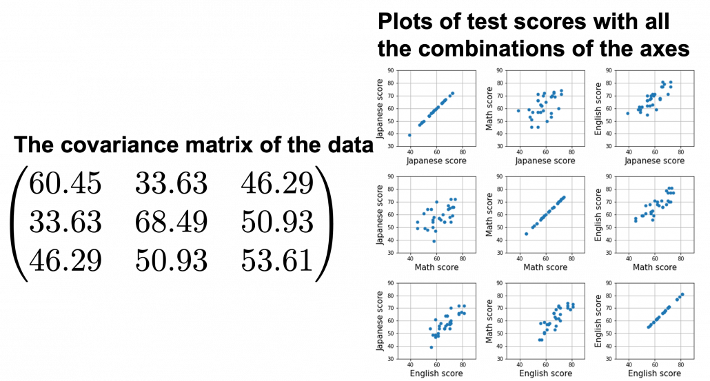
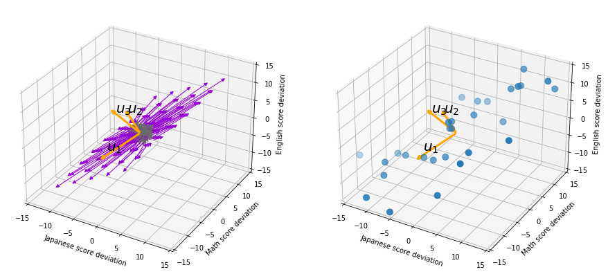
We have seen that PCA is sequentially choosing orthogonal axes along which data points swell the most. Also we have seen that it is equal to calculating eigenvalues of the covariance matrix of the data from the largest to smallest one. From now on let’s work on a practical example of data. Assume that we have 30 students’ scores of Japanese, math, and English tests as below.

* I think the subject “Japanese” is equivalent to “English” or “language art” in English speaking countries, and maybe “Deutsch” in Germany. This example and the explanation are largely based on a Japanese textbook named 「これなら分かる応用数学教室 最小二乗法からウェーブレットまで」. This is a famous textbook with cool and precise explanations on mathematics for engineering. Partly sharing this is one of purposes of this article.

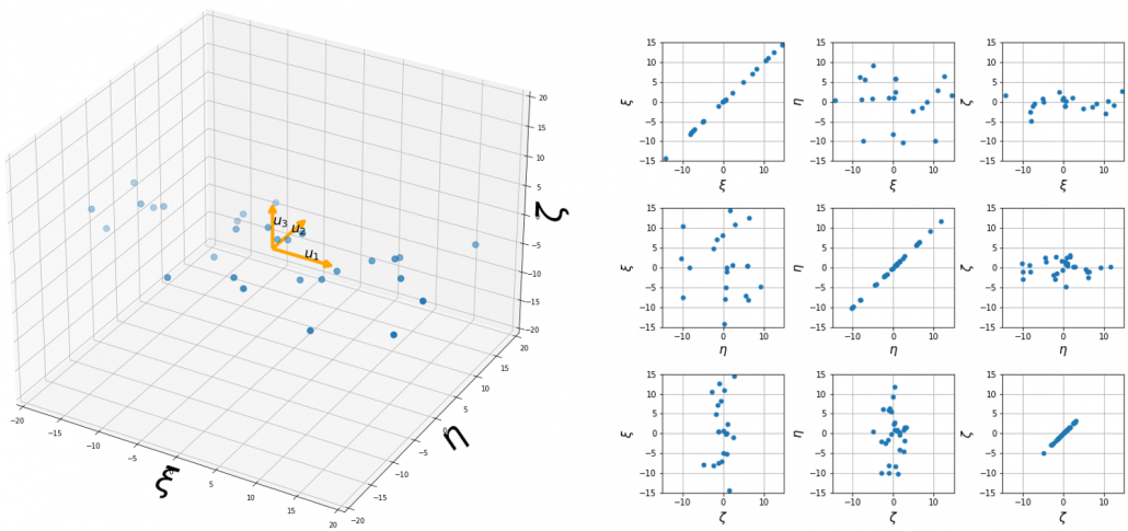
At the right side of the figure below is plots of the scores with all the combinations of coordinate axes. In total 9 inverse graphs are symmetrically arranged in the figure, and it is easy to see that English & Japanese or English and math have relatively high correlation. The more two axes have linear correlations, the bigger the covariance between them is.

In the last article, I visualized the eigenvectors of a 3\times 3 matrix A = \frac{1}{50} \begin{pmatrix} 60.45 &  33.63 & 46.29 \\33.63 & 68.49 & 50.93 \\ 46.29 & 50.93 & 53.61 \end{pmatrix}, and in fact the matrix is just a constant multiplication of this covariance matrix. I think now you understand that PCA is calculating the orthogonal eigenvectors of covariance matrix of data, that is diagonalizing covariance matrix with orthonormal eigenvectors. Hence we can guess that covariance matrix enables a type of linear transformation of rotation and expansion and contraction of vectors. And data points swell along eigenvectors of such matrix.

Then why PCA is useful? In order to see that at first, for simplicity assume that x, y, z denote Japanese, Math, English scores respectively. The mean of the data is \left( \begin{array}{c} \bar{x} \\ \bar{y} \\ \bar{z} \end{array} \right) = \left( \begin{array}{c} 58.1 \\ 61.8 \\ 67.3 \end{array} \right), and the covariance matrix of data in the original coordinate system is V_{xyz} = \begin{pmatrix} 60.45 & 33.63 & 46.29 \\33.63 & 68.49 & 50.93 \\ 46.29 & 50.93 & 53.61 \end{pmatrix}. The eigenvalues of  V_{xyz} are \lambda_1=148.34, \lambda_2 = 30.62, and \lambda_3 = 3.60, and their corresponding unit eigenvectors are \boldsymbol{u}_1 =  \left( \begin{array}{c} 0.540 \\ 0.602 \\ 0.589 \end{array} \right) , \boldsymbol{u}_2 =  \left( \begin{array}{c} 0.736 \\ -0.677 \\ 0.0174 \end{array} \right) , \boldsymbol{u}_3 =  \left( \begin{array}{c} -0.408 \\ -0.4.23 \\ 0.809 \end{array} \right) respectively.  U = (\boldsymbol{u}_1 \quad \boldsymbol{u}_2 \quad \boldsymbol{u}_3 )  is an orthonormal matrix, where \boldsymbol{u}_i^T\boldsymbol{u}_j = \begin{cases} 1 & (i=j) \\ 0 & (otherwise) \end{cases}. As I explained in the last article, you can diagonalize V_{xyz} with U: U^T V_{xyz}U = diag(\lambda_1, \dots, \lambda_D).

In order to see how PCA is useful, assume that \left( \begin{array}{c} \xi \\ \eta \\ \zeta \end{array} \right)  = U^T \left( \begin{array}{c} x - \bar{x} \\ y - \bar{y} \\ z - \bar{z} \end{array} \right).

Let’s take a brief look at what a linear transformation by U^T means. Each element of \boldsymbol{x} denotes coordinate of the data point \boldsymbol{x}  in the original coordinate system (In this case the original coordinate system is composed of \boldsymbol{e}_1, \boldsymbol{e}_2, and \boldsymbol{e}_3). U = (\boldsymbol{u}_1, \boldsymbol{u}_2, \boldsymbol{u}_3) enables a rotation of a rigid body, which means the shape or arrangement of data will not change after the rotation, and U^T enables a reverse rotation of the rigid body.

*Roughly putting, if you hold a bold object such as a metal ball and rotate your arm, that is a rotation of a rigid body, and your shoulder is the origin point. On the other hand, if you hold something soft like a marshmallow, it would be squashed in your hand, and that is not a not a rotation of a rigid body.

You can rotate \boldsymbol{x} with U like U^T\boldsymbol{x} = \left( \begin{array}{c} -\boldsymbol{u}_1^{T}- \\ -\boldsymbol{u}_2^{T}- \\ -\boldsymbol{u}_3^{T}- \end{array} \right)\boldsymbol{x}=\left( \begin{array}{c} \boldsymbol{u}_1^{T}\boldsymbol{x} \\ \boldsymbol{u}_2^{T}\boldsymbol{x} \\ \boldsymbol{u}_3^{T}\boldsymbol{x} \end{array} \right), and \boldsymbol{u}_i^{T}\boldsymbol{x} is the coordinate of \boldsymbol{x} projected on the axis \boldsymbol{u}_i.

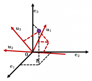
Let’s see this more visually. Assume that the data point \boldsymbol{x}  is a purple dot and its position is expressed in the original coordinate system spanned by black arrows . By multiplying \boldsymbol{x} with U^T, the purple point \boldsymbol{x} is projected on the red axes respectively, and the product \left( \begin{array}{c} \boldsymbol{u}_1^{T}\boldsymbol{x} \\ \boldsymbol{u}_2^{T}\boldsymbol{x} \\ \boldsymbol{u}_3^{T}\boldsymbol{x} \end{array} \right) denotes the coordinate point of the purple point in the red coordinate system. \boldsymbol{x} is rotated this way, but for now I think it is better to think that the data are projected on new coordinate axes rather than the data themselves are rotating.

Now that we have seen what rotation by U means, you should have clearer image on what \left( \begin{array}{c} \xi \\ \eta \\ \zeta \end{array} \right)  = U^T \left( \begin{array}{c} x - \bar{x} \\ y - \bar{y} \\ z - \bar{z} \end{array} \right) means. \left( \begin{array}{c} \xi \\ \eta \\ \zeta \end{array} \right) denotes the coordinates of data projected on new axes \boldsymbol{u}_1, \boldsymbol{u}_2, \boldsymbol{u}_3, which are unit eigenvectors of V_{xyz}. In the coordinate system spanned by the eigenvectors, the data distribute like below.

By multiplying U from both sides of the equation above, we get \left( \begin{array}{c} x - \bar{x} \\ y - \bar{y} \\ z - \bar{z} \end{array} \right) =U \left( \begin{array}{c} \xi \\ \eta \\ \zeta \end{array} \right), which means you can express deviations of the original data as linear combinations of the three factors \xi, \eta, and \zeta. We expect that those three factors contain keys for understanding the original data more efficiently. If you concretely write down all the equations for the factors: \xi = 0.540 (x - \bar{x}) + 0.602 (y - \bar{y}) + 0.588 (z - \bar{z}), \eta = 0.736(x - \bar{x}) - 0.677 (y - \bar{y}) + 0.0174 (z - \bar{z}), and \zeta = - 0.408 (x - \bar{x}) - 0.423 (y - \bar{y}) + 0.809(z - \bar{z}). If you examine the coefficients of the deviations (x - \bar{x}), (y - \bar{y}), and (z - \bar{z}), we can observe that \eta almost equally reflects the deviation of the scores of all the subjects, thus we can say \eta is a factor indicating one’s general academic level. When it comes to \eta Japanese and Math scores are important, so we can guess that this factor indicates whether the student is at more of “scientific side” or “liberal art side.” In the same way \zeta relatively makes much of one’s English score,  so it should show one’s “internationality.” However the covariance of the data \xi, \eta, \zeta is V_{\xi \eta \zeta} = \begin{pmatrix} 148.34 & 0 & 0 \\ 0 & 30.62 & 0 \\ 0 & 0 & 3.60 \end{pmatrix}. You can see \zeta does not vary from students to students, which means it is relatively not important to describe the tendency of data. Therefore for dimension reduction you can cut off the factor \zeta.

*Assume that you can apply PCA on D-dimensional data and that you get \boldsymbol{x}', where \boldsymbol{x}' = U^T\boldsymbol{x} - \bar{\boldsymbol{x}}. The variance of data projected on new D-dimensional coordinate system is V'=\frac{1}{N}\sum{(\boldsymbol{x}')^T\boldsymbol{x}'} =\frac{1}{N}\sum{(U^T\boldsymbol{x})^T(U^T\boldsymbol{x})} =\frac{1}{N}\sum{U^T\boldsymbol{x}\boldsymbol{x}^TU} =U^T(\frac{1}{N}\sum{\boldsymbol{x}\boldsymbol{x}^T})U =U^TVU =diag(\lambda_1, \dots, \lambda_D). This means that in the new coordinate system after PCA, covariances between any pair of variants are all zero.

*As I mentioned U is a rotation of a rigid body, and U^T is the reverse rotation, hence U^TU = UU^T = I.

Hence you can approximate the original 3 dimensional data on the coordinate system (\boldsymbol{e}_1, \boldsymbol{e}_2, \boldsymbol{e}_3) from the reduced two dimensional coordinate system (\boldsymbol{u}_1, \boldsymbol{u}_2) with the following equation: \left( \begin{array}{c} x - \bar{x} \\ y - \bar{y} \\ z - \bar{z} \end{array} \right) \approx U_{reduced} \left( \begin{array}{c} \xi \\ \eta  \end{array} \right)  = (\boldsymbol{u}_1 \quad \boldsymbol{u}_2) \left( \begin{array}{c} \xi \\ \eta  \end{array} \right). Then it mathematically clearer that we can express the data with two factors: “how smart the student is” and “whether he is at scientific side or liberal art side.”

We can observe that eigenvalue \lambda_i is a statistic which indicates how much the corresponding \boldsymbol{u}_i can express the data, \frac{\lambda_i}{\sum_{j=1}^{D}{\lambda_j}} is called the contribution ratio of eigenvector \boldsymbol{u}_i. In the example above, the contribution ratios of \boldsymbol{u}_1, \boldsymbol{u}_2, and \boldsymbol{u}_3 are respectively \frac{\lambda_1}{\lambda_1 + \lambda_2 + \lambda_3}=0.813, \frac{\lambda_2}{\lambda_1 + \lambda_2 + \lambda_3}=0.168, \frac{\lambda_3}{\lambda_1 + \lambda_2 + \lambda_3}=0.0197. You can decide how many degrees of dimensions you reduce based on this information.

Appendix: Playing with my toy PCA on MNIST dataset

Applying “so called” PCA on MNIST dataset is a super typical topic that many other tutorial on PCA also introduce, but I still recommend you to actually implement, or at least trace PCA implementation with MNIST dataset without using libraries like scikit-learn. While reading this article I recommend you to actually run the first and the second code below. I think you can just copy and paste them on your tool to run Python, installing necessary libraries. I wrote them on Jupyter Notebook.

In my implementation, in the simple configuration part you can set the USE_ALL_NUMBERS as True or False boolean. If you set it as True, you apply PCA on all the data of numbers from 0 to 9. If you set it as True, you can specify which digit to apply PCA on. In this article, I show the results results of PCA on the data of digit ‘3.’ The first three images of ‘3’ are as below.

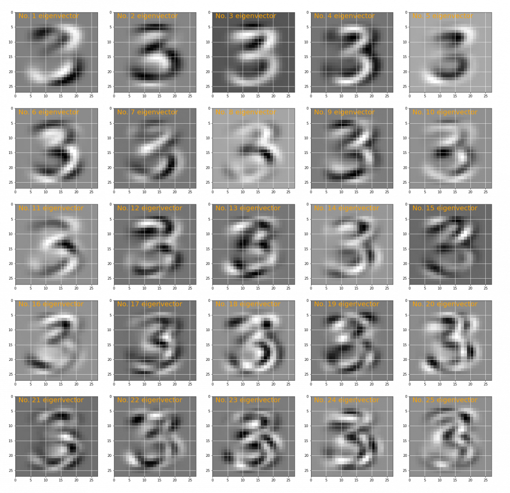
You have to keep it in mind that the data are all shown as 28 by 28 pixel grayscale images, but in the process of PCA, they are all processed as 28 * 28 = 784 dimensional vectors. After applying PCA on the 784 dimensional vectors of images of ‘3,’ the first 25 eigenvectors are as below. You can see that at the beginning the eigenvectors partly retain the shapes of ‘3,’ but they are distorted as the eigenvalues get smaller. We can guess that the latter eigenvalues are not that helpful in reconstructing the shape of ‘3.’

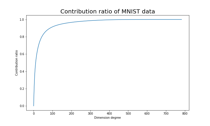
Just as we saw in the last section, you you can cut off axes of eigenvectors with small eigenvalues and reduce the dimension of MNIST data. The figure below shows how contribution ratio of MNIST data grows. You can see that around 200 dimension degree, the contribution ratio reaches around 0.95. Then we can guess that even if we reduce the dimension of MNIST from 784 to 200 we can retain the most of the structure of original data.

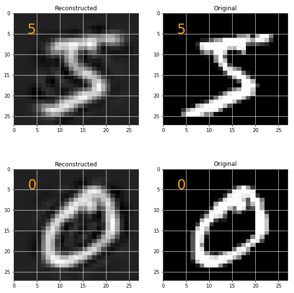
Some results of reconstruction of data from 200 dimensional space are as below. You can set how many images to display by adjusting NUMBER_OF_RESULTS in the code. And if you set LATENT_DIMENSION as 784, you can completely reconstruct the data.

* I make study materials on machine learning, sponsored by DATANOMIQ. I do my best to make my content as straightforward but as precise as possible. I include all of my reference sources. If you notice any mistakes in my materials, including grammatical errors, please let me know (email: yasuto.tamura@datanomiq.de). And if you have any advice for making my materials more understandable to learners, I would appreciate hearing it.
*I attatched the codes I used to make the figures in this article. You can just copy, paste, and run, sometimes installing necessary libraries.


Web Scraping Using R..!

In this blog, I’ll show you, How to Web Scrape using R..?

What is R..?

R is a programming language and its environment built for statistical analysis, graphical representation & reporting. R programming is mostly preferred by statisticians, data miners, and software programmers who want to develop statistical software.

R is also available as Free Software under the terms of the Free Software Foundation’s GNU General Public License in source code form.

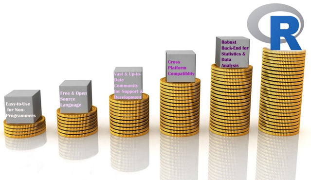
Reasons to choose R

Reasons to choose R

Let’s begin our topic of Web Scraping using R.

Step 1- Select the website & the data you want to scrape.

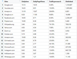
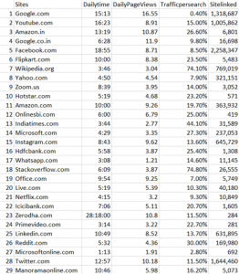
I picked this website “https://www.alexa.com/topsites/countries/IN” and want to scrape data of Top 50 sites in India.

Data we want to scrape

Data we want to scrape

Step 2- Get to know the HTML tags using SelectorGadget.

In my previous blog, I already discussed how to inspect & find the proper HTML tags. So, now I’ll explain an easier way to get the HTML tags.

You have to go to Google chrome extension (chrome://extensions) & search SelectorGadget. Add it to your browser, it’s a quite good CSS selector.

Step 3- R Code

Evoking Important Libraries or Packages

I’m using RVEST package to scrape the data from the webpage; it is inspired by libraries like Beautiful Soup. If you didn’t install the package yet, then follow the code in the snippet below.

Step 4- Set the url of the website

Step 5- Find the HTML tags using SelectorGadget

It’s quite easy to find the proper HTML tags in which your data is present.

Firstly, I have to click on data using SelectorGadget which I want to scrape, it automatically selects the data which are similar to selected HTML tags. Before going forward, cross-check the selected values, are they correct or some junk data is also gets selected..? If you noticed our page has only 50 values, but you can see 156 values are selected.

Selection by SelectorGadget

Selection by SelectorGadget

So I need to remove unwanted values who get selected, once you click on them to deselect it, it turns red and others will turn yellow except our primary selection which turn to green. Now you can see only 50 values are selected as per our primary requirement but it’s not enough. I have to again cross-check that some required values are not exchanged with junk values.

If we satisfy with our selection then copy the HTML tag & include it into the code, else repeat this exercise.

Modified Selection by SelectorGadget

Step 6- Include the tag in our Code

After including the tags, our code is like this.

Code Snippet

If I run the code, values in each list object will be 50.

Data Stored in List Objects

Step 7- Creating DataFrame

Now, we create a dataframe with our list-objects. So for creating a dataframe, we always need to remember one thumb rule that is the number of rows (length of all the lists) should be equal, else we get an error.

Error appears when number of rows differs

Finally, Our DataFrame will look like this:

Our Final Data

Step 8- Writing our DataFrame to CSV file

We need our scraped data to be available locally for further analysis & model building or other purposes.

Our final piece of code to write it in CSV file is:

Writing to CSV file

Step 9- Check the CSV file

Data written in CSV file

Conclusion-

I tried to explain Web Scraping using R in a simple way, Hope this will help you in understanding it better.

Find full code on

https://github.com/vgyaan/Alexa/blob/master/webscrap.R

If you have any questions about the code or web scraping in general, reach out to me on LinkedIn!

Okay, we will meet again with the new exposer.

Till then,

Happy Coding..!

Determining Your Data Pipeline Architecture and Its Efficacy

Data analytics has become a central part of how many businesses operate. If you hope to stay competitive in today’s market, you need to take advantage of all your available data. For that, you’ll need an efficient data pipeline, which is often easier said than done.

If your pipeline is too slow, your data will be all but useless by the time it’s usable. Successful analytics require an optimized pipeline, and that looks different for every company. No matter your specific circumstances, though, a traditional approach will result in inefficiencies.

Creating the most efficient pipeline architecture will require you to change how you look at the process. By understanding each stage’s role and how they serve your goals, you can optimize your data analytics.

Understanding Your Data Needs

You can’t build an optimal data pipeline if you don’t know what you need from your data. If you spend too much time collecting and organizing information you won’t use, you’ll take time away from what you need. Similarly, if you only work to meet one team’s needs, you’ll have to go back and start over to help others.

Data analytics involves multiple stakeholders, all with individual needs and expectations that you should consider. Your data engineers need your pipeline to be accessible and scalable, while analysts require visual, relevant datasets. If you consider these aspects from the beginning, you can build a pipeline that works for everyone.

Start at the earliest stage — collection. You may be collecting data from every channel you can, which could result in an information overload. Focus instead on gathering things from the most relevant sources. At the same time, ensure you can add more channels if necessary in the future.

As you reorganize your pipeline, remember that analytics are only as good as your datasets. If you put more effort into organizing and scrubbing data, helpful analytics will follow. Focus on preparing data well, and the last few stages will be smoother.

Creating a Collaborative Pipeline

When structuring your pipeline, it’s easy to focus too much on the individual stages. While seeing things as rigid steps can help you visualize them, you need something more fluid in practice. If you want the process to run as smoothly as possible, it needs to be collaborative.

Look at the software development practice of DevOps, which doubles a team’s likelihood of exceeding productivity goals. This strategy focuses on collaboration across separate teams instead of passing things back and forth between them. You can do the same thing with your data pipeline.

Instead of dividing steps between engineers and analysts, make it a single, cohesive process. Teams will still focus on different areas according to their expertise, but they’ll reduce disruption by working together instead of independently. If workers can collaborate along every step, they don’t have to go back and forth.

Simultaneously, everyone should have clearly defined responsibilities. Collaboration doesn’t mean overstepping your areas of expertise. The goal here isn’t to make everyone handle everything but to ensure they understand each other’s needs.

Eliminating the time between steps also applies to your platform. Look for or build software that integrates both refinement and data preparation. If you have to export data to various programs, it will cause unnecessary bottlenecks.

Enabling Continuous Improvement

Finally, understand that restructuring your data pipeline isn’t a one-and-done job. Another principle you can adopt from DevOps is continuous development across all sides of the process. Your engineers should keep looking for better ways to structure data as your analysts search for new applications for this information.

Make sure you always measure your throughput and efficiency. If you tweak something and you notice the process starts to slow, revert to the older method. If your changes improve the pipeline, try something similar in another area.

Optimize Your Data Pipeline

Remember to start slow when optimizing your data pipeline. Changing too much at once can cause more disruptions than it avoids, so start small with an emphasis on scalability.

The specifics of your pipeline will vary depending on your needs and circumstances. No matter what these are, though, you can benefit from collaboration and continuous development. When you start breaking down barriers between different steps and teams, you unclog your pipeline.

Bias and Variance in Machine Learning

Machine learning continues to be an ever more vital component of our lives and ecosystem, whether we’re applying the techniques to answer research or business problems or in some cases even predicting the future. Machine learning models need to give accurate predictions in order to create real value for a given industry or domain.

While training a model is one of the key steps in the Data Science Project Life Cycle, how the model generalizes on unseen data is an equally important aspect that should be considered in every Data Science Project Life Cycle. We need to know whether it works and, consequently, if we can trust its predictions. Could the model be merely memorizing the data it is fed with, and therefore unable to make good predictions on future samples, or samples that it hasn’t seen before?

Let’s know the importance of evaluation with a simple example, There are two student’s Ramesh and Suresh preparing for the CAT exam to get into top IIMs (Indian Institute of Management). They both are quite good friends and stayed in the room during preparation and put an equal amount of hard work while solving numerical problems.

They both prepared for almost the same number of hours for the entire year and appeared in the final CAT exam. Surprisingly, Ramesh cleared, but Suresh did not. When asked, we got to know that there was one difference in their strategy of preparation between them, Ramesh had joined a Test Series course where he used to test his knowledge and understanding by giving mock exams and then further evaluating on which portions he is lagging and making necessary adjustments to he is preparation cycle in order to do well in those areas. But Suresh was confident, and he just kept training himself without testing on the preparation he had done.

Like the above situation we can train a Machine Learning Algorithm extensively with many parameters and new techniques, but if you are skipping its evaluation step, you cannot trust your model to perform well on the unseen data. In this article, we explain the importance of Bias, Variance and the trade-off between them in order to know how well a machine learning model generalizes to new, previously unseen data.

Training of Supervised Machine Learning

Bias

Bias is the difference between the Predicted Value and the Expected Value or how far are the predicted values from the actual values. During the training process the model makes certain assumptions on the training data provided. After Training, when it is introduced to the testing/validation data or unseen data, these assumptions may not always be correct.

If we use a large number of nearest neighbors in the K-Nearest Neighbors Algorithm, the model can totally decide that some parameters are not important at all for the modelling.  For example, it can just consider that only two predictor variables are enough to classify the data point though we have more than 10 variables.

This type of model will make very strong assumptions about the other parameters not affecting the outcome at all. You can take it as a model predicting or understanding only the simple relationship when the data points clearly indicate a more complex relationship.

When the model has high bias error, it results in a very simplistic model that does not consider the complexity of the data very well leading to Underfitting.

Variance

Variance occurs when the model performs well on the trained dataset but does not do well on an unseen data set, it is when the model considers the fluctuations or i.e. the noise as in the data as well. The model will still consider the variance as something to learn from because it learns too much from the noise inside the trained data set that it fails to perform as expected on the unseen data.

Based on the above example from Bias, if the model learns that all the ten predictor variables are important to classify a given data point then it tends to have high variance. You can take it as the model is trying to understand every minute detail making it more complex and failing to perform well on the unseen data.

When a model has High Bias error, it underfits the data and makes very simplistic assumptions on it. When a model has High Variance error, it overfits the data and learns too much from it. When a model has balanced Bias and Variance errors, it performs well on the unseen data.

Bias-Variance Trade-off

Based on the definitions of bias and variance, there is clear trade-off between bias and variance when it comes to the performance of the model. A model will have a high error if it has very high bias and low variance and have a high error if it has high variance and low bias.

A model that strikes a balance between the bias and variance can minimize the error better than those that live on extreme ends.

We can find whether the model has High Bias using the below steps:

  1. We tend to get high training errors.
  2. The validation error or test error will be similar to the training error.

We can find whether the model has High Bias using the below steps:

  1. We tend to get low training error
  2. The validation error or test error will be very high.

We can fix the High Bias using below steps:

  1. We need to gather more input features or can even try to create few using the feature engineering techniques.
  2. We can even add few polynomial features in order to increase the complexity.
  3. If we are using any regularization terms in our model, we can try to minimize it.

We can fix the High Variance using below steps:

  1. We can gather more training data so that the model can learn more on the patterns rather than the noise.
  2. We can even try to reduce the input features or do feature selection.
  3.  If we are using any regularization terms in our model we can try to maximize it.

Conclusion

In this article, we got to know the importance of the evaluation step in the Data Science Project Life Cycle, definitions of Bias and Variance, the trade-off between them and the steps we can take to fix the Underfitting and Overfitting of a Machine Learning Model.

Rethinking linear algebra: visualizing linear transformations and eigenvectors

In terms of calculation processes of Principal Component Analysis (PCA) or Linear Discriminant Analysis (LDA), which are the dimension reduction techniques I am going to explain in the following articles, diagonalization is what they are all about. Throughout this article, I would like you to have richer insight into diagonalization in order to prepare for understanding those basic dimension reduction techniques.

When our professor started a lecture on the last chapter of our textbook on linear algebra, he said “It is no exaggeration to say that everything we have studied is for this ‘diagonalization.'” Until then we had to write tons of numerical matrices and vectors all over our notebooks, calculating those products, adding their rows or columns to other rows or columns, sometimes transposing the matrices, calculating their determinants.

It was like the scene in “The Karate Kid,” where the protagonist finally understood the profound meaning behind the prolonged and boring “wax on, wax off” training given by Miyagi (or “jacket on, jacket off” training given by Jackie Chan). We had finally understood why we had been doing those seemingly endless calculations.

Source: http://thinkbedoleadership.com/secret-success-wax-wax-off/

But usually you can do those calculations easily with functions in the Numpy library. Unlike Japanese college freshmen, I bet you are too busy to reopen textbooks on linear algebra to refresh your mathematics. Thus I am going to provide less mathematical and more intuitive explanation of diagonalization in this article.

*This is the second article of the article series ” Illustrative introductions on dimension reduction .”

1, The mainstream ways of explaining diagonalization.

*The statements below are very rough for mathematical topics, but I am going to give priority to offering more visual understanding on linear algebra in this article. For further understanding, please refer to textbooks on linear algebra. If you would like to have minimum understandings on linear algebra needed for machine learning, I recommend the Appendix C of Pattern Recognition and Machine Learning by C. M. Bishop.

In most textbooks on linear algebra, the explanations on dioagonalization is like this (if you are not sure what diagonalization is or if you are allergic to mathematics, you do not have to read this seriously):

Let V (dimV = D)be a vector space and let  T_A : V \rightarrow V be a mapping of V into itself,  defined as T_A(v) = A \cdot \boldsymbol{v}, where A is a D\times D matrix and \boldsymbol{v} is D dimensional vector. An element \boldsymbol{v} \in V is called an eigen vector if there exists a number \lambda such that A \cdot \boldsymbol{v}= \lambda \cdot \boldsymbol{v} and \boldsymbol{v} \neq \boldsymbol{0}. In this case \lambda is uniquely determined and is called an eigen value of A belonging to the eigen vector \boldsymbol{v}.

Any matrix A has D eigen values \lambda_{i}, belonging to \boldsymbol{v}_{i} (i=1, 2, …., D). If \boldsymbol{v}_{i} is basis of the vector space V, then A is diagonalizable.

When A is diagonalizable, with D \times D matrices P = (\boldsymbol{v}_{1}, \dots, \boldsymbol{v}_{D}) , whose column vectors are eigen vectors \boldsymbol{v}_{i} (i=1, 2, …., D), the following equation holds: P^{-1}AP = \Lambda, where \Lambda = diag(\lambda_{1}, \dots, \lambda_{D})= \begin{pmatrix} \lambda_{1} & 0& \ldots &0\\ 0 & \lambda_{2} & \ldots & 0 \\ \vdots & \vdots & \ddots & \vdots \\ 0 & 0 & \ldots & \lambda_{D} \end{pmatrix}.

And when A is diagonalizable, you can diagonalize A as below.

Most textbooks keep explaining these type of stuff, but I have to say they lack efforts to make it understandable to readers with low mathematical literacy like me. Especially if you have to apply the idea to data science field, I believe you need more visual understanding of diagonalization. Therefore instead of just explaining the definitions and theorems, I would like to take a different approach. But in order to understand them in more intuitive ways, we first have to rethink waht linear transformation T_A means in more visible ways.

2, Linear transformations

Even though I did my best to make this article understandable to people with little prerequisite knowledge, you at least have to understand linear transformation of numerical vectors and with matrices. Linear transformation is nothing difficult, and in this article I am going to use only 2 or 3 dimensional numerical vectors or square matrices. You can calculate linear transformation of \boldsymbol{v} by A as equations in the figure. In other words, \boldsymbol{u} is a vector transformed by A.

*I am not going to use the term “linear transformation” in a precise way in the context of linear algebra. In this article or in the context of data science or machine learning, “linear transformation” for the most part means products of matrices or vectors. 

*Forward/back propagation of deep learning is mainly composed of this linear transformation. You keep linearly transforming input vectors, frequently transforming them with activation functions, which are for the most part not linear transformation.

As you can see in the equations above, linear transformation with A transforms a vector to another vector. Assume that you have an original vector \boldsymbol{v} in grey and that the vector \boldsymbol{u} in pink is the transformed \boldsymbol{v} by A is. If you subtract \boldsymbol{v} from \boldsymbol{u}, you can get a displacement vector, which I displayed in purple. A displacement vector means the transition from a vector to another vector.

Let’s calculate the displacement vector with more vectors \boldsymbol{v}. Assume that A =\begin{pmatrix} 3 & 1 \\ 1 & 2 \end{pmatrix}, and I prepared several grid vectors \boldsymbol{v} in grey as you can see in the figure below. If you transform those grey grid points with A, they are mapped into the vectors \boldsymbol{u} in pink. With those vectors in grey or pink, you can calculate the their displacement vectors \boldsymbol{u} - \boldsymbol{v}, which are in purple.

The displacement vectors in the figure above have some tendencies. In order to see that more clearly, let’s calculate displacement vectors with several matrices A and more grid points. Assume that you have three 2 \times 2 square matrices A_1 =\begin{pmatrix} 3 & 1 \\ 1 & 2 \end{pmatrix}, A_2 =\begin{pmatrix} 3 & 1 \\ -1 & 1 \end{pmatrix}, A_3 =\begin{pmatrix} 1 & -1 \\ 1 & 1 \end{pmatrix}, and I plotted displace vectors made by the matrices respectively in the figure below.

I think you noticed some characteristics of the displacement vectors made by those linear transformations: the vectors are swirling and many of them seem to be oriented in certain directions. To be exact, some displacement vectors extend in the same directions as some of original vectors in grey. That means  linear transformation by A did not change the direction of the original vector \boldsymbol{v}, and the unchanged vectors are called eigen vectors. Real eigen vectors of each A are displayed as arrows in yellow in the figure above. But when it comes to A_3, the matrix does not have any real eigan values.

In linear algebra, depending on the type matrices A, you have to consider various cases such as whether the matrices have real or imaginary eigen values, whether the matrices are diagonalizable, whether the eigen vectors are orthogonal, or whether they are unit vectors. But those topics are out of the scope of this article series, so please refer to textbooks on linear algebra if you are interested.

Luckily, however, in terms of PCA or LDA, you only have to consider a type of matrices named positive semidefinite matrices, which A_1 is classified to, and I am going to explain positive semidefinite matrices in the fourth section.

3, Eigen vectors as coordinate system

Source: Ian Stewart, “Professor Stewart’s Cabinet of Mathematical Curiosities,” (2008), Basic Books

Let me take Fibonacci numbers as an example to briefly see why diagonalization is useful. Fibonacci is sequence is quite simple and it is often explained using an example of pairs of rabbits increasing generation by generation. Let a_n (n=0, 1, 2, …) be the number of pairs of grown up rabbits in the n^{th} generation. One pair of grown up rabbits produce one pair of young rabbit The concrete values of a_n are a_0 = 0, a_1 = 1, a_2=1, a_3=2, a_4=3, a_5=5, a_6=8, a_7=13, \dots. Assume that A =\begin{pmatrix} 1 & 1 \\ 1 & 0 \end{pmatrix} and that \begin{pmatrix} a_1 \\ a_0  \end{pmatrix} =\begin{pmatrix} 1 \\ 0  \end{pmatrix}, then you can calculate the number of the pairs of grown up rabbits in the next generation with the following recurrence relation. \begin{pmatrix} a_{n+1} \\ a_{n}  \end{pmatrix}=\begin{pmatrix} 1 & 1 \\ 1 & 0 \end{pmatrix} \cdot \begin{pmatrix} a_{n+1} \\ a_{n}  \end{pmatrix}.Let \boldsymbol{a}_n be \begin{pmatrix} a_{n+1} \\ a_{n}  \end{pmatrix}, then the recurrence relation can be written as \boldsymbol{a}_{n+1} = A \boldsymbol{a}_n, and the transition of \boldsymbol{a}_n are like purple arrows in the figure below. It seems that the changes of the purple arrows are irregular if you look at the plots in normal coordinate.

Assume that \lambda _1, \lambda_2 (\lambda _1< \lambda_2) are eigen values of A, and \boldsymbol{v}_1, \boldsymbol{v}_2 are eigen vectors belonging to them respectively. Also let \alpha, \beta scalars such that \begin{pmatrix} a_{1} \\ a_{0}  \end{pmatrix} = \begin{pmatrix} 1 \\ 0  \end{pmatrix} = \alpha \boldsymbol{v}_1 + \beta \boldsymbol{v}_2. According to the definition of eigen values and eigen vectors belonging to them, the following two equations hold: A\boldsymbol{v}_1 = \lambda_1 \boldsymbol{v}_1, A\boldsymbol{v}_2 = \lambda_2 \boldsymbol{v}_2. If you calculate \boldsymbol{a}_1 is, using eigen vectors of A, \boldsymbol{a}_1  = A\boldsymbol{a}_0 = A (\alpha \boldsymbol{v}_1 + \beta \boldsymbol{v}_2) = \alpha\lambda _1 \boldsymbol{v}_1 + \beta \lambda_2 \boldsymbol{v}_2. In the same way, \boldsymbol{a}_2 = A\boldsymbol{a}_1 = A (\alpha\lambda _1 \boldsymbol{v}_1 + \beta \lambda_2 \boldsymbol{v}_2) = \alpha\lambda _{1}^{2} \boldsymbol{v}_1 + \beta \lambda_{2}^{2} \boldsymbol{v}_2, and \boldsymbol{a}_3 = A\boldsymbol{a}_2 = A (\alpha\lambda _{1}^{2} \boldsymbol{v}_1 + \beta \lambda_{2}^{2} \boldsymbol{v}_2) = \alpha\lambda _{1}^{3} \boldsymbol{v}_1 + \beta \lambda_{2}^{3} \boldsymbol{v}_2. These equations show that in coordinate system made by eigen vectors of A, linear transformation by A is easily done by just multiplying eigen values with each eigen vector. Compared to the graph of Fibonacci numbers above, in the figure below you can see that in coordinate system made by eigen vectors the plots changes more systematically generation by generation.


In coordinate system made by eigen vectors of square matrices, the linear transformations by the matrices can be much more straightforward, and this is one powerful strength of eigen vectors.

*I do not major in mathematics, so I am not 100% sure, but vectors in linear algebra have more abstract meanings. Various things in mathematics can be vectors, even though in machine learning or data science we  mainly use numerical vectors with more concrete elements. We can also say that matrices are a kind of maps. That is just like, at least in my impression, even though a real town is composed of various components such as houses, smooth or bumpy roads, you can simplify its structure with simple orthogonal lines, like the map of Manhattan. But if you know what the town actually looks like, you do not have to follow the zigzag path on the map.

4, Eigen vectors of positive semidefinite matrices

In the second section of this article I told you that, even though you have to consider various elements when you discuss general diagonalization, in terms of PCA and LDA we mainly use only a type of matrices named positive semidefinite matrices. Let A be a D \times D square matrix. If \boldsymbol{x}^T A \boldsymbol{x} \geq 0 for all values of the vector \boldsymbol{x}, the A is said to be a positive semidefinite matrix. And also it is known that A being a semidefinite matrix is equivalent to \lambda _{i} \geq 0 for all the eigen values \lambda_i (i=1, \dots , D).

*I think most people first learn a type of matrices called positive definite matrices. Let A be aD \times D square matrix. If \boldsymbol{x}^T A \boldsymbol{x} > 0 for all values of the vector \boldsymbol{x}, the A is said to be a positive definite matrix. You have to keep it in mind that even if all the elements of A are positive, A is not necessarly positive definite/semidefinite.

Just as we did in the second section of this article, let’s visualize displacement vectors made by linear transformation with a 3 \times 3 square positive semidefinite matrix A.

*In fact A_1 =\begin{pmatrix} 3 & 1 \\ 1 & 2 \end{pmatrix}, whose linear transformation I visualized the second section, is also positive semidefinite.

Let’s visualize linear transformations by a positive definite matrix A = \frac{1}{50} \begin{pmatrix} 60.45 &  33.63 & 46.29 \\33.63 & 68.49 & 50.93 \\ 46.29 & 50.93 & 53.61 \end{pmatrix}. I visualized the displacement vectors made by the A just as the same way as in the second section of this article. The result is as below, and you can see that, as well as the displacement vectors made by A_1, the three dimensional displacement vectors below are swirling and extending in three directions, in the directions of the three orthogonal eigen vectors \boldsymbol{v}_1, \boldsymbol{v}_2, and \boldsymbol{v}_3.

*It might seem like a weird choice of a matrix, but you are going to see why I chose it in the next article.

You might have already noticed A_1 =\begin{pmatrix} 3 & 1 \\ 1 & 2 \end{pmatrix} and A = \frac{1}{50} \begin{pmatrix} 60.45 &  33.63 & 46.29 \\33.63 & 68.49 & 50.93 \\ 46.29 & 50.93 & 53.61 \end{pmatrix} are both symmetric matrices and that their elements are all real values, and that their diagonal elements are all positive values. Super importantly, when all the elements of a D \times D symmetric matrix A are real values and its eigen values are \lambda_{i} (i=1, \dots , D), there exist orthonormal matrices U such that U^{-1}AU = \Lambda, where \Lambda = diag(\lambda_{1}, \dots , \lambda_{D}).

*The title of this section might be misleading, but please keep it in mind that positive definite/semidefinite matrices are not necessarily real symmetric matrices. And real symmetric vectors are not necessarily positive definite/semidefinite matrices.

5, Orthonormal matrices and rotation of vectors

In this section I am gong to explain orthonormal matrices, as known as rotation matrices. If a D\times D matrix U is an orthonormal matrix, column vectors of U are orthonormal, which means U = (\boldsymbol{u}_1 \dots \boldsymbol{u}_D), where \begin{cases} \boldsymbol{u}_{i}^{T}\boldsymbol{u}_{j} = 1 \quad (i = j) \\ \boldsymbol{u}_{i}^{T}\boldsymbol{u}_{j} = 0 \quad (i\neq j) \end{cases}. In other words column vectors \boldsymbol{u}_{i} form an orthonormal coordinate system.

Orthonormal matrices U have several important properties, and one of the most important properties is U^{-1} = U^{T}. Combining this fact with what I have told you so far, you we can reach one conclusion: you can orthogonalize a real symmetric matrix A as U^{T}AU = \Lambda. This is known as spectral decomposition or singular value decomposition.

Another important property of U is that U^{T} is also orthonormal. In other words, assume U is orthonormal and that U = (\boldsymbol{u}_1 \dots \boldsymbol{u}_D) = \begin{pmatrix} -\boldsymbol{v_1}^{T}- \\ \vdots \\ -\boldsymbol{v_D}^{T}- \end{pmatrix}, (\boldsymbol{v}_1 \dots \boldsymbol{v}_D) also forms a orthonormal coordinate system.

…It seems things are getting too mathematical and abstract (for me), thus for now I am going to wrap up what I have explained in this article .

We have seen

  • Numerical matrices linearly transform vectors.
  • Certain linear transformations do not change the direction of vectors in certain directions, which are called eigen vectors.
  • Making use of eigen vectors, you can form new coordinate system which can describe the linear transformations in a more straightforward way.
  • You can diagonalize a real symmetric matrix A with an orthonormal matrix U.

Of our current interest is what kind of linear transformation the real symmetric positive definite matrix enables. I am going to explain why the purple vectors in the figure above is swirling in the upcoming articles. Before that, however, we are going to  see one application of what we have seen in this article, on dimension reduction. To be concrete the next article is going to be about principal component analysis (PCA), which is very important in many fields.

*In short, the orthonormal matrix U, which I mentioned above enables rotation of matrix, and the diagonal matrix diag(\lambda_1, \dots, \lambda_D) expands or contracts vectors along each axis. I am going to explain that more precisely in the upcoming articles.

* I make study materials on machine learning, sponsored by DATANOMIQ. I do my best to make my content as straightforward but as precise as possible. I include all of my reference sources. If you notice any mistakes in my materials, including grammatical errors, please let me know (email: yasuto.tamura@datanomiq.de). And if you have any advice for making my materials more understandable to learners, I would appreciate hearing it.

*I attatched the codes I used to make the figures in this article. You can just copy, paste, and run, sometimes installing necessary libraries.