Tag Archive for: Data Science

Connections Between Data Science & Finance

Image Source: pixabay.com

The world of finance is changing at an unprecedented rate. Data science has completely altered the face of traditional finance management. Though data has long been a critical component to finances, the introduction of big data and artificial intelligence have created new tools that are strengthening the predictive ability of many financial institutions.

These changes have led to a rapid increase in the need for financial professionals with data science skills. Nearly every sector in finances is converting to greater use of data science and management from the stock market and retirement accounts to credit score calculation. A greater understanding of the interplay between data and finance is a key skill gap.

Likewise, they have opened many doors for those that are interested in analyzing their personal finances. More and more people are taking their finances into their own hands and using the data tools available to make the best decisions for them. In today’s world, the sky’s the limit for financial analysis and management!

The Rise of the Financial Analyst

Financial analysts are the professionals who are responsible for the general management of money and investments both in an industrial and personal finance realm. Typically a financial analyst will spend time reviewing and understanding the overall stock portfolio and financial standing of a client including:

  • Stocks
  • Bonds
  • Retirement accounts
  • Financial history
  • Current financial statements and reports
  • Overarching business and industry trends

From there, the analyst will provide a recommendation with data-backed findings to the client on how they should manage their finances going into the future.

As you can imagine, with all of this data to analyze, the need for financial analysts to have a background or understanding of data science has never been higher! Finance jobs requiring skills such as artificial intelligence and big data increased by over 60% in the last year. Though these new jobs are typically rooted in computer science and data analytics, most professionals still need a background in financial management as well.

The unique skills required for a position like this means there is a huge (and growing) skills gap in the financial sector. Those professionals that are qualified and able to rise to fill the need are seeing substantial pay increases and hundreds of job opportunities across the nation and the globe.

A Credit Score Example

But where does all of this data science and professional financial account management come back to impact the everyday person making financial decisions? Surprisingly, pretty much in every facet of their lives. From things like retirement accounts to faster response times in financial analysis to credit scores — data science in the financial industry is like a cloaked hand pulling the strings in the background.

Take, for example, your credit score. It is one of the single most important numbers in your life, for better or worse. A high credit score can open all sorts of financial doors and get you better interest rates on the things you need loans for. A bad score can limit the amount lenders willing to qualify you for a loan and increase the interest rate substantially, meaning you will end up paying far more money in the end.

Your credit score is calculated by several things — though we understand the basic outline of what goes into the formula, the finer points are somewhat of a mystery. We know the big factors are:

  • Personal financial history
  • Debit-credit ratio
  • Length of credit history
  • Number of new credit hits or applications

All of this data and number crunching can have a real impact on your life, just one example of how data in the financial world is relevant.

Using Data Science in Personal Finance

Given all this information, you might be thinking to yourself that what you really need is a certificate in data science. Certainly, that will open a number of career doors for you in a multitude of realms, not just the finance industry. Data science is quickly becoming a cornerstone of how most major industries do business.

However, that isn’t necessarily required to get ahead on managing your personal finances. Just a little information about programs such as Excel can get you a long way. Some may even argue that Excel is the original online data management tool as it can be used to do things like:

  • Create schedules
  • Manage budgets
  • Visualize data in charts and graphs
  • Track revenues and expenses
  • Conditionally format information
  • Manage inventory
  • Identify trends in large data sets

There are even several tools and guides out there that will help you to get started!

***

Data analysis and management is here to stay, especially when it comes to the financial industry. The tools are likely to continue to become more important and skills in their use will increase in value. Though there are a lot of professional skills using big data to manage finances, there are still a lot of tools out there that are making it easier than ever to glean insights into your personal finances and make informed financial decisions.

K Nearest Neighbour For Supervised Learning

K-Nearest Neighbour (KNN) Algorithms is an easy-to-implement & advanced level supervised machine learning algorithm used for both – classification as well as regression problems. However, you can see a wide of its applications in classification problems across various industries.

If you’ve been shopping a lot in e-commerce sites like Amazon, Flipkart, Myntra, or love watching web series over Netflix and Amazon Prime, one common thing you’ve always noticed, and that is recommendations.

Are you wondering how they recommend you following your choice? They use KNN Supervised Learning to find out what you may need the next when you’re buying and recommend you with a few more products.

Imagine you’re looking for an iPhone to purchase. When you scroll down a little, you see some iPhone cases, tempered glasses – saying, “People who purchased an iPhone have also purchased these items. The same applies to Netflix and Amazon Prime. When you finished a show or a series, they give you recommendations of the same genre. And do it all using KNN supervised learning and classify the items for the best user experience.

Advantages Of KNN

  • Quickest Calculation Time
  • Simple Algorithms
  • High Accuracy
  • Versatile – best use for Regression and Classification.
  • Doesn’t make any assumptions about data.

Where KNN Are Mostly Used

  • Simple Recommendation Models
  • Image Recognition Technology
  • Decision-Making Models
  • Calculating Credit Rating

Choosing The Right Value For K

 To choose the right value of K, you have to run KNN algorithms several times with different values of K and select the value of K, which reduces the number of errors you’ve come across and come out as the most stable value for K.

Your Step-By-Step Guide For Choosing The Value Of K

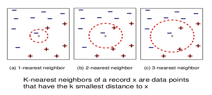
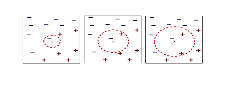
  • As you decrease the value of K to 1 (K = 1), you’ll reach a query point, where you get to see many elements from class A (-) and class B (+) where (-) is the only nearest neighbor. Reasonably, you would think about the query point to be most likely the red one. As K =1, which has a blue color, KNN incorrectly predicts the wrong color blue.
  • As you increase the value of K to 2 (K=2), you get to see two elements, (-) and (+) are the only nearest neighbor. As you have two values, which are of Class A and Class B, KNN incorrectly predicts the wrong values (Blue and Red).
  • As you increase the value of K to 3 (K=3), you get to see three elements (-) and (+), (+) are the only nearest neighbor. And this time, you got three values, one from blue and two from red. As your assumption is red, KNN correctly predicts the right value (Blue and Red, Red). Your answer is more stable this time compared to previous ones.

Conclusion

KNN works by finding the nearest distance between a query and all the elements in the database. By choosing the value for K, we get the closest to the query. And then, KNN algorithms look for the most frequent labels in classification and averages of labels in regression.

Spiky cubes, Pac-Man walking, empty M&M’s chocolate: curse of dimensionality

This is the first article of the article series Illustrative introductions on dimension reduction.

“Curse of dimensionality” means the difficulties of machine learning which arise when the dimension of data is higher. In short if the data have too many features like “weight,” “height,” “width,” “strength,” “temperature”…., that can undermine the performances of machine learning. The fact might be contrary to your image which you get from the terms “big” data or “deep” learning. You might assume that the more hints you have, the better the performances of machine learning are. There are some reasons for curse of dimensionality, and in this article I am going to introduce two major reasons below.

  1. High dimensional data usually have rich expressiveness, but usually training data are too poor for that.
  2. The behaviors of data points in high dimensional space are totally different from our common sense.

Through these topics, you will see that you always have to think about which features to use considering the number of data points.

*From now on I am going to talk about only Euclidean distance. If you are not sure what Euclidean distance means, please just keep it in mind that it is the type of distance most people wold have learnt in normal compulsory education.

*This is the first article of the article series ” Illustrative introductions on dimension reduction .”

1. Number of samples and degree of dimension

The most straightforward demerit of adding many features, or increasing dimensions of data, is the growth of computational costs. More importantly, however, you always have to think about the degree of dimensions in relation of the number of data points you have. Let me take a simple example in a book “Pattern Recognition and Machine Learning” by C. M. Bishop (PRML). This is an example of measurements of a pipeline. The figure below shows a comparison plot of 3 classes (red, green and blue), with parameter x_7 plotted against parameter x_6 out of 12 parameters.

* The meaning of data is not important in this article. If you are interested please refer to the appendix in PRML.

Assume that we are interested in classifying the cross in black into one of the three classes. One of the most naive ideas of this classification is dividing the graph into grids and labeling each grid depending on the number of samples in the classes (which are colored at the right side of the figure). And you can classify the test sample, the cross in black, into the class of the grid where the test sample is in. Thereby the cross is classified to the class in red.
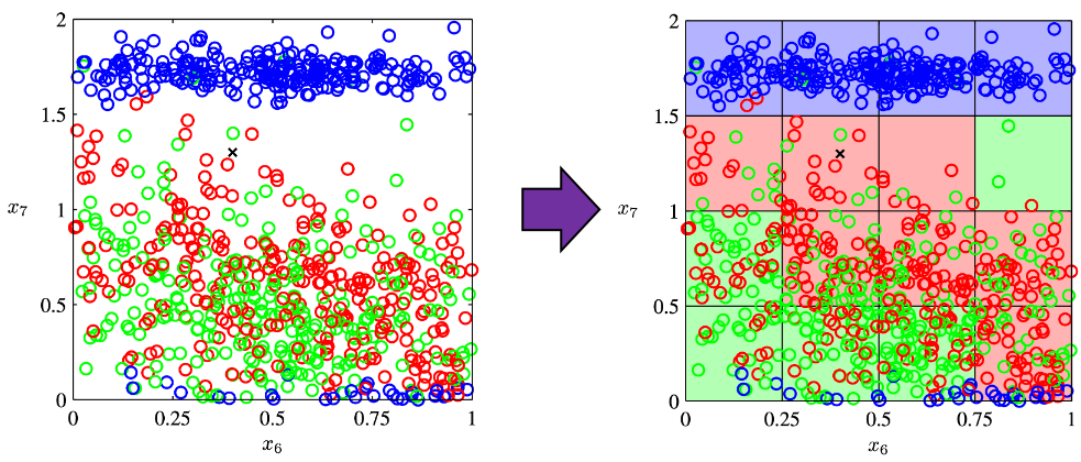
Source: C.M. Bishop, “Pattern Recognition and Machine Learning,” (2006), Springer, pp. 34-35

As I mentioned in the figure above, we used only two features out of 12 features in total. When the total number of data points is fixed and you add remaining ten axes/features one after another, what would happen? Let’s see what “adding axes/features” means. If you are talking about 1, 2, or 3 dimensional grids, you can visualize them. And as you can see from the figure below, if you make each 10^1, 10^2, 100^3 grids respectively in 1, 2, 3 dimensional spaces, the number of the small regions in the grids are respectively 10, 100, 1000. Even though you cannot visualize it anymore, you can make grids for more than 3 dimensional data. If you continue increasing the degree of dimension, the number of grids increases exponentially, and that can soon surpass the number of training data points. That means there would be a lot of empty spaces in such high dimensional grids. And the classifying method above: coloring each grid and classifying unknown samples depending on the colors of the grids, does not work out anymore because there would be a lot of empty grids.

* If you are still puzzled by the idea of “more than 3 dimensional grids,” you should not think too much about that now. It is enough if you can get some understandings on high dimensional data after reading the whole article of this.

Source: Goodfellow and Yoshua Bengio and Aaron Courville, Deep Learning, (2016), MIT Press, p. 153

I said the method above is the most naive way, but other classical classification methods , for example k-nearest neighbors algorithm, are more or less base on a similar idea. Many of classical machine learning algorithms are based on the idea of smoothness prior, or local constancy prior. In short in classical ways, you  do not expect data to change so much in a small region, so you can expect unknown samples to be similar to data in vicinity. But that soon turns out to be problematic when the dimension of data is bigger because training data would be sparse because the area of multidimensional space grows exponentially as I mentioned above. And sometimes you would not be able to find training data around test data. Plus, in high dimensional data, you cannot treat distance in the same as you do in lower dimensional space. The ideas of “close,” “nearby,” or “vicinity” get more obscure in high dimensional data. That point is related to the next topic: the intuition have cultivated in normal life is not applicable to higher dimensional data.

2. Bizarre characteristics of high dimensional data

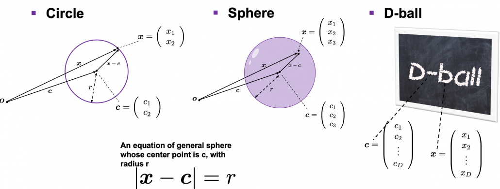
We form our sense of recognition in 3-dimensional ways in our normal life. Even though we can visualize only 1, 2, or 3 dimensional data, we can actually generalize the ideas in 1, 2, or 3 dimensional ideas to higher dimensions. For example 4 dimensional cubes, 100 dimensional spheres, or orthogonality in 255 dimensional space. Again, you cannot exactly visualize those ideas, and for many people, such high dimensional phenomenon are just imaginary matters on blackboards. Those high dimensional ideas are designed to retain some conditions just as well as 1, 2, or 3 dimensional space. Let’s take an example of spheres in several dimensional spaces. General spheres in any D-dimensional space can be defined as a set of any \boldsymbol{x}, such that |\boldsymbol{x} - \boldsymbol{c}| = r, where \boldsymbol{c} is the center point and r is length of radius. When \boldsymbol{x} is 2-dimensional, the spheres are called “circles.” When \boldsymbol{x} is 3-dimensional, the spheres are called “spheres” in our normal life, unless it is used in a conversation in a college cafeteria, by some students in mathematics department. And when \boldsymbol{x} is D-dimensional, they are called D-ball, and again, this is just a imaginary phenomenon on blackboard.

* Vectors and points are almost the same because all the vectors are denoted as “arrows” from the an origin point to sample data points.  The only difference is that when you use vectors, you have to consider their directions.

* “D-ball” is usually called “n-ball,” and in such context it is a sphere in a n-dimensional space. But please let me use the term “D-ball” in this article.
Not only spheres, but only many other ideas have been generalized to D-dimensional space, and many of them are indispensable also for data science. But there is one severe problem: the behaviors of data in high dimensional field is quite different from those in two or three dimensional space. To be concrete, in high dimensional field, cubes are spiky, you have to move like Pac-Man, and M & M’s Chocolate looks empty inside but tastes normal.

2.1: spiky cubes
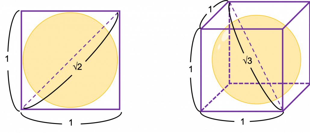
Let’s take a look at an elementary-school-level example of geometry first. Assume that you have several unit squares or unit cubes like below. In each of them a circle or sphere with diameter 1 is inscribed. The length of a diagonal line in each square is \sqrt{2}, and that in each cube is \sqrt{3}.

If you stack the squares or cubes as below, what are the length of diameters of the blue circle or sphere, circumscribing all the 4 orange circles or the 8 orange spheres?
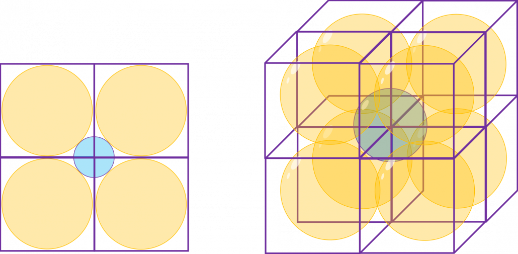
The answers are, the diameter of the blue circle is \sqrt{2} - 1, and the diameter of the blue sphere is \sqrt{3} - 1.

Next let’s think about the same situation in higher dimensional space. Assume that there are some unit D-dimensional hypercubes stacked, in each of which a D-ball with diameter 1 is inscribed, touching all the surfaces inside. Then what is the length of the diameter of  a D-ball circumscribing all the unit D-ball in the hypercubes ? Given the results above, it ca be predicted that its diameter is \sqrt{D}  -1. If that is true, there is one strange point: \sqrt{D} - 1 can soon surpass 2: that means in the chart above the blue sphere will stick out of the stacked cubes. That sounds like a paradox, but with one hypothesis, the phenomenon makes sense: cubes become more spiky as the degree of dimension grows. This hypothesis is a natural deduction because diagonal lines of hyper cubes get longer, and the the center of each surface of hypercubes still touches the unit D-ball with diameter 1, inscribing inscribing inside each unit hypercube.
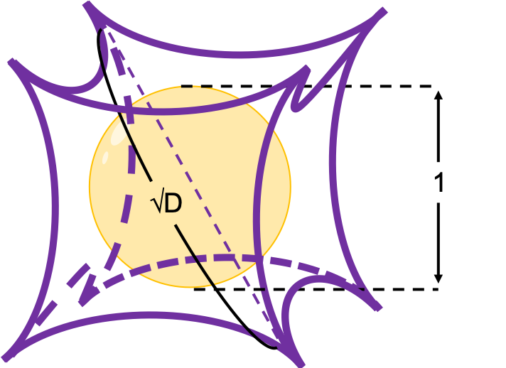
If you stack 4 hypercubes, the blue sphere circumscribing them will not stick out of the stacked hypercubes anymore like the figure below.

*Of course you cannot visualize what is going on in D-dimensional space, so the figure below is just a pseudo simulation of D-dimensional space in our 3-dimensional sense. I guess you have to stack more than four hyper cubes in higher dimensional data, but you cannot easily imagine what will go on in such space anymore.
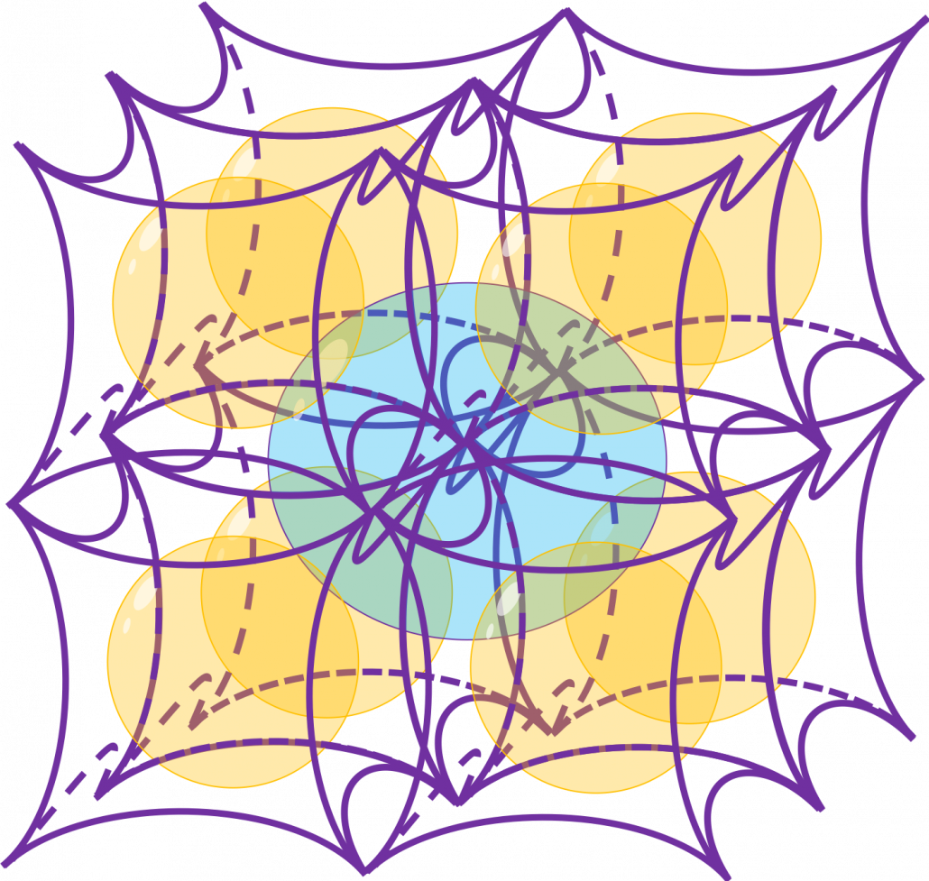
 

*You can confirm the fact that hypercube gets more spiky as the degree of dimension growth, by comparing the volume of the hypercube and the volume of the D-ball inscribed inside the hypercube. Thereby you can prove that the volume of hypercube concentrates on the corners of the hypercube. Plus, as I mentioned the longest diagonal distance of hypercube gets longer as dimension degree increases. That is why hypercube is said to be spiky. For mathematical proof, please check the Exercise 1.19 of PRML.

2.2: Pac-Man walking

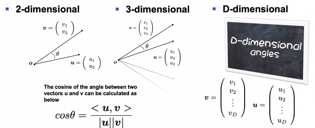
Next intriguing phenomenon in high dimensional field is that most of pairs of vectors in high dimensional space are orthogonal. In other words, if you select two random vectors in high dimensional space, the angle between them are mostly close to 90^\circ. Let’s see the general meaning of angle between two vectors in any dimensional spaces. Assume that the angle between two vectors \boldsymbol{u}, and \boldsymbol{v} is \theta, then cos\theta is calculated as cos\theta = \frac{<\boldsymbol{u}, \boldsymbol{v}>}{|\boldsymbol{u}||\boldsymbol{v}|}. In 1, 2, or 3 dimensional space, you can actually see the angle, but again you can define higher dimensional angle, which you cannot visualize anymore. And angles are sometimes used as similarity of two vectors.

* <\boldsymbol{u}, \boldsymbol{v}> is the inner product of \boldsymbol{u}, and \boldsymbol{v}.

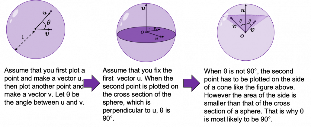
Assume that you generate a pair of two points inside a D-dimensional unit sphere and make two vectors \boldsymbol{u}, and \boldsymbol{v} by connecting the origin point and those two points respectively. When D is 2, I mean spheres are circles in this case, any \theta are equally generated as in the chart below. The fact might be the same as your intuition.   How about in 3-dimensional space? In fact the distribution of \theta is not uniform. \theta = 90^\circ is the most likely to be generated. As I explain in the figure below, if you compare the area of cross section of a hemisphere and the area of a cone whose vertex is the center point of the sphere, you can see why.
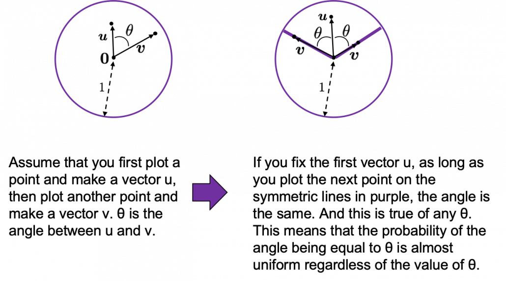
I generated 10000 random pairs of points in side a D-dimensional unit sphere, and calculated the angle between them. In other words I just randomly generated two D-dimensional vectors \boldsymbol{u} and \boldsymbol{v}, whose elements are randomly generated values between -1 and 1, and calculated the angle between them, repeating this process 10000 times. The chart below are the histograms of angle between pairs of generated vectors in respectively 2, 3, 50, and 100 dimensional space.
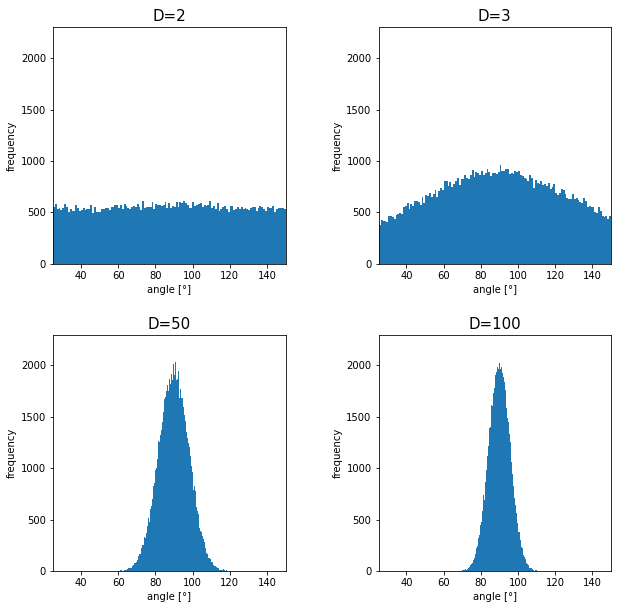
As I explained above, in 2-dimensional space, the distribution of \theta is almost uniform. However the distribution concentrates a little around 90^\circ in 3-dimensional space. You can see that the bigger the degree of dimension is, the more the angles of generated vectors concentrate around 90^\circ. That means most pairs of vectors in high dimensional space are close to orthogonal. Movements are also sequence of vectors, so when most pairs of movement vectors are orthogonal, that means you can only move like Pac-Man in such space.

Source: https://edition.cnn.com/style/article/pac-man-40-anniversary-history/index.html

* Of course I am talking about arcade Mac-Man game. Not Pac-Man in Super Smash Bros.  Retro RPG video games might have more similar playability, but in high dimensional space it is also difficult to turn back. At any rate, I think you have understood it is even difficult to move smoothly in high dimensional space, just like the first notorious Resident Evil on the first PS console also had terrible playability .

2.3: empty M & M’s chocolate

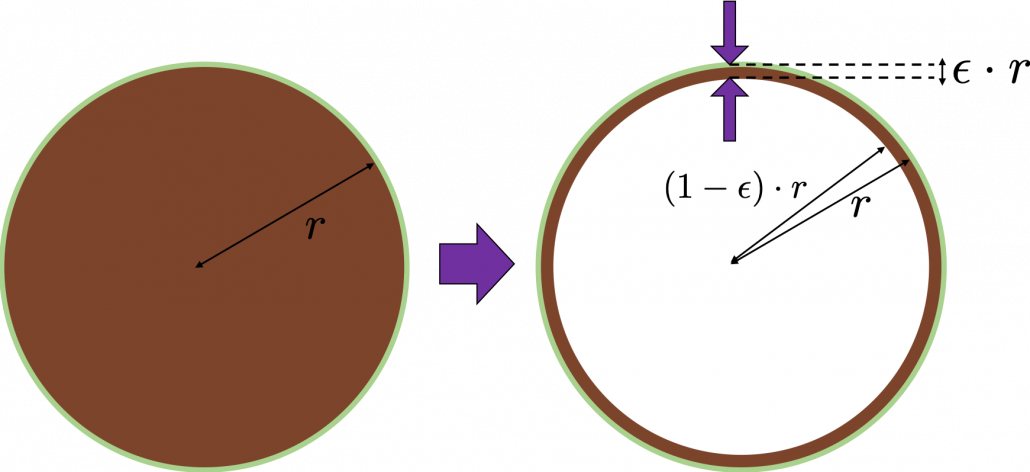
Let’s think about the proportion of the volume of the outermost \epsilon surface of general spheres with radius r. First, in 2 two dimensional space, spheres are circles. The area of the brown part of the circle below is \pi r^2. In order calculate the are of \epsilon \cdot r thick surface of the circle, you have only to subtract the area of \pi \{ (1 - \epsilon)\cdot r\} ^2. When \epsilon = 0.01, the area of outer most surface is \pi r^2 - \pi (0.99\cdot r)^2, and its proportion to the area of the whole circle is \frac{\pi r^2 - \pi (0.99\cdot r)^2}{\pi r^2} = 0.0199.

In case of 3-dimensional space, the value of a sphere with radius r is \frac{4}{3} \pi r^2, so the proportion of the \epsilon surface is calculated in the same way: \frac{\frac{4}{3} \pi r^3 -\frac{4}{3} \pi (0.99\cdot r)^2}{\frac{4}{3}\pi r^2} = 0.0297. Compared to the case in 2 dimensional space, the proportion is a little bigger.
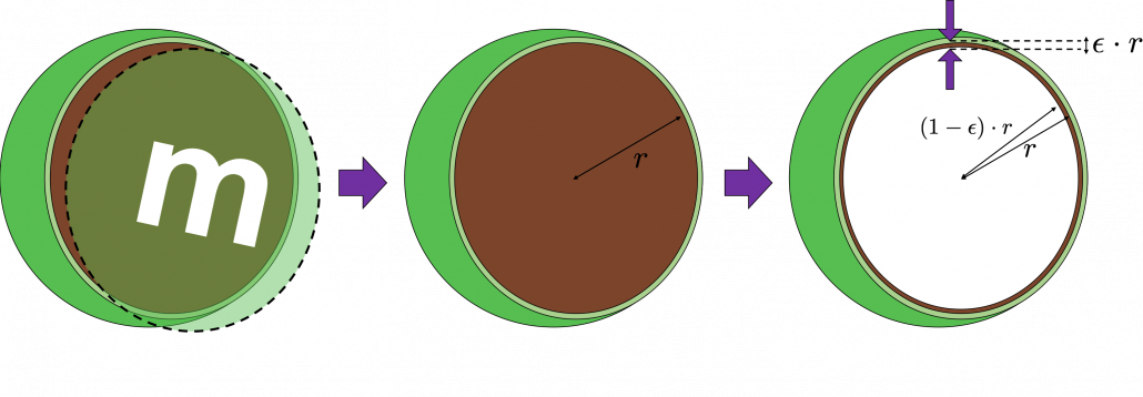
How about in D-dimensional space? We have seen that even in  D-dimensional space the surface of a sphere, I mean D-ball, can be defined as a set of any points whose distance from the center point is all r. And it is known that the volume of D-ball is defined as below.

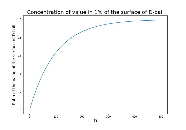
\Gamma () is called gamma function, but in this article it is not so important. The most important point now is, if you discuss any D-ball, their volume only depends on their radius r. That meas the proportion of outer \epsilon surface of D-ball is calculated as \frac{\pi r^2 - \pi \{ (1 - \epsilon)\cdot r\} ^2}{\pi r^2}. When \epsilon is 0.01, the proportion of the 1% surface of D-ball changes like in the chart below.

* And of course when D is 2,  \frac{\pi ^{(\frac{D}{2})}}{\Gamma (\frac{D}{2} + 1)} = \pi, and when D is 3 ,  \frac{\pi ^{(\frac{D}{2})}}{\Gamma (\frac{D}{2} + 1)} = \frac{4}{3} \pi

You can see that when D is over 400, around 90% of volume is concentrated in the very thin 1% surface of D-ball. That is why, in high dimensional space, M & M’s chocolate look empty but tastes normal: all the chocolate are concentrated beneath the sugar coating.

More interestingly, even if you choose any points as a central point of a sphere with radius r, the other points are squashed to the surface of the sphere, even if all the data points are uniformly distributed. This situation is problematic for classical machine learning algorithms, which are often based on the Euclidean distances between pairs of two sample data points: if you go from the central point to another sample point, the possibility of finding the point within (1 - \epsilon)\cdot r radius of the center is almost zero. But if you reach the outermost \epsilon part of the surface of the sphere, most data points are there. However, for one of the data points in the surface, any other data points are distant in the same way.

Inside M & M’s chocolate is a mysterious world.

Source: https://hipwallpaper.com/mms-wallpapers/

You have seen that using high dimensional data can be problematic in many ways. Data science and machine learning are largely based on one idea: you can find a lower dimensional meaningful and easier structure in data. In the next articles I am going to introduce some famous dimension reduction algorithms. And hopefully I would like to give some deeper insights in to these algorithms, in straightforward ways.

* I could not explain the relationships of variance and bias of data. This is also a very important factor when you think about dimensionality of data. I hope I can write about this topic someday. You can also look it up if you are interested.

[References]

[1]C. M. Bishop, “Pattern Recognition and Machine Learning,” (2006), Springer, pp. 33-37

[2]Goodfellow and Yoshua Bengio and Aaron Courville, Deep Learning, (2016), MIT Press, p. 153

[3] Shiga Kouji, “30 Lesson to Topology,” (1988)

[4]”Volume of an n-ball,” Wikipedia
https://en.wikipedia.org/wiki/Volume_of_an_n-ball

* I make study materials on machine learning, sponsored by DATANOMIQ. I do my best to make my content as straightforward but as precise as possible. I include all of my reference sources. If you notice any mistakes in my materials, including grammatical errors, please let me know (email: yasuto.tamura@datanomiq.de). And if you have any advice for making my materials more understandable to learners, I would appreciate hearing it.

Illustrative introductions on dimension reduction

“What is your image on dimensions?”

….That might be a cheesy question to ask to reader of Data Science Blog, but most people, with no scientific background, would answer “One dimension is a line, and two dimension is a plain, and we live in three-dimensional world.” After that if you ask “How about the fourth dimension?” many people would answer “Time?”

You can find books or writings about dimensions in various field. And you can use the word “dimension” in normal conversations, in many contexts.

*In Japanese, if you say “He likes two dimension.” that means he prefers anime characters to real women, as is often the case with Japanese computer science students.

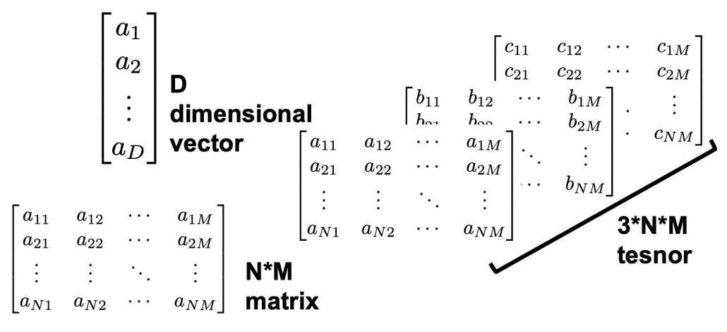
The meanings of “dimensions” depend on the context, but in data science dimension is usually the number of rows of your Excel data.

When you study data science or machine learning, usually you should start with understanding the algorithms with 2 or 3 dimensional data, and you can apply those ideas to any D dimensional data. But of course you cannot visualize D dimensional data anymore, and you always have to be careful of what happens if you expand degree of dimension.

Conversely it is also important to reduce dimension to understand abstract high dimensional stuff in 2 or 3 dimensional space, which are close to our everyday sense. That means dimension reduction is one powerful way of data visualization.

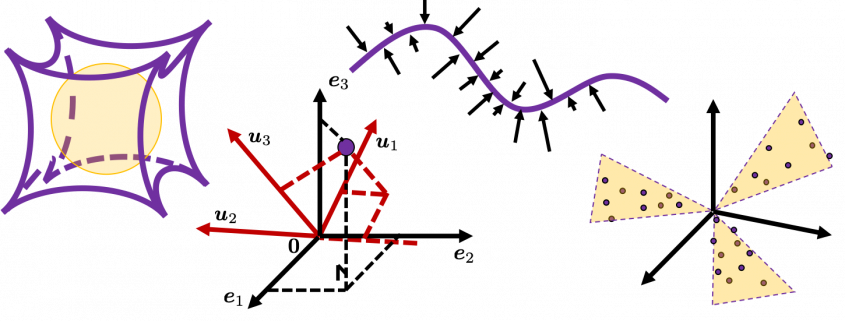
In this blog series I am going to explain meanings of dimension itself in machine learning context and algorithms for dimension reductions, such as PCA, LDA, and t-SNE, with 2 or 3 dimensional visible data. Along with that, I am going to delve into the meaning of calculations so that you can understand them in more like everyday-life sense.

This article series is going to be roughly divided into the contents below.

  1. Curse of Dimensionality
  2. Rethinking linear algebra: visualizing linear transformations and eigen vector
  3. The algorithm known as PCA and my taxonomy of linear dimension reductions
  4. Rethinking linear algebra part two: ellipsoids in data science
  5. Autoencoder as dimension reduction (to be published soon)
  6. t-SNE (to be published soon)

I hope you could see that reducing dimension is one of the fundamental approaches in data science or machine learning.

Data Science in Engineering Process - Product Lifecycle Management

How to develop digital products and solutions for industrial environments?

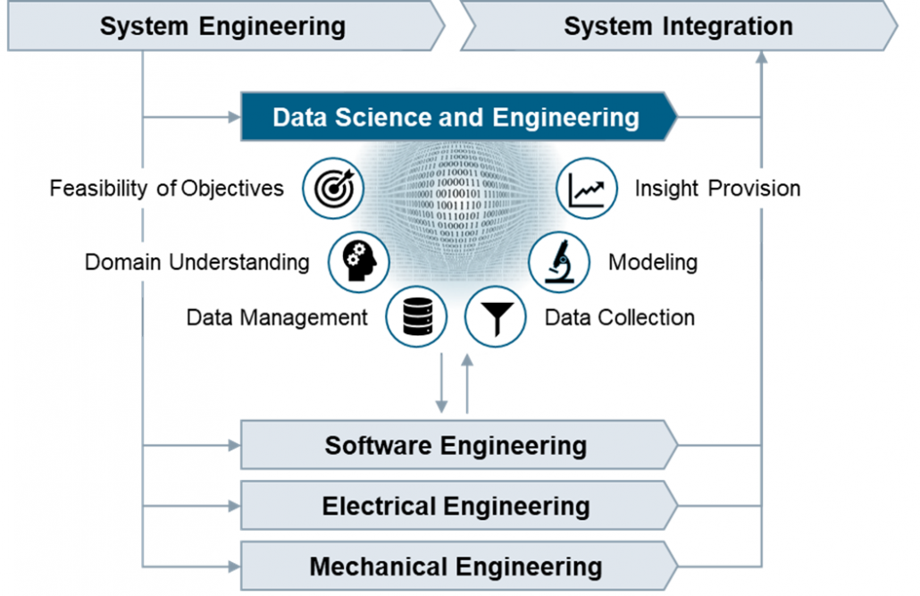
The Data Science and Engineering Process in PLM.

Huge opportunities for digital products are accompanied by huge risks

Digitalization is about to profoundly change the way we live and work. The increasing availability of data combined with growing storage capacities and computing power make it possible to create data-based products, services, and customer specific solutions to create insight with value for the business. Successful implementation requires systematic procedures for managing and analyzing data, but today such procedures are not covered in the PLM processes.

From our experience in industrial settings, organizations start processing the data that happens to be available. This data often does not fully cover the situation of interest, typically has poor quality, and in turn the results of data analysis are misleading. In industrial environments, the reliability and accuracy of results are crucial. Therefore, an enormous responsibility comes with the development of digital products and solutions. Unless there are systematic procedures in place to guide data management and data analysis in the development lifecycle, many promising digital products will not meet expectations.

Various methodologies exist but no comprehensive framework

Over the last decades, various methodologies focusing on specific aspects of how to deal with data were promoted across industries and academia. Examples are Six Sigma, CRISP-DM, JDM standard, DMM model, and KDD process. These methodologies aim at introducing principles for systematic data management and data analysis. Each methodology makes an important contribution to the overall picture of how to deal with data, but none provides a comprehensive framework covering all the necessary tasks and activities for the development of digital products. We should take these approaches as valuable input and integrate their strengths into a comprehensive Data Science and Engineering framework.

In fact, we believe it is time to establish an independent discipline to address the specific challenges of developing digital products, services and customer specific solutions. We need the same kind of professionalism in dealing with data that has been achieved in the established branches of engineering.

Data Science and Engineering as new discipline

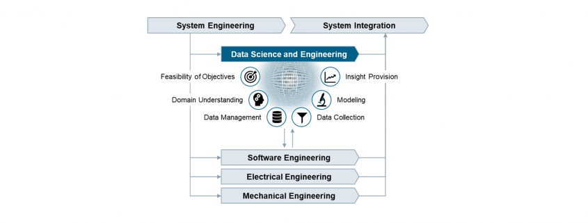
Whereas the implementation of software algorithms is adequately guided by software engineering practices, there is currently no established engineering discipline covering the important tasks that focus on the data and how to develop causal models that capture the real world. We believe the development of industrial grade digital products and services requires an additional process area comprising best practices for data management and data analysis. This process area addresses the specific roles, skills, tasks, methods, tools, and management that are needed to succeed.

Figure: Data Science and Engineering as new engineering discipline

More than in other engineering disciplines, the outputs of Data Science and Engineering are created in repetitions of tasks in iterative cycles. The tasks are therefore organized into workflows with distinct objectives that clearly overlap along the phases of the PLM process.

Feasibility of Objectives
  Understand the business situation, confirm the feasibility of the product idea, clarify the data infrastructure needs, and create transparency on opportunities and risks related to the product idea from the data perspective.
Domain Understanding
  Establish an understanding of the causal context of the application domain, identify the influencing factors with impact on the outcomes in the operational scenarios where the digital product or service is going to be used.
Data Management
  Develop the data management strategy, define policies on data lifecycle management, design the specific solution architecture, and validate the technical solution after implementation.
Data Collection
  Define, implement and execute operational procedures for selecting, pre-processing, and transforming data as basis for further analysis. Ensure data quality by performing measurement system analysis and data integrity checks.
Modeling
  Select suitable modeling techniques and create a calibrated prediction model, which includes fitting the parameters or training the model and verifying the accuracy and precision of the prediction model.
Insight Provision
  Incorporate the prediction model into a digital product or solution, provide suitable visualizations to address the information needs, evaluate the accuracy of the prediction results, and establish feedback loops.

Real business value will be generated only if the prediction model at the core of the digital product reliably and accurately reflects the real world, and the results allow to derive not only correct but also helpful conclusions. Now is the time to embrace the unique chances by establishing professionalism in data science and engineering.

Authors

Peter Louis                               

Peter Louis is working at Siemens Advanta Consulting as Senior Key Expert. He has 25 years’ experience in Project Management, Quality Management, Software Engineering, Statistical Process Control, and various process frameworks (Lean, Agile, CMMI). He is an expert on SPC, KPI systems, data analytics, prediction modelling, and Six Sigma Black Belt.


Ralf Russ    

Ralf Russ works as a Principal Key Expert at Siemens Advanta Consulting. He has more than two decades experience rolling out frameworks for development of industrial-grade high quality products, services, and solutions. He is Six Sigma Master Black Belt and passionate about process transparency, optimization, anomaly detection, and prediction modelling using statistics and data analytics.4


Simple RNN

LSTM back propagation: following the flows of variables

First of all, the summary of this article is: please just download my Power Point slides which I made and be patient, following the equations.

I am not supposed to use so many mathematics when I write articles on Data Science Blog. However using little mathematics when I talk about LSTM backprop is like writing German, never caring about “der,” “die,” “das,” or speaking little English in English classes (which most high school English teachers in Japan do) or writing Japanese without using any Chinese characters (which looks like a terrible handwriting by a drug addict). In short, that is ridiculous. And all the precise equations of LSTM backprop, written on a blog is not a comfortable thing to see. So basically the whole of this article is an advertisement on my PowerPoint slides, sponsored by DATANOMIQ, and I can just give you some tips to get ready for the most tiresome part of understanding LSTM here.

*This article is the fifth article of “A gentle introduction to the tiresome part of understanding RNN.”

 *In this article “Densely Connected Layers” is written as “DCL,” and “Convolutional Neural Network” as “CNN.”

1. Chain rules

This article is virtually an article on chain rules of differentiation. Even if you have clear understandings on chain rules, I recommend you to take a look at this section. If you have written down all the equations of back propagation of DCL, you would have seen what chain rules are. Even simple chain rules for backprop of normal DCL can be difficult to some people, but when it comes to backprop of LSTM, it is a pure torture.  I think using graphical models would help you understand what chain rules are like. Graphical models are basically used to describe the relations of variables and functions in probabilistic models, so to be exact I am going to use “something like graphical models” in this article. Not that this is a common way to explain chain rules.

First, let’s think about the simplest type of chain rule. Assume that you have a function f=f(x)=f(x(y)), and relations of the functions are displayed as the graphical model at the left side of the figure below. Variables are a type of function, so you should think that every node in graphical models denotes a function. Arrows in purple in the right side of the chart show how information propagate in differentiation.

Next, if you have a function f , which has two variances  x_1 and x_2. And both of the variances also share two variances  y_1 and y_2. When you take partial differentiation of f with respect to y_1 or y_2, the formula is a little tricky. Let’s think about how to calculate \frac{\partial f}{\partial y_1}. The variance y_1 propagates to f via x_1 and x_2. In this case the partial differentiation has two terms as below.

In chain rules, you have to think about all the routes where a variance can propagate through. If you generalize chain rules as the graphical model below, the partial differentiation of f with respect to y_i is calculated as below. And you need to understand chain rules in this way to understanding any types of back propagation.

The figure above shows that if you calculate partial differentiation of f with respect to y_i, the partial differentiation has n terms in total because y_i propagates to f via n variances. In order to understand backprop of LSTM, you constantly have to care about the flows of variances, which I display as purple arrows.

2. Chain rules in LSTM

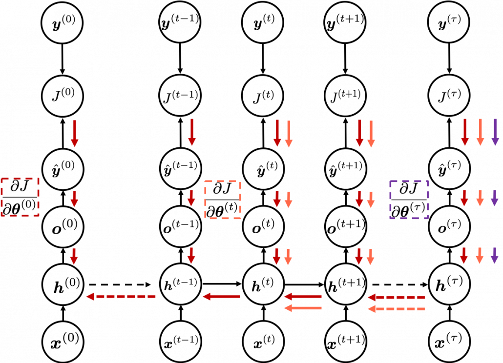
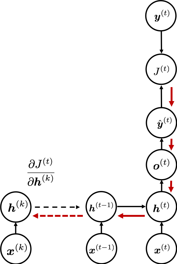
I would like you to remember the figure below, which I used in the second article to show how errors propagate backward during backprop of simple RNNs. After forward propagation, first of all, you need to calculate \frac{\partial J}{\partial \boldsymbol{\theta}^{(t)}}, gradients of the error function with respect to parameters, at each time step. But you have to be careful that even though these gradients depend on time steps, the parameters \boldsymbol{\theta} do not depend on time steps.

*As I mentioned in the second article I personally think \frac{\partial J}{\partial \boldsymbol{\theta}^{(t)}} should be rather denoted as (\frac{\partial J}{\partial \boldsymbol{\theta}})^{(t)} because parameters themselves do not depend on time. However even the textbook by MIT press partly use the former notation. And I think you are likely to encounter this type of notation, so I think it is not bad to get ready for both.

The errors at time step (t) propagate backward to all the \boldsymbol{h} ^{(s)} (s \leq t). Conversely, in order to calculate \frac{\partial J}{\partial \boldsymbol{\theta}^{(t)}} errors flowing from J^{(s)}  (s \geq t). In the chart you need arrows of errors in purple for the gradient in a purple frame, orange arrows for gradients in orange frame, red arrows for gradients in red frame. And you need to sum up \frac{\partial J}{\partial \boldsymbol{\theta}^{(t)}} to calculate \frac{\partial J}{\partial \boldsymbol{\theta}} = \sum_{t}{\frac{\partial J}{\partial \boldsymbol{\theta}^{(t)}}}, and you need this gradient \frac{\partial J}{\partial \boldsymbol{\theta}} to renew parameters, one time.

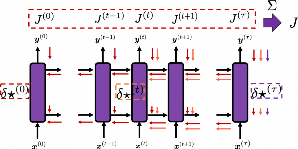
At an RNN block level, the flows of errors and how to renew parameters are the same in LSTM backprop, but the flow of errors inside each block is much more complicated in LSTM backprop. But in order to denote errors of LSTM backprop, instead of \frac{\partial J}{\partial \boldsymbol{\theta}^{(t)}}, I use a special notation \delta \star ^{(t)} = \frac{\partial J}{\partial \star}.

* Again, please be careful of what \delta \star  ^{(t)} means. Neurons depend on time steps, but parameters do not depend on time steps. So if \star are neurons,  \delta \star  ^{(t)}= \frac{\partial J}{ \partial \star ^{(t)}}, but when \star are parameters, \delta \star  ^{(t)} should be rather denoted like \delta \star  ^{(t)}= (\frac{\partial J}{ \partial \star })^{(t)}. In the Space Odyssey paper\boldsymbol{\star} are not used as parameters, but in my PowerPoint slides and some other materials, \boldsymbol{\star} are used also as parameteres.

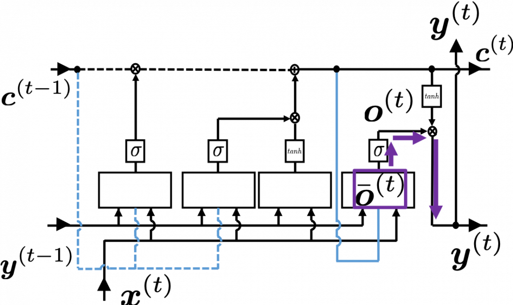
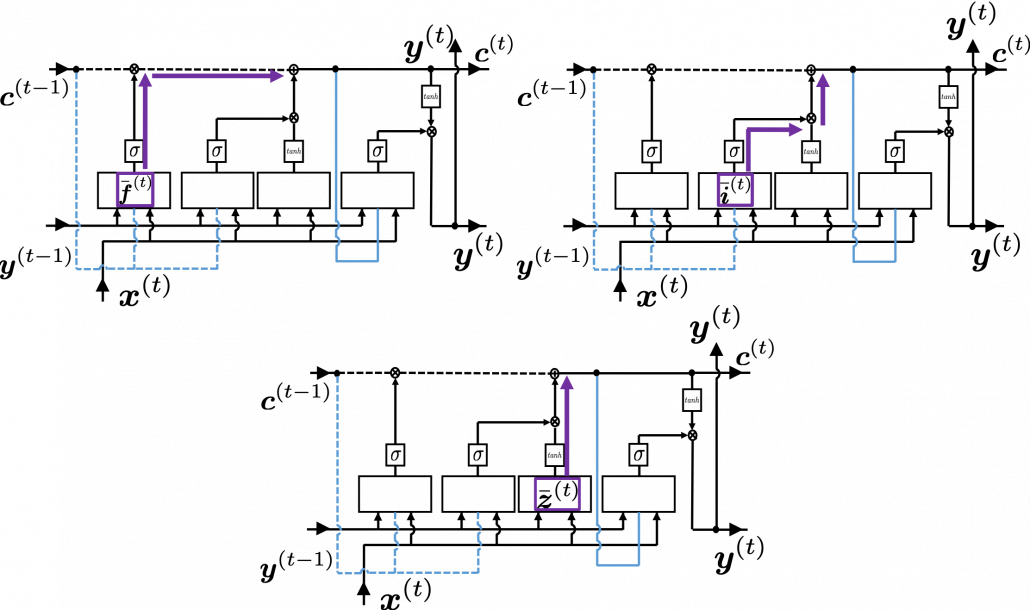
As I wrote in the last article, you calculate \boldsymbol{f}^{(t)}, \boldsymbol{i}^{(t)}, \boldsymbol{z}^{(t)}, \boldsymbol{o}^{(t)} as below. Unlike the last article, I also added the terms of peephole connections in the equations below, and I also introduced the variances \bar{\boldsymbol{f}}^{(t)}, \bar{\boldsymbol{i}}^{(t)}, \bar{\boldsymbol{z}}^{(t)}, \bar{\boldsymbol{o}}^{(t)} for convenience.

  • \boldsymbol{\bar{f}}^{(t)}=\boldsymbol{W}_{for} \cdot \boldsymbol{x}^{(t)} + \boldsymbol{R}_{for} \cdot \boldsymbol{y}^{(t-1)} + \boldsymbol{p}_{for}\odot \boldsymbol{c}^{(t-1)} + \boldsymbol{b}_{for}
  • \boldsymbol{\bar{i}}^{(t)}=\boldsymbol{W}_{in} \cdot \boldsymbol{x}^{(t)} + \boldsymbol{R}_{in} \cdot \boldsymbol{y}^{(t-1)} + \boldsymbol{p}_{in}\odot \boldsymbol{c}^{(t-1)} + \boldsymbol{b}_{in}
  • \boldsymbol{\bar{z}}^{(t)}=\boldsymbol{W}_z \cdot \boldsymbol{x}^{(t)} + \boldsymbol{R}_z \cdot \boldsymbol{y}^{(t-1)} + \boldsymbol{b}_z
  • \boldsymbol{\bar{o}}^{(t)}=\boldsymbol{W}_{out} \cdot \boldsymbol{x}^{(t)} + \boldsymbol{R}_{out} \cdot \boldsymbol{y}^{(t-1)} + \boldsymbol{p}_{out}\odot \boldsymbol{c}^{(t)} + \boldsymbol{b}_{out}
  • \boldsymbol{f}^{(t)}=\sigma( \boldsymbol{\bar{f}}^{(t)})
  • \boldsymbol{i}^{(t)}=\sigma(\boldsymbol{\bar{i}}^{(t)})
  • \boldsymbol{z}^{(t)}=tanh(\boldsymbol{\bar{z}}^{(t)})
  • \boldsymbol{o}^{(t)}=\sigma(\boldsymbol{\bar{o}}^{(t)})

With  Hadamar product operator, the renewed cell and the output are calculated as below.

  • \boldsymbol{c}^{(t)} = \boldsymbol{z}^{(t)}\odot \boldsymbol{i}^{(t)} + \boldsymbol{c}^{(t-1)} \odot \boldsymbol{f}^{(t)}
  • \boldsymbol{y}^{(t)} = \boldsymbol{o}^{(t)} \odot tanh(\boldsymbol{c}^{(t)})

In this article I would rather give instructions on how to read my PowerPoint slide. Just as general backprop, you need to calculate gradients of error functions with respect to parameters, such as \delta \boldsymbol{W}_{\star}, \delta \boldsymbol{R}_{\star}, \delta \boldsymbol{p}_{\star}, \delta \boldsymbol{b}_{\star}, where \star is either of \{z, in, for, out \}. And just as backprop of simple RNNs, in order to calculate gradients with respect to parameters, you need to calculate errors of neurons, that is gradients of error functions with respect to neurons, such as \delta \boldsymbol{f}^{(t)}, \delta \boldsymbol{i}^{(t)}, \delta \boldsymbol{z}^{(t)}, \delta \boldsymbol{o}^{(t)}.

*Again and again, keep it in mind that neurons depend on time steps, but parameters do not depend on time steps.

When you calculate gradients with respect to neurons, you can first calculate \delta \boldsymbol{y}^{(t)}, but the equation for this error is the most difficult, so I recommend you to put it aside for now. After calculating \delta \boldsymbol{y}^{(t)}, you can next calculate \delta \bar{\boldsymbol{o}}^{(t)}= \frac{\partial J^{(t)}}{ \partial \bar{\boldsymbol{o}}^{(t)}}. If you see the LSTM block below as a graphical model which I introduced, the information of \bar{\boldsymbol{o}}^{(t)} flow like the purple arrows. That means, \bar{\boldsymbol{o}}^{(t)} affects J only via \boldsymbol{y}^{(t)}, and this structure is equal to the first graphical model which I have introduced above. And if you calculate \bar{\boldsymbol{o}}^{(t)} element-wise, you get the equation \delta \bar{o}_{k}^{(t)}=\frac{\partial J}{\partial \bar{o}_{k}^{(t)}}= \frac{\partial J}{\partial y_{k}^{(t)}} \frac{\partial y_{k}^{(t)}}{\partial \bar{o}_{k}^{(t)}}.

*The k is an index of an element of vectors. If you can calculate element-wise gradients, it is easy to understand that as differentiation of vectors and matrices.

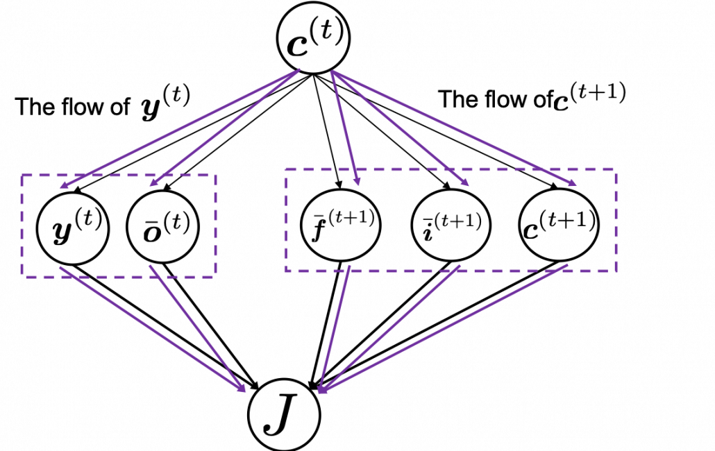
Next you can calculate \delta \boldsymbol{c}^{(t)}, and chain rules are very important in this process. The flow of \delta \boldsymbol{c}^{(t)} to J can be roughly divided into two streams: the one which flows to J as \bodlsymbol{y}^{(t)}, and the one which flows to J as \bodlsymbol{c}^{(t+1)}. And the stream from \bodlsymbol{c}^{(t)} to \bodlsymbol{y}^{(t)} also have two branches: the one via \bar{\boldsymbol{o}}^{(t)} and the one which directly converges as  \bodlsymbol{y}^{(t)}. Just as well, the stream from \bodlsymbol{c}^{(t)} to \bodlsymbol{c}^{(t+1)} also have three branches: the ones via \bar{\boldsymbol{f}}^{(t)}, \bar{\boldsymbol{i}}^{(t)}, and the one which directly converges as \bodlsymbol{c}^{(t+1)}.

If you see see these flows as graphical a graphical model, that would be like the figure below.

According to this graphical model, you can calculate \delta \boldsymbol{c} ^{(t)} element-wise as below.

* TO BE VERY HONEST I still do not fully understand why we can apply chain rules like above to calculate \delta \boldsymbol{c}^{(t)}. When you apply the formula of chain rules, which I showed in the first section, to this case, you have to be careful of where to apply partial differential operators \frac{\partial}{ \partial c_{k}^{(t)}}. In the case above, in the part \frac{\partial y_{k}^{(t)}}{\partial c_{k}^{(t)}} the partial differential operator only affects tanh(c_{k}^{(t)}) of o_{k}^{(t)} \cdot tanh(c_{k}^{(t)}). And in the part \frac{\partial c_{k}^{(t+1)}}{\partial c_{k}^{(t)}}, the partial differential operator \frac{\partial}{\partial c_{k}^{(t)}} only affects the part c_{k}^{(t)} of the term c^{t}_{k} \cdot f_{k}^{(t+1)}. In the \frac{\partial \bar{o}_{k}^{(t)}}{\partial c_{k}^{(t)}} part, only (p_{out})_{k} \cdot c_{k}^{(t)},  in the \frac{\partial \bar{i}_{k}^{(t+1)}}{\partial c_{k}^{(t)}} part, only (p_{in})_{k} \cdot c_{k}^{(t)}, and in the \frac{\partial \bar{f}_{k}^{(t+1)}}{\partial c_{k}^{(t)}} part, only (p_{in})_{k} \cdot c_{k}^{(t)}. But some other parts, which are not affected by \frac{\partial}{ \partial c_{k}^{(t)}} are also functions of c_{k}^{(t)}. For example o_{k}^{(t)} of o_{k}^{(t)} \cdot tanh(c_{k}^{(t)}) is also a function of c_{k}^{(t)}. And I am still not sure about the logic behind where to affect those partial differential operators.

*But at least, these are the only decent equations for LSTM backprop which I could find, and a frequently cited paper on LSTM uses implementation based on these equations. Computer science is more of practical skills, rather than rigid mathematical logic. Also I think I have spent great deal of my time thinking about this part, and it is now time for me to move to next step. If you have any comments or advice on this point, please let me know.

Calculating \delta \bar{\boldsymbol{f}}^{(t)}, \delta \bar{\boldsymbol{i}}^{(t)}, \delta \bar{\boldsymbol{z}}^{(t)} are also relatively straigtforward as calculating \delta \bar{\boldsymbol{o}}^{(t)}. They all use the first type of chain rule in the first section. Thereby you can get these gradients: \delta \bar{f}_{k}^{(t)}=\frac{\partial J}{ \partial \bar{f}_{k}^{(t)}} =\frac{\partial J}{\partial c_{k}^{(t)}} \frac{\partial c_{k}^{(t)}}{ \partial \bar{f}_{k}^{(t)}}, \delta \bar{i}_{k}^{(t)}=\frac{\partial J}{\partial \bar{i}_{k}^{(t)}} =\frac{\partial J}{\partial c_{k}^{(t)}} \frac{\partial c_{k}^{(t)}}{ \partial \bar{i}_{k}^{(t)}}, and \delta \bar{z}_{k}^{(t)}=\frac{\partial J}{\partial \bar{z}_{k}^{(t)}} =\frac{\partial J}{\partial c_{k}^{(t)}} \frac{\partial c_{k}^{(t)}}{ \partial \bar{i}_{k}^{(t)}}.

All the gradients which we have calculated use the error \delta \boldsymbol{y}^{(t)}, but when it comes to calculating \delta \boldsymbol{y}^{(t)}….. I can only say “Please be patient. I did my best in my PowerPoint slides to explain that.” It is not a kind of process which I want to explain on Word Press. In conclusion you get an error like this: \delta \boldsymbol{y}^{(t)}=\frac{\partial J^{(t)}}{\partial \boldsymbol{y}^{(t)}} + \boldsymbol{R}_{for}^{T} \delta \bar{\boldsymbol{f}}^{(t+1)} + \boldsymbol{R}_{in}^{T}\delta \bar{\boldsymbol{i}}^{(t+1)} + \boldsymbol{R}_{out}^{T}\delta \bar{\boldsymbol{o}}^{(t+1)} + \boldsymbol{R}_{z}^{T}\delta \bar{\boldsymbol{z}}^{(t+1)}, and the flows of \boldsymbol{y}^{(t)} are as blow.

Combining the gradients we have got so far, we can calculate gradients with respect to parameters. For concrete results, please check the Space Odyssey paper or my PowerPoint slide.

3. How LSTMs tackle exploding/vanishing gradients problems

*If you are allergic to mathematics, you should not read this section or even download my PowerPoint slide.

*Part of this section is more or less subjective, so if you really want to know how LSTM mitigate the problems, I highly recommend you to also refer to other materials. But at least I did my best for this article.

LSTMs do not completely solve, vanishing gradient problems. They mitigate vanishing/exploding gradient problems. I am going to roughly explain why they can tackle those problems. I think you find many explanations on that topic, but many of them seems to have some mathematical mistakes (even the slide used in a lecture in Stanford University) and I could not partly agree with some statements. I also could not find any papers or materials which show the whole picture of how LSTMs can tackle those problems. So in this article I am only going to give instructions on the major way to explain this topic.

First let’s see how gradients actually “vanish” or “explode” in simple RNNs. As I in the second article of this series, simple RNNs propagate forward as the equations below.

  • \boldsymbol{a}^{(t)} = \boldsymbol{b} + \boldsymbol{W} \cdot \boldsymbol{h}^{(t-1)} + \boldsymbol{U} \cdot \boldsymbol{x}^{(t)}
  • \boldsymbol{h}^{(t)}= g(\boldsymbol{a}^{(t)})
  • \boldsymbol{o}^{(t)} = \boldsymbol{c} + \boldsymbol{V} \cdot \boldsymbol{h}^{(t)}
  • \hat{\boldsymbol{y}} ^{(t)} = f(\boldsymbol{o}^{(t)})

And every time step, you get an error function J^{(t)}. Let’s consider the gradient of J^{(t)} with respect to \boldsymbol{h}^{(k)}, that is the error flowing from J^{(t)} to \boldsymbol{h}^{(k)}. This error is the most used to calculate gradients of the parameters in the equations above.

If you calculate this error more concretely, \frac{\partial J^{(t)}}{\partial \boldsymbol{h}^{(k)}} = \frac{\partial J^{(t)}}{\partial \boldsymbol{h}^{(t)}} \frac{\partial \boldsymbol{h}^{(t)}}{\partial \boldsymbol{h}^{(t-1)}} \cdots \frac{\partial \boldsymbol{h}^{(k+2)}}{\partial \boldsymbol{h}^{(k+1)}} \frac{\partial \boldsymbol{h}^{(k+1)}}{\partial \boldsymbol{h}^{(k)}} = \frac{\partial J^{(t)}}{\partial \boldsymbol{h}^{(t)}} \prod_{k< s \leq t} \frac{\partial \boldsymbol{h}^{(s)}}{\partial \boldsymbol{h}^{(s-1)}}, where \frac{\partial \boldsymbol{h}^{(s)}}{\partial \boldsymbol{h}^{(s-1)}} = \boldsymbol{W} ^T \cdot diag(g'(\boldsymbol{b} + \boldsymbol{W}\cdot \boldsymbol{h}^{(s-1)} + \boldsymbol{U}\cdot \boldsymbol{x}^{(s)})) = \boldsymbol{W} ^T \cdot diag(g'(\boldsymbol{a}^{(s)})).

* If you see the figure as a type of graphical model, you should be able to understand the why chain rules can be applied as the equation above.

*According to this paper \frac{\partial \boldsymbol{h}^{(s)}}{\partial \boldsymbol{h}^{(s-1)}}  = \boldsymbol{W} ^T \cdot diag(g'(\boldsymbol{a}^{(s)})), but it seems that many study materials and web sites are mistaken in this point.

Hence \frac{\partial J^{(t)}}{\partial \boldsymbol{h}^{(k)}} = \frac{\partial J^{(t)}}{\partial \boldsymbol{h}^{(t)}} \prod_{k< s \leq t} \boldsymbol{W} ^T \cdot diag(g'(\boldsymbol{a}^{(s)})) = \frac{\partial J^{(t)}}{\partial \boldsymbol{h}^{(t)}} (\boldsymbol{W} ^T )^{(t - k)} \prod_{k< s \leq t} diag(g'(\boldsymbol{a}^{(s)})). If you take norms of \frac{\partial J^{(t)}}{\partial \boldsymbol{h}^{(k)}} you get an equality \left\lVert \frac{\partial J^{(t)}}{\partial \boldsymbol{h}^{(k)}} \right\rVert \leq \left\lVert \frac{\partial J^{(t)}}{\partial \boldsymbol{h}^{(t)}} \right\rVert \left\lVert \boldsymbol{W} ^T \right\rVert ^{(t - k)} \prod_{k< s \leq t} \left\lVert diag(g'(\boldsymbol{a}^{(s)}))\right\rVert. I will not go into detail anymore, but it is known that according to this inequality, multiplication of weight vectors exponentially converge to 0 or to infinite number.

We have seen that the error \frac{\partial J^{(t)}}{\partial \boldsymbol{h}^{(k)}} is the main factor causing vanishing/exploding gradient problems of simple RNNs. In case of LSTM, \frac{\partial J^{(t)}}{\partial \boldsymbol{c}^{(k)}} is an equivalent. For simplicity, let’s calculate only \frac{\partial \boldsymbol{c}^{(t)}}{\partial \boldsymbol{c}^{(t-1)}}, which is equivalent to \frac{\partial \boldsymbol{h}^{(t)}}{\partial \boldsymbol{h}^{(t-1)}} of simple RNN backprop.

* Just as I noted above, you have to be careful of which part the partial differential operator \frac{\partial}{\partial \boldsymbol{c}^{(t-1)}} affects in the chain rule above. That is, you need to calculate \frac{\partial}{\partial \boldsymbol{c}^{(t-1)}} (\boldsymbol{c}^{(t-1)} \odot \boldsymbol{f}^{(t)}), and the partial differential operator only affects \boldsymbol{c}^{(t-1)}. I think this is not a correct mathematical notation, but please forgive me for doing this for convenience.

If you continue calculating the equation above more concretely, you get the equation below.

I cannot mathematically explain why, but it is known that this characteristic of gradients of LSTM backprop mitigate the vanishing/exploding gradient problem. We have seen that if you take a norm of \frac{\partial J^{(t)}}{\partial \boldsymbol{h}^{(k)}}, that is equal or smaller than repeated multiplication of the norm of the same weight matrix, and that soon leads to vanishing/exploding gradient problem. But according to the equation above, even if you take a norm of repeatedly multiplied \frac{\partial \boldsymbol{c}^{(t)}}{\partial \boldsymbol{c}^{(t-1)}}, its norm cannot be evaluated with a simple value like repeated multiplication of the norm of the same weight matrix. The outputs of each gate are different from time steps to time steps, and that adjust the value of \frac{\partial \boldsymbol{c}^{(t)}}{\partial \boldsymbol{c}^{(t-1)}}.

*I personally guess the term diag(\boldsymbol{f}^{(t)}) is very effective. The unaffected value of the elements of \boldsymbol{f}^{(t)} can directly adjust the value of \frac{\partial \boldsymbol{c}^{(t)}}{\partial \boldsymbol{c}^{(t-1)}}. And as a matter of fact, it is known that performances of LSTM drop the most when you get rid of forget gates.

When it comes to tackling exploding gradient problems, there is a much easier technique called gradient clipping. This algorithm is very simple: you just have to adjust the size of gradient so that the absolute value of gradient is under a threshold at every time step. Imagine that you decide in which direction to move by calculating gradients, but when the footstep is going to be too big, you just adjust the size of footstep to the threshold size you have set. In a pseudo code, you can write a gradient clipping part only with some two line codes as below.

*\boldsymbol{g} is a gradient at the time step threshold is the maximum size of the “step.”

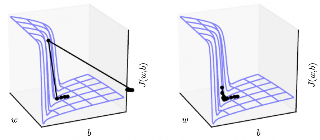
The figure below, cited from a deep learning text from MIT press textbook, is a good and straightforward explanation on gradient clipping.It is known that a strongly nonlinear function, such as error functions of RNN, can have very steep or plain areas. If you artificially visualize the idea in 3-dimensional space, as the surface of a loss function J with two variants w, b, that means the loss function J has plain areas and very steep cliffs like in the figure.Without gradient clipping, at the left side, you can see that the black dot all of a sudden climb the cliff and could jump to an unexpected area. But with gradient clipping, you avoid such “big jumps” on error functions.

Source: Source: Goodfellow and Yoshua Bengio and Aaron Courville, Deep Learning, (2016), MIT Press, 409p


I am glad that I have finally finished this article series. I am not sure how many of the readers would have read through all of the articles in this series, including my PowerPoint slides. I bet that is not so many. I spent a great deal of my time for making these contents, but sadly even when I was studying LSTM, it was becoming old-fashioned, at least in natural language processing (NLP) field: a very promising algorithm named Transformer has been replacing the position of LSTM. Deep learning is a very fast changing field. I also would like to make illustrative introductions on attention mechanism in NLP, from seq2seq model to Transformer. And I think LSTM would still remain as one of the algorithms in sequence data processing, such as hidden Hidden Markov model, or particle filter.


* I make study materials on machine learning, sponsored by DATANOMIQ. I do my best to make my content as straightforward but as precise as possible. I include all of my reference sources. If you notice any mistakes in my materials, including grammatical errors, please let me know (email: yasuto.tamura@datanomiq.de). And if you have any advice for making my materials more understandable to learners, I would appreciate hearing it.
Hypothesis Test for real problems

Hypothesis tests are significant for evaluating answers to questions concerning samples of data.

A statistical hypothesis is a belief made about a population parameter. This belief may or might not be right. In other words, hypothesis testing is a proper technique utilized by scientist to support or reject statistical hypotheses. The foremost ideal approach to decide if a statistical hypothesis is correct is examine the whole population.

Since that’s frequently impractical, we normally take a random sample from the population and inspect the equivalent. Within the event sample data set isn’t steady with the statistical hypothesis, the hypothesis is refused.

Types of hypothesis:

There are two sort of hypothesis and both the Null Hypothesis (Ho) and Alternative Hypothesis (Ha) must be totally mutually exclusive events.

• Null hypothesis is usually the hypothesis that the event wont’t happen.

• Alternative hypothesis is a hypothesis that the event will happen.

Why we need Hypothesis Testing?

Suppose a specific cosmetic producing company needs to launch a new Shampoo in the market. For this situation they will follow Hypothesis Testing all together decide the success of new product in the market.

Where likelihood of product being ineffective in market is undertaken as Null Hypothesis and likelihood of product being profitable is undertaken as Alternative Hypothesis. By following the process of Hypothesis testing they will foresee the accomplishment.

How to Calculate Hypothesis Testing?

  • State the two theories with the goal that just one can be correct, to such an extent that the two occasions are totally unrelated.
  • Now figure a study plan, that will lay out how the data will be assessed.
  • Now complete the plan and genuinely investigate the sample dataset.
  • Finally examine the outcome and either accept or reject the null hypothesis.

Another example

Assume, Person have gone after a typing job and he has expressed in the resume that his composing speed is 70 words per minute. The recruiter might need to test his case. On the off chance that he sees his case as adequate, he will enlist him in any case reject him. Thus, he types an example letter and found that his speed is 63 words a minute. Presently, he can settle on whether to employ him or not.  In the event that he meets all other qualification measures. This procedure delineates Hypothesis Testing in layman’s terms.

In statistical terms Hypothesis his typing speed is 70 words per minute is a hypothesis to be tested so-called null hypothesis. Clearly, the alternating hypothesis his composing speed isn’t 70 words per minute.

So, normal composing speed is population parameter and sample composing speed is sample statistics.

The conditions of accepting or rejecting his case is to be chosen by the selection representative. For instance, he may conclude that an error of 6 words is alright to him so he would acknowledge his claim between 64 to 76 words per minute. All things considered, sample speed 63 words per minute will close to reject his case. Furthermore, the choice will be he was producing a fake claim.

In any case, if the selection representative stretches out his acceptance region to positive/negative 7 words that is 63 to 77 words, he would be tolerating his case.

In this way, to finish up, Hypothesis Testing is a procedure to test claims about the population dependent on sample. It is a fascinating reasonable subject with a quite statistical jargon. You have to dive more to get familiar with the details.

Significance Level and Rejection Region for Hypothesis

Type I error probability is normally indicated by α and generally set to 0.05.  The value of α is recognized as the significance level.

The rejection region is the set of sample data that prompts the rejection of the null hypothesis.  The significance level, α, decides the size of the rejection region.  Sample results in the rejection region are labelled statistically significant at level of α .

The impact of differing α is that If α is small, for example, 0.01, the likelihood of a type I error is little, and a ton of sample evidence for the alternative hypothesis is needed before the null hypothesis can be dismissed. Though, when α is bigger, for example, 0.10, the rejection region is bigger, and it is simpler to dismiss the null hypothesis.

Significance from p-values

A subsequent methodology is to evade the utilization of a significance level and rather just report how significant the sample evidence is. This methodology is as of now more widespread.  It is accomplished by method of a p value. P value is gauge of power of the evidence against null hypothesis. It is the likelihood of getting the observed value of test statistic, or value with significantly more prominent proof against null hypothesis (Ho), if the null hypothesis of an investigation question is true. The less significant the p value, the more proof there is supportive of the alternative hypothesis. Sample evidence is measurably noteworthy at the α level just if the p value is less than α. They have an association for two tail tests. When utilizing a confidence interval to playout a two-tailed hypothesis test, reject the null hypothesis if and just if the hypothesized value doesn’t lie inside a confidence interval for the parameter.

Hypothesis Tests and Confidence Intervals

Hypothesis tests and confidence intervals are cut out of the same cloth. An event whose 95% confidence interval reject the hypothesis is an event for which p<0.05 under the relating hypothesis test, and the other way around. A p value is letting you know the greatest confidence interval that despite everything prohibits the hypothesis. As such, if p<0.03 against the null hypothesis, that implies that a 97% confidence interval does exclude the null hypothesis.

Hypothesis Tests for a Population Mean

We do a t test on the ground that the population mean is unknown. The general purpose is to contrast sample mean with some hypothetical population mean, to assess whether the watched the truth is such a great amount of unique in relation to the hypothesis that we can say with assurance that the hypothetical population mean isn’t, indeed, the real population mean.

Hypothesis Tests for a Population Proportion

At the point when you have two unique populations Z test facilitates you to choose if the proportion of certain features is the equivalent or not in the two populations. For instance, if the male proportion is equivalent between two nations.

Hypothesis Test for Equal Population Variances

F Test depends on F distribution and is utilized to think about the variance of the two impartial samples. This is additionally utilized with regards to investigation of variance for making a decision about the significance of more than two sample.

T test and F test are totally two unique things. T test is utilized to evaluate the population parameter, for example, population mean, and is likewise utilized for hypothesis testing for population mean. However, it must be utilized when we don’t know about population standard deviation. On the off chance that we know the population standard deviation, we will utilize Z test. We can likewise utilize T statistic to approximate population mean. T statistic is likewise utilised for discovering the distinction in two population mean with the assistance of sample means.

Z statistic or T statistic is utilized to assess population parameters such as population mean and population proportion. It is likewise used for testing hypothesis for population mean and population proportion. In contrast to Z statistic or T statistic, where we manage mean and proportion, Chi Square or F test is utilized for seeing if there is any variance inside the samples. F test is the proportion of fluctuation of two samples.

Conclusion

Hypothesis encourages us to make coherent determinations, the connection among variables, and gives the course to additionally investigate. Hypothesis for the most part results from speculation concerning studied behaviour, natural phenomenon, or proven theory. An honest hypothesis ought to be clear, detailed, and reliable with the data. In the wake of building up the hypothesis, the following stage is validating or testing the hypothesis. Testing of hypothesis includes the process that empowers to concur or differ with the expressed hypothesis.

Process Mining mit Celonis – Artikelserie

Der erste Artikel dieser Artikelserie Process Mining Tools beschäftigt sich mit dem Anbieter Celonis. Das 2011 in Deutschland gegründete Unternehmen ist trotz wachsender Anzahl an Wettbewerbern zum Zeitpunkt der Veröffentlichung dieses Artikels der eindeutige Marktführer im Bereich Process Mining.

Celonis Process Mining – Teil 1 der Artikelserie

Celonis Process Mining ist 2011 als reine On-Premise-Lösung gestartet und seit 2018 auch als Cloud-Lösuung zu haben. Übersicht zu den vier verschiedenen Produktversionen der Celonis Process Mining Lösungen:

Celonis Snap Celonis Enterprise Celonis Academic Celonis Consulting
Lizenz:  Kostenfrei Kostenpflichtige Lösungspakete Kostenfrei Consulting Lizenz on Demand
Zielgruppe:  Für kleine Unternehmen und Einzelanwender Für mittel- und große Unternehmen Für akademische Einrichtungen und Studenten Für Berater
Datenquellen: ServiceNow, CSV/XLS -Datei Beliebig (On-Premise- und Cloud – Anbindungen) ServiceNow, CSV/XLS/XES –Datei oder Demosysteme Beliebig (On-Premise- und Cloud – Anbindungen)
Datenvolumen: Limitiert auf 500 MB Event-Log-Daten Unlimitierte Datenmengen (Größte Installation 50 TB) Unlimitierte Datenmengen Unlimitierte Datenmengen (Größte Installation 30 TB
Architektur: Cloud & On-Premise Cloud & On-Premise Cloud & On-Premise Cloud & On-Premise

Dieser Artikel bezieht sich im weiteren Verlauf auf die Celonis Enterprise Version, wenn nicht anders gekennzeichnet. Spezifische Unterschiede unter den einzelnen Produkten und weitere Informationen können auf der Website von Celonis entnommen werden.

Bedienbarkeit und Anpassungsfähigkeit der Analysen

In Sachen Bedienbarkeit punktet Celonis mit einem sehr übersichtlichen und einsteigerfreundlichem Userinterface. Jeder der mit BI-Tools wir z.B. „Power-BI“ oder „Tableau“ gearbeitet hat, wird sich wahrscheinlich schnell zurechtfinden.

Userinterface Celonis

Abbildung 1: Userinterface von Celonis. Über die Reiter kann direkt von der Analyse (Process Analytics) zu den ETL-Prozessen (Event Collection) gewechselt werden.

Das Erstellen von Analysen funktioniert intuitiv und schnell, auch weil die einzelnen Komponentenbausteine lediglich per drag & drop platziert und mit den gewünschten Dimensionen und KPI’s bestückt werden müssen.

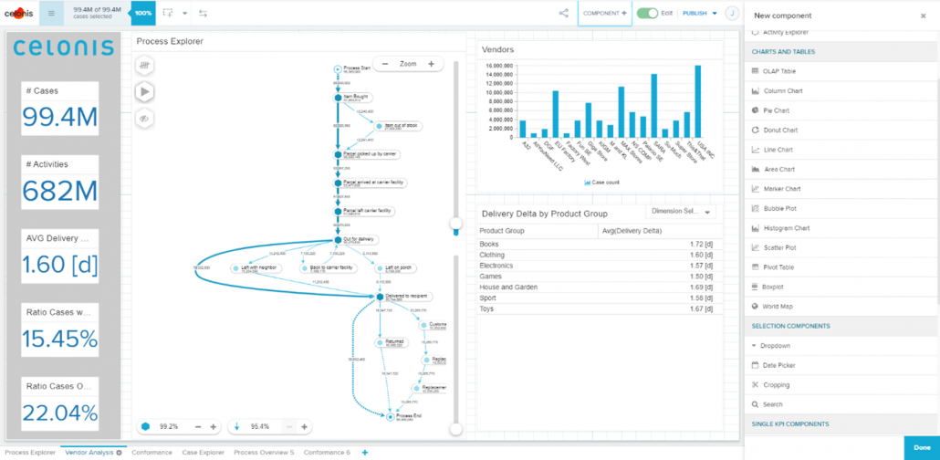
Process Analytics im Process Explorer

Abbildung 2: Typische Analyse im Edit Modus. Neue Komponenten können aus dem Reiter (rechts im Bild) mittels drag & drop auf der Dashboard Bearbeitungsfläche platziert werden.

Darüber hinaus bietet Celonis mit seinem kostenlosen Programm „Celonis Acadamy“ einen umfangreichen und leicht verständlichen Pool an Trainingseinheiten für die verschiedenen User-Rollen: „Snap“, „Executive“, „Business User“, „Analyst“ und „Data Engineer“. Einsteiger finden sich nach der Absolvierung der Grundkurse etwa nach vier Stunden in dem Tool zurecht.

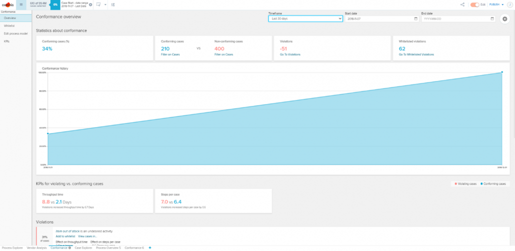
Conformance Analyse In Celonis

Abbildung 3: Conformance Analyse In Celonis. Es kann direkt analysiert werden, welche Art von Verstößen welche Auswirkungen haben und mit welcher Häufigkeit diese auftreten.

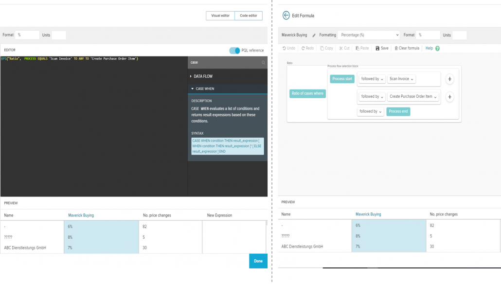
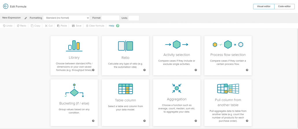
Die Definition von eigenen KPIs erfolgt mittels übersichtlichem Code Editor. Die verwendete proprietäre und patentierte Programmiersprache lautet PQL (Process Query Language) , dessen Syntax stark an SQL angelehnt ist und alle prozessrelevanten Berechnungen ermöglicht. Noch einsteigerfreundlicher ist der Visual Editor, in welchem KPIs alternativ mit zahlreicher visueller Unterstützung und über 130 mathematischen Operatoren erstellt werden können – ganz ohne Coding Erfahrung.
Mit Hilfe von über 30 Komponenten lassen sich alle üblichen Charts und Grafiken erstellen. Ich hatte das Gefühl, dass die Auswahl grundsätzlich ausreicht und dem Erkenntnisgewinn nicht im Weg steht. Dieses Gefühl rührt nicht zuletzt daher, dass die vorgefertigten Features, wie zum Beispiel „Conformance“ direkt und ohne Aufwand implementiert werden können und bemerkenswerte Erkenntnisse liefern. Kurzum: Ja es ist vieles vorgefertigt, aber hier wurde mit hohen Qualitätsansprüchen vorgefertigt!

Celonis Code Editor vs Visual Editor

Abbildung 4: Coder Editor (links) und Visual Editor (rechts). Während im Code Editor mit PQL geschrieben werden muss, können Einsteiger im Visual Editor visuelle Hilfestellungen nehmen, um KPIs zu definieren.

Diese Flexibilität erscheint groß und bedient mehrere Zielgruppen, beginnend bei den Einsteigern. Insbesondere da das Verständnis für den Code Editor und somit für PQL durch die Arbeit mit dem Visual Code Editor gefördert wird. Wer SQL-Kenntnisse mitbringt, wird sehr schnell ohne Probleme KPIs im Code Editor definieren können. Erfahrenen Data Engineers stünde es dennoch frei, die Entwicklungsarbeit auf die Datenbankebene zu verschieben.

Celonis Visual Editor

Abbildung 5: Mit Hilfe zahlreicher Möglichkeiten können Einsteiger im Visual Editor visuelle Hilfestellungen nehmen, um individuelle KPIs zu definieren.

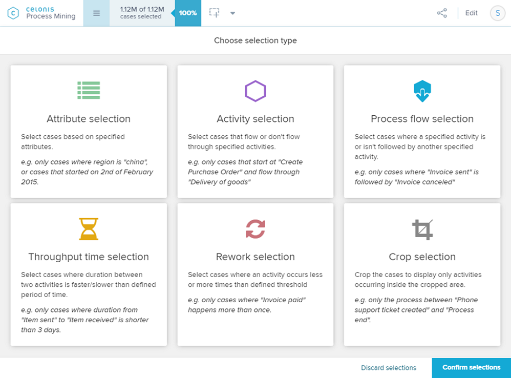
Nachdem die ersten Analysen erstellt wurden, steht der Prozessanalyse nichts mehr im Wege. Während sich per Knopfdruck auf alle visualisierten Datenpunkte filtern lässt, unterstützt auch hier Celonis zusätzlich mit zahlreichen sogenannten ‘Auswahlansichten’, um die Entdeckung unerwünschter oder betrügerischer Prozesse so einfach wie das Googeln zu machen.

Predefined dashboard apps

Abbildung 6: Die anwenderfreundlichen Auswahlarten ermöglichen es dem Benutzer, einfach mit wenigen Klicks nach Unregelmäßigkeiten oder Mustern in Transaktionen zu suchen und diese eingehend zu analysieren.

Integrationsfähigkeit

Die Celonis Enterprise Version ist sowohl als Cloud- und On-Premise-Lösung verfügbar. Die Cloud-Lösung bietet die folgenden Vorteile: Zum einen zusätzliche Leistungen wieCloud Connectoren, einer sogenannten Action Engine die jeden einzelnen Mitarbeiter in einem Unternehmen mit datengetriebenen nächstbesten Handlungen unterstützt, intelligenter Process Automation, Machine Learning und AI, einen App Store sowie verschiedene Boards. Diese Erweiterungen zeigen deutlich den Anspruch des Münchner Process Mining Vendors auf, neben der reinen Prozessanalyse Unternehmen beim heben der identifizierten Potentiale tatkräftig zu unterstützen. Darüber hinaus kann die Cloud-Lösung punkten mit, einer schnellen Amortisierung, bedarfsgerechter Skalierbarkeit der Kapazitäten sowie einen noch stärkeren Fokus auf Security & Compliance. Darüber hinaus  erfolgen regelmäßig Updates.

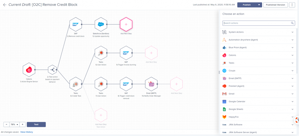
Celonis Process Automation

Abbildung 7: Celonis Process Automation ermöglicht Unternehmen ihre Prozesse auf intelligente Art und Weise so zu automatisieren, dass die Zielerreichung der jeweiligen Fachabteilung im Fokus stehen. Auch hier trumpft Celonis mit über 30+ vorgefertigten Möglichkeiten von der Automatisierung von Kommunikation, über Backend Automatisierung in Quellsystemen bis hin zu Einbindung von RPA Bots und vielem mehr.

Der Schwenk von Celonis scheint in Richtung Cloud zu sein und es bleibt abzuwarten, wie die On-Premise-Lösung zukünftig aussehen wird und ob sie noch angeboten wird. Je nach Ausgangssituation gilt es hier abzuwägen, welche der beiden Lösungen die meisten Vorteile bietet. In jedem Fall wird Celonis als browserbasierte Webanwendung für den Endanwender zur Verfügung gestellt. Die folgende Abbildung zeigt eine beispielhafte Celonis on-Premise-Architektur, bei welcher der User über den Webbrowser Zugang erhält.

Celonis bringt eine ausreichende Anzahl an vordefinierten Datenschnittstellen mit, wodurch sowohl gängige on-Premise Datenbanken / ERP-Systeme als auch Cloud-Dienste, wie z. B. „ServiceNow“ oder „Salesforce“ verbunden werden können. Im „App Store“ können zusätzlich sogenannte „prebuild Process-Connectors“ kostenlos erworben werden. Diese erstellen die Verbindung und erzeugen das Datenmodell (Extract and Transform) für einen Standard Prozess automatisch, so dass mit der Analyse direkt begonnen werden kann. Über 500 vordefinierte Analysen für Standard Prozesse gibt es zusätzlich im App Store. Dadurch kann die Bearbeitungszeit für ein Process-Mining Projekt erheblich verkürzt werden, vorausgesetzt das benötigte Datenmodel weicht im Kern nicht zu sehr von dem vordefinierten Model ab. Sollten Schnittstellen mal nicht vorhanden sein, können Daten auch als CSV oder XLS Format importiert werden.

Celonis App Store

Abbildung 8: Der Celonis App Store beinhaltet über 100 Prozesskonnektoren, über 500 vorgefertigte Analysen und über 80 Action Engine Fähigkeiten die kostenlos mit der Cloud Lizenz zur Verfügung stehen

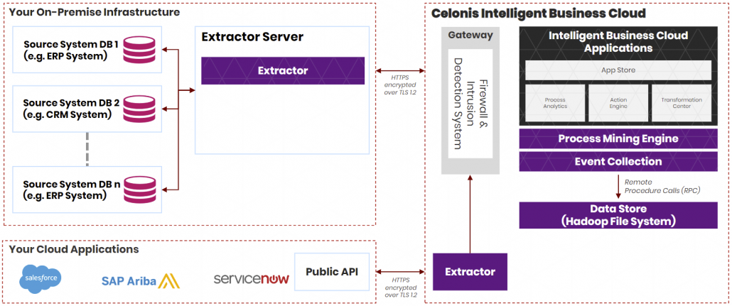
Auch wenn von einer 100%-Cloud gesprochen wird, muss für die Anbindung von unternehmensinternen on-premise Datenquellen (z. B. lokale Instanzen von SAP ERP, Oracle ERP, MS Dynamics ERP) ein sogenannter Extractor on-premise installiert werden.

Celonis Extractors

Abbildung 9: Celonis Extractor muss für die Anbindung von On-Premise Datenquellen ebenfalls On-Premise installiert werden. Dieser arbeitet wie ein Gateway zur Celonis Intelligent Business Cloud (IBC). Die IBC enthält zudem einen eigenen Extratctor für die Anbindung von Daten aus anderen Cloud-Systemen.

Celonis bietet in der Enterprise-Ausführung zudem ein umfassendes Benutzer-Berechtigungsmanagement, so dass beispielsweise für Analysen im Einkauf die Berechtigungen zwischen dem Einkaufsleiter, Einkäufern und Praktikanten im Einkauf unterschieden werden können. Auch dieser Punkt ist für viele Unternehmen eine Grundvoraussetzung für einen eventuellen unternehmensweiten Roll-Out.

Skalierbarkeit

In Punkto großen Datenmengen kann Celonis sich sehen lassen. Allein für „Uber“ verarbeitet die Cloud rund 50 Millionen Datensätze, wobei ein einzelner mehrere Terabyte (TB) groß sein kann. Der größte einzelne Datenblock, den Celonis analysiert, beträgt wohl etwas über 50 TB. Celonis bietet somit Process Mining, zeitgerecht im Bereich Big Data an und kann daher auch viele große renommierten Unternehmen zu seinen Kunden zählen, wie zum Beispiel Siemens, ABB oder BMW. Doch wie erweiterbar und flexibel sind die erstellten Datenmodelle? An diesem Punkt konnte ich keine Schwierigkeiten feststellen. Celonis bietet ein übersichtlich gestaltetes Userinterface, welches das Datenmodell mit seinen Tabellen und Beziehungen sauber darstellt. Modelliert wird mit SQL-Befehlen, wodurch eine zusätzliche Abfragesprache entfällt. Der von Celonis gewählte SQL-Dialekt ist Vertica. Dieser ist keineswegs begrenzt und bietet die ausreichende Tiefe, welche an dieser Stelle benötigt wird. Die Erweiterbarkeit sowie die Flexibilität der Datenmodelle wird somit ausschließlich von der Arbeit des Data Engineer bestimmt und in keiner Weise durch Celonis selbst eingeschränkt. Durch das Zurückgreifen auf die Abfragesprache SQL, kann bei der Modellierung auf eine sehr breite Community zurückgegriffen werden. Darüber hinaus können bestehende SQL-Skripte eingefügt und leicht angepasst werden. Und auch die Suche nach einem geeigneten Data Engineer gestaltet sich dadurch praktisch, da SQL eine der meistbeherrschten Abfragesprachen ist.

Zukunftsfähigkeit

Machine Learning umfasst Data Mining und Predictive Analytics und findet vermehrt den Einzug ins Process Mining. Auch ist es längst ein wesentlicher Bestandteil von Celonis. So basiert z. B. das Feature „Conformance“ auf Machine Learning Algorithmen, welche zu den identifizierten Prozessabweichungen den Einfluss auf das Geschäft berechnen. Aber auch Lösungen zu den Identifizierten Problemen werden von Verfahren des maschinellen Lernens dem Benutzer vorgeschlagen. Was zusätzlich in Sachen Machine Learning von Celonis noch bereitgestellt wird, ist die sogenannte Machine-Learning-Workbench, welche in die Intelligent Business Cloud integriert ist. Hier können eigene Anwendungen mit Machine Learning auf Basis der Event-Log Daten entwickelt und eingesetzt werden, um z. B. Vorhersagen zu Lieferzeiten treffen zu können.

Task Mining ist einer der nächsten Schritte im Bereich Process Mining, der den Detailgrad für Analysen von Prozessen bis hin zu einzelnen Aufgaben auf Mausklick-Ebene erhöht. Im Oktober 2019 hatte Celonis bereits angekündigt, dass die Intelligent Business Cloud um eben diese neue Technik der Datenerhebung und -analyse erweitert wird. Die beiden Methoden Prozess Analyse und Task Mining ergänzen sich ausgezeichnet. Stelle ich in der Prozess Analyse fest, dass sich eine bestimmte Aktivität besonders negativ auf meine gewünschte Performance auswirkt (z. B. Zeit), können mit Task Mining diese Aktivität genauer untersuchen und die möglichen Gründe sehr granular betrachten. So kann ich evtl. feststellen das Mitarbeiter bei einer bestimmten Art von Anfrage sehr viel Zeit in Salesforce verbringen, um Informationen zu sammeln. Hier liegt also viel Potential versteckt, um den gesamten Prozess zu verbessern. In dem z.B. die Informationsbeschaffung erleichtert wird oder evtl. der Anfragetyp optimiert wird, kann dieses Potential genutzt werden. Auch ist Task Mining die ideale Grundlage zur Formulierung von RPA-Lösungen.

Ebenfalls entscheidend für die Zukunftsfähigkeit von Process Mining ist die Möglichkeit, Verknüpfungen zwischen unterschiedlichen Geschäftsprozesse zu erkennen. Häufig sind diese untrennbar miteinander verbunden und der Output eines Prozesses bildet den Input für einen anderen. Mit prozessübergreifenden Multi-Event Logs bietet Celonis die Möglichkeit, genau diese Verbindungen aufzuzeigen. So entsteht ein einheitliches Prozessmodell für das gesamte Unternehmen. Und das unter bestimmten Voraussetzungen auch in nahezu Echtzeit.

Werden die ersten Entwicklungen im Bereich Machine Learning und Task Mining von Celonis weiter ausgebaut, ist Celonis weiterhin auf einem zukunftssicheren Weg. Unternehmen, die vor allem viel Wert auf Enterprise-Readiness und eine intensive Weiterentwicklung legen, dürften mit Celonis auf der sicheren Seite sein.

Preisgestaltung

Die Preisgestaltung der Enterprise Version wird von Celonis nicht transparent kommuniziert. Angeboten werden verschiedene kostenpflichtige Lösungspakete, welche sich aus den Anforderungen eines Projektes ergeben.  Generell stufe ich die Celonis Enterprise Version als Premium Produkt ein. Dies liegt auch daran, weil die Basisausführung der Celonis Enterprise Version bereits sehr umfänglich ist und neben der Software Subscription standardmäßig auch mit Wartung und Support kommt. Zusätzlich steckt mittlerweile sehr viel Entwicklungsarbeit in der Celonis Process Mining Plattform, welche weit über klassische Process Discovery Solutions hinausgeht.  Für kleinere Unternehmen mit begrenztem Budget gibt es daher zwischen der kostenfreien Snap Version und den Basis Paketen der Enterprise Version oft keine Interimslösung.

Fazit

Insgesamt stellt Celonis ein unabhängiges und leistungsstarkes Process Mining Tool in der Cloud bereit. Gehört die Cloud zur Unternehmensstrategie, ist man bei Celonis an der richtigen Adresse. Die „prebuild Process-Connectors“ und die vordefinierten Analysen können ein Process Mining Projekt signifikant beschleunigen und somit die Time-to-Value lukrativ verkürzen. Die Analyse Tools sind leicht bedienbar und schaffen dank integrierter Machine Learning Algorithmen Optimierungspotentiale. Positiv ist auch zu bewerten, dass Celonis ohne speziellen Syntax auskommt und mittelmäßige SQL-Fähigkeiten somit völlig ausreichend sind, um Prozessanalysen vollumfänglich durchzuführen. Diesen vielen positiven Aspekten steht eigentlich nur die hohe Preisgestaltung für die Enterprise Version gegenüber. Ob diese im Einzelfall gerechtfertigt ist, sollte situationsabhängig evaluiert werden. Sicherlich richtet sich Celonis Enterprise in erster Linie an größere Unternehmen, welche komplexe Prozesse mit hohen Datenvolumina analysieren möchte.  Mit Celonis-Snap können jedoch auch kleine Unternehmen und Start-ups einen begrenzten Einblick in dieses gut gelungene Process Mining Tool erhalten.

Data Science – A Beautiful Data Driven Journey

Data Science is a profession related to processing algorithms and extracting deep insights from raw data. It depicts the importance of data and how it can be used in business and to make IT strategies. For recognizing the new ventures available in the market, identifying the patterns and to make better business decisions, data science is of utmost significance.  It is the duty of data scientists to convert raw data into relevant business information. They hold a center stage in developing the data products by carrying out experiments, analyzing them by using scientific methods and using their skill set. Spotting the growing trends and capitalizing on it before the competition to gain advantage.

TRAITS REQUIRED FOR DATA SCIENCE:

Data Scientists are not born intellectuals; they continuously work to gain all the skills expected by the companies as the demand surpasses the supply of applicants. Here are a few skills of data scientists:

  • Curiosity and Intuition to identify the hidden meaning of data and able to visualize.
  • Need to have leadership skills and have a business savvy mind to identify risks and opportunities.
  • A bachelor’s degree in math, IT, statistics along with a letter of recommendation which will help in knowing your acquired range of knowledge.
  • Specialized skills in machine learning, clustering and segmentation, exploration of data, Statistical research which helps in finances and increasing the profits of companies including modeling.
  • Familiarity and strong hold with programming languages such as hadoop, python, perl, R, etc.

BENEFITS OF DATA SCIENCE:

There are many advantages depending on the aim and interest of the company. Sales and Marketing departments, for example collect information from a particular industry and determine which products interest the customer the most and recommend for their production, be it online shopping goods, some online series or which shipment companies are best. They also help in detection of bank fraud. Data Science currently is a raging industry with well paid professionals. The amount of knowledge acquired through this course makes it a bonus for a better and lucrative career.

APPLICATIONS OF DATA SCIENCE:

Data Science has become a significant field in almost all sectors ranging from healthcare, internet searches, e-commerce sites, cell phones by increasing the features. By making use of statistical measures they predict the future events and try to avoid them by giving optimal solutions. Speech recognition has made it easy to search information or do stuff without typing the best eg being google voice, siri. learn data science training in hyderabad

ROLES OF DATA SCIENTIST IN THE INDUSTRY:

This course is a boon for aspirants who wish to build a career in: Data Science, Machine Learning, Data Visualization, Business Intelligence, Big data, etc. This course is a combination of knowledge and money providing both these aspects in abundant measure. There are many boot camps and courses that provide certifications and provide you with the skills. A data scientist must have enough business domain expertise to analyze the risks, profits and achieve the department goals.

RESOURCE BOX:

Data Science is an amazing course enriching your education bank..If you are thinking how to learn data science then some of the best online data science courses are available to give a start to your incredible journey filled with incredible knowledge learning experience.

Click here for more about the data science course in Bangalore.

How Data Science Can Benefit Nonprofits

Image Source: https://pixabay.com/vectors/pixel-cells-pixel-creative-commons-3704068/

Data science is the poster child of the 21st century and for good reason. Data-based decisions have streamlined, automated, and made businesses more efficient than ever before, and there are practically no industries that haven’t recognized its immense potential. But when you think of data science application, sectors like marketing, finance, technology, SMEs, and even education are the first that come to mind. There’s one more sector that’s proving to be an untapped market for data—the social sector. At first, one might question why non-profit organizations even need complex data applications, but that’s just it—they don’t. What they really need is data tools that are simple and reliable, because if anything, accountability is the most important component of the way non-profits run.

Challenges for Non-profits and Data Science

If you’re wondering why many non-profits haven’t already hopped onto the data bandwagon, its because in most cases they lack one big thing—quality data.

One reason is that effective data application requires clean data, and heaps of it, something non-profits struggle with. Most don’t sell products or services, and their success is reliant on broad, long-term (sometimes decades) results and changes, which means their outcomes are highly unmeasurable. Metrics and data seem out of place when appealing to donors, who are persuaded more by emotional campaigns. Data collection is also rare, perhaps only being recorded when someone signs up to the program or leaves, and hardly any tracking in between. The result is data that’s too little and unreliable to make effective change.

Perhaps the most important phase, data collection relies heavily on accurate and organized processes. For non-profits that don’t have the resources for accurate and manual record-keeping, clean, and quality data collection is a huge pain point. However, that is an issue now easily avoidable. For instance, avoiding duplicate files, adopting record-keeping methods like off-site and cloud storage, digital retention, and of course back-up plans—are all processes that could save non-profits time, effort, and risk. On the other hand, poor record management has its consequences, namely on things like fund allocation, payroll, budgeting, and taxes. It could lead to financial risk, legal trouble, and data loss — all added worries for already under-resourced non-profit organizations.

But now, as non-governmental organizations (NGOs) and non-profits catch up and invest more in data collection processes, there’s room for data science to make its impact. A growing global movement, ‘Data For Good’ represents individuals, companies, and organizations volunteering to create or use data to help further social causes ad support non-profit organizations. This ‘Data For Good’ movement includes tools for data work that are donated or subsidized, as well as educational programs that serve marginalized communities. As the movement gains momentum, non-profits are seeing data seep into their structures and turn processes around.

How Can Data Do Social Good?

With data science set to take the non-profit sector by storm, let’s look at some of the ways data can do social good:

  1. Improving communication with donors: Knowing when to reach out to your donors is key. In between a meeting? You’re unlikely to see much enthusiasm. Once they’re at home with their families? You may see wonderful results, as pointed out in this Forbes article. The article opines that data can help non-profits understand and communicate with their donors better.
  2. Donor targetting: Cold calls are a hit and miss, and with data on their side, non-profits can discover and define their ideal donor and adapt their messaging to reach out to them for better results.
  3. Improving cost efficiency: Costs are a major priority for non-profits and every penny counts. Data can help decrease costs and streamline financial planning
  4. Increasing new member sign-ups and renewals: Through data, non-profits can reach out to the right people they want on-board, strengthen recruitment processes and keep track of volunteers reaching out to them for future events or recruitment drives.
  5. Modeling and forecasting performance: With predictive modeling tools, non-profits can make data-based decisions on where they should allocate time and money for the future, rather than go on gut instinct.
  6. Measuring return on investment: For a long time, the outcomes of social campaigns have been perceived as intangible and immeasurable—it’s hard to measure empowerment or change. With data, non-profits can measure everything from the amount a fundraiser raised against a goal, the cost of every lead in a lead generation campaign, etc
  7. Streamlining operations: Finally, non-profits can use data tools to streamline their business processes internally and invest their efforts into resources that need it.

It’s true, measuring good and having social change down to a science is a long way off — but data application is a leap forward into a more efficient future for the social sector. With mission-aligned processes, data-driven non-profits can realize their potential, redirect their focus from trivial tasks, and onto the bigger picture to drive true change.