Tag Archive for: Geo Analytics

Coffee Shop Location Predictor

As part of this article, we will explore the main steps involved in predicting the best location for a coffee shop in Vancouver. We will also take into consideration that the coffee shop is near a transit station, and has no Starbucks near it. Well, while at it, let us also add an extra feature where we make sure the crime in the area is lower.

Introduction

In this article, we will highlight the main steps involved to predict a location for a coffee shop in Vancouver. We also want to make sure that the coffee shop is near a transit station, and has no Starbucks near it. As an added feature, we will make sure that the crime concentration in the area is low, and the entire program should be implemented in Python. So let’s walk through the steps.

Steps Required

  • Get crime history for the last two years
  • Get locations of all transit stations and Starbucks in Vancouver
  • Check all the transit stations that do not have any Starbucks near them
  • Get all the data regarding crimes near the filtered transit stations
  • Create a grid of all possible coordinates around the transit station
  • Check crime around each created coordinate and display the top 5 locations.

Gathering Data

This covers the first two steps required to get data from the internet, both manually and automatically.

Getting all Crime History

We can get crime history for the past 14 years in Vancouver from here. This data is in raw crime.csv format, so we have to process it and filter out useless data. We then write this processed information on the crime_processed.csv file.

Note: There are 530,653 records of crime in this file

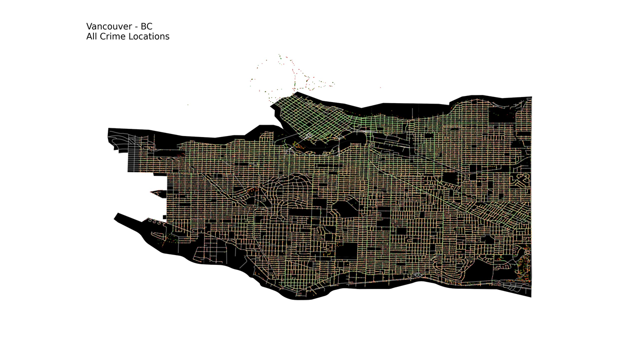
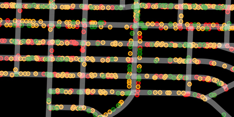
In this program, we will just use the type and coordinate of the crime. There are many crime types, but we have classified them into three major categories namely;

Theft (red), Break and Enter (orange) and Mischief (green)

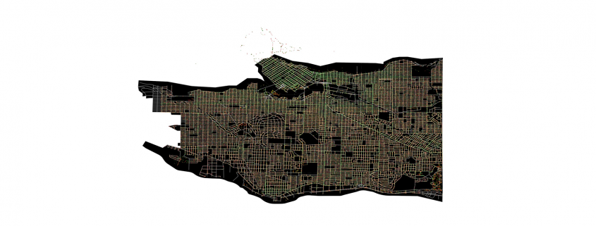
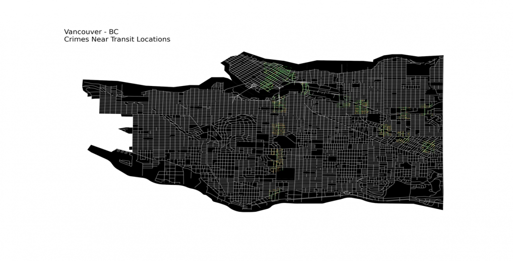
These all crimes can be plotted on Graph as displayed below.

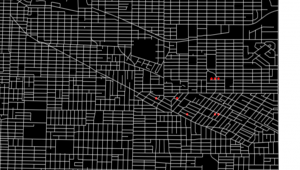
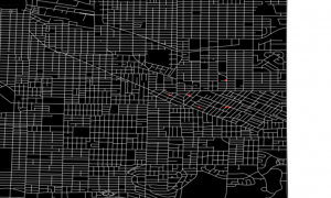
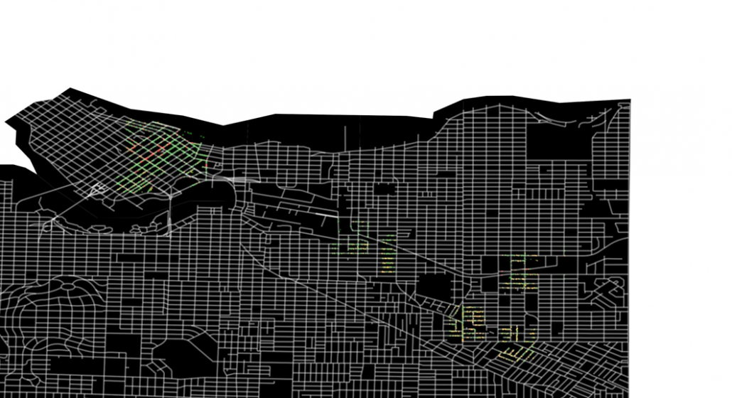
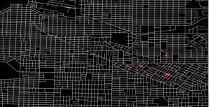
This may seem very congested and full, so let’s see a closeup image for future references.

Getting Locations of all Rapid Transit Stations

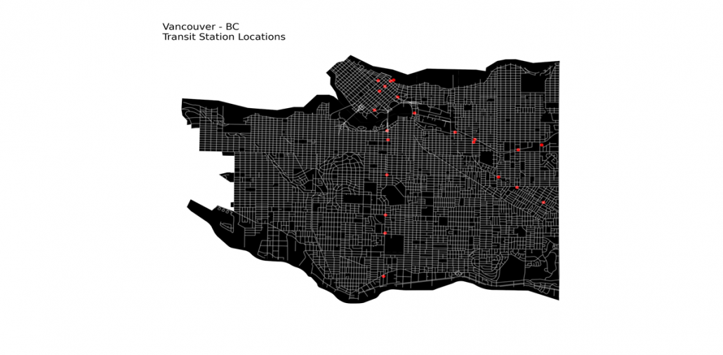
We can get the coordinates of all Transit Stations in Vancouver from here. This dataset has all coordinates of rapid transit stations in three transit lines in Vancouver. There are a total of 23 of them in Vancouver, we can then use it for further processing.

Getting Locations of all Starbucks

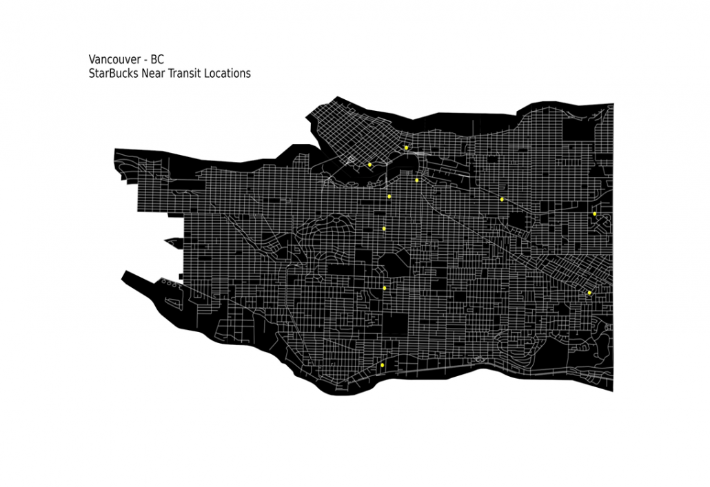
The Starbucks data is present here, we can scrape it easily and get the locations of all the Starbucks in Vancouver. We just need the Starbucks that is near transit stations, so we’ll filter out the rest. There are a total 24 Starbucks in Vancouver, and 10 of them are near Transit Stations.

Note: Other than the coordinates of Transit Stations and Starbucks, we also need coordinates and type of the crime.

Transit Stations with no Starbucks

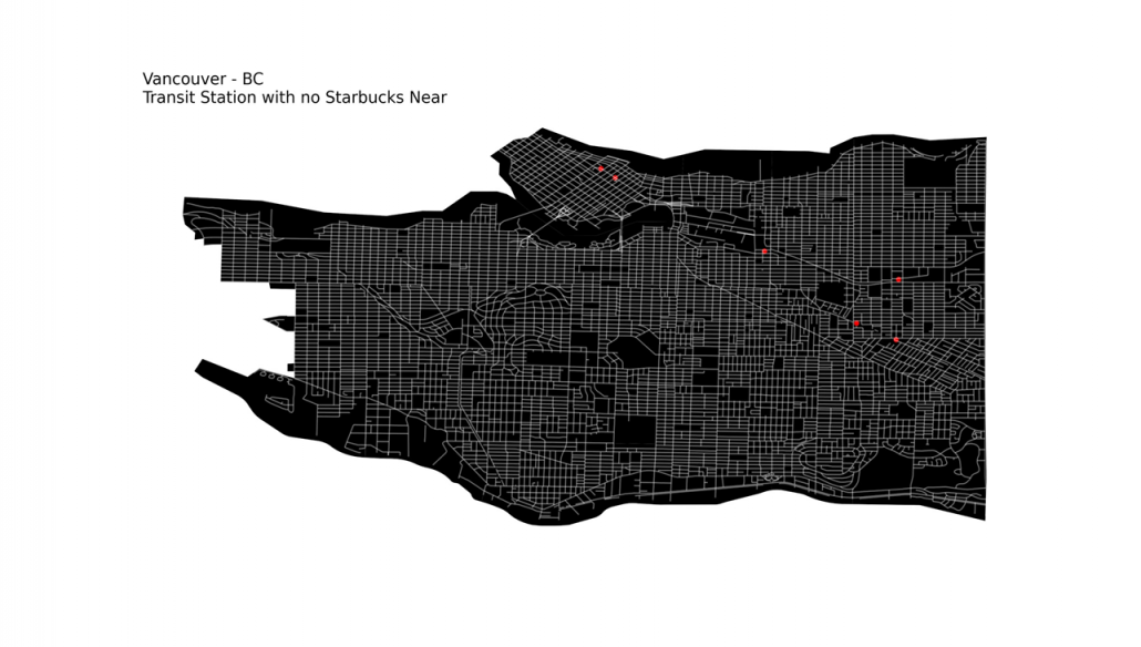
As we have all the data required, now moving to the next step. We need to get to the transit Station locations that have no Starbucks near them. For that we can create an area of particular radius around each Transit Station. Then check all Starbucks locations with respect to them, whether they are within that area or not.

If none of the Starbucks are within that particular Transit Station’s area, we can append it to a list. At the end, we have a list of all Transit locations with no Starbucks near them. There are a total of 6 Transit Stations with no Starbucks near them.

Crime near Transit Stations

Now lets filter out all crime records and get just what we are interested in, which means the crime near Transit stations. For that we will plot an area of specific radius around each of them to see the crimes. These are more than 110,000 crime records.

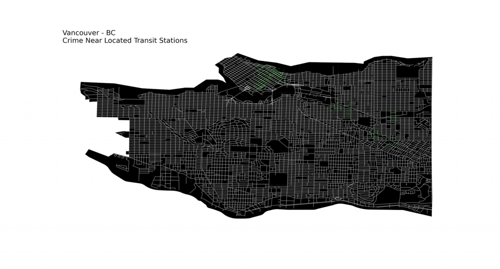
Crime near located Transit Stations

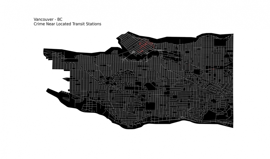
Now that we have all the Transit Stations that don’t have any Starbucks near them and also the crime near all Transit Stations. So, let’s use this information and get crime near the located Transit Stations. These are about 44,000 crime records.

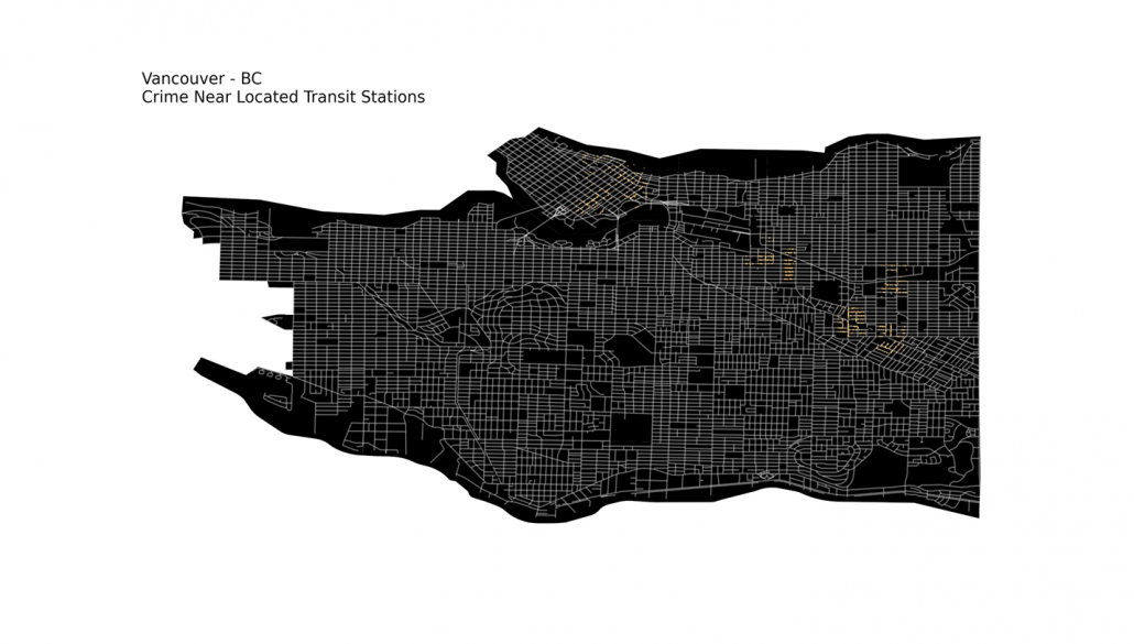
This may seem correct at first glance, but the points are overlapping due to abundance, so we can create different lists of crimes based on their types.

Theft

Break and Enter

Mischief

Generating all possible coordinates

Now finally, we have all the prerequisites and let’s get to the main task at hand, predicting the best coordinate for the coffee shop.

There may be many approaches to solve this problem, but the one I used in this program is that I will create a grid of all possible locations (coordinates) in the area of 1 km radius around each located transit station.

Initially I generated 1 coordinate for every m, this resulted in 1000,000 coordinates in every km. This is a huge number, and for the 6 located Transit stations, it becomes 6 Million. It may not seem much at first glance because computers can handle such data in a few seconds.

But for location prediction we need to compare each coordinate with crime coordinates. As the algorithm has to check for ~7,000 Thefts, ~19,000 Break ins, and ~17,000 Mischiefs around each generated coordinate. Computing this would want the program to process an estimate of 432.4 Billion times. This sort of execution takes many hours on normal computers (sometimes days).

The solution to this is to create a coordinate for each 10 m area, this results about 10,000 coordinate per km. For the above mentioned number of crimes, the estimated processes will be several Billions. That would significantly reduce the time, but is still not less.

To control this, we can remove the duplicate values in crime coordinates and those which are too close to each other ~1m. Doing so, we are left with just 816 Thefts, 2,654 Break ins, and 8,234 Mischiefs around each generated coordinate.
The precision will not be affected much but the time and computational resources required will be reduced a lot.


Checking Crime near Generated coordinates

Now that we have all the locations, we will start some processing on it and check each coordinate against some constraints. That are respectively;

  1. Filter out Coordinates having Theft near 1 km
    We get 122,000 coordinates with no Thefts (Below merged 1000 to 1)
  2. Filter out Coordinates having Break Ins near 200m
    We get 8000 coordinates with no Thefts (Below merged 1000 to 1)
  3. Filter out Coordinates having Mischief near 200m
    We get 6000 coordinates with no Thefts (Below merged 1000 to 1)
    Now that we have 6 Coordinates of best locations that have passed through all the constraints, we will order them.To order them, we will check their distance from the nearest transit location. The nearest will be on top of the list as the best possible location, then the second and so on. The generated List is;

    1. -123.0419406741792, 49.24824259252004
    2. -123.05887151659479, 49.24327221040713
    3. -123.05287151659476, 49.24327221040713
    4. -123.04994067417924, 49.239242592520064
    5. -123.0419406741792, 49.239242592520064
    6. -123.0409406741792, 49.239242592520064

How can MindTrades help?

MindTrades Consulting Services, a leading marketing agency provides in-depth analysis and insights for the global IT sector including leading data integration brands such as Diyotta. From Cloud Migration, Big Data, Digital Transformation, Agile Deliver, Cyber Security, to Analytics- Mind trades provides published breakthrough ideas, and prompt content delivery. For more information, refer to mindtrades.com.

Code

https://github.com/Mindtrades-Consulting/Coffee-Shop-Location-Predictor


Erstellen und benutzen einer Geodatenbank

In diesem Artikel soll es im Gegensatz zum vorherigen Artikel Alles über Geodaten weniger darum gehen, was man denn alles mit Geodaten machen kann, dafür aber mehr darum wie man dies anstellt. Es wird gezeigt, wie man aus dem öffentlich verfügbaren Datensatz des OpenStreetMap-Projekts eine Geodatenbank erstellt und einige Beispiele dafür gegeben, wie man diese abfragen und benutzen kann.

Wahl der Datenbank

Prinzipiell gibt es zwei große “geo-kompatible” OpenSource-Datenbanken bzw. “Datenbank-AddOn’s”: Spatialite, welches auf SQLite aufbaut, und PostGIS, das PostgreSQL verwendet.

PostGIS bietet zum Teil eine einfachere Syntax, welche manchmal weniger Tipparbeit verursacht. So kann man zum Beispiel um die Entfernung zwischen zwei Orten zu ermitteln einfach schreiben:

während dies in Spatialite “nur” mit einer normalen Funktion möglich ist:

Trotztdem wird in diesem Artikel Spatialite (also SQLite) verwendet, da dessen Einrichtung deutlich einfacher ist (schließlich sollen interessierte sich alle Ergebnisse des Artikels problemlos nachbauen können, ohne hierfür einen eigenen Datenbankserver aufsetzen zu müssen).

Der Hauptunterschied zwischen PostgreSQL und SQLite (eigentlich der Unterschied zwischen SQLite und den meissten anderen Datenbanken) ist, dass für PostgreSQL im Hintergrund ein Server laufen muss, an welchen die entsprechenden Queries gesendet werden, während SQLite ein “normales” Programm (also kein Client-Server-System) ist welches die Queries selber auswertet.

Hierdurch fällt beim Aufsetzen der Datenbank eine ganze Menge an Konfigurationsarbeit weg: Welche Benutzer gibt es bzw. akzeptiert der Server? Welcher Benutzer bekommt welche Rechte? Über welche Verbindung wird auf den Server zugegriffen? Wie wird die Sicherheit dieser Verbindung sichergestellt? …

Während all dies bei SQLite (und damit auch Spatialite) wegfällt und die Einrichtung der Datenbank eigentlich nur “installieren und fertig” ist, muss auf der anderen Seite aber auch gesagt werden dass SQLite nicht gut für Szenarien geeignet ist, in welchen viele Benutzer gleichzeitig (insbesondere schreibenden) Zugriff auf die Datenbank benötigen.

Benötigte Software und ein Beispieldatensatz

Was wird für diesen Artikel an Software benötigt?

SQLite3 als Datenbank

libspatialite als “Geoplugin” für SQLite

spatialite-tools zum erstellen der Datenbank aus dem OpenStreetMaps (*.osm.pbf) Format

python3, die beiden GeoModule spatialite, folium und cartopy, sowie die Module pandas und matplotlib (letztere gehören im Bereich der Datenauswertung mit Python sowieso zum Standart). Für pandas gibt es noch die Erweiterung geopandas sowie eine praktisch unüberschaubare Anzahl weiterer geographischer Module aber bereits mit den genannten lassen sich eine Menge interessanter Dinge herausfinden.

– und natürlich einen Geodatensatz: Zum Beispiel sind aus dem OpenStreetMap-Projekt extrahierte Datensätze hier zu finden.

Es ist ratsam, sich hier erst einmal einen kleinen Datensatz herunterzuladen (wie zum Beispiel einen der Stadtstaaten Bremen, Hamburg oder Berlin). Zum einen dauert die Konvertierung des .osm.pbf-Formats in eine Spatialite-Datenbank bei größeren Datensätzen unter Umständen sehr lange, zum anderen ist die fertige Datenbank um ein vielfaches größer als die stark gepackte Originaldatei (für “nur” Deutschland ist die fertige Datenbank bereits ca. 30 GB groß und man lässt die Konvertierung (zumindest am eigenen Laptop) am besten über Nacht laufen – willkommen im Bereich “BigData”).

Erstellen eine Geodatenbank aus OpenStreetMap-Daten

Nach dem Herunterladen eines Datensatzes der Wahl im *.osm.pbf-Format kann hieraus recht einfach mit folgendem Befehl aus dem Paket spatialite-tools die Datenbank erstellt werden:

Erkunden der erstellten Geodatenbank

Nach Ausführen des obigen Befehls sollte nun eine Datei mit dem gewählten Namen (im Beispiel bremen-latest.sqlite) im aktuellen Ordner vorhanden sein – dies ist bereits die fertige Datenbank. Zunächst sollte man mit dieser Datenbank erst einmal dasselbe machen, wie mit jeder anderen Datenbank auch: Sich erst einmal eine Weile hinsetzen und schauen was alles an Daten in der Datenbank vorhanden und vor allem wo diese Daten in der erstellten Tabellenstruktur zu finden sind. Auch wenn dieses Umschauen prinzipiell auch vollständig über die Shell oder in Python möglich ist, sind hier Programme mit graphischer Benutzeroberfläche (z. B. spatialite-gui oder QGIS) sehr hilfreich und sparen nicht nur eine Menge Zeit sondern vor allem auch Tipparbeit. Wer dies tut, wird feststellen, dass sich in der generierten Datenbank einige dutzend Tabellen mit Namen wie pt_addresses, ln_highway und pg_boundary befinden.

Die Benennung der Tabellen folgt dem Prinzip, dass pt_*-Tabellen Punkte im Geokoordinatensystem wie z. B. Adressen, Shops, Bäckereien und ähnliches enthalten. ln_*-Tabellen enthalten hingegen geographische Entitäten, welche sich als Linien darstellen lassen, wie beispielsweise Straßen, Hochspannungsleitungen, Schienen, ect. Zuletzt gibt es die pg_*-Tabellen welche Polygone – also Flächen einer bestimmten Form enthalten. Dazu zählen Landesgrenzen, Bundesländer, Inseln, Postleitzahlengebiete, Landnutzung, aber auch Gebäude, da auch diese jeweils eine Grundfläche besitzen. In dem genannten Datensatz sind die Grundflächen von Gebäuden – zumindest in Europa – nahezu vollständig. Aber auch der Rest der Welt ist für ein “Wikipedia der Kartographie” insbesondere in halbwegs besiedelten Gebieten bemerkenswert gut erfasst, auch wenn nicht unbedingt davon ausgegangen werden kann, dass abgelegenere Gegenden (z. B. irgendwo auf dem Land in Südamerika) jedes Gebäude eingezeichnet ist.

Verwenden der Erstellten Datenbank

Auf diese Datenbank kann nun entweder direkt aus der Shell über den Befehl

zugegriffen werden oder man nutzt das gleichnamige Python-Paket:

Nach Eingabe der obigen Befehle in eine Python-Konsole, ein Jupyter-Notebook oder ein anderes Programm, welches die Anbindung an den Python-Interpreter ermöglicht, können die von der Datenbank ausgegebenen Ergebnisse nun direkt in ein Pandas Data Frame hineingeladen und verwendet/ausgewertet/analysiert werden.

Im Grunde wird hierfür “normales SQL” verwendet, wie in anderen Datenbanken auch. Der folgende Beispiel gibt einfach die fünf ersten von der Datenbank gefundenen Adressen aus der Tabelle pt_addresses aus:

Link zur Ausgabe

Es wird dem Leser sicherlich aufgefallen sein, dass die Spalte “Geometry” (zumindest für das menschliche Auge) nicht besonders ansprechend sowie auch nicht informativ aussieht: Der Grund hierfür ist, dass diese Spalte die entsprechende Position im geographischen Koordinatensystem aus Gründen wie dem deutlich kleineren Speicherplatzbedarf sowie der damit einhergehenden Optimierung der Geschwindigkeit der Datenbank selber, in binärer Form gespeichert und ohne weitere Verarbeitung auch als solche ausgegeben wird.

Glücklicherweise stellt spatialite eine ganze Reihe von Funktionen zur Verarbeitung dieser geographischen Informationen bereit, von denen im folgenden einige beispielsweise vorgestellt werden:

Für einzelne Punkte im Koordinatensystem gibt es beispielsweise die Funktionen X(geometry) und Y(geometry), welche aus diesem “binären Wirrwarr” den Längen- bzw. Breitengrad des jeweiligen Punktes als lesbare Zahlen ausgibt.

Ändert man also das obige Query nun entsprechend ab, erhält man als Ausgabe folgendes Ergebnis in welchem die Geometry-Spalte der ausgegebenen Adressen in den zwei neuen Spalten Longitude und Latitude in lesbarer Form zu finden ist:

Link zur Tabelle

Eine weitere häufig verwendete Funktion von Spatialite ist die Distance-Funktion, welche die Distanz zwischen zwei Orten berechnet.

Das folgende Beispiel sucht in der Datenbank die 10 nächstgelegenen Bäckereien zu einer frei wählbaren Position aus der Datenbank und listet diese nach zunehmender Entfernung auf (Achtung – die frei wählbare Position im Beispiel liegt in München, wer die selbe Position z. B. mit dem Bremen-Datensatz verwendet, wird vermutlich etwas weiter laufen müssen…):

Link zur Ausgabe

Ein Anwendungsfall für eine solche Liste können zum Beispiel Programme/Apps wie maps.me oder Google-Maps sein, in denen User nach Bäckereien, Geldautomaten, Supermärkten oder Apotheken “in der Nähe” suchen können sollen.

Diese Liste enthält nun alle Informationen die grundsätzlich gebraucht werden, ist soweit auch informativ und wird in den meißten Fällen der Datenauswertung auch genau so gebraucht, jedoch ist diese für das Auge nicht besonders ansprechend.

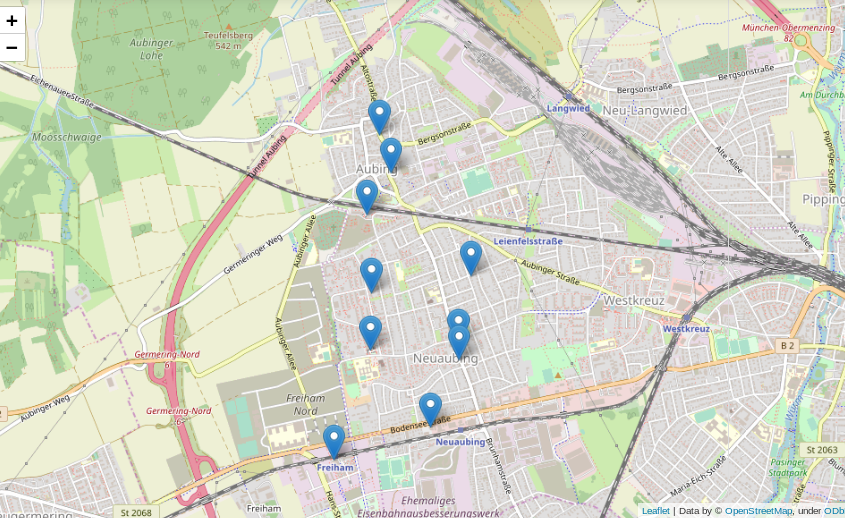
Viel besser wäre es doch, die gefundenen Positionen auf einer interaktiven Karte einzuzeichnen:

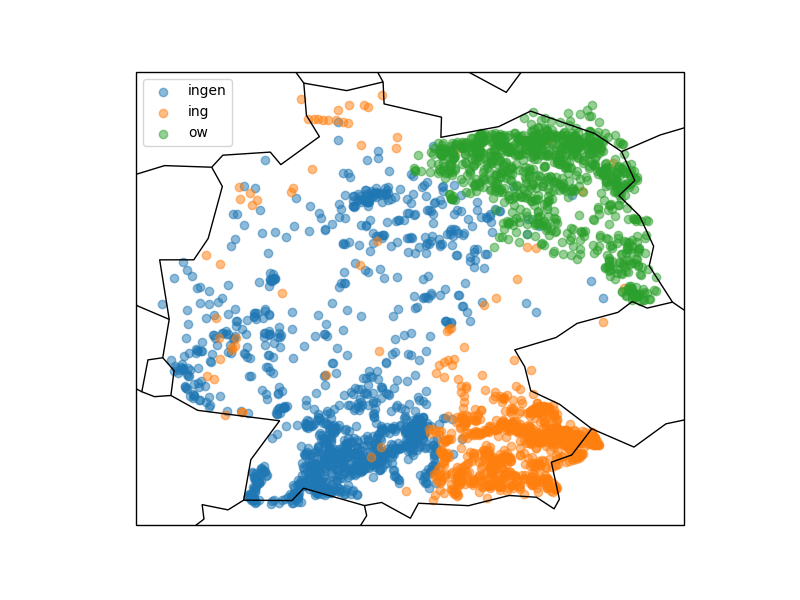
Was kann man sonst interessantes mit der erstellten Datenbank und etwas Python machen? Wer in Deutschland ein wenig herumgekommen ist, dem ist eventuell aufgefallen, dass sich die Endungen von Ortsnamen stark unterscheiden: Um München gibt es Stadteile und Dörfer namens Garching, Freising, Aubing, ect., rund um Stuttgart enden alle möglichen Namen auf “ingen” (Plieningen, Vaihningen, Echterdingen …) und in Berlin gibt es Orte wie Pankow, Virchow sowie eine bunte Auswahl weiterer *ow’s.

Das folgende Query spuckt gibt alle “village’s”, “town’s” und “city’s” aus der Tabelle pt_place, also Dörfer und Städte, aus:

Link zur Ausgabe

Graphisch mit matplotlib und cartopy in ein Koordinatensystem eingetragen sieht diese Verteilung folgendermassen aus:

Die Grafik zeigt, dass stark unterschiedliche Vorkommen der verschiedenen Ortsendungen in Deutschland (Clustering). Über das genaue Zustandekommen dieser Verteilung kann ich hier nur spekulieren, jedoch wird diese vermutlich ähnlichen Prozessen unterliegen wie beispielsweise die Entwicklung von Dialekten.

Wer sich die Karte etwas genauer anschaut wird merken, dass die eingezeichneten Landesgrenzen und Küstenlinien nicht besonders genau sind. Hieran wird ein interessanter Effekt von häufig verwendeten geographischen Entitäten, nämlich Linien und Polygonen deutlich. Im Beispiel werden durch die beiden Zeilen

die bereits im Modul cartopy hinterlegten Daten verwendet. Genaue Verläufe von Küstenlinien und Landesgrenzen benötigen mit wachsender Genauigkeit hingegen sehr viel Speicherplatz, da mehr und mehr zu speichernde Punkte benötigt werden (genaueres siehe hier).

Schlussfolgerung

Man kann also bereits mit einigen Grundmodulen und öffentlich verfügbaren Datensätzen eine ganze Menge im Bereich der Geodaten erkunden und entdecken. Gleichzeitig steht, insbesondere für spezielle Probleme, eine große Bandbreite weiterer Software zur Verfügung, für welche dieser Artikel zwar einen Grundsätzlichen Einstieg geben kann, die jedoch den Rahmen dieses Artikels sprengen würden.

A Bird’s Eye View: How Machine Learning Can Help You Charge Your E-Scooters

Bird scooters in Columbus, Ohio

Bird scooters in Columbus, Ohio

Ever since I started using bike-sharing to get around in Seattle, I have become fascinated with geolocation data and the transportation sharing economy. When I saw this project leveraging the mobility data RESTful API from the Los Angeles Department of Transportation, I was eager to dive in and get my hands dirty building a data product utilizing a company’s mobility data API.

Unfortunately, the major bike and scooter providers (Bird, JUMP, Lime) don’t have publicly accessible APIs. However, some folks have seemingly been able to reverse-engineer the Bird API used to populate the maps in their Android and iOS applications.

One interesting feature of this data is the nest_id, which indicates if the Bird scooter is in a “nest” — a centralized drop-off spot for charged Birds to be released back into circulation.

I set out to ask the following questions:

  1. Can real-time predictions be made to determine if a scooter is currently in a nest?
  2. For non-nest scooters, can new nest location recommendations be generated from geospatial clustering?

To answer these questions, I built a full-stack machine learning web application, NestGenerator, which provides an automated recommendation engine for new nest locations. This application can help power Bird’s internal nest location generation that runs within their Android and iOS applications. NestGenerator also provides real-time strategic insight for Bird chargers who are enticed to optimize their scooter collection and drop-off route based on proximity to scooters and nest locations in their area.

Bird

The electric scooter market has seen substantial growth with Bird’s recent billion dollar valuation  and their $300 million Series C round in the summer of 2018. Bird offers electric scooters that top out at 15 mph, cost $1 to unlock and 15 cents per minute of use. Bird scooters are in over 100 cities globally and they announced in late 2018 that they eclipsed 10 million scooter rides since their launch in 2017.
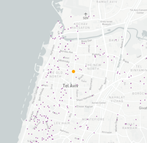
Bird scooters in Tel Aviv, Israel

Bird scooters in Tel Aviv, Israel

With all of these scooters populating cities, there’s much-needed demand for people to charge them. Since they are electric, someone needs to charge them! A charger can earn additional income for charging the scooters at their home and releasing them back into circulation at nest locations. The base price for charging each Bird is $5.00. It goes up from there when the Birds are harder to capture.

Data Collection and Machine Learning Pipeline
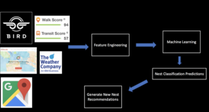
The full data pipeline for building “NestGenerator”

Data

From the details here, I was able to write a Python script that returned a list of Bird scooters within a specified area, their geolocation, unique ID, battery level and a nest ID.

I collected scooter data from four cities (Atlanta, Austin, Santa Monica, and Washington D.C.) across varying times of day over the course of four weeks. Collecting data from different cities was critical to the goal of training a machine learning model that would generalize well across cities.

Once equipped with the scooter’s latitude and longitude coordinates, I was able to leverage additional APIs and municipal data sources to get granular geolocation data to create an original scooter attribute and city feature dataset.

Data Sources:

  • Walk Score API: returns a walk score, transit score and bike score for any location.
  • Google Elevation API: returns elevation data for all locations on the surface of the earth.
  • Google Places API: returns information about places. Places are defined within this API as establishments, geographic locations, or prominent points of interest.
  • Google Reverse Geocoding API: reverse geocoding is the process of converting geographic coordinates into a human-readable address.
  • Weather Company Data: returns the current weather conditions for a geolocation.
  • LocationIQ: Nearby Points of Interest (PoI) API returns specified PoIs or places around a given coordinate.
  • OSMnx: Python package that lets you download spatial geometries and model, project, visualize, and analyze street networks from OpenStreetMap’s APIs.

Feature Engineering

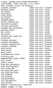
After extensive API wrangling, which included a four-week prolonged data collection phase, I was finally able to put together a diverse feature set to train machine learning models. I engineered 38 features to classify if a scooter is currently in a nest.
Full Feature Set

Full Feature Set

The features boiled down into four categories:

  • Amenity-based: parks within a given radius, gas stations within a given radius, walk score, bike score
  • City Network Structure: intersection count, average circuity, street length average, average streets per node, elevation level
  • Distance-based: proximity to closest highway, primary road, secondary road, residential road
  • Scooter-specific attributes: battery level, proximity to closest scooter, high battery level (> 90%) scooters within a given radius, total scooters within a given radius


Log-Scale Transformation

For each feature, I plotted the distribution to explore the data for feature engineering opportunities. For features with a right-skewed distribution, where the mean is typically greater than the median, I applied these log transformations to normalize the distribution and reduce the variability of outlier observations. This approach was used to generate a log feature for proximity to closest scooter, closest highway, primary road, secondary road, and residential road.

An example of a log transformation

Statistical Analysis: A Systematic Approach

Next, I wanted to ensure that the features I included in my model displayed significant differences when broken up by nest classification. My thinking was that any features that did not significantly differ when stratified by nest classification would not have a meaningful predictive impact on whether a scooter was in a nest or not.

Distributions of a feature stratified by their nest classification can be tested for statistically significant differences. I used an unpaired samples t-test with a 0.01% significance level to compute a p-value and confidence interval to determine if there was a statistically significant difference in means for a feature stratified by nest classification. I rejected the null hypothesis if a p-value was smaller than the 0.01% threshold and if the 99.9% confidence interval did not straddle zero. By rejecting the null-hypothesis in favor of the alternative hypothesis, it’s deemed there is a significant difference in means of a feature by nest classification.

Battery Level Distribution Stratified by Nest Classification to run a t-test

Battery Level Distribution Stratified by Nest Classification to run a t-test

Log of Closest Scooter Distribution Stratified by Nest Classification to run a t-test

Throwing Away Features

Using the approach above, I removed ten features that did not display statistically significant results.
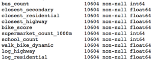
Statistically Insignificant Features Removed Before Model Development

Model Development

I trained two models, a random forest classifier and an extreme gradient boosting classifier since tree-based models can handle skewed data, capture important feature interactions, and provide a feature importance calculation. I trained the models on 70% of the data collected for all four cities and reserved the remaining 30% for testing.

After hyper-parameter tuning the models for performance on cross-validation data it was time to run the models on the 30% of test data set aside from the initial data collection.

I also collected additional test data from other cities (Columbus, Fort Lauderdale, San Diego) not involved in training the models. I took this step to ensure the selection of a machine learning model that would generalize well across cities. The performance of each model on the additional test data determined which model would be integrated into the application development.

Performance on Additional Cities Test Data

The Random Forest Classifier displayed superior performance across the board

The Random Forest Classifier displayed superior performance across the board

I opted to move forward with the random forest model because of its superior performance on AUC score and accuracy metrics on the additional cities test data. AUC is the Area under the ROC Curve, and it provides an aggregate measure of model performance across all possible classification thresholds.
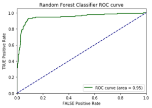
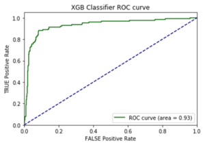
AUC Score on Test Data for each Model

AUC Score on Test Data for each Model

Feature Importance

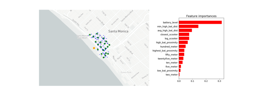
Battery level dominated as the most important feature. Additional important model features were proximity to high level battery scooters, proximity to closest scooter, and average distance to high level battery scooters.
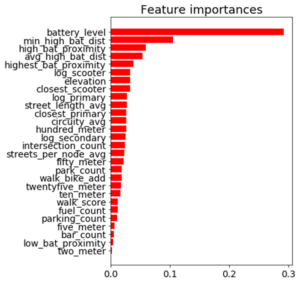
Feature Importance for the Random Forest Classifier

Feature Importance for the Random Forest Classifier

The Trade-off Space

Once I had a working machine learning model for nest classification, I started to build out the application using the Flask web framework written in Python. After spending a few days of writing code for the application and incorporating the trained random forest model, I had enough to test out the basic functionality. I could finally run the application locally to call the Bird API and classify scooter’s into nests in real-time! There was one huge problem, though. It took more than seven minutes to generate the predictions and populate in the application. That just wasn’t going to cut it.

The question remained: will this model deliver in a production grade environment with the goal of making real-time classifications? This is a key trade-off in production grade machine learning applications where on one end of the spectrum we’re optimizing for model performance and on the other end we’re optimizing for low latency application performance.

As I continued to test out the application’s performance, I still faced the challenge of relying on so many APIs for real-time feature generation. Due to rate-limiting constraints and daily request limits across so many external APIs, the current machine learning classifier was not feasible to incorporate into the final application.

Run-Time Compliant Application Model

After going back to the drawing board, I trained a random forest model that relied primarily on scooter-specific features which were generated directly from the Bird API.

Through a process called vectorization, I was able to transform the geolocation distance calculations utilizing NumPy arrays which enabled batch operations on the data without writing any “for” loops. The distance calculations were applied simultaneously on the entire array of geolocations instead of looping through each individual element. The vectorization implementation optimized real-time feature engineering for distance related calculations which improved the application response time by a factor of ten.
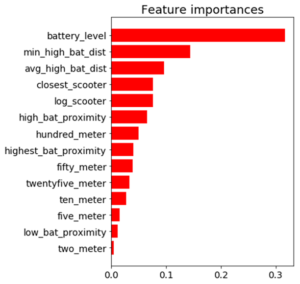
Feature Importance for the Run-time Compliant Random Forest Classifier

Feature Importance for the Run-time Compliant Random Forest Classifier

This random forest model generalized well on test-data with an AUC score of 0.95 and an accuracy rate of 91%. The model retained its prediction accuracy compared to the former feature-rich model, but it gained 60x in application performance. This was a necessary trade-off for building a functional application with real-time prediction capabilities.

Geospatial Clustering

Now that I finally had a working machine learning model for classifying nests in a production grade environment, I could generate new nest locations for the non-nest scooters. The goal was to generate geospatial clusters based on the number of non-nest scooters in a given location.

The k-means algorithm is likely the most common clustering algorithm. However, k-means is not an optimal solution for widespread geolocation data because it minimizes variance, not geodetic distance. This can create suboptimal clustering from distortion in distance calculations at latitudes far from the equator. With this in mind, I initially set out to use the DBSCAN algorithm which clusters spatial data based on two parameters: a minimum cluster size and a physical distance from each point. There were a few issues that prevented me from moving forward with the DBSCAN algorithm.

  1. The DBSCAN algorithm does not allow for specifying the number of clusters, which was problematic as the goal was to generate a number of clusters as a function of non-nest scooters.
  2. I was unable to hone in on an optimal physical distance parameter that would dynamically change based on the Bird API data. This led to suboptimal nest locations due to a distortion in how the physical distance point was used in clustering. For example, Santa Monica, where there are ~15,000 scooters, has a higher concentration of scooters in a given area whereas Brookline, MA has a sparser set of scooter locations.
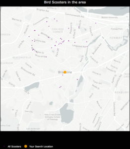
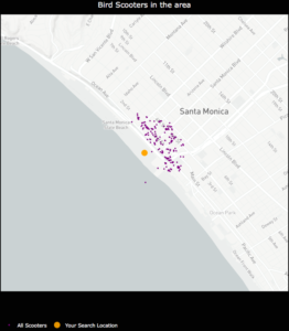
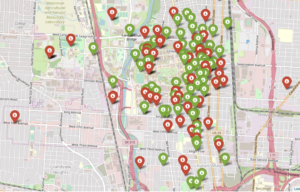
An example of how sparse scooter locations vs. highly concentrated scooter locations for a given Bird API call can create cluster distortion based on a static physical distance parameter in the DBSCAN algorithm. Left:Bird scooters in Brookline, MA. Right:Bird scooters in Santa Monica, CA.

An example of how sparse scooter locations vs. highly concentrated scooter locations for a given Bird API call can create cluster distortion based on a static physical distance parameter in the DBSCAN algorithm. Left:Bird scooters in Brookline, MA. Right:Bird scooters in Santa Monica, CA.

Given the granularity of geolocation scooter data I was working with, geospatial distortion was not an issue and the k-means algorithm would work well for generating clusters. Additionally, the k-means algorithm parameters allowed for dynamically customizing the number of clusters based on the number of non-nest scooters in a given location.

Once clusters were formed with the k-means algorithm, I derived a centroid from all of the observations within a given cluster. In this case, the centroids are the mean latitude and mean longitude for the scooters within a given cluster. The centroids coordinates are then projected as the new nest recommendations.
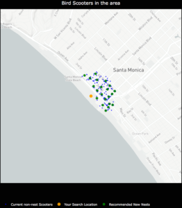
NestGenerator showcasing non-nest scooters and new nest recommendations utilizing the K-Means algorithm

NestGenerator showcasing non-nest scooters and new nest recommendations utilizing the K-Means algorithm.

NestGenerator Application

After wrapping up the machine learning components, I shifted to building out the remaining functionality of the application. The final iteration of the application is deployed to Heroku’s cloud platform.

In the NestGenerator app, a user specifies a location of their choosing. This will then call the Bird API for scooters within that given location and generate all of the model features for predicting nest classification using the trained random forest model. This forms the foundation for map filtering based on nest classification. In the app, a user has the ability to filter the map based on nest classification.
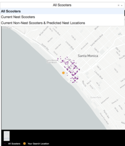
Drop-Down Map View filtering based on Nest Classification

Drop-Down Map View filtering based on Nest Classification

Nearest Generated Nest

To see the generated nest recommendations, a user selects the “Current Non-Nest Scooters & Predicted Nest Locations” filter which will then populate the application with these nest locations. Based on the user’s specified search location, a table is provided with the proximity of the five closest nests and an address of the Nest location to help inform a Bird charger in their decision-making.
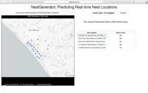
NestGenerator web-layout with nest addresses and proximity to nearest generated nests

NestGenerator web-layout with nest addresses and proximity to nearest generated nests

Conclusion

By accurately predicting nest classification and clustering non-nest scooters, NestGenerator provides an automated recommendation engine for new nest locations. For Bird, this application can help power their nest location generation that runs within their Android and iOS applications. NestGenerator also provides real-time strategic insight for Bird chargers who are enticed to optimize their scooter collection and drop-off route based on scooters and nest locations in their area.

Code

The code for this project can be found on my GitHub

Comments or Questions? Please email me an E-Mail!
 

Allgemeines über Geodaten

Dieser Artikel ist der Auftakt in einer Artikelserie zum Thema “Geodatenanalyse”.

Von den vielen Arten an Datensätzen, die öffentlich im Internet verfügbar sind, bin ich in letzter Zeit vermehrt über eine besonders interessante Gruppe gestolpert, die sich gleich für mehrere Zwecke nutzen lassen: Geodaten.

Gerade in wirtschaftlicher Hinsicht bieten sich eine ganze Reihe von Anwendungsfällen, bei denen Geodaten helfen können, Einblicke in Tatsachen zu erlangen, die ohne nicht möglich wären. Der wohl bekannteste Fall hierfür ist vermutlich die einfache Navigation zwischen zwei Punkten, die jeder kennt, der bereits ein Navigationssystem genutzt oder sich eine Route von Google Maps berechnen lassen hat.
Hiermit können nicht nur Fragen nach dem schnellsten oder Energie einsparensten (und damit gleichermaßen auch witschaftlichsten) Weg z. B. von Berlin nach Hamburg beantwortet werden, sondern auch die bestmögliche Lösung für Ausnahmesituationen wie Stau oder Vollsperrungen berechnet werden (ja, Stau ist, zumindest in der Theorie immer noch eine “Ausnahmesituation” ;-)).
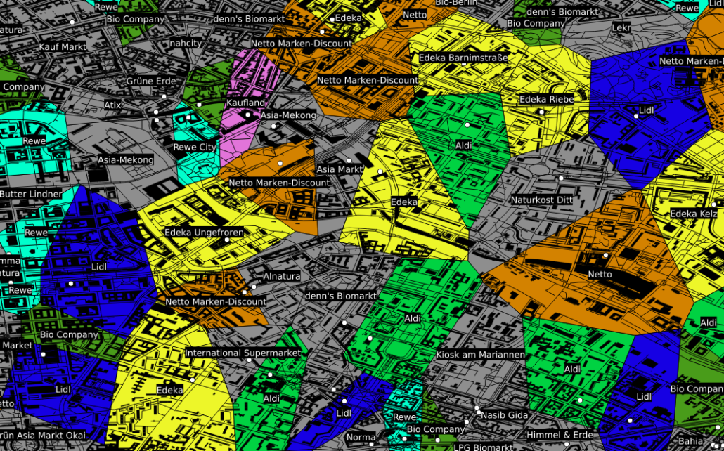
Neben dieser beliebten Art Geodaten zu nutzen, gibt es eine ganze Reihe weiterer Situationen in denen deren Nutzung hilfreich bis essentiell sein kann. Als Beispiel sei hier der Einzugsbereich von in Konkurrenz stehenden Einheiten, wie z. B. Supermärkten genannt. Ohne an dieser Stelle statistische Nachweise vorlegen zu können, kaufen (zumindest meiner persönlichen Beobachtung nach) die meisten Menschen fast immer bei dem Supermarkt ein, der am bequemsten zu erreichen ist und dies ist in der Regel der am nächsten gelegene. Besitzt man nun eine Datenbank mit der Information, wo welcher Supermarkt bzw. welche Supermarktkette liegt, kann man mit so genannten Voronidiagrammen recht einfach den jeweiligen Einzugsbereich der jeweiligen Supermärkte berechnen.
Entsprechende Karten können auch von beliebigen anderen Entitäten mit fester geographischer Position gezeichnet werden: Geldautomaten, Funkmasten, öffentlicher Nahverkehr, …

Ein anderes Beispiel, das für die Datenauswertung interessant ist, ist die kartographische Auswertung von Postleitzahlen. Diese sind in fast jedem Datensatz zu Kunden, Lieferanten, ect. vorhanden, bilden jedoch weder eine ordinale, noch eine sinnvolle kategorische Größe, da es viele tausend verschiedene gibt. Zudem ist auch eine einfache Gruppierung in gröbere Kategorien wie beispielsweise Postleitzahlen des Schemas 1xxxx oft kaum sinnvoll, da diese in aller Regel kein sinnvolles Mapping auf z. B. politische Gebiete – wie beispielsweise Bundesländer – zulassen. Ein Ausweg aus diesem Dilemma ist eine einfache kartographische Übersicht, welche die einzelnen Postleitzahlengebiete in einer Farbskala zeigt.

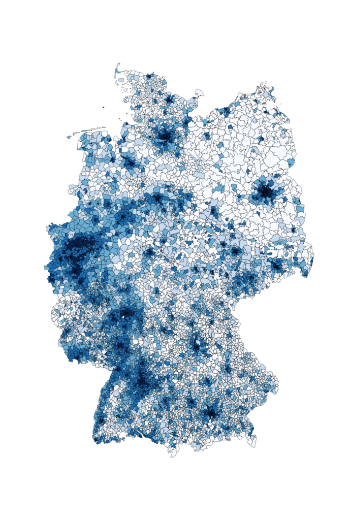
Im gezeigten Beispiel ist die Bevölkerungsdichte Deutschlands als Karte zu sehen. Hiermit wird schnell und übersichtlich deutlich, wo in Deutschland die Bevölkerung lokalisiert ist. Ähnliche Karten können beispielsweise erstellt werden, um Fragen wie “Wie ist meine Kundschaft verteilt?” oder “Wo hat die Werbekampange XYZ besonders gut funktioniert?” zu beantworten. Bezieht man weitere Daten wie die absolute Bevölkerung oder die Bevölkerungsdichte mit ein, können auch Antworten auf Fragen wie “Welchen Anteil der Bevölkerung habe ich bereits erreicht und wo ist noch nicht genutztes Potential?” oder “Ist mein Produkt eher in städtischen oder ländlichen Gebieten gefragt?” einfach und schnell gefunden werden.
Ohne die entsprechende geographische Zusatzinformation bleiben insbesondere Postleitzahlen leider oft als “nicht sinnvoll auswertbar” bei der Datenauswertung links liegen.
Eine ganz andere Art von Vorteil der Geodaten ist der educational point of view:
  • Wer erst anfängt, sich mit Datenbanken zu beschäftigen, findet mit Straßen, Postleitzahlen und Ländern einen deutlich einfacheren und vor allem besser verständlichen Zugang zu SQL als mit abstrakten Größen und Nummern wie ProductID, CustomerID und AdressID. Zudem lassen sich Geodaten nebenbei bemerkt mittels so genannter GeoInformationSystems (*gis-Programme), erstaunlich einfach und ansprechend plotten.
  • Wer sich mit SQL bereits ein wenig auskennt, kann mit den (beispielsweise von Spatialite oder PostGIS) bereitgestellten SQL-Funktionen eine ganze Menge über Datenbanken sowie deren Möglichkeiten – aber auch über deren Grenzen – erfahren.
  • Für wen relationale Datenbanken sowie deren Funktionen schon lange nichts Neues mehr darstellen, kann sich hier (selbst mit dem eigenen Notebook) erstaunlich einfach in das Thema “Bug Data” einarbeiten, da die Menge an öffentlich vorhandenen Geodaten z.B. des OpenStreetMaps-Projektes selbst in optimal gepackten Format vielen Dutzend GB entsprechen. Gerade die Möglichkeit, die viele *gis-Programme wie beispielsweise QGIS bieten, nämlich Straßen-, Schienen- und Stromnetze “on-the-fly” zu plotten, macht die Bedeutung von richtig oder falsch gesetzten Indices in verschiedenen Datenbanken allein anhand der Geschwindigkeit mit der sich die Plots aufbauen sehr eindrucksvoll deutlich.
Um an Datensätze zu kommen, reicht es in der Regel Google mit den entsprechenden Schlagworten zu versorgen.
Neben – um einen Vergleich zu nutzen – dem Brockhaus der Karten GoogleMaps gibt es beispielsweise mit dem OpenStreetMaps-Projekt einen freien Geodatensatz, welcher in diesem Kontext etwa als das Wikipedia der Karten zu verstehen ist.
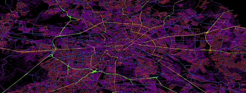
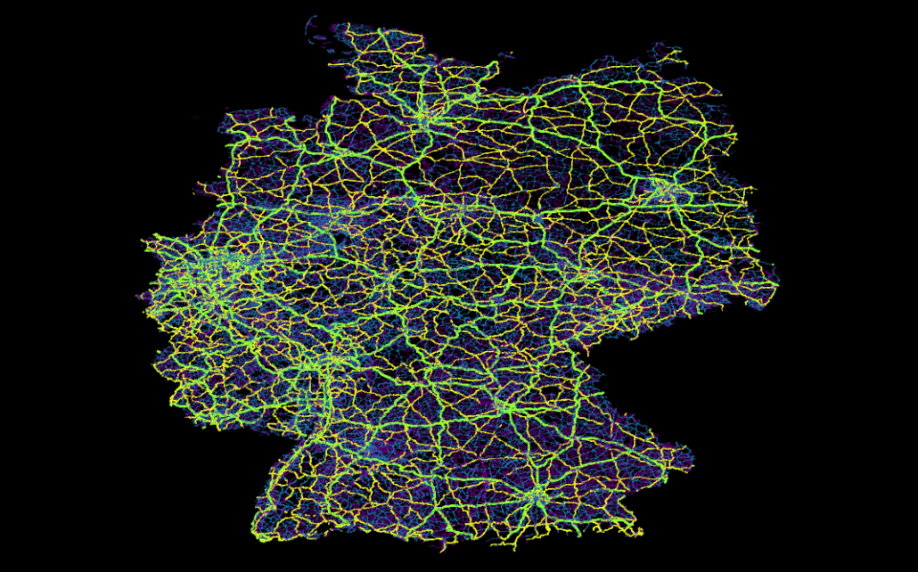
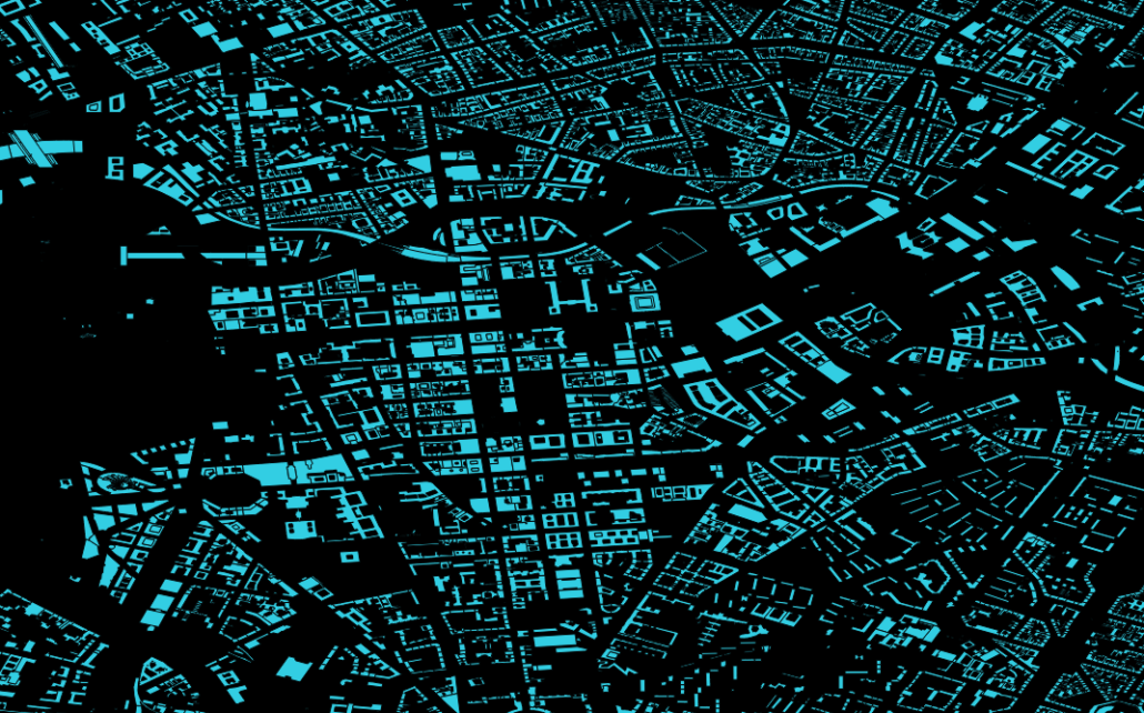
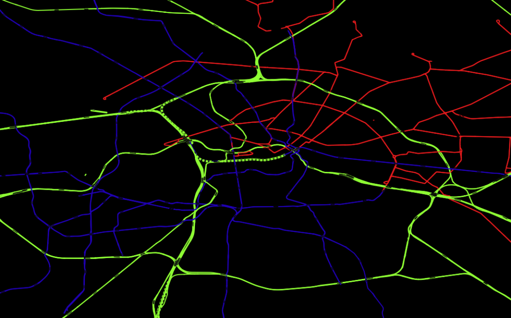
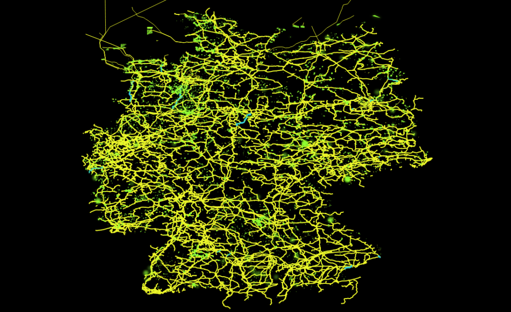
Hier findet man zum Beispiel Daten wie Straßen-, Schienen- oder dem Stromnetz, aber auch die im obigen Voronidiagramm eingezeichneten Gebäude und Supermärkte stammen aus diesem Datensatz. Hiermit lassen sich recht einfach just for fun interessante Dinge herausfinden, wie z. B., dass es in Deutschland ca. 28 Mio Gebäude gibt (ein SQL-Einzeiler), dass der Berliner Osten auch ca. 30 Jahre nach der Wende noch immer vorwiegend von der Tram versorgt wird, während im Westen hauptsächlich die U-Bahn fährt. Oder über welche Trassen der in der Nordsee von Windkraftanlagen erzeugte Strom auf das Festland kommt und von da aus weiter verteilt wird.
Eher grundlegende aber deswegen nicht weniger nützliche Datensätze lassen sich unter dem Stichwort “natural earth” finden. Hier sind Daten wie globale Küstenlinien, mittels Echolot ausgemessene Meerestiefen, aber auch von Menschen geschaffene Dinge wie Landesgrenzen und Städte sehr übersichtlich zu finden.
Im Grunde sind der Vorstellung aber keinerlei Grenzen gesetzt und fast alle denkbaren geographischen Fakten können, manchmal sogar live via Sattelit, mitverfolgt werden. So kann man sich beispielsweise neben aktueller Wolkenbedekung, Regenradar und globaler Oberflächentemperatur des Planeten auch das Abschmelzen der Polkappen seit 1970 ansehen (NSIDC) oder sich live die Blitzeinschläge auf dem gesamten Planeten anschauen – mit Vorhersage darüber, wann und wo der Donner zu hören ist (das funktioniert wirklich! Beispielsweise auf lightningmaps).
Kurzum Geodaten sind neben ihrer wirtschaftlichen Relevanz – vor allem für die Logistik – auch für angehende Data Scientists sehr aufschlussreich und ein wunderbares Spielzeug, mit dem man sich lange beschäftigen und eine Menge interessanter Dinge herausfinden kann.

Analyse der Netzwerktopologie des Internets auf Basis des IPv4-Protokolls

Wie kommen Daten die man via Internet quer durch die Welt sendet eigentlich an ihr Ziel? Welchen Weg nehmen beispielsweise die Datenpakete, wenn ich von mir zu Hause eine Datei an meinen Nachbarn ein Haus weiter sende? Wie groß ist der “Umweg”, den die Daten nehmen? Und macht es eigentlich einen Unterschied, ob ich www.google.de, www.google.com oder www.google.nl aufrufe, oder gehen alle Suchanfragen sowieso an dasselbe Ziel?

Fragen wie diese lassen sich durch eine Kombination von Tools wie traceroute oder tracepath und geoiplookup beantworten und unter Verwendung des Python-Paketes geoplotlib sogar graphisch auf einer Weltkarte darstellen. Die so gewonnenen Ergebnisse zeigen Teile der Netzwerktopologie des Internets auf und führen zu interessanten, teils unerwarteten Erkenntnissen.

Ziel dieses Artikels soll sein, ein möglichst einfaches Tutorial zum selber mitbasteln bereit zu stellen. Die einzelnen Schritte die hierfür notwendig sind, werden möglichst einfach verständlich dargestellt und erklärt, trotzdem sind zum vollständigen Verständnis grundlegende Kenntnisse in Python sowie der Kommandozeile hilfreich. Er richtet sich aber auch an alle, die sich einfach einmal etwas in ihrer virtuellen Umgebung „umschauen“ möchten oder einfach nur an den Ergebnissen interessiert sind, ohne sich mit den Details und wie diese umgesetzt werden, auseinander setzen zu wollen.  Am Ende des Artikels werden die einzelnen Skripte des Projekts als zip-Datei bereitgestellt.

Hinweis: Diese Anleitung bezieht sich auf ein Linux-System und wurde unter Ubuntu getestet. Windows-User können beispielsweise mit dem Befehl tracert (als Ersatz für traceroute) ähnliche Ergebnisse erziehlen, jedoch muss dann das Parsing der IP-Adressen abgeändert werden.

1. Grundsätzliches Erkunden der Route, die ein Datenpaket nimmt

Hierfür wird ein Programm wie traceroute, tracepath oder nmap benötigt, welches durch Versenden von „abgelaufenen Datenpaketen“ die Hosts „auf dem Weg“ zum Ziel dazu bringt, ihre IPv4-Adresse zurück zu geben. In diesem Artikel wird beispielhaft traceroute verwendet, da dieses unter den meisten Linux-Versionen bereits zur „Grundausstattung“ gehört und somit für diesen Schritt keine weitere Software installiert werden muss. Die Verwendung von traceroute folgt der Syntax:

Als Ziel muss hier die IP-Adresse bzw. der Domainname des Zielrechners angegeben werden. Ein Beispiel soll dies vereinfachen:

Im Beispiel wird die Route zum Hostrechner mit der Domain www.google.de ermittelt. In der ersten Spalte der Ausgabe ist die Nummer des jeweiligen „Hops“ zu sehen. Wichtig ist insbesondere die zweite Spalte, welche die IPv4-Adresse des jeweiligen Rechners auf dem Weg zum Ziel darstellt. Die folgenden Spalten enthalten weitere Informationen wie Antwortzeiten der jeweiligen Server und die IP-Adressen der Folge-Server.

Um die Ausgabe in eine Form umzuwandeln, welche später einfacher von Python gelesen werden kann, muss diese noch ausgelesen werden (Parsing). zuerst soll die erste Zeile der Ausgabe herausgeschnitten werden, da diese zwar informativ, jedoch kein Teil der eigentlichen Route ist. Dies kann sehr einfach durchgeführt werden, indem die Ausgabe des traceroute-Befehls an einen Befehl wie beispielsweise sed „gepiped“ (also weitergeleitet) wird. Die dabei entstehende Pipe sieht dann wie folgt aus:

Um bei unserem Beispiel mit der Route zu www.google.de zu bleiben, sieht der Befehl und die Entsprechende Ausgabe wie folgt aus:

Anschließend soll die zweite Spalte der Ausgabe herausgeschnitten werden. Dies ist am einfachsten mit dem Befehl awk zu bewerkstelligen. Das Prinzip dahinter ist das gleiche wie im obigen Schritt: die Ausgabe des vorherigen Befehls wird dem Befehl awk als Eingabe weitergeleitet, womit der gesamte Befehl nun wie folgt aussieht:

Bezogen auf das google-Beispiel sehen Ein- und Ausgabe nun so aus:

Im letzten Schritt sollen die einzelnen IP-Adressen durch Leerzeichen getrennt in eine einzelne Zeile geschrieben werden. Sinn dieses Schrittes ist, dass später viele Zielrechner nacheinander aus einer Datei eingelesen werden können und jede Route zu einem Zielrechner als eine einzelne Zeile in eine Zieldatei geschrieben wird.
Auch dieser Schritt funktioniert ähnlich wie die obigen Schritte, indem die Ausgabe des letzten Schrittes an einen weiteren Befehl weitergeleitet wird, der diese Funktion erfüllt. Dieser Schritt könnte wieder mit dem Befehl sed durchgeführt werden, da aber nur ein einzelnes Zeichen (nämlich das Zeilenumbruch-Zeichen bzw. Newline) durch ein Leerzeichen ersetzt werden soll, wird hier aufgrund der einfacheren Syntax der Befehl tr verwendet.
Der fertige Befehl sieht nun wie folgt aus:

Oder im fertigen Beispiel mit www.google.de:

Hiermit ist das Parsen abgeschlossen und die fertige Ausgabe kann nun in eine Ergebnisdatei geschrieben werden. Um automatisch viele Zielrechner aus einer Datei einzulesen und alle gefundenen Routen in eine Zieldatei zu schreiben, wird der obige Befehl in eine Schleife „verpackt“ welche die Zielrechner Zeile für Zeile aus der Datei zieladressen.txt ausliest und die gefundenen Routen ebenso Zeile für Zeile in die Datei routen.csv schreibt. Die Datei routen.csv kann später zur Ermittlung verschiedener Informationen zu den gefunden IP-Adressen einfach mit einem Python-Skript eingelesen und geparst werden.

In diesem Artikel wird das fertige Skript ohne weitere Erklärung in der beiliegenden zip-Datei bereitgestellt. Wen die genaue Funktionsweise der Schleife interessiert, sei angehalten sich generell über die Funktionsweise von Shellskripten einzulesen, da dies den Rahmen des Artikels sprengen würde.

Dieses Skript benötigt die Datei zieladressen.txt welche wie folgt aussehen muss (anstatt Domainnamen können auch direkt IPv4-Adressen verwendet werden):

2. Sammeln von (Geo-)Informationen zu bestimmten IPv4-Adressen

Die gefundenen IPv4-Adressen können anschließend mit dem Befehl geoiplookup oder über die Internetseite http://geoiplookup.net/ relativ genau (meißtens auf Städteniveau) lokalisiert werden. Dies funktioniert, da einzelne Subnets in der Regel bestimmten Regionen und Internetprovidern zugeordnet sind.

Der Befehl geoiplookup greift hierbei auf eine vorher installierte und lokal gespeicherte Datenbank zu, welche je nach installierter Version als Country- oder City-Edition vorliegt. Da geoiplookup nicht zu den Standartbordmitteln unter Linux gehört und um die weiteren Schritte auch Benutzern anderer Betriebssysteme zu ermöglichen, wird hier nur ein kurzes Beispiel der Benutzung dieses Befehls und dessen Ausgabe gegeben und im weiteren die Online-Abfrage mittels eines Python-Skriptes beschrieben.

Die Internetseite http://geoiplookup.net bietet einen Onlineservice welcher Geo- und weitere Informationen zu gegebenen IPv4-Adressen bereitstellt. Öffnet man die Seite ohne Angabe einer IP-Adresse in einem Browser, so erhält man die entsprechenden Informationen über die eigene IP-Adresse. (Achtung: die Verwendung eines Proxies oder gar Tor führt zwangsläufig zu falschen Ergebnissen.)

Da die Seite auch über eine API (also eine automatisierte Abfrageschnittstelle) unter der Adresse “http://api.geoiplookup.net/?query=${IPADRESSE}” verfügt, kann man die entsprechenden Informationen zu den IP-Adressen mittels eines Pythonskriptes abfragen und auswerten. Als Antwort erhält man eine XML‑Datei welche beispielsweise folgendermaßen aussieht:

Diese kann im Browser z. B. unter der Adresse http://api.geoiplookup.net/?query=77.20.253.87 aufgerufen werden (oder unter: http://api.geoiplookup.net/ für die eigene Adresse).

Um die hierin enthaltenen Informationen mit Hilfe von Python auszulesen lässt sich ElementTree aus aus dem Modul xml.etree, das in der Python-Standartbibliothek vorhanden ist, verwenden. Dies wird im beiliegenden Skript mit der Funktion get_hostinfo() bewerkstelligt:

Diese parst die XML-Datei automatisch zu einem Python-DefaultDict das dann die entsprechenden Informationen enthält (das DefaultDict wird verwendet da normale Python Dictionaries zu Fehlern führen, wenn nicht gesetzte Werte abgefragt werden). Die Ausgabe der Funktion sieht dann wie folgt aus:

3. Plotten der gefundenen Routen mit geoplotlib auf einer Weltkarte

Wichtig für das anschließende Plotten ist hierbei die Geolocation also ‘latitude’ und ‘longitude’. Mit den Werten kann man anschließend die mit traceroute gefundenen Pfade als Basemap plotten. Dies funktioniert mit der Funktion drawroutes2map():

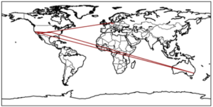
Der Plot einer Verbindungsanfrage an www.google.de aus Berlin sieht beispielsweise folgendermaßen aus:

Hier wird deutlich, dass Datenpakete durchaus nicht immer den kürzesten Weg nehmen, sondern teilweise rund um die Welt gesendet werden (Deutschland – USA – Sydney(!) – USA), bevor sie an ihrem Ziel ankommen und dass das Ziel einer Verbindung zu einer Domain mit der Endung „de“ nicht unbedingt in Deutschland liegen muss.

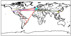
Mit Default-Einstellungen werden von der Funktion drawroutes2map() alle Routen in zufälligen Farben geplottet, welche in der Datei routen.csv gefunden werden.

Lässt man viele Routen plotten wird hierbei die Netzwerkstruktur deutlich, über die die Daten im Internet verteilt werden. Auf dem obigen Plot kann man recht gut erkennen, dass die meisten Internetseiten in Europa oder den USA gehostet werden, einige noch in China und Japan, dagegen beispielsweise Afrika praktisch unbedeutend ist.

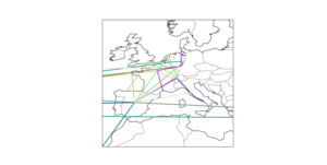
Auf dem nächsten Plot wiederum ist zu erkennen, dass es tatsächlich eine Art “Hotspots” gibt über die fast alle Daten laufen, wie z. B. Frankfurt am Main, Zürich und Madrid.

4. Schematische Darstellung der Routen als directed Graph mit graphviz

Mit graphviz lassen sich schematische Graphen darstellen. Mit dem Paket pygraphviz existiert hiefür auch eine Python-Anbindung. Die schematische Darstellung als Graph ist in vielen Fällen deutlich übersichtlicher als die Darstellung auf einer Weltkarte und die Topologie des Netzwerkes wird besser sichtbar.

Die entsprechende Python-Funktion, die alle Routen aus der Datei routes.csv als geplotteten Graph ausgibt ist drawroutes2graph():

Die Funktion schreibt den erstellten Graph in der Dot-Language in die Datei routes.dot und erstellt zwei verschiedene visuelle Darstellungen als png-Dateien.

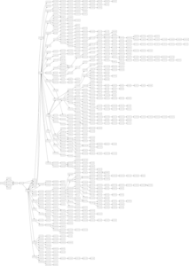
Da mit der Funktion get_hostinfo() auch weitere Informationen zu den jeweiligen IP-Adressen verfügbar sind  können diese auch visuell im Graph dargestellt werden. So sind in der folgenden Darstellung Hosts in verschiedenen Ländern in unterschiedlichen Farben dargestellt. (Deutschland in grün, USA in rot, Spanien in gelb, Schweiz in blau, China in magenta und alle übrigen Länder und Hosts ohne Länderinformation in schwarz).

Diese Art der Darstellung vereint damit die Vorteile der schematischen Darstellung mit der Geoinformation zu den jeweiligen Hosts. Aus der Grafik lässt sich beispielsweise sehr gut erkennen, dass, trotz oft vieler Zwischenstationen innerhalb eines Landes, Landesgrenzen überschreitende Verbindungen relativ selten sind.

Auch interessant ist, dass das Netzwerk durchaus Maschen aufweist – mit anderen Worten: Dass ein und dieselbe Station bei verschiedenen Verbindungsanfragen über verschiedene Zwischenstationen angesprochen wird und Daten, die von Punkt A nach Punkt B gesendet werden, nicht immer denselben Weg nehmen.

5. Schlussfolgerung

Was kann man hieraus denn nun letztendlich an Erkenntnissen ziehen? Zum einen natürlich, wie Daten via Internet über viele Zwischenstationen rund um die Welt gesendet und hierbei mit jeder Station neu sortiert werden. Vor allem aber auch, dass mit dem entsprechenden Know-How und etwas Kreativität mit bemerkenswert wenig Code bereits Unmengen an Daten gesammelt, geordnet und ausgewertet werden können. Alle möglichen Daten werden in unserer heutigen Welt gespeichert und sind zu einem nicht unbeträchtlichen Teil auch für jeden, der weiß, wer diese Daten hat oder wie man sie selber ermitteln kann, verfügbar und oft lassen sich hier interessante Einblicke in die Funktionsweise unserer Welt gewinnen.

Applying Data Science Techniques in Python to Evaluate Ionospheric Perturbations from Earthquakes

Multi-GNSS (Galileo, GPS, and GLONASS) Vertical Total Electron Content Estimates: Applying Data Science techniques in Python to Evaluate Ionospheric Perturbations from Earthquakes

1 Introduction

Today, Global Navigation Satellite System (GNSS) observations are routinely used to study the physical processes that occur within the Earth’s upper atmosphere. Due to the experienced satellite signal propagation effects the total electron content (TEC) in the ionosphere can be estimated and the derived Global Ionosphere Maps (GIMs) provide an important contribution to monitoring space weather. While large TEC variations are mainly associated with solar activity, small ionospheric perturbations can also be induced by physical processes such as acoustic, gravity and Rayleigh waves, often generated by large earthquakes.

In this study Ionospheric perturbations caused by four earthquake events have been observed and are subsequently used as case studies in order to validate an in-house software developed using the Python programming language. The Python libraries primarily utlised are Pandas, Scikit-Learn, Matplotlib, SciPy, NumPy, Basemap, and ObsPy. A combination of Machine Learning and Data Analysis techniques have been applied. This in-house software can parse both receiver independent exchange format (RINEX) versions 2 and 3 raw data, with particular emphasis on multi-GNSS observables from GPS, GLONASS and Galileo. BDS (BeiDou) compatibility is to be added in the near future.

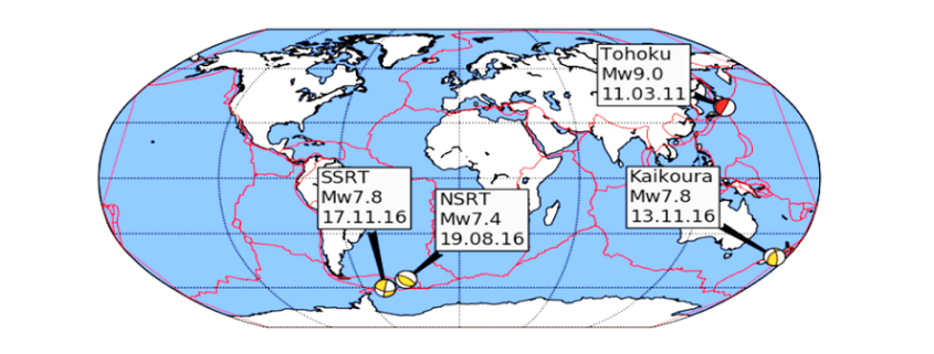
Several case studies focus on four recent earthquakes measuring above a moment magnitude (MW) of 7.0 and include: the 11 March 2011 MW 9.1 Tohoku, Japan, earthquake that also generated a tsunami; the 17 November 2013 MW 7.8 South Scotia Ridge Transform (SSRT), Scotia Sea earthquake; the 19 August 2016 MW 7.4 North Scotia Ridge Transform (NSRT) earthquake; and the 13 November 2016 MW 7.8 Kaikoura, New Zealand, earthquake.
Ionospheric disturbances generated by all four earthquakes have been observed by looking at the estimated vertical TEC (VTEC) and residual VTEC values. The results generated from these case studies are similar to those of published studies and validate the integrity of the in-house software.

2 Data Cleaning and Data Processing Methodology

Determining the absolute VTEC values are useful in order to understand the background ionospheric conditions when looking at the TEC perturbations, however small-scale variations in electron density are of primary interest. Quality checking processed GNSS data, applying carrier phase leveling to the measurements, and comparing the TEC perturbations with a polynomial fit creating residual plots are discussed in this section.

Time delay and phase advance observables can be measured from dual-frequency GNSS receivers to produce TEC data. Using data retrieved from the Center of Orbit Determination in Europe (CODE) site (ftp://ftp.unibe.ch/aiub/CODE), the differential code biases are subtracted from the ionospheric observables.

2.1 Determining VTEC: Thin Shell Mapping Function

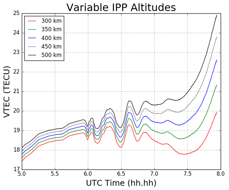
The ionospheric shell height, H, used in ionosphere modeling has been open to debate for many years and typically ranges from 300 – 400 km, which corresponds to the maximum electron density within the ionosphere. The mapping function compensates for the increased path length traversed by the signal within the ionosphere. Figure 1 demonstrates the impact of varying the IPP height on the TEC values.

Figure 1 Impact on TEC values from varying IPP heights. The height of the thin shell, H, is increased in 50km increments from 300 to 500 km.

2.2 Phase Smoothing

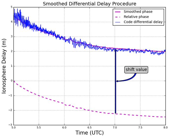
For dual-frequency GNSS users TEC values can be retrieved with the use of dual-frequency measurements by applying calculations. Calculation of TEC for pseudorange measurements in practice produces a noisy outcome and so the relative phase delay between two carrier frequencies – which produces a more precise representation of TEC fluctuations – is preferred. To circumvent the effect of pseudorange noise on TEC data, GNSS pseudorange measurements can be smoothed by carrier phase measurements, with the use of the carrier phase smoothing technique, which is often referred to as carrier phase leveling.

Figure 2 Phase smoothed code differential delay

2.3 Residual Determination

For the purpose of this study the monitoring of small-scale variations in ionospheric electron density from the ionospheric observables are of particular interest. Longer period variations can be associated with diurnal alterations, and changes in the receiver- satellite elevation angles. In order to remove these longer period variations in the TEC time series as well as to monitor more closely the small-scale variations in ionospheric electron density, a higher-order polynomial is fitted to the TEC time series. This higher-order polynomial fit is then subtracted from the observed TEC values resulting in the residuals. The variation of TEC due to the TID perturbation are thus represented by the residuals. For this report the polynomial order applied was typically greater than 4, and was chosen to emulate the nature of the arc for that particular time series. The order number selected is dependent on the nature of arcs displayed upon calculating the VTEC values after an initial inspection of the VTEC plots.

3 Results

3.1 Tohoku Earthquake

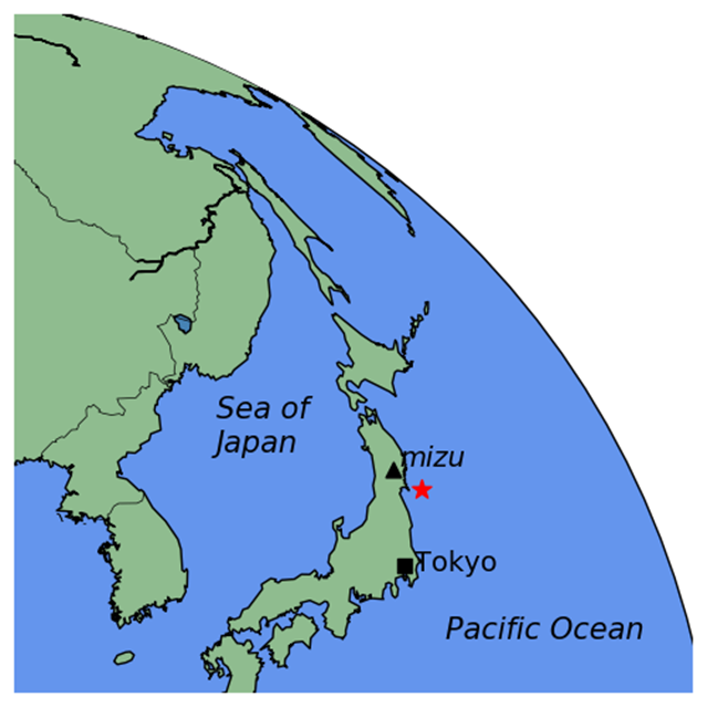
For this particular report, the sampled data focused on what was retrieved from the IGS station, MIZU, located at Mizusawa, Japan. The MIZU site is 39N 08′ 06.61″ and 141E 07′ 58.18″. The location of the data collection site, MIZU, and the earthquake epicenter can be seen in Figure 3.

Figure 3 MIZU IGS station and Tohoku earthquake epicenter [generated using the Python library, Basemap]

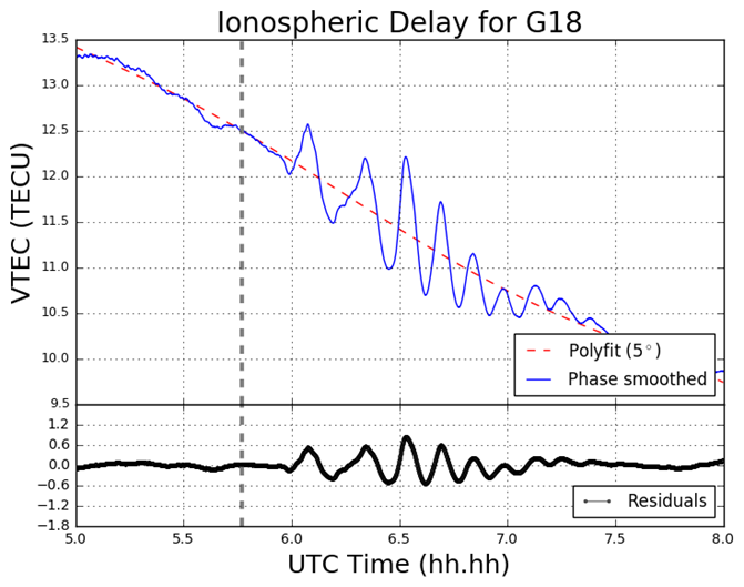
Figure 4 displays the ionospheric delay in terms of vertical TEC (VTEC), in units of TECU (1 TECU = 1016 el m-2). The plot is split into two smaller subplots, the upper section displaying the ionospheric delay (VTEC) in units of TECU, the lower displaying the residuals. The vertical grey-dashed lined corresponds to the epoch of the earthquake at 05:46:23 UT (2:46:23 PM local time) on March 11 2011. In the upper section of the plot, the blue line corresponds to the absolute VTEC value calculated from the observations, in this case L1 and L2 on GPS, whereby the carrier phase leveling technique was applied to the data set. The VTEC values are mapped from the STEC values which are calculated from the LOS between MIZU and the GPS satellite PRN18 (on Figure 4 denoted G18). For this particular data set as seen in Figure 4, a polynomial fit of  five degrees was applied, which corresponds to the red-dashed line. As an alternative to polynomial fitting, band-pass filtering can be employed when TEC perturbations are desired. However for the scope of this report polynomial fitting to the time series of TEC data was the only method used. In the lower section of Figure 4 the residuals are plotted. The residuals are simply the phase smoothed delay values (the blue line) minus the polynomial fit line (the red-dashed line). All ionosphere delay plots follow the same layout pattern and all time data is represented in UT (UT = GPS – 15 leap seconds, whereby 15 leap seconds correspond to the amount of leap seconds at the time of the seismic event). The time series shown for the ionosphere delay plots are given in terms of decimal of the hour, so that the format follows hh.hh.

Figure 4 VTEC and residual plot for G18 at MIZU on March 11 2011

3.2 South Georgia Earthquake

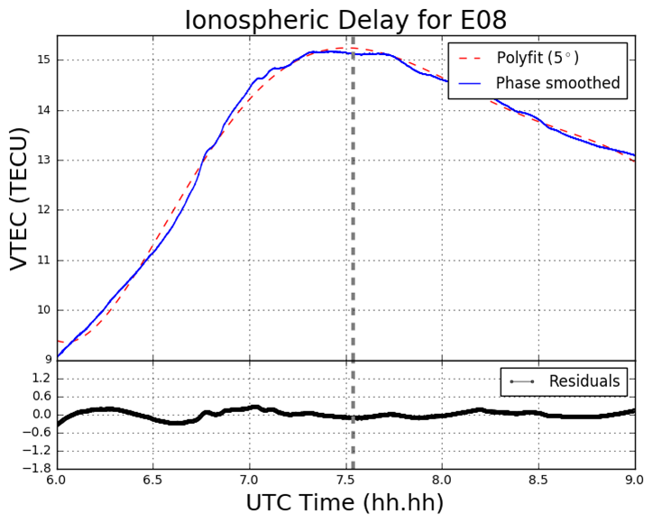
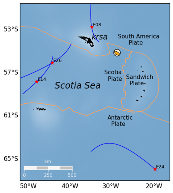
In the South Georgia Island region located in the North Scotia Ridge Transform (NSRT) plate boundary between the South American and Scotia plates on 19 August 2016, a magnitude of 7.4 MW earthquake struck at 7:32:22 UT. This subsection analyses the data retrieved from KEPA and KRSA. As well as computing the GPS and GLONASS TEC values, four Galileo satellites (E08, E14, E26, E28) are also analysed. Figure 5 demonstrates the TEC perturbations as computed for the Galileo L1 and L5 carrier frequencies.

Figure 5 VTEC and residual plots at KRSA on 19 August 2016. The plots are from the perspective of the GNSS receiver at KRSA, for four Galileo satellites (a) E08; (b) E14; (c) E24; (d) E26. The y-axes and x-axes in all plots do not conform with one another but are adjusted to fit the data. The y-axes for the residual section of each plot is consistent with one another.

Figure 6 Geometry of the Galileo (E08, E14, E24 and E26) satellites’ projected ground track whereby the IPP is set to 300km altitude. The orange lines correspond to tectonic plate boundaries.

4 Conclusion

The proximity of the MIZU site and magnitude of the Tohoku event has provided a remarkable – albeit a poignant – opportunity to analyse the ocean-ionospheric coupling aftermath of a deep submarine seismic event. The Tohoku event has also enabled the observation of the origin and nature of the TIDs generated by both a major earthquake and tsunami in close proximity to the epicenter. Further, the Python software developed is more than capable of providing this functionality, by drawing on its mathematical packages, such as NumPy, Pandas, SciPy, and Matplotlib, as well as employing the cartographic toolkit provided from the Basemap package, and finally by utilizing the focal mechanism generation library, Obspy.

Pre-seismic cursors have been investigated in the past and strongly advocated in particular by Kosuke Heki. The topic of pre-seismic ionospheric disturbances remains somewhat controversial. A potential future study area could be the utilization of the Python program – along with algorithmic amendments – to verify the existence of this phenomenon. Such work would heavily involve the use of Scikit-Learn in order to ascertain the existence of any pre-cursors.

Finally, the code developed is still retained privately and as of yet not launched to any particular platform, such as GitHub. More detailed information on this report can be obtained here:

Download as PDF