Tag Archive for: Data Mining

Data Mining Process flow – Easy Understanding

1 Overview

Development of computer processing power, network and automated software completely change and give new concept of each business. And data mining play the vital part to solve, finding the hidden patterns and relationship from large dataset with business by using sophisticated data analysis tools like methodology, method, process flow etc.

On this paper, proposed a process flow followed CRISP-DM methodology and has six steps where data understanding does not considered.

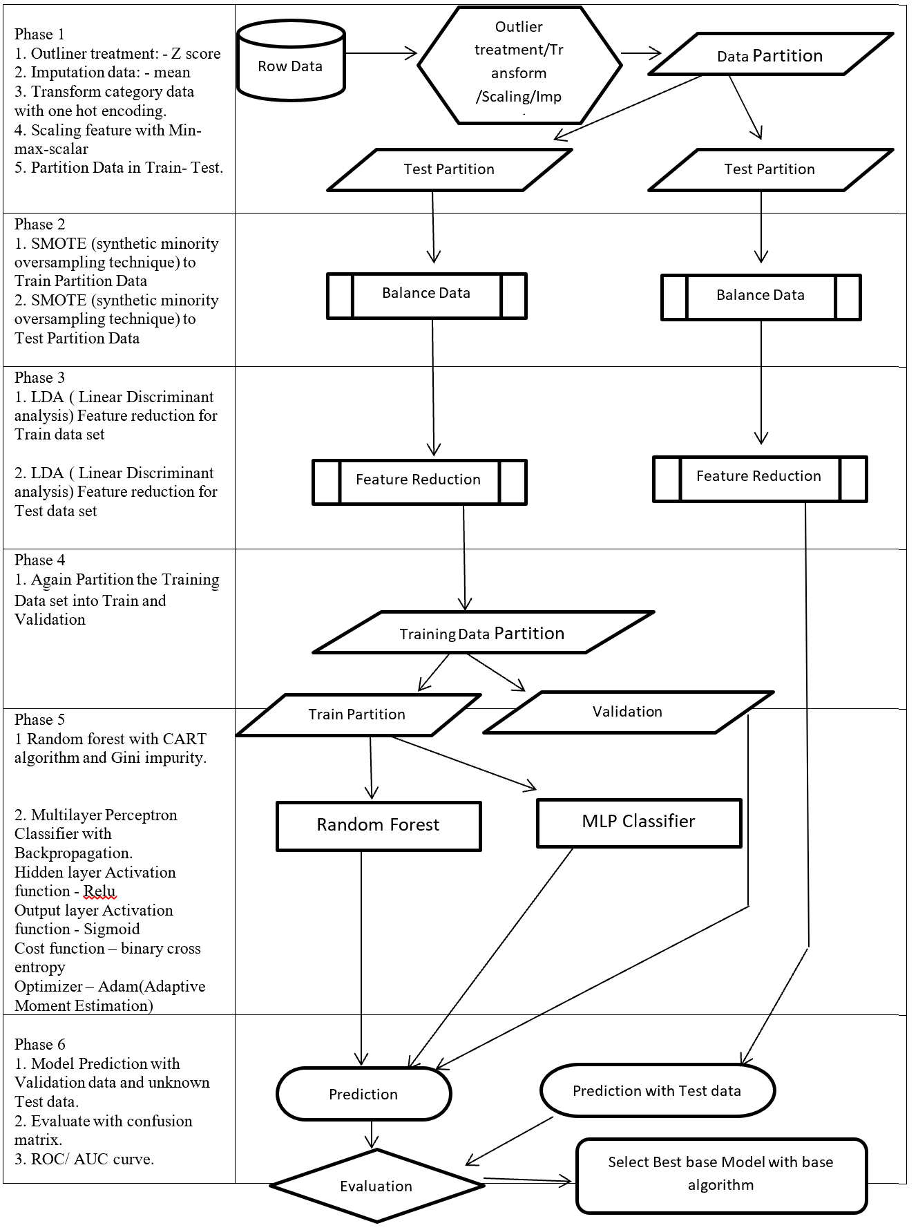
Phase of new process flow given below:-

Phase 1: Involved with collection, outliner treatment, imputation, transformation, scaling, and partition dataset in to two sub-frames (Training and Testing). Here as an example for outliner treatment, imputation, transformation, scaling consider accordingly Z score, mean, One hot encoding and Min Max Scaler.

Phase 2: On this Phase training and testing data balance with same balancing algorithm but separately. As an example here SMOTE (synthetic minority oversampling technique) is considered.

Phase 3: This phase involved with reduction, selection, aggregation, extraction. But here for an example considering same feature reduction algorithm (LDA -Linear Discriminant analysis) on training and testing data set separately.

Phase 4: On this Phase Training data set again partition into two more set (Training and Validation).

Phase 5: This Phase considering several base algorithms as a base model like CNN, RNN, Random forest, MLP, Regression, Ensemble method. This phase also involve to find out best hyper parameter and sub-algorithm for each base algorithm. As an example on this paper consider two class classification problems and also consider Random forest (Included CART – Classification and Regression Tree and GINI index impurity) and MLP classifier (Included (Relu, Sigmoid, binary cross entropy, Adam – Adaptive Moment Estimation) as base algorithms.

Phase 6: First, Prediction with validation data then evaluates with Test dataset which is fully unknown for these (Random forest, MLP classifier) two base algorithms. Then calculate the confusion matrix, ROC, AUC to find the best base algorithm.

New method from phase 1 to phase 4 followed CRISP-DM methodology steps such as data collection, data preparation then phase 5 followed modelling and phase 6 followed evaluation and implementation steps.

Structure of proposed process flow for two class problem combined with algorithm and sub-algorithm display on figure – 1.

These articles mainly focus to describe all algorithms which are going to implementation for better understanding.


Data Mining Process Flow

Figure 1 – Data Mining Process Flow

2 Phase 1: Outlier treatment, Transform, Scaling, Imputation

This phase involved with outlier treatment, imputation, scaling, and transform data.

2.1 Outliner treatment: – Z score

Outlier is a data point which lies far from all other data point in a data set. Outlier need to treat because it may bias the entire result. Outlier treatment with Z score is a common technique.  Z score is a standard score in statistics.  Z score provides information about data value is smaller or grater then mean that means how many standard deviations away from the mean value. Z score equation display below:

Z = \frac{(x - \mu)}{\sigma}

Here x = data point
σ = Standard deviation
μ = mean value

Equation- 1 Z-Score

In a normal distribution Z score represent 68% data lies on +/- 1, 95% data point lies on +/- 2, 99.7% data point lies on +/- 3 standard deviation.

2.2 Imputation data: – mean

Imputation is a way to handle missing data by replacing substituted value. There are many imputation technique represent like mean, median, mode, k-nearest neighbours. Mean imputation is the technique to replacing missing information with mean value. On the mean imputation first calculate the particular features mean value and then replace the missing value with mean value. The next equation displays the mean calculation:

\mu = \frac{(\sum x)}{n}

Here x = value of each point
n = number of values
μ = mean value

Equation- 2 Mean

2.3 Transform: – One hot encoding

Encoding is a pre-processing technique which represents data in such a way that computer can understand.  For understanding of machine learning algorithm categorical columns convert to numerical columns, this process called categorical encoding. There are multiple way to handle categorical variable but most widely used techniques are label encoding and one host encoding. On label encoding give a numeric (integer number) for each category. Suppose there are 3 categories of foods like apples, orange, banana. When label encoding is used then 3 categories will get a numerical value like apples = 1, banana = 2 and orange = 3. But there is very high probability that machine learning model can capture the relationship in between categories such as apple < banana < orange or calculate average across categories like 1 +3 = 4 / 2 = 2 that means model can understand average of apple and orange together is banana which is not acceptable because model correlation calculation is wrong. For solving this problem one hot encoding appear. The following table displays the label encoding is transformed into one hot encoding.

Label Encoding and One-Hot-Encoding

Table- 1 Encoding example

On hot encoding categorical value split into columns and each column contains 0 or 1 according to columns placement.

2.4 Scaling data: – Min Max Scaler

Feature scaling method is standardized or normalization the independent variable that means it is used to scale the data in a particular range like -1 to +1 or depending on algorithm. Generally normalization used where data distribution does not follow Gaussian distribution and standardization used where data distribution follow Gaussian distribution. On standardization techniques transform data values are cantered around the mean and unit is standard deviation. Formula for standardization given below:

Standardization X = \frac{(X - \mu)}{\sigma}

Equation-3 Equations for Standardization

X represent the feature value, µ represent mean of the feature value and σ represent standard deviation of the feature value. Standardized data value does not restrict to a particular range.

Normalization techniques shifted and rescaled data value range between 0 and 1. Normalization techniques also called Min-Max scaling. Formula for normalization given below:

Normalization X = \frac{(X - X_{min})}{X_{max} - X_{min}}

Equation – 4 Equations for Normalization

Above X, Xmin, Xmax are accordingly feature values, feature minimum value and feature maximum value. On above formula when X is minimums then numerator will be 0 (  is 0) or if X is maximums then the numerator is equal to the denominator (  is 1). But when X data value between minimum and maximum then  is between 0 and 1. If ranges value of data does not normalized then bigger range can influence the result.

3 Phase 2: – Balance Data

3.1 SMOTE

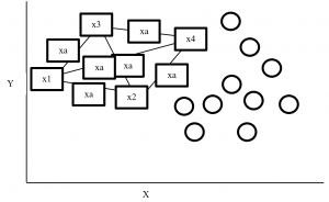
SMOTE (synthetic minority oversampling technique) is an oversampling technique where synthetic observations are created based on existing minority observations. This technique operates in feature space instead of data space. Under SMOTE each minority class observation calculates k nearest neighbours and randomly chose the neighbours depending on over-sampling requirements. Suppose there are 4 data point on minority class and 10 data point on majority class. For this imbalance data set, balance by increasing minority class with synthetic data point.   SMOTE creating synthetic data point but it is necessary to consider k nearest neighbours first. If k = 3 then SMOTE consider 3 nearest neighbours. Figure-2 display SMOTE with k = 3 and x = x1, x2, x3, x4 data point denote minority class. And all circles represent majority class.

SMOTE Example

Figure- 2 SMOTE example


4 Phase 3: – Feature Reduction

4.1 LDA

LDA stands for Linear Discriminant analysis supervised technique are commonly used for classification problem.  On this feature reduction account continuous independent variable and output categorical variable. It is multivariate analysis technique. LDA analyse by comparing mean of the variables.  Main goal of LDA is differentiate classes in low dimension space. LDA is similar to PCA (Principal component analysis) but in addition LDA maximize the separation between multiple classes. LDA is a dimensionality reduction technique where creating synthetic feature from linear combination of original data set then discard less important feature. LDA calculate class variance, it maximize between class variance and minimize within class variance. Table-2 display the process steps of LDA.

LDA Process

Table- 2 LDA process

5 Phase 5: – Base Model

Here we consider two base model ensemble random forest and MLP classifier.

5.1 Random Forest

Random forest is an ensemble (Bagging) method where group of weak learner (decision tree) come together to form a strong leaner. Random forest is a supervised algorithm which is used for regression and classification problem. Random forests create several decisions tree for predictions and provide solution by voting (classification) or mean (regression) value. Working process of Random forest given below (Table -3).

Random Forest

Table-3 Random Forest process

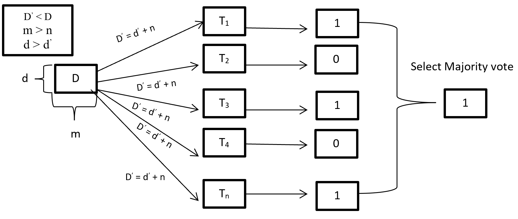
When training a Random forest root node contains a sample of bootstrap dataset and the feature is as same as original dataset. Suppose the dataset is D and contain d record and m number of columns. From the dataset D random forest first randomly select sample of rows (d) with replacement and sample of features (n) and give it to the decision tree. Suppose Random forest created several decision trees like T1, T2, T3, T4 . . . Tn. Then randomly selected dataset D = d + n is given to the decision tree T1, T2, T3, T4 . . . Tn where D < D, m > n and d > d.  After taking the dataset decision tree give the prediction for binary classification 1 or 0 then aggregating the decision and select the majority voted result. Figure-3 describes the structure of random forest process.

Random Forest Process

Figure- 3 Random Forest process

On Random forest base learner Decision Tree grows complete depth where bias (properly train on training dataset) is low and variance is high (when implementing test data give big error) called overfitting. On Random forest using multiple decision trees where each Decision tree is high variance but when combining all decision trees with the respect of majority vote then high variance converted into low variance because using row and feature sampling with replacement and taking the majority vote where decision is not depend on one decision tree.

CART (Classification and Regression Tree) is binary segmentation technique. CART is a Gini’s impurity index based classical algorithm to split a dataset and build a decision tree. By splitting a selected dataset CART created two child nodes repeatedly and builds a tree until the data no longer be split. There are three steps CART algorithm follow:

  1. Find best split for each features. For each feature in binary split make two groups of the ordered classes. That means possibility of split for k classes is k-1. Find which split is maximized and contain best splits (one for each feature) result.
  2. Find the best split for nodes. From step 1 find the best one split (from all features) which maximized the splitting criterion.
  3. Split the best node from step 2 and repeat from step 1 until fulfil the stopping criterion.


For splitting criteria CART use GINI index impurity algorithm to calculate the purity of split in a decision tree. Gini impurity randomly classified the labels with the same distribution in the dataset. A Gini impurity of 0 (lowest) is the best possible impurity and it is achieve when everything is in a same class. Gini index varies from 0 to 1. 0 indicate the purity of class where only one class exits or all element under a specific class. 1 indicates that elements are randomly distributed across various classes. And 0.5 indicate equal elements distributed over classes. Gini index (GI) described by mathematically that sum of squared of probabilities of each class (pi) deducted from one (Equation-5).

Gini Impurities

Equation – 5 Gini impurities

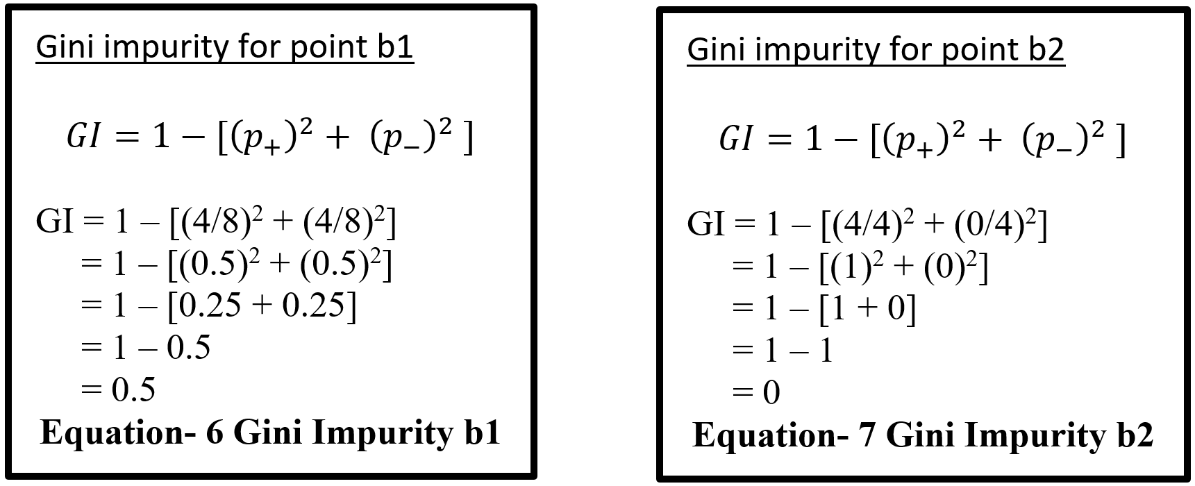
Here (Equation-5) pi represent the probability (probability of p+ or yes and probability of p- or no) of distinct class with classified element. Suppose randomly selected feature (a1) which has 8 yes and 4 no. After the split right had side (b1 on equation-6) has 4 yes and 4 no and left had side (b2 on equation – 7) has 4 yes and 0 no. here b2 is a pure split (leaf node) because only one class yes is present. By using the GI (Gini index) formula for b1 and b2:-

Equation- 6 & 7 – Gini Impurity b1 & Gini Impurity b2

Here for b1 value 0.5 indicates that equal element (yes and no) distribute over classes which is not pure split. And b2 value 0 indicates pure split. On GINI impurity indicates that when probability (yes or no) increases GINI value also increases. Here 0 indicate pure split and .5 indicate equal split that means worst situation. After calculating the GINI index for b1 and b2 now calculate the reduction of impurity for data point a1. Here total yes 8 (b1 and b2 on Equation – 8) and total no 4 (b1) so total data is 12 on a1. Below display the weighted GINI index for feature a1:

Total data point on b1 with Gini index (m) = 8/12 * 0.5 = 0.3333

Total data point on b2 with Gini index (n) = 4/12 * 0 = 0

Weighted Gini index for feature a1 = m + n = 0.3333

Equation- 8 Gini Impurity b1 & b2

After computing the weighted Gini value for every feature on a dataset taking the highest value feature as first node and split accordingly in a decision tree. Gini is less costly to compute.

5.2 Multilayer Perceptron Classifier (MLP Classifier)

Multilayer perceptron classifier is a feedforward neural network utilizes supervised learning technique (backpropagation) for training. MLP Classifier combines with multiple perceptron (hidden) layers. For feedforward taking input send combining with weight bias and then activation function from one hidden layer output goes to other hidden and this process continuing until reached the output. Then output calculates the error with error algorithm. These errors send back with backpropagation for weight adjustment by decreasing the total error and process is repeated, this process is call epoch. Number of epoch is determined with the hyper-parameter and reduction rate of total error.

5.2.1 Back-Propagation

Backpropagation is supervised learning algorithm that is used to train neural network. A neural network consists of input layer, hidden layer and output layer and each layer consists of neuron. So a neural network is a circuit of neurons. Backpropagation is a method to train multilayer neural network the updating of the weights of neural network and is done in such a way so that the error observed can be reduced here, error is only observed in the output layer and that error is back propagated to the previous layers and previous layer is proportionally updated weight. Backpropagation maintain chain rule to update weight. Mainly three steps on backpropagation are (Table-4):

Step Process
Step 1 Forward Pass
Step 2 Backward Pass
Step 3 Sum of all values and calculate updated weight value with Chain – rules.

Table-4 Back-Propagation process

5.2.2 Forward pass/ Forward propagation

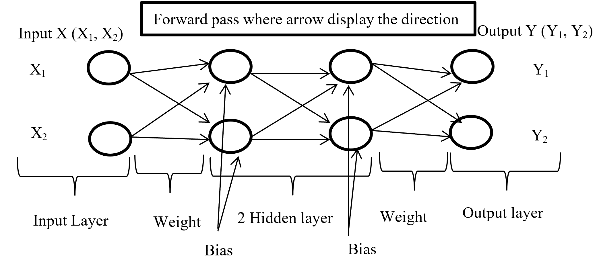
Forward propagation is the process where input layer send the input value with randomly selected weight and bias to connected neuron and inside neuron selected activation function combine them and forward to other connected neuron layer after layer then give an output with the help of output layer. Below (Figure-4) display the forward propagation.

Foreward Pass

Figure-4 Forward passes

Input layer take the input of X (X1, X2) combine with randomly selected weight for each connection and with fixed bias (different hidden layer has different bias) send it to first hidden layer where first multiply the input with corresponding weight and added all input with single bias then selected activation function (may different form other layer) combine all input and give output according to function and this process is going on until reach in output layer. Output layer give the output like Y (Y1, Y2) (here output is binary classification as an example) according to selected activation function.

5.2.3 Backward Pass

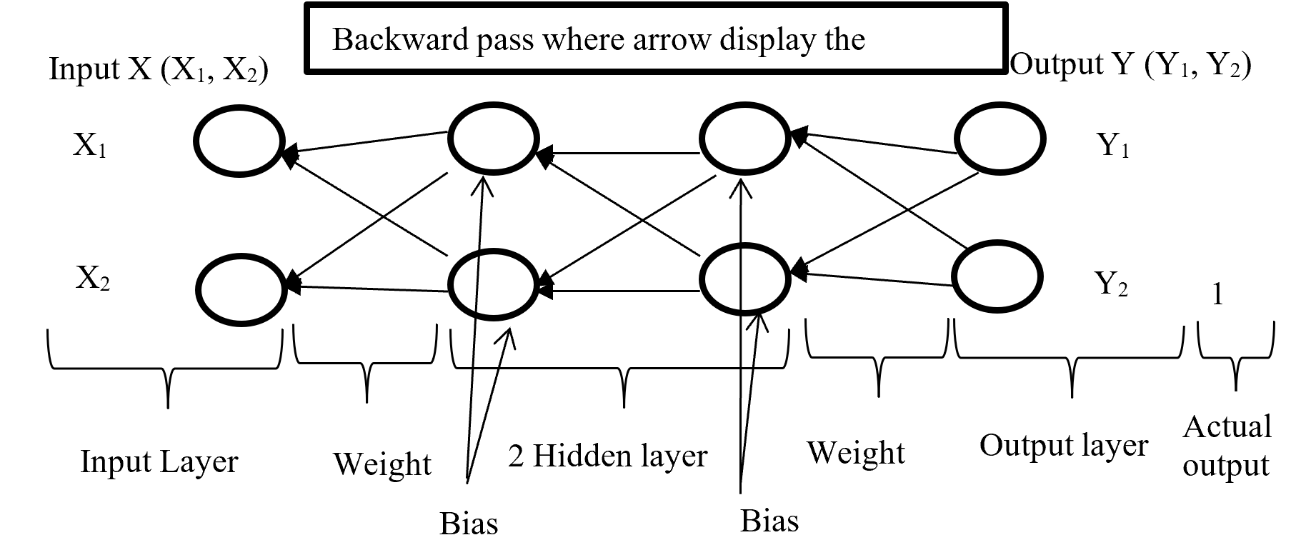
After calculating error (difference between Forward pass output and actual output) backward pass try to minimize the error with optimisation function by sending backward with proportionally distribution and maintain a chain rule. Backward pass distribution the error in such a way where weighted value is taking under consideration. Below (Figure-5) diagram display the Backward pass process.

Backward Pass

Figure-5 Backward passes

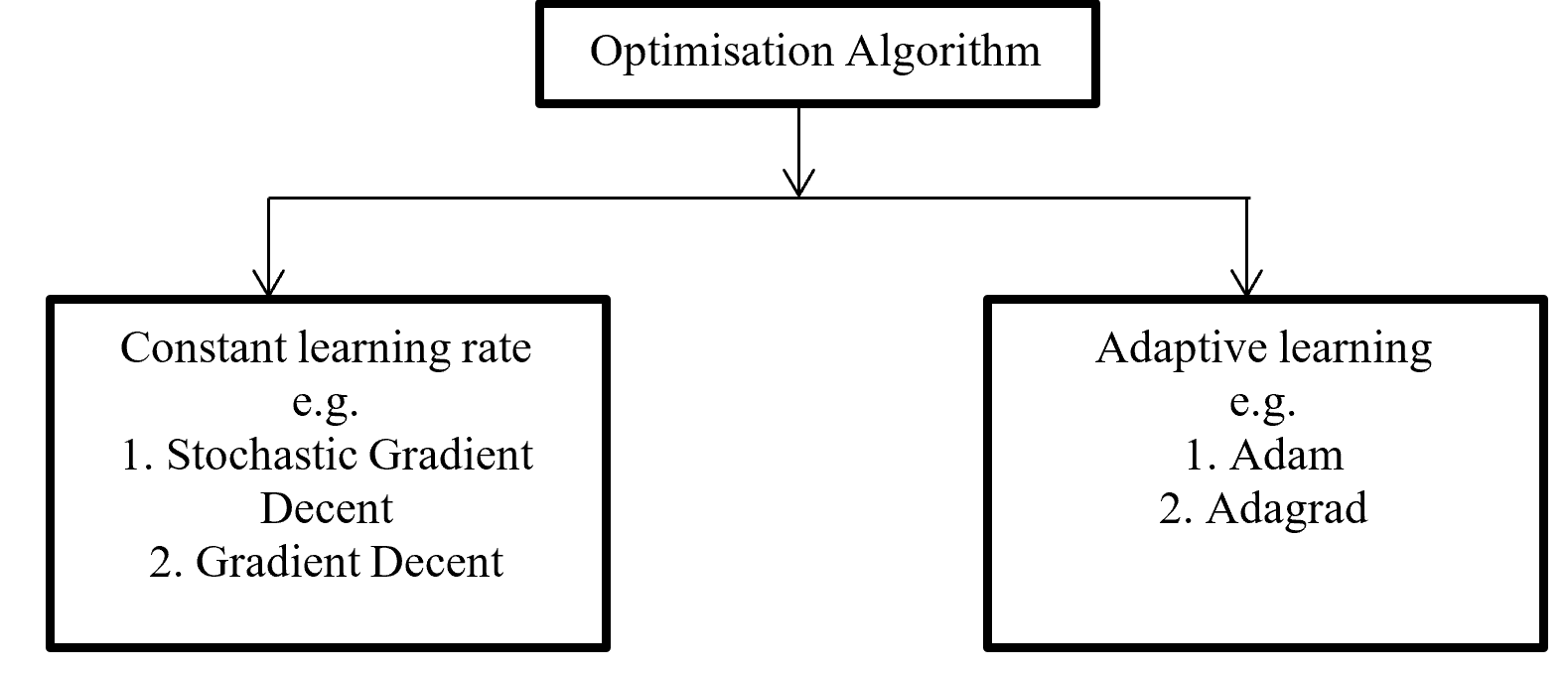
Backpropagation push back the error which is calculated with error function or loss function for update proportional distribution with the help of optimisation algorithm. Division of Optimisation algorithm given below on Figure – 6

Optimisation Algorithms

Figure -6 Division of Optimisation algorithms

Gradient decent calculate gradient and update value by increases or decreases opposite direction of gradients unit and try to find the minimal value. Gradient decent update just one time for whole dataset but stochastic gradient decent update on each training sample and it is faster than normal gradient decent. Gradient decent can be improve by tuning parameter like learning rate (0 to 1 mostly use 0.5). Adagrad use time step based parameter to compute learning rate for every parameter. Adam is Adaptive Moment Estimation. It calculates different parameter with different learning rate. It is faster and performance rate is higher than other optimization algorithm. On the other way Adam algorithm is squares the calculated exponential weighted moving average of gradient.

5.2.4 Chain – rules

Backpropagation maintain chain-rules to update weighted value. On chain-rules backpropagation find the derivative of error respect to any weight. Suppose E is output error. w is weight for input a and bias b and ac neuron output respect of activation function and summation of bias with weighted input (w*a) input to neuron is net. So partial derivative for error respect to weight is ∂E / ∂w display the process on figure-7.

Figure- 7 Partial derivative for error respect to weight

On the chain rules for backward pass to find (error respect to weight) ∂E / ∂w = ∂E / ∂ac * ∂ac / ∂net * ∂net / ∂w. here find to error respect to weight are error respect to output of activation function multiply by activation function output respect to input in a neuron multiply by input in a neuron respect to weight.

5.2.5 Activation function

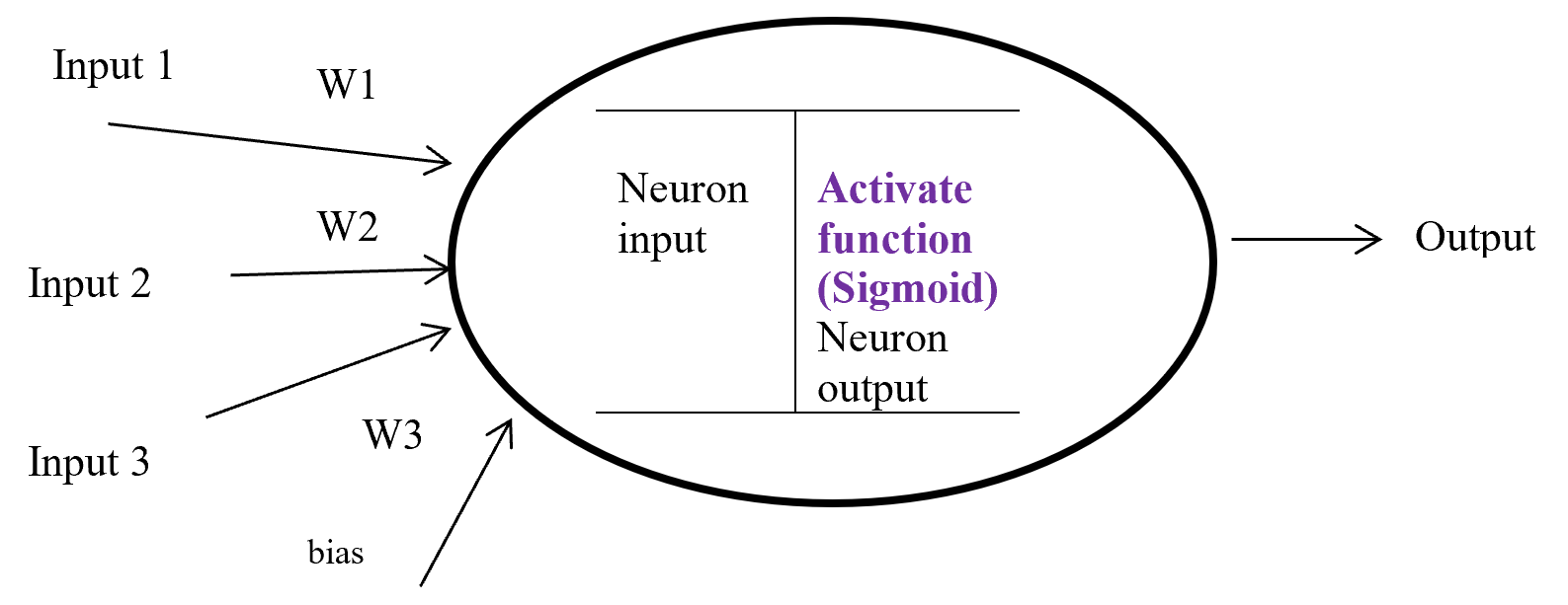
Activation function is a function which takes the decision about neuron to activate or deactivate. If the activate function activate the neuron then it will give an output on the basis of input. Input in a activation function is sum of input multiply with corresponding weight and adding the layered bias.  The main function of a activate function is non-linearity output of a neuron.

Activation Function

Figure-8 Activation function

Figure – 8 display a neuron in a hidden layer. Here several input (1, 2, 3) with corresponding weight (w1, w2, w3) putting in a neuron input layer where layer bias add with summation of multiplication with input and weight. Equation-9 display the output of an activate function.

Output from activate function y = Activate function (Ʃ (weight * input) + bias)

y = f (Ʃ (w*x) +b)

Equation- 9 Activate function

There are many activation functions like linear function for regression problem, sigmoid function for binary classification problem where result either 0 or 1, Tanh function which is based on sigmoid function but mathematically shifted version and values line -1 to 1. RELU function is Rectified linear unit. RELU is less expensive to compute.

5.2.6 Sigmoid

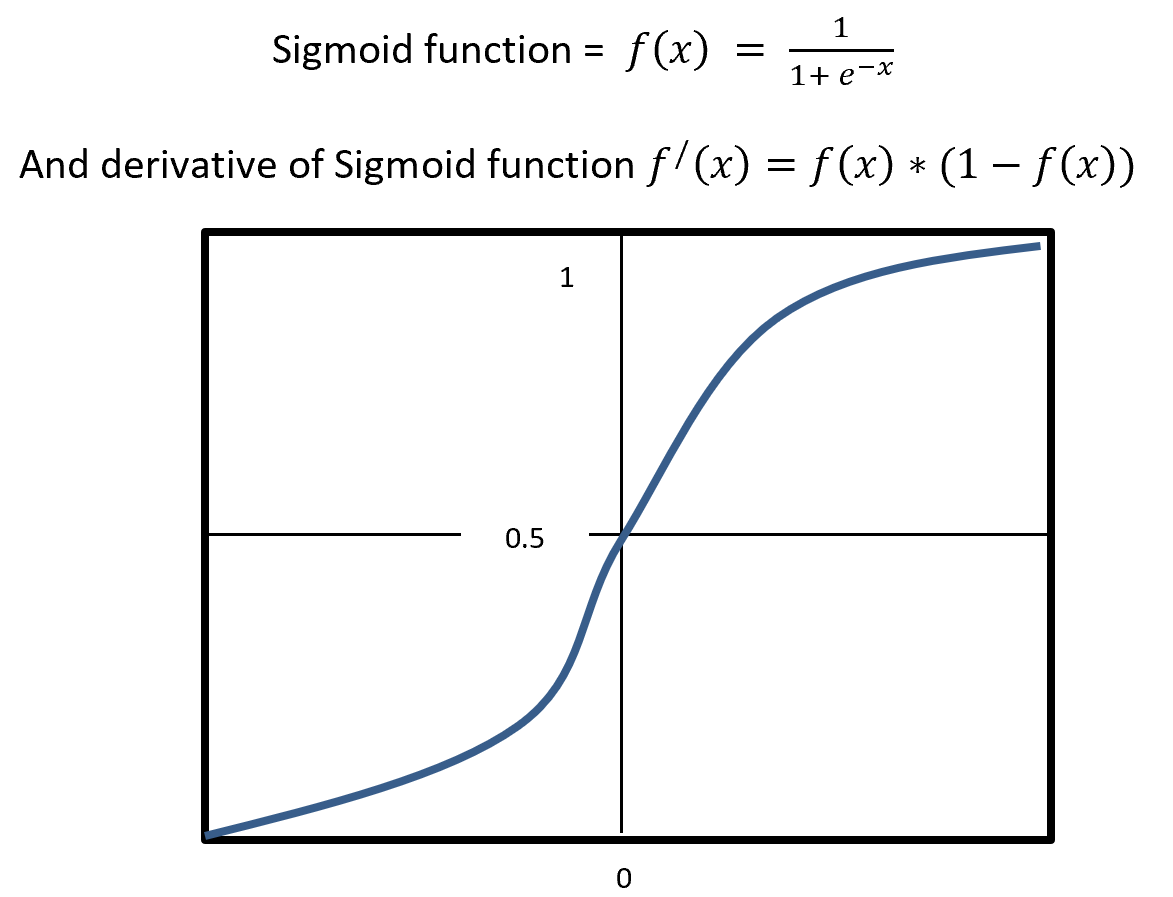
Sigmoid is a squashing activate function where output range between 0 and 1. Sigmoidal name comes from Greek letter sigma which looks like letter S when graphed. Sigmoid function is a logistic type function, it mainly use in output layer in neural network. Sigmoid is non-linear, fixed output range (between 0 and 1), monotonic (never decrees or never increases) and continuously differentiated function. Sigmoid function is good at classification and output from sigmoid is nonlinear. But Sigmoid has a vanishing gradient problem because output variable is very less to change in input variable. Figure- 9 displays the output of a Sigmoid and derivative of Sigmoid. Here x is any number (positive or negative). On sigmoid function 1 is divided by exponential negative input with adding 1.

Sigmoid

Figure – 9 Sigmoid Functions

4.5.2.7 RELU

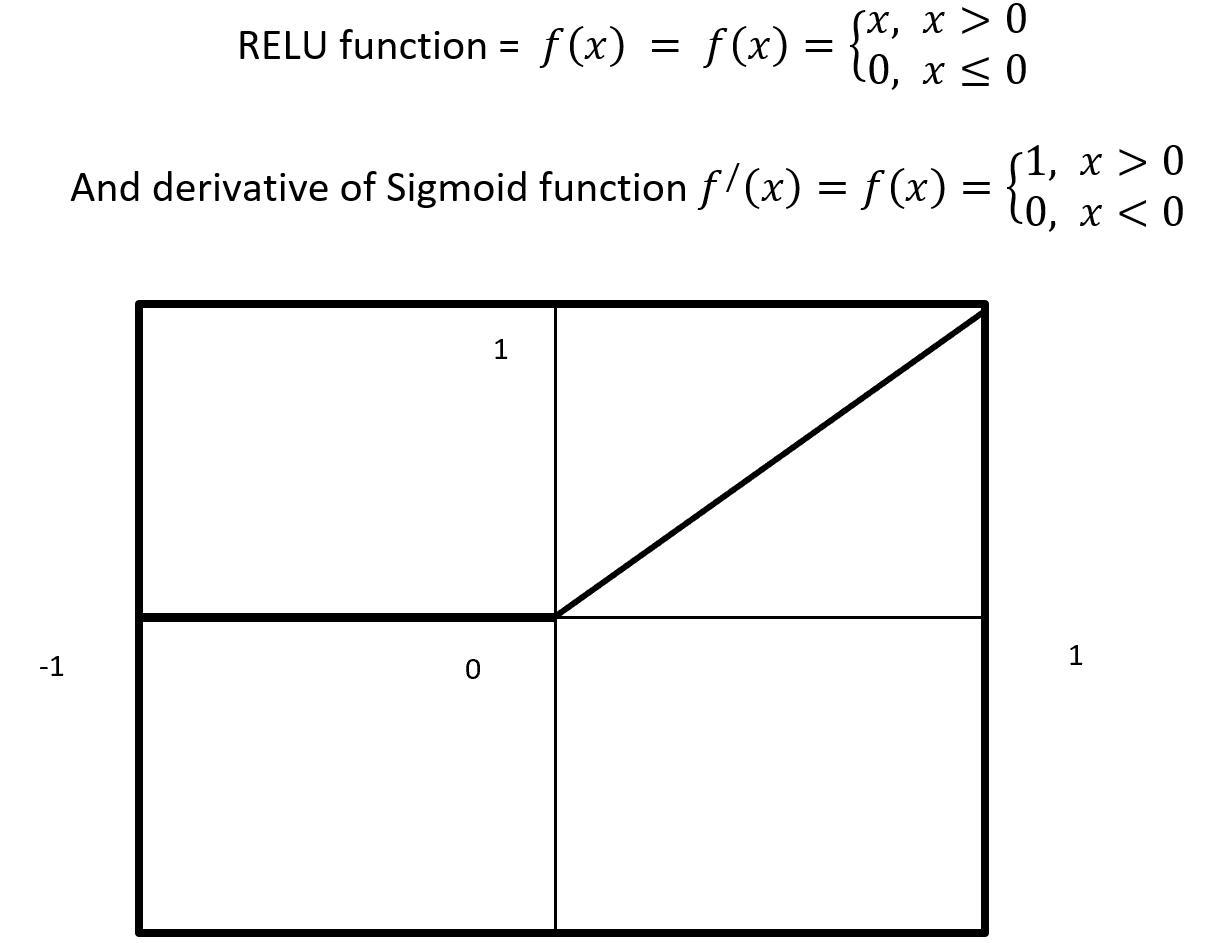
RELU stands for Rectified Linear Units it is simple, less expensive in computation and rectifies the gradient vanishing problem. RELU is nonlinear activation function. It gives output either positive (infinity) or 0. RELU has a dying problem because if neurons stop for responding to variation because of gradient is 0 or nothing has to change. Figure- 10 displays the output of an RELU and derivative of RELU. Here x is any positive input and if x is grater then 0 give the output as x or give output 0. RELU function gives the output maximum value of input, here max (0, x).

Relu Activation Function

Figure – 10 RELU Function

4.5.2.8 Cost / loss function (Binary Cross-Entropy)

Cost or loss function compare the predictive value (model outcome) with actual value and give a quantitative value which give the indication about how much good or bad the prediction is.

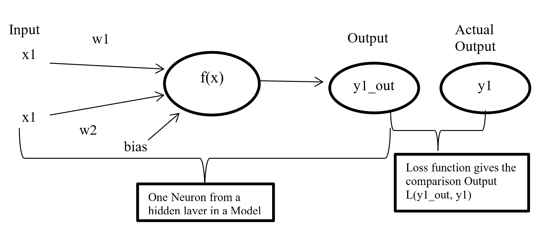
Cost Function

Figure- 11 Cost function work process

Figure-11 x1 and x2 are input in a activate function f(x) and output y1_out which is sum of weighted input added with bias going through activate function. After model output activate function compare the output with actual output and give a quantitative value which indicate how good or bad the prediction is.

There are many type of loss function but choosing of optimal loss function depends on the problem going to be solved such as regression or classification. For binary classification problem binary cross entropy is used to calculate cost. Equation-10 displays the binary cross entropy where y is actual binary value and yp predictive outcome range 0 and 1. And i is scalar vale range between 1 to model output size (N).

Binary Crossentropy

Equation-10 displays the binary cross entropy

6 Phase 6: – Evaluation

6.1 Confusion matrix

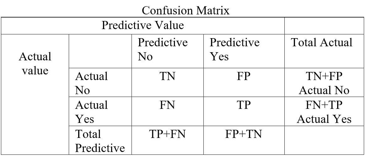
In a classification confusion matrix describe the performance of actual value against predictive value. Confusion Matrix does the performance measurement. So confusion matrix classifies and display predicted and actual value (Visa, S., Ramsay 2011).

Confusion Matrix

Table- 5 Confusion Matrix

Confusion Matrix (Table-5) combines with True Positive (TP), True Negative (TN), False Positive (FP), and False Negative (FN). True Positive is prediction positive and true. True Negative is prediction negative and that is true. False positive is prediction positive and it’s false. False negative is prediction negative and that is false. False positive is known as Type1 error and false negative is known as Type 2 error. Confusion matrix can able to calculate several list of rates which are given below on Table- 6.

Here    N = Total number of observation, TP = True Positive, TN = True Negative

FP = False Positive, FN = False Negative, Total Actual No (AN) = TN + FP,

Total Predictive Yes (PY) = FP + TP. Total Actual Yes (AY) = FN + TP

Rate


Description Mathematical Description
Accuracy Classifier, overall how often correctly identified  (TP+TN) / N
Misclassification Rate Classifier, overall how often wrongly identified (FP + FN) / N
True Positive Rate

(Sensitivity / Recall)

Classifier, how often predict correctly yes when it is actually yes.  TP / AY
False Positive Rate Classifier, how often predict wrongly yes when it is actually no.  FP / AN
True Negative Rate

(Specificity)

Classifier, how often predict correctly no when it is actually no.  TN / AN
Precision Classifier how often predict yes when it is correct.  TP / PY
Prevalence Yes conditions how often occur in a sample. AY / N

Table – 6 Confusion matrixes Calculation

From confusion matrix F1 score can be calculated because F1 score related to precision and recall. Higher F1 score is better. If precision or recall any one goes down F1 score also go down.

F1 = \frac{2 * Precision * Recall}{Precision + Recall}

4.6.2 ROC (Receiver Operating Characteristic) curve

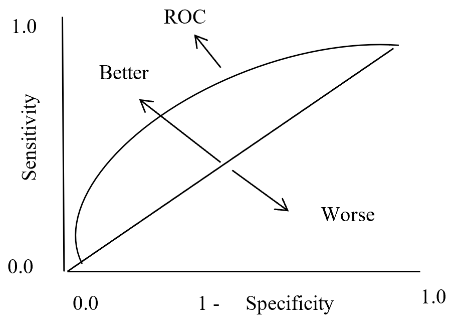
In statistics ROC is represent in a graph with plotting a curve which describe a binary classifiers performance as its differentiation threshold is varied. ROC (Equation-11) curve created true positive rate (TPR) against false positive rate (FPR). True positive rate also called as Sensitivity and False positive rate also known as Probability of false alarm. False positive rate also called as a probability of false alarm and it is calculated as 1 – Specificity.

True Positive Rate = \frac{True Positive}{True Positive + False Negative} = Recall or Sensivity

False Positive Rate = \frac{True Negative}{True Negative + False Positive} = 1 - Specificity

Equation- 11 ROC

So ROC (Receiver Operation Characteristic) curve allows visual representation between sensitivity and specificity associated with different values of the test result (Grzybowski, M. and Younger, J.G., 1997)

On ROC curve each point has different Threshold level. Below (Figure – 12) display the ROC curve. Higher the area curve covers is better that means high sensitivity and high specificity represent more accuracy. ROC curve also represent that if classifier predict more often true than it has more true positive and also more false positive. If classifier predict true less often then fewer false positive and also fewer true positive.

ROC Curve

ROC Curve

Figure – 12 ROC curve description

4.6.3 AUC (Area under Curve)

Area under curve (AUC) is the area surrounded by the ROC curve and AUC also represent the degree of separability that means how good the model to distinguished between classes. Higher the AUC value represents better the model performance to separate classes. AUC = 1 for perfect classifier, AUC = 0 represent worst classifier, and AUC = 0.5 means has no class separation capacity. Suppose AUC value is 0.6 that means 60% chance that model can classify positive and negative class.

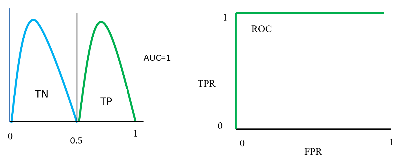
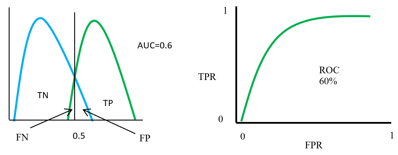
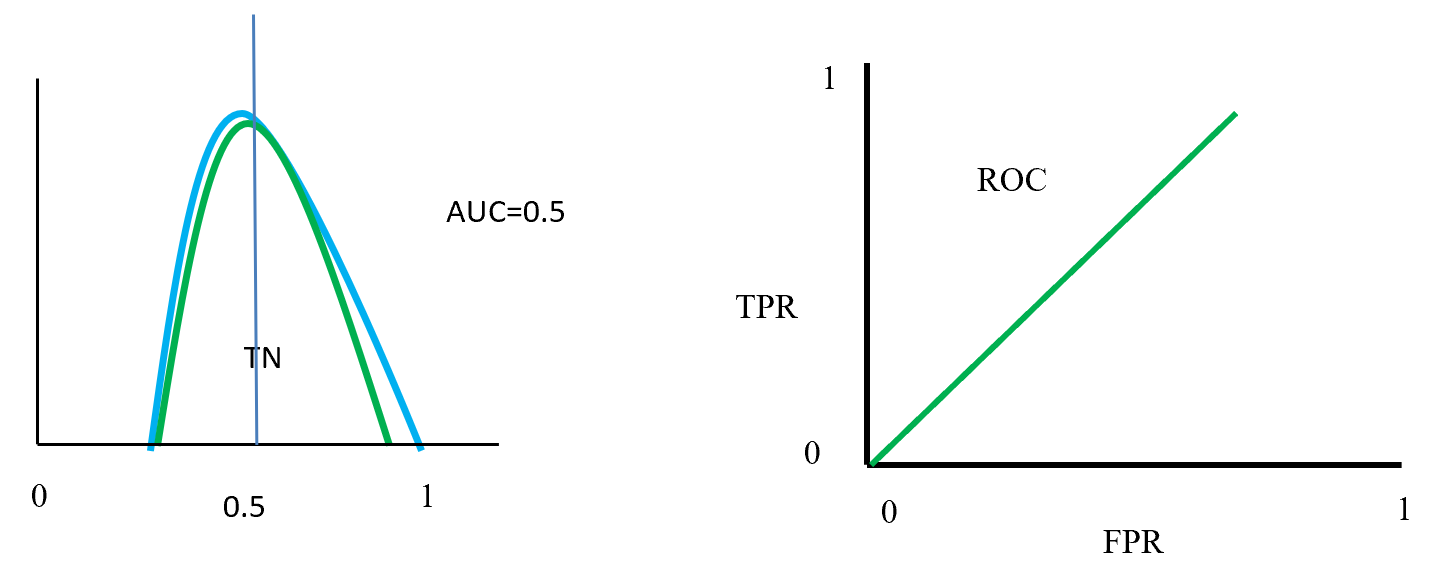
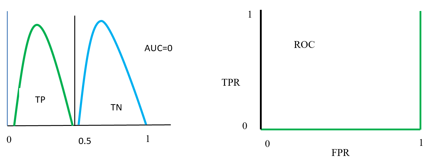
Figure- 13 to Figure – 16 displays an example of AUC where green distribution curve for positive class and blue distribution curve for negative class. Here threshold or cut-off value is 0.5 and range between ‘0’ to ‘1’. True negative = TN, True Positive = TP, False Negative = FN, False Positive = FP, True positive rate = TPR (range 0 to 1), False positive rate = FPR (range 0 to 1).

On Figure – 13 left distribution curve where two class curves does not overlap that means both class are perfectly distinguished. So this is ideal position and AUC value is 1.  On the left side ROC also display that TPR for positive class is 100% occupied.

ROC distributions (perfectly distinguished

ROC distributions (perfectly distinguished

Figure – 14 two class overlap each other and raise false positive (Type 1), false negative (Type 2) errors. Here error could be minimize or maximize according to threshold. Suppose here AUC = 0.6, that means chance of a model to distinguish two classes is 60%. On ROC curve also display the curve occupied for positive class is 60%.

ROC distributions (class partly overlap distinguished)

ROC distributions (class partly overlap distinguished)

Figure- 15 displayed that positive and negative overlap each other. Here AUC value is 0.5 or near to 0.5. On this position classifier model does not able distinguish positive and negative classes. On left side ROC curve become straight that means TPR and FPR are equal.

ROC distributions (class fully overlap distinguished)

ROC distributions (class fully overlap distinguished)

Figure- 16 positive and negative class swap position and on this position AUC = 0. That means classified model predict positive as a negative and negative as a positive. On the left ROC curve display that curve on FPR side fully fitted.

ROC distributions (class swap position distinguished)

ROC distributions (class swap position distinguished)

7 Summaries

This paper describes a data mining process flow and related model and its algorithm with textual representation. One hot encoding create dummy variable for class features and min-max scaling scale the data in a single format. Balancing by SMOTE data where Euclidian distance calculates the distance in-between nearest neighbour to produce synthetic data under minority class. LDA reduce the distance inside class and maximise distance in-between class and for two class problem give a single dimension features which is less costly to calculate accuracy by base algorithm (random forest and MLP classifier).  Confusion matrix gives the accuracy, precision, sensitivity, specificity which is help to take a decision about base algorithm. AUC and ROC curve also represent true positive rate against false positive rate which indicate base algorithm performance.

Base algorithm Random forest using CART with GINI impurity for feature selection to spread the tree. Here CART is selected because of less costly to run. Random forest algorithm is using bootstrap dataset to grow trees, and aggregation using majority vote to select accuracy.

MLP classifier is a neural network algorithm using backpropagation chain-rule to reducing error. Here inside layers using RLU activation function. Output layers using Sigmoid activation function and binary cross entropy loss function calculate the loss which is back propagate with Adam optimizer to optimize weight and reduce loss.

References:

  1. Visa, S., Ramsay, B., Ralescu, A.L. and Van Der Knaap, E., 2011. Confusion Matrix-based Feature Selection. MAICS, 710, pp.120-127.
  2. Grzybowski, M. and Younger, J.G., 1997. Statistical methodology: III. Receiver operating characteristic (ROC) curves. Academic Emergency Medicine, 4(8), pp.818-826.
CRISP-DM methodology in technical view

On this paper discuss about CRISP-DM (Cross Industry Standard Process for data mining) methodology and its steps including selecting technique to successful the data mining process. Before going to CRISP-DM it is better to understand what data mining is? So, here first I introduce the data mining and then discuss about CRISP-DM and its steps for any beginner (data scientist) need to know.

1 Data Mining

Data mining is an exploratory analysis where has no idea about interesting outcome (Kantardzic, 2003). So data mining is a process to explore by analysis a large set of data to discover meaningful information which help the business to take a proper decision. For better business decision data mining is a way to select feature, correlation, and interesting patterns from large dataset (Fu, 1997; SPSS White Paper, 1999).

Data mining is a step by step process to discover knowledge from data. Pre-processing data is vital part for a data mining. In pre-process remove noisy data, combining multiple sources of data, retrieve relevant feature and transforming data for analysis. After pre-process mining algorithm applied to extract data pattern so data mining is a step by step process and applied algorithm to find meaning full data pattern. Actually data mining is not only conventional analysis it is more than that (Read, 1999).

Data mining and statistics closely related. Main goal of data mining and statistic is find the structure of data because data mining is a part of statistics (Hand, 1999). However, data mining use tools, techniques, database, machine learning which not part of statistics but data mining use statistics algorithm to find a pattern or discover hidden decision.

Data mining objective could be prediction or description. On prediction data mining considering several features of dataset to predict unidentified future, on the other hand description involve identifying pattern of data to interpreted (Kantardzic, 2003).

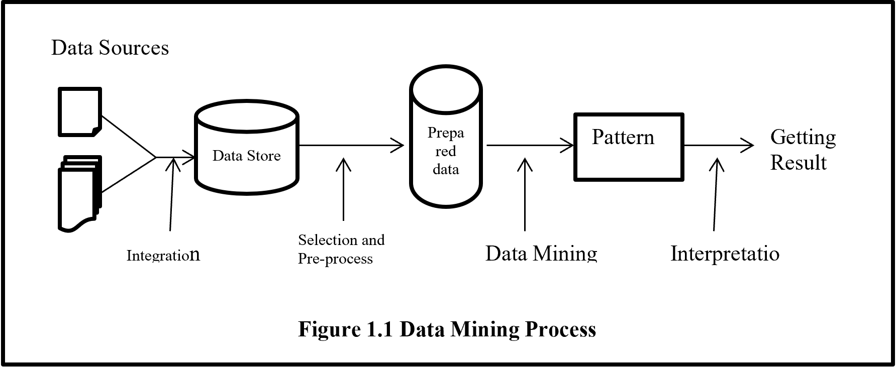
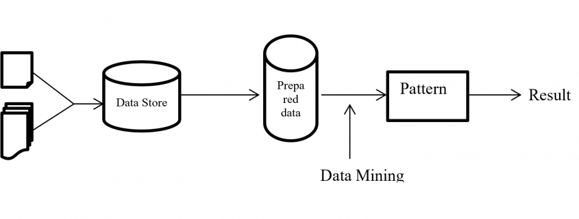
From figure 1.1 shows data mining is the only one part of getting unknown information from data but it is the central process of whole process. Before data mining there are several processes need to be done like collecting data from several sources than integrated data and keep in data storage. Stored unprocessed data evaluated and selected with pre-processed activity to give a standard format than data mining algorithm to analysis for hidden pattern.

Data Mining Process

2 CRISP-DM Methodologies

Cross Industry Standard Process for data mining (CRISP-DM) is most popular and widely uses data mining methodology. CRISP-DM breaks down the data mining project life cycle into six phases and each phase consists of many second-level generic tasks. Generic task cover all possible data mining application. CRISP-DM extends KDD (Knowledge Discovery and Data Mining) into six steps which are sequence of data mining application (Martínez-Plumed 2019).

Data science and data mining project extract meaningful information from data. Data science is an art where a lot of time need to spend for understanding the business value and data before applying any algorithm then evaluate and deployed a project. CRISP-DM help any data science and data mining project from start to end by giving step by step process.

Present world every day billions of data are generating. So organisations are struggling with overwhelmed data to process and find a business goal. Comprehensive data mining methodology, CRISP-DM help business to achieve desirable goal by analysing data.

CRISP-DM (Cross Industry Standard Process for Data Mining) is well documented, freely available, data mining methodology. CRISP-DM is developed by more than 200 data mining users and many mining tool and service providers funded by European Union. CRISP-DM encourages organization for best practice and provides a structure of data mining to get better, faster result.

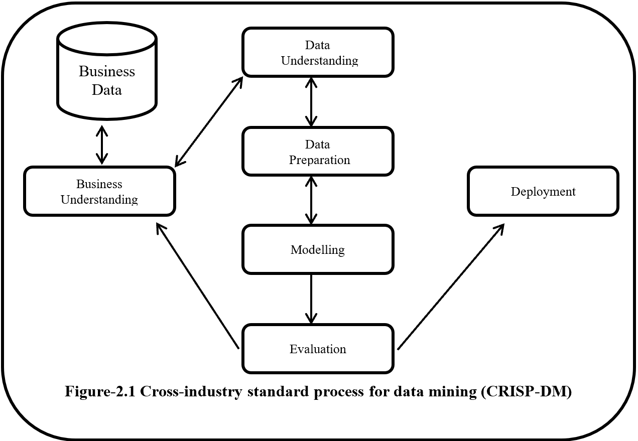
CRISP-DM is a step by step methodology. Figure-2.1 show the phases of CRISP-DM and process of data mining. Here one side arrow indicates the dependency between phases and double side arrow represents repeatable process. Six phases of CRISP-DM are Business understanding, Data understanding, Modelling, Evaluation and Deployment.

CRISP-DM

2.1 Business Understanding

Business Understanding or domain understanding is the first step of CRISP-DM methodology. On this stage identify the area of business which is going to transform into meaningful information by analysing, processing and implementing several algorithms. Business understanding identifies the available resource (human and hardware), problems and set a goal. Identification of business objective should be agreed with project sponsors and other unit of business which will be affected. This step also focuses about details business success criteria, requirements, constraints, risk, project plan and timeline.

2.2 Data Understanding

Data understanding is the second and closely related with the business understanding phase. This phase mainly focus on data collection and proceeds to get familiar with the data and also detect interesting subset from data. Data understanding has four subsets these are:-

2.2.1 Initial data collection

On this subset considering the data collection sources which is mainly divided into two categories like outsource data or internal source data.  If data is from outsource then it may costly, time consuming and may be low quality but if data is collected form internal source it is an easy and less costly, but it may be contain irrelevant data. If internal source data does not fulfil the interest of analysis than it is necessary to move outsource data. Data collection also give an assumption that the data is quantitative (continuous, count) or qualitative (categorical).  It also gives information about balance or imbalanced dataset.  On data collection should avoid random error, systematic error, exclusion errors, and errors of choosing.

2.2.2 Data Description

Data description performs initial analysis about data. On this stage it is going to determine about the source of data like RDBMS, SQL, NoSQL, Big data etc. then analysis and describe the data about size (large data set give more accurate result but time consuming), number of records, tables, database, variables, and data types (numeric, categorical or Boolean). On this phase examine the accessibility and availability of attributes.

2.2.3 Exploratory data analysis (EDA)

On exploratory data analysis describe the inferential statistics, descriptive statistics and graphical representation of data. Inferential statistics summarize the entire population from the sample data to perform sampling and hypothesis testing. On Parametric hypothesis testing  (Null or alternate – ANOVA, t-test, chi square test) perform for known distribution (based on population) like mean, variance, standard deviation, proportion and Non-parametric hypothesis testing perform when distribution is unknown or sample size is small. On sample dataset, random sampling implement when dataset is balance but for imbalance dataset should be follow random resampling (under  and over sampling), k fold cross validation, SMOTE (synthetic minority oversampling technique), cluster base sampling, ensemble techniques (bagging and boosting – Add boost, Gradient Tree Boosting, XG Boost) to form a balance dataset.

On descriptive statistics analysis describe about the mean, median, mode for measures of central tendency on first moment business decision. On second moment business decision describe the measure of dispersion about the variance, standard deviation and range of data.  On third and fourth moment business decision describe accordingly skewness (Positive skewness – heavier tail to the right, negative skewness – heavier tail to the left, Zero skewness – symmetric distribution) and Kurtosis (Leptokurtosis – heavy tail, platykurtosis – light tail, mesokurtic – normal distribution).

Graphical representation is divided into univariate, bivariate and multivariate analysis. Under univariate whisker plot, histogram identify the outliers and shape of distribution of data and Q-Q plot (Quantile – Quantile) plot describe the normality of data that means data is normally distribution or not.  On whisker plot if data present above of Q3 + 1.5 (IQR) and below of Q1 – 1.5 (IQR) is outlier. For Bivariate correlations identify with scatter plot which describe positive, negative or no correlation and also identify the data linearity or non-linearity. Scatter plot also describe the clusters and outliers of data.  For multivariate has no graphical analysis but used to use regression analysis, ANOVA, Hypothesis analysis.

2.2.4 Data Quality analysis

This phase identified and describes the potential errors like outliers, missing data, level of granularity, validation, reliability, bad metadata and inconsistency.  On this phase AAA (attribute agreement analysis) analysed discrete data for data error. Continuous data analysed with Gage repeatability and reproducibility (Gage R & R) which follow SOP (standard operating procedures). Here Gage R & R define the aggregation of variation in the measurement data because of the measurement system.

2.3 Data Preparation

Data Preparation is the time consuming stage for every data science project. Overall on every data science project 60% to 70% time spend on data preparation stage. Data preparation stapes are described below.

2.3.1 Data integration

Data integration involved to integrate or merged multiple dataset. Integration integrates data from different dataset where same attribute or same columns presents but when there is different attribute then merging the both dataset.

2.3.2 Data Wrangling

On this subset data are going to clean, curate and prepare for next level. Here analysis the outlier and treatment done with 3 R technique (Rectify, Remove, Retain) and for special cases if there are lots of outliner then need to treat outlier separately (upper outliner in an one dataset and lower outliner in another dataset) and alpha (significant value) trim technique use to separate the outliner from the original dataset. If dataset has a missing data then need to use imputation technique like mean, median, mode, regression, KNN etc.

If dataset is not normal or has a collinearity problem or autocorrelation then need to implement transformation techniques like log, exponential, sort, Reciprocal, Box-cox etc. On this subset use the data normalization (data –means/standard deviation) or standardization (min- max scaler) technique to make unitless and scale free data. This step also help if data required converting into categorical then need to use discretization or binning or grouping technique. For factor variable (where has limited set of values), dummy variable creation technique need to apply like one hot encoding.  On this subset also help heterogeneous data to transform into homogenous with clustering technique. Data inconsistencies also handle the inconsistence of data to make data in a single scale.

2.3.3 Feature engineering and selection/reduction

Feature engineering may called as attribute generation or feature extraction. Feature extraction creating new feature by reducing original feature to make simplex model. Feature engineering also do the normalized feature by producing calculative new feature. So feature engineering is a data pre-process technique where improve data quality by cleaning, integration, reduction, transformation and scaling.

Feature selections reduce the multicollinearity or high correlated data and make model simple. Main two type of feature selection technique are supervised and unsupervised. Principal Components Analysis (PCA) is an unsupervised feature reduction/ feature selection technique and LDA is a Linear Discriminant analysis supervised technique mainly use for classification problem. LDA analyse by comparing mean of the variables. Supervised technique is three types filter, wrapper and ensemble method. Filter method is easy to implement but wrapper is costly method and ensemble use inside a model.

2.4 Model

2.4.1 Model Selection Technique

Model selection techniques are influence by accuracy and performance.  Because recommendation need better performance but banking fraud detection needs better accuracy technique.  Model is mainly subdivided into two category supervised learning where predict an output variable according to given an input variable and unsupervised learning where has not output variable.

On supervised learning if an output variable is categorical than it is classification problem like two classes or multiclass classification problem. If an output variable is continuous (numerical) then the problem is called prediction problem. If need to recommending according to relevant information is called recommendation problem or if need to retrieve data according to relevance data is called retrieval problem.

On unsupervised learning where target or output variable is not present. On this technique all variable is treated as an input variable. Unsupervised learning also called clustering problem where clustering the dataset for future decision.

Reinforcement learning agent solves the problem by getting reward for success and penalty for any failure. And semi-supervised learning is a process to solve the problem by combining supervised and unsupervised learning method. On semi-supervised, a problem solved by apply unsupervised clustering technique then for each cluster apply different type of supervised machine learning algorithm like linear algorithm, neural network, K nearest  neighbour etc.

On data mining model selection technique, where output variable is known, then need to implement supervised learning.  Regression is the first choice where interpretation of parameter is important. If response variable is continuous then linear regression or if response variable is discrete with 2 categories value then logistic regression or if response variable is discrete with more than 2 categorical values then multinomial or ordinal regression or if response variable is count then poission where mean is equal to variance or negative binomial regression where variance is grater then mean or if response variable contain excessive zero values then need to choose Zero inflated poission (ZIP) or Zero inflated negative binomial (ZINB).

On supervised technique except regression technique all other technique can be used for both continuous or categorical response variable like KNN (K-Nearest Neighbour),  Naïve Bays, Black box techniques (Neural network, Support vector machine), Ensemble Techniques (Stacking, Bagging like random forest, Boosting like Decision tree, Gradient boosting, XGB, Adaboost).

When response variable is unknown then need to implement unsupervised learning. Unsupervised learning for row reduction is K-Means, Hierarchical etc., for columns reduction or dimension reduction PCA (principal component analysis), LDA (Linear Discriminant analysis), SVD (singular value decomposition) etc. On market basket analysis or association rules where measure are support and confidence then lift ration to determine which rules is important. There are recommendation systems, text analysis and NLP (Natural language processing) also unsupervised learning technique.

For time series need to select forecasting technique. Where forecasting may model based or data based. For Trend under model based need to use linear, exponential, quadratic techniques. And for seasonality need to use additive, multiplicative techniques. On data base approaches used auto regressive, moving average, last sample, exponential smoothing (e.g. SES – simple exponential smoothing, double exponential smoothing, and winters method).

2.4.2 Model building

After selection model according to model criterion model is need to be build. On model building provided data is subdivided with training, validation and testing.  But sometime data is subdivided just training and testing where information may leak from testing data to training data and cause an overfitting problem. So training dataset should be divided into training and validation whereas training model is tested with validation data and if need any tuning to do according to feedback from validation dataset. If accuracy is acceptable and error is reasonable then combine the training and validation data and build the model and test it on unknown testing dataset. If the training error and testing error is minimal or reasonable then the model is right fit or if the training error is low and testing error is high then model is over fitted (Variance) or if training error is high and testing error is also high then model is under fitted (bias). When model is over fitted then need to implement regularization technique (e.g. linear – lasso, ridge regression, Decision tree – pre-pruning, post-pruning, Knn – K value, Naïve Bays – Laplace, Neural network – dropout, drop connect, batch normalization, SVM –  kernel trick)

When data is balance then split the data training, validation and testing and here training is larger dataset then validation and testing. If data set is imbalance then need to use random resampling (over and under) by artificially increases training dataset. On random resampling by randomly partitioning data and for each partition implement the model and taking the average of accuracy. Under K fold cross validation creating K times cross dataset and creating model for every dataset and validate, after validation taking the average of accuracy of all model. There is more technique for imbalance dataset like SMOTH (synthetic minority oversampling technique), cluster based sampling, ensemble techniques e.g. Bagging, Boosting (Ada Boost, XGBoost).

2.4.3 Model evaluation and Tuning

On this stage model evaluate according to errors and accuracy and tune the error and accuracy for acceptable manner. For continuous outcome variable there are several way to measure the error like mean error, mean absolute deviation, Mean squared error, Root mean squared error, Mean percentage error and Mean absolute percentage error but more acceptable way is Mean absolute percentage error. For this continuous data if error is known then it is easy to find out the accuracy because accuracy and error combining value is one. The error function also called cost function or loss function.

For discrete output variable model, for evaluation and tuning need to use confusion matrix or cross table. From confusion matrix, by measuring accuracy, error, precision, sensitivity, specificity, F1 help to take decision about model fitness. ROC curve (Receiver operating characteristic curve), AUC curve (Area under the ROC curve) also evaluate the discrete output variable. AUC and ROC curve plot of sensitivity (true positive rate) vs 1-specificity (false positive rate).  Here sensitivity is a positive recall and  recall is basically out of all positive samples, how sample classifier able to identify. Specificity is negative recall here recall is out of all negative samples, how many sample classifier able to identify.  On AUC where more the area under the ROC is represent better accuracy. On ROC were step bend it’s indicate the cut off value.

2.4.4 Model Assessment

There is several ways to assess the model. First it is need to verify model performance and success according to desire achievement. It needs to identify the implemented model result according to accuracy where accuracy is repeatable and reproducible. It is also need to identify that the model is scalable, maintainable, robust and easy to deploy. On assessment identify that the model evaluation about satisfactory results (identify the precision, recall, sensitivity are balance) and meet business requirements.

2.5 Evaluation

On evaluation steps, all models which are built with same dataset, given a rank to find out the best model by assessing model quality of result and simplicity of algorithm and also cost of deployment. Evaluation part contains the data sufficiency report according to model result and also contain suggestion, feedback and recommendation from solutions team and SMEs (Subject matter experts) and record all these under OPA (organizational process assets).

2.6 Deployment

Deployment process needs to monitor under PEST (political economical social technological) changes within the organization and outside of the organization. PEST is similar to SWOT (strength weakness opportunity and thread) where SW represents the changes of internal and OT represents external changes.

On this deployment steps model should be seamless (like same environment, same result etc.) from development to production. Deployment plan contain the details of human resources, hardware, software requirements. Deployment plan also contain maintenance and monitoring plan by checking the model result and validity and if required then implement retire, replace and update plan.

3 Summaries

CRISP-DM implementation is costly and time consuming. But CRISP-DM methodology is an umbrella for data mining process. CRISP-DM has six phases, Business understanding, Data understanding, Modelling, Evaluation and Deployment. Every phase has several individual criteria, standard and process. CRISP-DM is Guideline for data mining process so if CRISP-DM is going to implement in any project it is necessary to follow each and every single guideline and maintain standard and criteria to get required result.

4 References

  1. Fu, Y., (1997), “Data Mining: Tasks, Techniques and Applications”, Potentials, IEEE, 16: 4, 18–20.
  2. Hand, D. J., (1999), “Statistics and Data Mining: Intersecting Disciplines”, ACM SIGKDD Explorations Newsletter, 1: 1, 16 – 19.
  3. Kantardzic, M., (2003), “Data Mining: Concepts, Models, Methods, and Algorithms” John Wiley and Sons, Inc., Hoboken, New Jersey
  4. Martínez-Plumed, F., Contreras-Ochando, L., Ferri, C., Orallo, J.H., Kull, M., Lachiche, N., Quintana, M.J.R. and Flach, P.A., 2019. CRISP-DM Twenty Years Later: From Data Mining Processes to Data Science Trajectories. IEEE Transactions on Knowledge and Data Engineering.
  5. Read, B.J., (1999), “Data Mining and Science? Knowledge discovery in science as opposed to business”, 12th ERCIM Workshop on Database Research.

The algorithm known as PCA and my taxonomy of linear dimension reductions

In one of my previous articles, I explained the importance of reducing dimensions. Principal Component Analysis (PCA) and Linear Discriminant Analysis (LDA) are the simplest types of dimension reduction algorithms. In upcoming articles of mine, you are going to see what these algorithms do. In conclusion, diagonalization, which I mentioned in the last article, is what these algorithms are all about, but still in this article I can mainly cover only PCA.

This article is largely based on the explanations in Pattern Recognition and Machine Learning by C. M. Bishop (which is often called “PRML”), and when you search “PCA” on the Internet, you will find more or less similar explanations. However I hope I can go some steps ahead throughout this article series. I mean, I am planning to also cover more generalized versions of PCA, meanings of diagonalization, the idea of subspace. I believe this article series is also effective for refreshing your insight into linear algebra.

*This is the third article of my article series “Illustrative introductions on dimension reduction.”

1. My taxonomy on linear dimension reduction

*If you soon want to know  what the algorithm called “PCA” is, you should skip this section for now to avoid confusion.

Out of the two algorithms I mentioned, PCA is especially important and you would see the same or similar ideas in various fields such as signal processing, psychology, and structural mechanics. However in most cases, the word “PCA” refers to one certain algorithm of linear dimension reduction. Most articles or study materials only mention the “PCA,” and this article is also going to cover only the algorithm which most poeple call “PCA.” However I found that PCA is only one branch of linear dimension reduction algorithms.

*From now on all the terms “PCA” in this article means the algorithm known as PCA unless I clearly mention the generalized KL transform.

*This chart might be confusing to you. According to PRML, PCA and KL transform is identical. PCA has two formulations, maximum variance formulation and minimum error formulation, and they can give the same result. However according to a Japanese textbook, which is very precise about this topic, KL transform has two formulations, and what we call PCA is based on maximum variance formulation. I am still not sure about correct terminology, but in this article I am going to call the most general algorithm “generalized KL transform,” I mean the root of the chart above.

*Most materials just explain the most major PCA, but if you consider this generalized KL transform, I can introduce an intriguing classification algorithm called subspace method. This algorithm was invented in Japan, and this is not so popular in machine learning textbooks in general, but learning this method would give you better insight into the idea of multidimensional space in machine learning. In the future, I am planning to cover this topic in this article series.

2. PCA

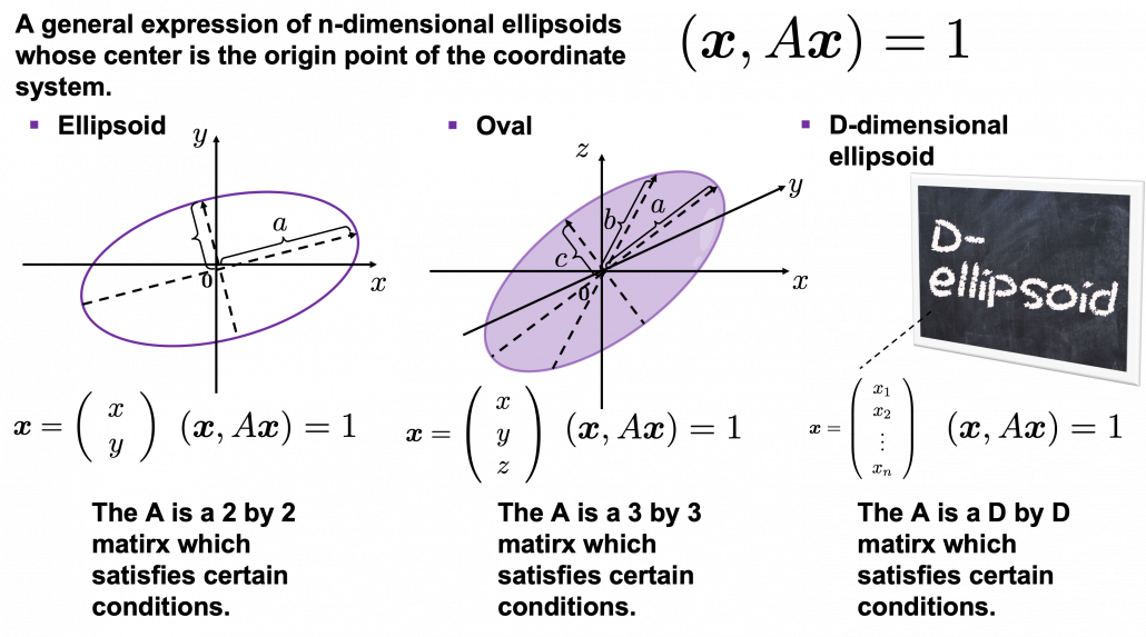
When someones mention “PCA,” I am sure for the most part that means the algorithm I am going to explain in the rest of this article. The most intuitive and straightforward way to explain PCA is that, PCA (Principal Component Analysis) of two or three dimensional data is fitting an oval to two dimensional data or fitting an ellipsoid to three dimensional data. You can actually try to plot some random dots on a piece of paper, and draw an oval which fits the dots the best. Assume that you have these 2 or 3 dimensional data below, and please try to put an oval or an ellipsoid to the data.

I think this is nothing difficult, but I have a question: what was the logic behind your choice?

Some might have roughly drawn its outline. Formulas of  “the surface” of general ellipsoids can be explained in several ways, but in this article you only have to consider ellipsoids whose center is the origin point of the coordinate system. In PCA you virtually shift data so that the mean of the data comes to the origin point of the coordinate system. When A is a certain type of D\times D matrix, the formula of a D-dimensional ellipsoid whose center is identical to the origin point is as follows: (\boldsymbol{x}, A\boldsymbol{x}) = 1, where \boldsymbol{x}\in \mathbb{R}. As is always the case with formulas in data science, you can visualize such ellipsoids if you are talking about 1, 2, or 3 dimensional data like in the figure below, but in general D-dimensional space, it is theoretical/imaginary stuff on blackboards.

*In order to explain the conditions which the matrix A has to hold, I need another article, so for now please just assume that the A is a kind of magical matrix.

You might have seen equations of 2 or 3 dimensional ellipsoids in the following way: \frac{x^2}{a^2} + \frac{y^2}{b^2} = 1, where a\neq 0, b\neq 0 or \frac{x^2}{a^2} + \frac{y^2}{b^2} + \frac{z^2}{c^2}= 1, where a\neq 0, b\neq 0, c \neq 0. These are special cases of the equation (\boldsymbol{x}, A\boldsymbol{x}) = 1, where A=diag(a_1^2, \dots, a_D^2). In this case the axes of ellipsoids the same as those of the coordinate system. Thus in this simple case, A=diag(a^2, b^2) or A=diag(a^2,c^2,c^2).

I am going explain these equations in detail in the upcoming articles. But thre is one problem: how would you fit an ellipsoid when a data distribution does not look like an ellipsoid?

In fact we have to focus more on another feature of ellipsoids: all the axes of an ellipsoid are orthogonal. In conclusion the axes of the ellipsoids are more important in PCA, so I do want you to forget about the surface of ellipsoids for the time being. You might get confused if you also think about the surface of ellipsoid now. I am planning to cover this topic in the next article. I hope this article, combined with the last one and the next one, would help you have better insight into the ideas which frequently appear in data science or machine learning context.

3. Fitting orthogonal axes on data

*If you have no trouble reading the chapter 12.1 of PRML, you do not need to this section or maybe even this article, but I hope at least some charts or codes of mine would enhance your understanding on this topic.

*I must admit I wrote only the essence of PCA formulations. If that seems too abstract to you, you should just breifly read through this section and go to the next section with a more concrete example. If you are confused, there should be other good explanations on PCA on the internet, and you should also check them. But at least the visualization of PCA in the next section would be helpful.

As I implied above, all the axes of ellipsoids are orthogonal, and selecting the orthogonal axes which match data is what PCA is all about. And when you choose those orthogonal axes, it is ideal if the data look like an ellipsoid. Simply putting we want the data to “swell” along the axes.

Then let’s see how to let them “swell,” more mathematically. Assume that you have 2 dimensional data plotted on a coordinate system (\boldsymbol{e}_1, \boldsymbol{e}_2) as below (The samples are plotted in purple). Intuitively, the data “swell” the most along the vector \boldsymbol{u}_1. Also  it is clear that \boldsymbol{u}_2 is the only vector orthogonal to \boldsymbol{u}_1. We can expect that the new coordinate system (\boldsymbol{u}_1, \boldsymbol{u}_2) expresses the data in a better way, and you you can get new coordinate points of the samples by projecting them on new axes as done with yellow lines below.

Next, let’s think about a case in 3 dimensional data. When you have 3 dimensional data in a coordinate system (\boldsymbol{e}_1, \boldsymbol{e}_2,\boldsymbol{e}_3) as below,  the data “swell” the most also along \boldsymbol{u}_1. And the data swells the second most along \boldsymbol{u}_2. The two axes, or vectors span the plain in purple. If you project all the samples on the plain, you will get 2 dimensional data at the right side. It is important that we did not consider the third axis. That implies you might be able to display the data well with only 2 dimensional sapce, which is spanned by the two axes \boldsymbol{v}_1, \boldsymbol{v}_2.


Thus the problem is how to calculate such axis \boldsymbol{u}_1. We want the variance of data projected on \boldsymbol{u}_1 to be the biggest. The coordinate of \boldsymbol{x}_n on the axis \boldsymbol{u}_1. The coordinate of a data point \boldsymbol{x}_n on the axis \boldsymbol{u}_1 is calculated by projecting \boldsymbol{x}_n on \boldsymbol{u}_1. In data science context, such projection is synonym to taking an inner  product of \boldsymbol{x}_n and \boldsymbol{u}_1, that is calculating \boldsymbol{u}_1^T \boldsymbol{x}_n.

*Each element of \boldsymbol{x}_n is the coordinate of the data point \boldsymbol{x}_n in the original coordinate system. And the projected data on \boldsymbol{u}_1 whose coordinates are 1-dimensional correspond to only one element of transformed data.

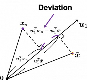
To calculate the variance of projected data on \boldsymbol{u}_1, we just have to calculate the mean of variances of 1-dimensional data projected on \boldsymbol{u}_1. Assume that \bar{\boldsymbol{x}} is the mean of data in the original coordinate, then the deviation of \boldsymbol{x}_1 on the axis \boldsymbol{u}_1 is calculated as \boldsymbol{u}_1^T \boldsymbol{x}_n - \boldsymbol{u}_1^T \bar{\boldsymbol{x}}, as shown in the figure. Hence the variance, I mean the mean of the deviation on is \frac{1}{N} \sum^{N}_{n}{\boldsymbol{u}_1^T \boldsymbol{x}_n - \boldsymbol{u}_1^T \bar{\boldsymbol{x}}}, where N is the total number of data points. After some deformations, you get the next equation \frac{1}{N} \sum^{N}_{n}{\boldsymbol{u}_1^T \boldsymbol{x}_n - \boldsymbol{u}_1^T \bar{\boldsymbol{x}}} = \boldsymbol{u}_1^T S \boldsymbol{u}_1, where S = \frac{1}{N}\sum_{n=1}^{N}{(\boldsymbol{x}_n - \bar{\boldsymbol{x}})(\boldsymbol{x}_n - \bar{\boldsymbol{x}})^T}. S is known as a covariance matrix.

We are now interested in maximizing the variance of projected data on  \boldsymbol{u}_1^T S \boldsymbol{u}_1, and for mathematical derivation we need some college level calculus, so if that is too much for you, you can skip reading this part till the next section.

We now want to calculate \boldsymbol{u}_1 with which \boldsymbol{u}_1^T S \boldsymbol{u}_1 is its maximum value. General \boldsymbol{u}_i including \boldsymbol{u}_1 are just coordinate axes after PCA, so we are just interested in their directions. Thus we can set one constraint \boldsymbol{u}_1^T  \boldsymbol{u}_1 = 1. Introducing a Lagrange multiplier, we have only to optimize next problem: \boldsymbol{u}_1 ^ {*} = \mathop{\rm arg~max}\limits_{\boldsymbol{u}_1} \{ \boldsymbol{u}_1^T S \boldsymbol{u}_1 + \lambda_1 (1 - \boldsymbol{u}_1^T \boldsymbol{u}_1) \}. In conclusion \boldsymbol{u}_1 ^ {*} satisfies S\boldsymbol{u}_1 ^ {*}  = \lamba_1 \boldsymbol{u}_1 ^ {*}. If you have read my last article on eigenvectors, you wold soon realize that this is an equation for calculating eigenvectors, and that means \boldsymbol{u}_1 ^ {*} is one of eigenvectors of the covariance matrix S. Given the equation of eigenvector the next equation holds \boldsymbol{u}_1 ^ {*}^T S \boldsymbol{u}_1 ^ {*} = \lambda_1. We have seen that \boldsymbol{u}_1 ^T S \boldsymbol{u}_1 ^ is a the variance of data when projected on a vector \boldsymbol{u}_1, thus the eigenvalue \lambda_1 is the biggest variance possible when the data are projected on a vector.

Just in the same way you can calculate the next biggest eigenvalue \lambda_2, and it it the second biggest variance possible, and in this case the date are projected on \boldsymbol{u}_2, which is orthogonal to \boldsymbol{u}_1. As well you can calculate orthogonal 3rd 4th …. Dth eigenvectors.

*To be exact I have to explain the cases where we can get such D orthogonal eigenvectors, but that is going to be long. I hope I can to that in the next article.

4. Practical three dimensional example of PCA

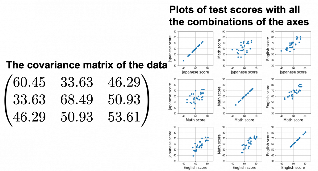
We have seen that PCA is sequentially choosing orthogonal axes along which data points swell the most. Also we have seen that it is equal to calculating eigenvalues of the covariance matrix of the data from the largest to smallest one. From now on let’s work on a practical example of data. Assume that we have 30 students’ scores of Japanese, math, and English tests as below.

* I think the subject “Japanese” is equivalent to “English” or “language art” in English speaking countries, and maybe “Deutsch” in Germany. This example and the explanation are largely based on a Japanese textbook named 「これなら分かる応用数学教室 最小二乗法からウェーブレットまで」. This is a famous textbook with cool and precise explanations on mathematics for engineering. Partly sharing this is one of purposes of this article.

At the right side of the figure below is plots of the scores with all the combinations of coordinate axes. In total 9 inverse graphs are symmetrically arranged in the figure, and it is easy to see that English & Japanese or English and math have relatively high correlation. The more two axes have linear correlations, the bigger the covariance between them is.

In the last article, I visualized the eigenvectors of a 3\times 3 matrix A = \frac{1}{50} \begin{pmatrix} 60.45 &  33.63 & 46.29 \\33.63 & 68.49 & 50.93 \\ 46.29 & 50.93 & 53.61 \end{pmatrix}, and in fact the matrix is just a constant multiplication of this covariance matrix. I think now you understand that PCA is calculating the orthogonal eigenvectors of covariance matrix of data, that is diagonalizing covariance matrix with orthonormal eigenvectors. Hence we can guess that covariance matrix enables a type of linear transformation of rotation and expansion and contraction of vectors. And data points swell along eigenvectors of such matrix.
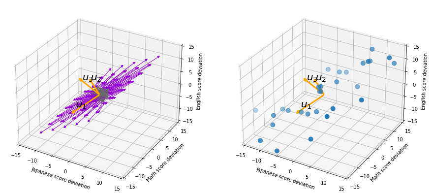
Then why PCA is useful? In order to see that at first, for simplicity assume that x, y, z denote Japanese, Math, English scores respectively. The mean of the data is \left( \begin{array}{c} \bar{x} \\ \bar{y} \\ \bar{z} \end{array} \right) = \left( \begin{array}{c} 58.1 \\ 61.8 \\ 67.3 \end{array} \right), and the covariance matrix of data in the original coordinate system is V_{xyz} = \begin{pmatrix} 60.45 & 33.63 & 46.29 \\33.63 & 68.49 & 50.93 \\ 46.29 & 50.93 & 53.61 \end{pmatrix}. The eigenvalues of  V_{xyz} are \lambda_1=148.34, \lambda_2 = 30.62, and \lambda_3 = 3.60, and their corresponding unit eigenvectors are \boldsymbol{u}_1 =  \left( \begin{array}{c} 0.540 \\ 0.602 \\ 0.589 \end{array} \right) , \boldsymbol{u}_2 =  \left( \begin{array}{c} 0.736 \\ -0.677 \\ 0.0174 \end{array} \right) , \boldsymbol{u}_3 =  \left( \begin{array}{c} -0.408 \\ -0.4.23 \\ 0.809 \end{array} \right) respectively.  U = (\boldsymbol{u}_1 \quad \boldsymbol{u}_2 \quad \boldsymbol{u}_3 )  is an orthonormal matrix, where \boldsymbol{u}_i^T\boldsymbol{u}_j = \begin{cases} 1 & (i=j) \\ 0 & (otherwise) \end{cases}. As I explained in the last article, you can diagonalize V_{xyz} with U: U^T V_{xyz}U = diag(\lambda_1, \dots, \lambda_D).

In order to see how PCA is useful, assume that \left( \begin{array}{c} \xi \\ \eta \\ \zeta \end{array} \right)  = U^T \left( \begin{array}{c} x - \bar{x} \\ y - \bar{y} \\ z - \bar{z} \end{array} \right).

Let’s take a brief look at what a linear transformation by U^T means. Each element of \boldsymbol{x} denotes coordinate of the data point \boldsymbol{x}  in the original coordinate system (In this case the original coordinate system is composed of \boldsymbol{e}_1, \boldsymbol{e}_2, and \boldsymbol{e}_3). U = (\boldsymbol{u}_1, \boldsymbol{u}_2, \boldsymbol{u}_3) enables a rotation of a rigid body, which means the shape or arrangement of data will not change after the rotation, and U^T enables a reverse rotation of the rigid body.

*Roughly putting, if you hold a bold object such as a metal ball and rotate your arm, that is a rotation of a rigid body, and your shoulder is the origin point. On the other hand, if you hold something soft like a marshmallow, it would be squashed in your hand, and that is not a not a rotation of a rigid body.

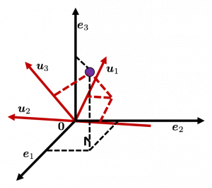
You can rotate \boldsymbol{x} with U like U^T\boldsymbol{x} = \left( \begin{array}{c} -\boldsymbol{u}_1^{T}- \\ -\boldsymbol{u}_2^{T}- \\ -\boldsymbol{u}_3^{T}- \end{array} \right)\boldsymbol{x}=\left( \begin{array}{c} \boldsymbol{u}_1^{T}\boldsymbol{x} \\ \boldsymbol{u}_2^{T}\boldsymbol{x} \\ \boldsymbol{u}_3^{T}\boldsymbol{x} \end{array} \right), and \boldsymbol{u}_i^{T}\boldsymbol{x} is the coordinate of \boldsymbol{x} projected on the axis \boldsymbol{u}_i.

Let’s see this more visually. Assume that the data point \boldsymbol{x}  is a purple dot and its position is expressed in the original coordinate system spanned by black arrows . By multiplying \boldsymbol{x} with U^T, the purple point \boldsymbol{x} is projected on the red axes respectively, and the product \left( \begin{array}{c} \boldsymbol{u}_1^{T}\boldsymbol{x} \\ \boldsymbol{u}_2^{T}\boldsymbol{x} \\ \boldsymbol{u}_3^{T}\boldsymbol{x} \end{array} \right) denotes the coordinate point of the purple point in the red coordinate system. \boldsymbol{x} is rotated this way, but for now I think it is better to think that the data are projected on new coordinate axes rather than the data themselves are rotating.
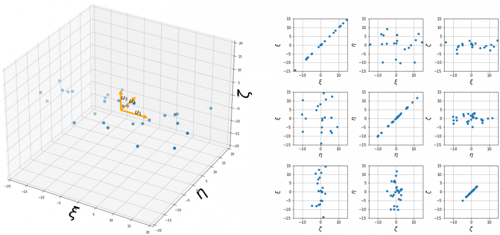
Now that we have seen what rotation by U means, you should have clearer image on what \left( \begin{array}{c} \xi \\ \eta \\ \zeta \end{array} \right)  = U^T \left( \begin{array}{c} x - \bar{x} \\ y - \bar{y} \\ z - \bar{z} \end{array} \right) means. \left( \begin{array}{c} \xi \\ \eta \\ \zeta \end{array} \right) denotes the coordinates of data projected on new axes \boldsymbol{u}_1, \boldsymbol{u}_2, \boldsymbol{u}_3, which are unit eigenvectors of V_{xyz}. In the coordinate system spanned by the eigenvectors, the data distribute like below.

By multiplying U from both sides of the equation above, we get \left( \begin{array}{c} x - \bar{x} \\ y - \bar{y} \\ z - \bar{z} \end{array} \right) =U \left( \begin{array}{c} \xi \\ \eta \\ \zeta \end{array} \right), which means you can express deviations of the original data as linear combinations of the three factors \xi, \eta, and \zeta. We expect that those three factors contain keys for understanding the original data more efficiently. If you concretely write down all the equations for the factors: \xi = 0.540 (x - \bar{x}) + 0.602 (y - \bar{y}) + 0.588 (z - \bar{z}), \eta = 0.736(x - \bar{x}) - 0.677 (y - \bar{y}) + 0.0174 (z - \bar{z}), and \zeta = - 0.408 (x - \bar{x}) - 0.423 (y - \bar{y}) + 0.809(z - \bar{z}). If you examine the coefficients of the deviations (x - \bar{x}), (y - \bar{y}), and (z - \bar{z}), we can observe that \eta almost equally reflects the deviation of the scores of all the subjects, thus we can say \eta is a factor indicating one’s general academic level. When it comes to \eta Japanese and Math scores are important, so we can guess that this factor indicates whether the student is at more of “scientific side” or “liberal art side.” In the same way \zeta relatively makes much of one’s English score,  so it should show one’s “internationality.” However the covariance of the data \xi, \eta, \zeta is V_{\xi \eta \zeta} = \begin{pmatrix} 148.34 & 0 & 0 \\ 0 & 30.62 & 0 \\ 0 & 0 & 3.60 \end{pmatrix}. You can see \zeta does not vary from students to students, which means it is relatively not important to describe the tendency of data. Therefore for dimension reduction you can cut off the factor \zeta.

*Assume that you can apply PCA on D-dimensional data and that you get \boldsymbol{x}', where \boldsymbol{x}' = U^T\boldsymbol{x} - \bar{\boldsymbol{x}}. The variance of data projected on new D-dimensional coordinate system is V'=\frac{1}{N}\sum{(\boldsymbol{x}')^T\boldsymbol{x}'} =\frac{1}{N}\sum{(U^T\boldsymbol{x})^T(U^T\boldsymbol{x})} =\frac{1}{N}\sum{U^T\boldsymbol{x}\boldsymbol{x}^TU} =U^T(\frac{1}{N}\sum{\boldsymbol{x}\boldsymbol{x}^T})U =U^TVU =diag(\lambda_1, \dots, \lambda_D). This means that in the new coordinate system after PCA, covariances between any pair of variants are all zero.

*As I mentioned U is a rotation of a rigid body, and U^T is the reverse rotation, hence U^TU = UU^T = I.

Hence you can approximate the original 3 dimensional data on the coordinate system (\boldsymbol{e}_1, \boldsymbol{e}_2, \boldsymbol{e}_3) from the reduced two dimensional coordinate system (\boldsymbol{u}_1, \boldsymbol{u}_2) with the following equation: \left( \begin{array}{c} x - \bar{x} \\ y - \bar{y} \\ z - \bar{z} \end{array} \right) \approx U_{reduced} \left( \begin{array}{c} \xi \\ \eta  \end{array} \right)  = (\boldsymbol{u}_1 \quad \boldsymbol{u}_2) \left( \begin{array}{c} \xi \\ \eta  \end{array} \right). Then it mathematically clearer that we can express the data with two factors: “how smart the student is” and “whether he is at scientific side or liberal art side.”
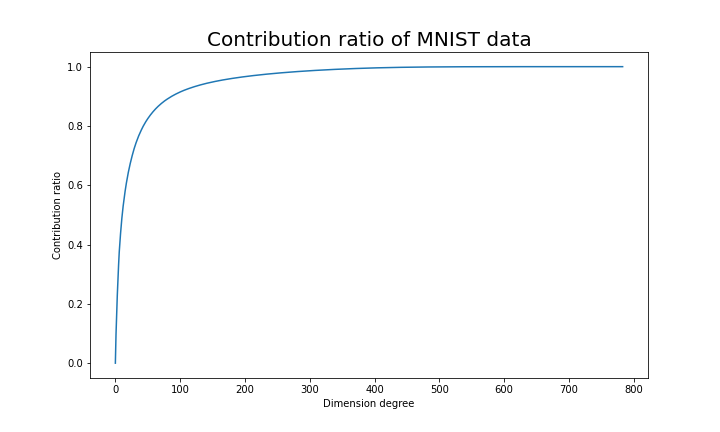
We can observe that eigenvalue \lambda_i is a statistic which indicates how much the corresponding \boldsymbol{u}_i can express the data, \frac{\lambda_i}{\sum_{j=1}^{D}{\lambda_j}} is called the contribution ratio of eigenvector \boldsymbol{u}_i. In the example above, the contribution ratios of \boldsymbol{u}_1, \boldsymbol{u}_2, and \boldsymbol{u}_3 are respectively \frac{\lambda_1}{\lambda_1 + \lambda_2 + \lambda_3}=0.813, \frac{\lambda_2}{\lambda_1 + \lambda_2 + \lambda_3}=0.168, \frac{\lambda_3}{\lambda_1 + \lambda_2 + \lambda_3}=0.0197. You can decide how many degrees of dimensions you reduce based on this information.

Appendix: Playing with my toy PCA on MNIST dataset

Applying “so called” PCA on MNIST dataset is a super typical topic that many other tutorial on PCA also introduce, but I still recommend you to actually implement, or at least trace PCA implementation with MNIST dataset without using libraries like scikit-learn. While reading this article I recommend you to actually run the first and the second code below. I think you can just copy and paste them on your tool to run Python, installing necessary libraries. I wrote them on Jupyter Notebook.

In my implementation, in the simple configuration part you can set the USE_ALL_NUMBERS as True or False boolean. If you set it as True, you apply PCA on all the data of numbers from 0 to 9. If you set it as True, you can specify which digit to apply PCA on. In this article, I show the results results of PCA on the data of digit ‘3.’ The first three images of ‘3’ are as below.

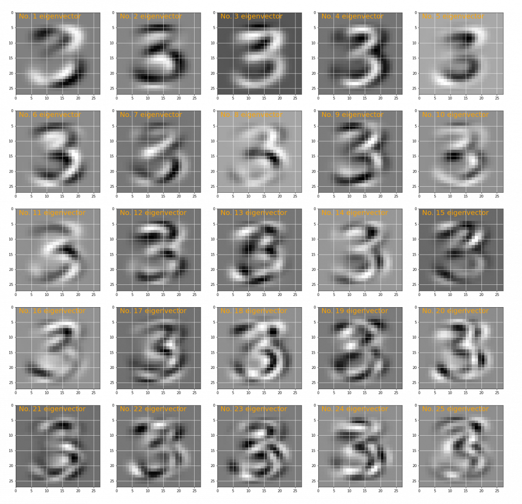
You have to keep it in mind that the data are all shown as 28 by 28 pixel grayscale images, but in the process of PCA, they are all processed as 28 * 28 = 784 dimensional vectors. After applying PCA on the 784 dimensional vectors of images of ‘3,’ the first 25 eigenvectors are as below. You can see that at the beginning the eigenvectors partly retain the shapes of ‘3,’ but they are distorted as the eigenvalues get smaller. We can guess that the latter eigenvalues are not that helpful in reconstructing the shape of ‘3.’

Just as we saw in the last section, you you can cut off axes of eigenvectors with small eigenvalues and reduce the dimension of MNIST data. The figure below shows how contribution ratio of MNIST data grows. You can see that around 200 dimension degree, the contribution ratio reaches around 0.95. Then we can guess that even if we reduce the dimension of MNIST from 784 to 200 we can retain the most of the structure of original data.

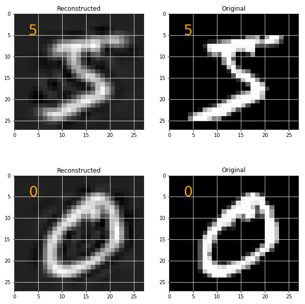
Some results of reconstruction of data from 200 dimensional space are as below. You can set how many images to display by adjusting NUMBER_OF_RESULTS in the code. And if you set LATENT_DIMENSION as 784, you can completely reconstruct the data.

* I make study materials on machine learning, sponsored by DATANOMIQ. I do my best to make my content as straightforward but as precise as possible. I include all of my reference sources. If you notice any mistakes in my materials, including grammatical errors, please let me know (email: yasuto.tamura@datanomiq.de). And if you have any advice for making my materials more understandable to learners, I would appreciate hearing it.

*I attatched the codes I used to make the figures in this article. You can just copy, paste, and run, sometimes installing necessary libraries.


Rethinking linear algebra: visualizing linear transformations and eigenvectors

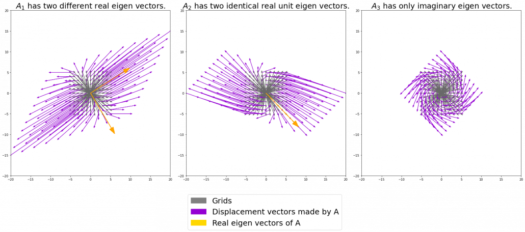
In terms of calculation processes of Principal Component Analysis (PCA) or Linear Discriminant Analysis (LDA), which are the dimension reduction techniques I am going to explain in the following articles, diagonalization is what they are all about. Throughout this article, I would like you to have richer insight into diagonalization in order to prepare for understanding those basic dimension reduction techniques.

When our professor started a lecture on the last chapter of our textbook on linear algebra, he said “It is no exaggeration to say that everything we have studied is for this ‘diagonalization.'” Until then we had to write tons of numerical matrices and vectors all over our notebooks, calculating those products, adding their rows or columns to other rows or columns, sometimes transposing the matrices, calculating their determinants.

It was like the scene in “The Karate Kid,” where the protagonist finally understood the profound meaning behind the prolonged and boring “wax on, wax off” training given by Miyagi (or “jacket on, jacket off” training given by Jackie Chan). We had finally understood why we had been doing those seemingly endless calculations.

Source: http://thinkbedoleadership.com/secret-success-wax-wax-off/

But usually you can do those calculations easily with functions in the Numpy library. Unlike Japanese college freshmen, I bet you are too busy to reopen textbooks on linear algebra to refresh your mathematics. Thus I am going to provide less mathematical and more intuitive explanation of diagonalization in this article.

*This is the second article of the article series ” Illustrative introductions on dimension reduction .”

1, The mainstream ways of explaining diagonalization.

*The statements below are very rough for mathematical topics, but I am going to give priority to offering more visual understanding on linear algebra in this article. For further understanding, please refer to textbooks on linear algebra. If you would like to have minimum understandings on linear algebra needed for machine learning, I recommend the Appendix C of Pattern Recognition and Machine Learning by C. M. Bishop.

In most textbooks on linear algebra, the explanations on dioagonalization is like this (if you are not sure what diagonalization is or if you are allergic to mathematics, you do not have to read this seriously):

Let V (dimV = D)be a vector space and let  T_A : V \rightarrow V be a mapping of V into itself,  defined as T_A(v) = A \cdot \boldsymbol{v}, where A is a D\times D matrix and \boldsymbol{v} is D dimensional vector. An element \boldsymbol{v} \in V is called an eigen vector if there exists a number \lambda such that A \cdot \boldsymbol{v}= \lambda \cdot \boldsymbol{v} and \boldsymbol{v} \neq \boldsymbol{0}. In this case \lambda is uniquely determined and is called an eigen value of A belonging to the eigen vector \boldsymbol{v}.

Any matrix A has D eigen values \lambda_{i}, belonging to \boldsymbol{v}_{i} (i=1, 2, …., D). If \boldsymbol{v}_{i} is basis of the vector space V, then A is diagonalizable.

When A is diagonalizable, with D \times D matrices P = (\boldsymbol{v}_{1}, \dots, \boldsymbol{v}_{D}) , whose column vectors are eigen vectors \boldsymbol{v}_{i} (i=1, 2, …., D), the following equation holds: P^{-1}AP = \Lambda, where \Lambda = diag(\lambda_{1}, \dots, \lambda_{D})= \begin{pmatrix} \lambda_{1} & 0& \ldots &0\\ 0 & \lambda_{2} & \ldots & 0 \\ \vdots & \vdots & \ddots & \vdots \\ 0 & 0 & \ldots & \lambda_{D} \end{pmatrix}.

And when A is diagonalizable, you can diagonalize A as below.

Most textbooks keep explaining these type of stuff, but I have to say they lack efforts to make it understandable to readers with low mathematical literacy like me. Especially if you have to apply the idea to data science field, I believe you need more visual understanding of diagonalization. Therefore instead of just explaining the definitions and theorems, I would like to take a different approach. But in order to understand them in more intuitive ways, we first have to rethink waht linear transformation T_A means in more visible ways.

2, Linear transformations

Even though I did my best to make this article understandable to people with little prerequisite knowledge, you at least have to understand linear transformation of numerical vectors and with matrices. Linear transformation is nothing difficult, and in this article I am going to use only 2 or 3 dimensional numerical vectors or square matrices. You can calculate linear transformation of \boldsymbol{v} by A as equations in the figure. In other words, \boldsymbol{u} is a vector transformed by A.

*I am not going to use the term “linear transformation” in a precise way in the context of linear algebra. In this article or in the context of data science or machine learning, “linear transformation” for the most part means products of matrices or vectors. 
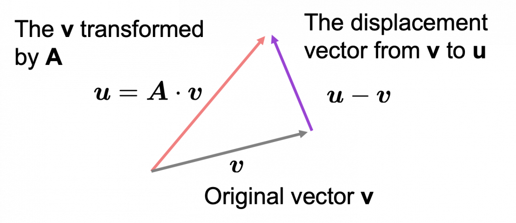
*Forward/back propagation of deep learning is mainly composed of this linear transformation. You keep linearly transforming input vectors, frequently transforming them with activation functions, which are for the most part not linear transformation.

As you can see in the equations above, linear transformation with A transforms a vector to another vector. Assume that you have an original vector \boldsymbol{v} in grey and that the vector \boldsymbol{u} in pink is the transformed \boldsymbol{v} by A is. If you subtract \boldsymbol{v} from \boldsymbol{u}, you can get a displacement vector, which I displayed in purple. A displacement vector means the transition from a vector to another vector.

Let’s calculate the displacement vector with more vectors \boldsymbol{v}. Assume that A =\begin{pmatrix} 3 & 1 \\ 1 & 2 \end{pmatrix}, and I prepared several grid vectors \boldsymbol{v} in grey as you can see in the figure below. If you transform those grey grid points with A, they are mapped into the vectors \boldsymbol{u} in pink. With those vectors in grey or pink, you can calculate the their displacement vectors \boldsymbol{u} - \boldsymbol{v}, which are in purple.
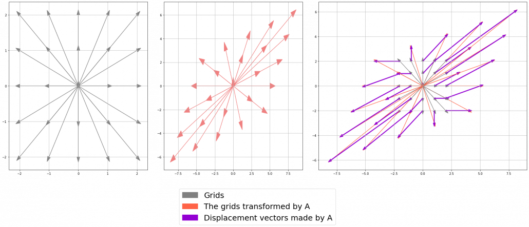
The displacement vectors in the figure above have some tendencies. In order to see that more clearly, let’s calculate displacement vectors with several matrices A and more grid points. Assume that you have three 2 \times 2 square matrices A_1 =\begin{pmatrix} 3 & 1 \\ 1 & 2 \end{pmatrix}, A_2 =\begin{pmatrix} 3 & 1 \\ -1 & 1 \end{pmatrix}, A_3 =\begin{pmatrix} 1 & -1 \\ 1 & 1 \end{pmatrix}, and I plotted displace vectors made by the matrices respectively in the figure below.

I think you noticed some characteristics of the displacement vectors made by those linear transformations: the vectors are swirling and many of them seem to be oriented in certain directions. To be exact, some displacement vectors extend in the same directions as some of original vectors in grey. That means  linear transformation by A did not change the direction of the original vector \boldsymbol{v}, and the unchanged vectors are called eigen vectors. Real eigen vectors of each A are displayed as arrows in yellow in the figure above. But when it comes to A_3, the matrix does not have any real eigan values.

In linear algebra, depending on the type matrices A, you have to consider various cases such as whether the matrices have real or imaginary eigen values, whether the matrices are diagonalizable, whether the eigen vectors are orthogonal, or whether they are unit vectors. But those topics are out of the scope of this article series, so please refer to textbooks on linear algebra if you are interested.

Luckily, however, in terms of PCA or LDA, you only have to consider a type of matrices named positive semidefinite matrices, which A_1 is classified to, and I am going to explain positive semidefinite matrices in the fourth section.

3, Eigen vectors as coordinate system

Source: Ian Stewart, “Professor Stewart’s Cabinet of Mathematical Curiosities,” (2008), Basic Books

Let me take Fibonacci numbers as an example to briefly see why diagonalization is useful. Fibonacci is sequence is quite simple and it is often explained using an example of pairs of rabbits increasing generation by generation. Let a_n (n=0, 1, 2, …) be the number of pairs of grown up rabbits in the n^{th} generation. One pair of grown up rabbits produce one pair of young rabbit The concrete values of a_n are a_0 = 0, a_1 = 1, a_2=1, a_3=2, a_4=3, a_5=5, a_6=8, a_7=13, \dots. Assume that A =\begin{pmatrix} 1 & 1 \\ 1 & 0 \end{pmatrix} and that \begin{pmatrix} a_1 \\ a_0  \end{pmatrix} =\begin{pmatrix} 1 \\ 0  \end{pmatrix}, then you can calculate the number of the pairs of grown up rabbits in the next generation with the following recurrence relation. \begin{pmatrix} a_{n+1} \\ a_{n}  \end{pmatrix}=\begin{pmatrix} 1 & 1 \\ 1 & 0 \end{pmatrix} \cdot \begin{pmatrix} a_{n+1} \\ a_{n}  \end{pmatrix}.Let \boldsymbol{a}_n be \begin{pmatrix} a_{n+1} \\ a_{n}  \end{pmatrix}, then the recurrence relation can be written as \boldsymbol{a}_{n+1} = A \boldsymbol{a}_n, and the transition of \boldsymbol{a}_n are like purple arrows in the figure below. It seems that the changes of the purple arrows are irregular if you look at the plots in normal coordinate.

Assume that \lambda _1, \lambda_2 (\lambda _1< \lambda_2) are eigen values of A, and \boldsymbol{v}_1, \boldsymbol{v}_2 are eigen vectors belonging to them respectively. Also let \alpha, \beta scalars such that \begin{pmatrix} a_{1} \\ a_{0}  \end{pmatrix} = \begin{pmatrix} 1 \\ 0  \end{pmatrix} = \alpha \boldsymbol{v}_1 + \beta \boldsymbol{v}_2. According to the definition of eigen values and eigen vectors belonging to them, the following two equations hold: A\boldsymbol{v}_1 = \lambda_1 \boldsymbol{v}_1, A\boldsymbol{v}_2 = \lambda_2 \boldsymbol{v}_2. If you calculate \boldsymbol{a}_1 is, using eigen vectors of A, \boldsymbol{a}_1  = A\boldsymbol{a}_0 = A (\alpha \boldsymbol{v}_1 + \beta \boldsymbol{v}_2) = \alpha\lambda _1 \boldsymbol{v}_1 + \beta \lambda_2 \boldsymbol{v}_2. In the same way, \boldsymbol{a}_2 = A\boldsymbol{a}_1 = A (\alpha\lambda _1 \boldsymbol{v}_1 + \beta \lambda_2 \boldsymbol{v}_2) = \alpha\lambda _{1}^{2} \boldsymbol{v}_1 + \beta \lambda_{2}^{2} \boldsymbol{v}_2, and \boldsymbol{a}_3 = A\boldsymbol{a}_2 = A (\alpha\lambda _{1}^{2} \boldsymbol{v}_1 + \beta \lambda_{2}^{2} \boldsymbol{v}_2) = \alpha\lambda _{1}^{3} \boldsymbol{v}_1 + \beta \lambda_{2}^{3} \boldsymbol{v}_2. These equations show that in coordinate system made by eigen vectors of A, linear transformation by A is easily done by just multiplying eigen values with each eigen vector. Compared to the graph of Fibonacci numbers above, in the figure below you can see that in coordinate system made by eigen vectors the plots changes more systematically generation by generation.


In coordinate system made by eigen vectors of square matrices, the linear transformations by the matrices can be much more straightforward, and this is one powerful strength of eigen vectors.

*I do not major in mathematics, so I am not 100% sure, but vectors in linear algebra have more abstract meanings. Various things in mathematics can be vectors, even though in machine learning or data science we  mainly use numerical vectors with more concrete elements. We can also say that matrices are a kind of maps. That is just like, at least in my impression, even though a real town is composed of various components such as houses, smooth or bumpy roads, you can simplify its structure with simple orthogonal lines, like the map of Manhattan. But if you know what the town actually looks like, you do not have to follow the zigzag path on the map.

4, Eigen vectors of positive semidefinite matrices

In the second section of this article I told you that, even though you have to consider various elements when you discuss general diagonalization, in terms of PCA and LDA we mainly use only a type of matrices named positive semidefinite matrices. Let A be a D \times D square matrix. If \boldsymbol{x}^T A \boldsymbol{x} \geq 0 for all values of the vector \boldsymbol{x}, the A is said to be a positive semidefinite matrix. And also it is known that A being a semidefinite matrix is equivalent to \lambda _{i} \geq 0 for all the eigen values \lambda_i (i=1, \dots , D).

*I think most people first learn a type of matrices called positive definite matrices. Let A be aD \times D square matrix. If \boldsymbol{x}^T A \boldsymbol{x} > 0 for all values of the vector \boldsymbol{x}, the A is said to be a positive definite matrix. You have to keep it in mind that even if all the elements of A are positive, A is not necessarly positive definite/semidefinite.

Just as we did in the second section of this article, let’s visualize displacement vectors made by linear transformation with a 3 \times 3 square positive semidefinite matrix A.

*In fact A_1 =\begin{pmatrix} 3 & 1 \\ 1 & 2 \end{pmatrix}, whose linear transformation I visualized the second section, is also positive semidefinite.

Let’s visualize linear transformations by a positive definite matrix A = \frac{1}{50} \begin{pmatrix} 60.45 &  33.63 & 46.29 \\33.63 & 68.49 & 50.93 \\ 46.29 & 50.93 & 53.61 \end{pmatrix}. I visualized the displacement vectors made by the A just as the same way as in the second section of this article. The result is as below, and you can see that, as well as the displacement vectors made by A_1, the three dimensional displacement vectors below are swirling and extending in three directions, in the directions of the three orthogonal eigen vectors \boldsymbol{v}_1, \boldsymbol{v}_2, and \boldsymbol{v}_3.

*It might seem like a weird choice of a matrix, but you are going to see why I chose it in the next article.

You might have already noticed A_1 =\begin{pmatrix} 3 & 1 \\ 1 & 2 \end{pmatrix} and A = \frac{1}{50} \begin{pmatrix} 60.45 &  33.63 & 46.29 \\33.63 & 68.49 & 50.93 \\ 46.29 & 50.93 & 53.61 \end{pmatrix} are both symmetric matrices and that their elements are all real values, and that their diagonal elements are all positive values. Super importantly, when all the elements of a D \times D symmetric matrix A are real values and its eigen values are \lambda_{i} (i=1, \dots , D), there exist orthonormal matrices U such that U^{-1}AU = \Lambda, where \Lambda = diag(\lambda_{1}, \dots , \lambda_{D}).

*The title of this section might be misleading, but please keep it in mind that positive definite/semidefinite matrices are not necessarily real symmetric matrices. And real symmetric vectors are not necessarily positive definite/semidefinite matrices.

5, Orthonormal matrices and rotation of vectors

In this section I am gong to explain orthonormal matrices, as known as rotation matrices. If a D\times D matrix U is an orthonormal matrix, column vectors of U are orthonormal, which means U = (\boldsymbol{u}_1 \dots \boldsymbol{u}_D), where \begin{cases} \boldsymbol{u}_{i}^{T}\boldsymbol{u}_{j} = 1 \quad (i = j) \\ \boldsymbol{u}_{i}^{T}\boldsymbol{u}_{j} = 0 \quad (i\neq j) \end{cases}. In other words column vectors \boldsymbol{u}_{i} form an orthonormal coordinate system.

Orthonormal matrices U have several important properties, and one of the most important properties is U^{-1} = U^{T}. Combining this fact with what I have told you so far, you we can reach one conclusion: you can orthogonalize a real symmetric matrix A as U^{T}AU = \Lambda. This is known as spectral decomposition or singular value decomposition.

Another important property of U is that U^{T} is also orthonormal. In other words, assume U is orthonormal and that U = (\boldsymbol{u}_1 \dots \boldsymbol{u}_D) = \begin{pmatrix} -\boldsymbol{v_1}^{T}- \\ \vdots \\ -\boldsymbol{v_D}^{T}- \end{pmatrix}, (\boldsymbol{v}_1 \dots \boldsymbol{v}_D) also forms a orthonormal coordinate system.

…It seems things are getting too mathematical and abstract (for me), thus for now I am going to wrap up what I have explained in this article .

We have seen

  • Numerical matrices linearly transform vectors.
  • Certain linear transformations do not change the direction of vectors in certain directions, which are called eigen vectors.
  • Making use of eigen vectors, you can form new coordinate system which can describe the linear transformations in a more straightforward way.
  • You can diagonalize a real symmetric matrix A with an orthonormal matrix U.

Of our current interest is what kind of linear transformation the real symmetric positive definite matrix enables. I am going to explain why the purple vectors in the figure above is swirling in the upcoming articles. Before that, however, we are going to  see one application of what we have seen in this article, on dimension reduction. To be concrete the next article is going to be about principal component analysis (PCA), which is very important in many fields.

*In short, the orthonormal matrix U, which I mentioned above enables rotation of matrix, and the diagonal matrix diag(\lambda_1, \dots, \lambda_D) expands or contracts vectors along each axis. I am going to explain that more precisely in the upcoming articles.

* I make study materials on machine learning, sponsored by DATANOMIQ. I do my best to make my content as straightforward but as precise as possible. I include all of my reference sources. If you notice any mistakes in my materials, including grammatical errors, please let me know (email: yasuto.tamura@datanomiq.de). And if you have any advice for making my materials more understandable to learners, I would appreciate hearing it.

*I attatched the codes I used to make the figures in this article. You can just copy, paste, and run, sometimes installing necessary libraries.


Spiky cubes, Pac-Man walking, empty M&M’s chocolate: curse of dimensionality

This is the first article of the article series Illustrative introductions on dimension reduction.

“Curse of dimensionality” means the difficulties of machine learning which arise when the dimension of data is higher. In short if the data have too many features like “weight,” “height,” “width,” “strength,” “temperature”…., that can undermine the performances of machine learning. The fact might be contrary to your image which you get from the terms “big” data or “deep” learning. You might assume that the more hints you have, the better the performances of machine learning are. There are some reasons for curse of dimensionality, and in this article I am going to introduce two major reasons below.

  1. High dimensional data usually have rich expressiveness, but usually training data are too poor for that.
  2. The behaviors of data points in high dimensional space are totally different from our common sense.

Through these topics, you will see that you always have to think about which features to use considering the number of data points.

*From now on I am going to talk about only Euclidean distance. If you are not sure what Euclidean distance means, please just keep it in mind that it is the type of distance most people wold have learnt in normal compulsory education.

*This is the first article of the article series ” Illustrative introductions on dimension reduction .”

1. Number of samples and degree of dimension

The most straightforward demerit of adding many features, or increasing dimensions of data, is the growth of computational costs. More importantly, however, you always have to think about the degree of dimensions in relation of the number of data points you have. Let me take a simple example in a book “Pattern Recognition and Machine Learning” by C. M. Bishop (PRML). This is an example of measurements of a pipeline. The figure below shows a comparison plot of 3 classes (red, green and blue), with parameter x_7 plotted against parameter x_6 out of 12 parameters.

* The meaning of data is not important in this article. If you are interested please refer to the appendix in PRML.

Assume that we are interested in classifying the cross in black into one of the three classes. One of the most naive ideas of this classification is dividing the graph into grids and labeling each grid depending on the number of samples in the classes (which are colored at the right side of the figure). And you can classify the test sample, the cross in black, into the class of the grid where the test sample is in. Thereby the cross is classified to the class in red.

Source: C.M. Bishop, “Pattern Recognition and Machine Learning,” (2006), Springer, pp. 34-35

As I mentioned in the figure above, we used only two features out of 12 features in total. When the total number of data points is fixed and you add remaining ten axes/features one after another, what would happen? Let’s see what “adding axes/features” means. If you are talking about 1, 2, or 3 dimensional grids, you can visualize them. And as you can see from the figure below, if you make each 10^1, 10^2, 100^3 grids respectively in 1, 2, 3 dimensional spaces, the number of the small regions in the grids are respectively 10, 100, 1000. Even though you cannot visualize it anymore, you can make grids for more than 3 dimensional data. If you continue increasing the degree of dimension, the number of grids increases exponentially, and that can soon surpass the number of training data points. That means there would be a lot of empty spaces in such high dimensional grids. And the classifying method above: coloring each grid and classifying unknown samples depending on the colors of the grids, does not work out anymore because there would be a lot of empty grids.

* If you are still puzzled by the idea of “more than 3 dimensional grids,” you should not think too much about that now. It is enough if you can get some understandings on high dimensional data after reading the whole article of this.

Source: Goodfellow and Yoshua Bengio and Aaron Courville, Deep Learning, (2016), MIT Press, p. 153

I said the method above is the most naive way, but other classical classification methods , for example k-nearest neighbors algorithm, are more or less base on a similar idea. Many of classical machine learning algorithms are based on the idea of smoothness prior, or local constancy prior. In short in classical ways, you  do not expect data to change so much in a small region, so you can expect unknown samples to be similar to data in vicinity. But that soon turns out to be problematic when the dimension of data is bigger because training data would be sparse because the area of multidimensional space grows exponentially as I mentioned above. And sometimes you would not be able to find training data around test data. Plus, in high dimensional data, you cannot treat distance in the same as you do in lower dimensional space. The ideas of “close,” “nearby,” or “vicinity” get more obscure in high dimensional data. That point is related to the next topic: the intuition have cultivated in normal life is not applicable to higher dimensional data.

2. Bizarre characteristics of high dimensional data

We form our sense of recognition in 3-dimensional ways in our normal life. Even though we can visualize only 1, 2, or 3 dimensional data, we can actually generalize the ideas in 1, 2, or 3 dimensional ideas to higher dimensions. For example 4 dimensional cubes, 100 dimensional spheres, or orthogonality in 255 dimensional space. Again, you cannot exactly visualize those ideas, and for many people, such high dimensional phenomenon are just imaginary matters on blackboards. Those high dimensional ideas are designed to retain some conditions just as well as 1, 2, or 3 dimensional space. Let’s take an example of spheres in several dimensional spaces. General spheres in any D-dimensional space can be defined as a set of any \boldsymbol{x}, such that |\boldsymbol{x} - \boldsymbol{c}| = r, where \boldsymbol{c} is the center point and r is length of radius. When \boldsymbol{x} is 2-dimensional, the spheres are called “circles.” When \boldsymbol{x} is 3-dimensional, the spheres are called “spheres” in our normal life, unless it is used in a conversation in a college cafeteria, by some students in mathematics department. And when \boldsymbol{x} is D-dimensional, they are called D-ball, and again, this is just a imaginary phenomenon on blackboard.

* Vectors and points are almost the same because all the vectors are denoted as “arrows” from the an origin point to sample data points.  The only difference is that when you use vectors, you have to consider their directions.

* “D-ball” is usually called “n-ball,” and in such context it is a sphere in a n-dimensional space. But please let me use the term “D-ball” in this article.

Not only spheres, but only many other ideas have been generalized to D-dimensional space, and many of them are indispensable also for data science. But there is one severe problem: the behaviors of data in high dimensional field is quite different from those in two or three dimensional space. To be concrete, in high dimensional field, cubes are spiky, you have to move like Pac-Man, and M & M’s Chocolate looks empty inside but tastes normal.

2.1: spiky cubes
Let’s take a look at an elementary-school-level example of geometry first. Assume that you have several unit squares or unit cubes like below. In each of them a circle or sphere with diameter 1 is inscribed. The length of a diagonal line in each square is \sqrt{2}, and that in each cube is \sqrt{3}.

If you stack the squares or cubes as below, what are the length of diameters of the blue circle or sphere, circumscribing all the 4 orange circles or the 8 orange spheres?

The answers are, the diameter of the blue circle is \sqrt{2} - 1, and the diameter of the blue sphere is \sqrt{3} - 1.

Next let’s think about the same situation in higher dimensional space. Assume that there are some unit D-dimensional hypercubes stacked, in each of which a D-ball with diameter 1 is inscribed, touching all the surfaces inside. Then what is the length of the diameter of  a D-ball circumscribing all the unit D-ball in the hypercubes ? Given the results above, it ca be predicted that its diameter is \sqrt{D}  -1. If that is true, there is one strange point: \sqrt{D} - 1 can soon surpass 2: that means in the chart above the blue sphere will stick out of the stacked cubes. That sounds like a paradox, but with one hypothesis, the phenomenon makes sense: cubes become more spiky as the degree of dimension grows. This hypothesis is a natural deduction because diagonal lines of hyper cubes get longer, and the the center of each surface of hypercubes still touches the unit D-ball with diameter 1, inscribing inscribing inside each unit hypercube.

If you stack 4 hypercubes, the blue sphere circumscribing them will not stick out of the stacked hypercubes anymore like the figure below.

*Of course you cannot visualize what is going on in D-dimensional space, so the figure below is just a pseudo simulation of D-dimensional space in our 3-dimensional sense. I guess you have to stack more than four hyper cubes in higher dimensional data, but you cannot easily imagine what will go on in such space anymore.


*You can confirm the fact that hypercube gets more spiky as the degree of dimension growth, by comparing the volume of the hypercube and the volume of the D-ball inscribed inside the hypercube. Thereby you can prove that the volume of hypercube concentrates on the corners of the hypercube. Plus, as I mentioned the longest diagonal distance of hypercube gets longer as dimension degree increases. That is why hypercube is said to be spiky. For mathematical proof, please check the Exercise 1.19 of PRML.

2.2: Pac-Man walking

Next intriguing phenomenon in high dimensional field is that most of pairs of vectors in high dimensional space are orthogonal. In other words, if you select two random vectors in high dimensional space, the angle between them are mostly close to 90^\circ. Let’s see the general meaning of angle between two vectors in any dimensional spaces. Assume that the angle between two vectors \boldsymbol{u}, and \boldsymbol{v} is \theta, then cos\theta is calculated as cos\theta = \frac{<\boldsymbol{u}, \boldsymbol{v}>}{|\boldsymbol{u}||\boldsymbol{v}|}. In 1, 2, or 3 dimensional space, you can actually see the angle, but again you can define higher dimensional angle, which you cannot visualize anymore. And angles are sometimes used as similarity of two vectors.

* <\boldsymbol{u}, \boldsymbol{v}> is the inner product of \boldsymbol{u}, and \boldsymbol{v}.

Assume that you generate a pair of two points inside a D-dimensional unit sphere and make two vectors \boldsymbol{u}, and \boldsymbol{v} by connecting the origin point and those two points respectively. When D is 2, I mean spheres are circles in this case, any \theta are equally generated as in the chart below. The fact might be the same as your intuition.   How about in 3-dimensional space? In fact the distribution of \theta is not uniform. \theta = 90^\circ is the most likely to be generated. As I explain in the figure below, if you compare the area of cross section of a hemisphere and the area of a cone whose vertex is the center point of the sphere, you can see why.
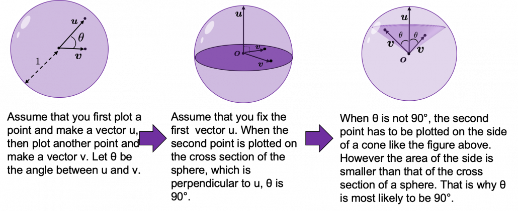
I generated 10000 random pairs of points in side a D-dimensional unit sphere, and calculated the angle between them. In other words I just randomly generated two D-dimensional vectors \boldsymbol{u} and \boldsymbol{v}, whose elements are randomly generated values between -1 and 1, and calculated the angle between them, repeating this process 10000 times. The chart below are the histograms of angle between pairs of generated vectors in respectively 2, 3, 50, and 100 dimensional space.

As I explained above, in 2-dimensional space, the distribution of \theta is almost uniform. However the distribution concentrates a little around 90^\circ in 3-dimensional space. You can see that the bigger the degree of dimension is, the more the angles of generated vectors concentrate around 90^\circ. That means most pairs of vectors in high dimensional space are close to orthogonal. Movements are also sequence of vectors, so when most pairs of movement vectors are orthogonal, that means you can only move like Pac-Man in such space.
Source: https://edition.cnn.com/style/article/pac-man-40-anniversary-history/index.html

* Of course I am talking about arcade Mac-Man game. Not Pac-Man in Super Smash Bros.  Retro RPG video games might have more similar playability, but in high dimensional space it is also difficult to turn back. At any rate, I think you have understood it is even difficult to move smoothly in high dimensional space, just like the first notorious Resident Evil on the first PS console also had terrible playability .

2.3: empty M & M’s chocolate

Let’s think about the proportion of the volume of the outermost \epsilon surface of general spheres with radius r. First, in 2 two dimensional space, spheres are circles. The area of the brown part of the circle below is \pi r^2. In order calculate the are of \epsilon \cdot r thick surface of the circle, you have only to subtract the area of \pi \{ (1 - \epsilon)\cdot r\} ^2. When \epsilon = 0.01, the area of outer most surface is \pi r^2 - \pi (0.99\cdot r)^2, and its proportion to the area of the whole circle is \frac{\pi r^2 - \pi (0.99\cdot r)^2}{\pi r^2} = 0.0199.

In case of 3-dimensional space, the value of a sphere with radius r is \frac{4}{3} \pi r^2, so the proportion of the \epsilon surface is calculated in the same way: \frac{\frac{4}{3} \pi r^3 -\frac{4}{3} \pi (0.99\cdot r)^2}{\frac{4}{3}\pi r^2} = 0.0297. Compared to the case in 2 dimensional space, the proportion is a little bigger.

How about in D-dimensional space? We have seen that even in  D-dimensional space the surface of a sphere, I mean D-ball, can be defined as a set of any points whose distance from the center point is all r. And it is known that the volume of D-ball is defined as below.

\Gamma () is called gamma function, but in this article it is not so important. The most important point now is, if you discuss any D-ball, their volume only depends on their radius r. That meas the proportion of outer \epsilon surface of D-ball is calculated as \frac{\pi r^2 - \pi \{ (1 - \epsilon)\cdot r\} ^2}{\pi r^2}. When \epsilon is 0.01, the proportion of the 1% surface of D-ball changes like in the chart below.

* And of course when D is 2,  \frac{\pi ^{(\frac{D}{2})}}{\Gamma (\frac{D}{2} + 1)} = \pi, and when D is 3 ,  \frac{\pi ^{(\frac{D}{2})}}{\Gamma (\frac{D}{2} + 1)} = \frac{4}{3} \pi

You can see that when D is over 400, around 90% of volume is concentrated in the very thin 1% surface of D-ball. That is why, in high dimensional space, M & M’s chocolate look empty but tastes normal: all the chocolate are concentrated beneath the sugar coating.

More interestingly, even if you choose any points as a central point of a sphere with radius r, the other points are squashed to the surface of the sphere, even if all the data points are uniformly distributed. This situation is problematic for classical machine learning algorithms, which are often based on the Euclidean distances between pairs of two sample data points: if you go from the central point to another sample point, the possibility of finding the point within (1 - \epsilon)\cdot r radius of the center is almost zero. But if you reach the outermost \epsilon part of the surface of the sphere, most data points are there. However, for one of the data points in the surface, any other data points are distant in the same way.

Inside M & M’s chocolate is a mysterious world.

Source: https://hipwallpaper.com/mms-wallpapers/

You have seen that using high dimensional data can be problematic in many ways. Data science and machine learning are largely based on one idea: you can find a lower dimensional meaningful and easier structure in data. In the next articles I am going to introduce some famous dimension reduction algorithms. And hopefully I would like to give some deeper insights in to these algorithms, in straightforward ways.

* I could not explain the relationships of variance and bias of data. This is also a very important factor when you think about dimensionality of data. I hope I can write about this topic someday. You can also look it up if you are interested.

[References]

[1]C. M. Bishop, “Pattern Recognition and Machine Learning,” (2006), Springer, pp. 33-37

[2]Goodfellow and Yoshua Bengio and Aaron Courville, Deep Learning, (2016), MIT Press, p. 153

[3] Shiga Kouji, “30 Lesson to Topology,” (1988)

[4]”Volume of an n-ball,” Wikipedia
https://en.wikipedia.org/wiki/Volume_of_an_n-ball

* I make study materials on machine learning, sponsored by DATANOMIQ. I do my best to make my content as straightforward but as precise as possible. I include all of my reference sources. If you notice any mistakes in my materials, including grammatical errors, please let me know (email: yasuto.tamura@datanomiq.de). And if you have any advice for making my materials more understandable to learners, I would appreciate hearing it.

Illustrative introductions on dimension reduction

“What is your image on dimensions?”

….That might be a cheesy question to ask to reader of Data Science Blog, but most people, with no scientific background, would answer “One dimension is a line, and two dimension is a plain, and we live in three-dimensional world.” After that if you ask “How about the fourth dimension?” many people would answer “Time?”

You can find books or writings about dimensions in various field. And you can use the word “dimension” in normal conversations, in many contexts.

*In Japanese, if you say “He likes two dimension.” that means he prefers anime characters to real women, as is often the case with Japanese computer science students.

The meanings of “dimensions” depend on the context, but in data science dimension is usually the number of rows of your Excel data.

When you study data science or machine learning, usually you should start with understanding the algorithms with 2 or 3 dimensional data, and you can apply those ideas to any D dimensional data. But of course you cannot visualize D dimensional data anymore, and you always have to be careful of what happens if you expand degree of dimension.

Conversely it is also important to reduce dimension to understand abstract high dimensional stuff in 2 or 3 dimensional space, which are close to our everyday sense. That means dimension reduction is one powerful way of data visualization.

In this blog series I am going to explain meanings of dimension itself in machine learning context and algorithms for dimension reductions, such as PCA, LDA, and t-SNE, with 2 or 3 dimensional visible data. Along with that, I am going to delve into the meaning of calculations so that you can understand them in more like everyday-life sense.

This article series is going to be roughly divided into the contents below.

  1. Curse of Dimensionality
  2. Rethinking linear algebra: visualizing linear transformations and eigen vector
  3. The algorithm known as PCA and my taxonomy of linear dimension reductions
  4. Rethinking linear algebra part two: ellipsoids in data science
  5. Autoencoder as dimension reduction (to be published soon)
  6. t-SNE (to be published soon)

I hope you could see that reducing dimension is one of the fundamental approaches in data science or machine learning.

Process Mining mit Celonis – Artikelserie

Der erste Artikel dieser Artikelserie Process Mining Tools beschäftigt sich mit dem Anbieter Celonis. Das 2011 in Deutschland gegründete Unternehmen ist trotz wachsender Anzahl an Wettbewerbern zum Zeitpunkt der Veröffentlichung dieses Artikels der eindeutige Marktführer im Bereich Process Mining.

Celonis Process Mining – Teil 1 der Artikelserie

Celonis Process Mining ist 2011 als reine On-Premise-Lösung gestartet und seit 2018 auch als Cloud-Lösuung zu haben. Übersicht zu den vier verschiedenen Produktversionen der Celonis Process Mining Lösungen:

Celonis Snap Celonis Enterprise Celonis Academic Celonis Consulting
Lizenz:  Kostenfrei Kostenpflichtige Lösungspakete Kostenfrei Consulting Lizenz on Demand
Zielgruppe:  Für kleine Unternehmen und Einzelanwender Für mittel- und große Unternehmen Für akademische Einrichtungen und Studenten Für Berater
Datenquellen: ServiceNow, CSV/XLS -Datei Beliebig (On-Premise- und Cloud – Anbindungen) ServiceNow, CSV/XLS/XES –Datei oder Demosysteme Beliebig (On-Premise- und Cloud – Anbindungen)
Datenvolumen: Limitiert auf 500 MB Event-Log-Daten Unlimitierte Datenmengen (Größte Installation 50 TB) Unlimitierte Datenmengen Unlimitierte Datenmengen (Größte Installation 30 TB
Architektur: Cloud & On-Premise Cloud & On-Premise Cloud & On-Premise Cloud & On-Premise

Dieser Artikel bezieht sich im weiteren Verlauf auf die Celonis Enterprise Version, wenn nicht anders gekennzeichnet. Spezifische Unterschiede unter den einzelnen Produkten und weitere Informationen können auf der Website von Celonis entnommen werden.

Bedienbarkeit und Anpassungsfähigkeit der Analysen

In Sachen Bedienbarkeit punktet Celonis mit einem sehr übersichtlichen und einsteigerfreundlichem Userinterface. Jeder der mit BI-Tools wir z.B. „Power-BI“ oder „Tableau“ gearbeitet hat, wird sich wahrscheinlich schnell zurechtfinden.

Userinterface Celonis

Abbildung 1: Userinterface von Celonis. Über die Reiter kann direkt von der Analyse (Process Analytics) zu den ETL-Prozessen (Event Collection) gewechselt werden.

Das Erstellen von Analysen funktioniert intuitiv und schnell, auch weil die einzelnen Komponentenbausteine lediglich per drag & drop platziert und mit den gewünschten Dimensionen und KPI’s bestückt werden müssen.

Process Analytics im Process Explorer

Abbildung 2: Typische Analyse im Edit Modus. Neue Komponenten können aus dem Reiter (rechts im Bild) mittels drag & drop auf der Dashboard Bearbeitungsfläche platziert werden.

Darüber hinaus bietet Celonis mit seinem kostenlosen Programm „Celonis Acadamy“ einen umfangreichen und leicht verständlichen Pool an Trainingseinheiten für die verschiedenen User-Rollen: „Snap“, „Executive“, „Business User“, „Analyst“ und „Data Engineer“. Einsteiger finden sich nach der Absolvierung der Grundkurse etwa nach vier Stunden in dem Tool zurecht.

Conformance Analyse In Celonis

Abbildung 3: Conformance Analyse In Celonis. Es kann direkt analysiert werden, welche Art von Verstößen welche Auswirkungen haben und mit welcher Häufigkeit diese auftreten.

Die Definition von eigenen KPIs erfolgt mittels übersichtlichem Code Editor. Die verwendete proprietäre und patentierte Programmiersprache lautet PQL (Process Query Language) , dessen Syntax stark an SQL angelehnt ist und alle prozessrelevanten Berechnungen ermöglicht. Noch einsteigerfreundlicher ist der Visual Editor, in welchem KPIs alternativ mit zahlreicher visueller Unterstützung und über 130 mathematischen Operatoren erstellt werden können – ganz ohne Coding Erfahrung.
Mit Hilfe von über 30 Komponenten lassen sich alle üblichen Charts und Grafiken erstellen. Ich hatte das Gefühl, dass die Auswahl grundsätzlich ausreicht und dem Erkenntnisgewinn nicht im Weg steht. Dieses Gefühl rührt nicht zuletzt daher, dass die vorgefertigten Features, wie zum Beispiel „Conformance“ direkt und ohne Aufwand implementiert werden können und bemerkenswerte Erkenntnisse liefern. Kurzum: Ja es ist vieles vorgefertigt, aber hier wurde mit hohen Qualitätsansprüchen vorgefertigt!

Celonis Code Editor vs Visual Editor

Abbildung 4: Coder Editor (links) und Visual Editor (rechts). Während im Code Editor mit PQL geschrieben werden muss, können Einsteiger im Visual Editor visuelle Hilfestellungen nehmen, um KPIs zu definieren.

Diese Flexibilität erscheint groß und bedient mehrere Zielgruppen, beginnend bei den Einsteigern. Insbesondere da das Verständnis für den Code Editor und somit für PQL durch die Arbeit mit dem Visual Code Editor gefördert wird. Wer SQL-Kenntnisse mitbringt, wird sehr schnell ohne Probleme KPIs im Code Editor definieren können. Erfahrenen Data Engineers stünde es dennoch frei, die Entwicklungsarbeit auf die Datenbankebene zu verschieben.

Celonis Visual Editor

Abbildung 5: Mit Hilfe zahlreicher Möglichkeiten können Einsteiger im Visual Editor visuelle Hilfestellungen nehmen, um individuelle KPIs zu definieren.

Nachdem die ersten Analysen erstellt wurden, steht der Prozessanalyse nichts mehr im Wege. Während sich per Knopfdruck auf alle visualisierten Datenpunkte filtern lässt, unterstützt auch hier Celonis zusätzlich mit zahlreichen sogenannten ‘Auswahlansichten’, um die Entdeckung unerwünschter oder betrügerischer Prozesse so einfach wie das Googeln zu machen.

Predefined dashboard apps

Abbildung 6: Die anwenderfreundlichen Auswahlarten ermöglichen es dem Benutzer, einfach mit wenigen Klicks nach Unregelmäßigkeiten oder Mustern in Transaktionen zu suchen und diese eingehend zu analysieren.

Integrationsfähigkeit

Die Celonis Enterprise Version ist sowohl als Cloud- und On-Premise-Lösung verfügbar. Die Cloud-Lösung bietet die folgenden Vorteile: Zum einen zusätzliche Leistungen wieCloud Connectoren, einer sogenannten Action Engine die jeden einzelnen Mitarbeiter in einem Unternehmen mit datengetriebenen nächstbesten Handlungen unterstützt, intelligenter Process Automation, Machine Learning und AI, einen App Store sowie verschiedene Boards. Diese Erweiterungen zeigen deutlich den Anspruch des Münchner Process Mining Vendors auf, neben der reinen Prozessanalyse Unternehmen beim heben der identifizierten Potentiale tatkräftig zu unterstützen. Darüber hinaus kann die Cloud-Lösung punkten mit, einer schnellen Amortisierung, bedarfsgerechter Skalierbarkeit der Kapazitäten sowie einen noch stärkeren Fokus auf Security & Compliance. Darüber hinaus  erfolgen regelmäßig Updates.

Celonis Process Automation

Abbildung 7: Celonis Process Automation ermöglicht Unternehmen ihre Prozesse auf intelligente Art und Weise so zu automatisieren, dass die Zielerreichung der jeweiligen Fachabteilung im Fokus stehen. Auch hier trumpft Celonis mit über 30+ vorgefertigten Möglichkeiten von der Automatisierung von Kommunikation, über Backend Automatisierung in Quellsystemen bis hin zu Einbindung von RPA Bots und vielem mehr.

Der Schwenk von Celonis scheint in Richtung Cloud zu sein und es bleibt abzuwarten, wie die On-Premise-Lösung zukünftig aussehen wird und ob sie noch angeboten wird. Je nach Ausgangssituation gilt es hier abzuwägen, welche der beiden Lösungen die meisten Vorteile bietet. In jedem Fall wird Celonis als browserbasierte Webanwendung für den Endanwender zur Verfügung gestellt. Die folgende Abbildung zeigt eine beispielhafte Celonis on-Premise-Architektur, bei welcher der User über den Webbrowser Zugang erhält.

Celonis bringt eine ausreichende Anzahl an vordefinierten Datenschnittstellen mit, wodurch sowohl gängige on-Premise Datenbanken / ERP-Systeme als auch Cloud-Dienste, wie z. B. „ServiceNow“ oder „Salesforce“ verbunden werden können. Im „App Store“ können zusätzlich sogenannte „prebuild Process-Connectors“ kostenlos erworben werden. Diese erstellen die Verbindung und erzeugen das Datenmodell (Extract and Transform) für einen Standard Prozess automatisch, so dass mit der Analyse direkt begonnen werden kann. Über 500 vordefinierte Analysen für Standard Prozesse gibt es zusätzlich im App Store. Dadurch kann die Bearbeitungszeit für ein Process-Mining Projekt erheblich verkürzt werden, vorausgesetzt das benötigte Datenmodel weicht im Kern nicht zu sehr von dem vordefinierten Model ab. Sollten Schnittstellen mal nicht vorhanden sein, können Daten auch als CSV oder XLS Format importiert werden.

Celonis App Store

Abbildung 8: Der Celonis App Store beinhaltet über 100 Prozesskonnektoren, über 500 vorgefertigte Analysen und über 80 Action Engine Fähigkeiten die kostenlos mit der Cloud Lizenz zur Verfügung stehen

Auch wenn von einer 100%-Cloud gesprochen wird, muss für die Anbindung von unternehmensinternen on-premise Datenquellen (z. B. lokale Instanzen von SAP ERP, Oracle ERP, MS Dynamics ERP) ein sogenannter Extractor on-premise installiert werden.

Celonis Extractors

Abbildung 9: Celonis Extractor muss für die Anbindung von On-Premise Datenquellen ebenfalls On-Premise installiert werden. Dieser arbeitet wie ein Gateway zur Celonis Intelligent Business Cloud (IBC). Die IBC enthält zudem einen eigenen Extratctor für die Anbindung von Daten aus anderen Cloud-Systemen.

Celonis bietet in der Enterprise-Ausführung zudem ein umfassendes Benutzer-Berechtigungsmanagement, so dass beispielsweise für Analysen im Einkauf die Berechtigungen zwischen dem Einkaufsleiter, Einkäufern und Praktikanten im Einkauf unterschieden werden können. Auch dieser Punkt ist für viele Unternehmen eine Grundvoraussetzung für einen eventuellen unternehmensweiten Roll-Out.

Skalierbarkeit

In Punkto großen Datenmengen kann Celonis sich sehen lassen. Allein für „Uber“ verarbeitet die Cloud rund 50 Millionen Datensätze, wobei ein einzelner mehrere Terabyte (TB) groß sein kann. Der größte einzelne Datenblock, den Celonis analysiert, beträgt wohl etwas über 50 TB. Celonis bietet somit Process Mining, zeitgerecht im Bereich Big Data an und kann daher auch viele große renommierten Unternehmen zu seinen Kunden zählen, wie zum Beispiel Siemens, ABB oder BMW. Doch wie erweiterbar und flexibel sind die erstellten Datenmodelle? An diesem Punkt konnte ich keine Schwierigkeiten feststellen. Celonis bietet ein übersichtlich gestaltetes Userinterface, welches das Datenmodell mit seinen Tabellen und Beziehungen sauber darstellt. Modelliert wird mit SQL-Befehlen, wodurch eine zusätzliche Abfragesprache entfällt. Der von Celonis gewählte SQL-Dialekt ist Vertica. Dieser ist keineswegs begrenzt und bietet die ausreichende Tiefe, welche an dieser Stelle benötigt wird. Die Erweiterbarkeit sowie die Flexibilität der Datenmodelle wird somit ausschließlich von der Arbeit des Data Engineer bestimmt und in keiner Weise durch Celonis selbst eingeschränkt. Durch das Zurückgreifen auf die Abfragesprache SQL, kann bei der Modellierung auf eine sehr breite Community zurückgegriffen werden. Darüber hinaus können bestehende SQL-Skripte eingefügt und leicht angepasst werden. Und auch die Suche nach einem geeigneten Data Engineer gestaltet sich dadurch praktisch, da SQL eine der meistbeherrschten Abfragesprachen ist.

Zukunftsfähigkeit

Machine Learning umfasst Data Mining und Predictive Analytics und findet vermehrt den Einzug ins Process Mining. Auch ist es längst ein wesentlicher Bestandteil von Celonis. So basiert z. B. das Feature „Conformance“ auf Machine Learning Algorithmen, welche zu den identifizierten Prozessabweichungen den Einfluss auf das Geschäft berechnen. Aber auch Lösungen zu den Identifizierten Problemen werden von Verfahren des maschinellen Lernens dem Benutzer vorgeschlagen. Was zusätzlich in Sachen Machine Learning von Celonis noch bereitgestellt wird, ist die sogenannte Machine-Learning-Workbench, welche in die Intelligent Business Cloud integriert ist. Hier können eigene Anwendungen mit Machine Learning auf Basis der Event-Log Daten entwickelt und eingesetzt werden, um z. B. Vorhersagen zu Lieferzeiten treffen zu können.

Task Mining ist einer der nächsten Schritte im Bereich Process Mining, der den Detailgrad für Analysen von Prozessen bis hin zu einzelnen Aufgaben auf Mausklick-Ebene erhöht. Im Oktober 2019 hatte Celonis bereits angekündigt, dass die Intelligent Business Cloud um eben diese neue Technik der Datenerhebung und -analyse erweitert wird. Die beiden Methoden Prozess Analyse und Task Mining ergänzen sich ausgezeichnet. Stelle ich in der Prozess Analyse fest, dass sich eine bestimmte Aktivität besonders negativ auf meine gewünschte Performance auswirkt (z. B. Zeit), können mit Task Mining diese Aktivität genauer untersuchen und die möglichen Gründe sehr granular betrachten. So kann ich evtl. feststellen das Mitarbeiter bei einer bestimmten Art von Anfrage sehr viel Zeit in Salesforce verbringen, um Informationen zu sammeln. Hier liegt also viel Potential versteckt, um den gesamten Prozess zu verbessern. In dem z.B. die Informationsbeschaffung erleichtert wird oder evtl. der Anfragetyp optimiert wird, kann dieses Potential genutzt werden. Auch ist Task Mining die ideale Grundlage zur Formulierung von RPA-Lösungen.

Ebenfalls entscheidend für die Zukunftsfähigkeit von Process Mining ist die Möglichkeit, Verknüpfungen zwischen unterschiedlichen Geschäftsprozesse zu erkennen. Häufig sind diese untrennbar miteinander verbunden und der Output eines Prozesses bildet den Input für einen anderen. Mit prozessübergreifenden Multi-Event Logs bietet Celonis die Möglichkeit, genau diese Verbindungen aufzuzeigen. So entsteht ein einheitliches Prozessmodell für das gesamte Unternehmen. Und das unter bestimmten Voraussetzungen auch in nahezu Echtzeit.

Werden die ersten Entwicklungen im Bereich Machine Learning und Task Mining von Celonis weiter ausgebaut, ist Celonis weiterhin auf einem zukunftssicheren Weg. Unternehmen, die vor allem viel Wert auf Enterprise-Readiness und eine intensive Weiterentwicklung legen, dürften mit Celonis auf der sicheren Seite sein.

Preisgestaltung

Die Preisgestaltung der Enterprise Version wird von Celonis nicht transparent kommuniziert. Angeboten werden verschiedene kostenpflichtige Lösungspakete, welche sich aus den Anforderungen eines Projektes ergeben.  Generell stufe ich die Celonis Enterprise Version als Premium Produkt ein. Dies liegt auch daran, weil die Basisausführung der Celonis Enterprise Version bereits sehr umfänglich ist und neben der Software Subscription standardmäßig auch mit Wartung und Support kommt. Zusätzlich steckt mittlerweile sehr viel Entwicklungsarbeit in der Celonis Process Mining Plattform, welche weit über klassische Process Discovery Solutions hinausgeht.  Für kleinere Unternehmen mit begrenztem Budget gibt es daher zwischen der kostenfreien Snap Version und den Basis Paketen der Enterprise Version oft keine Interimslösung.

Fazit

Insgesamt stellt Celonis ein unabhängiges und leistungsstarkes Process Mining Tool in der Cloud bereit. Gehört die Cloud zur Unternehmensstrategie, ist man bei Celonis an der richtigen Adresse. Die „prebuild Process-Connectors“ und die vordefinierten Analysen können ein Process Mining Projekt signifikant beschleunigen und somit die Time-to-Value lukrativ verkürzen. Die Analyse Tools sind leicht bedienbar und schaffen dank integrierter Machine Learning Algorithmen Optimierungspotentiale. Positiv ist auch zu bewerten, dass Celonis ohne speziellen Syntax auskommt und mittelmäßige SQL-Fähigkeiten somit völlig ausreichend sind, um Prozessanalysen vollumfänglich durchzuführen. Diesen vielen positiven Aspekten steht eigentlich nur die hohe Preisgestaltung für die Enterprise Version gegenüber. Ob diese im Einzelfall gerechtfertigt ist, sollte situationsabhängig evaluiert werden. Sicherlich richtet sich Celonis Enterprise in erster Linie an größere Unternehmen, welche komplexe Prozesse mit hohen Datenvolumina analysieren möchte.  Mit Celonis-Snap können jedoch auch kleine Unternehmen und Start-ups einen begrenzten Einblick in dieses gut gelungene Process Mining Tool erhalten.

Data Analytics and Mining for Dummies

Data Analytics and Mining is often perceived as an extremely tricky task cut out for Data Analysts and Data Scientists having a thorough knowledge encompassing several different domains such as mathematics, statistics, computer algorithms and programming. However, there are several tools available today that make it possible for novice programmers or people with no absolutely no algorithmic or programming expertise to carry out Data Analytics and Mining. One such tool which is very powerful and provides a graphical user interface and an assembly of nodes for ETL: Extraction, Transformation, Loading, for modeling, data analysis and visualization without, or with only slight programming is the KNIME Analytics Platform.

KNIME, or the Konstanz Information Miner, was developed by the University of Konstanz and is now popular with a large international community of developers. Initially KNIME was originally made for commercial use but now it is available as an open source software and has been used extensively in pharmaceutical research since 2006 and also a powerful data mining tool for the financial data sector. It is also frequently used in the Business Intelligence (BI) sector.

KNIME as a Data Mining Tool

KNIME is also one of the most well-organized tools which enables various methods of machine learning and data mining to be integrated. It is very effective when we are pre-processing data i.e. extracting, transforming, and loading data.

KNIME has a number of good features like quick deployment and scaling efficiency. It employs an assembly of nodes to pre-process data for analytics and visualization. It is also used for discovering patterns among large volumes of data and transforming data into more polished/actionable information.

Some Features of KNIME:

  • Free and open source
  • Graphical and logically designed
  • Very rich in analytics capabilities
  • No limitations on data size, memory usage, or functionalities
  • Compatible with Windows ,OS and Linux
  • Written in Java and edited with Eclipse.

A node is the smallest design unit in KNIME and each node serves a dedicated task. KNIME contains graphical, drag-drop nodes that require no coding. Nodes are connected with one’s output being another’s input, as a workflow. Therefore end-to-end pipelines can be built requiring no coding effort. This makes KNIME stand out, makes it user-friendly and make it accessible for dummies not from a computer science background.

KNIME workflow designed for graduate admission prediction

KNIME workflow designed for graduate admission prediction

KNIME has nodes to carry out Univariate Statistics, Multivariate Statistics, Data Mining, Time Series Analysis, Image Processing, Web Analytics, Text Mining, Network Analysis and Social Media Analysis. The KNIME node repository has a node for every functionality you can possibly think of and need while building a data mining model. One can execute different algorithms such as clustering and classification on a dataset and visualize the results inside the framework itself. It is a framework capable of giving insights on data and the phenomenon that the data represent.

Some commonly used KNIME node groups include:

  • Input-Output or I/O:  Nodes in this group retrieve data from or to write data to external files or data bases.
  • Data Manipulation: Used for data pre-processing tasks. Contains nodes to filter, group, pivot, bin, normalize, aggregate, join, sample, partition, etc.
  • Views: This set of nodes permit users to inspect data and analysis results using multiple views. This gives a means for truly interactive exploration of a data set.
  • Data Mining: In this group, there are nodes that implement certain algorithms (like K-means clustering, Decision Trees, etc.)

Comparison with other tools 

The first version of the KNIME Analytics Platform was released in 2006 whereas Weka and R studio were released in 1997 and 1993 respectively. KNIME is a proper data mining tool whereas Weka and R studio are Machine Learning tools which can also do data mining. KNIME integrates with Weka to add machine learning algorithms to the system. The R project adds statistical functionalities as well. Furthermore, KNIME’s range of functions is impressive, with more than 1,000 modules and ready-made application packages. The modules can be further expanded by additional commercial features.

Einführung in die Welt der Autoencoder

An wen ist der Artikel gerichtet?

In diesem Artikel wollen wir uns näher mit dem neuronalen Netz namens Autoencoder beschäftigen und wollen einen Einblick in die Grundprinzipien bekommen, die wir dann mit einem vereinfachten Programmierbeispiel festigen. Kenntnisse in Python, Tensorflow und neuronalen Netzen sind dabei sehr hilfreich.

Funktionsweise des Autoencoders

Ein Autoencoder ist ein neuronales Netz, welches versucht die Eingangsinformationen zu komprimieren und mit den reduzierten Informationen im Ausgang wieder korrekt nachzubilden.

Die Komprimierung und die Rekonstruktion der Eingangsinformationen laufen im Autoencoder nacheinander ab, weshalb wir das neuronale Netz auch in zwei Abschnitten betrachten können.


Der Encoder

Der Encoder oder auch Kodierer hat die Aufgabe, die Dimensionen der Eingangsinformationen zu reduzieren, man spricht auch von Dimensionsreduktion. Durch diese Reduktion werden die Informationen komprimiert und es werden nur die wichtigsten bzw. der Durchschnitt der Informationen weitergeleitet. Diese Methode hat wie viele andere Arten der Komprimierung auch einen Verlust.

In einem neuronalen Netz wird dies durch versteckte Schichten realisiert. Durch die Reduzierung von Knotenpunkten in den kommenden versteckten Schichten werden die Kodierung bewerkstelligt.

Der Decoder

Nachdem das Eingangssignal kodiert ist, kommt der Decoder bzw. Dekodierer zum Einsatz. Er hat die Aufgabe mit den komprimierten Informationen die ursprünglichen Daten zu rekonstruieren. Durch Fehlerrückführung werden die Gewichte des Netzes angepasst.

Ein bisschen Mathematik

Das Hauptziel des Autoencoders ist, dass das Ausgangssignal dem Eingangssignal gleicht, was bedeutet, dass wir eine Loss Funktion haben, die L(x , y) entspricht.

L(x, \hat{x})

Unser Eingang soll mit x gekennzeichnet werden. Unsere versteckte Schicht soll h sein. Damit hat unser Encoder folgenden Zusammenhang h = f(x).

Die Rekonstruktion im Decoder kann mit r = g(h) beschrieben werden. Bei unserem einfachen Autoencoder handelt es sich um ein Feed-Forward Netz ohne rückkoppelten Anteil und wird durch Backpropagation oder zu deutsch Fehlerrückführung optimiert.

Formelzeichen Bedeutung
\mathbf{x}, \hat{\mathbf{x}} Eingangs-, Ausgangssignal
\mathbf{W}, \hat{\mathbf{W}} Gewichte für En- und Decoder
\mathbf{B}, \hat{\mathbf{B}} Bias für En- und Decoder
\sigma, \hat{\sigma} Aktivierungsfunktion für En- und Decoder
L Verlustfunktion

Unsere versteckte Schicht soll mit \latex h gekennzeichnet werden. Damit besteht der Zusammenhang:

(1)   \begin{align*} \mathbf{h} &= f(\mathbf{x}) = \sigma(\mathbf{W}\mathbf{x} + \mathbf{B}) \\ \hat{\mathbf{x}} &= g(\mathbf{h}) = \hat{\sigma}(\hat{\mathbf{W}} \mathbf{h} + \hat{\mathbf{B}}) \\ \hat{\mathbf{x}} &= \hat{\sigma} \{ \hat{\mathbf{W}} \left[\sigma ( \mathbf{W}\mathbf{x} + \mathbf{B} )\right]  + \hat{\mathbf{B}} \}\\ \end{align*}

Für eine Optimierung mit der mittleren quadratischen Abweichung (MSE) könnte die Verlustfunktion wie folgt aussehen:

(2)   \begin{align*} L(\mathbf{x}, \hat{\mathbf{x}}) &= \mathbf{MSE}(\mathbf{x}, \hat{\mathbf{x}}) = \|  \mathbf{x} - \hat{\mathbf{x}} \| ^2 &=  \| \mathbf{x} - \hat{\sigma} \{ \hat{\mathbf{W}} \left[\sigma ( \mathbf{W}\mathbf{x} + \mathbf{B} )\right]  + \hat{\mathbf{B}} \} \| ^2 \end{align*}


Wir haben die Theorie und Mathematik eines Autoencoder in seiner Ursprungsform kennengelernt und wollen jetzt diese in einem (sehr) einfachen Beispiel anwenden, um zu schauen, ob der Autoencoder so funktioniert wie die Theorie es besagt.

Dazu nehmen wir einen One Hot (1 aus n) kodierten Datensatz, welcher die Zahlen von 0 bis 3 entspricht.

    \begin{align*} [1, 0, 0, 0] \ \widehat{=}  \ 0 \\ [0, 1, 0, 0] \ \widehat{=}  \ 1 \\ [0, 0, 1, 0] \ \widehat{=}  \ 2 \\ [0, 0, 0, 1] \ \widehat{=} \  3\\ \end{align*}

Diesen Datensatz könnte wie folgt kodiert werden:

    \begin{align*} [1, 0, 0, 0] \ \widehat{=}  \ 0 \ \widehat{=}  \ [0, 0] \\ [0, 1, 0, 0] \ \widehat{=}  \ 1 \ \widehat{=}  \  [0, 1] \\ [0, 0, 1, 0] \ \widehat{=}  \ 2 \ \widehat{=}  \ [1, 0] \\ [0, 0, 0, 1] \ \widehat{=} \  3 \ \widehat{=}  \ [1, 1] \\ \end{align*}

Damit hätten wir eine Dimensionsreduktion von vier auf zwei Merkmalen vorgenommen und genau diesen Vorgang wollen wir bei unserem Beispiel erreichen.

Programmierung eines einfachen Autoencoders


Typische Einsatzgebiete des Autoencoders sind neben der Dimensionsreduktion auch Bildaufarbeitung (z.B. Komprimierung, Entrauschen), Anomalie-Erkennung, Sequenz-to-Sequenz Analysen, etc.

Ausblick

Wir haben mit einem einfachen Beispiel die Funktionsweise des Autoencoders festigen können. Im nächsten Schritt wollen wir anhand realer Datensätze tiefer in gehen. Auch soll in kommenden Artikeln Variationen vom Autoencoder in verschiedenen Einsatzgebieten gezeigt werden.

5 Things You Should Know About Data Mining

The majority of people spend about twenty-four hours online every week. In that time they give out enough information for big data to know a lot about them. Having people collecting and compiling your data might seem scary but it might have been helpful for you in the past.


If you have ever been surprised to find an ad targeted toward something you were talking about earlier or an invention made based on something you were googling, then you already know that data mining can be helpful. Advanced education in data mining can be an awesome resource, so it may pay to have a personal tutor skilled in the area to help you understand. 


It is understandable to be unsure of a system that collects all of the information online so that they can learn more about you. Luckily, so much data is put out every day it is unlikely data mining is focusing on any of your important information. Here are a few statistics you should know about mining.


1. Data Mining Is Used In Crime Scenes

Using a variation of earthquake prediction software and data, the Los Angeles police department and researchers were able to predict crime within five hundred feet. As they learn how to compile and understand more data patterns, crime detecting will become more accurate.


Using their data the Los Angeles police department was able to stop thief activity by thirty-three percent. They were also able to predict violent crime by about twenty-one percent. Those are not perfect numbers, but they are better than before and will get even more impressive as time goes on. 


The fact that data mining is able to pick up on crime statistics and compile all of that data to give an accurate picture of where crime is likely to occur is amazing. It gives a place to look and is able to help stop crime as it starts.


2. Data Mining Helps With Sales

A great story about data mining in sales is the example of Walmart putting beer near the diapers. The story claims that through measuring statistics and mining data it was found that when men purchase diapers they are also likely to buy a pack of beer. Walmart collected that data and put it to good use by putting the beer next to the diapers.


The amount of truth in that story/example is debatable, but it has made data mining popular in most retail stores. Finding which products are often bought together can give insight into where to put products in a store. This practice has increased sales in both items immensely just because people tend to purchase items near one another more than they would if they had to walk to get the second item. 


Putting a lot of stock in the data-gathering teams that big stores build does not always work. There have been plenty of times when data teams failed and sales plummeted. Often, the benefits outweigh the potential failure, however, and many stores now use data mining to make a lot of big decisions about their sales.


3. It’s Helping With Predicting Disease 


In 2009 Google began work to be able to predict the winter flu. Google went through the fifty million most searched words and then compared them with what the CDC was finding during the 2003-2008 flu seasons. With that information google was able to help predict the next winter flu outbreak even down to the states it hit the hardest. 


Since 2009, data mining has gotten much better at predicting disease. Since the internet is a newer invention it is still growing and data mining is still getting better. Hopefully, in the future, we will be able to predict disease breakouts quickly and accurately. 


With new data mining techniques and research in the medical field, there is hope that doctors will be able to narrow down problems in the heart. As the information grows and more data is entered the medical field gets closer to solving problems through data. It is something that is going to help cure diseases more quickly and find the root of a problem.


4. Some Data Mining Gets Ignored

Interestingly, very little of the data that companies collect from you is actually used. “Big data Companies” do not use about eighty-eight percent of the data they have. It is incredibly difficult to use all of the millions of bits of data that go through big data companies every day.


The more people that are used for data mining and the more data companies are actually able to filter through, the better the online experience will be. It might be a bit frightening to think of someone going through what you are doing online, but no one is touching any of the information that you keep private. Big data is using the information you put out into the world and using that data to come to conclusions and make the world a better place.


There is so much information being put onto the internet at all times. Twenty-four hours a week is the average amount of time a single person spends on the internet, but there are plenty of people who spend more time than that. All of that information takes a lot of people to sift through and there are not enough people in the data mining industry to currently actually go through the majority of the data being put online.


5. Too Many Data Mining Jobs

Interestingly, the data industry is booming. In general, there are an amazing amount of careers opening on the internet every day. The industry is growing so quickly that there are not enough people to fill the jobs that are being created.


The lack of talent in the industry means there is plenty of room for new people who want to go into the data mining industry. It was predicted that by 2018 there would be a shortage of 140,000 with deep analytical skills. With the lack of jobs that are being discussed, it is amazing that there is such a shortage in the data industry. 


If big data is only able to wade through less than half of the data being collected then we are wasting a resource. The more people who go into an analytics or computer career the more information we will be able to collect and utilize. There are currently more jobs than there are people in the data mining field and that needs to be corrected.


To Conclude

The data mining industry is making great strides. Big data is trying to use the information they collect to sell more things to you but also to improve the world. Also, there is something very convenient about your computer knowing the type of things you want to buy and showing you them immediately. 


Data mining has been able to help predict crime in Los Angeles and lower crime rates. It has also helped companies know what items are commonly purchased together so that stores can be organized more efficiently. Data mining has even been able to predict the outbreak of disease down to the state.


Even with so much data being ignored and so many jobs left empty, data mining is doing incredible things. The entire internet is constantly growing and the data mining is growing right along with it. As the data mining industry climbs and more people find their careers mining data the more we will learn and the more facts we will find.