Severity of lockdowns and how they are reflected in mobility data
The global spread of the SARS-CoV-2 at the beginning of March 2020 forced majority of countries to introduce measures to contain the virus. The governments found themselves facing a very difficult tradeoff between limiting the spread of the virus and bearing potentially catastrophic economical costs of a lockdown. Notably, considering the level of globalization today, the response of countries varied a lot in severity and response latency. In the overwhelming amount of media and social media information feed a lot of misinformation and anecdotal evidence surfaced and remained in people’s mind. In this article, I try to have a more systematic view on the topics of severity of response from governments and change in people’s mobility due to the pandemic.
I want to look at several countries with different approach to restraining the spread of the virus. I will look at governmental regulations, when, and how they were introduced. For that I am referring to an index called Oxford COVID-19 Government Response Tracker (OxCGRT)[1]. The OxCGRT follows, records, and rates the actions taken by governments, that are available publicly. However, looking just at the regulations and taking them for granted does not provide that we have the whole picture. Therefore, equally interesting is the investigation of how the recommended levels of self-isolation and social distancing is reflected in the mobility data and we will look at it first.
The mobility dataset
The mobility data used in this article was collected by Google and made freely accessible[2]. The data reflects how the number of visits and their length changed as compared to a baseline from before the pandemic. The baseline is the median value for the corresponding day of the week in the period from 3.01.2020 – 6.02.2020. The dataset contains data in six categories. Here we look at only 4 of them: public transport stations, places of residence, workplaces, and retail/recreation (including shopping centers, libraries, gastronomy, culture). The analysis intentionally omits parks (public beaches, gardens etc.) and grocery/pharmacy category. Mobility in parks is excluded due to huge weather change confound. The baseline was created in winter and increased/decreased (depending on the hemisphere) activity in parks is expected as the weather changes. It would be difficult to detangle tis change from the change caused by the pandemic without referring to a different baseline. The grocery shops and pharmacies are excluded because the measures regarding the shopping were very similar across the countries.
Amid the Covid-19 pandemic a lot of anecdotal information surfaced, that some countries, like Sweden, acted completely against the current by not introducing a lockdown. It was reported that there were absolutely no restrictions and Sweden can be basically treated as a control group for comparing the different approaches to lockdown on the spread of the coronavirus. Looking at the mobility data (below), we can see however, that there was a change in the mobility of Swedish citizens in comparison to the baseline.
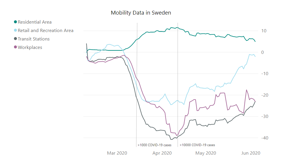
Fig. 1 Moving average (+/- 6 days) of the mobility data in Sweden in four categories.
Looking at the change in mobility in Sweden, we can see that the change in the residential areas is small, but it is indicating some change in behavior. A change in the retail and recreational sector is more noticeable. Most interestingly it is approaching the baseline levels at the beginning of June. The most substantial changes, however, are in the workplaces and transit categories. They are also much slower to come back to the baseline, although a trend in that direction starts to be visible.
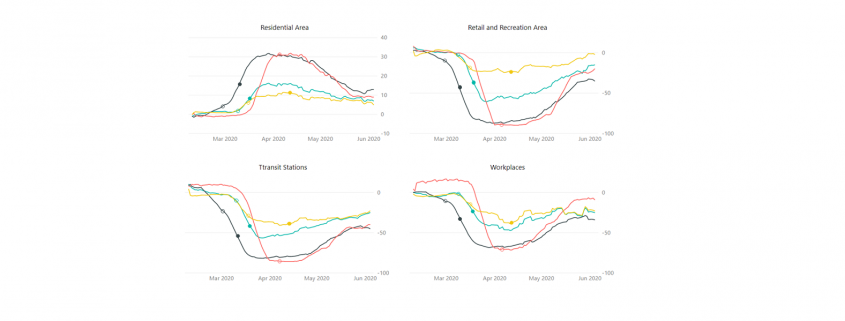
Next, let us have a look at the change in mobility in selected countries, separately for each category. Here, I compare Germany, Sweden, Italy, and New Zealand. (To see the mobility data for other countries visit https://covid19.datanomiq.de/#section-mobility).
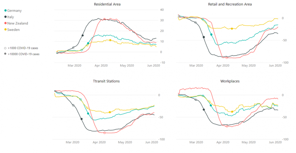
Fig. 2 Moving average (+/- 6 days) of the mobility data.
Looking at the data, we can see that the change in mobility in Germany and Sweden was somewhat similar in orders of magnitude, in comparison to changes in mobility in countries like Italy and New Zealand. Without a doubt, the behavior in Sweden changed the least from the baseline in all the categories. Nevertheless, claiming that people’s reaction to the pandemic in Sweden in Germany were polar opposites is not necessarily correct. The biggest discrepancy between Sweden and Germany is in the retail and recreation sector out of all categories presented. The changes in Italy and New Zealand reached very comparable levels, but in New Zealand they seem to be much more dynamic, especially in approaching the baseline levels again.
The government response dataset
Oxford COVID-19 Government Response Tracker records regulations from number of countries, rates them and categorizes into a few indices. The number between 1 and 100 reflects the level of the action taken by a government. Here, I focus on the Containment and Health sub-index that includes 11 indicators from categories: containment and closure policies and health system policies[3]. The actions included in the index are for example: school and workplace closing, restrictions on public events, travel restrictions, public information campaigns, testing policy and contact tracing.
Below, we look at a plot with the Containment and Health sub-index value for the four aforementioned countries. Data and documentation is available here[4]
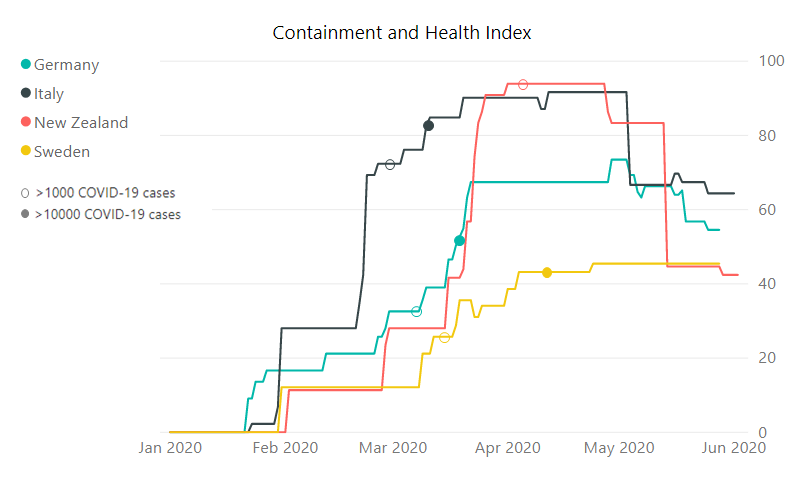
Fig. 3 Oxford COVID-19 Government Response Tracker, the Containment and Health sub-index.
Here the difference between Sweden and the other countries that we are looking at becomes more apparent. Nevertheless, the Swedish government did take some measures in order to condemn the spread of the SARS-CoV-2. At the highest, the index reached value 45 points in Sweden, 73 in Germany, 92 in Italy and 94 in New Zealand. In all these countries except for Sweden the index started dropping again, while the drop is the most dynamic in New Zealand and the index has basically reached the level of Sweden.
Conclusions
As we have hopefully seen, the response to the COVID-19 pandemic from governments differed substantially, as well as the resulting change in mobility behavior of the inhabitants did. However, the discrepancies were probably not as big as reported in the media.
The overwhelming presence of the social media could have blown some of the mentioned differences out of proportion. For example, the discrepancy in the mobility behavior between Sweden and Germany was biggest in recreation sector, that involves cafes, restaurants, cultural resorts, and shopping centers. It is possible, that those activities were the ones that people in lockdown missed the most. Looking at Swedes, who were participating in them it was easy to extrapolate on the overall landscape of the response to the virus in the country.
It is very hard to say which of the world country’s approach will bring the best effects for the people’s well-being and the economies. The ongoing pandemic will remain a topic of extensive research for many years to come. We will (most probably) eventually find out which approach to the lockdown was the most optimal (or at least come close to finding out). For the time being, it is however important to remember that there are many factors in play and looking into one type of data might be misleading. Comparing countries with different history, weather, political and economic climate, or population density might be misleading as well. But it is still more insightful than not looking into the data at all.
[1] Hale, Thomas, Sam Webster, Anna Petherick, Toby Phillips, and Beatriz Kira (2020). Oxford COVID-19 Government Response Tracker, Blavatnik School of Government. Data use policy: Creative Commons Attribution CC BY standard.
[2] Google LLC “Google COVID-19 Community Mobility Reports”. https://www.google.com/covid19/mobility/ retrived: 04.06.2020
[3] See documentation https://github.com/OxCGRT/covid-policy-tracker/tree/master/documentation
[4] https://github.com/OxCGRT/covid-policy-tracker retrieved on 04.06.2020