All about Big Data Storage and Analytics

ACID vs BASE Concepts

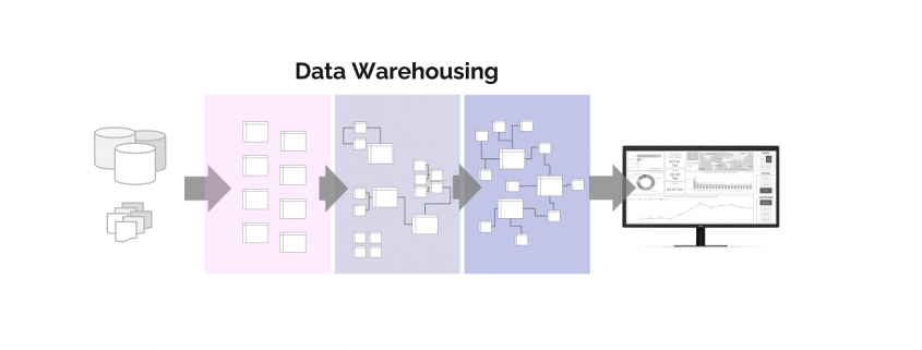
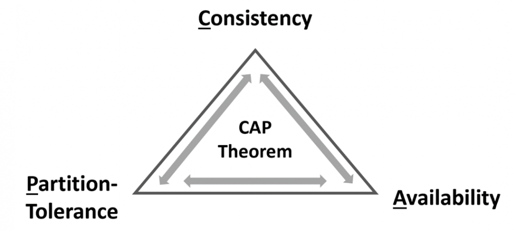
Understanding databases for storing, updating and analyzing data requires the understanding of two concepts: ACID and BASE. This is the first article of the article series Data Warehousing Basics.

The properties of ACID are being applied for databases in order to fulfill enterprise requirements of reliability and consistency.

ACID is an acronym, and stands for:

  • Atomicity – Each transaction is either properly executed completely or does not happen at all. If the transaction was not finished the process reverts the database back to the state before the transaction started. This ensures that all data in the database is valid even if we execute big transactions which include multiple statements (e. g. SQL) composed into one transaction updating many data rows in the database. If one statement fails, the entire transaction will be aborted, and hence, no changes will be made.
  • Consistency – Databases are governed by specific rules defined by table formats (data types) and table relations as well as further functions like triggers. The consistency of data will stay reliable if transactions never endanger the structural integrity of the database. Therefor, it is not allowed to save data of different types into the same single column, to use written primary key values again or to delete data from a table which is strictly related to data in another table.
  • Isolation – Databases are multi-user systems where multiple transactions happen at the same time. With Isolation, transactions cannot compromise the integrity of other transactions by interacting with them while they are still in progress. It guarantees data tables will be in the same states with several transactions happening concurrently as they happen sequentially.
  • Durability – The data related to the completed transaction will persist even in cases of network or power outages. Databases that guarante Durability save data inserted or updated permanently, save all executed and planed transactions in a recording and ensure availability of the data committed via transaction even after a power failure or other system failures If a transaction fails to complete successfully because of a technical failure, it will not transform the targeted data.

ACID Databases

The ACID transaction model ensures that all performed transactions will result in reliable and consistent databases. This suits best for businesses which use OLTP (Online Transaction Processing) for IT-Systems such like ERP- or CRM-Systems. Furthermore, it can also be a good choice for OLAP (Online Analytical Processing) which is used in Data Warehouses. These applications need backend database systems which can handle many small- or medium-sized transactions occurring simultaneous by many users. An interrupted transaction with write-access must be removed from the database immediately as it could cause negative side effects impacting the consistency(e.g., vendors could be deleted although they still have open purchase orders or financial payments could be debited from one account and due to technical failure, never credited to another).

The speed of the querying should be as fast as possible, but even more important for those applications is zero tolerance for invalid states which is prevented by using ACID-conform databases.

BASE Concept

ACID databases have their advantages but also one big tradeoff: If all transactions need to be committed and checked for consistency correctly, the databases are slow in reading and writing data. Furthermore, they demand more effort if it comes to storing new data in new formats.

In chemistry, a base is the opposite to acid. The database concepts of BASE and ACID have a similar relationship. The BASE concept provides several benefits over ACID compliant databases asthey focus more intensely on data availability of database systems without guarantee of safety from network failures or inconsistency.

The acronym BASE is even more confusing than ACID as BASE relates to ACID indirectly. The words behind BASE suggest alternatives to ACID.

BASE stands for:

  • Basically Available – Rather than enforcing consistency in any case, BASE databases will guarantee availability of data by spreading and replicating it across the nodes of the database cluster. Basic read and write functionality is provided without liabilityfor consistency. In rare cases it could happen that an insert- or update-statement does not result in persistently stored data. Read queries might not provide the latest data.
  • Soft State – Databases following this concept do not check rules to stay write-consistent or mutually consistent. The user can toss all data into the database, delegating the responsibility of avoiding inconsistency or redundancy to developers or users.
  • Eventually Consistent –No guarantee of enforced immediate consistency does not mean that the database never achieves it. The database can become consistent over time. After a waiting period, updates will ripple through all cluster nodes of the database. However, reading data out of it will stay always be possible, it is just not certain if we always get the last refreshed data.

All the three above mentioned properties of BASE-conforming databases sound like disadvantages. So why would you choose BASE? There is a tradeoff compared to ACID. If databases do not have to follow ACID properties then the database can work much faster in terms of writing and reading from the database. Further, the developers have more freedom to implement data storage solutions or simplify data entry into the database without thinking about formats and structure beforehand.

BASE Databases

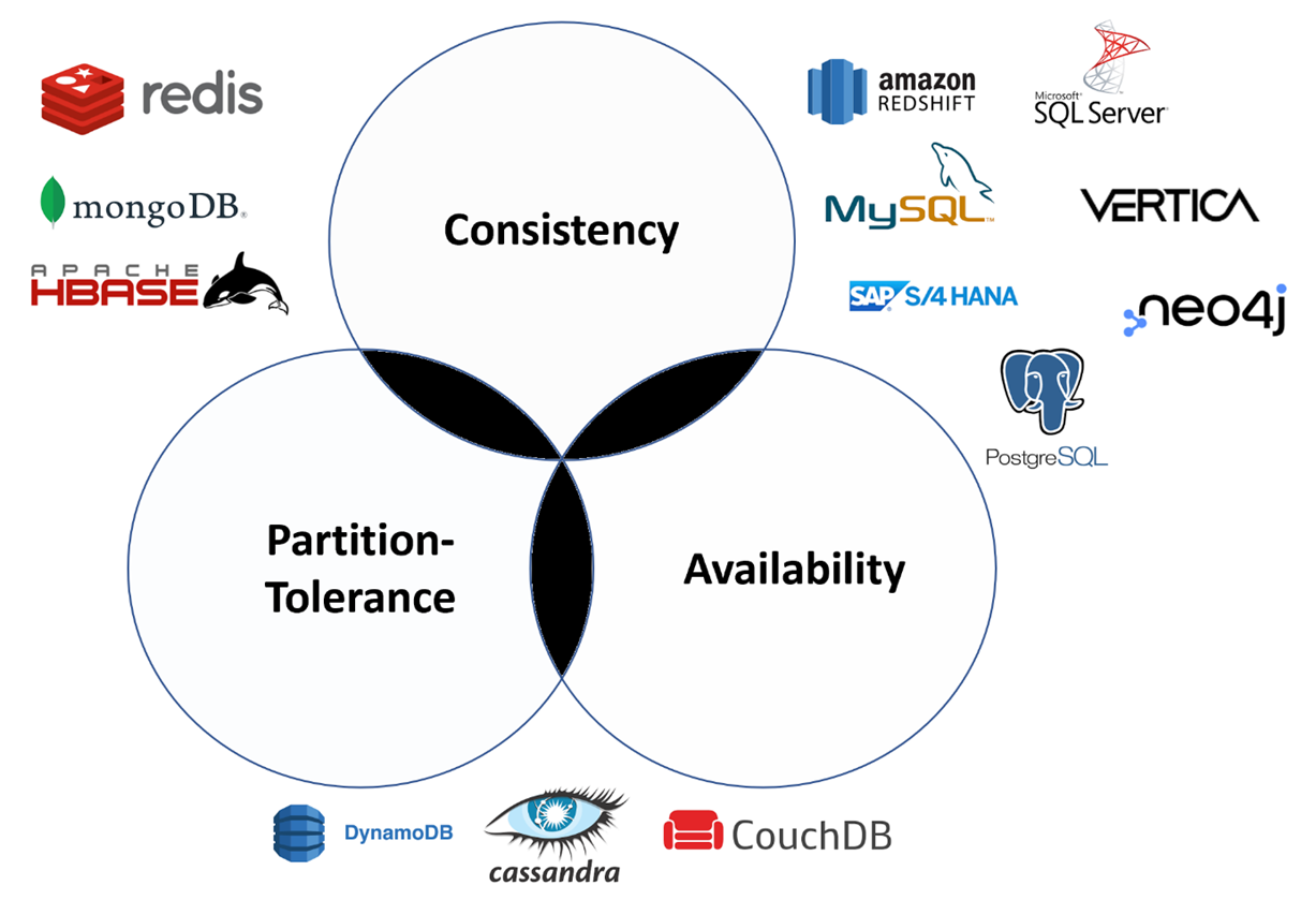
While ACID databases are mostly RDBMS, most other database types, known as NoSQL databases, tend more to conform to BASE principles. Redis, CouchDB, MongoDB, Cosmos DB, Cassandra, ElasticSearch, Neo4J, OrientDB or ArangoDB are just some popular examples. But other than ACID, BASE is not a strict approach. Some NoSQL databases apply at least partly to ACID rules or provide optional functions to get almost or even full ACID compatibility. These databases provide different level of freedom which can be useful for the Staging Layer in Data Warehouses or as a Data Lake, but they are not the recommended choice for applications which need data environments guaranteeing strict consistency.

Data Warehousing Basiscs

Data Warehousing is applied Big Data Management and a key success factor in almost every company. Without a data warehouse, no company today can control its processes and make the right decisions on a strategic level as there would be a lack of data transparency for all decision makers. Bigger comanies even have multiple data warehouses for different purposes.

In this series of articles I would like to explain what a data warehouse actually is and how it is set up. However, I would also like to explain basic topics regarding Data Engineering and concepts about databases and data flows.

To do this, we tick off the following points step by step:


Moderne Business Intelligence in der Microsoft Azure Cloud

Google, Amazon und Microsoft sind die drei großen Player im Bereich Cloud Computing. Die Cloud kommt für nahezu alle möglichen Anwendungsszenarien infrage, beispielsweise dem Hosting von Unternehmenssoftware, Web-Anwendungen sowie Applikationen für mobile Endgeräte. Neben diesen Klassikern spielt die Cloud jedoch auch für Internet of Things, Blockchain oder Künstliche Intelligenz eine wichtige Rolle als Enabler. In diesem Artikel beleuchten wir den Cloud-Anbieter Microsoft Azure mit Blick auf die Möglichkeiten des Aufbaues eines modernen Business Intelligence oder Data Platform für Unternehmen.

Eine Frage der Architektur

Bei der Konzeptionierung der Architektur stellen sich viele Fragen:

  • Welche Datenbank wird für das Data Warehouse genutzt?
  • Wie sollten ETL-Pipelines erstellt und orchestriert werden?
  • Welches BI-Reporting-Tool soll zum Einsatz kommen?
  • Müssen Daten in nahezu Echtzeit bereitgestellt werden?
  • Soll Self-Service-BI zum Einsatz kommen?
  • … und viele weitere Fragen.

1 Die Referenzmodelle für Business Intelligence Architekturen von Microsoft Azure

Die vielen Dienste von Microsoft Azure erlauben unzählige Einsatzmöglichkeiten und sind selbst für Cloud-Experten nur schwer in aller Vollständigkeit zu überblicken.  Microsoft schlägt daher verschiedene Referenzmodelle für Datenplattformen oder Business Intelligence Systeme mit unterschiedlichen Ausrichtungen vor. Einige davon wollen wir in diesem Artikel kurz besprechen und diskutieren.

1a Automatisierte Enterprise BI-Instanz

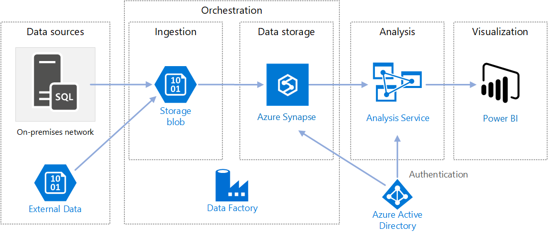
Diese Referenzarchitektur für automatisierte und eher klassische BI veranschaulicht die Vorgehensweise für inkrementelles Laden in einer ELT-Pipeline mit dem Tool Data Factory. Data Factory ist der Cloud-Nachfolger des on-premise ETL-Tools SSIS (SQL Server Integration Services) und dient nicht nur zur Erstellung der Pipelines, sondern auch zur Orchestrierung (Trigger-/Zeitplan der automatisierten Ausführung und Fehler-Behandlung). Über Pipelines in Data Factory werden die jeweils neuesten OLTP-Daten inkrementell aus einer lokalen SQL Server-Datenbank (on-premise) in Azure Synapse geladen, die Transaktionsdaten dann in ein tabellarisches Modell für die Analyse transformiert, dazu wird MS Azure Analysis Services (früher SSAS on-premis) verwendet. Als Tool für die Visualisierung der Daten wird von Microsoft hier und in allen anderen Referenzmodellen MS PowerBI vorgeschlagen. MS Azure Active Directory verbindet die Tools on Azure über einheitliche User im Active Directory Verzeichnis in der Azure-Cloud.

https://docs.microsoft.com/en-us/azure/architecture/reference-architectures/data/enterprise-bi-adfQuelle:
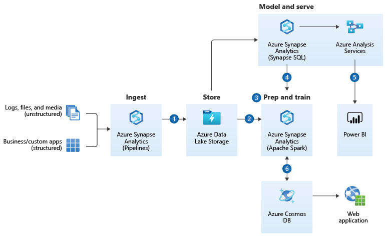
Einige Diskussionspunkte zur BI-Referenzarchitektur von MS Azure

Der von Microsoft vorgeschlagenen Referenzarchitektur zu folgen kann eine gute Idee sein, ist jedoch tatsächlich nur als Vorschlag – eher noch als Kaufvorschlag – zu betrachten. Denn Unternehmens-BI ist hochgradig individuell und Bedarf einiger Diskussion vor der Festlegung der Architektur.

Azure Data Factory als ETL-Tool

Azure Data Factory wird in dieser Referenzarchitektur als ETL-Tool vorgeschlagen. In der Tat ist dieses sehr mächtig und rein über Mausklicks bedienbar. Darüber hinaus bietet es die Möglichkeit z. B. über Python oder Powershell orchestriert und pipeline-modelliert zu werden. Der Clue für diese Referenzarchitektur ist der Hinweis auf die On-Premise-Datenquellen. Sollte zuvor SSIS eingesetzt werden sollen, können die SSIS-Packages zu Data Factory migriert werden.

Die Auswahl der Datenbanken

Der Vorteil dieser Referenzarchitektur ist ohne Zweifel die gute Aufstellung der Architektur im Hinblick auf vielseitige Einsatzmöglichkeiten, so werden externe Daten (in der Annahme, dass diese un- oder semi-strukturiert vorliegen) zuerst in den Azure Blob Storage oder in den auf dem Blob Storage beruhenden Azure Data Lake zwischen gespeichert, bevor sie via Data Factory in eine für Azure Synapse taugliche Struktur transformiert werden können. Möglicherweise könnte auf den Blob Storage jedoch auch gut verzichtet werden, solange nur Daten aus bekannten, strukturierten Datenbanken der Vorsysteme verarbeitet werden. Als Staging-Layer und für Datenhistorisierung sind der Azure Blob Storage oder der Azure Data Lake jedoch gute Möglichkeiten, da pro Dateneinheit besonders preisgünstig.

Azure Synapse ist eine mächtige Datenbank mindestens auf Augenhöhe mit zeilen- und spaltenorientierten, verteilten In-Memory-Datenbanken wie Amazon Redshift, Google BigQuery oder SAP Hana. Azure Synapse bietet viele etablierte Funktionen eines modernen Data Warehouses und jährlich neue Funktionen, die zuerst als Preview veröffentlicht werden, beispielsweise der Einsatz von Machine Learning direkt auf der Datenbank.

Zur Diskussion steht jedoch, ob diese Funktionen und die hohe Geschwindigkeit (bei richtiger Nutzung) von Azure Synapse die vergleichsweise hohen Kosten rechtfertigen. Alternativ können MySQL-/MariaDB oder auch PostgreSQL-Datenbanken bei MS Azure eingesetzt werden. Diese sind jedoch mit Vorsicht zu nutzen bzw. erst unter genauer Abwägung einzusetzen, da sie nicht vollständig von Azure Data Factory in der Pipeline-Gestaltung unterstützt werden. Ein guter Kompromiss kann der Einsatz von Azure SQL Database sein, der eigentliche Nachfolger der on-premise Lösung MS SQL Server. MS Azure Snypase bleibt dabei jedoch tatsächlich die Referenz, denn diese Datenbank wurde speziell für den Einsatz als Data Warehouse entwickelt.

Zentrale Cube-Generierung durch Azure Analysis Services

Zur weiteren Diskussion stehen könnte MS Azure Analysis Sevice als Cube-Engine. Diese Cube-Engine, die ursprünglich on-premise als SQL Server Analysis Service (SSAS) bekannt war, nun als Analysis Service in der Azure Cloud verfügbar ist, beruhte früher noch als SSAS auf der Sprache MDX (Multi-Dimensional Expressions), eine stark an SQL angelehnte Sprache zum Anlegen von schnellen Berechnungsformeln für Kennzahlen im Cube-Datenmodellen, die grundlegendes Verständnis für multidimensionale Abfragen mit Tupeln und Sets voraussetzt. Heute wird statt MDX die Sprache DAX (Data Analysis Expression) verwendet, die eher an Excel-Formeln erinnert (diesen aber keinesfalls entspricht), sie ist umfangreicher als MDX, jedoch für den abitionierten Anwender leichter verständlich und daher für Self-Service-BI geeignet.

Punkt der Diskussion ist, dass der Cube über den Analysis-Service selbst keine Möglichkeiten eine Self-Service-BI nicht ermöglicht, da die Bearbeitung des Cubes mit DAX nur über spezielle Entwicklungsumgebungen möglich ist (z. B. Visual Studio). MS Power BI selbst ist ebenfalls eine Instanz des Analysis Service, denn im Kern von Power BI steckt dieselbe Engine auf Basis von DAX. Power BI bietet dazu eine nutzerfreundliche UI und direkt mit mausklickbaren Elementen Daten zu analysieren und Kennzahlen mit DAX anzulegen oder zu bearbeiten. Wird im Unternehmen absehbar mit Power BI als alleiniges Analyse-Werkzeug gearbeitet, ist eine separate vorgeschaltete Instanz des Azure Analysis Services nicht notwendig. Der zur Abwägung stehende Vorteil des Analysis Service ist die Nutzung des Cubes in Microsoft Excel durch die User über Power Pivot. Dies wiederum ist eine eigene Form des sehr flexiblen Self-Service-BIs.

1b Enterprise Data Warehouse-Architektur

Eine weitere Referenz-Architektur von Microsoft auf Azure ist jene für den Einsatz als Data Warehouse, bei der Microsoft Azure Synapse den dominanten Part von der Datenintegration über die Datenspeicherung und Vor-Analyse übernimmt.https://docs.microsoft.com/en-us/azure/architecture/solution-ideas/articles/enterprise-data-warehouseQuelle: 
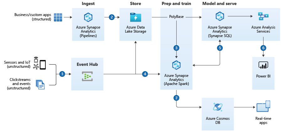
Diskussionspunkte zum Referenzmodell der Enterprise Data Warehouse Architecture

Auch diese Referenzarchitektur ist nur für bestimmte Einsatzzwecke in dieser Form sinnvoll.

Azure Synapse als ETL-Tool

Im Unterschied zum vorherigen Referenzmodell wird hier statt auf Azure Data Factory auf Azure Synapse als ETL-Tool gesetzt. Azure Synapse hat die Datenintegrationsfunktionalitäten teilweise von Azure Data Factory geerbt, wenn gleich Data Factory heute noch als das mächtigere ETL-Tool gilt. Azure Synapse entfernt sich weiter von der alten SSIS-Logik und bietet auch keine Integration von SSIS-Paketen an, zudem sind einige Anbindungen zwischen Data Factory und Synapse unterschiedlich.

Auswahl der Datenbanken

Auch in dieser Referenzarchitektur kommt der Azure Blob Storage als Zwischenspeicher bzw. Staging-Layer zum Einsatz, jedoch im Mantel des Azure Data Lakes, der den reinen Speicher um eine Benutzerebene erweitert und die Verwaltung des Speichers vereinfacht. Als Staging-Layer oder zur Datenhistorisierung ist der Blob Storage eine kosteneffiziente Methode, darf dennoch über individuelle Betrachtung in der Notwendigkeit diskutiert werden.

Azure Synapse erscheint in dieser Referenzarchitektur als die sinnvolle Lösung, da nicht nur die Pipelines von Synapse, sondern auch die SQL-Engine sowie die Spark-Engine (über Python-Notebooks) für die Anwendung von Machine Learning (z. B. für Recommender-Systeme) eingesetzt werden können. Hier spielt Azure Synpase die Möglichkeiten als Kern einer modernen, intelligentisierbaren Data Warehouse Architektur voll aus.

Azure Analysis Service

Auch hier wird der Azure Analysis Service als Cube-generierende Maschinerie von Microsoft vorgeschlagen. Hier gilt das zuvor gesagte: Für den reinen Einsatz mit Power BI ist der Analysis Service unnötig, sollen Nutzer jedoch in MS Excel komplexe, vorgerechnete Analysen durchführen können, dann zahlt sich der Analysis Service aus.

Azure Cosmos DB

Die Azure Cosmos DB ist am nächsten vergleichbar mit der MongoDB Atlas (die Cloud-Version der eigentlich on-premise zu hostenden MongoDB). Es ist eine NoSQL-Datenbank, die über Datendokumente im JSON-File-Format auch besonders große Datenmengen in sehr hoher Geschwindigkeit abfragen kann. Sie gilt als die zurzeit schnellste Datenbank in Sachen Lesezugriff und spielt dabei alle Vorteile aus, wenn es um die massenweise Bereitstellung von Daten in andere Applikationen geht. Unternehmen, die ihren Kunden mobile Anwendungen bereitstellen, die Millionen parallele Datenzugriffe benötigen, setzen auf Cosmos DB.

1c Referenzarchitektur für Realtime-Analytics

Die Referenzarchitektur von Microsoft Azure für Realtime-Analytics wird die Referenzarchitektur für Enterprise Data Warehousing ergänzt um die Aufnahme von Data Streaming.

Diskussionspunkte zum Referenzmodell für Realtime-Analytics

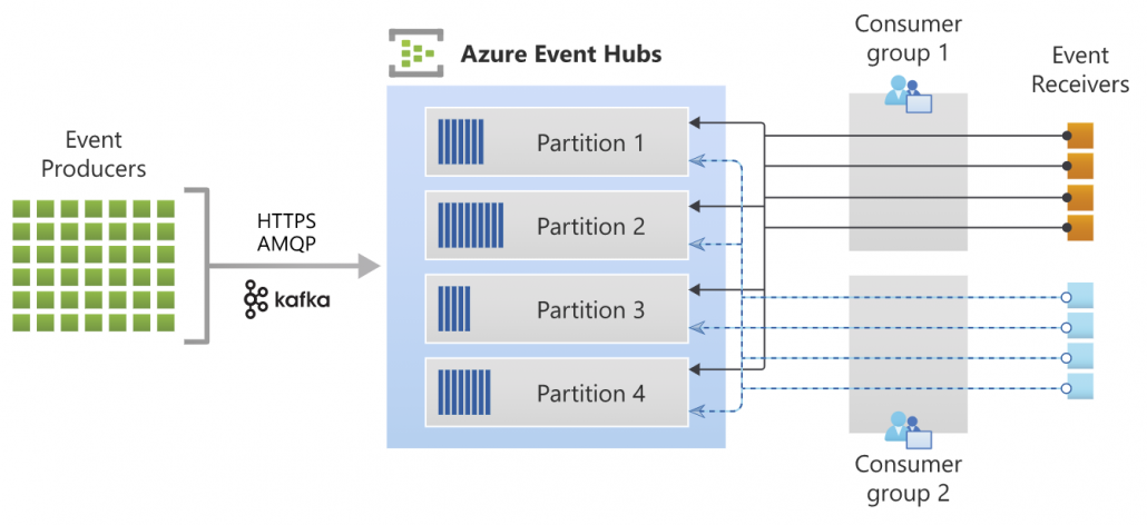
Diese Referenzarchitektur ist nur für Einsatzszenarios sinnvoll, in denen Data Streaming eine zentrale Rolle spielt. Bei Data Streaming handelt es sich, vereinfacht gesagt, um viele kleine, ereignis-getriggerte inkrementelle Datenlade-Vorgänge bzw. -Bedarfe (Events), die dadurch nahezu in Echtzeit ausgeführt werden können. Dies kann über Webshops und mobile Anwendungen von hoher Bedeutung sein, wenn z. B. Angebote für Kunden hochgrade-individualisiert angezeigt werden sollen oder wenn Marktdaten angezeigt und mit ihnen interagiert werden sollen (z. B. Trading von Wertpapieren). Streaming-Tools bündeln eben solche Events (bzw. deren Datenhäppchen) in Data-Streaming-Kanäle (Partitionen), die dann von vielen Diensten (Consumergruppen / Receiver) aufgegriffen werden können. Data Streaming ist insbesondere auch dann ein notwendiges Setup, wenn ein Unternehmen über eine Microservices-Architektur verfügt, in der viele kleine Dienste (meistens als Docker-Container) als dezentrale Gesamtstruktur dienen. Jeder Dienst kann über Apache Kafka als Sender- und/oder Empfänger in Erscheinung treten. Der Azure Event-Hub dient dazu, die Zwischenspeicherung und Verwaltung der Datenströme von den Event-Sendern in den Azure Blob Storage bzw. Data Lake oder in Azure Synapse zu laden und dort weiter zu reichen oder für tiefere Analysen zu speichern.

Azure Eventhub ArchitectureQuelle: https://docs.microsoft.com/de-de/azure/event-hubs/event-hubs-about
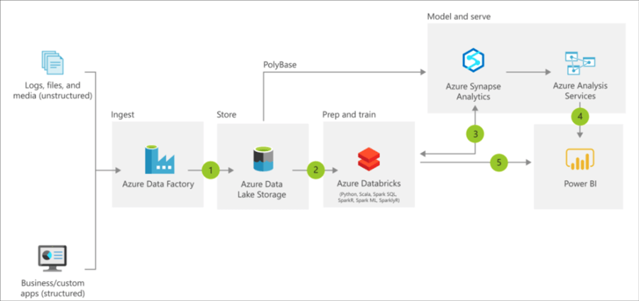
Für die Datenverarbeitung in nahezu Realtime sind der Azure Data Lake und Azure Synapse derzeitig relativ alternativlos. Günstigere Datenbank-Instanzen von MariaDB/MySQL, PostgreSQL oder auch die Azure SQL Database wären hier ein Bottleneck.

2 Fazit zu den Referenzarchitekturen

Die Referenzarchitekturen sind exakt als das zu verstehen: Als Referenz. Keinesfalls sollte diese Architektur unreflektiert für ein Unternehmen übernommen werden, sondern vorher in Einklang mit der Datenstrategie gebracht werden, dabei sollten mindestens diese Fragen geklärt werden:

  • Welche Datenquellen sind vorhanden und werden zukünftig absehbar vorhanden sein?
  • Welche Anwendungsfälle (Use Cases) habe ich für die Business Intelligence bzw. Datenplattform?
  • Über welche finanziellen und fachlichen Ressourcen darf verfügt werden?

Darüber hinaus sollten sich die Architekten bewusst sein, dass, anders als noch in der trägeren On-Premise-Welt, die Could-Dienste schnelllebig sind. So sah die Referenzarchitektur 2019/2020 noch etwas anders aus, in der Databricks on Azure als System für Advanced Analytics inkludiert wurde, heute scheint diese Position im Referenzmodell komplett durch Azure Synapse ersetzt worden zu sein.

Azure Reference Architecture BI Databrikcs 2019

Azure Reference Architecture – with Databricks, old image source: https://docs.microsoft.com/en-us/azure/architecture/solution-ideas/articles/modern-data-warehouse

Hinweis zu den Kosten und der Administration

Die Kosten für Cloud Computing statt für IT-Infrastruktur On-Premise sind ein zweischneidiges Schwert. Der günstige Einstieg in de Azure Cloud ist möglich, jedoch bedingt ein kosteneffizienter Betrieb viel Know-How im Umgang mit den Diensten und Konfigurationsmöglichkeiten der Azure Cloud oder des jeweiligen alternativen Anbieters. Beispielsweise können über Azure Data Factory Datenbanken über Pipelines automatisiert hochskaliert und nach nur Minuten wieder runterskaliert werden. Nur wer diese dynamischen Skaliermöglichkeiten nutzt, arbeitet effizient in der Cloud.

Ferner sind Kosten nur schwer einschätzbar, da diese mehr noch von der Nutzung (Datenmenge, CPU, RAM) als von der zeitlichen Nutzung (Lifetime) abhängig sind. Preisrechner ermöglichen zumindest eine Kosteneinschätzung: https://azure.com/e/96162a623bda4911bb8f631e317affc6

How to Efficiently Manage Big Data

The benefits of big data today can’t be ignored, especially since these benefits encompass industries. Despite the misconceptions around big data, it has shown potential in helping organizations move forward and adapt to an ever-changing market, where those that can’t respond appropriately or quickly enough are left behind. Data analytics is the name of the game, and efficient data management is the main differentiator.

A digital integration hub (DIH) will provide the competitive edge an organization needs in the efficient handling of data. It’s an application architecture that aggregates operational data into a low-latency data fabric and helps in digital transformation by offloading from legacy architecture and providing a decoupled API layer that effectively supports modern online applications. Data management entails the governance, organization, and administration of large, and possibly complex, datasets. The rapid growth of data pooIs has left unprepared companies scrambling to find solutions that will help keep them above water. Data in these pools originate from a myriad of sources, including websites, social media sites, and system logs. The variety in data types and their sheer size make data management a fairly complex undertaking.

Big Data Management for Big Wins

In today’s data-driven world, the capability to efficiently analyze and store data are vital factors in enhancing current business processes and setting up new ones. Data has gone beyond the realm of data analysts and into the business mainstream. As such, businesses should add data analysis as a core competency to ensure that the entire organization is on the same page when it comes to data strategy. Below are a few ways you can make big data work for you and your business.

Define Specific Goals

The data you need to capture will depend on your business goals so it’s imperative that you know what these are and ensure that these are shared across the organization. Without definite and specific goals, you’ll end up with large pools of data and nowhere to use them in. As such, it’s advisable to involve the entire team in mapping out a data strategy based on the company’s objectives. This strategy should be part of the organization’s overall business strategy to avoid the collection of irrelevant data that has no impact on business performance. Setting the direction early on will help set you up for long-term success.

Secure Your Data

Because companies have to contend with large amounts of data each day, storage and management could become very challenging. Security is also a main concern; no organization wants to lose it’s precious data after spending time and money processing and storing them. While keeping data accessible for analysis, you should also ensure that it’s kept secure at all times. When handling data, you should have security measures in place, such as firewall security, malware scanning, and spam filtering. Data security is especially important when collecting customer data to avoid violating data privacy regulations. Ideally, it should be one of the main considerations in data management because it’s a critical factor that could mean the difference between a successful venture and a problematic one.

Interlink Your Data

Different channels can be used to access a database, but this doesn’t necessarily mean that you should use several or all of them. There’s no need to deploy different tools for each application your organization uses. One of the ways to prevent miscommunication between applications and ensure that data is synchronized at all times is to keep data interlinked. Synchronicity of data is vital if your organization or team plans to use a single database. An in-memory data grid, cloud storage system, and remote database administrator are just some of the tools a company can use to interlink data.

Ensure Compliance With Audit Regulations

One thing that could be easy to overlook is how compliant systems are to audit regulations. A database and it is conducted to check on the actions of database users and managers. It is typically done for security purposes—to ensure that data or information can be accessed only by those authorized to do so. Adhering to audit regulations is a must, even for offsite database administrators, so it’s critical that they maintain compliant database components.

Be Prepared for Change

There have been significant changes in the field of data processing and management in recent years, which indicates a promising yet constantly changing landscape. To get ahead of the data analytics game, it’s vital that you keep up with current data trends. New tools and technology are made available at an almost regular pace, and keeping abreast of them will ensure that a business keeps its database up to date. It’s also important to be flexible and be able to pivot or restrategize at a moment’s notice so the business can adapt to change accordingly.

Big Data for the Long Haul

Traditional data warehouses and relational database platforms are slowly becoming things of the past. Big data analytics has changed the game, with data management moving away from being a complex, IT-team focused function and becoming a core competency of every business. Ensuring efficient data management means giving your business a competitive edge, and implementing the tips above ensures that a business manages its data effectively. Changes in data strategies are certain, and they may come sooner than later. Equipping your people with the appropriate skills and knowledge will ensure that your business can embrace change with ease.

On the difficulty of language: prerequisites for NLP with deep learning

This is the first article of my article series “Instructions on Transformer for people outside NLP field, but with examples of NLP.”

1 Preface

This section is virtually just my essay on language. You can skip this if you want to get down on more technical topic.

As I do not study in natural language processing (NLP) field, I would not be able to provide that deep insight into this fast changing deep leaning field throughout my article series. However at least I do understand language is a difficult and profound field, not only in engineering but also in many other study fields. Some people might be feeling that technologies are eliminating languages, or one’s motivations to understand other cultures. First of all, I would like you to keep it in mind that I am not a geek who is trying to turn this multilingual world into a homogeneous one and rebuild Tower of Babel, with deep learning. I would say I am more keen on social or anthropological sides of language.

I think you would think more about languages if you have mastered at least one foreign language. As my mother tongue is Japanese, which is totally different from many other Western languages in terms of characters and ambiguity, I understand translating is not what learning a language is all about. Each language has unique characteristics, and I believe they more or less influence one’s personalities. For example, many Western languages make the verb, I mean the conclusion, of sentences clear in the beginning part of the sentences. That is also true of Chinese, I heard. However in Japanese, the conclusion comes at the end, so that is likely to give an impression that Japanese people are being obscure or indecisive. Also, Japanese sentences usually omit their subjects. In German as well, the conclusion of a sentences tend to come at the end, but I am almost 100% sure that no Japanese people would feel German people make things unclear. I think that comes from the structures of German language, which tends to make the number, verb, relations of words crystal clear.

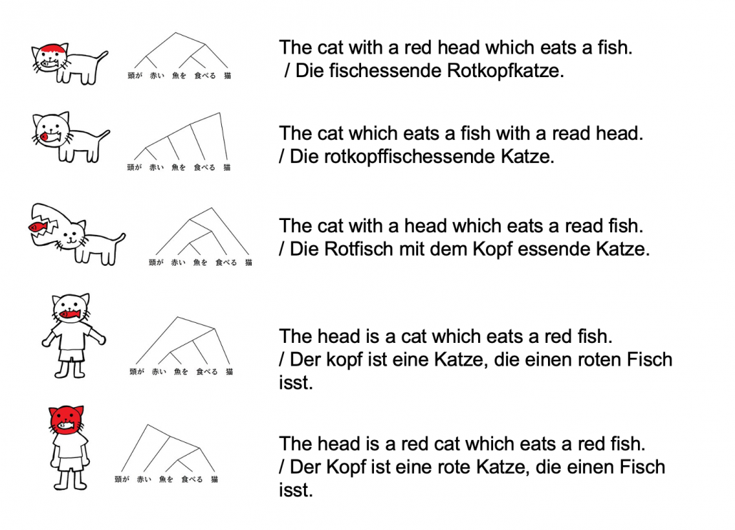
Source: https://twitter.com/nakamurakihiro

Let’s take an example to see how obscure Japanese is. A Japanese sentence 「頭が赤い魚を食べる猫」can be interpreted in five ways, depending on where you put emphases on.

Common sense tells you that the sentence is likely to mean the first two cases, but I am sure they can mean those five possibilities. There might be similarly obscure sentences in other languages, but I bet few languages can be as obscure as Japanese. Also as you can see from the last two sentences, you can omit subjects in Japanese. This rule is nothing exceptional. Japanese people usually don’t use subjects in normal conversations. And when you read classical Japanese, which Japanese high school students have to do just like Western students learn some of classical Latin, the writings omit subjects much more frequently.

*However interestingly we have rich vocabulary of subjects. The subject “I” can be translated to 「私」、「僕」、「俺」、「自分」、「うち」etc, depending on your personality, who you are talking to, and the time when it is written in.

I believe one can see the world only in the framework of their language, and it seems one’s personality changes depending on the language they use. I am not sure whether the language originally determines how they think, or how they think forms the language. But at least I would like you to keep it in mind that if you translate a conversation, for example a random conversation at a bar in Berlin, into Japanese, that would linguistically sound Japanese, but not anthropologically. Imagine that such kind of random conversation in Berlin or something is like playing a catch, I mean throwing a ball named “your opinion.” On the other hand,  normal conversations of Japanese people are in stead more of, I would say,  “resonance” of several tuning forks. They do their bests to show that they are listening to each other, by excessively nodding or just repeating “Really?”, but usually it seems hardly any constructive dialogues have been made.

*I sometimes feel you do not even need deep learning to simulate most of such Japanese conversations. Several-line Python codes would be enough.

My point is, this article series is mainly going to cover only a few techniques of NLP in deep learning field: sequence to sequence model (seq2seq model) , and especially Transformer. They are, at least for now, just mathematical models and mappings of a small part of this profound field of language (as far as I can cover in this article series). But still, examples of language would definitely help you understand Transformer model in the long run.

2 Tokens and word embedding

*Throughout my article series, “words” just means the normal words you use in daily life. “Tokens” means more general unit of NLP tasks. For example the word “Transformer” might be denoted as a single token “Transformer,” or maybe as a combination of two tokens “Trans” and “former.”

One challenging part of handling language data is its encodings. If you started learning programming in a language other than English, you would have encountered some troubles of using keyboards with different arrangements or with characters. Some comments on your codes in your native languages are sometimes not readable on some software. You can easily get away with that by using only English, but when it comes to NLP you have to deal with this difficulty seriously. How to encode characters in each language should be a first obstacle of NLP. In this article we are going to rely on a library named BPEmb, which provides word embedding in various languages, and you do not have to care so much about encodings in languages all over the world with this library.

In the first section, you might have noticed that Japanese sentence is not separated with spaces like Western languages. This is also true of Chinese language, and that means we need additional tasks of separating those sentences at least into proper chunks of words. This is not only a matter of engineering, but also of some linguistic fields. Also I think many people are not so conscious of how sentences in their native languages are grammatically separated.

The next point is, unlike other scientific data, such as temperature, velocity, voltage, or air pressure, language itself is not measured as numerical data. Thus in order to process language, including English, you first have to map language to certain numerical data, and after some processes you need to conversely map the output numerical data into language data. This section is going to be mainly about one-hot encoding and word embedding, the ways to convert word/token into numerical data. You might already have heard about this

You might have learnt about word embedding to some extent, but I hope you could get richer insight into this topic through this article.

2.1 One-hot encoding

One-hot encoding would be the most straightforward way to encode words/tokens. Assume that you have a dictionary whose size is |\mathcal{V}|, and it includes words from “a”, “ablation”, “actually” to “zombie”, “?”, “!”

In a mathematical manner, in order to choose a word out of those |\mathcal{V}| words, all you need is a |\mathcal{V}| dimensional vector, one of whose elements is 1, and the others are 0. When you want to choose the No. i word, which is “indeed” in the example below, its corresponding one-hot vector is \boldsymbol{v} = (0, \dots, 1, \dots, 0 ), where only the No. i element is 1. One-hot encoding is also easy to understand, and that’s all. It is easy to imagine that people have already come up with more complicated and better way to encoder words. And one major way to do that is word embedding.

2.2 Word embedding

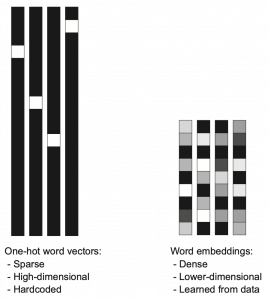
Source: Francois Chollet, Deep Learning with Python,(2018), Manning

Actually word embedding is related to one-hot encoding, and if you understand how to train a simple neural network, for example densely connected layers, you would understand word embedding easily. The key idea of word embedding is denoting each token with a D dimensional vector, whose dimension is fewer than the vocabulary size |\mathcal{V}|. The elements of the resulting word embedding vector are real values, I mean not only 0 or 1. Obviously you can encode much richer variety of tokens with such vectors. The figure at the left side is from “Deep Learning with Python” by François Chollet, and I think this is an almost perfect and simple explanation of the comparison of one-hot encoding and word embedding. But the problem is how to get such convenient vectors. The answer is very simple: you have only to train a network whose inputs are one-hot vector of the vocabulary.

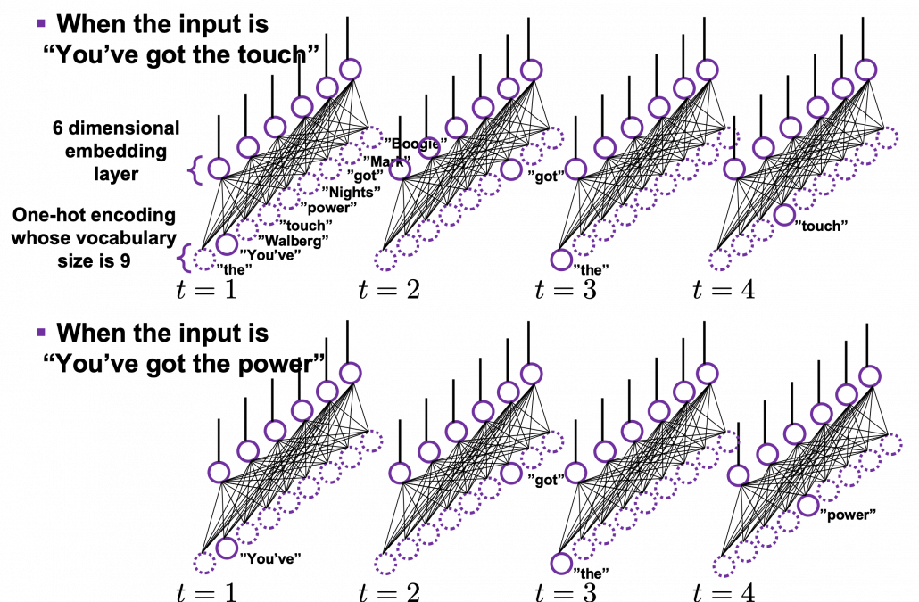
The figure below is a simplified model of word embedding of a certain word. When the word is input into a neural network, only the corresponding element of the one-hot vector is 1, and that virtually means the very first input layer is composed of one neuron whose value is 1. And the only one neuron propagates to the next D dimensional embedding layer. These weights are the very values which most other study materials call “an embedding vector.”

When you input each word into a certain network, for example RNN or Transformer, you map the input one-hot vector into the embedding layer/vector. The examples in the figure are how inputs are made when the input sentences are “You’ve got the touch” and “You’ve got the power.”   Assume that you have a dictionary of one-hot encoding, whose vocabulary is {“the”, “You’ve”, “Walberg”, “touch”, “power”, “Nights”, “got”, “Mark”, “Boogie”}, and the dimension of word embeding is 6. In this case |\mathcal{V}| = 9, D=6. When the inputs are “You’ve got the touch” or “You’ve got the power” , you put the one-hot vector corresponding to “You’ve”, “got”, “the”, “touch” or “You’ve”, “got”, “the”, “power” sequentially every time step t.

In order to get word embedding of certain vocabulary, you just need to train the network. We know that the words “actually” and “indeed” are used in similar ways in writings. Thus when we propagate those words into the embedding layer, we can expect that those embedding layers are similar. This is how we can mathematically get effective word embedding of certain vocabulary.

More interestingly, if word embedding is properly trained, you can mathematically “calculate” words. For example, \boldsymbol{v}_{king} - \boldsymbol{v}_{man} + \boldsymbol{v}_{woman} \approx \boldsymbol{v}_{queen}, \boldsymbol{v}_{Japan} - \boldsymbol{v}_{Tokyo} + \boldsymbol{v}_{Vietnam} \approx \boldsymbol{v}_{Hanoi}.

*I have tried to demonstrate this type of calculation on several word embedding, but none of them seem to work well. At least you should keep it in mind that word embedding learns complicated linear relations between words.

I should explain word embedding techniques such as word2vec in detail, but the main focus of this article is not NLP, so the points I have mentioned are enough to understand Transformer model with NLP examples in the upcoming articles.


3 Language model

Language models is one of the most straightforward, but crucial ideas in NLP. This is also a big topic, so this article is going to cover only basic points. Language model is a mathematical model of the probabilities of which words to come next, given a context. For example if you have a sentence “In the lecture, he opened a _.”, a language model predicts what comes at the part “_.” It is obvious that this is contextual. If you are talking about general university students, “_” would be “textbook,” but if you are talking about Japanese universities, especially in liberal art department, “_” would be more likely to be “smartphone. I think most of you use this language model everyday. When you type in something on your computer or smartphone, you would constantly see text predictions, or they might even correct your spelling or grammatical errors. This is language modelling. You can make language models in several ways, such as n-gram and neural language models, but in this article I can explain only general formulations for such models.

*I am not sure which algorithm is used in which services. That must be too fast changing and competitive for me to catch up.

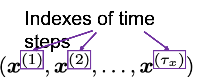
As I mentioned in the first article series on RNN, a sentence is usually processed as sequence data in NLP. One single sentence is denoted as \boldsymbol{X} = (\boldsymbol{x}^{(1)}, \dots, \boldsymbol{x}^{(\tau)}), a list of vectors. The vectors are usually embedding vectors, and the (t) is the index of the order of tokens. For example the sentence “You’ve go the power.” can be expressed as \boldsymbol{X} = (\boldsymbol{x}^{(1)}, \boldsymbol{x}^{(2)}, \boldsymbol{x}^{(3)}, \boldsymbol{x}^{(4)}), where \boldsymbol{x}^{(1)}, \boldsymbol{x}^{(2)}, \boldsymbol{x}^{(3)}, \boldsymbol{x}^{(4)} denote “You’ve”, “got”, “the”, “power”, “.” respectively. In this case \tau = 4.

In practice a sentence \boldsymbol{X} usually includes two tokens BOS and EOS at the beginning and the end of the sentence. They mean “Beginning Of Sentence” and “End Of Sentence” respectively. Thus in many cases \boldsymbol{X} = (\boldsymbol{BOS} , \boldsymbol{x}^{(1)}, \dots, \boldsymbol{x}^{(\tau)}, \boldsymbol{EOS} ). \boldsymbol{BOS} and \boldsymbol{EOS} are also both vectors, at least in the Tensorflow tutorial.

P(\boldsymbol{X} = (\boldsymbol{BOS}, \boldsymbol{x}^{(1)}, \dots, \boldsymbol{x}^{(\tau)}, \boldsymbol{EOS}) is the probability of incidence of the sentence. But it is easy to imagine that it would be very hard to directly calculate how likely the sentence \boldsymbol{X} appears out of all possible sentences. I would rather say it is impossible. Thus instead in NLP we calculate the probability P(\boldsymbol{X}) as a product of the probability of incidence or a certain word, given all the words so far. When you’ve got the words (\boldsymbol{x}^{(1)}, \dots, \boldsymbol{x}^{(t-1}) so far, the probability of the incidence of \boldsymbol{x}^{(t)}, given the context is  P(\boldsymbol{x}^{(t)}|\boldsymbol{x}^{(1)}, \dots, \boldsymbol{x}^{(t-1)}). P(\boldsymbol{BOS}) is a probability of the the sentence \boldsymbol{X} being (\boldsymbol{BOS}), and the probability of \boldsymbol{X} being (\boldsymbol{BOS}, \boldsymbol{x}^{(1)}) can be decomposed this way: P(\boldsymbol{BOS}, \boldsymbol{x}^{(1)}) = P(\boldsymbol{x}^{(1)}|\boldsymbol{BOS})P(\boldsymbol{BOS}).

Just as well P(\boldsymbol{BOS}, \boldsymbol{x}^{(1)}, \boldsymbol{x}^{(2)}) = P(\boldsymbol{x}^{(2)}| \boldsymbol{BOS}, \boldsymbol{x}^{(1)}) P( \boldsymbol{BOS}, \boldsymbol{x}^{(1)})= P(\boldsymbol{x}^{(2)}| \boldsymbol{BOS}, \boldsymbol{x}^{(1)}) P(\boldsymbol{x}^{(1)}| \boldsymbol{BOS}) P( \boldsymbol{BOS}).

Hence, the general probability of incidence of a sentence \boldsymbol{X} is P(\boldsymbol{X})=P(\boldsymbol{BOS}, \boldsymbol{x}^{(1)}, \boldsymbol{x}^{(2)}, \dots, \boldsymbol{x}^{(\tau -1)}, \boldsymbol{x}^{(\tau)}, \boldsymbol{EOS}) = P(\boldsymbol{EOS}| \boldsymbol{BOS}, \boldsymbol{x}^{(1)}, \dots, \boldsymbol{x}^{(\tau)}) P(\boldsymbol{x}^{(\tau)}| \boldsymbol{BOS}, \boldsymbol{x}^{(1)}, \dots, \boldsymbol{x}^{(\tau - 1)}) \cdots P(\boldsymbol{x}^{(2)}| \boldsymbol{BOS}, \boldsymbol{x}^{(1)}) P(\boldsymbol{x}^{(1)}| \boldsymbol{BOS}) P(\boldsymbol{BOS}).

Let \boldsymbol{x}^{(0)} be \boldsymbol{BOS} and \boldsymbol{x}^{(\tau + 1)} be \boldsymbol{EOS}. Plus, let P(\boldsymbol{x}^{(t+1)}|\boldsymbol{X}_{[0, t]}) be P(\boldsymbol{x}^{(t+1)}|\boldsymbol{x}^{(0)}, \dots, \boldsymbol{x}^{(t)}), then P(\boldsymbol{X}) = P(\boldsymbol{x}^{(0)})\prod_{t=0}^{\tau}{P(\boldsymbol{x}^{(t+1)}|\boldsymbol{X}_{[0, t]})}. Language models calculate which words to come sequentially in this way.

Here’s a question: how would you evaluate a language model?

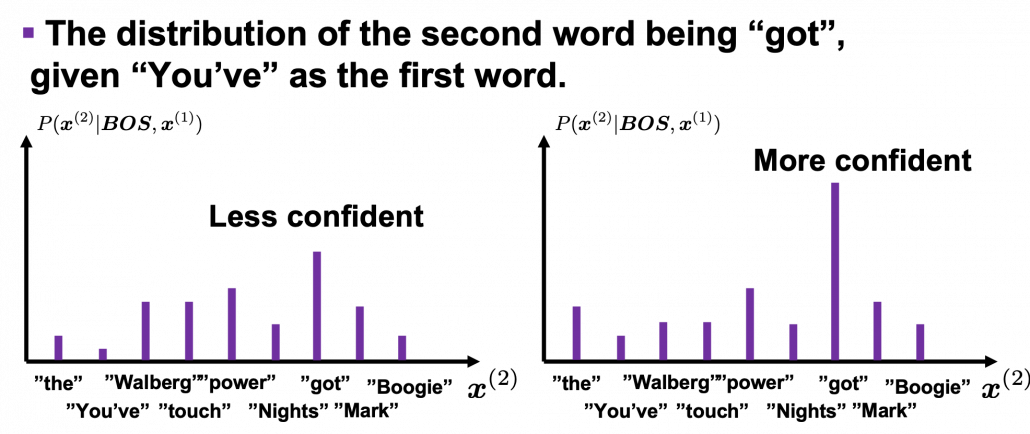
I would say the answer is, when the language model generates words, the more confident the language model is, the better the language model is. Given a context, when the distribution of the next word is concentrated on a certain word, we can say the language model is confident about which word to come next, given the context.

*For some people, it would be more understandable to call this “entropy.”

Let’s take the vocabulary {“the”, “You’ve”, “Walberg”, “touch”, “power”, “Nights”, “got”, “Mark”, “Boogie”} as an example. Assume that P(\boldsymbol{X}) = P(\boldsymbol{BOS}, \boldsymbol{You've}, \boldsymbol{got}, \boldsymbol{the}, \boldsymbol{touch}, \boldsymbol{EOS}) = P(\boldsymbol{BOS}, \boldsymbol{x}^{(1)}, \boldsymbol{x}^{(2)}, \boldsymbol{x}^{(3)}, \boldsymbol{x}^{(4)}, \boldsymbol{EOS})= P(\boldsymbol{x}^{(0)})\prod_{t=0}^{4}{P(\boldsymbol{x}^{(t+1)}|\boldsymbol{X}_{[0, t]})}. Given a context (\boldsymbol{BOS}, \boldsymbol{x}^{(1)}), the probability of incidence of \boldsymbol{x}^{(2)} is P(\boldsymbol{x}^{2}|\boldsymbol{BOS}, \boldsymbol{x}^{(1)}). In the figure below, the distribution at the left side is less confident because probabilities do not spread widely, on the other hand the one at the right side is more confident that next word is “got” because the distribution concentrates on “got”.

*You have to keep it in mind that the sum of all possible probability P(\boldsymbol{x}^{(2)} | \boldsymbol{BOS}, \boldsymbol{x}^{(1)}) is 1, that is, P(\boldsymbol{the}| \boldsymbol{BOS}, \boldsymbol{x}^{(1)}) + P(\boldsymbol{You've}| \boldsymbol{BOS}, \boldsymbol{x}^{(1)}) + \cdots + P(\boldsymbol{Boogie}| \boldsymbol{BOS}, \boldsymbol{x}^{(1)}) = 1.

While the language model generating the sentence “BOS You’ve got the touch EOS”, it is better if the language model keeps being confident. If it is confident, P(\boldsymbol{X})= P(\boldsymbol{BOS}) P(\boldsymbol{x}^{(1)}|\boldsymbol{BOS}}P(\boldsymbol{x}^{(3)}|\boldsymbol{BOS}, \boldsymbol{x}^{(1)}, \boldsymbol{x}^{(2)}) P(\boldsymbol{x}^{(4)}|\boldsymbol{BOS}, \boldsymbol{x}^{(1)}, \boldsymbol{x}^{(2)}, \boldsymbol{x}^{(3)}) P(\boldsymbol{EOS}|\boldsymbol{BOS}, \boldsymbol{x}^{(1)}, \boldsymbol{x}^{(2)}, \boldsymbol{x}^{(3)}, \boldsymbol{x}^{(4)})} gets higher. Thus (-1) \{ log_{b}{P(\boldsymbol{BOS})} + log_{b}{P(\boldsymbol{x}^{(1)}|\boldsymbol{BOS}}) + log_{b}{P(\boldsymbol{x}^{(3)}|\boldsymbol{BOS}, \boldsymbol{x}^{(1)}, \boldsymbol{x}^{(2)})} + log_{b}{P(\boldsymbol{x}^{(4)}|\boldsymbol{BOS}, \boldsymbol{x}^{(1)}, \boldsymbol{x}^{(2)}, \boldsymbol{x}^{(3)})} + log_{b}{P(\boldsymbol{EOS}|\boldsymbol{BOS}, \boldsymbol{x}^{(1)}, \boldsymbol{x}^{(2)}, \boldsymbol{x}^{(3)}, \boldsymbol{x}^{(4)})} \} gets lower, where usually b=2 or b=e.

This is how to measure how confident language models are, and the indicator of the confidence is called perplexity. Assume that you have a data set for evaluation \mathcal{D} = (\boldsymbol{X}_1, \dots, \boldsymbol{X}_n, \dots, \boldsymbol{X}_{|\mathcal{D}|}), which is composed of |\mathcal{D}| sentences in total. Each sentence \boldsymbol{X}_n = (\boldsymbol{x}^{(0)})\prod_{t=0}^{\tau ^{(n)}}{P(\boldsymbol{x}_{n}^{(t+1)}|\boldsymbol{X}_{n, [0, t]})} has \tau^{(n)} tokens in total excluding \boldsymbol{BOS}, \boldsymbol{EOS}. And let |\mathcal{V}| be the size of the vocabulary of the language model. Then the perplexity of the language model is b^z, where z = \frac{-1}{|\mathcal{V}|}\sum_{n=1}^{|\mathcal{D}|}{\sum_{t=0}^{\tau ^{(n)}}{log_{b}P(\boldsymbol{x}_{n}^{(t+1)}|\boldsymbol{X}_{n, [0, t]})}. The b is usually 2 or e.

For example, assume that \mathcal{V} is vocabulary {“the”, “You’ve”, “Walberg”, “touch”, “power”, “Nights”, “got”, “Mark”, “Boogie”}. Also assume that the evaluation data set for perplexity of a language model is \mathcal{D} = (\boldsymbol{X}_1, \boldsymbol{X}_2), where \boldsymbol{X_1} =(\boldsymbol{You've}, \boldsymbol{got}, \boldsymbol{the}, \boldsymbol{touch}) \boldsymbol{X_2} = (\boldsymbol{You've}, \boldsymbol{got}, \boldsymbol{the }, \boldsymbol{power}). In this case |\mathcal{V}|=9, |\mathcal{D}|=2. I have already showed you how to calculate the perplexity of the sentence “You’ve got the touch.” above. You just need to do a similar thing on another sentence “You’ve got the power”, and then you can get the perplexity of the language model.

*If the network is not properly trained, it would also be confident of generating wrong outputs. However, such network still would give high perplexity because it is “confident” at any rate. I’m sorry I don’t know how to tackle the problem. Please let me put this aside, and let’s get down on Transformer model soon.

Appendix

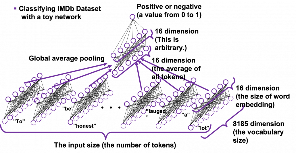
Let’s see how word embedding is implemented with a very simple example in the official Tensorflow tutorial. It is a simple binary classification task on IMDb Dataset. The dataset is composed to comments on movies by movie critics, and you have only to classify if the commentary is positive or negative about the movie. For example when you get you get an input “To be honest, Michael Bay is a terrible as an action film maker. You cannot understand what is going on during combat scenes, and his movies rely too much on advertisements. I got a headache when Mark Walberg used a Chinese cridit card in Texas. However he is very competent when it comes to humorous scenes. He is very talented as a comedy director, and I have to admit I laughed a lot.“, the neural netowork has to judge whether the statement is positive or negative.

This networks just takes an average of input embedding vectors and regress it into a one dimensional value from 0 to 1. The shape of embedding layer is (8185, 16). Weights of neural netowrks are usually implemented as matrices, and you can see that each row of the matrix corresponds to emmbedding vector of each token.

*It is easy to imagine that this technique is problematic. This network virtually taking a mean of input embedding vectors. That could mean if the input sentence includes relatively many tokens with negative meanings, it is inclined to be classified as negative. But for example, if the sentence is “This masterpiece is a dark comedy by Charlie Chaplin which depicted stupidity of the evil tyrant gaining power in the time. It thoroughly mocked Germany in the time as an absurd group of fanatics, but such propaganda could have never been made until ‘Casablanca.'” , this can be classified as negative, because only the part “masterpiece” is positive as a token, and there are much more words with negative meanings themselves.

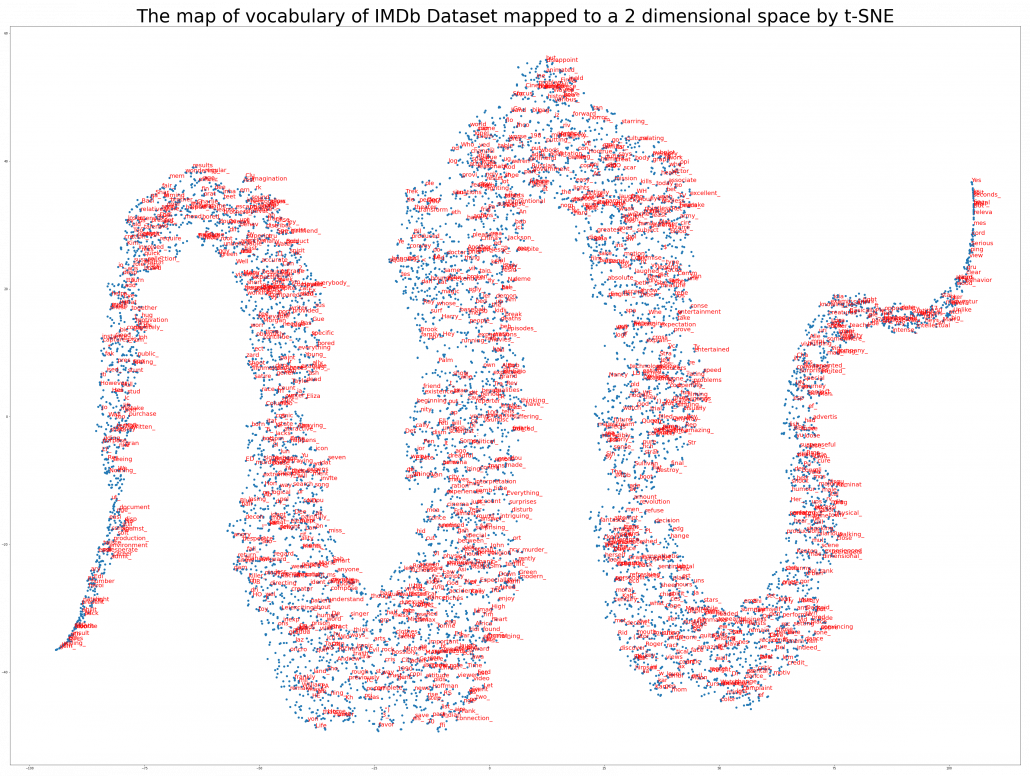
The official Tensorflow tutorial provides visualization of word embedding with Embedding Projector, but I would like you to take more control over the data by yourself. Please just copy and paste the codes below, installing necessary libraries. You would get a map of vocabulary used in the text classification task. It seems you cannot find clear tendency of the clusters of the tokens. You can try other dimension reduction methods to get maps of the vocabulary by for example using Scikit Learn.

[References]

[1] “Word embeddings” Tensorflow Core
https://www.tensorflow.org/tutorials/text/word_embeddings

[2]Tsuboi Yuuta, Unno Yuuya, Suzuki Jun, “Machine Learning Professional Series: Natural Language Processing with Deep Learning,” (2017), pp. 43-64, 72-85, 91-94
坪井祐太、海野裕也、鈴木潤 著, 「機械学習プロフェッショナルシリーズ 深層学習による自然言語処理」, (2017), pp. 43-64, 72-85, 191-193

[3]”Stanford CS224N: NLP with Deep Learning | Winter 2019 | Lecture 8 – Translation, Seq2Seq, Attention”, stanfordonline, (2019)
https://www.youtube.com/watch?v=XXtpJxZBa2c

[4] Francois Chollet, Deep Learning with Python,(2018), Manning , pp. 178-185

[5]”2.2. Manifold learning,” scikit-learn
https://scikit-learn.org/stable/modules/manifold.html

* I make study materials on machine learning, sponsored by DATANOMIQ. I do my best to make my content as straightforward but as precise as possible. I include all of my reference sources. If you notice any mistakes in my materials, including grammatical errors, please let me know (email: yasuto.tamura@datanomiq.de). And if you have any advice for making my materials more understandable to learners, I would appreciate hearing it.

Turbocharge Business Analytics With In-memory Computing

One of the customer traits that’s been gradually diminishing through the years is patience; if a customer-facing website or application doesn’t deliver real-time or near-instant results, it can be a reason for a customer to look elsewhere. This trend has pushed companies to turn to in-memory computing to get the speed needed to address customer demands in real-time. It simplifies access to multiple data sources to provide super-fast performance that’s thousands of times faster than disk-based storage systems. By storing data in RAM and processing in parallel against the full dataset, in-memory computing solutions allow for real-time insights that lead to informed business decisions and improved performance.

The in-memory computing solutions market has been on the rise in recent years because it has been heralded as the platform that will accelerate IT modernization. In-memory data grids, in particular, show great promise because it addresses the main limitation of an in-memory relational database. While the latter is designed to scale up, the former is designed to scale out. This scalability is one of the main draws of an in-memory data grid, since a scale-up architecture is not sustainable in the long term and will always have a breaking point. In-memory data grids on the other hand, benefit from horizontal scalability and computing elasticity. Scaling an in-memory data grid is as simple as adding nodes to a cluster and removing it when it’s no longer needed. This is especially useful for businesses that demand speed in the management of hundreds of terabytes of data across multiple networked computers in geographically distributed data centers.

Since big data is complex and fast-moving, keeping data synchronized across data centers is vital to preserve data integrity. Keeping data in memory removes the bottleneck caused by constant access to disk -based storage and allows applications and their data to collocate in the same memory space. This allows for optimization that allows the amount of data to exceed the amount of available memory. Speed and efficiency is also improved by keeping frequently accessed data in memory and the rest on disk, consequently allowing data to reside both in memory and on disk.

Future-proofing Businesses With In-memory Computing

Data analytics is as much a part of every business as other marketing and business intelligence tools. Because data constantly grows at an exponential rate, in-memory computing serves as the enabler of data analytics because it provides speed, high availability, and straightforward scalability. Speeds more than 100 times faster than other solutions enable in-memory computing solutions to provide real-time insights that are applicable in a host of industries and use cases.

Location-based Marketing

A report from 2019 shows that location-based marketing helped 89% of marketers increase sales, 86% grow their customer base, and 84% improve customer engagement. Location data can be leveraged to identify patterns of behavior by analyzing frequently visited locations. By understanding why certain customers frequent specific locations and knowing when they are there, you can better target your marketing messages and make more strategic customer acquisitions. Location data can also be used as a demographic identifier to help you segment your customers and tailor your offers and messaging accordingly.

Fraud Detection

In-memory computing helps improve operational intelligence by detecting anomalies in transaction data immediately. Through high-speed analysis of large amounts of data, potential risks are detected early on and addressed as soon as possible. Transaction data is fast-moving and changes frequently, and in-memory computing is equipped to handle data as it changes. This is why it’s an ideal platform for payment processing; it helps make comparisons of current transactions with the history of all transactions on record in a matter of seconds. Companies typically have several fraud detection measures in place, and in-memory computing allows running these algorithms concurrently without compromising overall system performance. This ensures responsiveness of systems despite peak volume levels and avoids interruptions to customer service.

Tailored Customer Experiences

The real-time insights delivered by in-memory computing helps personalize experiences based on customer data. Because customer experiences are time-sensitive, processing and analyzing data at super-fast speeds is vital in capturing real-time event data that can be used to craft the best experience possible for each customer. Without in-memory computing, getting real-time data and other necessary information that ensures a seamless customer experience would have been near impossible.

Real-time data analytics helps provide personalized recommendations based on both existing and new customer data. By looking at historical data like previously visited pages and comparing them with newer data from the stream, businesses can craft the proper messaging and plan the next course of action. The anticipation and forecasting of customers’ future actions and behavior is the key to improving conversion rates and customer satisfaction—ultimately leading to higher revenues and more loyal customers.

Conclusion

Big data is the future, and companies that don’t use it to their advantage would find it hard to compete in this ever-connected world that demands results in an instant. Processing and analyzing data can only become more complex and challenging through time, and for this reason, in-memory computing should be a solution that companies should consider. Aside from improving their business from within, it will also help drive customer acquisition and revenue, while also providing a viable low-latency, high throughput platform for high-speed data analytics.

The algorithm known as PCA and my taxonomy of linear dimension reductions

In one of my previous articles, I explained the importance of reducing dimensions. Principal Component Analysis (PCA) and Linear Discriminant Analysis (LDA) are the simplest types of dimension reduction algorithms. In upcoming articles of mine, you are going to see what these algorithms do. In conclusion, diagonalization, which I mentioned in the last article, is what these algorithms are all about, but still in this article I can mainly cover only PCA.

This article is largely based on the explanations in Pattern Recognition and Machine Learning by C. M. Bishop (which is often called “PRML”), and when you search “PCA” on the Internet, you will find more or less similar explanations. However I hope I can go some steps ahead throughout this article series. I mean, I am planning to also cover more generalized versions of PCA, meanings of diagonalization, the idea of subspace. I believe this article series is also effective for refreshing your insight into linear algebra.

*This is the third article of my article series “Illustrative introductions on dimension reduction.”

1. My taxonomy on linear dimension reduction

*If you soon want to know  what the algorithm called “PCA” is, you should skip this section for now to avoid confusion.

Out of the two algorithms I mentioned, PCA is especially important and you would see the same or similar ideas in various fields such as signal processing, psychology, and structural mechanics. However in most cases, the word “PCA” refers to one certain algorithm of linear dimension reduction. Most articles or study materials only mention the “PCA,” and this article is also going to cover only the algorithm which most poeple call “PCA.” However I found that PCA is only one branch of linear dimension reduction algorithms.

*From now on all the terms “PCA” in this article means the algorithm known as PCA unless I clearly mention the generalized KL transform.

*This chart might be confusing to you. According to PRML, PCA and KL transform is identical. PCA has two formulations, maximum variance formulation and minimum error formulation, and they can give the same result. However according to a Japanese textbook, which is very precise about this topic, KL transform has two formulations, and what we call PCA is based on maximum variance formulation. I am still not sure about correct terminology, but in this article I am going to call the most general algorithm “generalized KL transform,” I mean the root of the chart above.

*Most materials just explain the most major PCA, but if you consider this generalized KL transform, I can introduce an intriguing classification algorithm called subspace method. This algorithm was invented in Japan, and this is not so popular in machine learning textbooks in general, but learning this method would give you better insight into the idea of multidimensional space in machine learning. In the future, I am planning to cover this topic in this article series.

2. PCA

When someones mention “PCA,” I am sure for the most part that means the algorithm I am going to explain in the rest of this article. The most intuitive and straightforward way to explain PCA is that, PCA (Principal Component Analysis) of two or three dimensional data is fitting an oval to two dimensional data or fitting an ellipsoid to three dimensional data. You can actually try to plot some random dots on a piece of paper, and draw an oval which fits the dots the best. Assume that you have these 2 or 3 dimensional data below, and please try to put an oval or an ellipsoid to the data.

I think this is nothing difficult, but I have a question: what was the logic behind your choice?

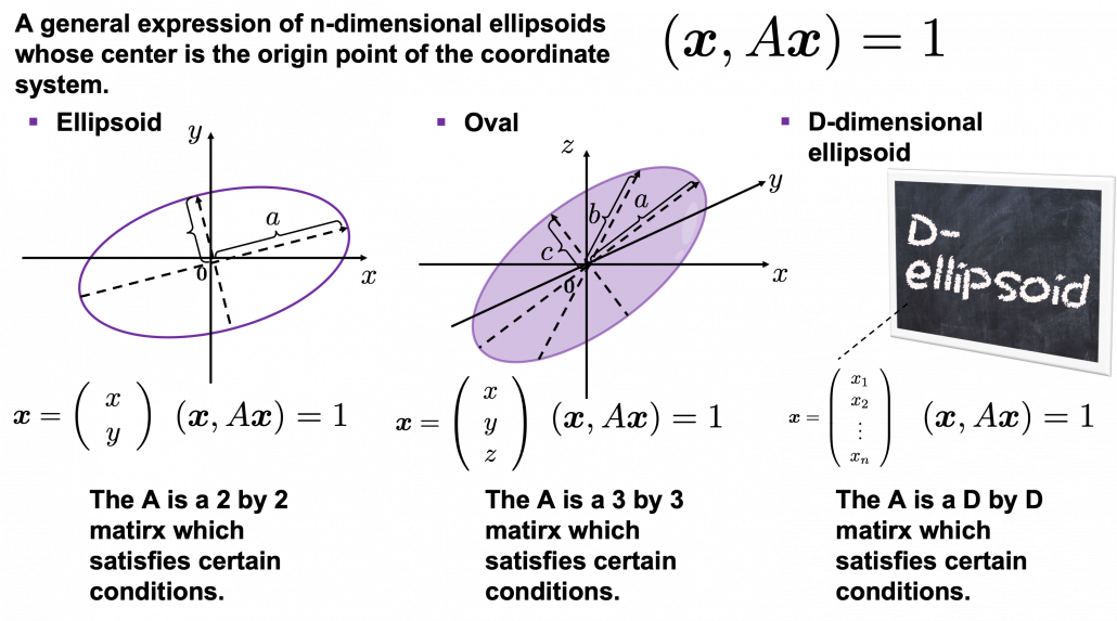
Some might have roughly drawn its outline. Formulas of  “the surface” of general ellipsoids can be explained in several ways, but in this article you only have to consider ellipsoids whose center is the origin point of the coordinate system. In PCA you virtually shift data so that the mean of the data comes to the origin point of the coordinate system. When A is a certain type of D\times D matrix, the formula of a D-dimensional ellipsoid whose center is identical to the origin point is as follows: (\boldsymbol{x}, A\boldsymbol{x}) = 1, where \boldsymbol{x}\in \mathbb{R}. As is always the case with formulas in data science, you can visualize such ellipsoids if you are talking about 1, 2, or 3 dimensional data like in the figure below, but in general D-dimensional space, it is theoretical/imaginary stuff on blackboards.

*In order to explain the conditions which the matrix A has to hold, I need another article, so for now please just assume that the A is a kind of magical matrix.

You might have seen equations of 2 or 3 dimensional ellipsoids in the following way: \frac{x^2}{a^2} + \frac{y^2}{b^2} = 1, where a\neq 0, b\neq 0 or \frac{x^2}{a^2} + \frac{y^2}{b^2} + \frac{z^2}{c^2}= 1, where a\neq 0, b\neq 0, c \neq 0. These are special cases of the equation (\boldsymbol{x}, A\boldsymbol{x}) = 1, where A=diag(a_1^2, \dots, a_D^2). In this case the axes of ellipsoids the same as those of the coordinate system. Thus in this simple case, A=diag(a^2, b^2) or A=diag(a^2,c^2,c^2).

I am going explain these equations in detail in the upcoming articles. But thre is one problem: how would you fit an ellipsoid when a data distribution does not look like an ellipsoid?

In fact we have to focus more on another feature of ellipsoids: all the axes of an ellipsoid are orthogonal. In conclusion the axes of the ellipsoids are more important in PCA, so I do want you to forget about the surface of ellipsoids for the time being. You might get confused if you also think about the surface of ellipsoid now. I am planning to cover this topic in the next article. I hope this article, combined with the last one and the next one, would help you have better insight into the ideas which frequently appear in data science or machine learning context.

3. Fitting orthogonal axes on data

*If you have no trouble reading the chapter 12.1 of PRML, you do not need to this section or maybe even this article, but I hope at least some charts or codes of mine would enhance your understanding on this topic.

*I must admit I wrote only the essence of PCA formulations. If that seems too abstract to you, you should just breifly read through this section and go to the next section with a more concrete example. If you are confused, there should be other good explanations on PCA on the internet, and you should also check them. But at least the visualization of PCA in the next section would be helpful.

As I implied above, all the axes of ellipsoids are orthogonal, and selecting the orthogonal axes which match data is what PCA is all about. And when you choose those orthogonal axes, it is ideal if the data look like an ellipsoid. Simply putting we want the data to “swell” along the axes.

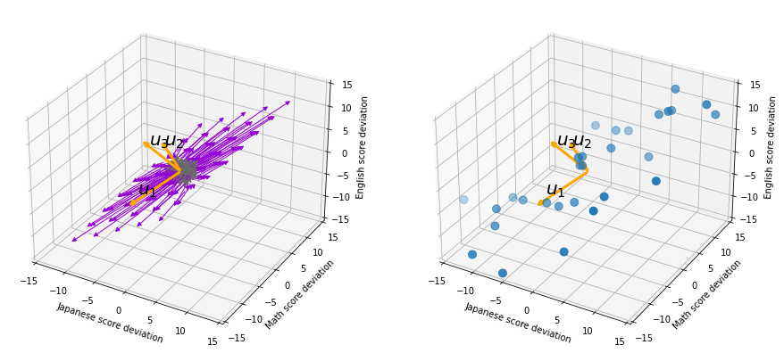
Then let’s see how to let them “swell,” more mathematically. Assume that you have 2 dimensional data plotted on a coordinate system (\boldsymbol{e}_1, \boldsymbol{e}_2) as below (The samples are plotted in purple). Intuitively, the data “swell” the most along the vector \boldsymbol{u}_1. Also  it is clear that \boldsymbol{u}_2 is the only vector orthogonal to \boldsymbol{u}_1. We can expect that the new coordinate system (\boldsymbol{u}_1, \boldsymbol{u}_2) expresses the data in a better way, and you you can get new coordinate points of the samples by projecting them on new axes as done with yellow lines below.

Next, let’s think about a case in 3 dimensional data. When you have 3 dimensional data in a coordinate system (\boldsymbol{e}_1, \boldsymbol{e}_2,\boldsymbol{e}_3) as below,  the data “swell” the most also along \boldsymbol{u}_1. And the data swells the second most along \boldsymbol{u}_2. The two axes, or vectors span the plain in purple. If you project all the samples on the plain, you will get 2 dimensional data at the right side. It is important that we did not consider the third axis. That implies you might be able to display the data well with only 2 dimensional sapce, which is spanned by the two axes \boldsymbol{v}_1, \boldsymbol{v}_2.


Thus the problem is how to calculate such axis \boldsymbol{u}_1. We want the variance of data projected on \boldsymbol{u}_1 to be the biggest. The coordinate of \boldsymbol{x}_n on the axis \boldsymbol{u}_1. The coordinate of a data point \boldsymbol{x}_n on the axis \boldsymbol{u}_1 is calculated by projecting \boldsymbol{x}_n on \boldsymbol{u}_1. In data science context, such projection is synonym to taking an inner  product of \boldsymbol{x}_n and \boldsymbol{u}_1, that is calculating \boldsymbol{u}_1^T \boldsymbol{x}_n.

*Each element of \boldsymbol{x}_n is the coordinate of the data point \boldsymbol{x}_n in the original coordinate system. And the projected data on \boldsymbol{u}_1 whose coordinates are 1-dimensional correspond to only one element of transformed data.

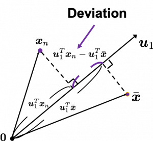
To calculate the variance of projected data on \boldsymbol{u}_1, we just have to calculate the mean of variances of 1-dimensional data projected on \boldsymbol{u}_1. Assume that \bar{\boldsymbol{x}} is the mean of data in the original coordinate, then the deviation of \boldsymbol{x}_1 on the axis \boldsymbol{u}_1 is calculated as \boldsymbol{u}_1^T \boldsymbol{x}_n - \boldsymbol{u}_1^T \bar{\boldsymbol{x}}, as shown in the figure. Hence the variance, I mean the mean of the deviation on is \frac{1}{N} \sum^{N}_{n}{\boldsymbol{u}_1^T \boldsymbol{x}_n - \boldsymbol{u}_1^T \bar{\boldsymbol{x}}}, where N is the total number of data points. After some deformations, you get the next equation \frac{1}{N} \sum^{N}_{n}{\boldsymbol{u}_1^T \boldsymbol{x}_n - \boldsymbol{u}_1^T \bar{\boldsymbol{x}}} = \boldsymbol{u}_1^T S \boldsymbol{u}_1, where S = \frac{1}{N}\sum_{n=1}^{N}{(\boldsymbol{x}_n - \bar{\boldsymbol{x}})(\boldsymbol{x}_n - \bar{\boldsymbol{x}})^T}. S is known as a covariance matrix.

We are now interested in maximizing the variance of projected data on  \boldsymbol{u}_1^T S \boldsymbol{u}_1, and for mathematical derivation we need some college level calculus, so if that is too much for you, you can skip reading this part till the next section.

We now want to calculate \boldsymbol{u}_1 with which \boldsymbol{u}_1^T S \boldsymbol{u}_1 is its maximum value. General \boldsymbol{u}_i including \boldsymbol{u}_1 are just coordinate axes after PCA, so we are just interested in their directions. Thus we can set one constraint \boldsymbol{u}_1^T  \boldsymbol{u}_1 = 1. Introducing a Lagrange multiplier, we have only to optimize next problem: \boldsymbol{u}_1 ^ {*} = \mathop{\rm arg~max}\limits_{\boldsymbol{u}_1} \{ \boldsymbol{u}_1^T S \boldsymbol{u}_1 + \lambda_1 (1 - \boldsymbol{u}_1^T \boldsymbol{u}_1) \}. In conclusion \boldsymbol{u}_1 ^ {*} satisfies S\boldsymbol{u}_1 ^ {*}  = \lamba_1 \boldsymbol{u}_1 ^ {*}. If you have read my last article on eigenvectors, you wold soon realize that this is an equation for calculating eigenvectors, and that means \boldsymbol{u}_1 ^ {*} is one of eigenvectors of the covariance matrix S. Given the equation of eigenvector the next equation holds \boldsymbol{u}_1 ^ {*}^T S \boldsymbol{u}_1 ^ {*} = \lambda_1. We have seen that \boldsymbol{u}_1 ^T S \boldsymbol{u}_1 ^ is a the variance of data when projected on a vector \boldsymbol{u}_1, thus the eigenvalue \lambda_1 is the biggest variance possible when the data are projected on a vector.

Just in the same way you can calculate the next biggest eigenvalue \lambda_2, and it it the second biggest variance possible, and in this case the date are projected on \boldsymbol{u}_2, which is orthogonal to \boldsymbol{u}_1. As well you can calculate orthogonal 3rd 4th …. Dth eigenvectors.

*To be exact I have to explain the cases where we can get such D orthogonal eigenvectors, but that is going to be long. I hope I can to that in the next article.

4. Practical three dimensional example of PCA

We have seen that PCA is sequentially choosing orthogonal axes along which data points swell the most. Also we have seen that it is equal to calculating eigenvalues of the covariance matrix of the data from the largest to smallest one. From now on let’s work on a practical example of data. Assume that we have 30 students’ scores of Japanese, math, and English tests as below.

* I think the subject “Japanese” is equivalent to “English” or “language art” in English speaking countries, and maybe “Deutsch” in Germany. This example and the explanation are largely based on a Japanese textbook named 「これなら分かる応用数学教室 最小二乗法からウェーブレットまで」. This is a famous textbook with cool and precise explanations on mathematics for engineering. Partly sharing this is one of purposes of this article.

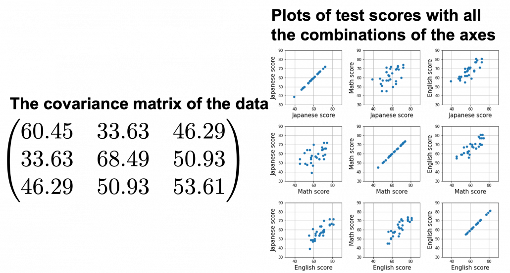
At the right side of the figure below is plots of the scores with all the combinations of coordinate axes. In total 9 inverse graphs are symmetrically arranged in the figure, and it is easy to see that English & Japanese or English and math have relatively high correlation. The more two axes have linear correlations, the bigger the covariance between them is.

In the last article, I visualized the eigenvectors of a 3\times 3 matrix A = \frac{1}{50} \begin{pmatrix} 60.45 &  33.63 & 46.29 \\33.63 & 68.49 & 50.93 \\ 46.29 & 50.93 & 53.61 \end{pmatrix}, and in fact the matrix is just a constant multiplication of this covariance matrix. I think now you understand that PCA is calculating the orthogonal eigenvectors of covariance matrix of data, that is diagonalizing covariance matrix with orthonormal eigenvectors. Hence we can guess that covariance matrix enables a type of linear transformation of rotation and expansion and contraction of vectors. And data points swell along eigenvectors of such matrix.
Then why PCA is useful? In order to see that at first, for simplicity assume that x, y, z denote Japanese, Math, English scores respectively. The mean of the data is \left( \begin{array}{c} \bar{x} \\ \bar{y} \\ \bar{z} \end{array} \right) = \left( \begin{array}{c} 58.1 \\ 61.8 \\ 67.3 \end{array} \right), and the covariance matrix of data in the original coordinate system is V_{xyz} = \begin{pmatrix} 60.45 & 33.63 & 46.29 \\33.63 & 68.49 & 50.93 \\ 46.29 & 50.93 & 53.61 \end{pmatrix}. The eigenvalues of  V_{xyz} are \lambda_1=148.34, \lambda_2 = 30.62, and \lambda_3 = 3.60, and their corresponding unit eigenvectors are \boldsymbol{u}_1 =  \left( \begin{array}{c} 0.540 \\ 0.602 \\ 0.589 \end{array} \right) , \boldsymbol{u}_2 =  \left( \begin{array}{c} 0.736 \\ -0.677 \\ 0.0174 \end{array} \right) , \boldsymbol{u}_3 =  \left( \begin{array}{c} -0.408 \\ -0.4.23 \\ 0.809 \end{array} \right) respectively.  U = (\boldsymbol{u}_1 \quad \boldsymbol{u}_2 \quad \boldsymbol{u}_3 )  is an orthonormal matrix, where \boldsymbol{u}_i^T\boldsymbol{u}_j = \begin{cases} 1 & (i=j) \\ 0 & (otherwise) \end{cases}. As I explained in the last article, you can diagonalize V_{xyz} with U: U^T V_{xyz}U = diag(\lambda_1, \dots, \lambda_D).

In order to see how PCA is useful, assume that \left( \begin{array}{c} \xi \\ \eta \\ \zeta \end{array} \right)  = U^T \left( \begin{array}{c} x - \bar{x} \\ y - \bar{y} \\ z - \bar{z} \end{array} \right).

Let’s take a brief look at what a linear transformation by U^T means. Each element of \boldsymbol{x} denotes coordinate of the data point \boldsymbol{x}  in the original coordinate system (In this case the original coordinate system is composed of \boldsymbol{e}_1, \boldsymbol{e}_2, and \boldsymbol{e}_3). U = (\boldsymbol{u}_1, \boldsymbol{u}_2, \boldsymbol{u}_3) enables a rotation of a rigid body, which means the shape or arrangement of data will not change after the rotation, and U^T enables a reverse rotation of the rigid body.

*Roughly putting, if you hold a bold object such as a metal ball and rotate your arm, that is a rotation of a rigid body, and your shoulder is the origin point. On the other hand, if you hold something soft like a marshmallow, it would be squashed in your hand, and that is not a not a rotation of a rigid body.

You can rotate \boldsymbol{x} with U like U^T\boldsymbol{x} = \left( \begin{array}{c} -\boldsymbol{u}_1^{T}- \\ -\boldsymbol{u}_2^{T}- \\ -\boldsymbol{u}_3^{T}- \end{array} \right)\boldsymbol{x}=\left( \begin{array}{c} \boldsymbol{u}_1^{T}\boldsymbol{x} \\ \boldsymbol{u}_2^{T}\boldsymbol{x} \\ \boldsymbol{u}_3^{T}\boldsymbol{x} \end{array} \right), and \boldsymbol{u}_i^{T}\boldsymbol{x} is the coordinate of \boldsymbol{x} projected on the axis \boldsymbol{u}_i.

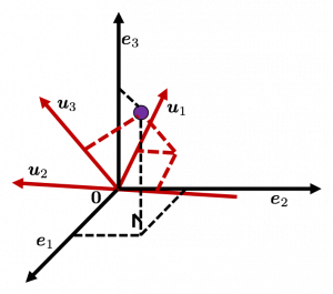
Let’s see this more visually. Assume that the data point \boldsymbol{x}  is a purple dot and its position is expressed in the original coordinate system spanned by black arrows . By multiplying \boldsymbol{x} with U^T, the purple point \boldsymbol{x} is projected on the red axes respectively, and the product \left( \begin{array}{c} \boldsymbol{u}_1^{T}\boldsymbol{x} \\ \boldsymbol{u}_2^{T}\boldsymbol{x} \\ \boldsymbol{u}_3^{T}\boldsymbol{x} \end{array} \right) denotes the coordinate point of the purple point in the red coordinate system. \boldsymbol{x} is rotated this way, but for now I think it is better to think that the data are projected on new coordinate axes rather than the data themselves are rotating.
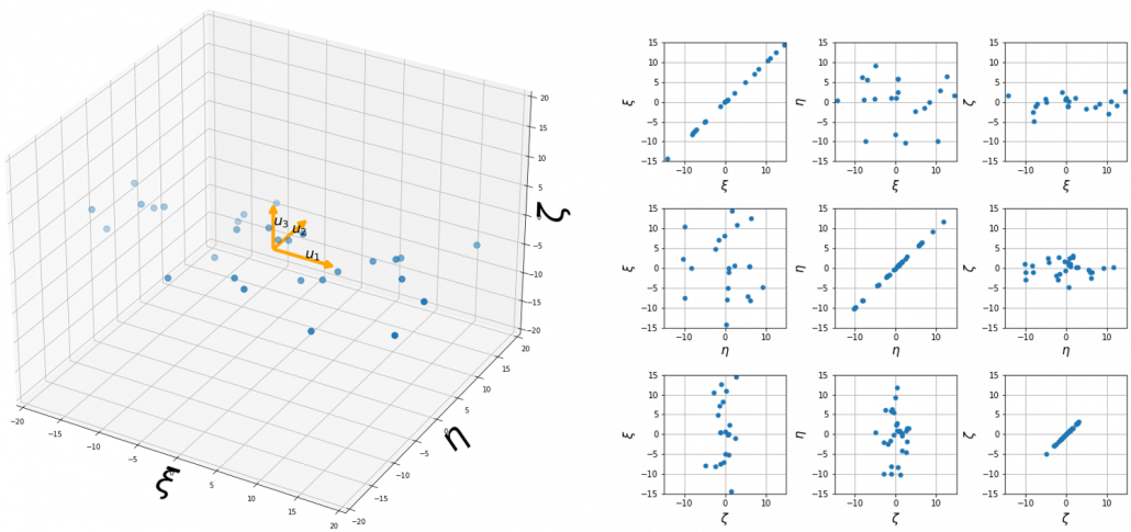
Now that we have seen what rotation by U means, you should have clearer image on what \left( \begin{array}{c} \xi \\ \eta \\ \zeta \end{array} \right)  = U^T \left( \begin{array}{c} x - \bar{x} \\ y - \bar{y} \\ z - \bar{z} \end{array} \right) means. \left( \begin{array}{c} \xi \\ \eta \\ \zeta \end{array} \right) denotes the coordinates of data projected on new axes \boldsymbol{u}_1, \boldsymbol{u}_2, \boldsymbol{u}_3, which are unit eigenvectors of V_{xyz}. In the coordinate system spanned by the eigenvectors, the data distribute like below.

By multiplying U from both sides of the equation above, we get \left( \begin{array}{c} x - \bar{x} \\ y - \bar{y} \\ z - \bar{z} \end{array} \right) =U \left( \begin{array}{c} \xi \\ \eta \\ \zeta \end{array} \right), which means you can express deviations of the original data as linear combinations of the three factors \xi, \eta, and \zeta. We expect that those three factors contain keys for understanding the original data more efficiently. If you concretely write down all the equations for the factors: \xi = 0.540 (x - \bar{x}) + 0.602 (y - \bar{y}) + 0.588 (z - \bar{z}), \eta = 0.736(x - \bar{x}) - 0.677 (y - \bar{y}) + 0.0174 (z - \bar{z}), and \zeta = - 0.408 (x - \bar{x}) - 0.423 (y - \bar{y}) + 0.809(z - \bar{z}). If you examine the coefficients of the deviations (x - \bar{x}), (y - \bar{y}), and (z - \bar{z}), we can observe that \eta almost equally reflects the deviation of the scores of all the subjects, thus we can say \eta is a factor indicating one’s general academic level. When it comes to \eta Japanese and Math scores are important, so we can guess that this factor indicates whether the student is at more of “scientific side” or “liberal art side.” In the same way \zeta relatively makes much of one’s English score,  so it should show one’s “internationality.” However the covariance of the data \xi, \eta, \zeta is V_{\xi \eta \zeta} = \begin{pmatrix} 148.34 & 0 & 0 \\ 0 & 30.62 & 0 \\ 0 & 0 & 3.60 \end{pmatrix}. You can see \zeta does not vary from students to students, which means it is relatively not important to describe the tendency of data. Therefore for dimension reduction you can cut off the factor \zeta.

*Assume that you can apply PCA on D-dimensional data and that you get \boldsymbol{x}', where \boldsymbol{x}' = U^T\boldsymbol{x} - \bar{\boldsymbol{x}}. The variance of data projected on new D-dimensional coordinate system is V'=\frac{1}{N}\sum{(\boldsymbol{x}')^T\boldsymbol{x}'} =\frac{1}{N}\sum{(U^T\boldsymbol{x})^T(U^T\boldsymbol{x})} =\frac{1}{N}\sum{U^T\boldsymbol{x}\boldsymbol{x}^TU} =U^T(\frac{1}{N}\sum{\boldsymbol{x}\boldsymbol{x}^T})U =U^TVU =diag(\lambda_1, \dots, \lambda_D). This means that in the new coordinate system after PCA, covariances between any pair of variants are all zero.

*As I mentioned U is a rotation of a rigid body, and U^T is the reverse rotation, hence U^TU = UU^T = I.

Hence you can approximate the original 3 dimensional data on the coordinate system (\boldsymbol{e}_1, \boldsymbol{e}_2, \boldsymbol{e}_3) from the reduced two dimensional coordinate system (\boldsymbol{u}_1, \boldsymbol{u}_2) with the following equation: \left( \begin{array}{c} x - \bar{x} \\ y - \bar{y} \\ z - \bar{z} \end{array} \right) \approx U_{reduced} \left( \begin{array}{c} \xi \\ \eta  \end{array} \right)  = (\boldsymbol{u}_1 \quad \boldsymbol{u}_2) \left( \begin{array}{c} \xi \\ \eta  \end{array} \right). Then it mathematically clearer that we can express the data with two factors: “how smart the student is” and “whether he is at scientific side or liberal art side.”
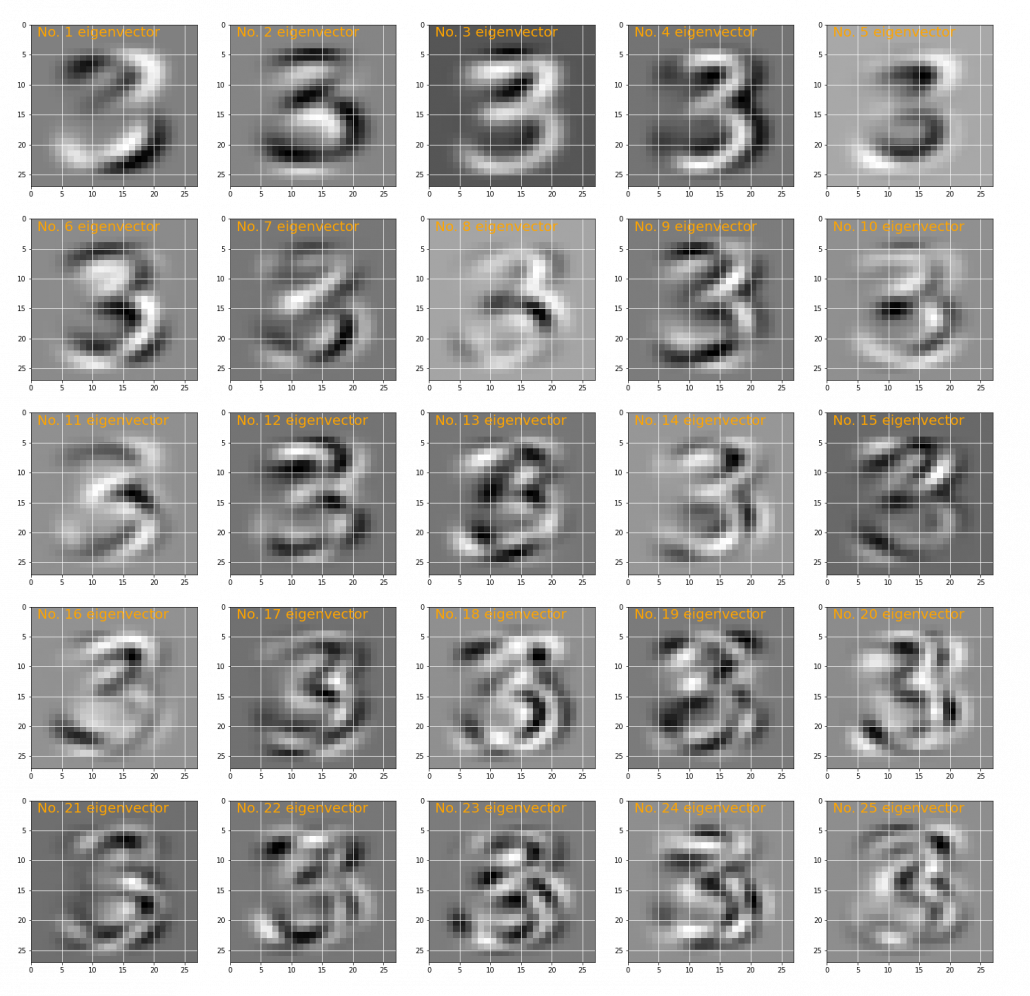
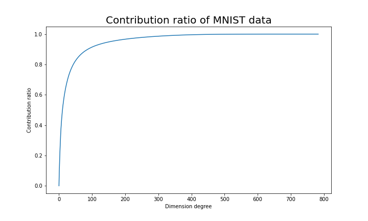
We can observe that eigenvalue \lambda_i is a statistic which indicates how much the corresponding \boldsymbol{u}_i can express the data, \frac{\lambda_i}{\sum_{j=1}^{D}{\lambda_j}} is called the contribution ratio of eigenvector \boldsymbol{u}_i. In the example above, the contribution ratios of \boldsymbol{u}_1, \boldsymbol{u}_2, and \boldsymbol{u}_3 are respectively \frac{\lambda_1}{\lambda_1 + \lambda_2 + \lambda_3}=0.813, \frac{\lambda_2}{\lambda_1 + \lambda_2 + \lambda_3}=0.168, \frac{\lambda_3}{\lambda_1 + \lambda_2 + \lambda_3}=0.0197. You can decide how many degrees of dimensions you reduce based on this information.

Appendix: Playing with my toy PCA on MNIST dataset

Applying “so called” PCA on MNIST dataset is a super typical topic that many other tutorial on PCA also introduce, but I still recommend you to actually implement, or at least trace PCA implementation with MNIST dataset without using libraries like scikit-learn. While reading this article I recommend you to actually run the first and the second code below. I think you can just copy and paste them on your tool to run Python, installing necessary libraries. I wrote them on Jupyter Notebook.

In my implementation, in the simple configuration part you can set the USE_ALL_NUMBERS as True or False boolean. If you set it as True, you apply PCA on all the data of numbers from 0 to 9. If you set it as True, you can specify which digit to apply PCA on. In this article, I show the results results of PCA on the data of digit ‘3.’ The first three images of ‘3’ are as below.

You have to keep it in mind that the data are all shown as 28 by 28 pixel grayscale images, but in the process of PCA, they are all processed as 28 * 28 = 784 dimensional vectors. After applying PCA on the 784 dimensional vectors of images of ‘3,’ the first 25 eigenvectors are as below. You can see that at the beginning the eigenvectors partly retain the shapes of ‘3,’ but they are distorted as the eigenvalues get smaller. We can guess that the latter eigenvalues are not that helpful in reconstructing the shape of ‘3.’

Just as we saw in the last section, you you can cut off axes of eigenvectors with small eigenvalues and reduce the dimension of MNIST data. The figure below shows how contribution ratio of MNIST data grows. You can see that around 200 dimension degree, the contribution ratio reaches around 0.95. Then we can guess that even if we reduce the dimension of MNIST from 784 to 200 we can retain the most of the structure of original data.

Some results of reconstruction of data from 200 dimensional space are as below. You can set how many images to display by adjusting NUMBER_OF_RESULTS in the code. And if you set LATENT_DIMENSION as 784, you can completely reconstruct the data.

* I make study materials on machine learning, sponsored by DATANOMIQ. I do my best to make my content as straightforward but as precise as possible. I include all of my reference sources. If you notice any mistakes in my materials, including grammatical errors, please let me know (email: yasuto.tamura@datanomiq.de). And if you have any advice for making my materials more understandable to learners, I would appreciate hearing it.

*I attatched the codes I used to make the figures in this article. You can just copy, paste, and run, sometimes installing necessary libraries.


Simple RNN

Prerequisites for understanding RNN at a more mathematical level

Writing the A gentle introduction to the tiresome part of understanding RNN Article Series on recurrent neural network (RNN) is nothing like a creative or ingenious idea. It is quite an ordinary topic. But still I am going to write my own new article on this ordinary topic because I have been frustrated by lack of sufficient explanations on RNN for slow learners like me.

I think many of readers of articles on this website at least know that RNN is a type of neural network used for AI tasks, such as time series prediction, machine translation, and voice recognition. But if you do not understand how RNNs work, especially during its back propagation, this blog series is for you.

After reading this articles series, I think you will be able to understand RNN in more mathematical and abstract ways. But in case some of the readers are allergic or intolerant to mathematics, I tried to use as little mathematics as possible.

Ideal prerequisite knowledge:

  • Some understanding on densely connected layers (or fully connected layers, multilayer perception) and how their forward/back propagation work.
  •  Some understanding on structure of Convolutional Neural Network.

*In this article “Densely Connected Layers” is written as “DCL,” and “Convolutional Neural Network” as “CNN.”

1, Difficulty of Understanding RNN

I bet a part of difficulty of understanding RNN comes from the variety of its structures. If you search “recurrent neural network” on Google Image or something, you will see what I mean. But that cannot be helped because RNN enables a variety of tasks.

Another major difficulty of understanding RNN is understanding its back propagation algorithm. I think some of you found it hard to understand chain rules in calculating back propagation of densely connected layers, where you have to make the most of linear algebra. And I have to say backprop of RNN, especially LSTM, is a monster of chain rules. I am planing to upload not only a blog post on RNN backprop, but also a presentation slides with animations to make it more understandable, in some external links.

In order to avoid such confusions, I am going to introduce a very simplified type of RNN, which I call a “simple RNN.” The RNN displayed as the head image of this article is a simple RNN.

2, How Neurons are Connected

How to connect neurons and how to activate them is what neural networks are all about. Structures of those neurons are easy to grasp as long as that is about DCL or CNN. But when it comes to the structure of RNN, many study materials try to avoid showing that RNNs are also connections of neurons, as well as DCL or CNN(*If you are not sure how neurons are connected in CNN, this link should be helpful. Draw a random digit in the square at the corner.). In fact the structure of RNN is also the same, and as long as it is a simple RNN, and it is not hard to visualize its structure.

Even though RNN is also connections of neurons, usually most RNN charts are simplified, using blackboxes. In case of simple RNN, most study material would display it as the chart below.

But that also cannot be helped because fancier RNN have more complicated connections of neurons, and there are no longer advantages of displaying RNN as connections of neurons, and you would need to understand RNN in more abstract way, I mean, as you see in most of textbooks.

I am going to explain details of simple RNN in the next article of this series.

3, Neural Networks as Mappings

If you still think that neural networks are something like magical spider webs or models of brain tissues, forget that. They are just ordinary mappings.

If you have been allergic to mathematics in your life, you might have never heard of the word “mapping.” If so, at least please keep it in mind that the equation y=f(x), which most people would have seen in compulsory education, is a part of mapping. If you get a value x, you get a value y corresponding to the x.

But in case of deep learning, x is a vector or a tensor, and it is denoted in bold like \boldsymbol{x} . If you have never studied linear algebra , imagine that a vector is a column of Excel data (only one column), a matrix is a sheet of Excel data (with some rows and columns), and a tensor is some sheets of Excel data (each sheet does not necessarily contain only one column.)

CNNs are mainly used for image processing, so their inputs are usually image data. Image data are in many cases (3, hight, width) tensors because usually an image has red, blue, green channels, and the image in each channel can be expressed as a height*width matrix (the “height” and the “width” are number of pixels, so they are discrete numbers).

The convolutional part of CNN (which I call “feature extraction part”) maps the tensors to a vector, and the last part is usually DCL, which works as classifier/regressor. At the end of the feature extraction part, you get a vector. I call it a “semantic vector” because the vector has information of “meaning” of the input image. In this link you can see maps of pictures plotted depending on the semantic vector. You can see that even if the pictures are not necessarily close pixelwise, they are close in terms of the “meanings” of the images.

In the example of a dog/cat classifier introduced by François Chollet, the developer of Keras, the CNN maps (3, 150, 150) tensors to 2-dimensional vectors, (1, 0) or (0, 1) for (dog, cat).

Wrapping up the points above, at least you should keep two points in mind: first, DCL is a classifier or a regressor, and CNN is a feature extractor used for image processing. And another important thing is, feature extraction parts of CNNs map images to vectors which are more related to the “meaning” of the image.

Importantly, I would like you to understand RNN this way. An RNN is also just a mapping.

*I recommend you to at least take a look at the beautiful pictures in this link. These pictures give you some insight into how CNN perceive images.

4, Problems of DCL and CNN, and needs for RNN

Taking an example of RNN task should be helpful for this topic. Probably machine translation is the most famous application of RNN, and it is also a good example of showing why DCL and CNN are not proper for some tasks. Its algorithms is out of the scope of this article series, but it would give you a good insight of some features of RNN. I prepared three sentences in German, English, and Japanese, which have the same meaning. Assume that each sentence is divided into some parts as shown below and that each vector corresponds to each part. In machine translation we want to convert a set of the vectors into another set of vectors.

Then let’s see why DCL and CNN are not proper for such task.

  • The input size is fixed: In case of the dog/cat classifier I have mentioned, even though the sizes of the input images varies, they were first molded into (3, 150, 150) tensors. But in machine translation, usually the length of the input is supposed to be flexible.
  • The order of inputs does not mater: In case of the dog/cat classifier the last section, even if the input is “cat,” “cat,” “dog” or “dog,” “cat,” “cat” there’s no difference. And in case of DCL, the network is symmetric, so even if you shuffle inputs, as long as you shuffle all of the input data in the same way, the DCL give out the same outcome . And if you have learned at least one foreign language, it is easy to imagine that the orders of vectors in sequence data matter in machine translation.

*It is said English language has phrase structure grammar, on the other hand Japanese language has dependency grammar. In English, the orders of words are important, but in Japanese as long as the particles and conjugations are correct, the orders of words are very flexible. In my impression, German grammar is between them. As long as you put the verb at the second position and the cases of the words are correct, the orders are also relatively flexible.

5, Sequence Data

We can say DCL and CNN are not useful when you want to process sequence data. Sequence data are a type of data which are lists of vectors. And importantly, the orders of the vectors matter. The number of vectors in sequence data is usually called time steps. A simple example of sequence data is meteorological data measured at a spot every ten minutes, for instance temperature, air pressure, wind velocity, humidity. In this case the data is recorded as 4-dimensional vector every ten minutes.

But this “time step” does not necessarily mean “time.” In case of natural language processing (including machine translation), which you I mentioned in the last section, the numberings of each vector denoting each part of sentences are “time steps.”

And RNNs are mappings from a sequence data to another sequence data.

In case of the machine translation above, the each sentence in German, English, and German is expressed as sequence data \boldsymbol{G}=(\boldsymbol{g}_1,\dots ,\boldsymbol{g}_{12}), \boldsymbol{E}=(\boldsymbol{e}_1,\dots ,\boldsymbol{e}_{11}), \boldsymbol{J}=(\boldsymbol{j}_1,\dots ,\boldsymbol{j}_{14}), and machine translation is nothing but mappings between these sequence data.


*At least I found a paper on the RNN’s capability of universal approximation on many-to-one RNN task. But I have not found any papers on universal approximation of many-to-many RNN tasks. Please let me know if you find any clue on whether such approximation is possible. I am desperate to know that. 

6, Types of RNN Tasks

RNN tasks can be classified into some types depending on the lengths of input/output sequences (the “length” means the times steps of input/output sequence data).

If you want to predict the temperature in 24 hours, based on several time series data points in the last 96 hours, the task is many-to-one. If you sample data every ten minutes, the input size is 96*6=574 (the input data is a list of 574 vectors), and the output size is 1 (which is a value of temperature). Another example of many-to-one task is sentiment classification. If you want to judge whether a post on SNS is positive or negative, the input size is very flexible (the length of the post varies.) But the output size is one, which is (1, 0) or (0, 1), which denotes (positive, negative).

*The charts in this section are simplified model of RNN used for each task. Please keep it in mind that they are not 100% correct, but I tried to make them as exact as possible compared to those in other study materials.

Music/text generation can be one-to-many tasks. If you give the first sound/word you can generate a phrase.

Next, let’s look at many-to-many tasks. Machine translation and voice recognition are likely to be major examples of many-to-many tasks, but here name entity recognition seems to be a proper choice. Name entity recognition is task of finding proper noun in a sentence . For example if you got two sentences “He said, ‘Teddy bears on sale!’ ” and ‘He said, “Teddy Roosevelt was a great president!” ‘ judging whether the “Teddy” is a proper noun or a normal noun is name entity recognition.

Machine translation and voice recognition, which are more popular, are also many-to-many tasks, but they use more sophisticated models. In case of machine translation, the inputs are sentences in the original language, and the outputs are sentences in another language. When it comes to voice recognition, the input is data of air pressure at several time steps, and the output is the recognized word or sentence. Again, these are out of the scope of this article but I would like to introduce the models briefly.

Machine translation uses a type of RNN named sequence-to-sequence model (which is often called seq2seq model). This model is also very important for other natural language processes tasks in general, such as text summarization. A seq2seq model is divided into the encoder part and the decoder part. The encoder gives out a hidden state vector and it used as the input of the decoder part. And decoder part generates texts, using the output of the last time step as the input of next time step.

Voice recognition is also a famous application of RNN, but it also needs a special type of RNN.

*To be honest, I don’t know what is the state-of-the-art voice recognition algorithm. The example in this article is a combination of RNN and a collapsing function made using Connectionist Temporal Classification (CTC). In this model, the output of RNN is much longer than the recorded words or sentences, so a collapsing function reduces the output into next output with normal length.

You might have noticed that RNNs in the charts above are connected in both directions. Depending on the RNN tasks you need such bidirectional RNNs.  I think it is also easy to imagine that such networks are necessary. Again, machine translation is a good example.

And interestingly, image captioning, which enables a computer to describe a picture, is one-to-many-task. As the output is a sentence, it is easy to imagine that the output is “many.” If it is a one-to-many task, the input is supposed to be a vector.

Where does the input come from? I mentioned that the last some layers in of CNN are closely connected to how CNNs extract meanings of pictures. Surprisingly such vectors, which I call a “semantic vectors” is the inputs of image captioning task (after some transformations, depending on the network models).

I think this articles includes major things you need to know as prerequisites when you want to understand RNN at more mathematical level. In the next article, I would like to explain the structure of a simple RNN, and how it forward propagate.

* I make study materials on machine learning, sponsored by DATANOMIQ. I do my best to make my content as straightforward but as precise as possible. I include all of my reference sources. If you notice any mistakes in my materials, please let me know (email: yasuto.tamura@datanomiq.de). And if you have any advice for making my materials more understandable to learners, I would appreciate hearing it.

Interview: Operationalisierung von Data Science

Interview mit Herrn Dr. Frank Block von Roche Diagnostics über Operationalisierung von Data Science

Herr Dr. Frank Block ist Head of IT Data Science bei Roche Diagnostics mit Sitz in der Schweiz. Zuvor war er Chief Data Scientist bei der Ricardo AG nachdem er für andere Unternehmen die Datenanalytik verantwortet hatte und auch 20 Jahre mit mehreren eigenen Data Science Consulting Startups am Markt war. Heute tragen ca. 50 Mitarbeiter bei Roche Diagnostics zu Data Science Projekten bei, die in sein Aktivitätsportfolio fallen: 

Data Science Blog: Herr Dr. Block, Sie sind Leiter der IT Data Science bei Roche Diagnostics? Warum das „IT“ im Namen dieser Abteilung?

Roche ist ein großes Unternehmen mit einer großen Anzahl von Data Scientists in ganz verschiedenen Bereichen mit jeweils sehr verschiedenen Zielsetzungen und Themen, die sie bearbeiten. Ich selber befinde mich mit meinem Team im Bereich „Diagnostics“, d.h. der Teil von Roche, in dem Produkte auf den Markt gebracht werden, die die korrekte Diagnose von Krankheiten und Krankheitsrisiken ermöglichen. Innerhalb von Roche Diagnostics gibt es wiederum verschiedene Bereiche, die Data Science für ihre Zwecke nutzen. Mit meinem Team sind wir in der globalen IT-Organisation angesiedelt und kümmern uns dort insbesondere um Anwendungen von Data Science für die Optimierung der internen Wertschöpfungskette.

Data Science Blog: Sie sind längst über die ersten Data Science Experimente hinaus. Die Operationalisierung von Analysen bzw. analytischen Applikationen ist für Sie besonders wichtig. Welche Rolle spielt das Datenmanagement dabei? Und wo liegen die Knackpunkte?

Ja, richtig. Die Zeiten, in denen sich Data Science erlauben konnte „auf Vorrat“ an interessanten Themen zu arbeiten, weil sie eben super interessant sind, aber ohne jemals konkrete Wertschöpfung zu liefern, sind definitiv und ganz allgemein vorbei. Wir sind seit einigen Jahren dabei, den Übergang von Data Science Experimenten (wir nennen es auch gerne „proof-of-value“) in die Produktion voranzutreiben und zu optimieren. Ein ganz essentielles Element dabei stellen die Daten dar; diese werden oft auch als der „Treibstoff“ für Data Science basierte Prozesse bezeichnet. Der große Unterschied kommt jedoch daher, dass oft statt „Benzin“ nur „Rohöl“ zur Verfügung steht, das zunächst einmal aufwändig behandelt und vorprozessiert werden muss, bevor es derart veredelt ist, dass es für Data Science Anwendungen geeignet ist. In diesem Veredelungsprozess wird heute noch sehr viel Zeit aufgewendet. Je besser die Datenplattformen des Unternehmens, umso größer die Produktivität von Data Science (und vielen anderen Abnehmern dieser Daten im Unternehmen). Ein anderes zentrales Thema stellt der Übergang von Data Science Experiment zu Operationalisierung dar. Hier muss dafür gesorgt werden, dass eine reibungslose Übergabe von Data Science an das IT-Entwicklungsteam erfolgt. Die Teamzusammensetzung verändert sich an dieser Stelle und bei uns tritt der Data Scientist von einer anfänglich führenden Rolle in eine Beraterrolle ein, wenn das System in die produktive Entwicklung geht. Auch die Unterstützung der Operationalisierung durch eine durchgehende Data Science Plattform kann an dieser Stelle helfen.

Data Science Blog: Es heißt häufig, dass Data Scientists kaum zu finden sind. Ist Recruiting für Sie tatsächlich noch ein Thema?

Generell schon, obwohl mir scheint, dass dies nicht unser größtes Problem ist. Glücklicherweise übt Roche eine große Anziehung auf Talente aus, weil im Zentrum unseres Denkens und Handelns der Patient steht und wir somit durch unsere Arbeit einen sehr erstrebenswerten Zweck verfolgen. Ein zweiter Aspekt beim Aufbau eines Data Science Teams ist übrigens das Halten der Talente im Team oder Unternehmen. Data Scientists suchen vor allem spannenden und abwechselnden Herausforderungen. Und hier sind wir gut bedient, da die Palette an Data Science Anwendungen derart breit ist, dass es den Kollegen im Team niemals langweilig wird.

Data Science Blog: Sie haben bereits einige Analysen erfolgreich produktiv gebracht. Welche Herausforderungen mussten dabei überwunden werden? Und welche haben Sie heute noch vor sich?

Wir konnten bereits eine wachsende Zahl an Data Science Experimenten in die Produktion überführen und sind sehr stolz darauf, da dies der beste Weg ist, nachhaltig Geschäftsmehrwert zu generieren. Die gleichzeitige Einbettung von Data Science in IT und Business ist uns bislang gut gelungen, wir werden aber noch weiter daran arbeiten, denn je näher wir mit unseren Kollegen in den Geschäftsabteilungen arbeiten, umso besser wird sichergestellt, das Data Science sich auf die wirklich relevanten Themen fokussiert. Wir sehen auch guten Fortschritt aus der Datenperspektive, wo zunehmend Daten über „Silos“ hinweg integriert werden und so einfacher nutzbar sind.

Data Science Blog: Data Driven Thinking wird heute sowohl von Mitarbeitern in den Fachbereichen als auch vom Management verlangt. Sind wir schon so weit? Wie könnten wir diese Denkweise im Unternehmen fördern?

Ich glaube wir stecken mitten im Wandel, Data-Driven Decisions sind im Kommen, aber das braucht auch seine Zeit. Indem wir zeigen, welches Potenzial ganz konkrete Daten und Advanced Analytics basierte Entscheidungsprozesse innehaben, helfen wir, diesen Wandel voranzutreiben. Spezifische Weiterbildungsangebote stellen eine andere Komponente dar, die diesen Transformationszrozess unterstützt. Ich bin überzeugt, dass wenn wir in 10-20 Jahren zurückblicken, wir uns fragen, wie wir überhaupt ohne Data-Driven Thinking leben konnten…

Interview – IT-Netzwerk Werke überwachen und optimieren mit Data Analytics

Interview mit Gregory Blepp von NetDescribe über Data Analytics zur Überwachung und Optimierung von IT-Netzwerken

Gregory Blepp ist Managing Director der NetDescribe GmbH mit Sitz in Oberhaching im Süden von München. Er befasst sich mit seinem Team aus Consultants, Data Scientists und IT-Netzwerk-Experten mit der technischen Analyse von IT-Netzwerken und der Automatisierung der Analyse über Applikationen.

Data Science Blog: Herr Blepp, der Name Ihres Unternehmens NetDescribe beschreibt tatsächlich selbstsprechend wofür Sie stehen: die Analyse von technischen Netzwerken. Wo entsteht hier der Bedarf für diesen Service und welche Lösung haben Sie dafür parat?

Unsere Kunden müssen nahezu in Echtzeit eine Visibilität über die Leistungsfähigkeit ihrer Unternehmens-IT haben. Dazu gehört der aktuelle Status der Netzwerke genauso wie andere Bereiche, also Server, Applikationen, Storage und natürlich die Web-Infrastruktur sowie Security.

Im Bankenumfeld sind zum Beispiel die uneingeschränkten WAN Verbindungen für den Handel zwischen den internationalen Börsenplätzen absolut kritisch. Hierfür bieten wir mit StableNetⓇ von InfosimⓇ eine Netzwerk Management Plattform, die in Echtzeit den Zustand der Verbindungen überwacht. Für die unterlagerte Netzwerkplattform (Router, Switch, etc.) konsolidieren wir mit GigamonⓇ das Monitoring.

Für Handelsunternehmen ist die Performance der Plattformen für den Online Shop essentiell. Dazu kommen die hohen Anforderungen an die Sicherheit bei der Übertragung von persönlichen Informationen sowie Kreditkarten. Hierfür nutzen wir SplunkⓇ. Diese Lösung kombiniert in idealer Form die generelle Performance Überwachung mit einem hohen Automatisierungsgrad und bietet dabei wesentliche Unterstützung für die Sicherheitsabteilungen.

Data Science Blog: Geht es den Unternehmen dabei eher um die Sicherheitsaspekte eines Firmennetzwerkes oder um die Performance-Analyse zum Zwecke der Optimierung?

Das hängt von den aktuellen Ansprüchen des Unternehmens ab.
Für viele unserer Kunden standen und stehen zunächst Sicherheitsaspekte im Vordergrund. Im Laufe der Kooperation können wir durch die Etablierung einer konsequenten Performance Analyse aufzeigen, wie eng die Verzahnung der einzelnen Abteilungen ist. Die höhere Visibilität erleichtert Performance Analysen und sie liefert den Sicherheitsabteilung gleichzeitig wichtige Informationen über aktuelle Zustände der Infrastruktur.

Data Science Blog: Haben Sie es dabei mit Big Data – im wörtlichen Sinne – zu tun?

Wir unterscheiden bei Big Data zwischen

  • dem organischen Wachstum von Unternehmensdaten aufgrund etablierter Prozesse, inklusive dem Angebot von neuen Services und
  • wirklichem Big Data, z. B. die Anbindung von Produktionsprozessen an die Unternehmens IT, also durch die Digitalisierung initiierte zusätzliche Prozesse in den Unternehmen.

Beide Themen sind für die Kunden eine große Herausforderung. Auf der einen Seite muss die Leistungsfähigkeit der Systeme erweitert und ausgebaut werden, um die zusätzlichen Datenmengen zu verkraften. Auf der anderen Seite haben diese neuen Daten nur dann einen wirklichen Wert, wenn sie richtig interpretiert werden und die Ergebnisse konsequent in die Planung und Steuerung der Unternehmen einfließen.

Wir bei NetDescribe kümmern uns mehrheitlich darum, das Wachstum und die damit notwendigen Anpassungen zu managen und – wenn Sie so wollen – Ordnung in das Datenchaos zu bringen. Konkret verfolgen wir das Ziel den Verantwortlichen der IT, aber auch der gesamten Organisation eine verlässliche Indikation zu geben, wie es der Infrastruktur als Ganzes geht. Dazu gehört es, über die einzelnen Bereiche hinweg, gerne auch Silos genannt, die Daten zu korrelieren und im Zusammenhang darzustellen.

Data Science Blog: Log-Datenanalyse gibt es seit es Log-Dateien gibt. Was hält ein BI-Team davon ab, einen Data Lake zu eröffnen und einfach loszulegen?

Das stimmt absolut, Log-Datenanalyse gibt es seit jeher. Es geht hier schlichtweg um die Relevanz. In der Vergangenheit wurde mit Wireshark bei Bedarf ein Datensatz analysiert um ein Problem zu erkennen und nachzuvollziehen. Heute werden riesige Datenmengen (Logs) im IoT Umfeld permanent aufgenommen um Analysen zu erstellen.

Nach meiner Überzeugung sind drei wesentliche Veränderungen der Treiber für den flächendeckenden Einsatz von modernen Analysewerkzeugen.

  • Die Inhalte und Korrelationen von Log Dateien aus fast allen Systemen der IT Infrastruktur sind durch die neuen Technologien nahezu in Echtzeit und für größte Datenmengen überhaupt erst möglich. Das hilft in Zeiten der Digitalisierung, wo aktuelle Informationen einen ganz neuen Stellenwert bekommen und damit zu einer hohen Gewichtung der IT führen.
  • Ein wichtiger Aspekt bei der Aufnahme und Speicherung von Logfiles ist heute, dass ich die Suchkriterien nicht mehr im Vorfeld formulieren muss, um dann die Antworten aus den Datensätzen zu bekommen. Die neuen Technologien erlauben eine völlig freie Abfrage von Informationen über alle Daten hinweg.
  • Logfiles waren in der Vergangenheit ein Hilfswerkzeug für Spezialisten. Die Information in technischer Form dargestellt, half bei einer Problemlösung – wenn man genau wusste was man sucht. Die aktuellen Lösungen sind darüber hinaus mit einer GUI ausgestattet, die nicht nur modern, sondern auch individuell anpassbar und für Nicht-Techniker verständlich ist. Somit erweitert sich der Anwenderkreis des “Logfile Managers” heute vom Spezialisten im Security und Infrastrukturbereich über Abteilungsverantwortliche und Mitarbeiter bis zur Geschäftsleitung.

Der Data Lake war und ist ein wesentlicher Bestandteil. Wenn wir heute Technologien wie Apache/KafkaⓇ und, als gemanagte Lösung, Confluent für Apache/KafkaⓇ betrachten, wird eine zentrale Datendrehscheibe etabliert, von der alle IT Abteilungen profitieren. Alle Analysten greifen mit Ihren Werkzeugen auf die gleiche Datenbasis zu. Somit werden die Rohdaten nur einmal erhoben und allen Tools gleichermaßen zur Verfügung gestellt.

Data Science Blog: Damit sind Sie ein Unternehmen das Datenanalyse, Visualisierung und Monitoring verbindet, dies jedoch auch mit der IT-Security. Was ist Unternehmen hierbei eigentlich besonders wichtig?

Sicherheit ist natürlich ganz oben auf die Liste zu setzen. Organisation sind naturgemäß sehr sensibel und aktuelle Medienberichte zu Themen wie Cyber Attacks, Hacking etc. zeigen große Wirkung und lösen Aktionen aus. Dazu kommen Compliance Vorgaben, die je nach Branche schneller und kompromissloser umgesetzt werden.

Die NetDescribe ist spezialisiert darauf den Bogen etwas weiter zu spannen.

Natürlich ist die sogenannte Nord-Süd-Bedrohung, also der Angriff von außen auf die Struktur erheblich und die IT-Security muss bestmöglich schützen. Dazu dienen die Firewalls, der klassische Virenschutz etc. und Technologien wie Extrahop, die durch konsequente Überwachung und Aktualisierung der Signaturen zum Schutz der Unternehmen beitragen.

Genauso wichtig ist aber die Einbindung der unterlagerten Strukturen wie das Netzwerk. Ein Angriff auf eine Organisation, egal von wo aus initiiert, wird immer über einen Router transportiert, der den Datensatz weiterleitet. Egal ob aus einer Cloud- oder traditionellen Umgebung und egal ob virtuell oder nicht. Hier setzen wir an, indem wir etablierte Technologien wie zum Beispiel ´flow` mit speziell von uns entwickelten Software Modulen – sogenannten NetDescibe Apps – nutzen, um diese Datensätze an SplunkⓇ, StableNetⓇ  weiterzuleiten. Dadurch entsteht eine wesentlich erweiterte Analysemöglichkeit von Bedrohungsszenarien, verbunden mit der Möglichkeit eine unternehmensweite Optimierung zu etablieren.

Data Science Blog: Sie analysieren nicht nur ad-hoc, sondern befassen sich mit der Formulierung von Lösungen als Applikation (App).

Das stimmt. Alle von uns eingesetzten Technologien haben ihre Schwerpunkte und sind nach unserer Auffassung führend in ihren Bereichen. InfosimⓇ im Netzwerk, speziell bei den Verbindungen, VIAVI in der Paketanalyse und bei flows, SplunkⓇ im Securitybereich und Confluent für Apache/KafkaⓇ als zentrale Datendrehscheibe. Also jede Lösung hat für sich alleine schon ihre Daseinsberechtigung in den Organisationen. Die NetDescribe hat es sich seit über einem Jahr zur Aufgabe gemacht, diese Technologien zu verbinden um einen “Stack” zu bilden.

Konkret: Gigaflow von VIAVI ist die wohl höchst skalierbare Softwarelösung um Netzwerkdaten in größten Mengen schnell und und verlustfrei zu speichern und zu analysieren. SplunkⓇ hat sich mittlerweile zu einem Standardwerkzeug entwickelt, um Datenanalyse zu betreiben und die Darstellung für ein großes Auditorium zu liefern.

NetDescribe hat jetzt eine App vorgestellt, welche die NetFlow-Daten in korrelierter Form aus Gigaflow, an SplunkⓇ liefert. Ebenso können aus SplunkⓇ Abfragen zu bestimmten Datensätzen direkt an die Gigaflow Lösung gestellt werden. Das Ergebnis ist eine wesentlich erweiterte SplunkⓇ-Plattform, nämlich um das komplette Netzwerk mit nur einem Knopfdruck (!!!).
Dazu schont diese Anbindung in erheblichem Umfang SplunkⓇ Ressourcen.

Dazu kommt jetzt eine NetDescribe StableNetⓇ App. Weitere Anbindungen sind in der Planung.

Das Ziel ist hier ganz pragmatisch – wenn sich SplunkⓇ als die Plattform für Sicherheitsanalysen und für das Data Framework allgemein in den Unternehmen etabliert, dann unterstützen wir das als NetDescribe dahingehend, dass wir die anderen unternehmenskritischen Lösungen der Abteilungen an diese Plattform anbinden, bzw. Datenintegration gewährleisten. Das erwarten auch unsere Kunden.

Data Science Blog: Auf welche Technologien setzen Sie dabei softwareseitig?

Wie gerade erwähnt, ist SplunkⓇ eine Plattform, die sich in den meisten Unternehmen etabliert hat. Wir machen SplunkⓇ jetzt seit über 10 Jahren und etablieren die Lösung bei unseren Kunden.

SplunkⓇ hat den großen Vorteil dass unsere Kunden mit einem dedizierten und überschaubaren Anwendung beginnen können, die Technologie selbst aber nahezu unbegrenzt skaliert. Das gilt für Security genauso wie Infrastruktur, Applikationsmonitoring und Entwicklungsumgebungen. Aus den ständig wachsenden Anforderungen unserer Kunden ergeben sich dann sehr schnell weiterführende Gespräche, um zusätzliche Einsatzszenarien zu entwickeln.

Neben SplunkⓇ setzen wir für das Netzwerkmanagement auf StableNetⓇ von InfosimⓇ, ebenfalls seit über 10 Jahren schon. Auch hier, die Erfahrungen des Herstellers im Provider Umfeld erlauben uns bei unseren Kunden eine hochskalierbare Lösung zu etablieren.

Confluent für Apache/KafkaⓇ ist eine vergleichbar jüngere Lösung, die aber in den Unternehmen gerade eine extrem große Aufmerksamkeit bekommt. Die Etablierung einer zentralen Datendrehscheibe für Analyse, Auswertungen, usw., auf der alle Daten zur Performance zentral zur Verfügung gestellt werden, wird es den Administratoren, aber auch Planern und Analysten künftig erleichtern, aussagekräftige Daten zu liefern. Die Verbindung aus OpenSource und gemanagter Lösung trifft hier genau die Zielvorstellung der Kunden und scheinbar auch den Zahn der Zeit. Vergleichbar mit den Linux Derivaten von Red Hat Linux und SUSE.

VIAVI Gigaflow hatte ich für Netzwerkanalyse schon erwähnt. Hier wird in den kommenden Wochen mit der neuen Version der VIAVI Apex Software ein Scoring für Netzwerke etabliert. Stellen sie sich den MOS score von VoIP für Unternehmensnetze vor. Das trifft es sehr gut. Damit erhalten auch wenig spezialisierte Administratoren die Möglichkeit mit nur 3 (!!!) Mausklicks konkrete Aussagen über den Zustand der Netzwerkinfrastruktur, bzw. auftretende Probleme zu machen. Ist es das Netz? Ist es die Applikation? Ist es der Server? – der das Problem verursacht. Das ist eine wesentliche Eindämmung des derzeitigen Ping-Pong zwischen den Abteilungen, von denen oft nur die Aussage kommt, “bei uns ist alles ok”.

Abgerundet wird unser Software Portfolio durch die Lösung SentinelOne für Endpoint Protection.

Data Science Blog: Inwieweit spielt Künstliche Intelligenz (KI) bzw. Machine Learning eine Rolle?

Machine Learning spielt heute schon ein ganz wesentliche Rolle. Durch konsequentes Einspeisen der Rohdaten und durch gezielte Algorithmen können mit der Zeit bessere Analysen der Historie und komplexe Zusammenhänge aufbereitet werden. Hinzu kommt, dass so auch die Genauigkeit der Prognosen für die Zukunft immens verbessert werden können.

Als konkretes Beispiel bietet sich die eben erwähnte Endpoint Protection von SentinelOne an. Durch die Verwendung von KI zur Überwachung und Steuerung des Zugriffs auf jedes IoT-Gerät, befähigt  SentinelOne Maschinen, Probleme zu lösen, die bisher nicht in größerem Maßstab gelöst werden konnten.

Hier kommt auch unser ganzheitlicher Ansatz zum Tragen, nicht nur einzelne Bereiche der IT, sondern die unternehmensweite IT ins Visier zu nehmen.

Data Science Blog: Mit was für Menschen arbeiten Sie in Ihrem Team? Sind das eher die introvertierten Nerds und Hacker oder extrovertierte Consultants? Was zeichnet Sie als Team fachlich aus?

Nerds und Hacker würde ich unsere Mitarbeiter im technischen Consulting definitiv nicht nennen.

Unser Consulting Team besteht derzeit aus neun Leuten. Jeder ist ausgewiesener Experte für bestimmte Produkte. Natürlich ist es auch bei uns so, dass wir introvertierte Kollegen haben, die zunächst lieber in Abgeschiedenheit oder Ruhe ein Problem analysieren, um dann eine Lösung zu generieren. Mehrheitlich sind unsere technischen Kollegen aber stets in enger Abstimmung mit dem Kunden.

Für den Einsatz beim Kunden ist es sehr wichtig, dass man nicht nur fachlich die Nase vorn hat, sondern dass man auch  kommunikationsstark und extrem teamfähig ist. Eine schnelle Anpassung an die verschiedenen Arbeitsumgebungen und “Kollegen” bei den Kunden zeichnet unsere Leute aus.

Als ständig verfügbares Kommunikationstool nutzen wir einen internen Chat der allen jederzeit zur Verfügung steht, so dass unser Consulting Team auch beim Kunden immer Kontakt zu den Kollegen hat. Das hat den großen Vorteil, dass das gesamte Know-how sozusagen “im Pool” verfügbar ist.

Neben den Consultants gibt es unser Sales Team mit derzeit vier Mitarbeitern*innen. Diese Kollegen*innen sind natürlich immer unter Strom, so wie sich das für den Vertrieb gehört.
Dedizierte PreSales Consultants sind bei uns die technische Speerspitze für die Aufnahme und das Verständnis der Anforderungen. Eine enge Zusammenarbeit mit dem eigentlichen Consulting Team ist dann die  Voraussetzung für die vorausschauende Planung aller Projekte.

Wir suchen übrigens laufend qualifizierte Kollegen*innen. Details zu unseren Stellenangeboten finden Ihre Leser*innen auf unserer Website unter dem Menüpunkt “Karriere”.  Wir freuen uns über jede/n Interessenten*in.

Über NetDescribe:

NetDescribe steht mit dem Claim Trusted Performance für ausfallsichere Geschäftsprozesse und Cloud-Anwendungen. Die Stärke von NetDescribe sind maßgeschneiderte Technologie Stacks bestehend aus Lösungen mehrerer Hersteller. Diese werden durch selbst entwickelte Apps ergänzt und verschmolzen.

Das ganzheitliche Portfolio bietet Datenanalyse und -visualisierung, Lösungskonzepte, Entwicklung, Implementierung und Support. Als Trusted Advisor für Großunternehmen und öffentliche Institutionen realisiert NetDescribe hochskalierbare Lösungen mit State-of-the-Art-Technologien für dynamisches und transparentes Monitoring in Echtzeit. Damit erhalten Kunden jederzeit Einblicke in die Bereiche Security, Cloud, IoT und Industrie 4.0. Sie können agile Entscheidungen treffen, interne und externe Compliance sichern und effizientes Risikomanagement betreiben. Das ist Trusted Performance by NetDescribe.