Neural Nets: Time Series Prediction
Artificial neural networks are very strong universal approximators. Google recently defeated the worlds strongest Go (“chinese chess”) player with two neural nets, which captured the game board as a picture. Aside from these classification tasks, neural nets can be used to predict future values, behaviors or patterns solely based on learned history. In the machine learning literature, this is often referred to as time series prediction, because, you know, values over time need to be predicted. Hah! To illustrate the concept, we will train a neural net to learn the shape of a sinusoidal wave, so it can continue to draw the shape without any help. We will do this with Scala. Scala is a great lang, because it is strongly typed but feels easy like Python. Throughout this article, I will use the library NeuroFlow, which is a simple, lightweight library I wrote to build and train nets. Because Open Source is the way to go, feel free to check (and contribute to? :-)) the code on GitHub.
Introduction of the shape
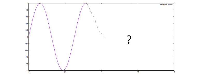
If we, as humans, want to predict the future based on historic observations, we would have no other chance but to be guided by the shape drawn so far. Let’s study the plot below, asking ourselves: How would a human continue the plot?
Intuitively, we would keep on oscillating up and down, just like the grey dotted line tries to rough out. To us, the continuation of the shape is reasonably easy to understand, but a machine does not have a gut feeling to ask for a good guess. However, we can summon a Frankenstein, which will be able to learn and continue the shape based on numbers. In order to do so, let’s have a look at the raw, discrete data of our sinusoidal wave:
| x | f(x) |
| 0.0 | 0.0 |
| 0.05 | 0.479425538604203 |
| 0.10 | 0.8414709848078965 |
| 0.15 | 0.9974949866040544 |
| 0.20 | 0.9092974268256817 |
| 0.25 | 0.5984721441039564 |
| 0.30 | 0.1411200080598672 |
| 0.35 | -0.35078322768961984 |
| … | … |
| 0.75 | 0.9379999767747389 |
Ranging from 0.0 until 0.75, these discrete values drawn from our function with step size 0.05 will be the basis for training. Now, one could come up with the idea to just memorize all values, so a sufficiently reasonable value can be picked based on comparison. For instance, to continue at the point 0.75 in our plot, we could simply examine the area close to 0.15, noticing a similar value close to 1, and hence go downwards. Well, of course this is cheating, but if a good cheat is a superior solution, why not cheat? Being hackers, we wouldn’t care. What’s really limiting here is the fact that the whole data set needs to be kept in memory, which can be infeasible for large sets, plus for more complex shapes, this approach would quickly result in a lot of weird rules and exceptions to be made in order to find comprehensible predictions.
Net to the rescue
Let’s go back to our table and see if a neural net can learn the shape, instead of simply memorizing it. Here, we want our net architecture to be of kind [3, 5, 3, 1]. Three input neurons, two hidden layers with five and three neurons respectively, as well as one neuron for the output layer will capture the data shown in the table.
A supervised training mode means, that we want to train our net with three discrete steps as input and the fourth step as the supervised training element. So we will train a, b, c -> d and e, f, g -> h et cetera, hoping that this way our net will capture the slope pattern of our sinusoidal wave. Let’s code this in Scala:
|
1 2 3 |
import neuroflow.core.Activator.Tanh import neuroflow.core.WeightProvider.randomWeights import neuroflow.nets.DynamicNetwork.constructor |
First, we want a Tanh activation function, because the domain of our sinusoidal wave is [-1, 1], just like the hyperbolic tangent. This way we can be sure that we are not comparing apples with oranges. Further, we want a dynamic network (adaptive learning rate) and random initial weights. Let’s put this down:
|
1 2 3 |
val fn = Tanh.apply val sets = Settings(true, 10.0, 0.0000001, 500, None, None, Some(Map("τ" -> 0.25, "c" -> 0.25))) val net = Network(Input(3) :: Hidden(5, fn) :: Hidden(3, fn) :: Output(1, fn) :: Nil, sets) |
No surprises here. After some experiments, we can pick values for the settings instance, which will promise good convergence during training. Now, let’s prepare our discrete steps drawn from the sinus function:
|
1 2 3 4 5 6 |
val group = 4 val sinusoidal = Range.Double(0.0, 0.8, 0.05).grouped(group).toList.map(i => i.map(k => (k, Math.sin(10 * k)))) val xsys = sinusoidal.map(s => (s.dropRight(1).map(_._2), s.takeRight(1).map(_._2))) val xs = xsys.map(_._1) val ys = xsys.map(_._2) net.train(xs, ys) |
We will draw samples from the range with step size 0.05. After this, we will construct our training values xs as well as our supervised output values ys. Here, a group consists of 4 steps, with 3 steps as input and the last step as the supervised value.
|
1 2 3 |
[INFO] [25.01.2016 14:07:51:677] [run-main-5] Taking step 499 - error: 1.4395661497489177E-4 , error per sample: 3.598915374372294E-5 [INFO] [25.01.2016 14:07:51:681] [run-main-5] Took 500 iterations of 500 with error 1.4304189739640242E-4 [success] Total time: 4 s, completed 25.01.2016 14:20:56 |
After a pretty short time, we will see good news. Now, how can we check if our net can successfully predict the sinusoidal wave? We can’t simply call our net like a sinus function to map from one input value to one output value, e. g. something like net(0.75) == sin(0.75). Our net does not care about any x values, because it was trained purely based on the function values f(x), or the slope pattern in general. We need to feed our net with a three-dimensional input vector holding the first three, original function values to predict the fourth step, then drop the first original step and append the recently predicted step to predict the fifth step, et cetera. In other words, we need to traverse the net. Let’s code this:
|
1 2 3 |
val initial = Range.Double(0.0, 0.15, 0.05).zipWithIndex.map(p => (p._1, xs.head(p._2))) val result = predict(net, xs.head, 0.15, initial) result.foreach(r => println(s"${r._1}, ${r._2}")) |
with
|
1 2 3 4 5 6 |
@tailrec def predict(net: Network, last: Seq[Double], i: Double, results: Seq[(Double, Double)]): Seq[(Double, Double)] = { if (i < 4.0) { val score = net.evaluate(last).head predict(net, last.drop(1) :+ score, i + 0.05, results :+ (i, score)) } else results } |
So, basically we don’t just continue to draw the sinusoidal shape at the point 0.75, we draw the entire shape right from the start until 4.0 – solely based on our trained net! Now, let’s see how our Frankenstein will complete the sinusoidal shape from 0.75 on:
I’d say, pretty neat? Keep in mind, here, the discrete predictions are connected through splines. Another interesting property of our trained net is its prediction compared to the original sinus function when taking the limit towards 4.0. Let’s plot both:
The purple line is the original sinusoidal wave, whereas the green line is the prediction of our net. The first steps show great consistency, but slowly the curves diverge a little over time, as uncertainties will add up. To keep this divergence rather low, one could fine tune settings, for instance numeric precision. However, if one is taking the limit towards infinity, a perfect fit is illusory.
Final thoughts
That’s it! We have trained our net to learn and continue the sinusoidal shape. Now, I know that this is a rather academic example, but to train a neural net to learn more complex shapes is straightforward from here.
Thanks for reading!


