Ein Einblick in die Aktienmärkte unter Berücksichtigung von COVID-19

Einleitung

Die COVID-19-Pandemie hat uns alle fest im Griff. Besonders die Wirtschaft leidet stark unter den erforderlichen Maßnahmen, die weltweit angewendet werden. Wir wollen daher die Gelegenheit nutzen einen Blick auf die Aktienkurse zu wagen und analysieren, inwieweit der Virus einen Einfluss auf das Wachstum des Marktes hat.

Rahmenbedingungen

Zuallererst werden wir uns auf die Industrie-, Schwellenländer und Grenzmärkte konzentrieren. Dafür nutzen wir die MSCI Global Investable Market Indizes (kurz GIMI), welche die zuvor genannten Gruppen abbilden. Die MSCI Inc. ist ein US-amerikanischer Finanzdienstleister und vor allem für ihre Aktienindizes bekannt.

Aktienindizes sind Kennzahlen der Entwicklung bzw. Änderung einer Auswahl von Aktienkursen und können repräsentativ für ganze Märkte, spezifische Branchen oder Länder stehen. Der DAX ist zum Beispiel ein Index, welcher die Entwicklung der größten 30 deutschen Unternehmen zusammenfasst.

Leider sind die Daten von MSCI nicht ohne weiteres zugänglich, weshalb wir unsere Analysen mit ETFs (engl.: “Exchange Traded Fund”) durchführen werden. ETFs sind wiederum an Börsen gehandelte Fonds, die von Fondgesellschaften/-verwaltern oder Banken verwaltet werden.

Für unsere erste Analyse sollen folgende ETFs genutzt werden, welche die folgenden Indizes führen:

Index Beschreibung ETF
MSCI World über 1600 Aktienwerte aus 24 Industrieländern iShares MSCI World ETF
MSCI Emerging Markets ca. 1400 Aktienwerte aus 27 Schwellenländern iShares MSCI Emerging Markets ETF
MSCI Frontier Markets Aktienwerte aus ca. 29 Frontier-Ländern iShares MSCI Frontier 100 ETF

Tab.1: MSCI Global Investable Market Indizes mit deren repräsentativen ETFs

Datenquellen

Zur Extraktion der ETF-Börsenkurse nehmen wir die yahoo finance API zur Hilfe. Mit den richtigen Symbolen können wir die historischen Daten unserer ETF-Auswahl ausgeben lassen. Wie unter diesem Link für den iShares MSCI World ETF zu sehen ist, gibt es mehrere Werte in den historischen Daten. Für unsere Analyse nutzen wir den Wert, nachdem die Börse geschlossen hat.

Da die ETFs in ihren Kurswerten Unterschiede haben und uns nur die relative Entwicklung interessiert, werden wir relative Werte für die Analyse nutzen. Der Startzeitpunkt soll mit dem 06.01.2020 festgelegt werden.

Die Daten über bestätigte Infektionen mit COVID-19 entnehmen wir aus der Hochrechnung der Johns Hopkins Universität.

Correlation between confirmed cases and growth of MSCI GIMI
Abb.1: Interaktives Diagramm: Wachstum der Aktienmärkte getrennt in Industrie-, Schwellen-, Frontier-Länder und deren bestätigten COVID-19 Fälle über die Zeit. Die bestätigten Fälle der jeweiligen Märkte basieren auf der Aufsummierung der Länder, welche auch in den Märkten aufzufinden sind und daher kann es zu Unterschieden bei den offiziellen Zahlen kommen.

Interpretation des Diagramms

Auf den ersten Blick sieht man deutlich, dass mit steigenden COVID-19 Fällen die Aktienkurse bis zu -31% einbrechen. (Anfangszeitpunkt: 06.01.2020 Endzeitpunkt: 09.04.2020)

Betrachten wir den Anfang des Diagramms so sehen wir einen Einbruch der Emerging Markets, welche eine Gewichtung von 39.69 % (Stand 09.04.20) chinesische Aktien haben. Am 17.01.20 verzeichnen die Emerging Marktes noch ein Plus von 3.15 % gegenüber unserem Startzeitpunkt, wohingegen wir am 01.02.2020 ein Defizit von -6.05 % gegenüber dem Startzeitpunkt haben, was ein Einbruch von -9.20 % zum 17.01.2020 entspricht. Da der Ursprung des COVID-19 Virus auch in China war, könnte man diesen Punkt als Grund des Einbruches interpretieren. Die Industrie- und  Frontier-Länder bleiben hingegen recht stabil und auch deren bestätigten Fälle sind noch sehr niedrig.

Die Industrieländer erreichen ihren Höchststand am 19.02.20 mit einem Plus von 2.80%. Danach brachen alle drei Märkte deutlich ein. Auch in diesem Zeitraum gab es die ersten Todesopfer in Europa und in den USA. Der derzeitige Tiefpunkt, welcher am 23.03.20 zu registrieren ist, beläuft sich für die Industrieländer -32.10 %, Schwellenländer 31.7 % und Frontier-Länder auf -34.88 %.

Interessanterweise steigen die Marktwerte ab diesem Zeitpunkt wieder an. Gründe könnten die Nachrichten aus China sein, welche keine weiteren Neu-Infektionen verzeichnen, die FED dem Markt bis zu 1.5 Billionen Dollar zur Verfügung stellt und/oder die Ankündigung der Europäische Zentralbank Anleihen in Höhe von 750 MRD. Euro zu kaufen. Auch in Deutschland wurden große Hilfspakete angekündigt.

Um detaillierte Aussagen treffen zu können, müssen wir uns die Kurse auf granularer Ebene anschauen. Durch eine gezieltere Betrachtung auf Länderebene könnten Zusammenhänge näher beschrieben werden.

Wenn du dich für interaktive Analysen interessierst und tiefer in die Materie eintauchen möchtest: DATANOMIQ COVID-19 Dashboard

Hier haben wir ein Dashboard speziell für Analysen für die Aktienmärkte, welches stetig verbessert wird. Auch sollen Krypto-Währungen bald implementiert werden. Habt ihr Vorschläge und Verbesserungswünsche, dann lasst gerne ein Kommentar da!

Article series: 5 Clean Coding Tips – 3. Take Advantage of the Formatting Tools.

This is the third of the article series “5 tips for clean coding” to follow as soon as you’ve made the first steps into your coding career, in this article series. Read the introduction here, to find out why it is important to write clean code if you missed it.

Unfortunately, no automatic formatting tool will correct the logic in your code, suggest meaningful names of your variables or comment the code for you. Yet. Gmail has lately started suggesting email titles based on email content. AI-powered variable naming can be next, who knows. Anyway, the visual level of the code is much easier to correct and there are tools that will do some of the code formatting on the visual level job for you. Some of them might be already existing in your IDE, you just need to look for them a bit, others need to be installed. One of the most popular formatting tools is pylint[i]. It is worth checking it out and learning to use it in an efficient way.

Beware that as convenient as it may seem to copy and paste your code into a quick online ‘beautifier’ it is not always a good idea. The online tools might store your code. If you are working on something that shouldn’t just freely float in the world wide web, stick to reliable tools like pylint, that will store the data within your working directory.

These tools can become very good friends of yours but also very annoying ones. They will not miss single whitespace and will not keep their mouth shut when your line length jumps from 79 to 80 characters. They will be shouting with an underscoring of some worrying color and/or exclamation marks. You will need to find your way to coexist and retain your sanity. It can be very distracting when you are in a working flow and warnings pop up all the time about formatting details that have nothing to do with what you are trying to solve. Sometimes, it might be better to turn those warnings off while you are in your most concentrated/creative phase of writing and turn them back on while the dust of your genius settles down a little bit. Usually the offer a lot of flexibility, regarding which warnings you want to be ignored and other features. The good thing is, they also teach you what are mistakes that you are making and after some time you will just stop making them in the first place.

References:

[i] https://www.pylint.org/

Einführung in die Welt der Autoencoder

An wen ist der Artikel gerichtet?

In diesem Artikel wollen wir uns näher mit dem neuronalen Netz namens Autoencoder beschäftigen und wollen einen Einblick in die Grundprinzipien bekommen, die wir dann mit einem vereinfachten Programmierbeispiel festigen. Kenntnisse in Python, Tensorflow und neuronalen Netzen sind dabei sehr hilfreich.

Funktionsweise des Autoencoders

Ein Autoencoder ist ein neuronales Netz, welches versucht die Eingangsinformationen zu komprimieren und mit den reduzierten Informationen im Ausgang wieder korrekt nachzubilden.

Die Komprimierung und die Rekonstruktion der Eingangsinformationen laufen im Autoencoder nacheinander ab, weshalb wir das neuronale Netz auch in zwei Abschnitten betrachten können.


Der Encoder

Der Encoder oder auch Kodierer hat die Aufgabe, die Dimensionen der Eingangsinformationen zu reduzieren, man spricht auch von Dimensionsreduktion. Durch diese Reduktion werden die Informationen komprimiert und es werden nur die wichtigsten bzw. der Durchschnitt der Informationen weitergeleitet. Diese Methode hat wie viele andere Arten der Komprimierung auch einen Verlust.

In einem neuronalen Netz wird dies durch versteckte Schichten realisiert. Durch die Reduzierung von Knotenpunkten in den kommenden versteckten Schichten werden die Kodierung bewerkstelligt.

Der Decoder

Nachdem das Eingangssignal kodiert ist, kommt der Decoder bzw. Dekodierer zum Einsatz. Er hat die Aufgabe mit den komprimierten Informationen die ursprünglichen Daten zu rekonstruieren. Durch Fehlerrückführung werden die Gewichte des Netzes angepasst.

Ein bisschen Mathematik

Das Hauptziel des Autoencoders ist, dass das Ausgangssignal dem Eingangssignal gleicht, was bedeutet, dass wir eine Loss Funktion haben, die L(x , y) entspricht.

L(x, \hat{x})

Unser Eingang soll mit x gekennzeichnet werden. Unsere versteckte Schicht soll h sein. Damit hat unser Encoder folgenden Zusammenhang h = f(x).

Die Rekonstruktion im Decoder kann mit r = g(h) beschrieben werden. Bei unserem einfachen Autoencoder handelt es sich um ein Feed-Forward Netz ohne rückkoppelten Anteil und wird durch Backpropagation oder zu deutsch Fehlerrückführung optimiert.

Formelzeichen Bedeutung
\mathbf{x}, \hat{\mathbf{x}} Eingangs-, Ausgangssignal
\mathbf{W}, \hat{\mathbf{W}} Gewichte für En- und Decoder
\mathbf{B}, \hat{\mathbf{B}} Bias für En- und Decoder
\sigma, \hat{\sigma} Aktivierungsfunktion für En- und Decoder
L Verlustfunktion

Unsere versteckte Schicht soll mit \latex h gekennzeichnet werden. Damit besteht der Zusammenhang:

(1)   \begin{align*} \mathbf{h} &= f(\mathbf{x}) = \sigma(\mathbf{W}\mathbf{x} + \mathbf{B}) \\ \hat{\mathbf{x}} &= g(\mathbf{h}) = \hat{\sigma}(\hat{\mathbf{W}} \mathbf{h} + \hat{\mathbf{B}}) \\ \hat{\mathbf{x}} &= \hat{\sigma} \{ \hat{\mathbf{W}} \left[\sigma ( \mathbf{W}\mathbf{x} + \mathbf{B} )\right]  + \hat{\mathbf{B}} \}\\ \end{align*}

Für eine Optimierung mit der mittleren quadratischen Abweichung (MSE) könnte die Verlustfunktion wie folgt aussehen:

(2)   \begin{align*} L(\mathbf{x}, \hat{\mathbf{x}}) &= \mathbf{MSE}(\mathbf{x}, \hat{\mathbf{x}}) = \|  \mathbf{x} - \hat{\mathbf{x}} \| ^2 &=  \| \mathbf{x} - \hat{\sigma} \{ \hat{\mathbf{W}} \left[\sigma ( \mathbf{W}\mathbf{x} + \mathbf{B} )\right]  + \hat{\mathbf{B}} \} \| ^2 \end{align*}


Wir haben die Theorie und Mathematik eines Autoencoder in seiner Ursprungsform kennengelernt und wollen jetzt diese in einem (sehr) einfachen Beispiel anwenden, um zu schauen, ob der Autoencoder so funktioniert wie die Theorie es besagt.

Dazu nehmen wir einen One Hot (1 aus n) kodierten Datensatz, welcher die Zahlen von 0 bis 3 entspricht.

    \begin{align*} [1, 0, 0, 0] \ \widehat{=}  \ 0 \\ [0, 1, 0, 0] \ \widehat{=}  \ 1 \\ [0, 0, 1, 0] \ \widehat{=}  \ 2 \\ [0, 0, 0, 1] \ \widehat{=} \  3\\ \end{align*}

Diesen Datensatz könnte wie folgt kodiert werden:

    \begin{align*} [1, 0, 0, 0] \ \widehat{=}  \ 0 \ \widehat{=}  \ [0, 0] \\ [0, 1, 0, 0] \ \widehat{=}  \ 1 \ \widehat{=}  \  [0, 1] \\ [0, 0, 1, 0] \ \widehat{=}  \ 2 \ \widehat{=}  \ [1, 0] \\ [0, 0, 0, 1] \ \widehat{=} \  3 \ \widehat{=}  \ [1, 1] \\ \end{align*}

Damit hätten wir eine Dimensionsreduktion von vier auf zwei Merkmalen vorgenommen und genau diesen Vorgang wollen wir bei unserem Beispiel erreichen.

Programmierung eines einfachen Autoencoders


Typische Einsatzgebiete des Autoencoders sind neben der Dimensionsreduktion auch Bildaufarbeitung (z.B. Komprimierung, Entrauschen), Anomalie-Erkennung, Sequenz-to-Sequenz Analysen, etc.

Ausblick

Wir haben mit einem einfachen Beispiel die Funktionsweise des Autoencoders festigen können. Im nächsten Schritt wollen wir anhand realer Datensätze tiefer in gehen. Auch soll in kommenden Artikeln Variationen vom Autoencoder in verschiedenen Einsatzgebieten gezeigt werden.

Article series: 5 Clean Coding Tips – 2. Name Variables in a Meaningful Way

This is the second of the article series “5 tips for clean coding” to follow as soon as you’ve made the first steps into your coding career, in this article series. Read the introduction here, to find out why it is important to write clean code if you missed it.

When it comes to naming variables, there are a few official rules in the PEP8 style guide. A variable must start with an underscore or a letter and can be followed by a number of underscores or letters or digits. They cannot be reserved words: True, False, or, not, lambda etc. The preferred naming style is lowercase or lowercase_with_underscore. This all refers to variable names on a visual level. However, for readability purposes, the semantic level is as important, or maybe even more so. If it was for python, the variables could be named like this:

It wouldn’t make the slightest difference. But again, the code is not only for the interpreter to be read. It is for humans. Other people might need to look at your code to understand what you did, to be able to continue the work that you have already started. In any case, they need to be able to decipher what hides behind the variable names, that you’ve given the objects in your code. They will need to remember what they meant as they reappear in the code. And it might not be easy for them.

Remembering names is not an easy thing to do in all life situations. Let’s consider the following situation. You go to a party, there is a bunch of new people that you meet for the first time. They all have names and you try very hard to remember them all. Imagine how much easier would it be if you could call the new girl who came with John as the_girl_who_came_with_John. How much easier would it be to gossip to your friends about her? ‘Camilla is on the 5th glass of wine tonight, isn’t she?!.’ ‘Who are you talking about???’ Your friends might ask. ‘The_Girl_who_came_with_John.’ And they will all know. ‘It was nice to meet you girl_who_came_with_john, see you around.’ The good thing is that variables are not really like people. You can be a bit rude to them, they will not mind. You don’t have to force yourself or anyone else to remember an arbitrary name of a variable, that accidentally came to your mind in the moment of creation. Let your colleagues figure out what is what by a meaningful, straightforward description of it.

There is an important tradeoff to be aware of here. The lines of code should not exceed a certain length (79 characters, according to the PEP 8), therefore, it is recommended that you keep your names as short as possible. It is worth to give it a bit of thought about how you can name your variable in the most descriptive way, keeping it as short as possible. Keep in mind, that
the_blond_girl_in_a_dark_blue_dress_who_came_with_John_to_this_party might not be the best choice.

There are a few additional pieces of advice when it comes to naming your variables. First, try to always use pronounceable names. If you’ve ever been to an international party, you will know how much harder to remember is something that you cannot even repeat. Second, you probably have been taught over and over again that whenever you create a loop, you use i and j to denote the iterators.

It is probably engraved deep into the folds in your brain to write for i in…. You need to try and scrape it out of your cortex. Think about what the i stands for, what it really does and name it accordingly. Is i maybe the row_index? Is it a list_element?

Additionally, think about when to use a noun and where a verb. Variables usually are things and functions usually do things. So, it might be better to name functions with verb expressions, for example: get_id() or raise_to_power().

Moreover, it is a good practice to name constant numbers in the code. First, because when you name them you explain the meaning of the number. Second, because maybe one day you will have to change that number. If it appears multiple times in your code, you will avoid searching and changing it in every place. PEP 8 states that the constants should be named with UPPER_CASE_NAME. It is also quite common practice to explain the meaning of the constants with an inline comment at the end of the line, where the number appears. However, this approach will increase the line length and will require repeating the comment if the number appears more than one time in the code.

Matrix search: Finding the blocks of neighboring fields in a matrix with Python

Task

In this article we will look at a solution in python to the following grid search task:

Find the biggest block of adjoining elements of the same kind and into how many blocks the matrix is divided. As adjoining blocks, we will consider field touching by the sides and not the corners.

Input data

For the ease of the explanation, we will be looking at a simple 3×4 matrix with elements of three different kinds, 0, 1 and 2 (see above). To test the code, we will simulate data to achieve different matrix sizes and a varied number of element types. It will also allow testing edge cases like, where all elements are the same or all elements are different.

To simulate some test data for later, we can use the numpy randint() method:

The code

How the code works

In summary, the algorithm loops through all fields of the matrix looking for unseen fields that will serve as a starting point for a local exploration of each block of color – the find_blocks() function. The local exploration is done by looking at the neighboring fields and if they are within the same kind, moving to them to explore further fields – the explore_block() function. The fields that have already been seen and counted are stored in the visited list.

find_blocks() function:

  1. Finds a starting point of a new block
  2. Runs a the explore_block() function for local exploration of the block
  3. Appends the size of the explored block
  4. Updates the list of visited points
  5. Returns the result, once all fields of the matrix have been visited.

explore_block() function:

  1. Takes the coordinates of the starting field for a new block and the list of visited points
  2. Creates the queue set with the starting point
  3. Sets the size of the current block (field_count) to 1
  4. Starts a while loop that is executed for as long as the queue is not empty
    1. Takes an element of the queue and uses its coordinates as the current location for further exploration
    2. Adds the current field to the visited list
    3. Explores the neighboring fields and if they belong to the same block, they are added to the queue
    4. The fields are taken off the queue for further exploration one by one until the queue is empty
  5. Returns the field_count of the explored block and the updated list of visited fields

Execute the function

The returned result is biggest block: 4, number of blocks: 4.

Run the test matrices:

Visualization

The matrices for the article were visualized with the seaborn heatmap() method.

Article series: 5 Clean Coding Tips – 1. Be Consistent

This is the first of the article series “5 tips for clean coding” to follow as soon as you’ve made the first steps into your coding career, in this article series. Read the introduction here, to find out why it is important to write clean code if you missed it.

Consistency is THE rule to follow if you want to make your code clean and increase readability. Not to make it sound desperate, but honestly, whatever you decide to do when it comes to the coding style, just be consistent. Whether you agree with any standards, formatting styles or don’t even know them, just be consistent. Don’t ever allow inconsistency to sneak into your script or your project. This will only bring confusion, disorientation, chaos and general misery.

The rules for how exactly keep your code clean and organized visually might differ slightly depending on the situation you find yourself in. The PEP 8 rules can be ambiguous in some places and leave room for interpretation. For example, the question, whether you use single or double quotes to denote a string, is open. It is possible, that your work environment already has a standard and you just need to comply with that. No room to show off your highly unique take on it, sorry. However, if you are working on your own and there is no one to roll their eyes looking at your messed-up code, you need to decide for yourself. Once you do, again, be consistent at the level of the script, project, your work in general. Otherwise, it will look messy, patchworky and simply unprofessional.

People famously are quick to ascribe intentionality, even to thermostats[i]. They will assume that the details of how you wrote your code are intentional. They will try to figure out why you are doing one thing in some places and a different thing in other places. If those differences came from you being careless and have no meaning behind them, the reader of your code will waste a lot of time trying to figure it out and end up frustrated. Remember the first few snippets of python code you have ever seen? Maybe you saw some code with double quotes and some with single quotes. You were green, knew nothing and quite possibly thought that they both have different meanings and you spent time trying to figure out why on earth in some places there is a single quote and in other double-quotes.

If those altruistic arguments do not really convince you, let’s see how consistency can serve to your own benefit. First, that outsider, who is looking at your code and is trying very hard to figure out what on Earth is going on, might be you. It might sound crazy, and it is, indeed, quite sad, but most likely, after 6 months of not looking at your code you will no longer remember what you did there if it is not documented well. Documenting in a homogenous way can take some time and some effort. Nevertheless, in general, code gets read many times after it has been written. When in doubt, sacrifice some of your writing time to increase readability and minimize the reading time later. It will pay off in the long run.

Having a set of rules at your disposal can make your work faster. You will avoid arguing with yourself about which option is the best one: mean_income, income_mean or income_avg. You can avoid making loads of small decisions as you write your code by making a set of global rules. In that way, you can allocate your energy and resources into solving the real problem. Not the how-do-I-format-this? one.

It is not necessary that you make all those grand decisions right now. You also don’t have to make them for life, it’s ok to change your mind eventually, so don’t feel overwhelmed. But once you’ve learned this and that, spent a little time coding, have a good long look at your sprouting habits and decide what you are going to do about splitting those lines and stick to it!

References:

[i] https://en.wikipedia.org/wiki/Intentional_stance

Introduction to Recommendation Engines

This is the second article of article series Getting started with the top eCommerce use cases. If you are interested in reading the first article you can find it here.

What are Recommendation Engines?

Recommendation engines are the automated systems which helps select out similar things whenever a user selects something online. Be it Netflix, Amazon, Spotify, Facebook or YouTube etc. All of these companies are now using some sort of recommendation engine to improve their user experience. A recommendation engine not only helps to predict if a user prefers an item or not but also helps to increase sales, ,helps to understand customer behavior, increase number of registered users and helps a user to do better time management. For instance Netflix will suggest what movie you would want to watch or Amazon will suggest what kind of other products you might want to buy. All the mentioned platforms operates using the same basic algorithm in the background and in this article we are going to discuss the idea behind it.

What are the techniques?

There are two fundamental algorithms that comes into play when there’s a need to generate recommendations. In next section these techniques are discussed in detail.

Content-Based Filtering

The idea behind content based filtering is to analyse a set of features which will provide a similarity between items themselves i.e. between two movies, two products or two songs etc. These set of features once compared gives a similarity score at the end which can be used as a reference for the recommendations.

There are several steps involved to get to this similarity score and the first step is to construct a profile for each item by representing some of the important features of that item. In other terms, this steps requires to define a set of characteristics that are discovered easily. For instance, consider that there’s an article which a user has already read and once you know that this user likes this article you may want to show him recommendations of similar articles. Now, using content based filtering technique you could find the similar articles. The easiest way to do that is to set some features for this article like publisher, genre, author etc. Based on these features similar articles can be recommended to the user (as illustrated in Figure 1). There are three main similarity measures one could use to find the similar articles mentioned below.


Figure 1: Content-Based Filtering


Minkowski distance

Minkowski distance between two variables can be calculated as:

(x,y)= (\sum_{i=1}^{n}{|X_{i} - Y_{i}|^{p}})^{1/p}


Cosine Similarity

Cosine similarity between two variables can be calculated as :

  \mbox{Cosine Similarity} = \frac{\sum_{i=1}^{n}{x_{i} y_{i}}} {\sqrt{\sum_{i=1}^{n}{x_{i}^{2}}} \sqrt{\sum_{i=1}^{n}{y_{i}^{2}}}} \


Jaccard Similarity


  J(X,Y) = |X ∩ Y| / |X ∪ Y|


These measures can be used to create a matrix which will give you the similarity between each movie and then a function can be defined to return the top 10 similar articles.


Collaborative filtering

This filtering method focuses on finding how similar two users or two products are by analyzing user behavior or preferences rather than focusing on the content of the items. For instance consider that there are three users A,B and C.  We want to recommend some movies to user A, our first approach would be to find similar users and compare which movies user A has not yet watched and recommend those movies to user A.  This approach where we try to find similar users is called as User-User Collaborative Filtering.  

The other approach that could be used here is when you try to find similar movies based on the ratings given by others, this type is called as Item-Item Collaborative Filtering. The research shows that item-item collaborative filtering works better than user-user collaborative filtering as user behavior is really dynamic and changes over time. Also, there are a lot more users and increasing everyday but on the other side item characteristics remains the same. To calculate the similarities we can use Cosine distance.


Figure 2: Collaborative Filtering


Recently some companies have started to take advantage of both content based and collaborative filtering techniques to make a hybrid recommendation engine. The results from both models are combined into one hybrid model which provides more accurate recommendations. Five steps are involved to make a recommendation engine work which are collection of data, storing of data, analyzing the data, filtering the data and providing recommendations. There are a lot of attributes that are involved in order to collect user data including browsing history, page views, search logs, order history, marketing channel touch points etc. which requires a strong data architecture.  The collection of data is pretty straightforward but it can be overwhelming to analyze this amount of data. Storing this data could get tricky on the other hand as you need a scalable database for this kind of data. With the rise of graph databases this area is also improving for many use cases including recommendation engines. Graph databases like Neo4j can also help to analyze and find similar users and relationship among them. Analyzing the data can be carried in different ways, depending on how strong and scalable your architecture you can run real time, batch or near real time analysis. The fourth step involves the filtering of the data and here you can use any of the above mentioned approach to find similarities to finally provide the recommendations.

Having a good recommendation engine can be time consuming initially but it is definitely beneficial in the longer run. It not only helps to generate revenue but also helps to to improve your product catalog and customer service.

Python vs R: Which Language to Choose for Deep Learning?

Data science is increasingly becoming essential for every business to operate efficiently in this modern world. This influences the processes composed together to obtain the required outputs for clients. While machine learning and deep learning sit at the core of data science, the concepts of deep learning become essential to understand as it can help increase the accuracy of final outputs. And when it comes to data science, R and Python are the most popular programming languages used to instruct the machines.

Python and R: Primary Languages Used for Deep Learning

Deep learning and machine learning differentiate based on the input data type they use. While machine learning depends upon the structured data, deep learning uses neural networks to store and process the data during the learning. Deep learning can be described as the subset of machine learning, where the data to be processed is defined in another structure than a normal one.

R is developed specifically to support the concepts and implementation of data science and hence, the support provided by this language is incredible as writing codes become much easier with its simple syntax.

Python is already much popular programming language that can serve more than one development niche without straining even for a bit. The implementation of Python for programming machine learning algorithms is very much popular and the results provided are accurate and faster than any other language. (C or Java). And because of its extended support for data science concept implementation, it becomes a tough competitor for R.

However, if we compare the charts of popularity, Python is obviously more popular among data scientists and developers because of its versatility and easier usage during algorithm implementation. However, R outruns Python when it comes to the packages offered to developers specifically expertise in R over Python. Therefore, to conclude which one of them is the best, let’s take an overview of the features and limits offered by both languages.

Python

Python was first introduced by Guido Van Rossum who developed it as the successor of ABC programming language. Python puts white space at the center while increasing the readability of the developed code. It is a general-purpose programming language that simply extends support for various development needs.

The packages of Python includes support for web development, software development, GUI (Graphical User Interface) development and machine learning also. Using these packages and putting the best development skills forward, excellent solutions can be developed. According to Stackoverflow, Python ranks at the fourth position as the most popular programming language among developers.

Benefits for performing enhanced deep learning using Python are:

  • Concise and Readable Code
  • Extended Support from Large Community of Developers
  • Open-source Programming Language
  • Encourages Collaborative Coding
  • Suitable for small and large-scale products

The latest and stable version of Python has been released as Python 3.8.0 on 14th October 2019. Developing a software solution using Python becomes much easier as the extended support offered through the packages drives better development and answers every need.

R

R is a language specifically used for the development of statistical software and for statistical data analysis. The primary user base of R contains statisticians and data scientists who are analyzing data. Supported by R Foundation for statistical computing, this language is not suitable for the development of websites or applications. R is also an open-source environment that can be used for mining excessive and large amounts of data.

R programming language focuses on the output generation but not the speed. The execution speed of programs written in R is comparatively lesser as producing required outputs is the aim not the speed of the process. To use R in any development or mining tasks, it is required to install its operating system specific binary version before coding to run the program directly into the command line.

R also has its own development environment designed and named RStudio. R also involves several libraries that help in crafting efficient programs to execute mining tasks on the provided data.

The benefits offered by R are pretty common and similar to what Python has to offer:

  • Open-source programming language
  • Supports all operating systems
  • Supports extensions
  • R can be integrated with many of the languages
  • Extended Support for Visual Data Mining

Although R ranks at the 17th position in Stackoverflow’s most popular programming language list, the support offered by this language has no match. After all, the R language is developed by statisticians for statisticians!

Python vs R: Should They be Really Compared?

Even when provided with the best technical support and efficient tools, a developer will not be able to provide quality outputs if he/she doesn’t possess the required skills. The point here is, technical skills rank higher than the resources provided. A comparison of these two programming languages is not advisable as they both hold their own set of advantages. However, the developers considering to use both together are less but they obtain maximum benefit from the process.

Both these languages have some features in common. For example, if a representative comes asking you if you lend technical support for developing an uber clone, you are directly going to decline as Python and R both do not support mobile app development. To benefit the most and develop excellent solutions using both these programming languages, it is advisable to stop comparing and start collaborating!

R and Python: How to Fit Both In a Single Program

Anticipating the future needs of the development industry, there has been a significant development to combine these both excellent programming languages into one. Now, there are two approaches to performing this: either we include R script into Python code or vice versa.

Using the available interfaces, packages and extended support from Python we can include R script into the code and enhance the productivity of Python code. Availability of PypeR, pyRserve and more resources helps run these two programming languages efficiently while efficiently performing the background work.

Either way, using the developed functions and packages made available for integrating Python in R are also effective at providing better results. Available R packages like rJython, rPython, reticulate, PythonInR and more, integrating Python into R language is very easy.

Therefore, using the development skills at their best and maximizing the use of such amazing resources, Python and R can be togetherly used to enhance end results and provide accurate deep learning support.

Conclusion

Python and R both are great in their own names and own places. However, because of the wide applications of Python in almost every operation, the annual packages offered to Python developers are less than the developers skilled in using R. However, this doesn’t justify the usability of R. The ultimate decision of choosing between these two languages depends upon the data scientists or developers and their mining requirements.

And if a developer or data scientist decides to develop skills for both- Python and R-based development, it turns out to be beneficial in the near future. Choosing any one or both to use in your project depends on the project requirements and expert support on hand.

Multi-touch attribution: A data-driven approach

This is the first article of article series Getting started with the top eCommerce use cases.

What is Multi-touch attribution?

Customers shopping behavior has changed drastically when it comes to online shopping, as nowadays, customer likes to do a thorough market research about a product before making a purchase. This makes it really hard for marketers to correctly determine the contribution for each marketing channel to which a customer was exposed to. The path a customer takes from his first search to the purchase is known as a Customer Journey and this path consists of multiple marketing channels or touchpoints. Therefore, it is highly important to distribute the budget between these channels to maximize return. This problem is known as multi-touch attribution problem and the right attribution model helps to steer the marketing budget efficiently. Multi-touch attribution problem is well known among marketers. You might be thinking that if this is a well known problem then there must be an algorithm out there to deal with this. Well, there are some traditional models  but every model has its own limitation which will be discussed in the next section.

Traditional attribution models

Most of the eCommerce companies have a performance marketing department to make sure that the marketing budget is spent in an agile way. There are multiple heuristics attribution models pre-existing in google analytics however there are several issues with each one of them. These models are:

First touch attribution model

100% credit is given to the first channel as it is considered that the first marketing channel was responsible for the purchase.

Figure 1: First touch attribution model

Last touch attribution model

100% credit is given to the last channel as it is considered that the first marketing channel was responsible for the purchase.

Figure 2: Last touch attribution model

Linear-touch attribution model

In this attribution model, equal credit is given to all the marketing channels present in customer journey as it is considered that each channel is equally responsible for the purchase.

Figure 3: Linear attribution model

U-shaped or Bath tub attribution model

This is most common in eCommerce companies, this model assigns 40% to first and last touch and 20% is equally distributed among the rest.

Figure 4: Bathtub or U-shape attribution model

Data driven attribution models

Traditional attribution models follows somewhat a naive approach to assign credit to one or all the marketing channels involved. As it is not so easy for all the companies to take one of these models and implement it. There are a lot of challenges that comes with multi-touch attribution problem like customer journey duration, overestimation of branded channels, vouchers and cross-platform issue, etc.

Switching from traditional models to data-driven models gives us more flexibility and more insights as the major part here is defining some rules to prepare the data that fits your business. These rules can be defined by performing an ad hoc analysis of customer journeys. In the next section, I will discuss about Markov chain concept as an attribution model.

Markov chains

Markov chains concepts revolves around probability. For attribution problem, every customer journey can be seen as a chain(set of marketing channels) which will compute a markov graph as illustrated in figure 5. Every channel here is represented as a vertex and the edges represent the probability of hopping from one channel to another. There will be an another detailed article, explaining the concept behind different data-driven attribution models and how to apply them.

Figure 5: Markov chain example

Challenges during the Implementation

Transitioning from a traditional attribution models to a data-driven one, may sound exciting but the implementation is rather challenging as there are several issues which can not be resolved just by changing the type of model. Before its implementation, the marketers should perform a customer journey analysis to gain some insights about their customers and try to find out/perform:

  1. Length of customer journey.
  2. On an average how many branded and non branded channels (distinct and non-distinct) in a typical customer journey?
  3. Identify most upper funnel and lower funnel channels.
  4. Voucher analysis: within branded and non-branded channels.

When you are done with the analysis and able to answer all of the above questions, the next step would be to define some rules in order to handle the user data according to your business needs. Some of the issues during the implementation are discussed below along with their solution.

Customer journey duration

Assuming that you are a retailer, let’s try to understand this issue with an example. In May 2016, your company started a Fb advertising campaign for a particular product category which “attracted” a lot of customers including Chris. He saw your Fb ad while working in the office and clicked on it, which took him to your website. As soon as he registered on your website, his boss called him (probably because he was on Fb while working), he closed everything and went for the meeting. After coming back, he started working and completely forgot about your ad or products. After a few days, he received an email with some offers of your products which also he ignored until he saw an ad again on TV in Jan 2019 (after 3 years). At this moment, he started doing his research about your products and finally bought one of your products from some Instagram campaign. It took Chris almost 3 years to make his first purchase.

Figure 6: Chris journey

Now, take a minute and think, if you analyse the entire journey of customers like Chris, you would realize that you are still assigning some of the credit to the touchpoints that happened 3 years ago. This can be solved by using an attribution window. Figure 6 illustrates that 83% of the customers are making a purchase within 30 days which means the attribution window here could be 30 days. In simple words, it is safe to remove the touchpoints that happens after 30 days of purchase. This parameter can also be changed to 45 days or 60 days, depending on the use case.

Figure 7: Length of customer journey

Removal of direct marketing channel

A well known issue that every marketing analyst is aware of is, customers who are already aware of the brand usually comes to the website directly. This leads to overestimation of direct channel and branded channels start getting more credit. In this case, you can set a threshold (say 7 days) and remove these branded channels from customer journey.

Figure 8: Removal of branded channels

Cross platform problem

If some of your customers are using different devices to explore your products and you are not able to track them then it will make retargeting really difficult. In a perfect world these customers belong to same journey and if these can’t be combined then, except one, other paths would be considered as “non-converting path”. For attribution problem device could be thought of as a touchpoint to include in the path but to be able to track these customers across all devices would still be challenging. A brief introduction to deterministic and probabilistic ways of cross device tracking can be found here.

Figure 9: Cross platform clash

How to account for Vouchers?

To better account for vouchers, it can be added as a ‘dummy’ touchpoint of the type of voucher (CRM,Social media, Affiliate or Pricing etc.) used. In our case, we tried to add these vouchers as first touchpoint and also as a last touchpoint but no significant difference was found. Also, if the marketing channel of which the voucher was used was already in the path, the dummy touchpoint was not added.

Figure 10: Addition of Voucher as a touchpoint

Let me know in comments if you would like to add something or if you have a different perspective about this use case.

Artikelserie: BI Tools im Vergleich – Power BI von Microsoft


Den Auftakt dieser Artikelserie zum Vergleich von BI-Tools macht die Softwarelösung Power BI von Microsoft. Solltet ihr gerade erst eingestiegen sein, dann schaut euch ruhig vorher einmal die einführenden Worte und die Ausführungen zur Datenbasis an.

Lizenzmodell

Power BI ist in seinem Kern ein Cloud-Dienst und so ist auch die Ausrichtung des Lizenzmodells. Der Bezug als Stand-Alone SaaS ist genauso gut möglich, wie auch die Nutzung von Power BI im Rahmen des Serviceportfolios Office 365 von Microsoft. Zusätzlich besteht aber auch die Möglichkeit die Software lokal, also on premise laufen zu lassen. Beachten sollten man aber die eingeschränkte Funktionalität gegenüber der cloudbasierten Alternative.

Power BI Desktop, das Kernelement des Produktportfolios, ist eine frei verfügbare Anwendung. Damit schafft Microsoft eine geringe Einstiegsbarriere zur Nutzung der Software. Natürlich gibt es, wie auf dem Markt üblich, Nutzungsbeschränkungen, welche den User zum Kauf animieren. Interessanterweise liegen diese Limitierungen nicht in den wesentlichen Funktionen der Software selbst, also nicht im Aufbau von Visualisierungen, sondern vor allem in der beschränkten Möglichkeit Dashboards in einem Netzwerk zu teilen. Beschränkt auch deshalb, weil in der freien Version ebenfalls die Möglichkeit besteht, die Dashboards teilen zu können, indem eine Datei gespeichert und weiter versendet werden kann. Microsoft rät natürlich davon ab und verweist auf die Vorteile der Power BI Pro Lizenz. Dem ist i.d.R. zuzustimmen, da (wie im ersten Artikel näher erläutert) ein funktionierendes Konzept zur Data Governance die lokale Erstellung von Dashboards und manuelle Verteilung nicht erlauben würde. Sicherlich gibt es Firmen die Lizenzkosten einsparen wollen und funktionierende Prozesse eingeführt haben, um eine Aktualität und Korrektheit der Dashboards zu gewährleisten. Ein Restrisiko bleibt! Demgegenüber stehen relativ geringe Lizenzkosten mit $9,99 pro Monat/User für eine Power BI Pro Lizenz, nutzt man die cloud-basierte Variante mit dem Namen Power BI Service. Das Lizenzmodell ist für den Einstieg mit wenigen Lizenzen transparent gestaltet und zudem besteht keine Verpflichtung zur Abnahme einer Mindestmenge an Lizenzen, also ist der Einstieg auch für kleine Unternehmen gut möglich. Das Lizenzmodell wird komplexer bei intensivierter Nutzung der Cloud (Power BI Service) und dem zeitgleichen Wunsch, leistungsfähige Abfragen durchzuführen und große Datenmengen zu sichern. Mit einer Erweiterung der Pro Lizenz auf die Power BI Premium Lizenz, kann der Bedarf nach höheren Leistungsanforderungen gedeckt werden. Natürlich sind mit diesem Upgrade Kapazitätsgrenzen nicht aufgehoben und die Premium Lizenz kann je nach Leistungsanforderungen unterschiedliche Ausprägungen annehmen und Kosten verursachen. Microsoft hat sogenannte SKU´s definiert, welche hier aufgeführt sind. Ein Kostenrechner steht für eine Kostenschätzung online bereit, wobei je nach Anforderung unterschiedliche Parameter zu SKU`s (Premium P1, P2, P3) und die Anzahl der Pro Lizenzen wesentliche Abweichungen zum kalkulierten Preis verursachen kann. Die Kosten für die Premium P1 Lizenz belaufen sich auf derzeit $4.995 pro Monat und pro Speicherressource (Cloud), also i.d.R. je Kunde. Sollte eine cloud-basierte Lösung aus Kosten, technischen oder sogar Data Governance Gründen nicht möglich sein, kann der Power BI Report Server auf einer selbst gewählten Infrastruktur betrieben werden. Eine Premium Lizenz ermöglicht die lokale Bereitstellung der Software.

Anmerkung: Sowohl die Pro als auch die Premium Lizenz umfassen weitere Leistungen, welche in Einzelfällen ähnlich bedeutend sein können.

Um nur einige wenige zu nennen:

  • Eingebettete Dashboards auf Webseiten oder anderer SaaS Anwendungen
  • Nutzung der Power BI mobile app
  • Inkrementelle Aktualisierung von Datenquellen
  • Erhöhung der Anzahl automatischer Aktualisierungen pro Tag (Pro = 8)
  • u.v.m.

Community & Features von anderen Entwicklern

Power BI Benutzer können sich einer sehr großen Community erfreuen, da diese Software sich laut Gartner unter den führenden BI Tools befindet und Microsoft einen großen Kundenstamm vorzuweisen hat. Dementsprechend gibt es nicht nur auf der Microsoft eigenen Webseite https://community.powerbi.com/ eine Vielzahl von Themen, welche erörtert werden, sondern behandeln auch die einschlägigen Foren Problemstellungen und bieten Infomaterial an. Dieser große Kundenstamm bietet eine attraktive Geschäftsgrundlage für Entwickler von Produkten, welche komplementär oder gar substitutiv zu einzelnen Funktionen von Power BI angeboten werden. Ein gutes Beispiel für einen ersetzenden Service ist das Tool PowerBI Robots, welches mit Power BI verbunden, automatisch generierte E-Mails mit Screenshots von Dashboards an beliebig viele Personen sendet. Da dafür keine Power BI Pro Lizenz benötigt wird, hebelt dieser Service die wichtige Veröffentlichungsfunktion und damit einen der Hauptgründe für die Beschaffung der Pro Lizenz teilweise aus. Weiterhin werden Features ergänzt, welche noch nicht durch Microsoft selbst angeboten werden, wie z.B. die Erweiterung um ein Process Mining Tool namens PAFnow. Dieses und viele weitere Angebote können auf der Marketplace-Plattform heruntergeladen werden, sofern man eine Pro Lizenz besitzt.

Daten laden: Allgemeines

Ein sehr großes Spektrum an Datenquellen wird von Power BI unterstützt und fast jeder Nutzer sollte auf seinen Datenbestand zugreifen können. Unterstützte Datenquellen sind natürlich diverse Textdateien, SaaS verschiedenster Anbieter und Datenbanken jeglicher Art, aber auch Python, R Skripte sowie Blank Queries können eingebunden werden. Ebenfalls besteht die Möglichkeit mit einer ODBC-Schnittstelle eine Verbindung zu diversen, nicht aufgelisteten Datenquellen herstellen zu können. Ein wesentlicher Unterschied zwischen den einzelnen Datenquellen besteht in der Limitierung, eine direkte Verbindung aufsetzen zu können, eine sogenannte DirectQuery. In der Dokumentation zu Datenquellen findet man eine Auflistung mit entsprechender Info zur DirectQuery. Die Alternative dazu ist ein Import der Daten in Kombination mit regelmäßig durchgeführten Aktualisierungen. Mit Dual steht dem Anwender ein Hybrid aus beiden Methoden zur Verfügung, welcher in besonderen Anwendungsfällen sinnvoll sein kann. Demnach können einzelne Tabellen als Dual definiert und die im Folgenden beschriebenen Vorteile beider Methoden genutzt werden.

Import vs DirectQuery

Welche Verbindung man wählen sollte, hängt von vielen Faktoren ab. Wie bereits erwähnt, besteht eine Limitierung von 8 Aktualisierungen pro Tag und je Dataset bei importierten Datenquellen, sofern man nur eine Pro Lizenz besitzt. Mit der Nutzung einer DirectQuery besteht diese Limitierung nicht. Ebenfalls existiert keine Beschränkung in Bezug auf die Upload-Größe von 1GB je Dataset. Eine stetige Aktualität der Reports ist unter der Einstellung DirectQuery selbst redend.

Wann bringt also der Import Vorteile?

Dieser besteht im Grunde in den folgenden technischen Limitierungen von DirectQuery:

  • Es können nicht mehr als 1 Mio. Zeilen zurückgegeben werden (Aggregationen wiederum können über mehr Zeilen laufen).
  • Es können nur eingeschränkt Measures (Sprache DAX) geschrieben werden.
  • Es treten Fehler im Abfrageeditor bei übermäßiger Komplexität von Abfragen auf.
  • Zeitintelligenzfunktionen sind nicht verfügbar.

Daten laden: AdventureWorks2017Dataset

Wie zu erwarten, verlief der Import der Daten reibungslos, da sowohl die Datenquelle als auch das Dataset Produkte von Microsoft sind. Ein Import war notwendig, um Measures unter Nutzung von DAX anzuwenden. Power BI ermöglichte es, die Daten schnell in das Tool zu laden.

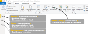
Beziehungen zwischen Datentabellen werden durch die Software entweder aufgrund von automatischer Erkennung gleicher Attribute über mehrere Tabellen hinweg oder durch das Laden von Metadaten erkannt. Aufgrund des recht komplexen und weit verzweigten Datasets schien dieses Feature im ersten Moment von Vorteil zu sein, erst in späteren Visualisierungsschritten stellte sich heraus, dass einige Verbindungen nicht aus den Metadaten geladen wurden, da eine falsch gesetzte Beziehung durch eine automatische Erkennung gesetzt wurde und so die durch die Metadaten determinierte Beziehung nicht übernommen werden konnte. Lange Rede kurzer Sinn: Diese Automatisierung ist arbeitserleichternd und nützlich, insbesondere für Einsteiger, aber das manuelle Setzen von Beziehungen kann wenig auffällige Fehler vermeiden und fördert zugleich das eigene Verständnis für die Datengrundlage. Microsoft bietet seinen Nutzer an, diese Features zu deaktivieren. Das manuelle Setzen der Beziehungen ist über das Userinterface (UI) im Register „Beziehungen“ einfach umzusetzen. Besonders positiv ist die Verwirklichung dieses Registers, da der Nutzer ein einfach zu bedienendes Tool zur Strukturierung der Daten erhält. Ein Entity-Relationship-Modell (ERM) zeigt das Resultat der Verknüpfung und zugleich das Datenmodel gemäß dem Konzept eines Sternenschemas.

Daten transformieren

Eines der wesentlichen Instrumente zur Transformierung von Daten ist Power Query. Diese Software ist ebenfalls ein etablierter Bestandteil von Excel und verfügt über ein gelungenes UI, welches die Sprache M generiert. Ca. 95% der gewünschten Daten Transformationen können über das UI durchgeführt werden und so ist es in den meisten Fällen nicht notwendig, M schreiben zu müssen. Durch das UI ermöglicht Power Query, wesentliche Aufgaben wie das Bereinigen, Pivotieren und Zusammenführen von Daten umzusetzen. Aber es ist von Vorteil, wenn man sich zumindest mit der Syntax auskennt und die Sprache in groben Zügen versteht. Die Sprache M wie auch das UI, welches unter anderem die einzelnen Bearbeitungs-/Berechnungsschritte aufzeigt, ist Workflow-orientiert. Das UI ist gut strukturiert, und Nutzer finden schnellen Zugang zur Funktionsweise. Ein sehr gut umgesetztes Beispiel ist die Funktion „Spalten aus Beispielen“. In nur wenigen Schritten konnten der Längen- und Breitengrad aus einer zusammengefassten Spalte getrennt werden. Den erzeugten M-Code und den beschriebenen Workflow seht ihr in der folgenden Grafik.

Das Feature zur Zusammenführung von Tabellen ist jedoch problematisch, da das UI von Power Query dem Nutzer keine vorprogrammierten Visualisierungen o.ä. an die Hand gibt, um die Resultate überprüfen zu können. Wie bei dem Beispiel Dataset von Microsoft, welches mit über 70 Tabellen eine relativ komplexe Struktur aufweist, können bei unzureichender Kenntnis über die Struktur der Datenbasis Fehler entstehen. Eine mögliche Folge können die ungewollte Vervielfachung von Zeilen (Kardinalität ist „viele zu viele“) oder gar das Fehlen von Informationen sein (nur eine Teilmenge ist in die Verknüpfung eingeschlossen). Zur Überprüfung der JOIN Ergebnisse können die drei genannten Register (siehe obige Grafik) dienen, aber ein Nutzer muss sich selbst ein eigenes Vorgehen zur Überwachung der korrekten Zusammenführung überlegen.

Nachdem die Bearbeitung der Daten in Power Query abgeschlossen ist und diese in Power BI geladen werden, besteht weiterhin die Möglichkeit, die Daten unter Nutzung von DAX zu transformieren. Insbesondere Measures bedienen sich ausschließlich dieser Sprache und ein gutes Auto-Fill-Feature mit zusätzlicher Funktionsbeschreibung erleichtert das Schreiben in DAX. Dynamische Aggregationen und etliche weitere Kalkulationen sind denkbar. Nachfolgend findet ihr einige wenige Beispiele, welche auch im AdventureWorks Dashboard Anwendung finden:

Measures können komplexe Formen annehmen und Power BI bietet eine sehr gute Möglichkeit gebräuchliche Berechnungen über sogenannte Quickmeasures (QM) vorzunehmen. Ähnlich wie für die Sprache M gibt es ein UI zur Erstellung dieser, ohne eine Zeile Code schreiben zu müssen. Die Auswahl an QM ist groß und die Anwendungsfälle für die einzelnen QM sind vielfältig. Als Beispiel könnt ihr euch das Measure „Kunden nach Year/KPI/Category“ im bereitgestellten AdventureWorks Dashboard anschauen, welches leicht abgewandelt auf Grundlage des QM „Verkettete Werteliste“ erstellt wurde. Dieses Measure wurde als dynamischer Titel in das Balkendiagramm eingebunden und wie das funktioniert seht ihr hier.
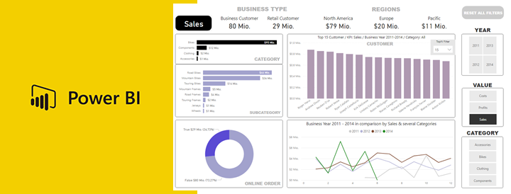
Daten visualisieren

Der letzte Schritt, die Visualisierung der Daten, ist nicht nur der wichtigste, sondern auch der sich am meisten unterscheidende Schritt im Vergleich der einzelnen BI-Tools. Ein wesentlicher Faktor dabei ist die Arbeitsabfolge in Bezug auf den Bau von Visualisierungen. Power BI ermöglicht dem Nutzer, einzelne Grafiken in einem UI zu gestalten und in dem selbigen nach Belieben anzuordnen. Bei Tableau und Looker zum Beispiel werden die einzelnen Grafiken in separaten UIs gestaltet und in einem weiteren UI als Dashboard zusammengesetzt. Eine Anordnung der Visualisierungen ist in Power BI somit sehr flexibel und ein Dashboard kann in wenigen Minuten erstellt werden. Verlieren kann man sich in den Details, fast jede visuelle Vorstellung kann erfüllt werden und in der Regel sind diese nur durch die eigene Zeit und das Know-How limitiert. Ebenfalls kann das Repertoire an Visualisierungen um sogenannte Custom Visualizations erweitert werden. Sofern man eine Pro Lizenz besitzt, ist das Herunterladen dieser Erweiterungen unter AppSource möglich.

Eine weitere Möglichkeit zur Anreicherung von Grafiken um Detailinformationen, besteht über das Feature Quickinfo. Sowohl eine schnell umsetzbare und somit wenig detaillierte Einbindung von Details ist möglich, aber auch eine aufwendigere Alternative ermöglicht die Umsetzung optisch ansprechender und sehr detaillierter Quickinfos.

Das Setzen von Filtern kann etliche Resultate und Erkenntnisse mit sich bringen. Dem Nutzer können beliebige Ansichten bzw. Filtereinstellungen in sogenannten Bookmarks gespeichert werden, sodass ein einziger Klick genügt. In dem AdventureWorks Dashboard wurde ein nützliches Bookmark verwendet, welches dem Zurücksetzen aller Filter dient.

Erstellt man Visualisierungen im immer gleichen Format, dann lohnt es sich ein eigenes Design in JSON-Format zu erstellen. Wenn man mit diesem Format nicht vertraut ist, kann man eine Designvorlage über das Tool Report Theme Generator V3 sehr einfach selbst erstellen.

Existiert ein Datenmodell und werden Daten aus verschiedenen Tabellen im selben Dashboard zusammengestellt (siehe auch Beispiel Dashboard AdventureWorks), dann werden entsprechende JOIN-Operationen im Hintergrund beim Zusammenstellen der Visualisierung erstellt. Ob das Datenmodell richtig aufgebaut wurde, ist oft erst in diesem Schritt erkennbar und wie bereits erwähnt, muss sich ein jeder Anwender ein eigenes Vorgehen überlegen, um mit Hilfe dieses Features die vorausgegangenen Schritte zu kontrollieren.

Warum braucht Power BI eine Python Integration?

Interessant ist dieses Feature in Bezug auf Machine Learning Algorithmen, welche direkt in Power BI integriert werden können. Python ist aber auch für einige Nutzer eine gern genutzte Alternative zu DAX und M, sofern man sich mit diesen Sprachen nicht auseinandersetzen möchte. Zwei weitere wesentliche Gründe für die Nutzung von Python sind Daten zu transformieren und zu visualisieren, unter Nutzung der allseits bekannten Plots. Zudem können weitere Quellen eingebunden werden. Ein Vorteil von Python ist dessen Repertoire an vielen nützlichen Bibliotheken wie pandas, matplotlib u.v.m.. Jedoch ist zu bedenken, dass die Python-Skripte zur Datenbereinigung und zur Abfrage der Datenquelle erst durch den Data Refresh in Power BI ausgeführt werden. In DAX geschriebene Measures bieten den Vorteil, dass diese mehrmals verwendet werden können. Ein Python-Skript hingegen muss kopiert und demnach auch mehrfach instandgehalten werden.

Es ist ratsam, Python in Power BI nur zu nutzen, wenn man an die Grenzen von DAX und M kommt.

Fazit

Das Lizenzmodel ist stark auf die Nutzung in der Cloud ausgerichtet und zudem ist die Funktionalität der Software, bei einer lokalen Verwendung (Power Bi Report Server) verglichen mit der cloud-basierten Variante, eingeschränkt. Das Lizenzmodell ist für den Power BI Neuling, welcher geringe Kapazitäten beansprucht einfach strukturiert und sehr transparent. Bereits kleine Firmen können so einen leichten Einstieg in Power BI finden, da auch kein Mindestumsatz gefordert ist.

Gut aufbereitete Daten können ohne großen Aufwand geladen werden und bis zum Aufbau erster Visualisierungen bedarf es nicht vieler Schritte, jedoch sind erste Resultate sehr kritisch zu hinterfragen. Die Kontrolle automatisch generierter Beziehungen und das Schreiben von zusätzlichen DAX Measures zur Verwendung in den Visualisierungen sind in den meisten Fällen notwendig, um eine korrekte Darstellung der Zahlen zu gewährleisten.

Die Transformation der Daten kann zum großen Teil über unterschiedliche UIs umgesetzt werden, jedoch ist das Schreiben von Code ab einem gewissen Punkt unumgänglich und wird auch nie komplett vermeidbar sein. Power BI bietet aber bereits ein gut durchdachtes Konzept.

Im Großen und Ganzen ist Power BI ein ausgereiftes und sehr gut handhabbares Produkt mit etlichen Features, ob von Microsoft selbst oder durch Drittanbieter angeboten. Eine große Community bietet ebenfalls Hilfestellung bei fast jedem Problem, wenn dieses nicht bereits erörtert wurde. Hervorzuheben ist der Kern des Produkts: die Visualisierungen. Einfach zu erstellende Visualisierungen jeglicher Art in einem ansprechenden Design grenzen dieses Produkt von anderen ab.

Fortsetzung: Tableau wurde als zweites Tool dieser Artikelserie näher beleuchtet.