Business Intelligence – 5 Tips for better Reporting & Visualization
Data and BI Analysts often concentrate on learning a BI Tool, but the main thing to do is learn how to create good data visualization!
BI reporting has become an indispensable part of any company. In Business Intelligence, companies sometimes have to choose between tools such as PowerBI, QlikSense, Tableau, MikroStrategy, Looker or DataStudio (and others). Even if each of these tools has its own strengths and weaknesses, good reporting depends less on the respective tool but much more on the analyst and his skills in structured and appropriate visualization and text design.
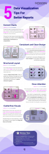
Based on our experience at DATANOMIQ and the book “Storytelling with data” (see footnote in the pdf), we have created an infographic that conveys five tips for better design of BI reports – with self-reflective clarification.
 Direct link to the PDF: https://data-science-blog.com/de/wp-content/uploads/sites/5/2021/12/Infographic_Data_Visualization_Infographic_DATANOMIQ.pdf
About DATANOMIQ
DATANOMIQ is a platform-independent consulting- and service-partner for Business Intelligence and Data Science. We are opening up multiple possibilities for the first time in all areas of the value chain through Big Data and Artificial Intelligence. We rely on the best minds and the most comprehensive method and technology portfolio for the use of data for business optimization.
Contact
DATANOMIQ GmbH
Franklinstr. 11
D-10587 Berlin
I: www.datanomiq.de
E: info@datanomiq.de