In terms of calculation processes of Principal Component Analysis (PCA) or Linear Discriminant Analysis (LDA), which are the dimension reduction techniques I am going to explain in the following articles, diagonalization is what they are all about. Throughout this article, I would like you to have richer insight into diagonalization in order to prepare for understanding those basic dimension reduction techniques.
When our professor started a lecture on the last chapter of our textbook on linear algebra, he said “It is no exaggeration to say that everything we have studied is for this ‘diagonalization.'” Until then we had to write tons of numerical matrices and vectors all over our notebooks, calculating those products, adding their rows or columns to other rows or columns, sometimes transposing the matrices, calculating their determinants.
It was like the scene in “The Karate Kid,” where the protagonist finally understood the profound meaning behind the prolonged and boring “wax on, wax off” training given by Miyagi (or “jacket on, jacket off” training given by Jackie Chan). We had finally understood why we had been doing those seemingly endless calculations.

Source: http://thinkbedoleadership.com/secret-success-wax-wax-off/
But usually you can do those calculations easily with functions in the Numpy library. Unlike Japanese college freshmen, I bet you are too busy to reopen textbooks on linear algebra to refresh your mathematics. Thus I am going to provide less mathematical and more intuitive explanation of diagonalization in this article.
1, The mainstream ways of explaining diagonalization.
*The statements below are very rough for mathematical topics, but I am going to give priority to offering more visual understanding on linear algebra in this article. For further understanding, please refer to textbooks on linear algebra. If you would like to have minimum understandings on linear algebra needed for machine learning, I recommend the Appendix C of Pattern Recognition and Machine Learning by C. M. Bishop.
In most textbooks on linear algebra, the explanations on dioagonalization is like this (if you are not sure what diagonalization is or if you are allergic to mathematics, you do not have to read this seriously):
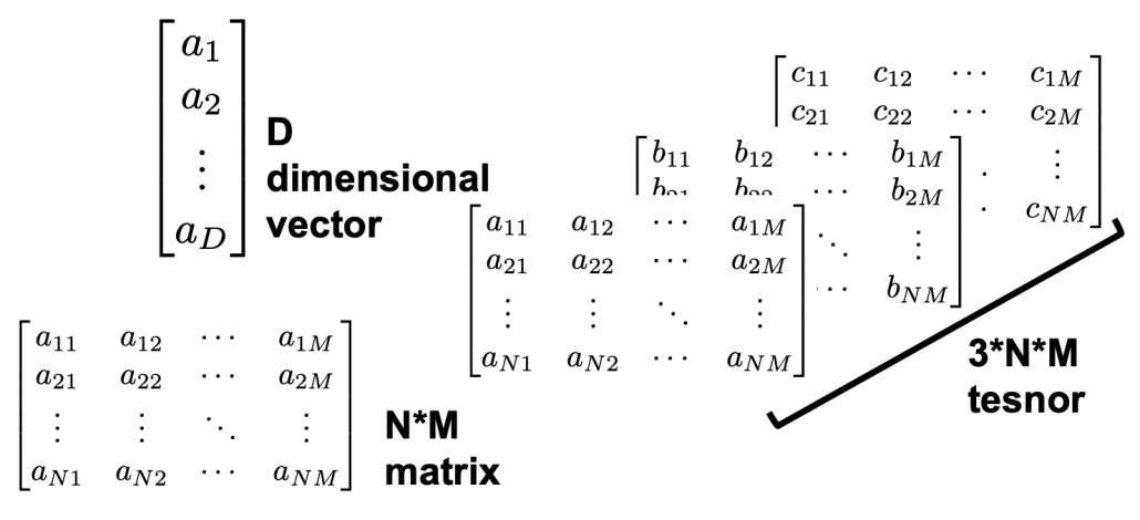
Let  be a vector space and let
  be a mapping of
  into itself, defined as
  , where
  is a
is a  matrix and
  is
is  dimensional vector. An element
  is called an eigen vector if there exists a number
  such that
  and
and  . In this case is uniquely determined and is called an eigen value of belonging to the eigen vector .
Any matrix has eigen values  , belonging to
  . If
. If  is basis of the vector space , then is diagonalizable.
When is diagonalizable, with  matrices
  , whose column vectors are eigen vectors , the following equation holds:
  , where
  .
.
And when is diagonalizable, you can diagonalize as below.
 Most textbooks keep explaining these type of stuff, but I have to say they lack efforts to make it understandable to readers with low mathematical literacy like me. Especially if you have to apply the idea to data science field, I believe you need more visual understanding of diagonalization. Therefore instead of just explaining the definitions and theorems, I would like to take a different approach. But in order to understand them in more intuitive ways, we first have to rethink waht linear transformation
  means in more visible ways.
2, Linear transformations
Even though I did my best to make this article understandable to as little prerequisite knowledge, you at least have to understand linear transformation of numerical vectors and with matrices. Linear transformation is nothing difficult, and in this article I am going to use only 2 or 3 dimensional numerical vectors or square matrices. You can calculate linear transformation of by A as equations in the figure. In other words,  is a vector transformed by .
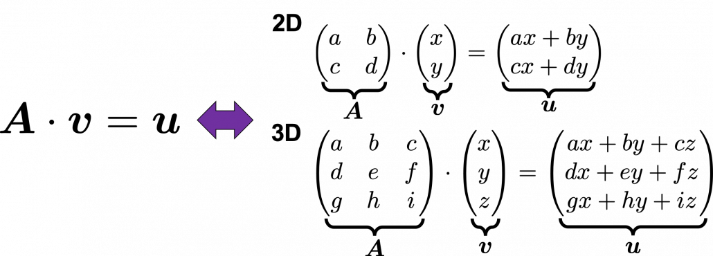 *I am not going to use the term “linear transformation” in a precise way in the context of linear algebra. In this article or in the context of data science or machine learning, “linear transformation” for the most part means products of matrices or vectors.
*Forward/back propagation of deep learning is mainly composed of this linear transformation. You keep linearly transforming input vectors, frequently transforming them with activation functions, which are for the most part not linear transformation.
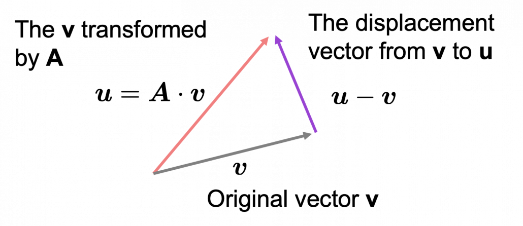
As you can see in the equations above, linear transformation with A transforms a vector to another vector. Assume that you have an original vector in grey and that the vector in pink is the transformed by A is. If you subtract from , you can get a displacement vector, which I displayed in purple. A displacement vector means the transition from a vector to another vector.
 Let’s calculate the displacement vector with more vectors . Assume that
  , and I prepared several grid vectors in grey as you can see in the figure below. If you transform those grey grid points with , they are mapped into the vectors in pink. With those vectors in grey or pink, you can calculate the their displacement vectors
  in purple.
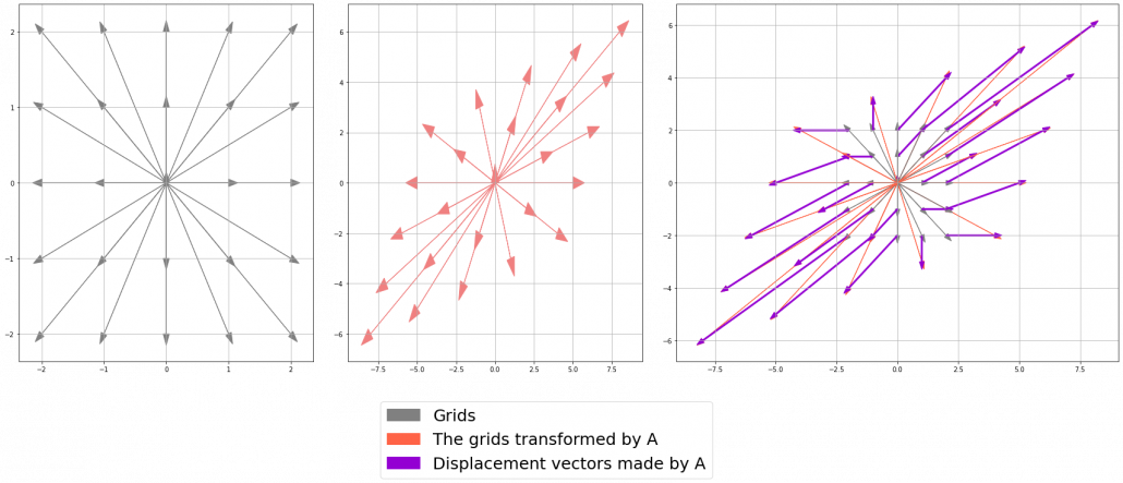
I think you noticed that the displacement vectors in the figure above have some tendencies. In order to see that more clearly, let’s calculate displacement vectors with several matrices and more grid points. Assume that you have three  square matrices
  , and I plotted displace vectors made by the matrices respectively in the figure below.
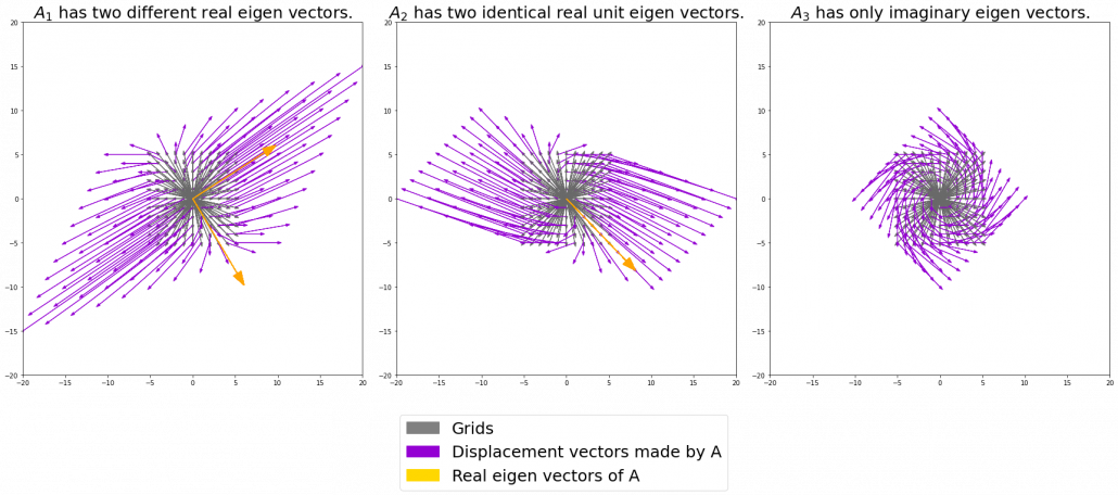
I think you noticed some characteristics of the displacement vectors made by those linear transformations: the vectors are swirling and many of them seem to be oriented in certain directions. To be exact, some displacement vectors have extend in the same directions as some of original vectors in grey. That means linear transformation by did not change the direction of the original vector , and the unchanged vectors are called eigen vectors. Real eigen vectors of each A are displayed as arrows in yellow in the figure above. But when it comes to  , the matrix does not have any real eigan values.
In linear algebra, depending on the type matrices , you have consider various cases such as whether the matrices have real or imaginary eigen values, whether the matrices are diagonalizable, whether the eigen vectors are orthogonal, or whether they are unit vectors. But those topics are out of the scope of this article series, so please refer to textbooks on linear algebra if you are interested.
Luckily, however, in terms of PCA or LDA, you only have to consider a type of matrices named positive semidefinite matrices, which  is classified to, and I am going to explain positive semidefinite matrices in the fourth section.
3, Eigen vectors as coordinate system
Source: Ian Stewart, “Professor Stewart’s Cabinet of Mathematical Curiosities,” (2008), Basic Books
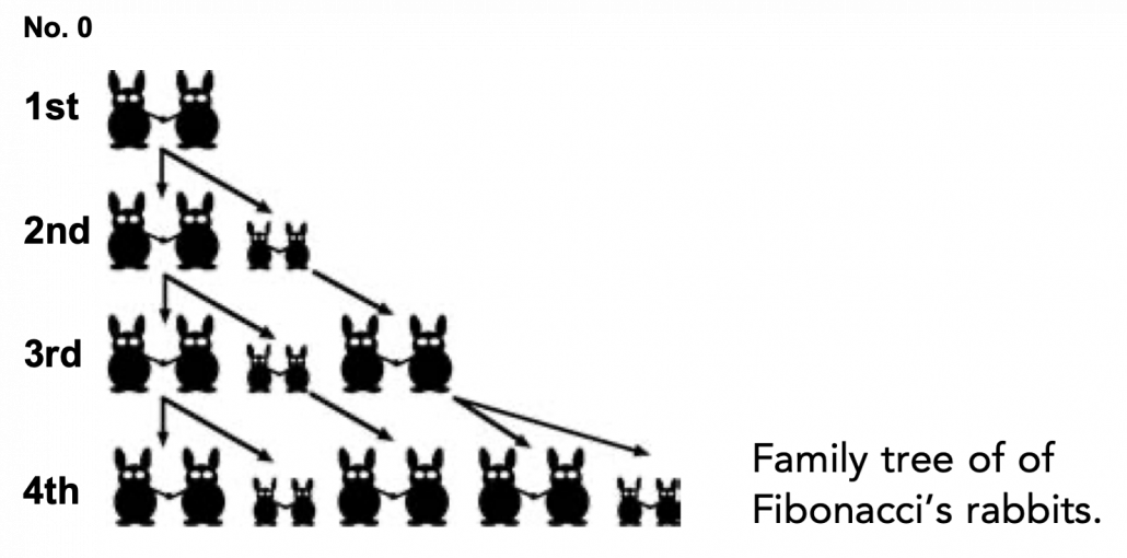
Let me take Fibonacci numbers as an example to briefly see why diagonalization is useful. Fibonacci is sequence is quite simple and it is often explained using an example of pairs of rabbits increasing generation by generation. Let  be the number of pairs of grown up rabbits in the
  generation. One pair of grown up rabbits produce one pair of young rabbit The concrete values of
  are
are  ,
,  ,
,  ,
,  ,
,  ,
,  ,
,  ,
,  . Assume that
  and that
  , then you can calculate the number of the pairs of grown up rabbits in the next generation with the following recurrence relation.
  .Let
.Let  be
be  , then the recurrence relation can be written as
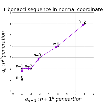
  , and the transition of are like purple arrows in the figure below. It seems that the changes of the purple arrows are irregular if you look at the plots in normal coordinate.
Assume that  are eigen values of , and
  are eigen vectors belonging to them respectively. Also let
  scalars such that
  . According to the definition of eigen values and eigen vectors belonging to them, the following two equations hold:
  . If you calculate
  is, using eigen vectors of ,
  . In the same way,
  , and
, and  . These equations show that in coordinate system made by eigen vectors of , linear transformation by is easily done by just multiplying eigen values with each eigen vector. Compared to the graph of Fibonacci numbers above, in the figure below you can see that in coordinate system made by eigen vectors the plots changes more systematically generation by generation.
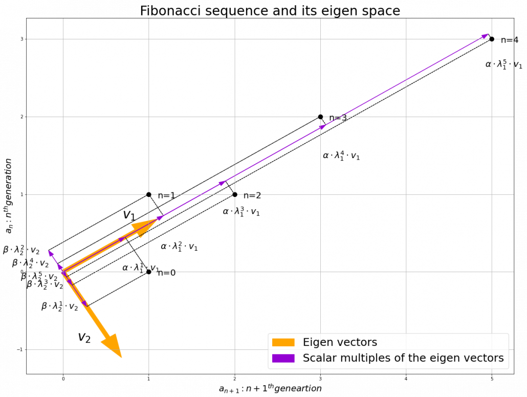
In coordinate system made by eigen vectors of square matrices, the linear transformations by the matrices can be much more straightforward, and this is one powerful strength of eigen vectors.
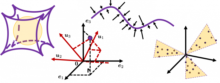
*I do not major in mathematics, so I am not 100% sure, but vectors in linear algebra have more abstract meanings and various things in mathematics can be vectors, even though in machine learning or data science we mainly use numerical vectors with more concrete elements. We can also say that matrices are a kind of maps. That is just like, at leas in my impression, even though a real town is composed of various components such as houses, smooth or bumpy roads, you can simplify its structure with simple orthogonal lines, like the map of Manhattan. But if you know what the town actually looks like, you do not have to follow the zigzag path on the map.
4, Eigen vectors of positive semidefinite matrices
In the second section of this article I told you that, even though you have to consider various elements when you discuss general diagonalization, in terms of PCA and LDA we mainly use only a type of matrices named positive semidefinite matrices. Let be a square matrix. If  for all values of the vector
  , the is said to be a positive semidefinite matrix. And also it is known that being a semidefinite matrix is equivalent to
  for all the eigen values
  .
.
*I think most people first learn a type of matrices called positive definite matrices. Let be a square matrix. If  for all values of the vector , the is said to be a positive definite matrix. You have to keep it in mind that even if all the elements of are positive, is not necessarly positive definite/semidefinite.
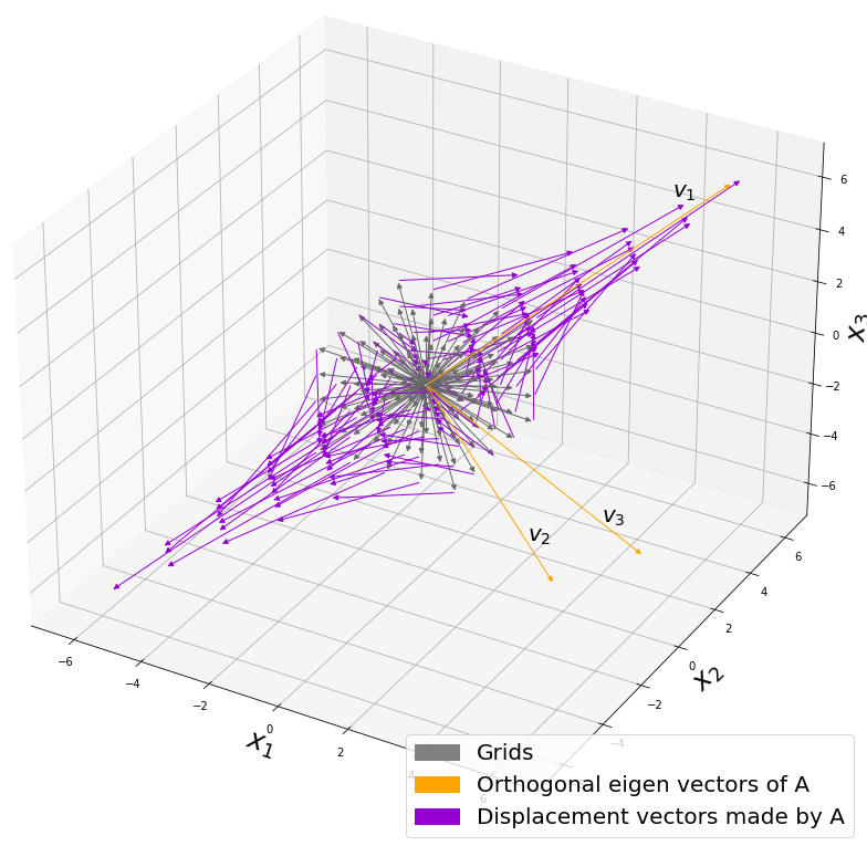
Just as we did in the second section of this article, let’s visualize displacement vectors made by linear transformation with a  square positive semidefinite matrix .
*In fact  , whose linear transformation I visualized the second section, is also positive semidefinite.
Let’s visualize linear transformations by a positive definite matrix  . I visualized the displacement vectors made by the just as the same way as in the second section of this article. The result is as below, and you can see that, as well as the displacement vectors made by , the three dimensional displacement vectors below are swirling and extending in three directions, in the directions of the three orthogonal eigen vectors , and
  .
.
*It might seem like a weird choice of a matrix, but you are going to see why in the next article.
You might have already noticed and are both symmetric matrices and that their elements are all real values, and that their diagonal elements are all positive values. Super importantly, when all the elements of a symmetric matrix are real values and its eigen values are  , there exist orthonormal matrices
  such that
  , where
  .
.
*The title of this section might be misleading, but please keep it in mind that positive definite/semidefinite matrices are not necessarily real symmetric matrices. And real symmetric vectors are not necessarily positive definite/semidefinite matrices.
5, Orthonormal matrices and rotation of vectors
In this section I am gong to explain orthonormal matrices, as known as rotation matrices. If a matrix is an orthonormal matrix, column vectors of are orthonormal, which means  , where
  . In other words column vectors
  form an orthonormal coordinate system.
Orthonormal matrices have several important matrices, and one of them is  . Combining this fact with what I have told you so far, you we can reach one conclusion that you can orthogonalize a real symmetric matrix as
  . This is known as spectral decomposition or singular value decomposition.
Another important property of is that  is also orthonormal. In other words, assume is orthonormal and that
  ,
,  also forms a orthonormal coordinate system.
…It seems things are getting too mathematical and abstract (for me), thus for now I am going to wrap up what I have explained in this article .
We have seen
- Numerical matrices linearly transform vectors.
- Certain linear transformations do not change the direction of vectors in certain directions, which are called eigen vectors.
- Making use of eigen vectors, you can form new coordinate system which can describe the linear transformations in a more straightforward way.
- You can diagonalize a real symmetric matrix with an orthonormal matrix .
Of our current interest is what kind of linear transformation the real symmetric positive definite matrix enables. I am going to explain why the purple vectors in the figure above is swirling like that in the upcoming articles. Before that, however, we are going to see one application of what we have seen in this article, on dimension reduction. To be concrete the next article is going to be about principal component analysis (PCA), which is very important in many fields.
*In short, the orthonormal matrix I mentioned above enables rotation of matrix, and the diagonal matrix  expands or contracts vectors along each axis. I am going to explain that more precisely in the upcoming articles.
* I make study materials on machine learning, sponsored by DATANOMIQ. I do my best to make my content as straightforward but as precise as possible. I include all of my reference sources. If you notice any mistakes in my materials, including grammatical errors, please let me know (email: yasuto.tamura@datanomiq.de). And if you have any advice for making my materials more understandable to learners, I would appreciate hearing it.
*I attatched the codes I used to make the figures in this article. You can just copy, paste, and run, sometimes installing necessary libraries.
import matplotlib.pyplot as plt
import numpy as np
import matplotlib.patches as mpatches
T_A = np.array([[1, 1],
[1, 0]])
total_step = 5
x = np.zeros((total_step, 2))
x[0] = np.array([1, 0])
for i in range(total_step - 1):
x[i + 1] = np.dot(T_A, x[i])
eigen_values, eigen_vectors = np.linalg.eig(T_A)
idx = eigen_values.argsort()[::-1]
eigen_values = eigen_values[idx]
eigen_vectors = eigen_vectors[:,idx]
for i in range(len(eigen_vectors)):
if(eigen_vectors.T[i][0] < 0):
eigen_vectors.T[i] = - eigen_vectors.T[i]
v_initial = x[0]
v_coefficients = np.zeros((total_step , 2))
v_coefficients[0] = np.dot(v_initial , np.linalg.inv(eigen_vectors.T))
for i in range(total_step-1):
v_coefficients[i + 1] = v_coefficients[i] * eigen_values
for i in range(total_step):
v_1_list[i+1] = v_coefficients.T[0][i]*eigen_vectors.T[0]
v_2_list[i+1] = v_coefficients.T[1][i]*eigen_vectors.T[1]
plt.figure(figsize=(20, 15))
fontsize = 20
small_shift = 0.2
plt.plot(x[:, 0], x[:, 1], marker='o', linestyle='none', markersize=10, color='black')
plt.arrow(0, 0, eigen_vectors.T[0][0], eigen_vectors.T[0][1], width=0.05, head_width=0.2, color='orange')
plt.arrow(0, 0, eigen_vectors.T[1][0], eigen_vectors.T[1][1], width=0.05, head_width=0.2, color='orange')
plt.text(eigen_vectors.T[0][0], eigen_vectors.T[0][1]+small_shift, r' ', va='center',ha='right', fontsize=fontsize + 10)
plt.text(eigen_vectors.T[1][0] - small_shift, eigen_vectors.T[1][1],r'
', va='center',ha='right', fontsize=fontsize + 10)
plt.text(eigen_vectors.T[1][0] - small_shift, eigen_vectors.T[1][1],r' ', va='center',ha='right', fontsize=fontsize + 10)
for i in range(total_step):
plt.arrow(0, 0, v_1_list[i+1][0], v_1_list[i+1][1], head_width=0.05, color='darkviolet', length_includes_head=True)
plt.arrow(0, 0, v_2_list[i+1][0], v_2_list[i+1][1], head_width=0.05, color='darkviolet', length_includes_head=True)
plt.text(v_1_list[i+1][0] + 2*small_shift , v_1_list[i+1][1]-2*small_shift,r'
', va='center',ha='right', fontsize=fontsize + 10)
for i in range(total_step):
plt.arrow(0, 0, v_1_list[i+1][0], v_1_list[i+1][1], head_width=0.05, color='darkviolet', length_includes_head=True)
plt.arrow(0, 0, v_2_list[i+1][0], v_2_list[i+1][1], head_width=0.05, color='darkviolet', length_includes_head=True)
plt.text(v_1_list[i+1][0] + 2*small_shift , v_1_list[i+1][1]-2*small_shift,r' '.format(1,i+1, 1),va='center',ha='right', fontsize=fontsize)
plt.text(v_2_list[i+1][0]-0.1, v_2_list[i+1][1],r'
'.format(1,i+1, 1),va='center',ha='right', fontsize=fontsize)
plt.text(v_2_list[i+1][0]-0.1, v_2_list[i+1][1],r' '.format(2, i+1, 2),va='center',ha='right', fontsize=fontsize)
plt.arrow(v_1_list[i+1][0], v_1_list[i+1][1], v_2_list[i+1][0], v_2_list[i+1][1], head_width=0, color='black', linestyle='--', length_includes_head=True)
plt.arrow(v_2_list[i+1][0], v_2_list[i+1][1], v_1_list[i+1][0], v_1_list[i+1][1], head_width=0, color='black', linestyle='--', length_includes_head=True)
orange_patch = mpatches.Patch(color='orange', label='Eigen vectors')
purple_patch = mpatches.Patch(color='darkviolet', label='Scalar multiples of the eigen vectors')
plt.legend(handles=[orange_patch, purple_patch], fontsize=25, loc='lower right')
for i in range(total_step):
plt.text(x[i][0]+0.1, x[i][1]-0.05, r'n={0}'.format(i), fontsize=20)
plt.grid(True)
plt.ylabel("
'.format(2, i+1, 2),va='center',ha='right', fontsize=fontsize)
plt.arrow(v_1_list[i+1][0], v_1_list[i+1][1], v_2_list[i+1][0], v_2_list[i+1][1], head_width=0, color='black', linestyle='--', length_includes_head=True)
plt.arrow(v_2_list[i+1][0], v_2_list[i+1][1], v_1_list[i+1][0], v_1_list[i+1][1], head_width=0, color='black', linestyle='--', length_includes_head=True)
orange_patch = mpatches.Patch(color='orange', label='Eigen vectors')
purple_patch = mpatches.Patch(color='darkviolet', label='Scalar multiples of the eigen vectors')
plt.legend(handles=[orange_patch, purple_patch], fontsize=25, loc='lower right')
for i in range(total_step):
plt.text(x[i][0]+0.1, x[i][1]-0.05, r'n={0}'.format(i), fontsize=20)
plt.grid(True)
plt.ylabel(" ", fontsize=20)
plt.xlabel("
", fontsize=20)
plt.xlabel(" ", fontsize=20)
plt.title("Fibonacci sequence and its eigen space", fontsize=30)
#plt.savefig("Fibonacci_eigen_space.png")
plt.show()
", fontsize=20)
plt.title("Fibonacci sequence and its eigen space", fontsize=30)
#plt.savefig("Fibonacci_eigen_space.png")
plt.show()
import matplotlib.pyplot as plt
import numpy as np
import matplotlib.patches as mpatches

const_range = 10

X = np.arange(-const_range, const_range + 1, 1)
Y = np.arange(-const_range, const_range + 1, 1)
U_x, U_y = np.meshgrid(X, Y)

T_A_0 = np.array([[3, 1],
                [1, 2]])

T_A_1 = np.array([[3, 1],
                [-1, 1]])

T_A_2 = np.array([[1, -1],
                [1, 1]])

T_A_list = np.array((T_A_0, T_A_1, T_A_2))

const_range = 5
plt.figure(figsize=(30, 10))
plt.subplots_adjust(wspace=0.1)
labels = ["Grids", "Displacement vectors made by A", "Real eigen vectors of A"]
title_list = [r" has two different real eigen vectors.", r" has two identical real unit eigen vectors.",  r" has only imaginary eigen vectors."]
for idx in range(len(T_A_list)):

    eigen_values, eigen_vectors = np.linalg.eig(T_A_list[idx])
    sorted_idx = eigen_values.argsort()[::-1]
    eigen_values = eigen_values[sorted_idx]
    eigen_vectors = eigen_vectors[:,sorted_idx]
    eigen_vectors = eigen_vectors.astype(float)

    for i in range(len(eigen_vectors)):
        if(eigen_vectors.T[i][0] < 0):
            eigen_vectors.T[i] = - eigen_vectors.T[i]


    X = np.arange(-const_range, const_range + 1, 1)
    Y = np.arange(-const_range, const_range + 1, 1)
    U_x, U_y = np.meshgrid(X, Y)

    V_x = np.zeros((len(U_x), len(U_y)))
    V_y = np.zeros((len(U_x), len(U_y)))

    temp_vec = np.zeros((1, 2))

    W_x = np.zeros((len(U_x), len(U_y)))
    W_y = np.zeros((len(U_x), len(U_y)))

    plt.subplot(1, 3, idx + 1)


    for i in range(len(U_x)):
        for j in range(len(U_y)):
            temp_vec[0][0] = U_x[i][j]
            temp_vec[0][1] = U_y[i][j]

            temp_vec[0] = np.dot(T_A_list[idx], temp_vec[0])

            V_x[i][j] = temp_vec[0][0]
            V_y[i][j] = temp_vec[0][1]

            W_x[i][j] = V_x[i][j] - U_x[i][j]
            W_y[i][j] = V_y[i][j] - U_y[i][j]
            #plt.arrow(0, 0, V_x[i][j], V_y[i][j], head_width=0.1, color='red')
            plt.arrow(0, 0, U_x[i][j], U_y[i][j], head_width=0.3, color='dimgrey', label=labels[0])
            plt.arrow(U_x[i][j], U_y[i][j], W_x[i][j], W_y[i][j], head_width=0.3, color='darkviolet', label=labels[1])

            range_const = 20
            plt.xlim([-range_const, range_const])
            plt.ylim([-range_const, range_const])
            plt.title(title_list[idx], fontsize=25)

            if idx==2:
                continue

            plt.arrow(0, 0, eigen_vectors.T[0][0]*10, eigen_vectors.T[0][1]*10, head_width=1, color='orange', label=labels[2])
            plt.arrow(0, 0, eigen_vectors.T[1][0]*10, eigen_vectors.T[1][1]*10, head_width=1, color='orange', label=labels[2])

grey_patch = mpatches.Patch(color='grey', label='Grids')
purple_patch = mpatches.Patch(color='darkviolet', label='Displacement vectors made by A')
yellow_patch = mpatches.Patch(color='gold', label='Real eigen vectors of A')
plt.legend(handles=[grey_patch, purple_patch, yellow_patch], fontsize=25, loc='lower right', bbox_to_anchor=(-0.1, -.35))
#plt.savefig("linear_transformation.png")
plt.show()
has two identical real unit eigen vectors.", r" has only imaginary eigen vectors."]
for idx in range(len(T_A_list)):
eigen_values, eigen_vectors = np.linalg.eig(T_A_list[idx])
sorted_idx = eigen_values.argsort()[::-1]
eigen_values = eigen_values[sorted_idx]
eigen_vectors = eigen_vectors[:,sorted_idx]
eigen_vectors = eigen_vectors.astype(float)
for i in range(len(eigen_vectors)):
if(eigen_vectors.T[i][0] < 0):
eigen_vectors.T[i] = - eigen_vectors.T[i]
X = np.arange(-const_range, const_range + 1, 1)
Y = np.arange(-const_range, const_range + 1, 1)
U_x, U_y = np.meshgrid(X, Y)
V_x = np.zeros((len(U_x), len(U_y)))
V_y = np.zeros((len(U_x), len(U_y)))
temp_vec = np.zeros((1, 2))
W_x = np.zeros((len(U_x), len(U_y)))
W_y = np.zeros((len(U_x), len(U_y)))
plt.subplot(1, 3, idx + 1)
for i in range(len(U_x)):
for j in range(len(U_y)):
temp_vec[0][0] = U_x[i][j]
temp_vec[0][1] = U_y[i][j]
temp_vec[0] = np.dot(T_A_list[idx], temp_vec[0])
V_x[i][j] = temp_vec[0][0]
V_y[i][j] = temp_vec[0][1]
W_x[i][j] = V_x[i][j] - U_x[i][j]
W_y[i][j] = V_y[i][j] - U_y[i][j]
#plt.arrow(0, 0, V_x[i][j], V_y[i][j], head_width=0.1, color='red')
plt.arrow(0, 0, U_x[i][j], U_y[i][j], head_width=0.3, color='dimgrey', label=labels[0])
plt.arrow(U_x[i][j], U_y[i][j], W_x[i][j], W_y[i][j], head_width=0.3, color='darkviolet', label=labels[1])
range_const = 20
plt.xlim([-range_const, range_const])
plt.ylim([-range_const, range_const])
plt.title(title_list[idx], fontsize=25)
if idx==2:
continue
plt.arrow(0, 0, eigen_vectors.T[0][0]*10, eigen_vectors.T[0][1]*10, head_width=1, color='orange', label=labels[2])
plt.arrow(0, 0, eigen_vectors.T[1][0]*10, eigen_vectors.T[1][1]*10, head_width=1, color='orange', label=labels[2])
grey_patch = mpatches.Patch(color='grey', label='Grids')
purple_patch = mpatches.Patch(color='darkviolet', label='Displacement vectors made by A')
yellow_patch = mpatches.Patch(color='gold', label='Real eigen vectors of A')
plt.legend(handles=[grey_patch, purple_patch, yellow_patch], fontsize=25, loc='lower right', bbox_to_anchor=(-0.1, -.35))
#plt.savefig("linear_transformation.png")
plt.show()
import numpy as np
import matplotlib.pyplot as plt
from mpl_toolkits.mplot3d.proj3d import proj_transform
from mpl_toolkits.mplot3d.axes3d import Axes3D
from matplotlib.text import Annotation
from matplotlib.patches import FancyArrowPatch
import matplotlib.patches as mpatches
class Annotation3D(Annotation):
def __init__(self, text, xyz, *args, **kwargs):
super().__init__(text, xy=(0,0), *args, **kwargs)
self._xyz = xyz
def draw(self, renderer):
x2, y2, z2 = proj_transform(*self._xyz, renderer.M)
self.xy=(x2,y2)
super().draw(renderer)
def _annotate3D(ax,text, xyz, *args, **kwargs):
'''Add anotation `text` to an `Axes3d` instance.'''
annotation= Annotation3D(text, xyz, *args, **kwargs)
ax.add_artist(annotation)
setattr(Axes3D,'annotate3D',_annotate3D)
class Arrow3D(FancyArrowPatch):
def __init__(self, x, y, z, dx, dy, dz, *args, **kwargs):
super().__init__((0,0), (0,0), *args, **kwargs)
self._xyz = (x,y,z)
self._dxdydz = (dx,dy,dz)
def draw(self, renderer):
x1,y1,z1 = self._xyz
dx,dy,dz = self._dxdydz
x2,y2,z2 = (x1+dx,y1+dy,z1+dz)
xs, ys, zs = proj_transform((x1,x2),(y1,y2),(z1,z2), renderer.M)
self.set_positions((xs[0],ys[0]),(xs[1],ys[1]))
super().draw(renderer)
def _arrow3D(ax, x, y, z, dx, dy, dz, *args, **kwargs):
'''Add an 3d arrow to an `Axes3D` instance.'''
arrow = Arrow3D(x, y, z, dx, dy, dz, *args, **kwargs)
ax.add_artist(arrow)
setattr(Axes3D,'arrow3D',_arrow3D)
T_A = np.array([[60.45, 33.63, 46.29],
[33.63, 68.49, 50.93],
[46.29, 50.93, 53.61]])
T_A = T_A/50
const_range = 2
X = np.arange(-const_range, const_range + 1, 1)
Y = np.arange(-const_range, const_range + 1, 1)
Z = np.arange(-const_range, const_range + 1, 1)
U_x, U_y, U_z = np.meshgrid(X, Y, Z)
V_x = np.zeros((len(U_x), len(U_y), len(U_z)))
V_y = np.zeros((len(U_x), len(U_y), len(U_z)))
V_z = np.zeros((len(U_x), len(U_y), len(U_z)))
temp_vec = np.zeros((1, 3))
W_x = np.zeros((len(U_x), len(U_y), len(U_z)))
W_y = np.zeros((len(U_x), len(U_y), len(U_z)))
W_z = np.zeros((len(U_x), len(U_y), len(U_z)))
eigen_values, eigen_vectors = np.linalg.eig(T_A)
sorted_idx = eigen_values.argsort()[::-1]
eigen_values = eigen_values[sorted_idx]
eigen_vectors = eigen_vectors[:,sorted_idx]
eigen_vectors = eigen_vectors.astype(float)
fig = plt.figure(figsize=(15, 15))
ax = fig.add_subplot(111, projection='3d')
grid_range = const_range + 5
ax.set_xlim(-grid_range, grid_range)
ax.set_ylim(-grid_range, grid_range)
ax.set_zlim(-grid_range, grid_range)
eigen_values, eigen_vectors = np.linalg.eig(T_A)
sorted_idx = eigen_values.argsort()[::-1]
eigen_values = eigen_values[sorted_idx]
eigen_vectors = eigen_vectors[:,sorted_idx]
eigen_vectors = eigen_vectors.astype(float)
for i in range(len(eigen_vectors)):
if(eigen_vectors.T[i][0] < 0):
eigen_vectors.T[i] = - eigen_vectors.T[i]
for i in range(len(U_x)):
for j in range(len(U_x)):
for k in range(len(U_x)):
temp_vec[0][0] = U_x[i][j][k]
temp_vec[0][1] = U_y[i][j][k]
temp_vec[0][2] = U_z[i][j][k]
temp_vec[0] = np.dot(T_A, temp_vec[0])
V_x[i][j][k] = temp_vec[0][0]
V_y[i][j][k] = temp_vec[0][1]
V_z[i][j][k] = temp_vec[0][2]
W_x[i][j][k] = V_x[i][j][k] - U_x[i][j][k]
W_y[i][j][k] = V_y[i][j][k] - U_y[i][j][k]
W_z[i][j][k] = V_z[i][j][k] - U_z[i][j][k]
ax.arrow3D(0, 0, 0,
U_x[i][j][k], U_y[i][j][k], U_z[i][j][k],
mutation_scale=10, arrowstyle="-|>", fc='dimgrey', ec='dimgrey')
#ax.arrow3D(0, 0, 0,
# V_x[i][j][k], V_y[i][j][k], V_z[i][j][k],
# mutation_scale=10, arrowstyle="-|>", fc='red', ec='red')
ax.arrow3D(U_x[i][j][k], U_y[i][j][k], U_z[i][j][k],
W_x[i][j][k], W_y[i][j][k], W_z[i][j][k],
mutation_scale=10, arrowstyle="-|>", fc='darkviolet', ec='darkviolet')
ax.arrow3D(0, 0, 0, eigen_vectors.T[0][0]*10, eigen_vectors.T[0][1]*10, eigen_vectors.T[0][2]*10,
mutation_scale=10, arrowstyle="-|>", fc='orange', ec='orange')
ax.arrow3D(0, 0, 0, eigen_vectors.T[1][0]*10, eigen_vectors.T[1][1]*10, eigen_vectors.T[1][2]*10,
mutation_scale=10, arrowstyle="-|>", fc='orange', ec='orange')
ax.arrow3D(0, 0, 0, eigen_vectors.T[2][0]*10, eigen_vectors.T[2][1]*10, eigen_vectors.T[2][2]*10,
mutation_scale=10, arrowstyle="-|>", fc='orange', ec='orange')
ax.text(eigen_vectors.T[0][0]*8 , eigen_vectors.T[0][1]*8, eigen_vectors.T[0][2]*8+1, r' ', fontsize=20)
ax.text(eigen_vectors.T[1][0]*8 , eigen_vectors.T[1][1]*8, eigen_vectors.T[1][2]*8, r'
', fontsize=20)
ax.text(eigen_vectors.T[1][0]*8 , eigen_vectors.T[1][1]*8, eigen_vectors.T[1][2]*8, r' ', fontsize=20)
ax.text(eigen_vectors.T[2][0]*8 , eigen_vectors.T[2][1]*8, eigen_vectors.T[2][2]*8, r'
', fontsize=20)
ax.text(eigen_vectors.T[2][0]*8 , eigen_vectors.T[2][1]*8, eigen_vectors.T[2][2]*8, r' ', fontsize=20)
grey_patch = mpatches.Patch(color='grey', label='Grids')
orange_patch = mpatches.Patch(color='orange', label='Orthogonal eigen vectors of A')
purple_patch = mpatches.Patch(color='darkviolet', label='Displacement vectors made by A')
plt.legend(handles=[grey_patch, orange_patch, purple_patch], fontsize=20, loc='lower right')
ax.set_xlabel(r'
', fontsize=20)
grey_patch = mpatches.Patch(color='grey', label='Grids')
orange_patch = mpatches.Patch(color='orange', label='Orthogonal eigen vectors of A')
purple_patch = mpatches.Patch(color='darkviolet', label='Displacement vectors made by A')
plt.legend(handles=[grey_patch, orange_patch, purple_patch], fontsize=20, loc='lower right')
ax.set_xlabel(r' ', fontsize=25)
ax.set_ylabel(r'
', fontsize=25)
ax.set_ylabel(r' ', fontsize=25)
ax.set_zlabel(r'
', fontsize=25)
ax.set_zlabel(r' ', fontsize=25)
#plt.savefig("symmetric_positive_definite_visualizaiton.png")
plt.show()
', fontsize=25)
#plt.savefig("symmetric_positive_definite_visualizaiton.png")
plt.show()

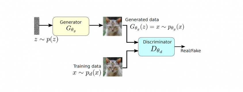
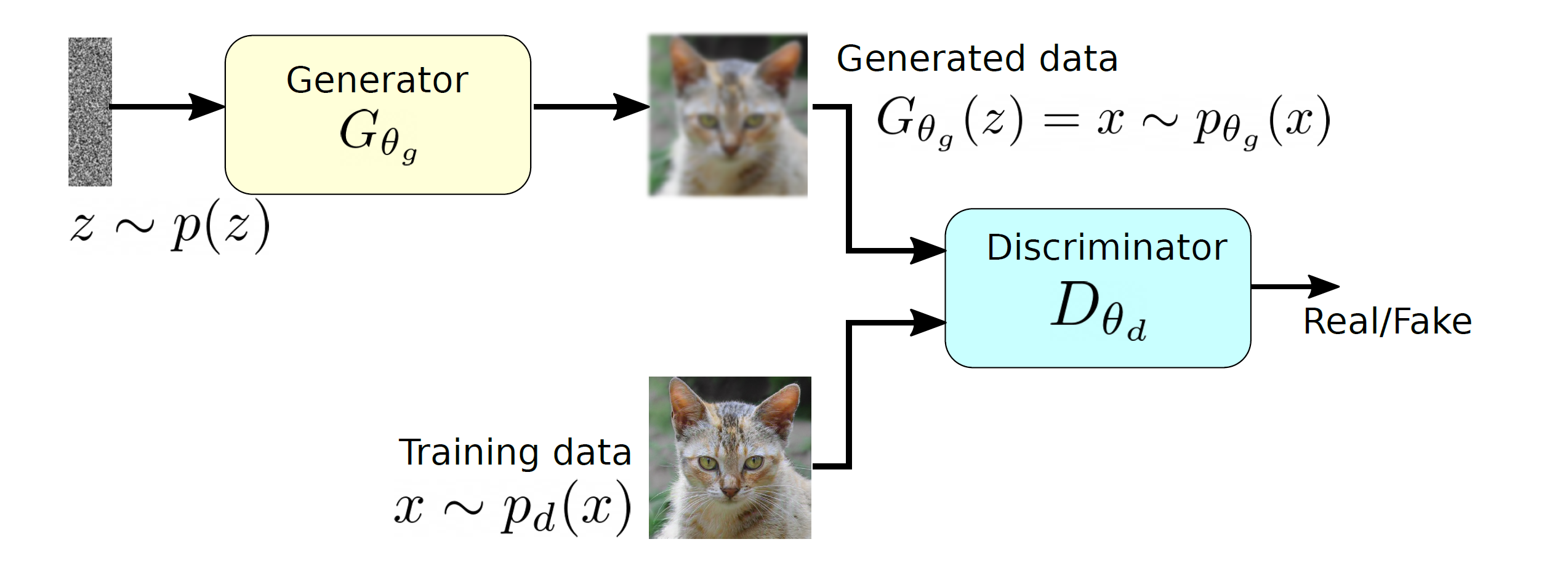
 and produces a sample that has a similar distribution as
  . To train this network efficiently, there is the other network that is utilized as the second player and known as the discriminator. The generator network (player one) tries to fool the discriminator by generating real looking images. Moreover, the discriminator network tries to distinguish between real (training data
  ) and fake images effectively. Our main aim is to have an efficiently trained discriminator to be able to distinguish between real and fake images (the generator’s output) and on the other hand, we would like to have a generator, which can easily fool the discriminator by generating real-looking images.
![\begin{equation*} \min_{p_{\theta_g}}\: \max_{D_{\theta_d}\in F} \: \mathbb{E}_{x\sim p_d}[D_{\theta_d}(x)] - \mathbb{E}_{x\sim p_{\theta_g}} [D_{\theta_d}(G_{\theta_g}(x))], \end{equation*}](https://data-science-blog.com/en/wp-content/ql-cache/quicklatex.com-7980edcee550a3814c1f817f58e1bfb3_l3.png "Rendered by QuickLaTeX.com")
 and
and  is a set of functions. The \textit{max} part is computing the discrepancies between two distribution using a function
  and this part is very similar to the term
  (discrepancy measure) from our
  . The above mentioned objective function does not use any likelihood function and utilizing two different data samples from training and generated data respectively.
![\mathbb{E}_{x\sim p_d}[D_{\theta_d}(x)]](https://data-science-blog.com/en/wp-content/ql-cache/quicklatex.com-1c4b4cb35296fdd7dc76bf9166842c48_l3.png "Rendered by QuickLaTeX.com") corresponds to the discriminator, which has direct access to the training data and the second term
corresponds to the discriminator, which has direct access to the training data and the second term ![\mathbb{E}_{x\sim p_{\theta_g}}[D_{\theta_d}(G_{\theta_g}(x))]](https://data-science-blog.com/en/wp-content/ql-cache/quicklatex.com-9271a567a190dfafd06b4f7d53f5ffa8_l3.png "Rendered by QuickLaTeX.com") represents the generator part as it relies only on the latent space and produces synthetic data. Therefore, Equation
represents the generator part as it relies only on the latent space and produces synthetic data. Therefore, Equation ![\begin{equation*} \min_{p_{\theta_g}}\: \max_{D_{\theta_d}\in F} \: \mathbb{E}_{x\sim p_d}[D_{\theta_d}(x)] - \mathbb{E}_{z\sim p_z}[D_{\theta_d}(G_{\theta_g}(z))], \end{equation*}](https://data-science-blog.com/en/wp-content/ql-cache/quicklatex.com-768b9dece98731bd7d56aaa85d15a3d9_l3.png "Rendered by QuickLaTeX.com")
![\begin{equation*} \min_{\theta_g}\: \max_{\theta_d} \: (\mathbb{E}_{x\sim p_d} [log \: D_{\theta_d} (x)] + \mathbb{E}_{z\sim p_z}[log(1 - D_{\theta_d}(G_{\theta_g}(z))]), \end{equation*}](https://data-science-blog.com/en/wp-content/ql-cache/quicklatex.com-bac04040928a64b0805eb863ec4e2864_l3.png "Rendered by QuickLaTeX.com")
 to
to  and
and  respectively as we would like to approximate the network parameters, which are represented by
  , which indicates that the outcome is close to the real data. Furthermore,
  should be close to zero as it is fake data, therefore, the maximization of the above objective function for
  . If the minimization of the objective function happens effectively for
  is a random input vector to the generator to produce a synthetic outcome
  (green curve). The generated data distribution is not close to the original data distribution
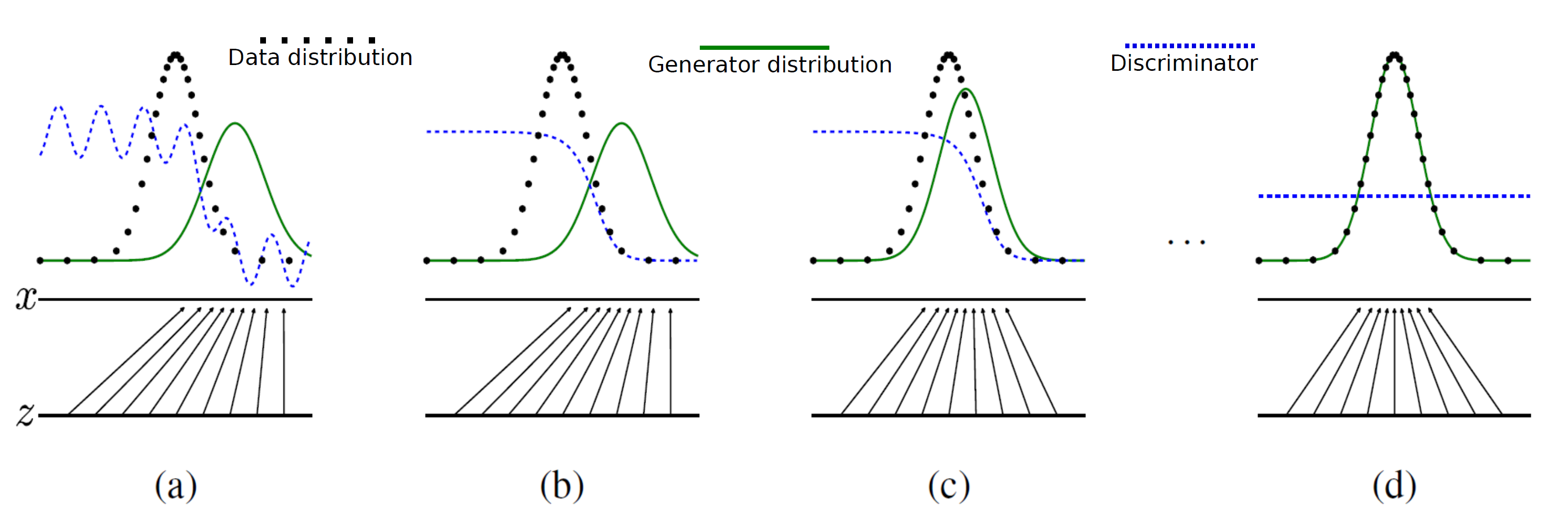
![\begin{equation*} \max_{\theta_d} \: (\mathbb{E}_{x\sim p_d} [log \: D_{\theta_d}(x)] + \mathbb{E}_{z\sim p_z}[log(1 - D_{\theta_d}(G_{\theta_g}(z))]) \end{equation*}](https://data-science-blog.com/en/wp-content/ql-cache/quicklatex.com-79cc0abf65c2730d44630b9e9078c251_l3.png "Rendered by QuickLaTeX.com")
![\begin{equation*} \min_{\theta_g} \: ( \mathbb{E}_{z\sim p_z}[log(1 - D_{\theta_d}(G_{\theta_g}(z))]) \end{equation*}](https://data-science-blog.com/en/wp-content/ql-cache/quicklatex.com-1a5f55cfe2aa160fc40a567edc93237d_l3.png "Rendered by QuickLaTeX.com")
 then the term
  has the dominant gradient and vice versa.
 , the generator is not well trained and producing low quality outputs therefore, it requires a dominant gradient for an efficient training. To fix this problem, the gradient ascent method is applied to maximize the modified generator’s objective:
![\begin{equation*} \max_{\theta_g} \: \mathbb{E}_{z\sim p_z}[log \: (D_{\theta_d}(G_{\theta_g}(z))] \end{equation*}](https://data-science-blog.com/en/wp-content/ql-cache/quicklatex.com-20421f265a98722e9835849d78d80269_l3.png "Rendered by QuickLaTeX.com")


 , where


 .
. .
. , where
  and
and  .
.  are eigenvectors corresponding to
  respectively.
 .
. are positive semidefinite and real symmetric, which means you can always diagonalize
  , based on
  , such that

 , where
  . Assume that you have got an orthonormal rotation matrix
  which diagonalizes
  which are in red in the figure below. Projecting a point
  on the new orthonormal basis is simple: you just have to multiply
  . Let
. Let  be
be  , and then
  . You can see
  are
are  respectively, and the left side of the figure below shows the idea. When you replace the orginal orthonormal basis
  with
with  to
to  by a rotation matrix
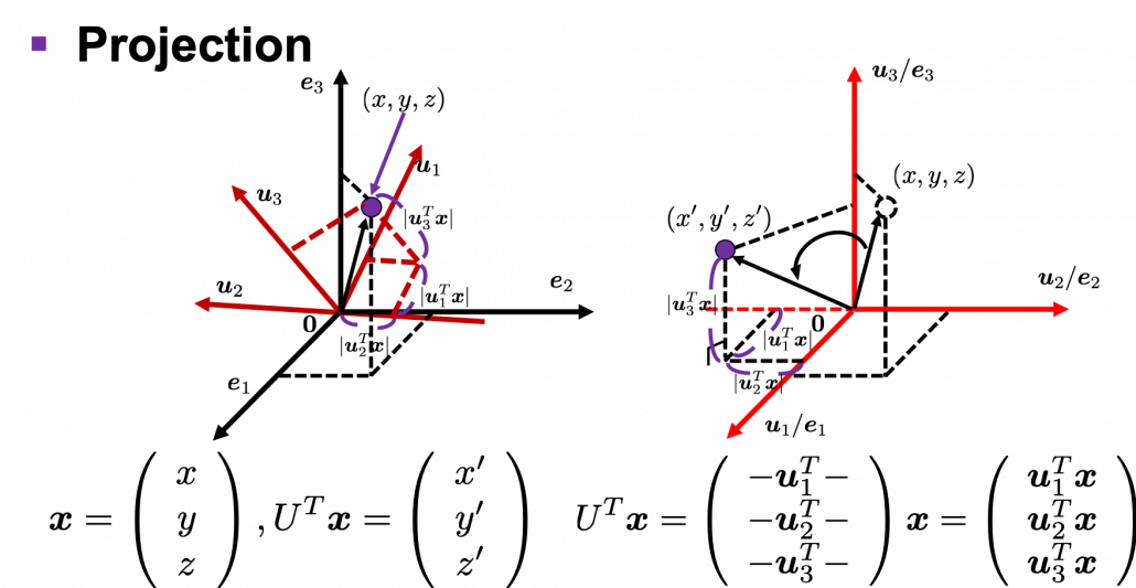
 , with one corner of the cube located at the origin point of those axes. The purple dot denotes the corner of the cube directly opposite the origin corner. The cube is rotated in three dimensions, with the origin corner staying fixed in place. After the rotation with a pivot at the origin, the edges of the cube are now aligned with a new set of orthogonal axes
  , shown in red. You might understand that more clearly with an equation:
 . In short this rotation means you keep relative position of
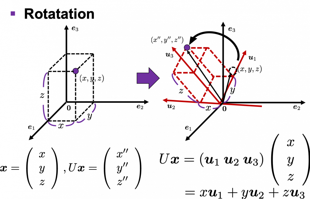
 is an orthonormal matrix and a vector
  , you can project
  or rotate it to
  , where
  and
and  . In other words
  , which means you can rotate back
  to the original point
  , where
  is a real symmetric matrix. The distribution of
  is quadratic curves whose center point covers the origin, and it is known that you can express this distribution in a much simpler way using eigenvectors. When you project this function on eigenvectors of
  for
for 


 . You can always diagonalize real symmetric matrices, so the formula implies that the shapes of quadratic curves largely depend on eigenvectors. We are going to see this in detail in the next section.
 denotes an inner product of
  .
.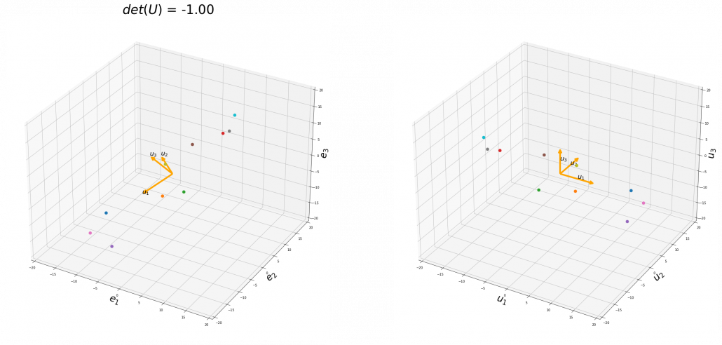
 , and in the case above
  was
was  , and you needed to flip one axis to make the determinant
  . In the example in the figure below, you can match the basis. This also can be generalized to higher dimensions, but that is also beyond the scope of this article series. If you are really interested, you should prepare some coffee and snacks and textbooks on linear algebra, and some weekends.
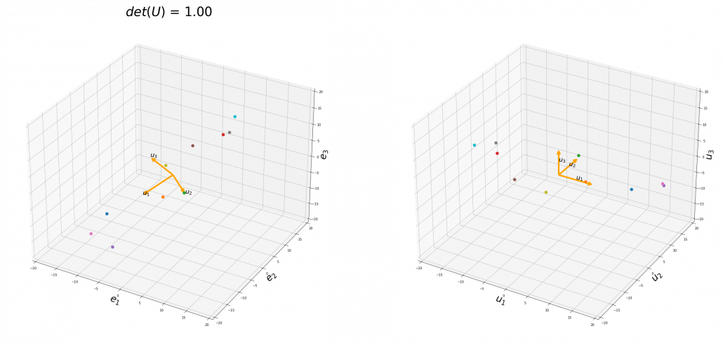
 , you can rotate the original ellipsoid so that it fits the data well.
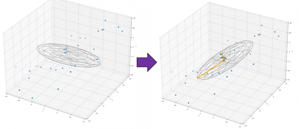
 , where
  , not
, not  .
. , where at least one of
  is not
  . Let
. Let  , then the quadratic curves can be simply denoted with a
  matrix
  as follows:
  ,
,  . General quadratic curves are roughly classified into the 9 types below.
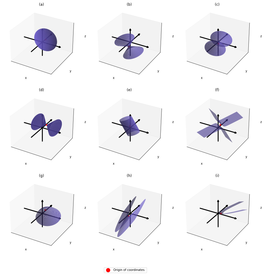
 .
.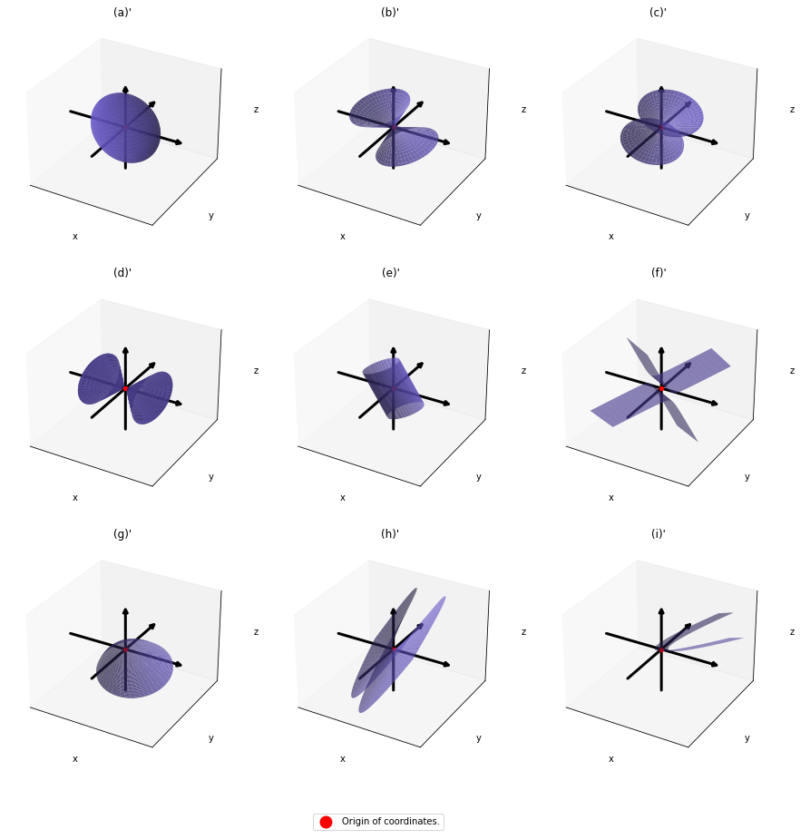

 . After you apply rotation by
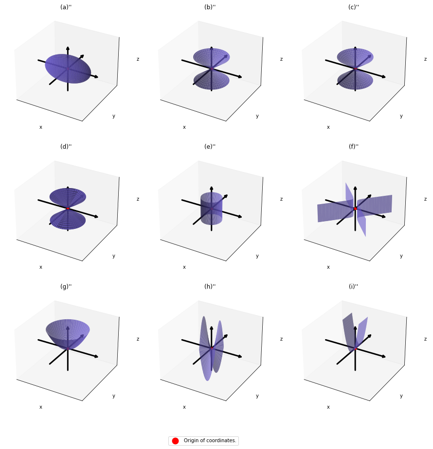


 .
. , those points
  . That means the rotation of the original quadratic curve with
  . Also it is known that when
  , with proper translations and rotations, the quadratic curve
  in a very simple way by projecting
  in two ways. One is a normal “functions”
  , and the others are “curves”
  . “Functions” get an input
  or
or  . However if you replace
  , you can interpret the “curves” as “functions” which are denoted as
  . This might sounds too obvious to you, and my point is you can visualize how values of “functions” change only when the inputs are 2 dimensional.
 real matrices
  , the distribution of quadratic curves can be roughly classified to the following three types.
 and
and  are positive or negative.
 , and thier curves look like the three graphs below.
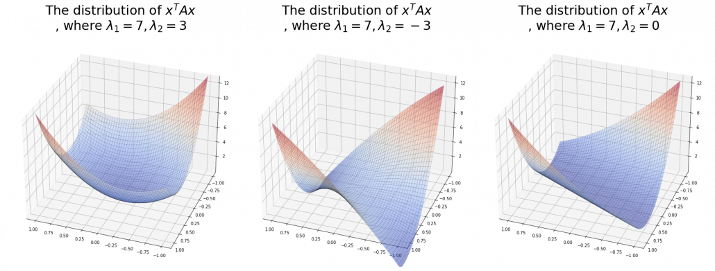
 ,
,  is the gradient of the direction. You can see that more clearly when you restrict the distribution of
  , which is classified to (g), the distribution looks like the left side, and if you restrict the distribution in the unit circle, the distribution looks like a bowl like the middle and the right side. When you move in the direction of
  , you can climb the bowl as as high as
  as high as
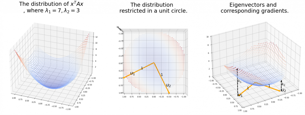
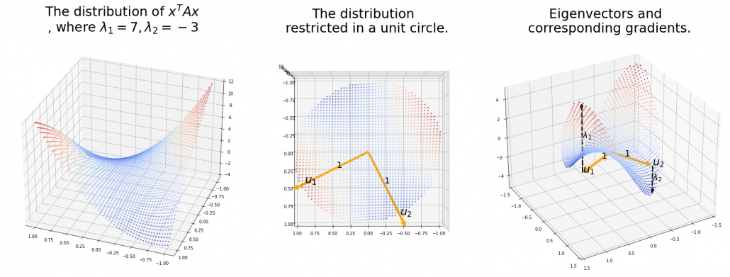
 . Hence, if you project
  , quadratic curves formed by a covariance matrix
 . This shows that you can re-weight
  , the coordinates of data projected projected on eigenvectors of
  , as I have visualized in the case of (g) type curve in the figure above.

 .
. the resulting cross section does not fit the original data well because the equation of the cross section is
  The figure below is an example of slicing the same
  , and the resulting cross section.
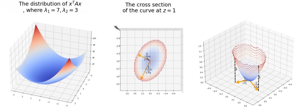
 is the radius of the ellipsoid corresponding to
  .
.  means you multiply each eigenvalue to each element of
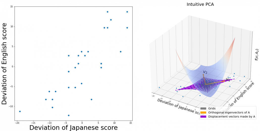
 , the ellipsoid which fits the distribution the best is
  . You might have seen the part
 somewhere else. It is the exponent of general Gaussian distributions:
 . It is known that the eigenvalues of
  are
are  , and eigenvectors corresponding to each eigenvalue are also
  respectively. Hence just as well as what we have seen, if you project
  on each eigenvector of
  be
be  be
be  , where
  . Just as we have seen,


 . Hence
 .
.
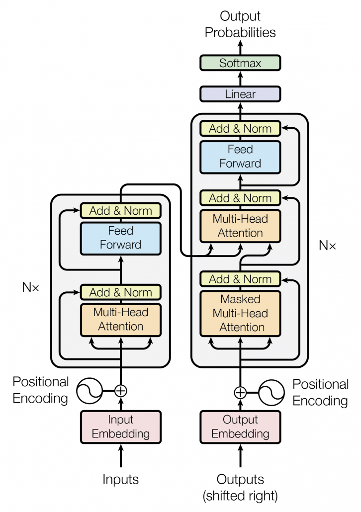
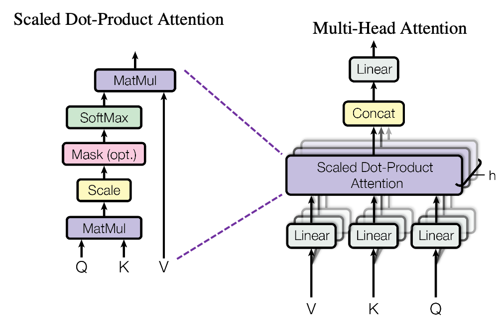
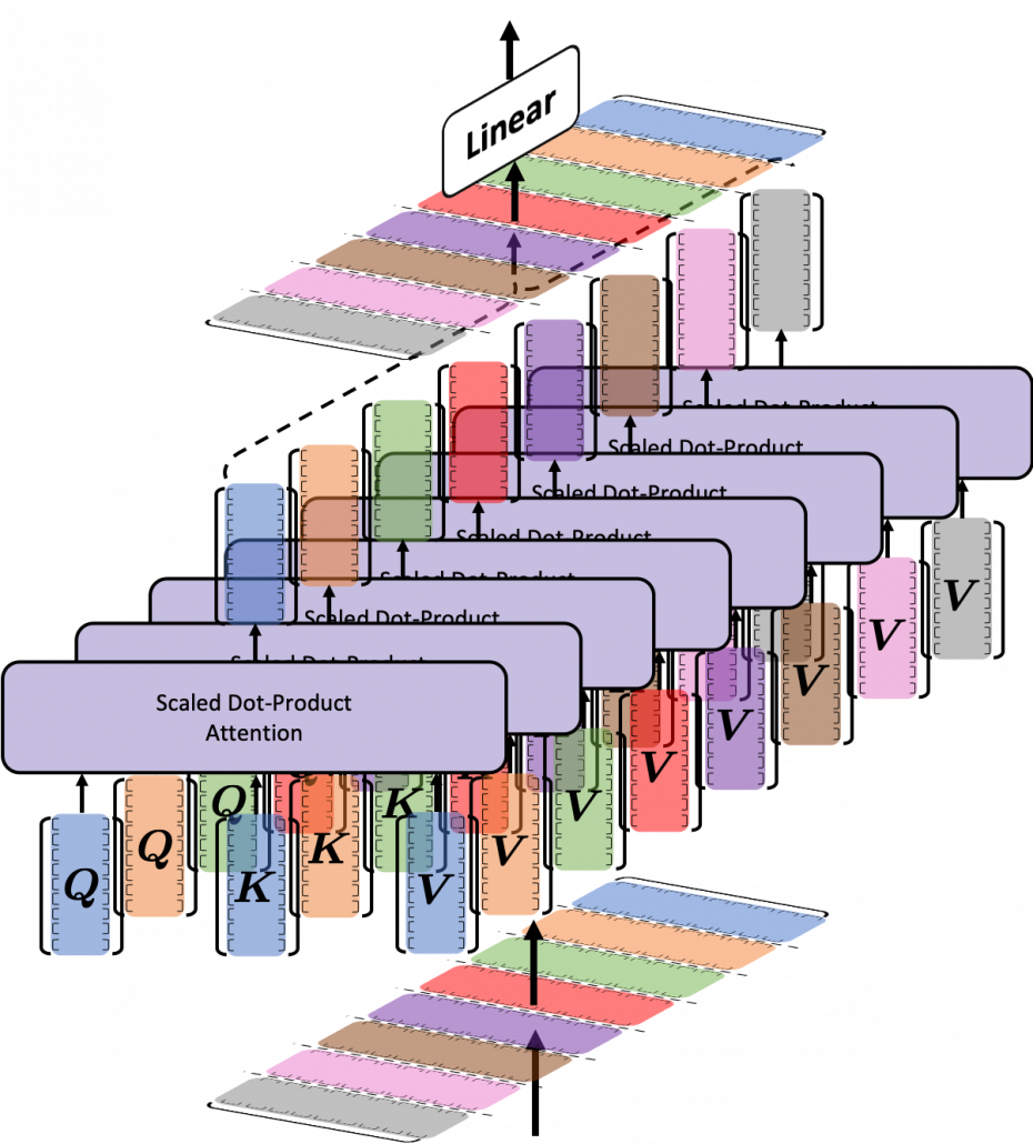
 matrix. You first split each token into
  dimensional, 8 vectors in total, as I colored in the figure below. In other words, the input matrix is divided into 8 colored chunks, which are all
  matrices, but each colored matrix expresses the same sentence. And you calculate self-attentions of the input sentence independently in the 8 heads, and you reweight the “values” according to the attentions/weights. After this, you stack the sum of the reweighted “values” in each colored head, and you concatenate the stacked tokens of each colored head. The size of each colored chunk does not change even after reweighting the tokens. According to Ashish Vaswani, who invented Transformer model, each head compare “queries” and “keys” on each standard. If the a Transformer model has 4 layers with 8-head multi-head attention , at least its encoder has
  heads, so the encoder learn the relations of tokens of the input on 32 different standards.
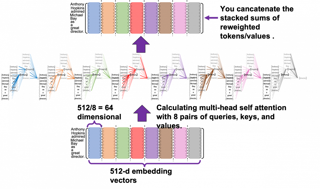
![[ \cdots ]](https://data-science-blog.com/en/wp-content/ql-cache/quicklatex.com-a935a6ae352397cdde28cd5115cc275a_l3.png "Rendered by QuickLaTeX.com") denotes a token, which is usually an embedding vector in practice.
denotes a token, which is usually an embedding vector in practice.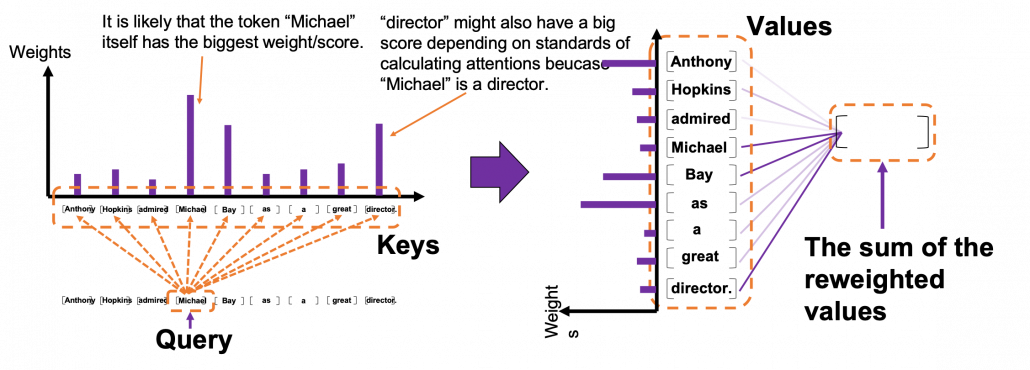 *I have been repeating the phrase “reweighting ‘values’ with attentions,” but you in practice calculate the sum of those reweighted “values.”
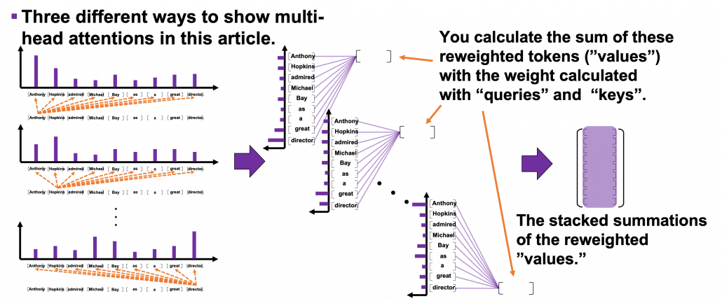

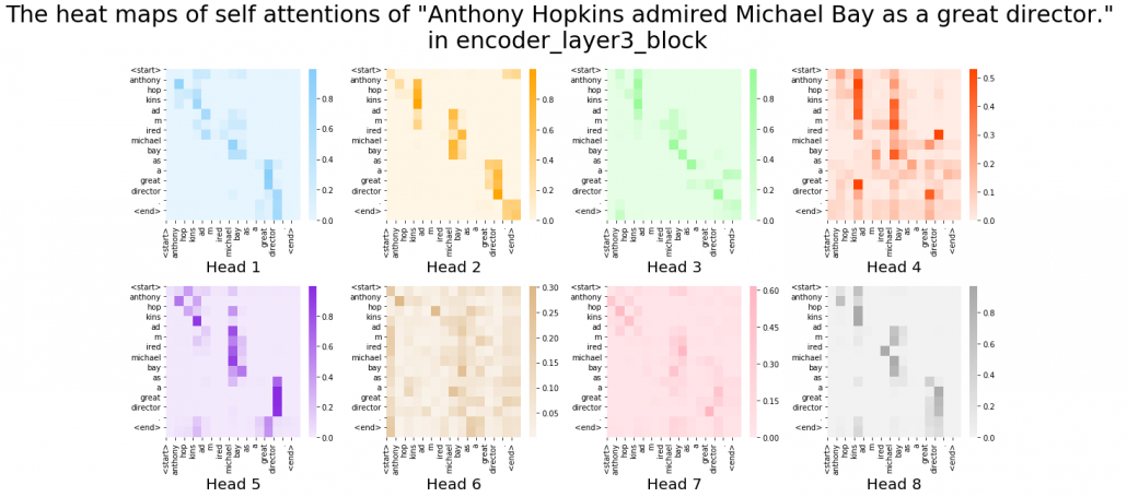
 . Let’s take an example of calculating a scaled dot-product in the blue head.
 , which are “queries”, “keys”, and “values” respectively.
 by
by  in the formula. According to the original paper, it is known that re-scaling
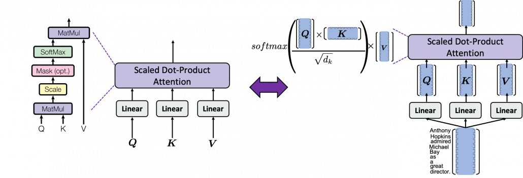
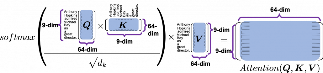
 is calculated like in the figure below. The softmax function regularize each row of the re-scaled product
  , and the resulting
  matrix is a kind a heat map of self-attentions.
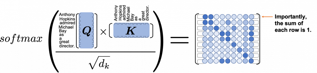
 and regularizing them with a softmax function, you stack those vectors, and the stacked vectors is the heat map of attentions.
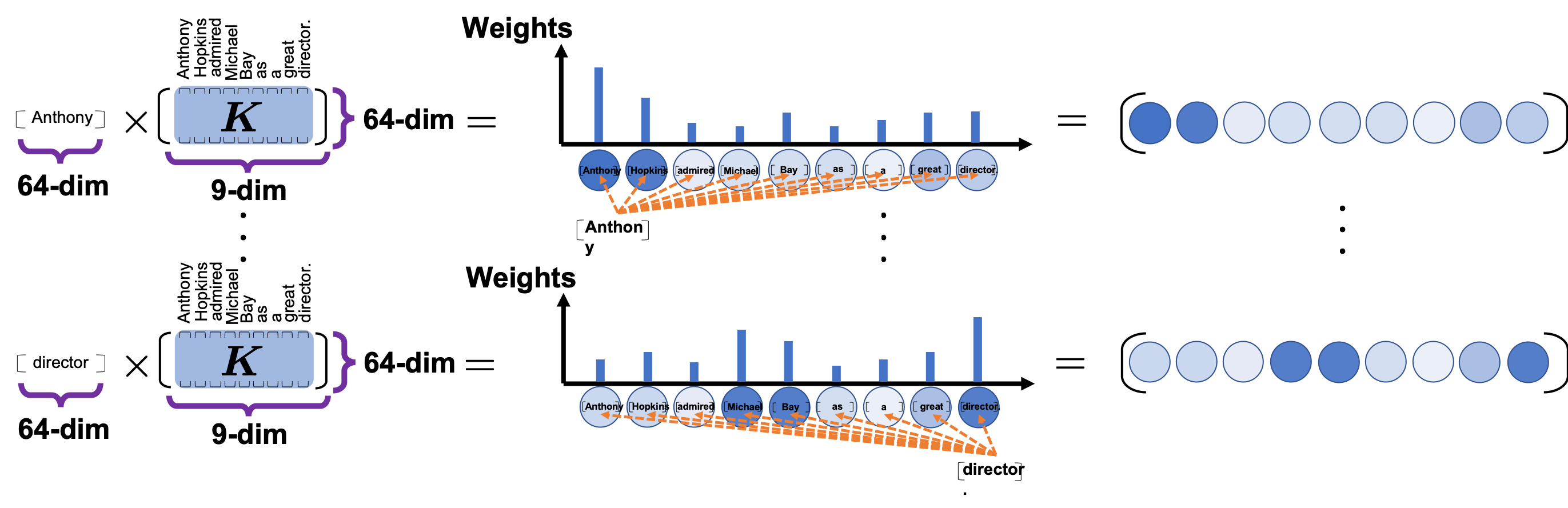
 . This also should be easy to understand if you know basics of linear algebra.
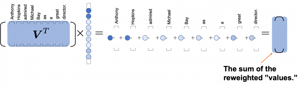


 plotted against parameter
  out of 12 parameters.
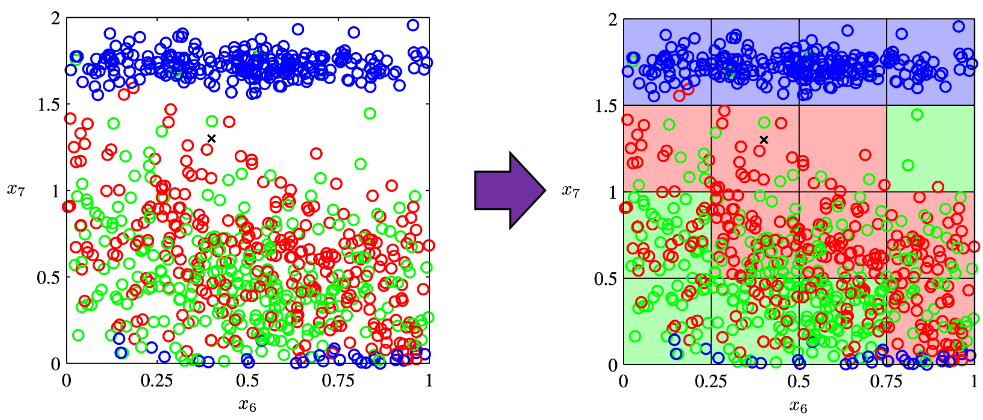
 grids respectively in 1, 2, 3 dimensional spaces, the number of the small regions in the grids are respectively 10, 100, 1000. Even though you cannot visualize it anymore, you can make grids for more than 3 dimensional data. If you continue increasing the degree of dimension, the number of grids increases exponentially, and that can soon surpass the number of training data points. That means there would be a lot of empty spaces in such high dimensional grids. And the classifying method above: coloring each grid and classifying unknown samples depending on the colors of the grids, does not work out anymore because there would be a lot of empty grids.
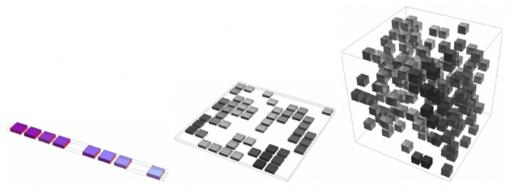
 , where
  is the center point and
  is length of radius. When
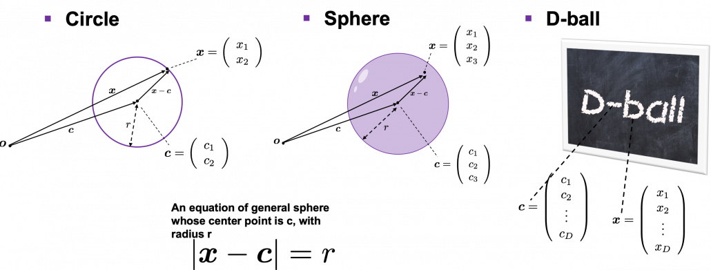
 , and that in each cube is
  .
. 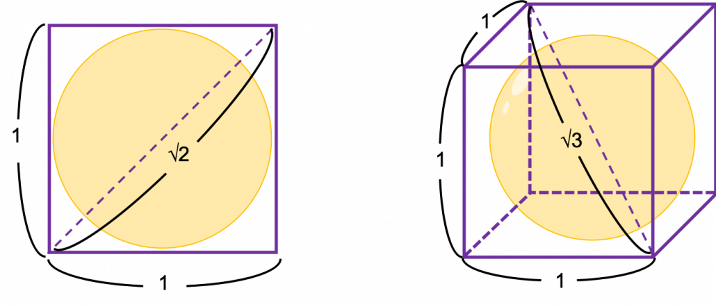
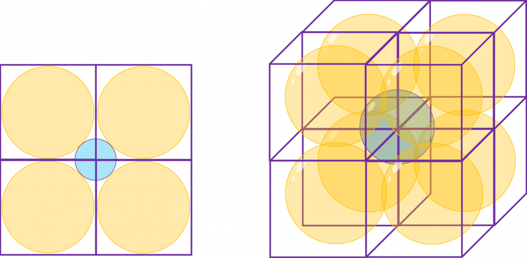
 , and the diameter of the blue sphere is
  .
. . If that is true, there is one strange point:
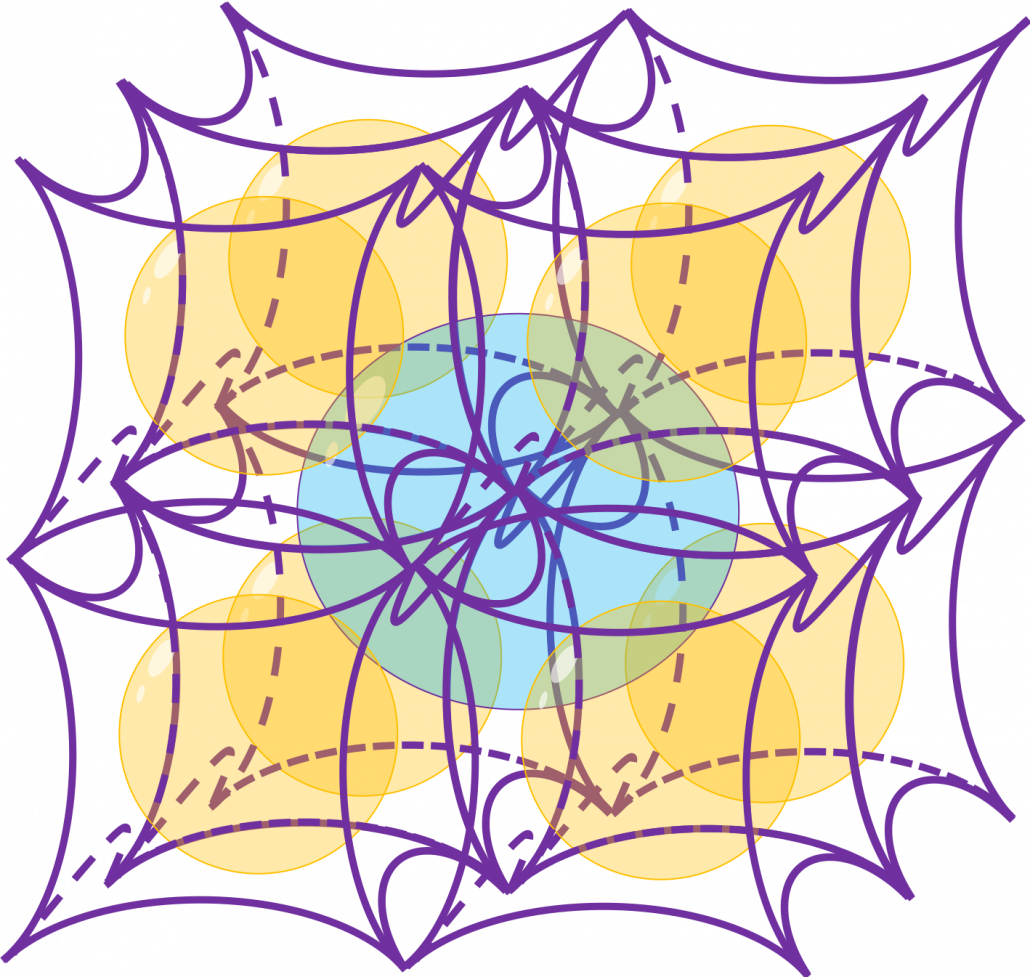
  can soon surpass 2: that means in the chart above the blue sphere will stick out of the stacked cubes. That sounds like a paradox, but with one hypothesis, the phenomenon makes sense: cubes become more spiky as the degree of dimension grows. This hypothesis is a natural deduction because diagonal lines of hyper cubes get longer, and the the center of each surface of hypercubes still touches the unit D-ball with diameter 1, inscribing inscribing inside each unit hypercube.
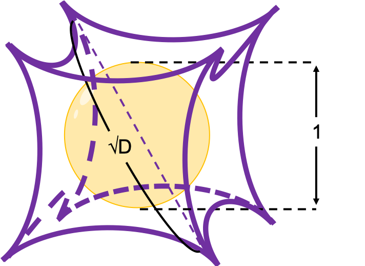
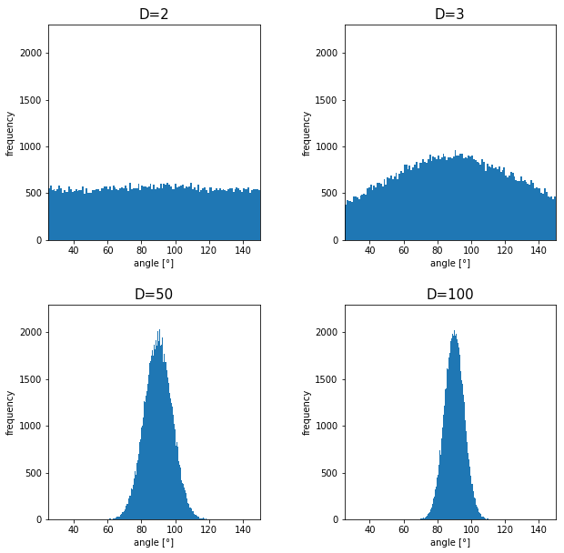
 . Let’s see the general meaning of angle between two vectors in any dimensional spaces. Assume that the angle between two vectors
  , then
  is calculated as
  . In 1, 2, or 3 dimensional space, you can actually see the angle, but again you can define higher dimensional angle, which you cannot visualize anymore. And angles are sometimes used as similarity of two vectors.
 is the inner product of
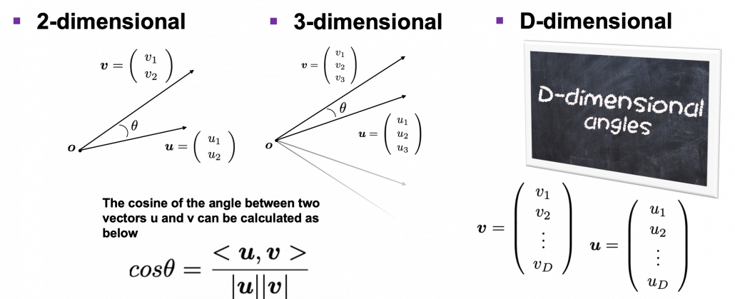
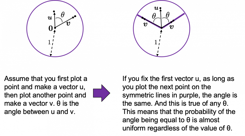 How about in 3-dimensional space? In fact the distribution of
  is the most likely to be generated. As I explain in the figure below, if you compare the area of cross section of a hemisphere and the area of a cone whose vertex is the center point of the sphere, you can see why.
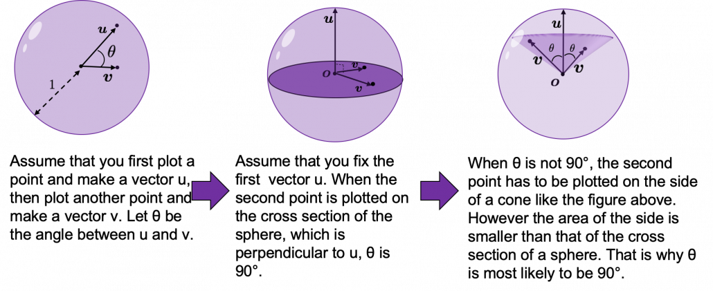
 surface of general spheres with radius
  First, in 2 two dimensional space, spheres are circles. The area of the brown part of the circle below is
  . In order calculate the are of
  thick surface of the circle, you have only to subtract the area of
  . When
  , the area of outer most surface is
  , and its proportion to the area of the whole circle is
  .
.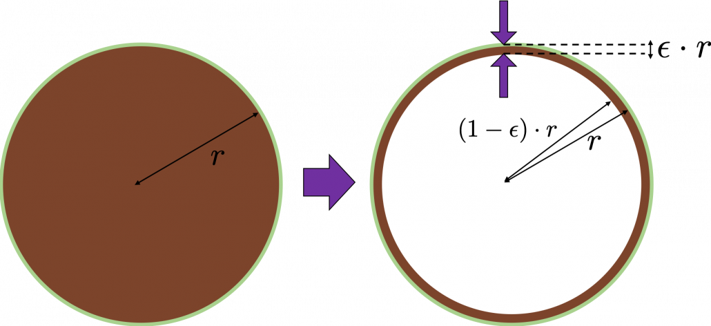
 , so the proportion of the
  . Compared to the case in 2 dimensional space, the proportion is a little bigger.
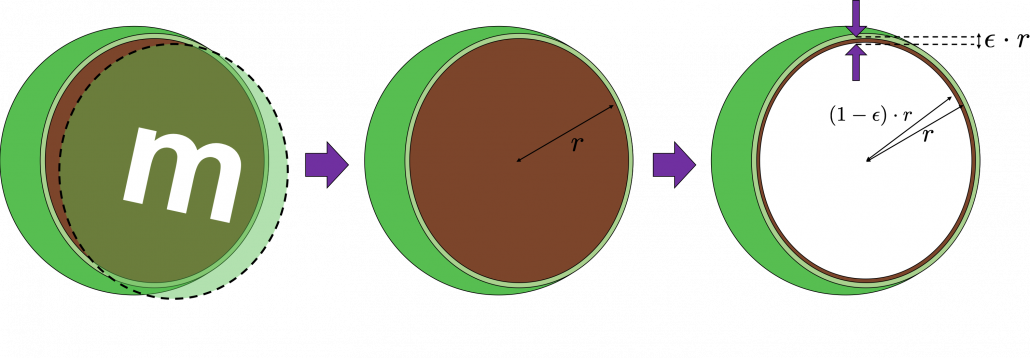

 is called gamma function, but in this article it is not so important. The most important point now is, if you discuss any D-ball, their volume only depends on their radius
  . When
  , and when
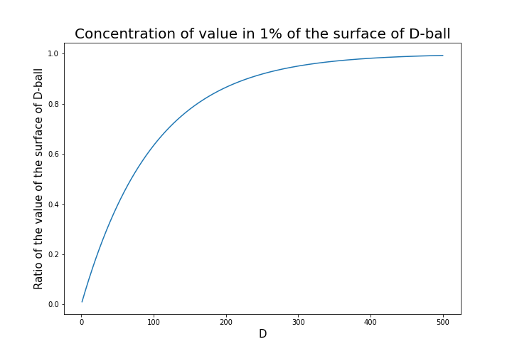
 radius of the center is almost zero. But if you reach the outermost