Tag Archive for: Data Analytics

How to Successfully Perform a Data Quality Assessment (DQA)

People generate 2.5 quintillion bytes of data every single day. That’s 1.7 megabytes generated every second for each of the 7.8 billion residents of Earth. A lot of that information is junk that somebody can easily discard, but just as much can prove to be vital. How do you tell the difference?

According to industry experts, poor quality information costs the U.S. economy upwards of $3.1 trillion annually. That is why data quality assessments (DQAs) are so important.

A Brief Explanation of Data Quality Assessments

With companies around the globe generating massive amounts of data every second of the day, it’s essential to have tools that help you sort through it all. Data quality assessments are usually carried out by software programmed with a predefined set of rules. They can compare the incoming information to those guidelines and provide reports.

This is a simplified explanation, but the goal of these DQA programs is to separate the wheat from the chaff. They eliminate any unnecessary or redundant data, leaving only the highest quality information.

The biggest challenge here is figuring who will determine what is considered quality. Data quality depends on three things: the individual or team that creates the requirements, how they complete that task, and how flexible the program meets those obligations.

How to Perform a DQA

Once you have your DQA program in place, performing an assessment is relatively simple. The challenge lies in establishing the program. The first step is to determine the scope of the data you’re trying to assess. The details of this step will depend on your system and the amount of information you have to sort through. You can set up a program to assess a single data point at a time, but if your system generates a lot of info, this isn’t effective from an efficiency standpoint.

Define your scope carefully to ensure the program does the job correctly without wasting time sorting through bytes one at a time.

Now that you have a framework to work from, you can move on to monitoring and cleansing data. Analyze your information against the scope and details you’ve established. Validate each point against your existing statistical measures, and determine its quality.

Next, ensure all the data requirements are available and correctly formatted. You may wish to provide training for any new team members entering information to ensure it’s in a format that the DQA system can understand.

Finally, make it a point to verify that your data is consistent with the rules you’ve established, as well as your business goals. DQAs aren’t a one-and-done kind of program. Monitoring needs to be an ongoing process to prevent things from falling through the cracks and keeping bad information from potentially costing you millions of dollars.

Benefits of DQA

A data quality assessment has various benefits, both on the commercial and consumer side of your business. Accuracy is essential. It’s valuable for marketers who purchase demographic data, with 84% stating it plays a large role in their purchase decisions. Targeted marketing is one of the most popular forms of advertisement, and while it’s not always practical, its efficacy drops even further if the demographic data is incorrect.

High-quality data should be accurate, complete, relevant, valid, timely and consistent. Maintaining frequent and comprehensive quality assessments can help you do that and more. The goal of collecting this information is to produce results. The higher quality your data is, the easier and faster your system will work, with better results than you might manage without DQAs.

Data Quality Assessment vs. Data Profiling

When talking about data quality, you’ll often see the terms assessment and profiling used interchangeably. While the concepts are similar, they are not the same. Data profiling is a valuable tool for setting up your quality assessment program, giving you the information you’ll need to build your program in the future. It isn’t a step you can perform independently and expect to get the same results.

If you don’t already have a DQA in place, start with profiling to create the foundation for a comprehensive data quality assessment program.

The Growing Importance of Data Quality

Data quality has always been important. However, as the population generates more information every year, learning how to separate value from junk is more critical than ever.

How the Pandemic is Changing the Data Analytics Outsourcing Industry

While media pundits have largely focused on the impact of COVID-19 as far as human health is concerned, it hasn’t been particularly good for the health of automated systems either. As cybersecurity budgets plummet in the face of dwindling finances, computer criminals have taken the opportunity to increase attacks against high value targets.

In June, an online antique store suffered a data breach that contained over 3 million records, and it’s likely that a number of similar attacks have simply gone unpublished. Fortunately, data scientists are hard at work developing new methods of fighting back against these kinds of breaches. Budget constraints and a lack of personnel as a result of the pandemic continues to be a problem, but automation has helped to assuage the issue to some degree.

AI-Driven Data Storage Systems

Big data experts have long promoted the cloud as an ideal metaphor for the way that data is stored remotely, but as a result few people today consider the physical locations that this information is stored at. All data has to be located on some sort of physical storage device. Even so-called serverless apps have to be distributed from a server unless they’re fully deployed using P2P services.

Since software can never truly replace hardware, researchers are looking at refining the various abstraction layers that exist between servers and the clients who access them. Data warehousing software has enabled computer scientists to construct centralized data storage solutions that look like traditional disk locations. This gives users the ability to securely interact with resources that are encrypted automatically.

Background services based on artificial intelligence monitor virtual data warehouse locations, which gives specialists the freedom to conduct whatever analytics they deem necessary. In some cases, a data warehouse can even anonymize information as it’s stored, which can streamline workflows involved with the analysis process.

While this level of automation has proven useful, it’s still subject to some of the problems that have occurred as a result of the pandemic. Traditional supply chains are in shambles and a large percentage of technical workers are now telecommuting. If there’s a problem with any existing big data plans, then there’s often nobody around to do any work in person.

Living with Shifting Digital Priorities

Many businesses were in the process of outsourcing their data operations even before the pandemic, and the current situation is speeding this up considerably. Initial industry estimates had projected steady growth numbers for the data analytics sector through 2025. While the current figures might not be quite as bullish, it’s likely that sales of outsourcing contracts will remain high.

That being said, firms are also shifting a large percentage of their IT spending dollars into cybersecurity projects. A recent survey found that 37 percent of business leaders said they were already going to cut their IT department budgets. The same study found that 28 percent of businesses are going to move at least some part of their data analytics programs abroad.

Those companies that can’t find an attractive outsourcing contract might start to patch their remote systems over a virtual private network. Unfortunately, this kind of technology has been strained to some degree in recent months. The virtual servers that power VPNs are flooded with requests, which in turn has brought them down in some instances. Neural networks, which utilize deep learning technology to improve themselves as time goes on, have proven more than capable of predicting when these problems are most likely to arise.

That being said, firms that deploy this kind of technology might find that it still costs more to work with automated technology on-premise compared to simply investing in an outsourcing program that works with these kinds of algorithms at an outside location.

Saving Money in the Time of Corona

Experts from Think Big Analytics pointed out how specialist organizations can deal with a much wider array of technologies than a small business ever could. Since these companies specialize in providing support for other organizations, they have a tendency to offer support for a large number of platforms.

These representatives recently opined that they could provide support for NoSQL, Presto, Apache Spark and several other emerging platforms at the same time. Perhaps most importantly, these organizations can work with Hadoop and other traditional data analysis languages.

Staffers working on data mining operations have long relied on languages like Hadoop and R to write scripts that they later use to automate the process of collecting and analyzing data. By working with an organization that already supports a language that companies rely on, they can avoid the need of changing up their existing operations.

This can help to drastically reduce the cost of migration, which is extremely important since many of the firms that need to migrate to a remote system are already suffering from budget problems. Assuming that some issues related to the pandemic continue to plague businesses for some time, it’s likely that these budget constraints will force IT departments to consider a migration even if they would have otherwise relied solely on a traditional colocation arrangement.

IT department staffers were already moving away from many rare platforms even before the COVID-19 pandemic hit, however, so this shouldn’t be as much of a herculean task as it sounds. For instance, the KNIME Analytics Platform has increased in popularity exponentially since it’s release in 2006. The fact that it supports over 1,000 plug-in modules has made it easy for smaller businesses to move toward the platform.

The road ahead isn’t going to be all that pleasant, however. COBOL and other antiquated languages still rule the roost at many governmental big data processing centers. At the same time, some small businesses have never even been able to put a big data plan into play in the first place. As the pandemic continues to wreak havoc on the world’s economy, however, it’s likely that there will be no shortage of organizations continuing to migrate to more secure third-party platforms backed by outsourcing contracts.

Data Analytics and Mining for Dummies

Data Analytics and Mining is often perceived as an extremely tricky task cut out for Data Analysts and Data Scientists having a thorough knowledge encompassing several different domains such as mathematics, statistics, computer algorithms and programming. However, there are several tools available today that make it possible for novice programmers or people with no absolutely no algorithmic or programming expertise to carry out Data Analytics and Mining. One such tool which is very powerful and provides a graphical user interface and an assembly of nodes for ETL: Extraction, Transformation, Loading, for modeling, data analysis and visualization without, or with only slight programming is the KNIME Analytics Platform.

KNIME, or the Konstanz Information Miner, was developed by the University of Konstanz and is now popular with a large international community of developers. Initially KNIME was originally made for commercial use but now it is available as an open source software and has been used extensively in pharmaceutical research since 2006 and also a powerful data mining tool for the financial data sector. It is also frequently used in the Business Intelligence (BI) sector.

KNIME as a Data Mining Tool

KNIME is also one of the most well-organized tools which enables various methods of machine learning and data mining to be integrated. It is very effective when we are pre-processing data i.e. extracting, transforming, and loading data.

KNIME has a number of good features like quick deployment and scaling efficiency. It employs an assembly of nodes to pre-process data for analytics and visualization. It is also used for discovering patterns among large volumes of data and transforming data into more polished/actionable information.

Some Features of KNIME:

  • Free and open source
  • Graphical and logically designed
  • Very rich in analytics capabilities
  • No limitations on data size, memory usage, or functionalities
  • Compatible with Windows ,OS and Linux
  • Written in Java and edited with Eclipse.

A node is the smallest design unit in KNIME and each node serves a dedicated task. KNIME contains graphical, drag-drop nodes that require no coding. Nodes are connected with one’s output being another’s input, as a workflow. Therefore end-to-end pipelines can be built requiring no coding effort. This makes KNIME stand out, makes it user-friendly and make it accessible for dummies not from a computer science background.

KNIME workflow designed for graduate admission prediction

KNIME workflow designed for graduate admission prediction

KNIME has nodes to carry out Univariate Statistics, Multivariate Statistics, Data Mining, Time Series Analysis, Image Processing, Web Analytics, Text Mining, Network Analysis and Social Media Analysis. The KNIME node repository has a node for every functionality you can possibly think of and need while building a data mining model. One can execute different algorithms such as clustering and classification on a dataset and visualize the results inside the framework itself. It is a framework capable of giving insights on data and the phenomenon that the data represent.

Some commonly used KNIME node groups include:

  • Input-Output or I/O:  Nodes in this group retrieve data from or to write data to external files or data bases.
  • Data Manipulation: Used for data pre-processing tasks. Contains nodes to filter, group, pivot, bin, normalize, aggregate, join, sample, partition, etc.
  • Views: This set of nodes permit users to inspect data and analysis results using multiple views. This gives a means for truly interactive exploration of a data set.
  • Data Mining: In this group, there are nodes that implement certain algorithms (like K-means clustering, Decision Trees, etc.)

Comparison with other tools 

The first version of the KNIME Analytics Platform was released in 2006 whereas Weka and R studio were released in 1997 and 1993 respectively. KNIME is a proper data mining tool whereas Weka and R studio are Machine Learning tools which can also do data mining. KNIME integrates with Weka to add machine learning algorithms to the system. The R project adds statistical functionalities as well. Furthermore, KNIME’s range of functions is impressive, with more than 1,000 modules and ready-made application packages. The modules can be further expanded by additional commercial features.

Severity of lockdowns and how they are reflected in mobility data

The global spread of the SARS-CoV-2 at the beginning of March 2020 forced majority of countries to introduce measures to contain the virus. The governments found themselves facing a very difficult tradeoff between limiting the spread of the virus and bearing potentially catastrophic economical costs of a lockdown. Notably, considering the level of globalization today, the response of countries varied a lot in severity and response latency. In the overwhelming amount of media and social media information feed a lot of misinformation and anecdotal evidence surfaced and remained in people’s mind. In this article, I try to have a more systematic view on the topics of severity of response from governments and change in people’s mobility due to the pandemic.

I want to look at several countries with different approach to restraining the spread of the virus. I will look at governmental regulations, when, and how they were introduced. For that I am referring to an index called Oxford COVID-19 Government Response Tracker (OxCGRT)[1]. The OxCGRT follows, records, and rates the actions taken by governments, that are available publicly. However, looking just at the regulations and taking them for granted does not provide that we have the whole picture. Therefore, equally interesting is the investigation of how the recommended levels of self-isolation and social distancing is reflected in the mobility data and we will look at it first.

The mobility dataset

The mobility data used in this article was collected by Google and made freely accessible[2]. The data reflects how the number of visits and their length changed as compared to a baseline from before the pandemic. The baseline is the median value for the corresponding day of the week in the period from 3.01.2020 – 6.02.2020. The dataset contains data in six categories. Here we look at only 4 of them: public transport stations, places of residence, workplaces, and retail/recreation (including shopping centers, libraries, gastronomy, culture). The analysis intentionally omits parks (public beaches, gardens etc.) and grocery/pharmacy category. Mobility in parks is excluded due to huge weather change confound. The baseline was created in winter and increased/decreased (depending on the hemisphere) activity in parks is expected as the weather changes. It would be difficult to detangle tis change from the change caused by the pandemic without referring to a different baseline. The grocery shops and pharmacies are excluded because the measures regarding the shopping were very similar across the countries.

Amid the Covid-19 pandemic a lot of anecdotal information surfaced, that some countries, like Sweden, acted completely against the current by not introducing a lockdown. It was reported that there were absolutely no restrictions and Sweden can be basically treated as a control group for comparing the different approaches to lockdown on the spread of the coronavirus. Looking at the mobility data (below), we can see however, that there was a change in the mobility of Swedish citizens in comparison to the baseline.

Fig. 1 Moving average (+/- 6 days) of the mobility data in Sweden in four categories.

Fig. 1 Moving average (+/- 6 days) of the mobility data in Sweden in four categories.

Looking at the change in mobility in Sweden, we can see that the change in the residential areas is small, but it is indicating some change in behavior. A change in the retail and recreational sector is more noticeable. Most interestingly it is approaching the baseline levels at the beginning of June. The most substantial changes, however, are in the workplaces and transit categories. They are also much slower to come back to the baseline, although a trend in that direction starts to be visible.

Next, let us have a look at the change in mobility in selected countries, separately for each category. Here, I compare Germany, Sweden, Italy, and New Zealand. (To see the mobility data for other countries visit https://covid19.datanomiq.de/#section-mobility).

Fig. 2 Moving average (+/- 6 days) of the mobility data.

Fig. 2 Moving average (+/- 6 days) of the mobility data.

Looking at the data, we can see that the change in mobility in Germany and Sweden was somewhat similar in orders of magnitude, in comparison to changes in mobility in countries like Italy and New Zealand. Without a doubt, the behavior in Sweden changed the least from the baseline in all the categories. Nevertheless, claiming that people’s reaction to the pandemic in Sweden in Germany were polar opposites is not necessarily correct. The biggest discrepancy between Sweden and Germany is in the retail and recreation sector out of all categories presented. The changes in Italy and New Zealand reached very comparable levels, but in New Zealand they seem to be much more dynamic, especially in approaching the baseline levels again.

The government response dataset

Oxford COVID-19 Government Response Tracker records regulations from number of countries, rates them and categorizes into a few indices. The number between 1 and 100 reflects the level of the action taken by a government. Here, I focus on the Containment and Health sub-index that includes 11 indicators from categories: containment and closure policies and health system policies[3]. The actions included in the index are for example: school and workplace closing, restrictions on public events, travel restrictions, public information campaigns, testing policy and contact tracing.

Below, we look at a plot with the Containment and Health sub-index value for the four aforementioned countries. Data and documentation is available here[4]

Fig. 3 Oxford COVID-19 Government Response Tracker, the Containment and Health sub-index.

Fig. 3 Oxford COVID-19 Government Response Tracker, the Containment and Health sub-index.

Here the difference between Sweden and the other countries that we are looking at becomes more apparent. Nevertheless, the Swedish government did take some measures in order to condemn the spread of the SARS-CoV-2. At the highest, the index reached value 45 points in Sweden, 73 in Germany, 92 in Italy and 94 in New Zealand. In all these countries except for Sweden the index started dropping again, while the drop is the most dynamic in New Zealand and the index has basically reached the level of Sweden.

Conclusions

As we have hopefully seen, the response to the COVID-19 pandemic from governments differed substantially, as well as the resulting change in mobility behavior of the inhabitants did. However, the discrepancies were probably not as big as reported in the media.

The overwhelming presence of the social media could have blown some of the mentioned differences out of proportion. For example, the discrepancy in the mobility behavior between Sweden and Germany was biggest in recreation sector, that involves cafes, restaurants, cultural resorts, and shopping centers. It is possible, that those activities were the ones that people in lockdown missed the most. Looking at Swedes, who were participating in them it was easy to extrapolate on the overall landscape of the response to the virus in the country.

It is very hard to say which of the world country’s approach will bring the best effects for the people’s well-being and the economies. The ongoing pandemic will remain a topic of extensive research for many years to come. We will (most probably) eventually find out which approach to the lockdown was the most optimal (or at least come close to finding out). For the time being, it is however important to remember that there are many factors in play and looking into one type of data might be misleading. Comparing countries with different history, weather, political and economic climate, or population density might be misleading as well. But it is still more insightful than not looking into the data at all.

[1] Hale, Thomas, Sam Webster, Anna Petherick, Toby Phillips, and Beatriz Kira (2020). Oxford COVID-19 Government Response Tracker, Blavatnik School of Government. Data use policy: Creative Commons Attribution CC BY standard.

[2] Google LLC “Google COVID-19 Community Mobility Reports”. https://www.google.com/covid19/mobility/ retrived: 04.06.2020

[3] See documentation https://github.com/OxCGRT/covid-policy-tracker/tree/master/documentation

[4] https://github.com/OxCGRT/covid-policy-tracker  retrieved on 04.06.2020

Conversion Rate Optimization: Understanding the Sales Funnel

Are you capturing the attention of consumers or prospects with your content? Do they trust you enough to give you their contact information? Will they come back and buy from you again? Knowing how the sales funnel works and what you can do to improve it will take you down the road of success.

Business 101

As a business owner, your goal is to turn a prospect (meaning a prospective buyer) into a loyal customer. Nobody wants to lose a possible customer after putting a lot of effort into the attempt of establishing a relationship. Once you understand the different stages of the sales funnel, it will be easier to find cracks and holes within. The following sections unpack how sales funnel management can help you optimize your conversion rate and build a successful long-term relationship with your customers and website users.

The Sales Funnel

The sales funnel describes the path a customer takes on the way to buying a product or service. It visualizes the typical journey they go through and in which stage of the buying decision prospects are at the moment. As one of the core concepts in digital marketing, sales funnel management can help you to understand your audience and prevent them from dropping out before a sale is made. It is about giving every potential customer the treatment they are looking for. If you don’t understand your sales funnel, you can’t optimize it. What matters most when it comes to a sales funnel is website optimization.

Prospects move from the top of the funnel to the bottom as they become more familiar with what you have to offer. The sales funnel narrows as visitors move through it, and the number of people in your funnel will continue to decrease the closer you get to sealing the deal. It starts at the top with all the prospects who landed on your website one way or another, while the narrow bottom represents loyal customers.

The 4 Stages of the Sales Funnel

Moving people through the funnel can be a challenge. A stratagem to keep in mind is that your goal should be to solve the “problems” of your customers, or potentially make them aware of a problem they didn’t even know existed. Start by creating content that attracts your prospect’s attention, followed by offering an irresistible solution to the problem. All you have to do then is watch the magic happen.

Truthfully, that is easier said than done, but if you follow the four stages of a prospective customer’s mindset, you will reach your goal sooner than later. The different stages can be easily explained using the AIDA (Awareness, Interest, Decision, Action) strategy. To understand what moves a buying decision, we have to take a closer look at each stage and the approach it requires.

Awareness

To end up with a strong bond with your prospect, you have to gain attention first. Depending on how they found you (organic search results, recommendations, advertisements, or just pure luck), people will put different amounts of trust in your business. If you are lucky and all circumstances fall perfectly into place, a prospect turns into a customer immediately. More often though, the awareness stage does exactly what it sounds like; it creates awareness of your business and your products or services. At this point, all you are trying to do is lead prospects into the next stage, which will make them return for more.

Interest

Once a potential customer is aware of you, you need to build their interest. In this stage potential customers are interested in what you have to offer and are doing research or comparison. It is the perfect time to show off authority in your field and support them with helpful content that does not yet try to sell to them. Make sure your message stays consistent throughout the whole process and do not try to push too hard from the beginning. The interest stage should only lead them to be able to make an informed decision.

Decision

For the most part, the majority of people do not like making decisions and, therefore, getting a prospect to make a buying decision is not an easy feat. At this stage, you have to bring on your A-game and make them an offer they can’t refuse. Whether this means offering free premium shipping, a discount code, or a free month of your services is totally up to you; you just have to make sure that your potential customer wants to take advantage of it. Showcasing positive reviews or social proof is another powerful way that you can get people to take action.

 Action

Now your prospect turns into a customer. When he or she purchases your product or takes advantage of your service, that customer becomes part of your business’s ecosystem. But just because they reached the final stage of the sales funnel and the AIDA principle doesn’t mean your work is all said and done. Starting to build a long-term relationship with someone who already trusts your company is easier than starting the sales funnel all over again with a new prospect.

Sales Funnel Management

At this point, you should understand why sales funnel management is so important. Even the best prospects can get lost along the way if expectations aren’t met. It takes time to build a sales funnel that represents what your audience is looking for. The best way to optimize a sales funnel is to start with the results and work your way up. Another point of interest is the timing when people move from one point to the next within the funnel. This can help you find out where, when, and why you’re losing potential customers.

Too slow: New leads are nine times more likely to convert if someone follows up within the first five minutes. On the other hand, a lead is 21 times less likely to turn into a sale after 30 minutes have passed. To react within tight response times like that, you need to implement sales funnel management automation.

Too impatient: It can be tempting to dump a lead that isn’t converting right away and move on to the next. You should ask yourself the question if you are patient enough and if you are following up as much as you should. A marketing automation funnel also helps to stay in touch with the prospect over time.

Too fast: Instead of asking people to buy from you right away, you should cultivate them over time. If you adjust your sales approach to the different stages, you don’t just avoid chasing them away; you also find out what is working and what is a waste of your time.

How can you optimize your conversion rate?

There are countless ways you can improve your conversion rate and turn a “no, thank you” into a “yes, please.” In sales, a no often simply means “not until later” or “try again, I’m just not totally convinced yet.” Any time you encounter problems like that, you can use one or multiple of the following, mostly automated sales techniques, to reach your goals.

Target your Audience

To lead people into your sales funnel, you have to put the right content in front of your prospects. How and where you do that depends on your target audience. Be creative with your content, but make sure it mimics your offer and the call-to-action you are using. Customer relationship management (CRM) can help you track interactions with current and future customers.

Build a Landing Page

A landing page offers content that addresses a specific problem, ideally with a single call-to-action, and should steer your visitor towards becoming a customer. A/B testing your landing pages will help you figure out what your audience responds to best and what language, imagery, or layouts can help you improve conversion rates. Experienced hosting companies like 101domain can help you along the way. Additionally, you can use pay-per-click campaigns to drive traffic to your landing page and contact forms to gain subscribers to a mailing list.

Targeting Soft Conversions

When considering which page to use as a landing page, you can increase your conversion rate by bringing leads to an on-site resource to gain a “soft conversion.”

 To illustrate the importance of a good landing page and soft conversions, consider the following data:

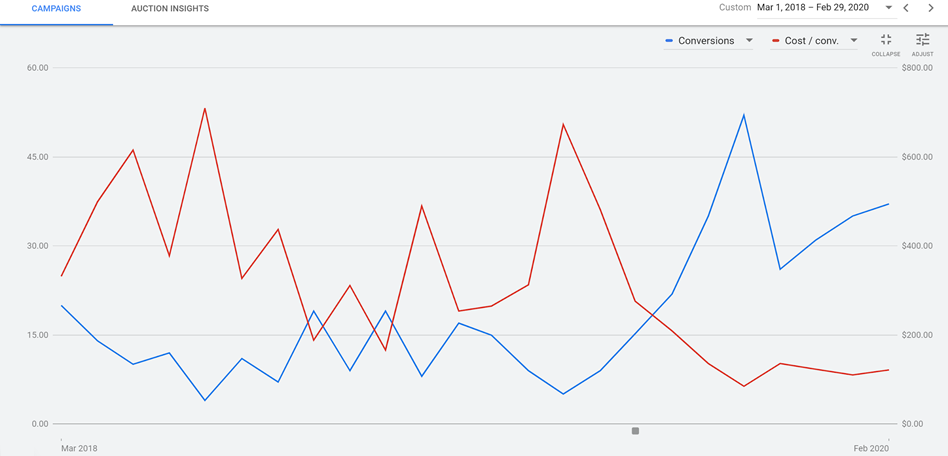
RED: Cost per conversion BLUE: Number of conversions X-AXIS: Time (Screenshot supplied by Howard Ahmanson)

The initial strategy represented in this graph was to take visitors directly to a sales page. This resulted in a very low number of conversions, about a rate of 1%,, which in turn drove the cost per conversion way up. Later, the landing page was switched to an on-site resource, such as  a form fill of “get the free retirement planning guide.” This prompted a few soft conversions, or in other words email addresses. Upon doing this, the average number of conversions per month increased from about 10 to between 30 and 45, which in turn dropped the total cost per conversion from a median of about $400 to about $100. This is an approximately 300% increase in conversions at 50% of the cost.

But how does increased conversions translate in terms of sales numbers? To see an example of this, consider the data from the Ken Tamplin Vocal Academy:

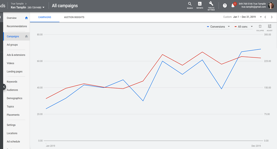
RED: Total conversion, including soft conversions
BLUE: Sales conversions
X-AXIS: Time

When running ads for Ken, the initial strategy was to bring prospects directly to a sales page. Later, this was switched out for a “Yes! I want Ken’s free lessons!” page.

This led to an increase in the number of soft conversions, which led to a tightly correlated increase in sales. There was an increase from around 30 conversions per month up to over 225, which is an increase of 750%.

Create an Email Drip Campaign

Email drip campaigns are used to send a pre-written set of emails to subscribers or customers over time. You can use those campaigns to educate the receiver as well as make them aware of sales or offers. Last but not least, don’t forget about existing customers. This technique is ideal for building up loyalty and making them feel like part of the family.

Python vs R: Which Language to Choose for Deep Learning?

Data science is increasingly becoming essential for every business to operate efficiently in this modern world. This influences the processes composed together to obtain the required outputs for clients. While machine learning and deep learning sit at the core of data science, the concepts of deep learning become essential to understand as it can help increase the accuracy of final outputs. And when it comes to data science, R and Python are the most popular programming languages used to instruct the machines.

Python and R: Primary Languages Used for Deep Learning

Deep learning and machine learning differentiate based on the input data type they use. While machine learning depends upon the structured data, deep learning uses neural networks to store and process the data during the learning. Deep learning can be described as the subset of machine learning, where the data to be processed is defined in another structure than a normal one.

R is developed specifically to support the concepts and implementation of data science and hence, the support provided by this language is incredible as writing codes become much easier with its simple syntax.

Python is already much popular programming language that can serve more than one development niche without straining even for a bit. The implementation of Python for programming machine learning algorithms is very much popular and the results provided are accurate and faster than any other language. (C or Java). And because of its extended support for data science concept implementation, it becomes a tough competitor for R.

However, if we compare the charts of popularity, Python is obviously more popular among data scientists and developers because of its versatility and easier usage during algorithm implementation. However, R outruns Python when it comes to the packages offered to developers specifically expertise in R over Python. Therefore, to conclude which one of them is the best, let’s take an overview of the features and limits offered by both languages.

Python

Python was first introduced by Guido Van Rossum who developed it as the successor of ABC programming language. Python puts white space at the center while increasing the readability of the developed code. It is a general-purpose programming language that simply extends support for various development needs.

The packages of Python includes support for web development, software development, GUI (Graphical User Interface) development and machine learning also. Using these packages and putting the best development skills forward, excellent solutions can be developed. According to Stackoverflow, Python ranks at the fourth position as the most popular programming language among developers.

Benefits for performing enhanced deep learning using Python are:

  • Concise and Readable Code
  • Extended Support from Large Community of Developers
  • Open-source Programming Language
  • Encourages Collaborative Coding
  • Suitable for small and large-scale products

The latest and stable version of Python has been released as Python 3.8.0 on 14th October 2019. Developing a software solution using Python becomes much easier as the extended support offered through the packages drives better development and answers every need.

R

R is a language specifically used for the development of statistical software and for statistical data analysis. The primary user base of R contains statisticians and data scientists who are analyzing data. Supported by R Foundation for statistical computing, this language is not suitable for the development of websites or applications. R is also an open-source environment that can be used for mining excessive and large amounts of data.

R programming language focuses on the output generation but not the speed. The execution speed of programs written in R is comparatively lesser as producing required outputs is the aim not the speed of the process. To use R in any development or mining tasks, it is required to install its operating system specific binary version before coding to run the program directly into the command line.

R also has its own development environment designed and named RStudio. R also involves several libraries that help in crafting efficient programs to execute mining tasks on the provided data.

The benefits offered by R are pretty common and similar to what Python has to offer:

  • Open-source programming language
  • Supports all operating systems
  • Supports extensions
  • R can be integrated with many of the languages
  • Extended Support for Visual Data Mining

Although R ranks at the 17th position in Stackoverflow’s most popular programming language list, the support offered by this language has no match. After all, the R language is developed by statisticians for statisticians!

Python vs R: Should They be Really Compared?

Even when provided with the best technical support and efficient tools, a developer will not be able to provide quality outputs if he/she doesn’t possess the required skills. The point here is, technical skills rank higher than the resources provided. A comparison of these two programming languages is not advisable as they both hold their own set of advantages. However, the developers considering to use both together are less but they obtain maximum benefit from the process.

Both these languages have some features in common. For example, if a representative comes asking you if you lend technical support for developing an uber clone, you are directly going to decline as Python and R both do not support mobile app development. To benefit the most and develop excellent solutions using both these programming languages, it is advisable to stop comparing and start collaborating!

R and Python: How to Fit Both In a Single Program

Anticipating the future needs of the development industry, there has been a significant development to combine these both excellent programming languages into one. Now, there are two approaches to performing this: either we include R script into Python code or vice versa.

Using the available interfaces, packages and extended support from Python we can include R script into the code and enhance the productivity of Python code. Availability of PypeR, pyRserve and more resources helps run these two programming languages efficiently while efficiently performing the background work.

Either way, using the developed functions and packages made available for integrating Python in R are also effective at providing better results. Available R packages like rJython, rPython, reticulate, PythonInR and more, integrating Python into R language is very easy.

Therefore, using the development skills at their best and maximizing the use of such amazing resources, Python and R can be togetherly used to enhance end results and provide accurate deep learning support.

Conclusion

Python and R both are great in their own names and own places. However, because of the wide applications of Python in almost every operation, the annual packages offered to Python developers are less than the developers skilled in using R. However, this doesn’t justify the usability of R. The ultimate decision of choosing between these two languages depends upon the data scientists or developers and their mining requirements.

And if a developer or data scientist decides to develop skills for both- Python and R-based development, it turns out to be beneficial in the near future. Choosing any one or both to use in your project depends on the project requirements and expert support on hand.

4 Industries Likely to Be Further Impacted by Data and Analytics in 2020

Image by seeya.com

The possibilities for collecting and analyzing data have skyrocketed in recent years. Company leaders no longer must rely primarily on guesswork when making decisions. They can look at the hard statistics to get verification before making a choice.

Here are four industries likely to notice continuing positive benefits while using data and analytics in 2020.

  1. Transportation

If the transportation sector suffers from problems like late arrivals or buses and trains never showing up, people complain. Many use transportation options to reach work or school, and use long-term solutions like planes to visit relatives or enjoy vacations.

Data analysis helps transportation authorities learn about things such as ridership numbers, the most efficient routes and more. Digging into data can also help professionals in the sector verify when recent changes pay off.

For example, New York City recently enacted a plan called the 14th Street Busway. It stops cars from traveling on 14th Street for more than a couple of blocks from 6 a.m. to 10 p.m. every day. One of the reasons for making the change was to facilitate the buses that carry passengers along 14th Street. Data confirms the Busway did indeed encourage people to use the bus. Ridership jumped 24% overall, and by 20% during the morning rush hour.

Data analysis could also streamline air travel. A new solution built with artificial intelligence can reportedly make flights more on time and reduce fuel consumption by improving traffic flow in the terminals. The system also crunches numbers to warn people about long lines in an airport. Then, some passengers might make schedule adjustments to avoid those backups.

These examples prove why it’s smart for transportation professionals to continually see what the data shows. Becoming more aware of what’s happening, where problems exist and how people respond to different transit options could lead to better decision-making.

  1. Agriculture

People in the agriculture industry face numerous challenges, such as climate change and the need to produce food for a growing global population. There’s no single, magic fix for these challenges, but data analytics could help.

For example, MIT researchers are using data to track the effects of interventions on underperforming African farms. The outcome could make it easier for farmers to prove that new, high-tech equipment will help them succeed, which could be useful when applying for loans.

Elsewhere, scientists developed a robot called the TerraSentia that can collect information about a variety of crop traits, such as the height and biomass. The machine then transfers that data to a farmer’s laptop or computer. The robot’s developers say their creation could help farmers figure out which kinds of crops would give the best yields in specific locations, and that the TerraSentia will do it much faster than humans.

Applying data analysis to agriculture helps farmers remove much of the guesswork from what they do. Data can help them predict the outcome of a growing season, target a pest or crop disease problem and more. For these reasons and others, data analysis should remain prominent in agriculture for the foreseeable future.

  1. Energy 

Statistics indicate global energy demand will increase by at least 30% over the next two decades. Many energy industry companies have turned to advanced data analysis technologies to prepare for that need. Some solutions examine rocks to improve the detection of oil wells, while others seek to maximize production over the lifetime of an oilfield.

Data collection in the energy sector is not new, but there’s been a long-established habit of only using a small amount of the overall data collected. That’s now changing as professionals are more frequently collecting new data, plus converting information from years ago into usable data.

Strategic data analysis could also be a good fit for renewable energy efforts. A better understanding of weather forecasts could help energy professionals pinpoint how much a solar panel or farm could contribute to the electrical grid on a given day.

Data analysis helps achieve that goal. For example, some solutions can predict the weather up to a month in advance. Then, it’s possible to increase renewable power generation by up to 10%.

  1. Construction

Construction projects can be costly and time-consuming, although the results are often impressive. Construction professionals must work with a vast amount of data as they meet customers’ needs. Site plans, scheduling specifics, weather information and regulatory documents all help define how the work progresses and whether everything stays under budget.

Construction firms increasingly use big data analysis software to pull all the information into one place and make it easier to use. That data often streamlines customer communications and helps with meeting expectations. In one instance, a construction company depended on a real-time predictive modeling solution and combined it with in-house estimation software.

The outcome enabled instantly showing a client how much a new addition would cost. Other companies that are starting to use big data in construction note that having the option substantially reduces their costs — especially during the planning phase before construction begins. Another company is working on a solution that can analyze job site photos and use them to spot injury risks.

Data Analysis Increases Success

The four industries mentioned here have already enjoyed success by investigating the potential data analysis offers. People should expect them to continue making gains through 2020.

Image by seeya.com

A common trap when it comes to sampling from a population that intrinsically includes outliers

I will discuss a common fallacy concerning the conclusions drawn from calculating a sample mean and a sample standard deviation and more importantly how to avoid it.

Suppose you draw a random sample x_1, x_2, … x_N of size N 
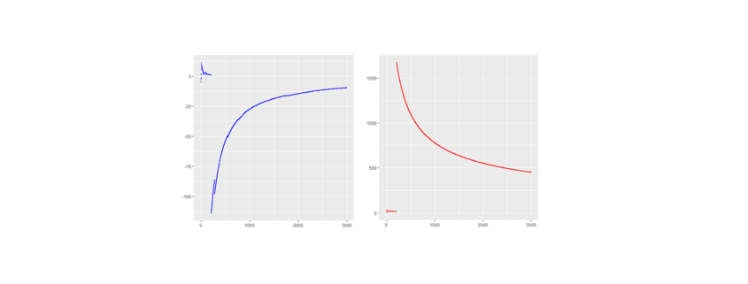
and compute the ordinary (arithmetic) sample mean  x_m and a sample standard deviation sd from it.  Now if (and only if) the (true) population mean µ (first moment) and population variance (second moment) obtained from the actual underlying PDF  are finite, the numbers x_m and sd make the usual sense otherwise they are misleading as will be shown by an example.

By the way: The common correlation coefficient will also be undefined (or in practice always point to zero) in the presence of infinite population variances. Hopefully I will create an article discussing this related fallacy in the near future where a suitable generalization to Lévy-stable variables will be proposed.

 Drawing a random sample from a heavy tailed distribution and discussing certain measures

As an example suppose you have a one dimensional random walker whose step length is distributed by a symmetric standard Cauchy distribution (Lorentz-profile) with heavy tails, i.e. an alpha-stable distribution with alpha being equal to one. The PDF of an individual independent step is given by p(x) = \frac{\pi^{-1}}{(1 + x^2)} , thus neither the first nor the second moment exist whereby the first exists and vanishes at least in the sense of a principal value due to symmetry.

Still let us generate N = 3000 (pseudo) standard Cauchy random numbers in R* to analyze the behavior of their sample mean and standard deviation sd as a function of the reduced sample size n \leq N.

*The R-code is shown at the end of the article.

Here are the piecewise sample mean (in blue) and standard deviation (in red) for the mentioned Cauchy sampling. We see that both the sample mean and sd include jumps and do not converge.

Especially the mean deviates relatively largely from zero even after 3000 observations. The sample sd has no target due to the population variance being infinite.

If the data is new and no prior distribution is known, computing the sample mean and sd will be misleading. Astonishingly enough the sample mean itself will have the (formally exact) same distribution as the single step length p(x)
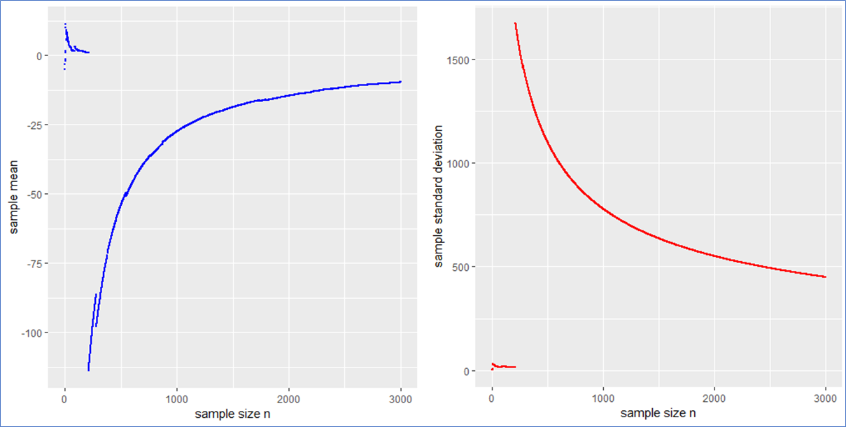
. This means that the sample mean is also standard Cauchy distributed implying that with a different Cauchy sample one could have easily observed different sample means far of the presented values in blue.

What sense does it make to present the usual interval x_m \pm sd / \sqrt{N} in such a case? What to do?

The sample median, median absolute difference (mad) and Inter-Quantile-Range (IQR) are more appropriate to describe such a data set including outliers intrinsically. To make this plausible I present the following plot, whereby the median is shown in black, the mad in green and the IQR in orange.

This example shows that the median, mad and IQR converge quickly against their assumed values and contain no major jumps. These quantities do an obviously better job in describing the sample. Even in the presence of outliers they remain robust, whereby the mad converges more quickly than the IQR. Note that a standard Cauchy sample will contain half of its sample in the interval median \pm 
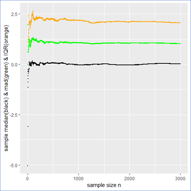
mad meaning that the IQR is twice the mad.

Drawing a random sample from a PDF that has finite moments

Just for comparison I also show the above quantities for a standard normal (pseudo) sample labeled with the same color as before as a counter example. In this case not only do both the sample mean and median but also the sd and mad converge towards their expected values (see plot below). Here all the quantities describe the data set properly and there is no trap since there are no intrinsic outliers. The sample mean itself follows a standard normal, so that the sd in deed makes sense and one could calculate a standard error \frac{sd}{\sqrt{N}} from it to present the usual stochastic confidence intervals for the sample mean.

A careful observation shows that in contrast to the Cauchy case here the sampled mean and sd converge more quickly than the sample median and the IQR. However still the sampled mad performs about as well as the sd. Again the mad is twice the IQR.

And here are the graphs of the prementioned quantities for a pseudo normal sample:

The take-home-message:

Just be careful when you observe outliers and calculate sample quantities right away, you might miss something. At best one carefully observes how the relevant quantities change with sample size as demonstrated in this article.

Such curves should become of broader interest in order to improve transparency in the Data Science process and reduce fallacies as well.

Thank you for reading.

P.S.: Feel free to play with the set random seed in the R-code below and observe how other quantities behave with rising sample size. Of course you can also try different PDFs at the beginning of the code. You can employ a Cauchy, Gaussian, uniform, exponential or Holtsmark (pseudo) random sample.


QUIZ: Which one of the recently mentioned random samples contains a trap** and why?

**in the context of this article


R-code used to generate the data and for producing plots:


#R-script for emphasizing convergence and divergence of sample means

####install and load relevant packages ####

#uncomment these lines if necessary
#install.packages(c('ggplot2',’stabledist’))
#library(ggplot2)
#library(stabledist)

#####drawing random samples #####

#Setting a random seed for being able to reproduce results  
set.seed(1234567)   
N= 2000     #sample size

#Choose a PDF from which a sample shall be drawn
#To do so (un)comment the respective lines of following code

data <- rcauchy(N)    # option1(default): standard Cauchy sampling

#data <- rnorm(N)     #option2: standard Gaussian sampling
                               
#data <- rexp(N)    # option3: standard exponential sampling

#data <- rstable(N,alpha=1.5,beta=0)  # option4: standard symmetric Holtsmark sampling

#data <- runif(N)              #option5: standard uniform sample

#####descriptive statistics####
#preparations/declarations

SUM = vector()
sd =vector()
mean = vector()
SQ =vector()
SQUARES = vector()
median = vector()
mad =vector()
quantiles = data.frame()
sem =vector()

#piecewise calculaion of descrptive quantities

for (k in 1:length(data)){              #mainloop
SUM[k] <- sum(data[1:k])            # sum of sample
mean[k] <- mean(data[1:k])          # arithmetic mean
sd[k] <- sd(data[1:k])              # standard deviation
sem[k] <- sd[k]/(sqrt(k))          #standard error of the sample mean (for finite variances)
mad[k] <- mad(data[1:k],const=1)   # median absolute deviation    

for (j in 1:5){
qq <- quantile(data[1:k],na.rm = T)
quantiles[k,j] <- qq[j]         #quantiles of sample
}
colnames(quantiles) <- c('min','Q1','median','Q3','max')

for (i in 1:length(data[1:k])){
SQUARES[i] <- data[i]*data[i]    
}
SQ[k] <- sum(SQUARES[1:k])    #sum of squares of random sample
}  #end of mainloop

#create table containing all relevant data
TABLE <-  as.data.frame(cbind(quantiles,mean,sd,SQ,SUM,sem))


#####plotting results###
x11()
print(ggplot(TABLE,aes(1:N,median))+
geom_point(size=.5)+xlab('sample size n')+ylab('sample median'))
x11()
print(ggplot(TABLE,aes(1:N,mad))+geom_point(size=.5,color ='green')+
xlab('sample size n')+ylab('sample median absolute difference'))
x11()
print(ggplot(TABLE,aes(1:N,sd))+geom_point(size=.5,color ='red')+
xlab('sample size n')+ylab('sample standard deviation'))
x11()
print(ggplot(TABLE,aes(1:N,mean))+geom_point(size=.5, color ='blue')+
xlab('sample size n')+ylab('sample mean'))
x11()
print(ggplot(TABLE,aes(1:N,Q3-Q1))+geom_point(size=.5, color ='blue')+
xlab('sample size n')+ylab('IQR'))

#uncomment the following lines of code to see further plots

#x11()
#print(ggplot(TABLE,aes(1:N,sem))+geom_point(size=.5)+
#xlab('sample size n')+ylab('sample sum of r.v.'))
#x11()
#print(ggplot(TABLE,aes(1:N,SUM))+geom_point(size=.5)+
#xlab('sample size n')+ylab('sample sum of r.v.'))
#x11()
#print(ggplot(TABLE,aes(1:N,SQ))+geom_point(size=.5)+
#xlab('sample size n')+ylab('sample sum of squares'))